10 of the Best Adobe Commerce-Built Stores We Love
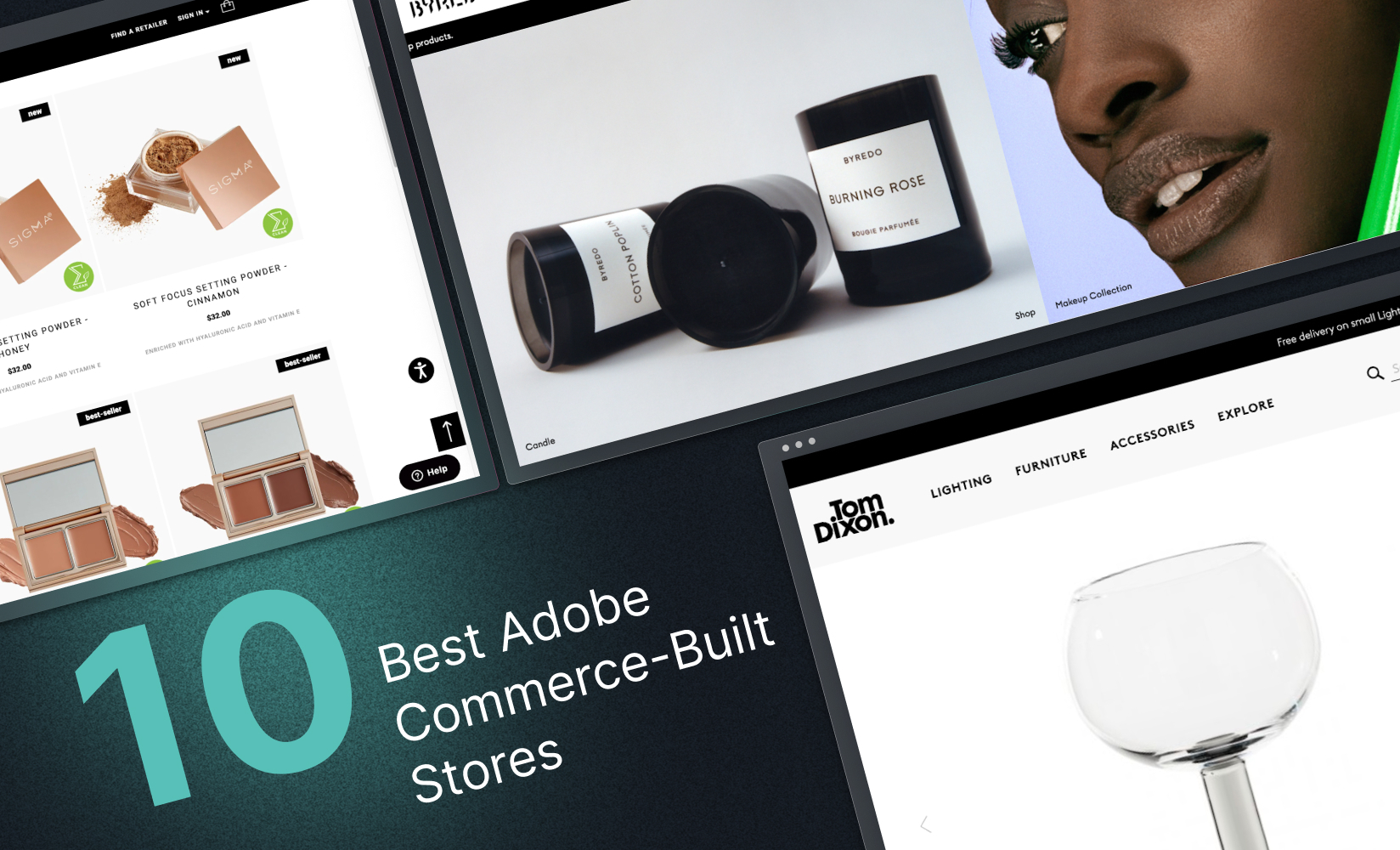
Adobe Commerce is a powerful, versatile, and fast ecommerce platform.
If your store is built on Adobe Commerce, or if you’re thinking of replatforming to it, you’ll be keen to see all its possibilities.
You might already be sold on their backend functionality and reliability as a solid ecommerce services provider, but what about the part of your site that your shoppers browse the most?
How can you use Adobe stores to create an especially unique shopping experience on the frontend? An experience powerful enough to seal the deal with your visitors and keep them returning?
Today we’re looking at some of the best examples of stores built on Adobe Commerce, and analyzing what makes them great. The aim is to showcase what Adobe stores are capable of and inspire you to craft the storefront of your dreams.
Based on our research, here’s our list of the best Adobe-built stores (in no particular order):
But before we get into what makes them so awesome (and what you should aim to emulate with your own storefront), first let’s explore why brands often build with Adobe to begin with!
What makes Adobe Commerce such a great backend platform?
Adobe Commerce—or Magento as it is still sometimes called—is a great choice of backend platform for enterprise-level businesses and scaling brands.
Some of its advantages include its:
- Extensive offerings. Adobe is a large, well-established vendor and, as such, can offer a huge range of services. The platform also integrates with an exhaustive list of in-house and third-party extensions, making Adobe a perfect technology partner for ecommerce brands who need to build versatility and extensibility into their store.
- Enterprise-grade technology. Another advantage of choosing a backend vendor of the size and scale of Adobe is its increased capacity. Adobe Commerce is ideal for retailers with long product lists and complex catalogs. It can accommodate up to several million product listings and SKUs and claims you can load over 48 products on a single category page before performance is affected.
- Headless architecture. Adobe Commerce is a headless platform, giving you freedom and flexibility when it comes to building out your tech stack. You can take advantage of the range of backend services and high-level support without being tied into Adobe’s frontend themes. You can scale your store with its powerful backend capabilities, and you have options when it comes to how you craft the frontend layer for being agile.
- API-first-approach. Adobe is not only headless, it is API-first, which means it is built with API integration as the foundation of its architecture. This gives the platform an added layer of flexibility, so you can do far more with your tech stack. There are a range of services that Adobe connects to out-of-the-box, and if you want to use a third party that isn’t on the list, you can do so with a Generic Analytics Snippet.
#cta-visual-fe#<cta-title>Want total control of your Adobe storefront design? Chat with Shogun<cta-title>See how Shogun Frontend can help you deliver elevated shopping experiences and speed. Learn more
10 outstanding Adobe store examples
To showcase what storefronts built on Adobe Commerce can do, we’ve brought together our favorite examples of brands that have taken full advantage of what the commerce platform has to offer.
These online retailers have cleverly harnessed the speed, power, and flexibility of Adobe to create outstanding experiences that exceed the expectations of their customers.
1) Tom Dixon
The online outlet for high-end furniture designer Tom Dixon is an excellent example of what you can do with Adobe. The sleek site is fast to load (an impressive feat with so many elements, high-quality images, and embedded videos).
But despite its many components, there is a simplicity that allows the brand to convey its identity.
First notice that the site facilitates a luxury and bespoke guided journey.
- Divided into ‘Studio’ and ‘Upholstery’ pathways as the first section that a visitor sees, we get a good idea of what the brand is all about—the commitment to quality and craftsmanship that Tom Dixon wants to instill in their products is mirrored in their site:
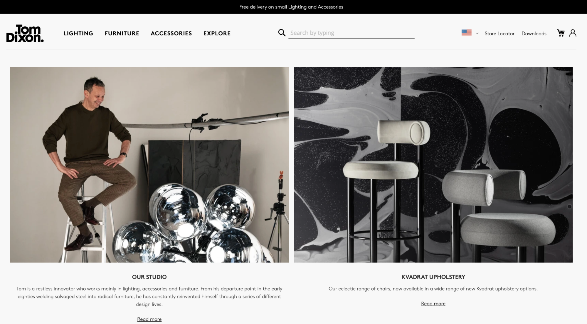
Below this, categories are displayed on the homepage, allowing for exploration and giving Tom Dixon’s chances of conversion a boost.
And to cap off the homepage is some social proof—images of furniture in customers’ living spaces allow shoppers to discover products in context of use and purchase with confidence.
There are two key elements of this store that you should aim to replicate with your own:
- Immersive customer experience. The site displays visually rich content (like large images and video) while maintaining fast load times and site performance.
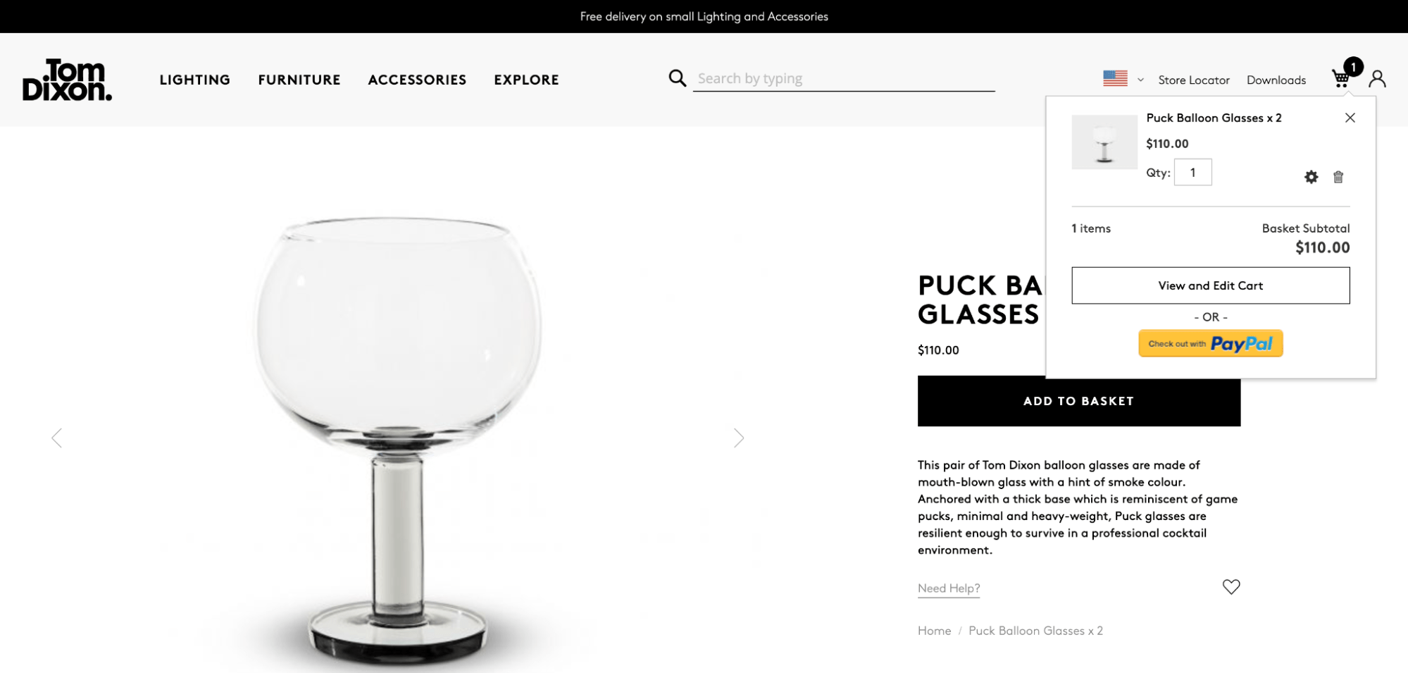
- Fast journey to checkout. An embedded Paypal button is accessible directly from the product page (once customers have added an item to their cart). This allows customers to checkout with minimal clicks.
#cta-visual-fe#<cta-title>Want total control of your Adobe storefront design? Chat with Shogun<cta-title>See how Shogun Frontend can help you deliver elevated shopping experiences and speed. Learn more
2) Cox & Cox
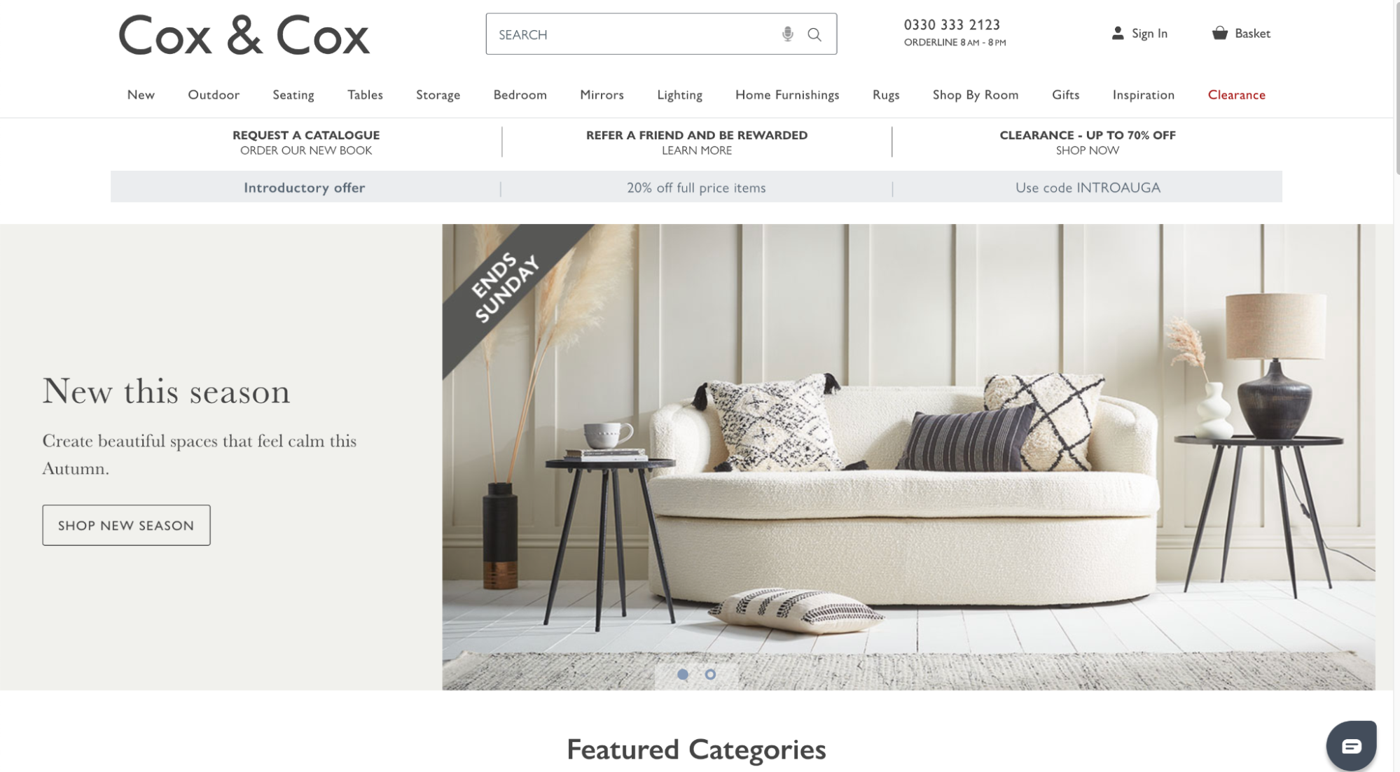
The British home and garden furniture retailer upgraded to Magento 2 back in 2016. By upgrading, they’ve been able to streamline their checkout service and provide more advanced filtering options with cart and navigation extensions built for Magento 2
They’ve been able to create a faster, more engaging customer experience by increasing the capabilities of their Adobe-powered store.
The time it takes to navigate to relevant product pages is lighting fast page-to-page, with several filters available to visitors right from the homepage:
- At the top of the page is a search box that suggests popular searches and trending products.
- Below search is a standard menu that displays detailed sub-menus when visitors hover over it.
- Scroll down, and the site showcases featured categories, taking advantage of Adobe’s ability to pull and display categories on the homepage.
- On the category pages, visitors can filter the displayed products by price with an embedded sliding scale, quickly moving visitors along the customer journey. This search feature moves customers to individual product pages relevant to their needs in seconds.
3) Graze
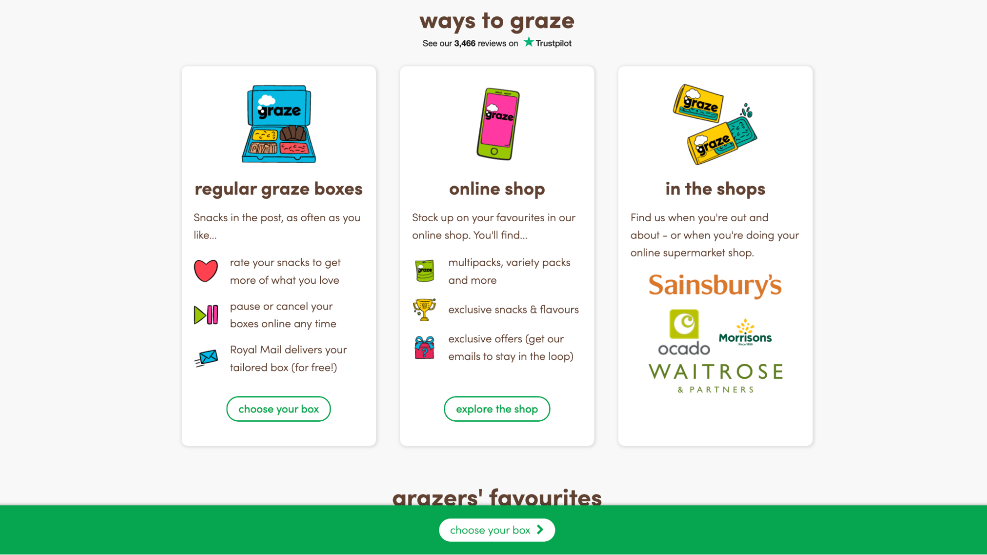
This UK-based purveyor of healthy snacks has a site that shows the versatility of Adobe. Having super-fast, engaging pages doesn’t mean you have to opt for the sleek, high-end aesthetic common to other brands we’ve looked at..
Graze’s product is light, fun, and enjoyable, and this is what their online store is about too.
- The layout is clear, and CTAs are easy to understand.
- It’s easy to navigate to products from the homepage. Even though their brand identity highlights fun times, the close attention paid to the customer experience is anything but frivolous.
- When visitors hit a landing page, they are immediately encouraged to ‘choose your box’ —a CTAreinforced with a pop-up banner as visitors scroll down the page.
- Social proof is employed throughout, with embedded customer reviews and TrustPilot ratings placed in prominent positions.
- The different ways you can shop (from one-off online orders, subscriptions, or in-store) are broken out into clickable options.
- The clear, unambiguous layout coupled with the bright, lighthearted color scheme, creates an inviting atmosphere and the legitimacy of their checkout flow/feel reassures customers it’s ok to purchase.
The layout and navigation of this site strengthen bonds between brand and customer.
4) Sigma Beauty
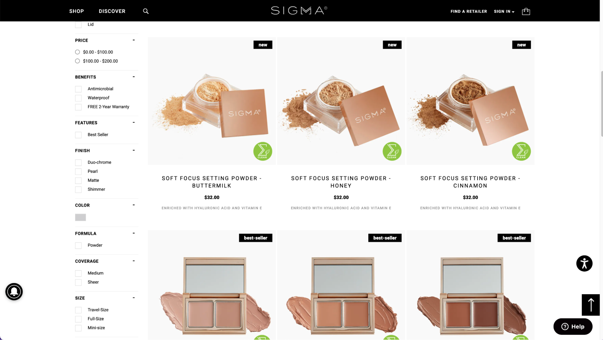
In 2018, the online cosmetics brand used Adobe to redesign its B2C and B2B storefronts. They used Adobe’s B2B platform to create a portal within their site, where B2B customers can log in to view, manage, and track their orders.
By doing so, they avoided the need for an entirely separate site for B2B ecommerce, while still being able to provide the specialist functionality that B2B customers need.
But the basis of an outstanding customer experience is the same across B2B and B2C— fast-to-load sites and intuitive navigation to products.
- On the B2C side, the navigation is facilitated by extensive product filters —an important Adobe feature for brands with large catalogs.
- The filter options allow customers to shop by price, product type, and color, as well as offering several niche-specific filters: finish, fiber, and experience level are all available to let visitors hone in on the specific product they need.
5) Byredo
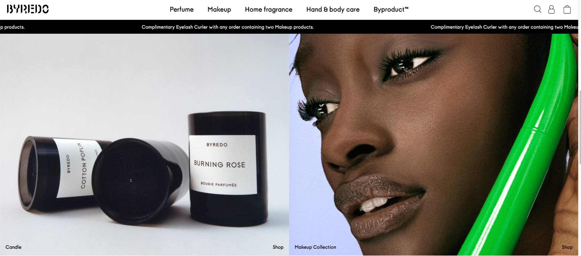
This luxury perfume retailer boosted their conversions by more than 30% by transitioning their store to Magento 2. They increased engagement by focusing on their content.
They did this by:
- Using minimalist product listings, combined with instantaneous drop-down menus, to facilitate intuitive and clean navigation.
- Pairing down their homepage; it’s full of large images, but they’re fast to load even though they are high-quality.
By focusing on delivering high-quality content at high speed, Byredo increased their AOV by 160%.
6)Liverpool FC

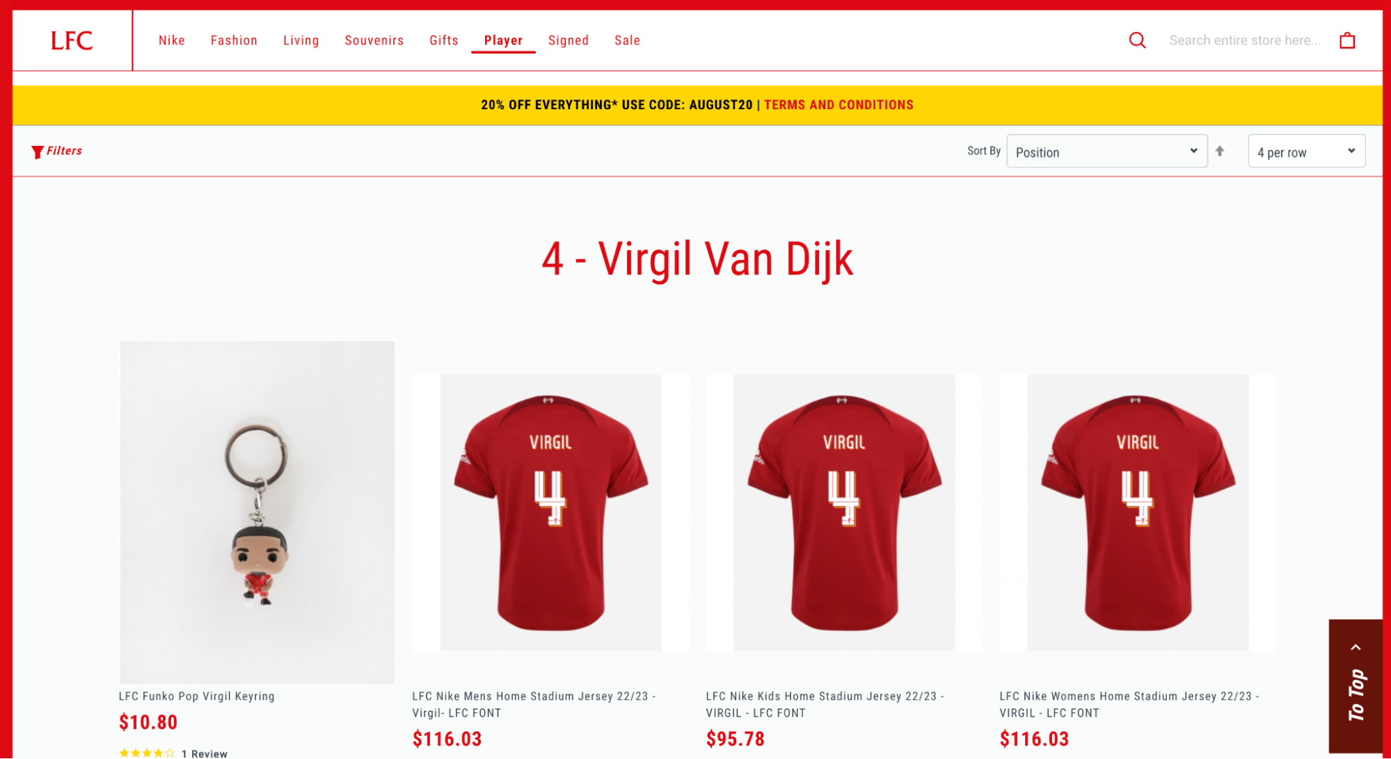
Combining sport and fashion in a menu configuration is no mean feat! But the versatility of Adobe’s menu system makes it appear seamless on this hybrid soccer club site/ecommerce store.
Magento lets you set menu depth to whatever configuration you need. In this example, the unique need to sell personalized player jerseys is facilitated by a menu that lists every player for the men’s and women’s teams, each linking to an individual product page where customers can buy their favorite player’s replica jersey. All in a few clicks from landing page to checkout.
7) Björn Borg
The space above the fold on the homepage for this sports apparel retailer is entirely taken up with one image:
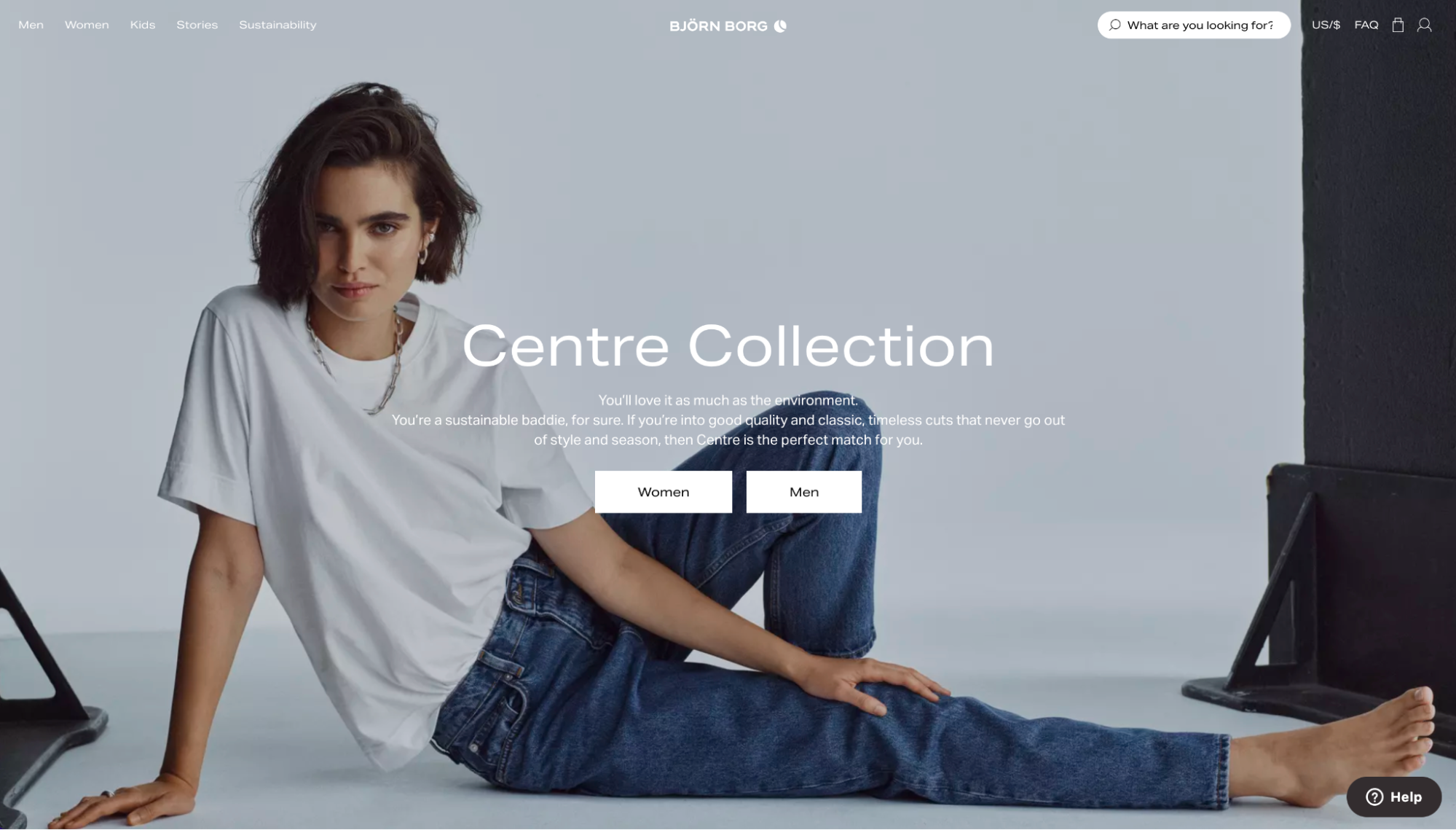
This minimalist yet bold layout draws site visitors to the collection highlighted in the center of their screen. It’s pretty effective at ensuring a focus and offers an immediate path forward.
Clicking through leads to the category page, and the visitor sees a series of large product images, drawing them through the buyer journey. It’s an immersive and enticing shopping experience.

Further, the responsiveness and speed, despite the use of large, high-quality images, showcase Adobe’s ability to support content-rich experiences that otherwise would prove a drag on load times.
Definitely worth a click through to see what they’re doing with their product photography and large images focusing on the product in excellent detail.
#cta-visual-fe#<cta-title>Want total control of your Adobe storefront design? Chat with Shogun<cta-title>See how Shogun Frontend can help you deliver elevated shopping experiences and speed. Learn more
8) The New Craftsmen
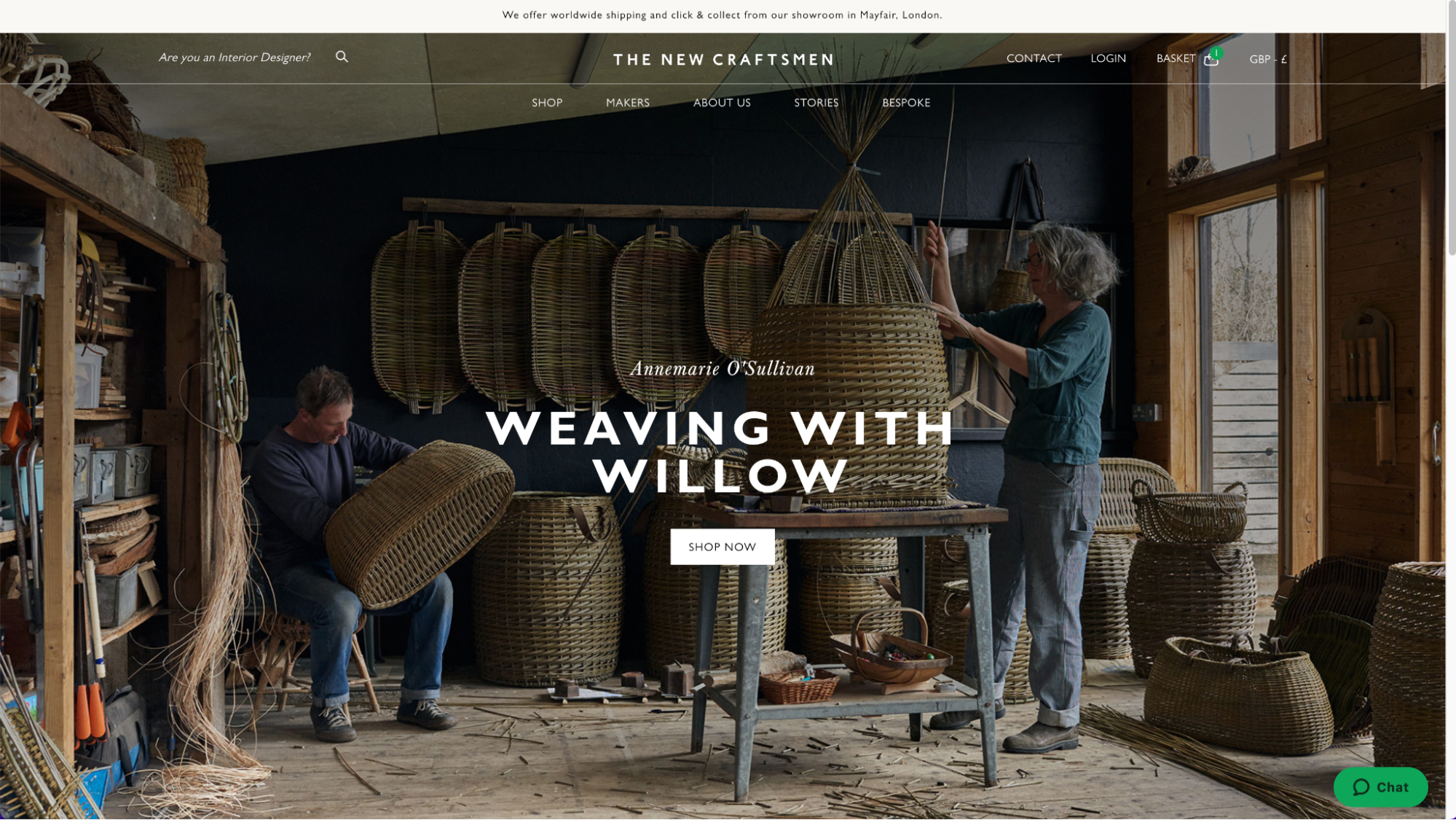
For brands offering a unique product, having the ability to create a unique website is important. The New Craftsmen bring together artisans and makers who use traditional techniques to create bespoke items of furniture, glassware, lighting, textiles, and a range of household objects such as vases and tiles.
To convey this uniqueness, this brand include makers’ stories that consist of short bursts of text interspersed with beautiful photographs from the artisans’ workshops throughout the site:
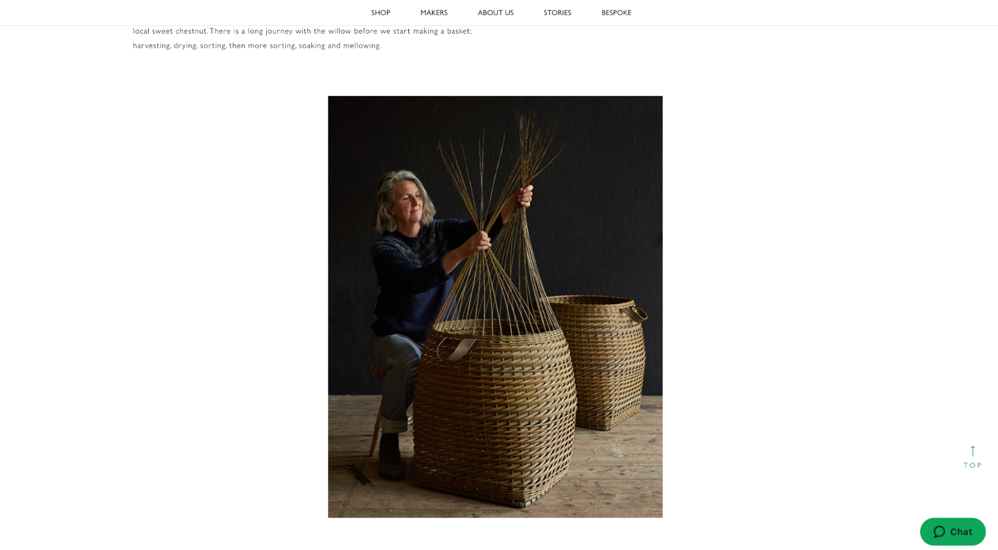
The site navigation is designed to offer simplicity. An interesting feat for a site that is at once an online store, a marketplace, and a community.
There are three routes the visitor can take to the product pages depending on how they want to shop: by maker, by product category, or even by commissioning a bespoke object themselves! But despite the complexity here, the layout and UX is exceptionally clean and simple to use.
The main takeaways for your store to replicate:
- A clean layout. Lots of white space gives these beautiful products room to breathe. Images and short copy blurbs add persuasive and endearing detail without overwhelming site visitors with a wall of text or information overload. The site caters to varying levels of commitment someone is going to give to the content.
- Detailed images showcasing the products. For luxury items, The New Craftsmen let the products do the talking, with multiple images on the product page showcasing the uniqueness of their goods. The product images are rich enough to display the quality of the product in multiple angles too.
#cta-visual-fe#<cta-title>Want total control of your Adobe storefront design?<cta-title>See how Shogun Frontend can help you deliver elevated shopping experiences and speed. Learn more
9) Le Creuset
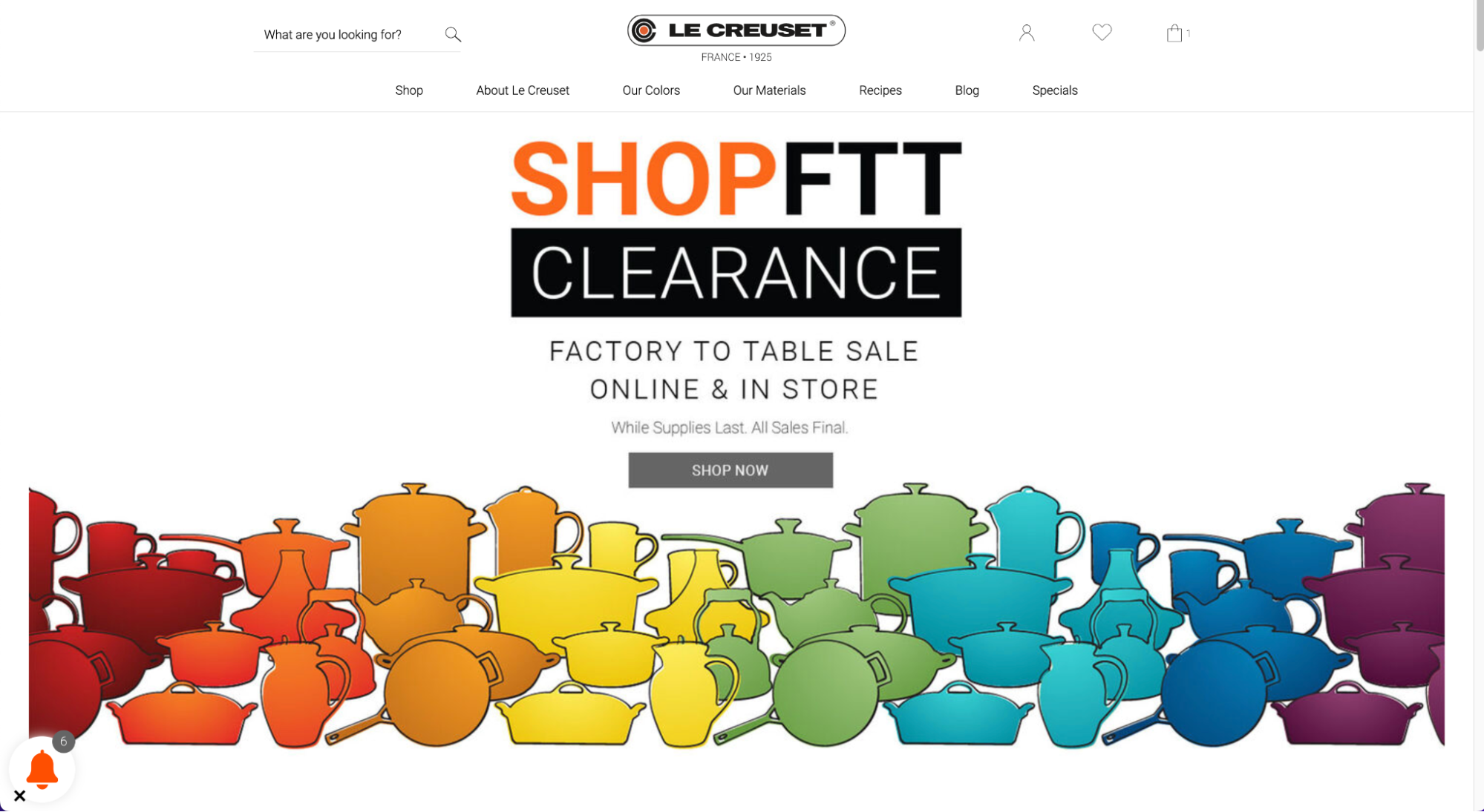
The famous cookware manufacturer’s products need very little introduction.
Because their site visitors are already sold on the quality and craftsmanship of their products, the journey from Le Creuset’s landing page to their checkout is often, likely short.
A ‘quick view’ option displays a pop-up product page (terrific for avoiding needing to always click through):
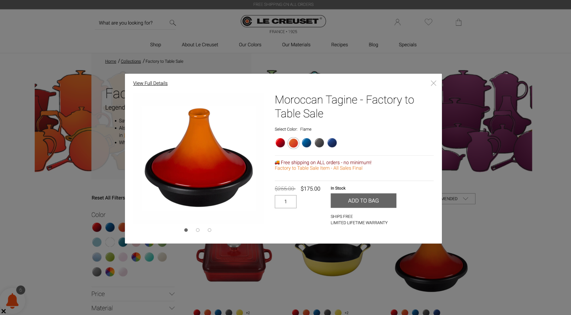
One more click takes customers to checkout, with several payment options embedded on the page.
The speed with which customers can get from homepage to checkout is key to the success of Le Creuset’s store. Adding to the customer experience is the ability to quickly filter by and select color with visually intuitive buttons on the category and product pages.
10) Shinola
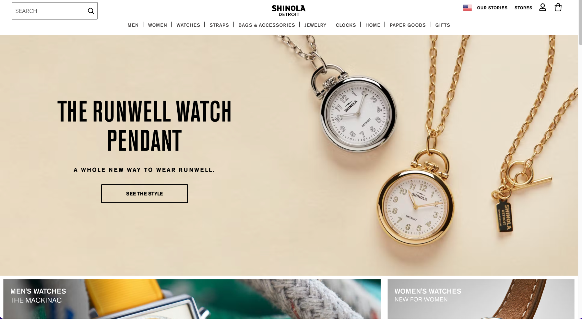
When the watchmaker switched its online store to Adobe Commerce, they had the aim of increasing conversions on their mobile site. They were able to do this by making their mobile site more responsive and improving the navigation and customer experience.
Shinola’s mobile add-to-cart feature helps guide visitors through the shopping journey without any unnecessary hold-ups or diversions.
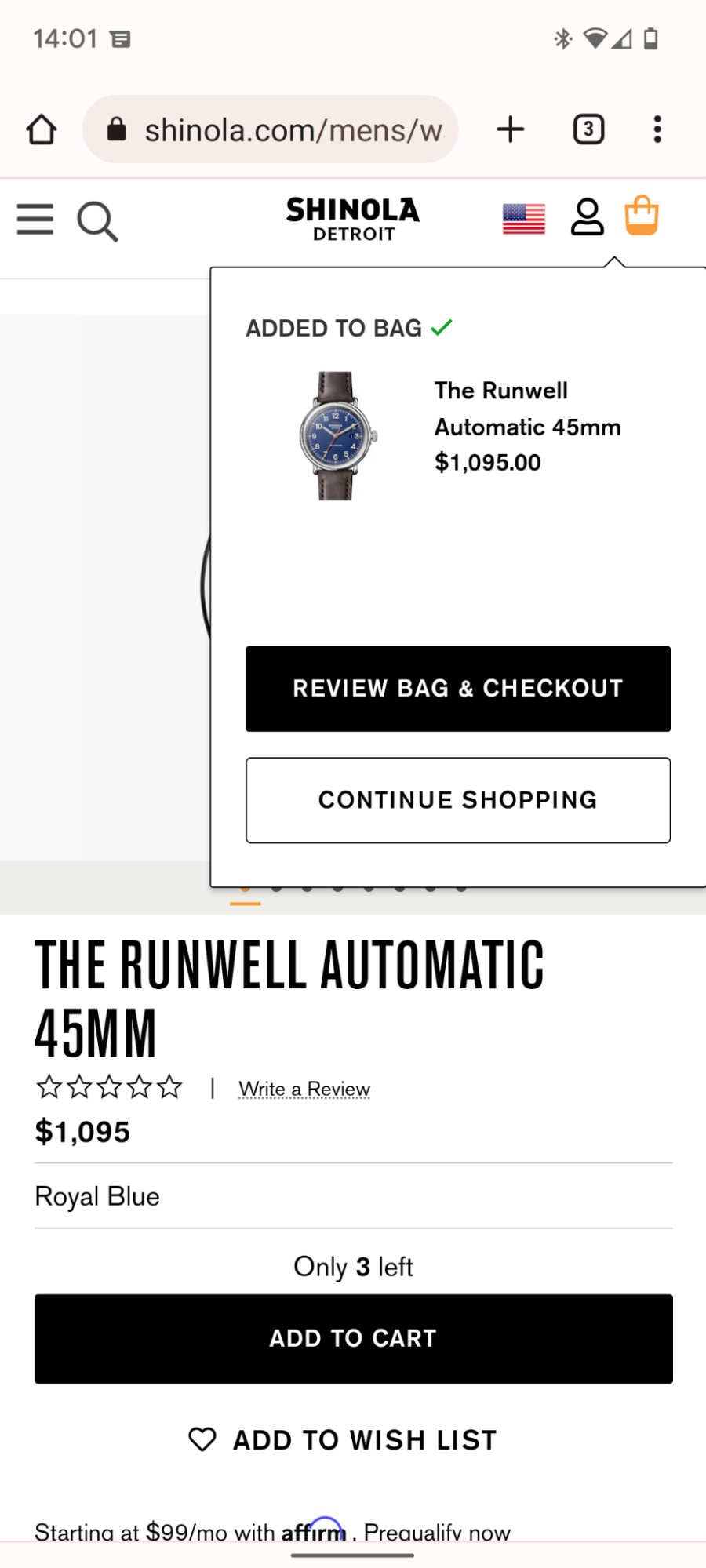
On both mobile and desktop, the site is quick to reload after filtering options are applied. This is important for a watch manufacturer, whose customers will need to filter their search by strap size, type of watch, color, material, and a host of other variables.
But the most noticeable thing is the amount of large, high-quality images that fill the width of the screen. They instantly convey brand identity— top-notch products with no cutting corners on satisfaction and quality.
How you can take your Adobe Commerce store to the next level
These 10 brands deliver outstanding customer shopping experiences with fast-loading content, rich imagery, and intuitive navigation.
If you’re inspired, then you might be keen to explore ways to develop your ecommerce set-up and the frontend experience of your dreams. You ultimately want a frontend that’s capable of creating the shopping you need to match and surpass your customers’ expectations as you scale.
So what are the key attributes your online store should have to keep you competitive?
- Offer you greater control – You need to be able to switch out content and augment layouts regularly as you respond to new product lines, the results of testing, and changing customer tastes. Putting your marketing and business teams front and center of this process gives you more control over your brand.
- Deliver rich content fast – Aside from keeping your content fresh and up-to-date, you need content to be high-quality. But heavy images and video have traditionally been associated with slow-loading pages and sub-par site performance. To deliver the kind of immersive digital experiences your customers expect, you need to be able to offer up breathtaking images and video at lightning-fast speeds.
- Easily integrate channels – Being able to add new sales channels to your commerce platform and deliver consistent experiences across them all is crucial if you want to meet the needs of an omnichannel world. Your frontend layer has a huge part in this, so you need something especially flexible.
As we’ve hopefully shown, getting these things right is perfectly possible on an Adobe Commerce-built store.
But to get the agility you are hoping for, you might have to change up parts of your ecommerce frontend tech stack. For this, you have options, including:
- Transform your Adobe store into a PWA – Progressive Web Apps can deliver rich content at high speeds by caching the static parts of your site. They take less time to load than traditional web pages and are capable of serving content-rich experiences and app-like sites right from the visitors’ browser.
- Leverage Adobe’s headless architecture – Because Adobe Commerce is headless, you have the freedom and flexibility to build out your frontend layer exactly in line with your brand’s needs. You can add in functionality, increasing the speed and content capacity of your store, with whatever tools you find are necessary. Ultimately, you don’t have to stick within the Adobe framework to complete your store, you can add things on top if you’d like.
- Implement an all-in-one Frontend Platform atop Adobe Commerce – Shogun Frontend is a unified frontend platform that gives you the ability to completely design, build, and deliver a frontend layer for nearly every popular ecommerce backend, including Adobe Commerce. With Shogun, you can get the flexibility and incredible design ability associated with headless commerce—all without building a custom frontend tech stack. You outsource the infrastructure entirely!
You can deliver rich content to your site visitors and make your site faster without having to piece together disparate technologies and deal with multiple third parties.
Instead, you can focus on the things that are important to your business – crafting an unbeatable ecommerce site that will build your brand, increase your customer base, and boost your conversions.
#cta-visual-fe#<cta-title>Want total control of your Adobe storefront design?<cta-title>See how Shogun Frontend can help you deliver elevated shopping experiences and speed. Learn more

Rhys Williams
Rhys is a writer specializing in enterprise software, ecommerce, and SaaS. He describes himself as a geek and a wordsmith and relishes making complex, technical topics come to life in easy-to-understand web copy.


