Ecommerce Navigation: 8 Tips to Improve UX, Product Discovery & Search Rankings
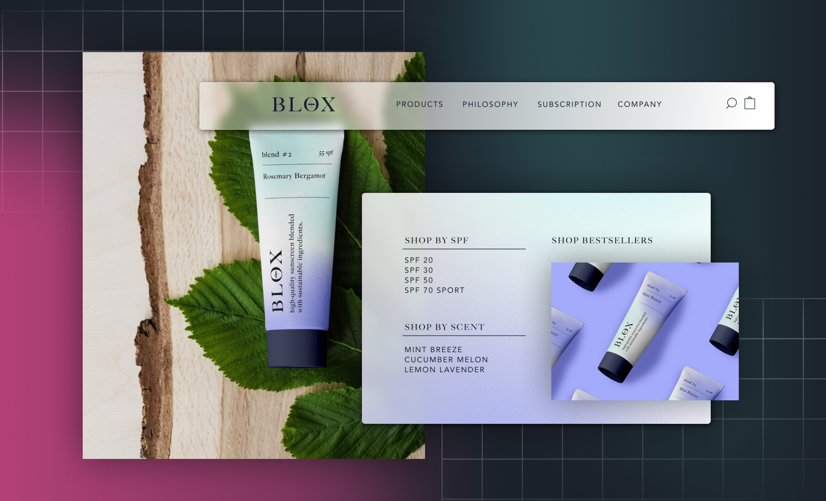
You already know that ecommerce navigation and information architecture on your store’s site are critical.
The more shoppers can intuitively find items or can naturally discover products as they shop (via your suggestions)—the more you’ll actually sell.
In fact, changes to website navigation can positively impact conversion rates by as much as 18.5%. So optimizing your navigational structure can equal thousands of dollars in profit each week!
In this post, we’ll walk through great ecommerce navigation examples, plus cover best practices or standards you can introduce for a site that’s intuitive (without feeling cookie-cutter.)
- What constitutes good ecommerce navigation?
- Ecommerce navigation examples we love
- Best practices for optimizing your ecommerce navigation
What constitutes good ecommerce navigation?
Ecommerce navigation helps a website visitor find their way around your website.
It’s like a map: where the goal is to make it super simple for shoppers to find what they’re looking for—be that a specific item, your returns policy, or a product category page.
Navigation for any standard ecommerce site includes:
- Top navigation bar
- Drop down menus
- Sidebar menus
- Breadcrumb navigation
- Footer menus

Rumpl’s top navigation bar helps ecommerce shoppers discover what they’re looking for.
But just any navigation isn’t good navigation. Yours needs to give shoppers the information they need quickly and easily—without overwhelming them with too many options.
And good information hierarchy is especially important for ecommerce sites. As Brittany Wong, owner of Happyland Creative, shares:
“In a brick-and-mortar shop, an employee can offer help to a customer who looks lost. But online, the customer is completely independent and relying on your optimized navigation to find their way around your site.”
The criteria for especially good ecommerce navigation
So how should you broadly approach the structure of your entire ecommerce site from the top menu? Well, a good ecommerce navigation, high level, tends to meet the following criteria:
- It showcases bestsellers. Best-selling products generate the most revenue for your online store. Best you can, your navigation should divert people there. Many top brands include an entire menu item devoted to “Best sellers”.
- It makes great use of categories (and subcategories). Showcase parent categories in your navigation structure, with dropdown menus to expand on subcategories for people who’ve shown an interest in them.
- It shows the cart button prominently. The cart should always be easily visible by shoppers. Highlighting the cart button prominently in your navigation makes it easily accessible on all pages so you don’t fall at the last hurdle toward a sale.
- Your top navigation must include a clickable logo. The homepage is arguably the most important page on your online store. Include your logo in your navigation to give visitors a constant route back to the homepage (your store’s main entrance), regardless of the page they’re currently on.
- It uses optimized anchor text. Search engines consider user experience when deciding where a site should rank. SEO best practice is to use exact-match anchor text in your navigation structure. It’ll increase the chances of linked-to pages appearing in search results for related terms.
And finally, as Chris Roth, CEO and founder of Highline Wellness highlights—the navigation needs to be convenient and fast: “It’s critical that site visitors use the least amount of clicks to get to a product so that they don’t get frustrated and leave….”
“For instance, if you have many products in a particular category, provide the option of increasing the number of products that can be shown in one page, so that your visitors don’t have to click numerous times to get to the page where a product is listed. This is a sure way of making the browsing experience convenient and quick.”
#cta-visual-pb#<cta-title>Create a high-converting ecommerce shopping experience<cta-title>See how you can customize landing pages that engage customers with Shogun Page Builder.Learn more
Top ecommerce navigation examples we love
So now that we know what makes for especially good ecommerce site navigation, what does it look like in practice?
Let’s take a look at two real-life examples of ecommerce navigation and what you can learn from them.
Nolah
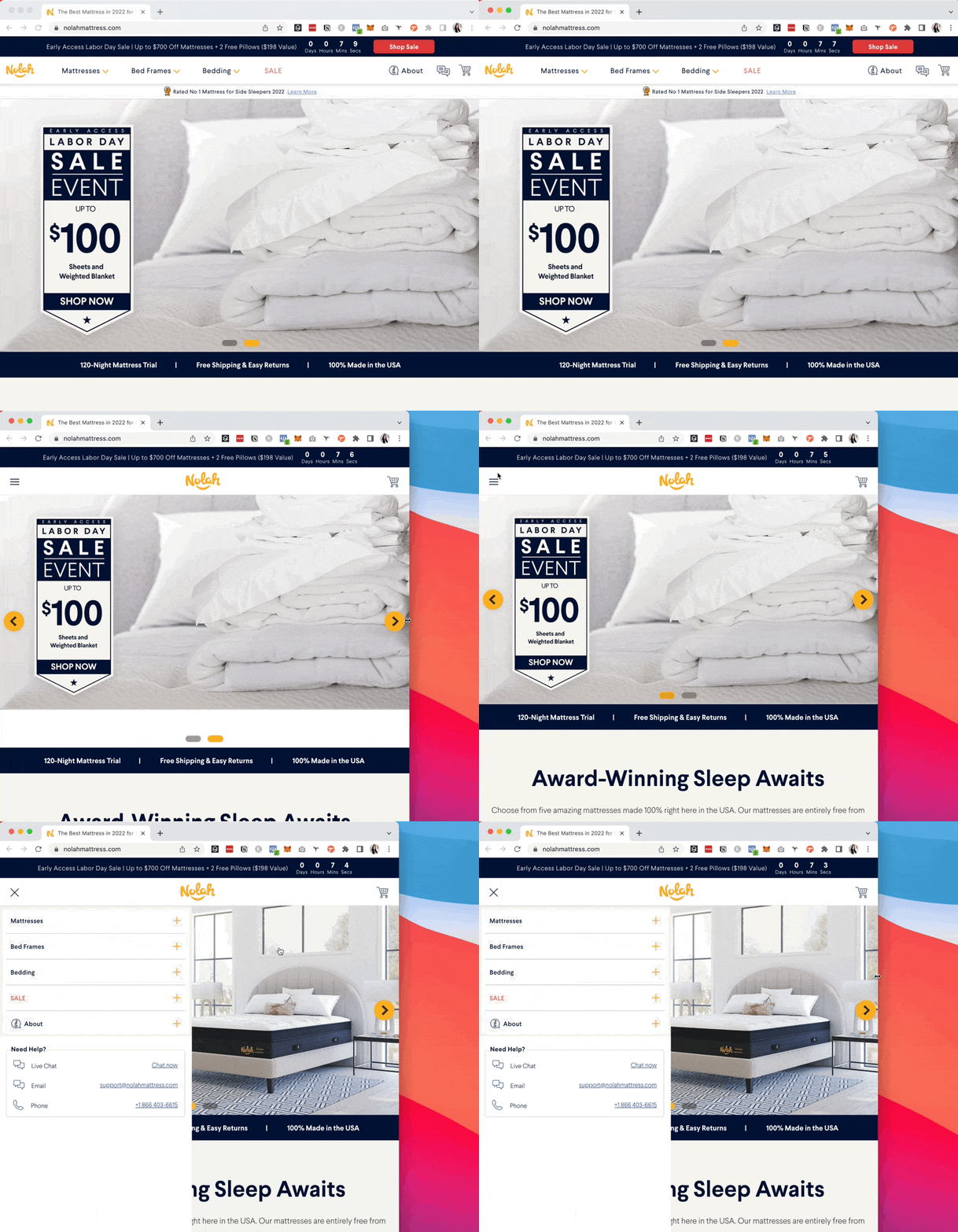
Nolah sells mattresses, bed frames, and bedding. So, to keep things simple, it uses these exact three categories for the main navigation bar. From here, dropdowns present further options for shoppers searching for a particular item.
The brand’s CEO Stephen Light says this navigational decision was intentional: “From our homepage, it takes less than five seconds for customers to identify the items they want to purchase.
“We categorized mattresses according to our best-selling, most versatile, and kid-friendly brands. We also include images of our top three product lines under each [site-wide] navigation bar to help customers visualize the quality of our items. We use this benefits-first strategy to expedite the buyer’s journey by highlighting how each option could improve their sleep.”

You can see how Nolah emphasizes how each mattress is different by including ‘sticker’ style callouts on the drop-down navigation imagery. I.e., “Best-selling,” “versatile,” and “Pressure relief,” for example. This helps bring customer needs or pain points to the forefront of how they want to shop.
You’ll also see a prominent sale menu item in Nolah’s top navigation bar.
According to Stephen, this section should advertise any promotions available to grab the attention of lower-budget customers who might not have made any purchases otherwise.
“Highlighting sales also instills a sense of urgency for window shoppers to convert into paying customers on the spot. If you hide your sales, you could miss out on significant profits.”

Most importantly, the navigation bar is responsive. Visitors accessing the website on a desktop computer see the full navigation bar.
When the page resizes for a mobile or tablet screen, it collapses into a stacked vertical navigation at the side of the page. Visitors aren’t overwhelmed with options or struggling with hard-to-click buttons on a smaller screen.
OLIPOP
OLIPOP is the fastest-growing functional beverage brand in the US. With a selection of flavors and packs to choose from, its ecommerce navigation bar serves as a way for customers to discover products in just a few clicks.
The retailer has three main categories listed in the top navigation bar: shop, learn, and subscribe.
Its senior ecommerce and digital product manager Melanie Edwards says:
“We’re making it easy for our customers to buy our products, learn about our company, and become a subscriber. It’s also important to make those tabs links. You can still have a dropdown menu, but ensure that the tabs are clickable links. This improves your user experience.”

- While the top-level navigation bar might look simple, customers see a variety of products when clicking each dropdown. The Shop tab, for example, lists bestselling flavors, with links to subcategories (variety packs and gift cards) to make those products more accessible.
- Essential pages (albeit with perhaps less revenue value) are stored in the footer. Again, they’re grouped into three different sections, making it easy for website visitors to find information they’re looking for.
OLIPOPs tips for crafting especially great ecommerce navigation? “Don’t get too creative,” Melanie summarizes. “It’s important that your customers don’t have to spend time figuring out where they want to go.”

#cta-visual-pb#<cta-title>Create a high-converting ecommerce shopping experience<cta-title>See how you can customize landing pages that engage customers with Shogun Page Builder.Learn more
8 best practices for optimizing your ecommerce navigation
Having seen some great ecommerce navigation examples, now we’ll explore actionable tactics you can use to improve your own site structure.
We’ve scoured navigation strategies from tons of ecommerce brands to land on these eight optimization strategies below. Let’s dive into how each improves the way your site visitor navigates to discover your products:
- Evaluate your current navigation
- Add a search function
- Enable breadcrumb navigation
- Add a “new arrivals” tab
- Set premade filters for delivery options
- Use the footer for low priority menu items
- Add images to your navigation dropdown
- Minimize the navigation on mobile
1. First: Audit and evaluate your current navigation menu
Before making any changes to your navigation design, evaluate whether it’s working. The last thing you want to do is overhaul the store’s navigation only to get worse results than you had before.
Customer journey mapping highlights the steps a customer takes before completing a goal. Use it to evaluate whether your current navigation is guiding website visitors in the right direction.
If your priority is generating sales, for example, use:
- Customer interviews
- Post-purchase surveys
- Google Analytics
Each of these will help you discover the steps a given shopper takes before becoming a customer. From there, redesign your navigation to prompt new store visitors into the first step of the journey map. From there, use secondary navigation—such as subcategories, breadcrumbs, and footers—to nudge them further down the sales funnel.
Customer journey mapping can reveal additions to your site navigation that go beyond internal links too.
That is—you can discover points of friction that may be solved for using the design of your site nav.
For example, as Pants and Socks’ founder Richard Clews shared: “We are heavily invested in our customer journey mapping process. It’s the best way to see if customers are smoothly making their way through your ecommerce store.”
The retailer uses a combination of session recordings, website analytics, and customer feedback to track the performance of its navigation. One of the most telling performance metrics to look at while auditing the navigation’s effectiveness? Cart abandonment rate.
“When we first launched our store, we were experiencing a cart abandonment rate hovering around 85%, which is almost 20% higher than an average ecommerce store sees,” Richard says. “We were able to use session recordings and customer feedback to see our potential customers leaving their cart at the payment screen.”
Richard adds that from this data, “It was apparent that our customers wanted more payment options like Google Pay and Apple Pay, and as an oversight on my part, we hadn’t enabled those methods.”

Pants and Socks added their new payment options to their footer navigation (see above) and saw cart abandonment rate drop to under 52% (from 85%).
2. Add a top-nav search function
While you can use journey mapping to optimize your ecommerce navigation, you can’t plan for everything. For this, add a search function (preferably with autocomplete) to your top-level navigation and help customers find what they’re looking for.
“We noticed that bounce rate improved when we’ve implemented a new navigation bar, but the biggest [win] we’ve found is the search function,” says Richard Kennedy, founder of Arken Digital. “You should absolutely have a search function, but we’ve [also] noticed that when we’ve nailed the navigation the searches typically drop.”
- In other words, you can keep visitors engaged with your site longer if there’s a prominent way to search
- You can learn more about shoppers’ and products they’re looking for from their search data
- And the frequency of site searches can indicate whether your navigation requires improvements.
Wisdom Supply Co has a site search bar in its main navigation. If I search for “journals,” three best selling journals with an option ‘view more’ appear. Ultimately this ensures visitors are just one click away from a category or product page related to a given search:

3. Enable breadcrumb navigation
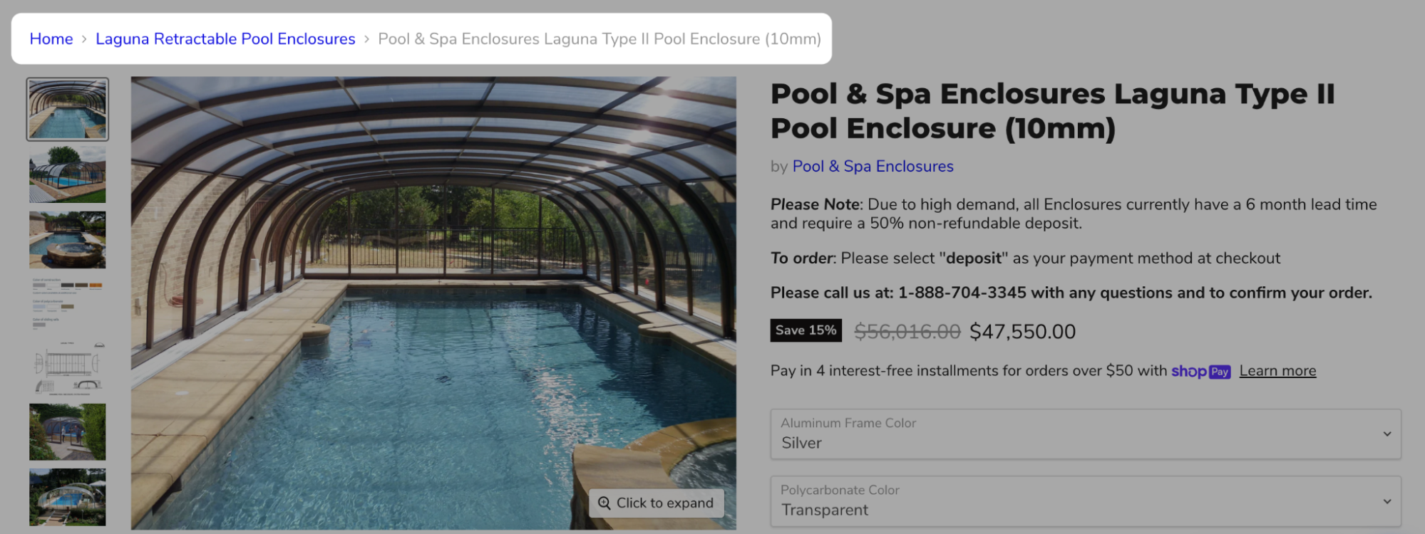
Breadcrumb navigation is the journey someone took to arrive on a product page. It’s cited that 90% of sites don’t highlight the user’s current place in the main site navigation, even though it’s important for helping visitors orient themselves in the grand scheme of the site or discover other products.
Breadcrumbs can be especially useful if your store regularly directs traffic to PPC pages.
For example, Lou Haverty explains that Enhanced Leisure runs paid campaigns diverting shoppers to individual product pages. For this, they share, “I’ve found it is very important to provide a customer with a link back to a collection page so they have the option to search other products within a particular product line or brand….”
“This is especially important because not all customers are ready to buy the specific product on the [PPC] page they land on,” Lou says. “They may need to compare other related product options or sizes.”
After adding breadcrumb navigation to product pages, Enhanced Leisure experienced a spike in collection page views for pool enclosures.
#cta-visual-pb#<cta-title>Create a high-converting ecommerce shopping experience<cta-title>See how you can customize landing pages that engage customers with Shogun Page Builder.Learn more
4. Add a “new arrivals” tab
People love discovering new products and collections. To help them naturally discover the latest and greatest, incorporate a “new arrivals” tab in your ecommerce navigation. It can help drive traffic to the most recently-listed inventory.
- A ‘new arrivals’ category helps to engage repeat visitors, too. They can arrive on your website and instantly see items that weren’t listed last time they checked, eliminating the need for them to scroll through already-skipped items (and improving user experience for loyal brand fans.)
“It is an excellent strategy for brands to sell their seasonal merchandise,” says Eric Jones, CEO of Couture Candy. “Besides that, make categories for sales, discounts, clearance items, and other special offers. It will give your customers access to find good deals right upon entering your website.”
“You can also have [navigation] categories for seasonal items, clearance sales, and promotional specials to give your customers easy access to your best deals, translating to higher conversion rates in the process.”
—Nunzio Ross, founder and CEO of Majesty Coffee
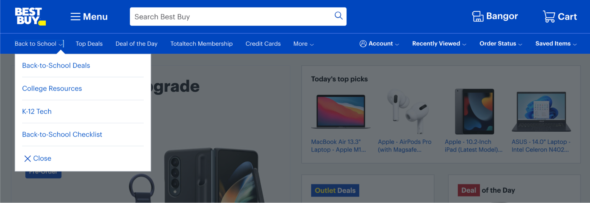
Take Best Buy, for example. The brand adds seasonal products to its top navigation bar, like this prominent “back to school” category. The dropdown shows the best school-related deals, broken down by age range, alongside a handy back-to-school checklist.
5. Create premade filters to showcase delivery options
Amazon paved the way for free, fast shipping. If your DTC brand can’t compete, but operates a physical store (whether temporary or permanent), consider leaning on those locations as a way to get products into a customers’ hands fast.
One popular fulfillment option is buy online, pickup in-store. Research shows that more than half of shoppers use BOPIS, with more than two thirds adding extra items to their cart when they know immediate pickup is available.
Capture this demand—and increase average order value—with a navigational collection that shows products available for each fulfillment option.
“If you are an ecommerce store and offer curbside pick for specific products, create a filter for that in your faceted navigation, so customers can conveniently only shop for pick-up items.” —Kevin Indig
Magnolia Bakery is one ecommerce business using this omnichannel retail strategy. Its top or main navigation shows an “order now” tab. When it’s selected, site visitors can choose their preferred delivery method—such as home delivery, same day BOPIS, and advanced pickup—and see a collection of products that fit their fulfillment criteria:

6. Use the footer for lower-priority menu items
Product categories aside, there are tons of essential pages your ecommerce store needs. But too many links can cause usability problems. In fact, most website visitors feel overwhelmed when presented with more than 10 subcategory options in an ecommerce navigation.
Link to essential, but not high-priority store content in the footer of your website, such as:
- Your about page
- FAQs
- Contact information
- Referral and affiliate programs
- Returns and exchange policies
- Privacy policy
- Terms and conditions
Kavin Patel, founder and CEO of Convrrt, adds:
“Most consumers are aware that these types of tools and connections are located in the footer. Keeping them there helps maintain your visitors’ attention on your products; if they need to access additional information, they will scroll. Avoid creating distractions and clutter that can hinder the flow of purchase conversions.”
Take TULA Skincare’s footer navigation, for example. There are 25 links in the website footer, which would be too overwhelming for the site’s main navigation bar. To improve usability and help shoppers find what they’re looking for, TULA groups pages with similar intent. You’ll see clear footer columns for shopping, brand, and help-related pages.

7. Add contextual product images to the navigation dropdown
Walls of text can feel overwhelming to some website visitors. Plus, not everyone prefers text. Some 65% of consumers self-identify as visual learners. Capture these visual shoppers with an ecommerce navigation that incorporates product visuals.
Take a look at Nomad Goods’ navigation for inspiration. Instead of a standard list of text-based links, the retailer uses product shots to describe each category.
This navigation bar also blends new arrivals within evergreen navigation. Shoppers see small “new” tabs beside recently listed items, drawing the eye to exciting new products to discover.

#cta-paragraph-pb#Go behind the scenes with Nomad’s Creative Director. Learn how the brand incorporates intention ldesign thinking on their storefront.
8. Use a stacked navigation on mobile
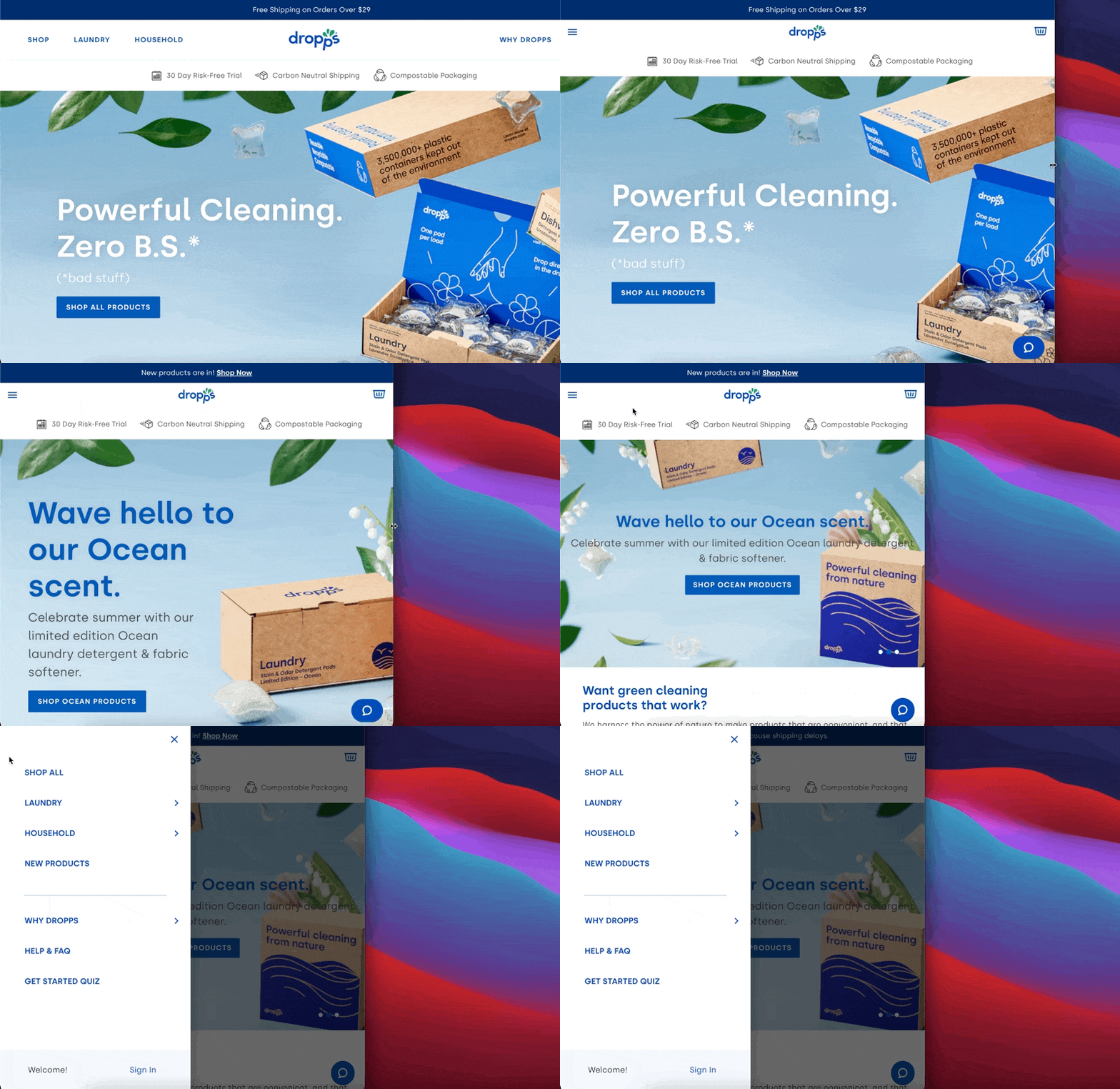
Remember: visitors don’t access your website on desktop only. Shoppers spend $431 billion through mobile devices each year. A good ecommerce navigation adapts for these shoppers, automatically collapsing into a hamburger menu based on the screen size it’s loaded on.
Dropps, for example, uses a responsive navigation menu that automatically collapses when the screen size reduces. Buttons appear larger, catering to “fat fingers” on mobile. It also makes the page’s content the forefront of the website design, making navigation an optional extra for those who need it.
How does your ecommerce navigation stack up?
Overall, navigation menus are one of the most important elements of your ecommerce store.
Not only do they help customers find products they’re most interested in, but the contents of the navigation can also impact SEO, helping to bring a long-term influx of potential customers with minimal effort on your behalf.
Use the best practices we’ve shared here to improve your own—starting with an evaluation of your current navigation. Find out how customers currently make their way to checkout, and design a navigation that helps more people do the same.
#cta-visual-pb#<cta-title>Create a high-converting ecommerce shopping experience<cta-title>See how you can customize landing pages that engage customers with Shogun Page Builder.Learn more

Elise Dopson
Elise Dopson is a freelance writer for B2B commerce and martech companies. When she's not writing, you'll find her in the Peak Freelance community or on Twitter.

