Ecommerce Web Design: Capture More Conversions With These 10 Tips (+ Examples)
As a rapidly scaling brand, your ecommerce website design needs to maximize your chance of converting each visitor.
And as brands move away from the “Standard Default Theme”—really valuing differentiated site experiences, some ecommerce design best practices are emerging.
So we set out to identify some of the site design components of Shogun Frontend customers and other ecommerce brands to better understand what may be contributing to their success.
Armed with these actionable tips and examples, you’ll walk away with inspiration for not just redesigning your ecommerce website—but easing friction and creating a repeat-customer experience.
Here are some of the standout patterns or trends you can try:
1) Use ‘quick add’ cart buttons across your site
Reduce friction in the purchase process by adding quick add buttons across your site content. Quick add-to-cart buttons can be placed virtually anywhere (especially if you’re departing from the standard default theme), and they allow customers to add the product they want without needing to visit a product page.
Have a look at this example of a successful quick add button design in play on Daring Foods’ website:
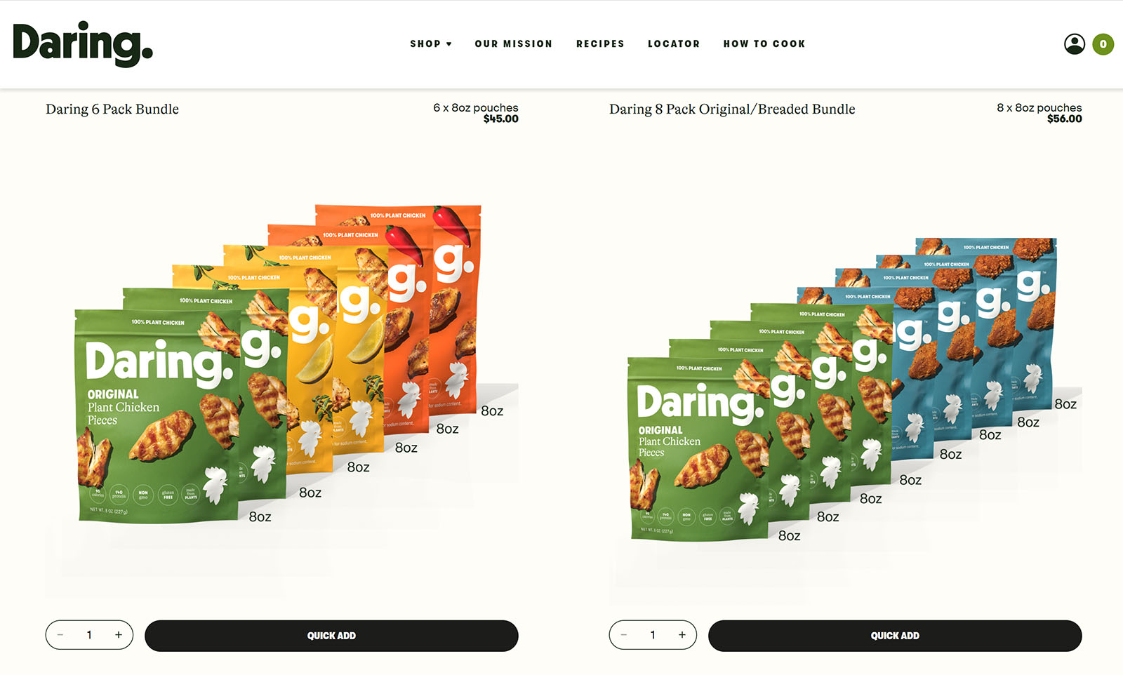
Instead of directing shoppers to a product detail page, Daring rounds up bundles to feature on collections like this and visitors can quickly add to cart from here.
We suspect this convenient design element influences tons more purchases for the brand because it mimics the impulse-style buying we’re used to with in-person shopping.
#cta-visual-fe#<cta-title>See more examples of exceptional ecommerce<cta-title> There are tons of site interactions you can learn from out in the wild. We’ve rounded up some of the best and a blueprint you can replicate for success.Download the guide
While add-ons to a typical Shopify template can wind up being more complex than merchants bargain for—adding this ‘quick add’ button to the Daring Foods website was simple.
This is because Daring decoupled the frontend presentation layer of their site from the backend by implementing Shogun Frontend. By taking their store headless, the brand can make changes like this quickly and with limited-to-no code required.
#cta-mini-fe#See why Daring chose Shogun Frontend.Read more
2) Design your site as a progressive web app
Site speed and performance have a tremendous effect on website conversions—the faster the site loads, the higher the chance your website visitor turns into a customer.
Naturally, you’ll want to watch your site’s lighthouse score and look for areas of improvement. Many scaling brands are prioritizing site speed while developing their unique site experiences to maximize a customer’s chance of converting.
One way to guarantee faster site speed and balance a highly creative site is to design your store as a progressive web app. As an example—The Feed, a marketplace for healthy foods, improved their site speed and lighthouse score by using progressive web app (PWA) technology to their advantage.
According to Ben Kennedy, The Feed’s CTO and Co-Founder:
“…it’s especially important that our visitors can navigate through dozens of product pages without delay. Initial page load is important but we knew the sub-second page-to-page load time was just as critical. We always want customers to browse the catalog as efficiently as possible.”
The Feed has a 5.2% higher conversion rate and 10.8% more page views per session because of transitioning their static site over to a PWA technology. Additionally, their bounce rate decreased by 4.5%—indicating more visitors are staying on the site, engaged with their product catalog.
Ultimately, PWAs have become a perfect fit for brands looking to improve their customers’ experiences and a huge consideration for keeping your ecommerce site meeting modern design expectations.
#cta-paragraph-fe#PWA technology (which loads a site entirely differently in a browser) underlies Shogun Frontend’s headless commerce software, giving ecommerce websites unparalleled speed.
3) Create the smoothest checkout process possible
According to research done by the Baymard Institute, two of the top four reasons for shopping cart abandonment can be directly tied to a bad checkout. So, your ecommerce website design project should pay special attention to simplifying the checkout process. Here are some of the many ways to accomplish this:
- Don’t require an account to checkout. (This may not be possible if you are subscription based.)
- Find a checkout software that can take all types of credit cards and online payments. (Venmo, PayPal, Afterpay, etc.)
- Show the cart throughout the checkout process (this stops visitors from needing to revisit prior steps to confirm details and keeps purchase friction low)
- Make the return policy, taxes, fees, and expected shipping time very clear and visible during checkout.
- Keep the checkout process short and easy to follow (reduce the number of steps where possible).
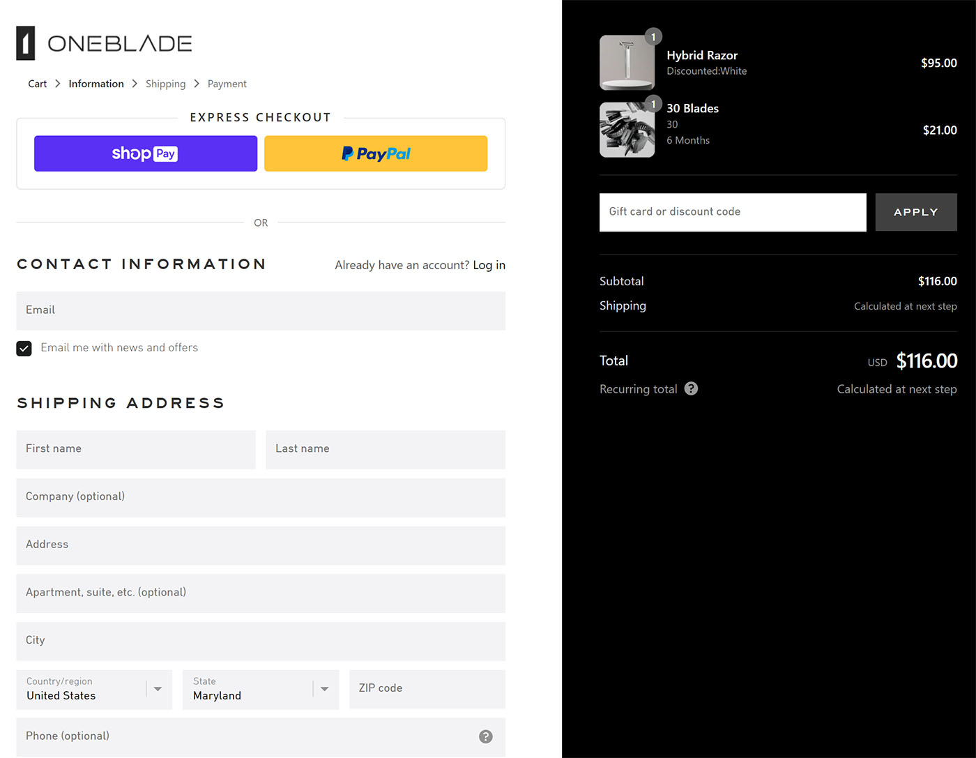
OneBlade’s ecommerce website is a prime example of a seamless checkout process incorporating many of the above best practices.
As a Shopify store with express checkout options set up with Shop Pay and PayPal (they also support subscriptions)—it’s clear and easy to stay engaged.
The cart is always on the right side of the screen for reference, and they were able to keep this setup entirely intact as they took their brand headless in 2021.
#cta-visual-fe#<cta-title>See how OneBlade increased average order value by 30.1%<cta-title>After launching their headless PWA and streamlining their store’s design, OneBlade saw incredible results.See their story
4) Formalize brand guidelines
The ecommerce customer journey takes place across multiple platforms, and it’s not always linear. That is—the customer may not reach the purchase stage until weeks or even months after their first introduction to you.
Your branding should be consistent at each stage of the customer journey, so they recognize it, or you might be forgotten in the face of the 12 to 24 million other ecommerce brands.
As we’ve said before, investing in high-quality product photography is a great way to increase conversions and a great place to begin when thinking about branding guidelines and ecommerce website design. Marketing and sales teams use brand guidelines to stay aligned on what makes an image a high-quality visual or what colors should be used consistently to stay on brand at all times.
Cohesive looks can make or break scaling brands’ success. Beverage brand Après, for example, really achieved massive success with their community and omnichannel strategy once they locked in on their consistent and punchy visuals:
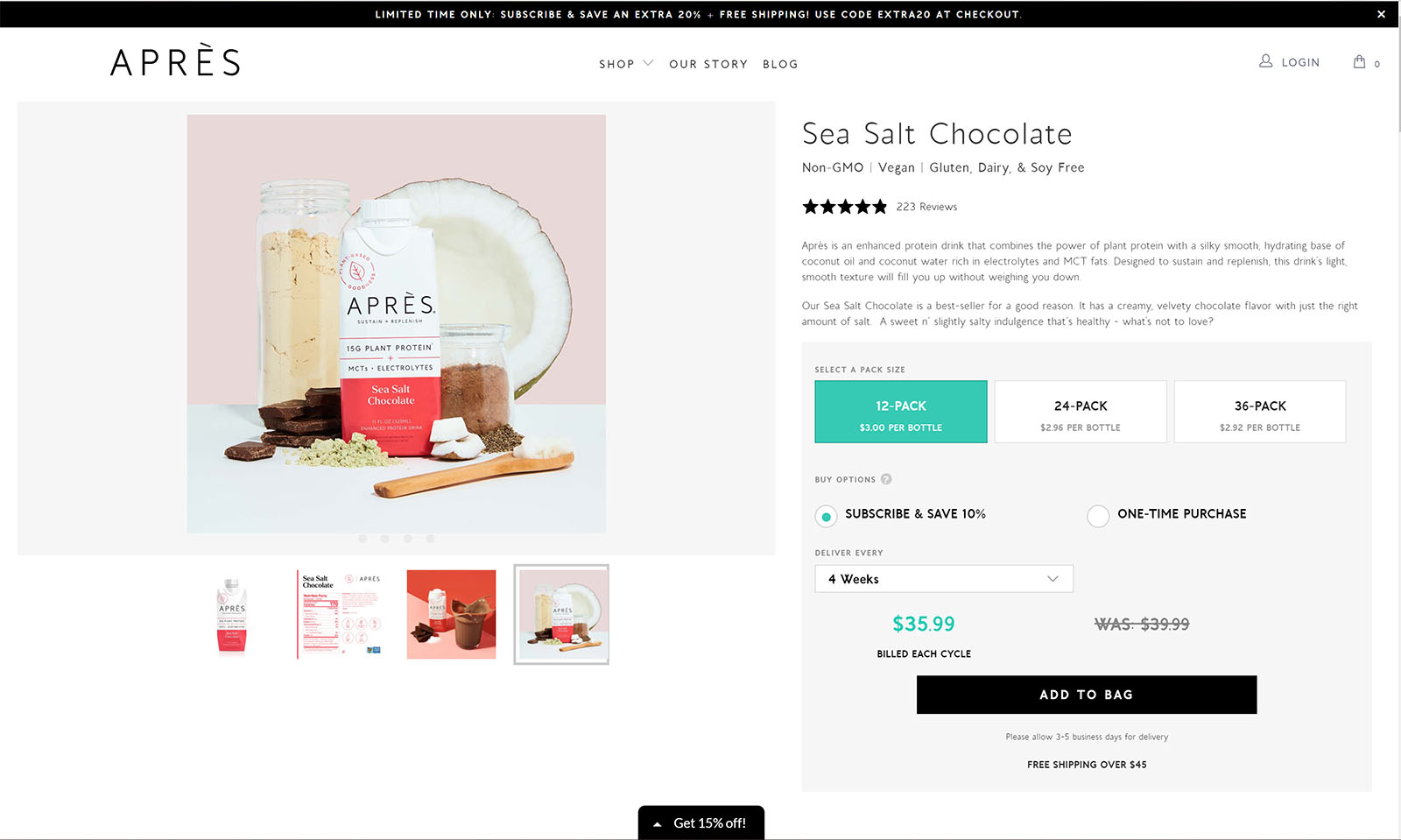
Christina Burton, the director of ecommerce at Après, told us that defining their look at an early stage was critical in achieving their level of success.
She said choosing photographers required that she and her team really think through who they could work with to achieve a signature look—else, they couldn’t get the crisp, clean visuals they needed.
She also emphasized that aligning on a style guide early on to ensure the look and feel were maintained was an essential aspect of developing their site and drumming up recognition.
5) Implement unique ways to interact with your site
As you design or rebrand your ecommerce site, look for opportunities to include videos, parallax scroll, and animations—also known as rich merchandising—rather than only still photos to increase customer interest and better convey product features.
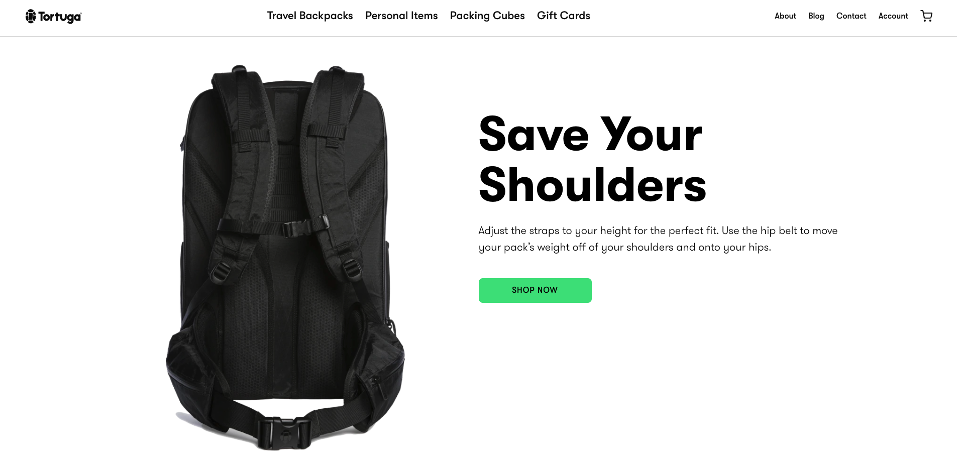
Tortuga Backpacks’ site showcases rich merchandising that helps customers really understand the product quality right from the homepage.
Check out the parallax scrolling and rich merchandising (the way the backpack moves across the screen fluidly). This type of detail immediately tells shoppers Tortuga cares about all aspects of the buyer journey.
A few other ways to add rich merchandising to your brand’s website include:
- GIFs showing the opening and closing of your product
- Videos that include your products in use
- Animations on your home page that showcase your products in a fun/engaging way (think: stop motion effects or other transitions)
If you add rich media (typically heavy design components) to your store, you’ll want to consider how you’ll do this without sacrificing page speed or performance generally.
#cta-visual-fe#<cta-title>Add all the rich merchandising you want—no compromises<cta-title> Shogun Frontend delivers unparalleled performance. Now, add all the rich merchandising you want—no compromises.Learn more
6) Include methods of personalization
Offer site visitors a personalized experience to stand out and make shoppers feel like people rather than numbers. Interactions and personalization can turn potential customers into devoted fans faster than letting them browse a traditional site.
For example, many brands now offer shoppers a quiz to help define their needs and suggest products.
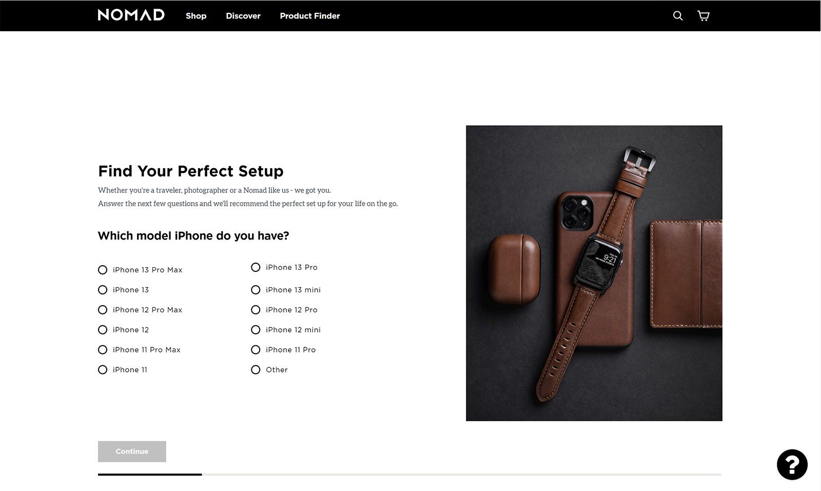
Adding personalization features like this allows shoppers to feel more involved in the process than they traditionally would. In addition, personalization features provide customers with tailored solutions and visualizations of what they want—as with the case of real-time personalization like Nomad’s Air Tags.
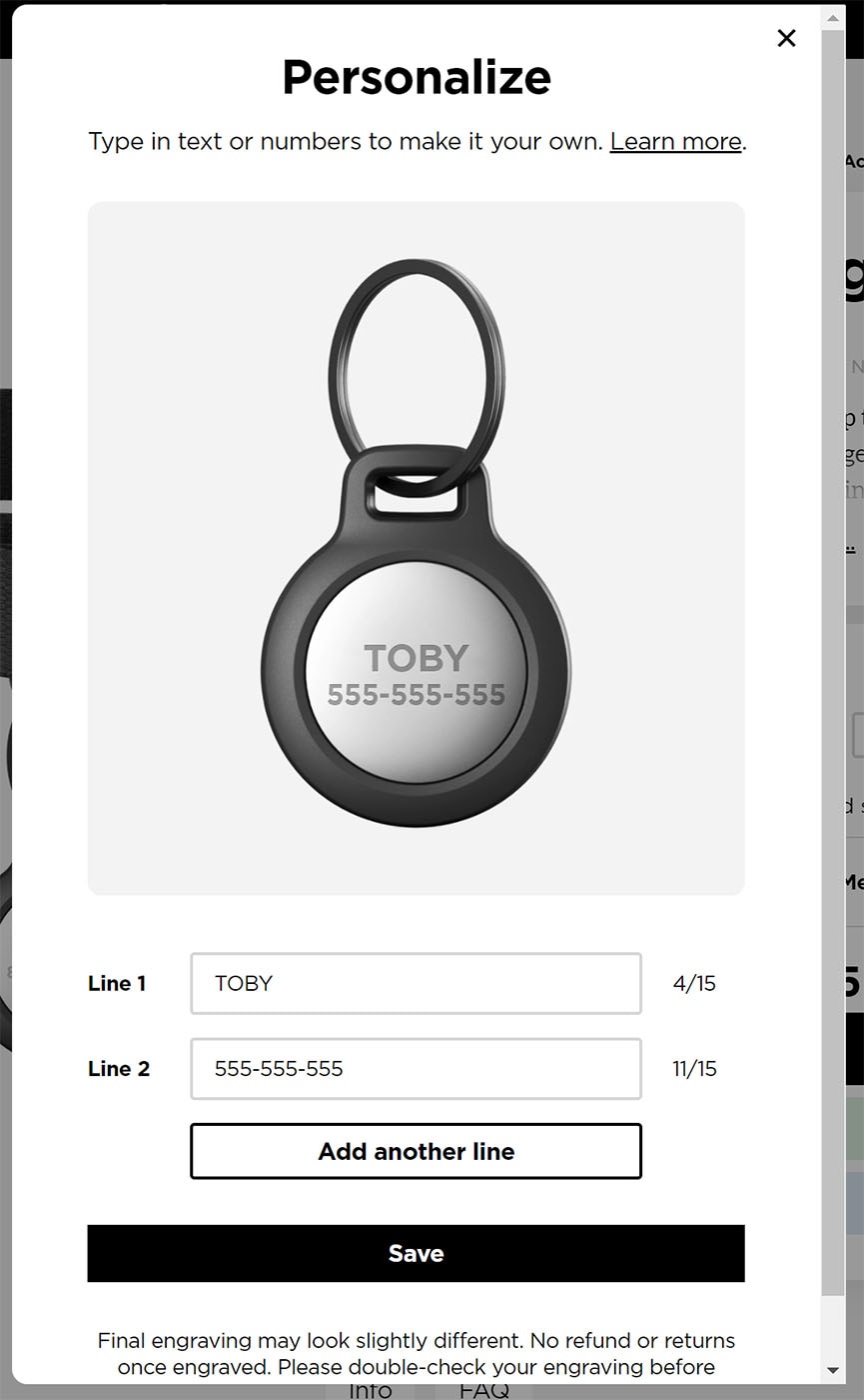
Whether you’re on Shopify, BigCommerce, or Salesforce Commerce Cloud, the flexibility of the ecommerce website infrastructure you set up will be instrumental in designing an interactive and personalized experience.
That is—if you’re able to better control the frontend separate from the backend, you’ll have an easier time trying out these design features.
#cta-paragraph-fe#Implementing Shogun Frontend to go headless ultimately helped Nomad more easily build-in design features like the personalized Air Tag Interaction above, plus features like this contributed to their 25% increase in ecommerce conversion rate and a 25% increase in revenue per session.
7) Write high-quality, scannable copy/content
While not an entirely visual aspect of the site (okay, y’got us!), easy-to-read and optimized site copy give both the customer and the search engine what they want—information.
You can regularly publish optimized content on your brand’s blog to increase your online rankings.
Optimized content is website content that is useful to your customer/reader while also being ideal for search engines—including things like keywords, meta tags, and structured data.
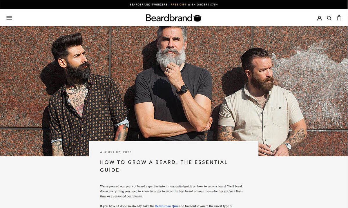
Like Beardbrand, it’s important to focus not just on your site’s blog content but your product information as well.
Make sure all the copy on your brand’s website (product pages, collections pages) is optimized so that the visitor gets exactly what they want without having to spend too much time reading.
Product and collections pages need to be scannable, but think of how a search engine will ‘scan’ through as well, sprinkling in keywords you wish to rank for and following on-page best practices.
8) Optimize your site navigation and page formatting
Poorly formatted site content can cause potential customers to leave before they find what they’re looking for. Fortunately, heatmapping tools can reveal what your customers are looking at and what they aren’t, so you can improve your website’s design based on data.
Page formatting and navigation is vital to a successful customer experience. If you have what a shopper wants at the top or above the fold aligned to expected UX principles, you increase their chances of buying from you.
On the other hand, if you don’t have a website optimized for expected UX, your customers could bounce quickly.
Ecommerce brand Girlfriend has taken the time to optimize their site/homepage with only what’s most important to their audience.
Look at how clear and easy to navigate their main menu is. Everything is designed in a pretty standard way—aligned with UX expectations customers have ‘learned’ throughout the web.
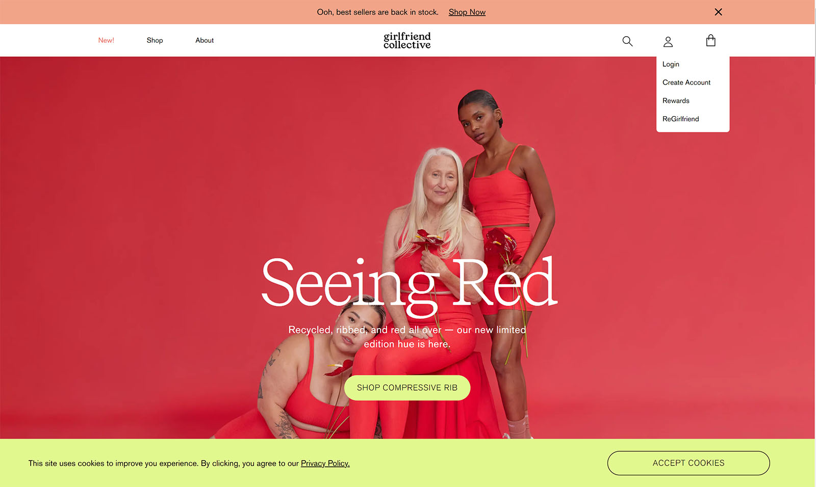
To optimize your brand’s site design and information hierarchy or nav, consider using a heat-map tool like Hotjar to see what your customers are looking at and what they always avoid.
Observe your heatmapping over an extended period of a month or more and experiment accordingly. You can use collected results to inform your page layouts, removing ignored sections and emphasizing the most touched ones.
9) Feature your popular/recommended items prominently
Ecommerce website design focuses on facilitating customers getting what they want with as little friction as possible. You can forge a shopper’s path initially by showcasing your most popular items at the top of the homepage or by offering co-items to what’s in their cart when they add something new.
One prime example of recommended items is Brooklinen. When you get to their homepage, the second section you see is best sellers.
Featuring best sellers prominently (with the name best sellers!) is awesome for scaling brands because as you gain name recognition, many customers will head to your homepage based on word of mouth (“I hear Brooklinen is super popular…”), but they may not arrive knowing exactly what they want.
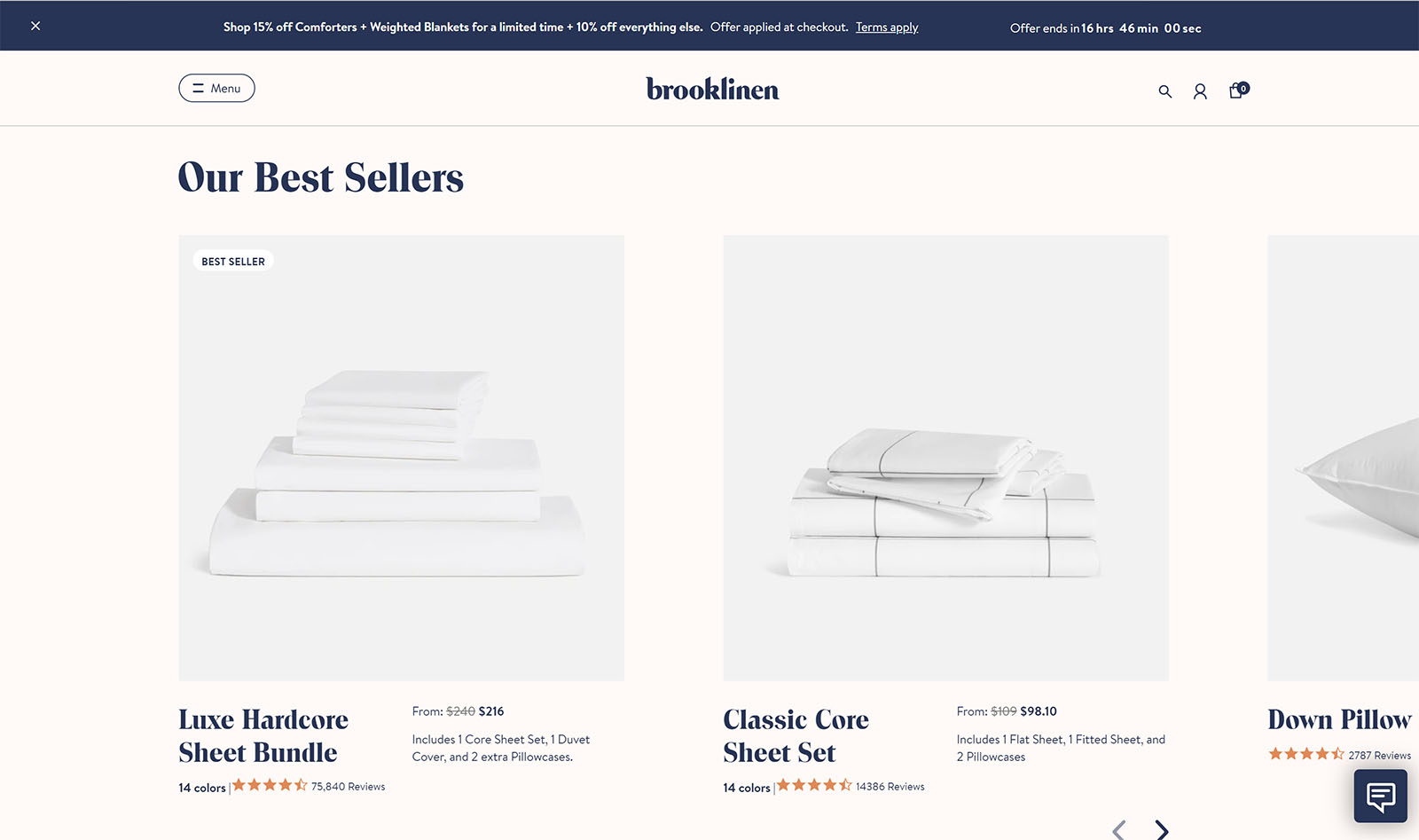
To add recommended products, first, start tracking purchase data if you haven’t already. Consider what items are often bought together and what items are bought the most in general.
Use this information to inform what to place on your top sellers’ category page and what to recommend to people who then add something to their cart.
Categorizing like this—and even adding in automation to make it possible—makes products easier to buy and increases the chance of a successful upsell.
10) Design and add coupon popups to increase purchases + your email subscription rate
When added tastefully, in moderation, and with good timing, popups can provide a way to capture lead information and increase the chances of a potential customer purchasing. There are a few different types of popups to consider when thinking about adding one to your website.
- Lightbox – a small box that pops up overtop the current page, maybe dimming the rest of the page.
- Top bar – A bar at the top of the page that displays a deal or asks the customer to give their information for a discount.
- Fullscreen – A popup that covers the whole screen and prevents scrolling or further interaction until it’s closed.
- Scroll-in – As your customer scrolls the page, this chatbox-looking popup will appear to scroll up from below the fold.
While these are the main ways to display popups, there are ways to initiate a popup as well. Which works best for you will likely depend on your customer, the goal, and A/B testing. In addition, some will require additional software (like mouse tracking).
- Timed – these popups will always ‘pop up’ after a certain number of seconds on the page.
- Exit initiated – when your customer moves their cursor to the top of the page (as if to exit), these will ‘pop up.’
- Click-based – these will ‘pop up’ if a customer clicks on a button—like between pages.
It’s important not to overwhelm the customers with too many popups or to gatekeep product purchases behind required email-signup popups. Adding a popup to your site can be done with tools like OptinMonster or Sendlane.
Create a striking shopping experience with unparalleled site speed and performance
Ecommerce website design provides many opportunities for your brand’s website to stand out. However, if you choose a traditional website, you might not be able to maximize your potential. Stand out from the competition by implementing Shogun Frontend in combination with your ecommerce website redesign.
Shogun Frontend is a unified frontend solution that makes it easy to fully control everything about a shopper’s frontend experience (everything they see). You can design the site of your dreams, all while achieving break-neck speed and unparalleled performance.
#cta-visual-fe#<cta-title>Exceed the limits of modern commerce<cta-title>Get more conversions (and more creative control!) with Shogun Frontend.Get started
The Shogun Team
Shogun's team is full of whipsmart ecommerce experts, dedicated to making the process of building and customizing your Shopify store simpler, faster, and more intuitive.

