Why Elevated Web Design Converts: 6 DTC Brands Prove the Power of Custom User Experiences
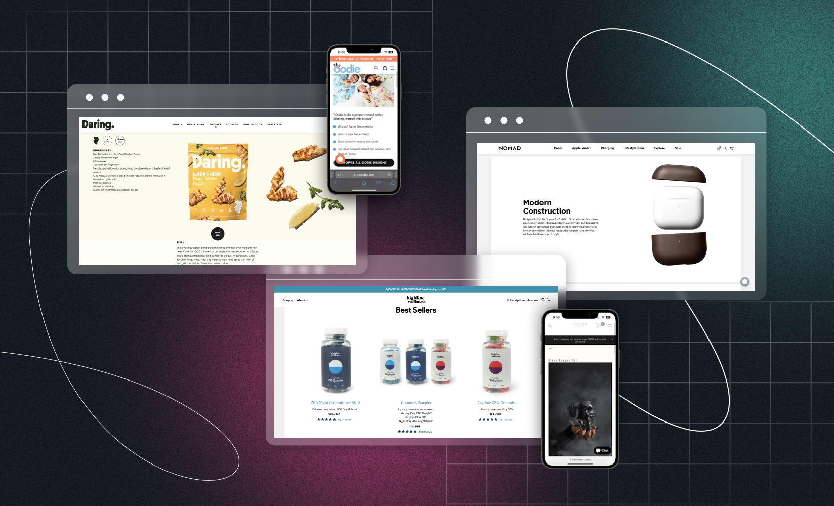
As a merchant, you know you need to balance a highly performant site with its design X-factor (or the compelling visuals and merchandising that make it exciting to shop!)
Customer expectations are changing when it comes to experience. Half of consumers were open to personalized shopping experiences pre-pandemic. Now, 71% of consumers expect it as standard.
Falling behind is a costly mistake. It’s reported that one in three shoppers will walk away from a brand after just one negative experience. You’ll also lose out on the 16% price premium attached to great online experiences.
But even though we know terrific experiences are critical—how can you justify your scaling store’s rebrand? Or even smaller tweaks to design for conversion rate optimization (CRO)?
How do you make the case for great ecommerce site design and the tech that makes it possible? Well, for one, you can focus on elevated web design’s impact on revenue.
In this post, we’ll cover how elevated web design converts. We’ll walk you through real ecommerce case studies and what online store operators did with their websites (specific to design) to help them convert better—ultimately proving that elevated design contributes to your bottom line and should be a priority for your DTC brand.
Here are the brand examples we’ll cover if you’d like to skip ahead:
1. Daring Foods
Daring Foods is an ecommerce retailer selling plant-based protein foods in retail stores, restaurants, and through its online store—the latter of which came first.
Its Shopify website needed to educate health-conscious consumers on the benefits of switching to plant protein.
Despite the world opening its eyes to vegan alternatives, educating customers is no small feat. Breaking into a new market means Daring needed more than a boilerplate website. So, they chose to take their Shopify store headless.
As Joe Tao, Daring’s Head of Platform & Delivery, shares:
“While going headless may have been a bit early for us, we knew we were going to go in this direction at some point…We decided to invest now instead of having to build another site later. We were confident that going headless would allow us to scale as we grow.”
Using Shogun Frontend, Daring took a unified platform approach to headless, building out a progressive web app (PWA) to add rich merchandising to any page of its website more easily.
Their design overhaul on the way to headless flexibility included recipe pages, where shoppers could see products in action and buy them instantly via ‘buy now’ buttons and faster page loads—no clicking around or delays necessary.
“If you’re on a recipe page and see a product you like, you can now quickly add it to your cart. [The quick add-to-cart buttons] helps us incorporate products anywhere across the site.”
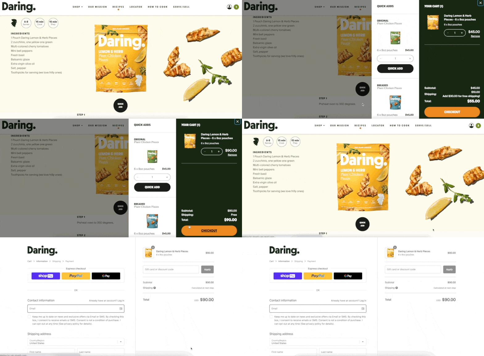
Site speed is a known factor in user experience and search rankings. And even worse: it’s often typically compromised when adding extra elements to an online store.
Not so with Shogun Frontend, however. Daring’s backend ecommerce platform, Shopify, is now decoupled from the front-end experience customers get, meaning the front and backend are no longer dependent, and visitors don’t need to wait for web requests via the backend. The brand achieved lightning-fast site load times with their new headless PWA.
The results of upping their experience and design efforts speak for themselves. Since implementing rich merchandising features with Shogun Frontend, Daring’s percentage of sessions with a product view went up almost 40%. They’ve also seen a 25% increase in average pages per session, thanks to more intuitive website navigation.
#cta-visual-pb#<cta-title>Create the perfect Shopify store<cta-title>Take your store to the next level with Shogun Page Builder.Start building for free
2. franklinAve
Interior design brand franklinAve initially started as a place for founder Kristy DeGina to share art and design projects. Kristy says the first iteration of its online presence was “beautifully designed, but would not convert once the ecommerce portion was added.”
Kristy wanted to expand by selling products through the franklinAve website. This meant the goal of the site—and therefore, the actions it prompted a visitor to complete—saw a dramatic shift.
So Kristy redesigned the site to improve shopping experiences by focusing on two core elements:
The first: its ecommerce navigation. Kristy shares:
“Bold shopping folders were added to the header and broken down by standard retail categories, followed by secondary folders for the services, collaborations, and custom artwork. As a very robust website this helped increase the user experience navigation.”
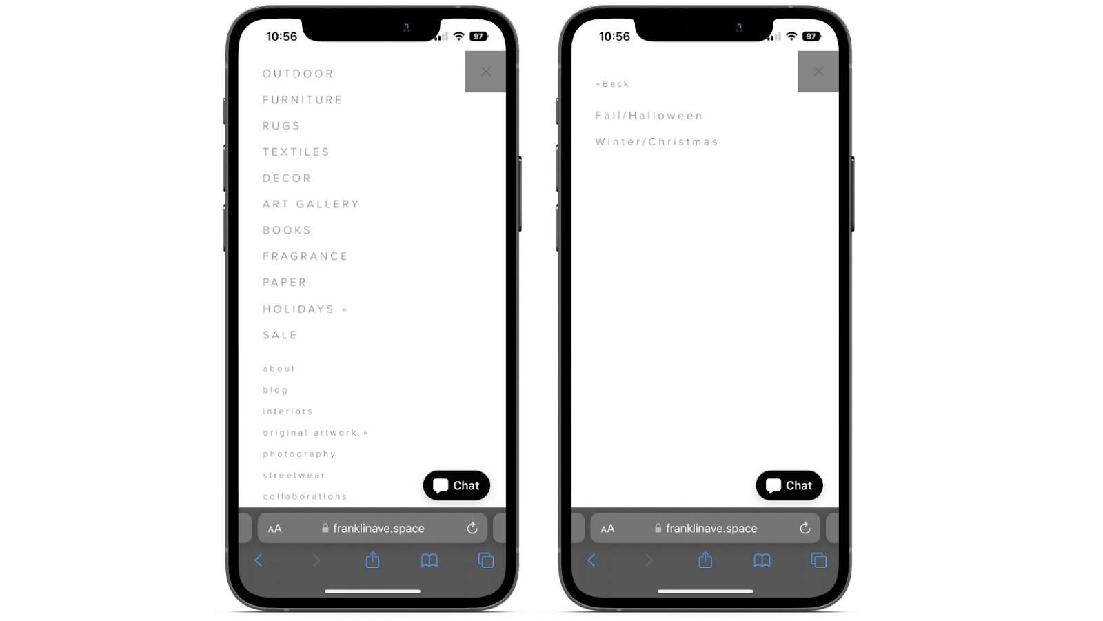
Next, Kristy also experimented with imagery to see the design impact on conversion.
Website visitors now see clear photos of each folder, complete with larger fonts. Kristy says these were designed “to create a simple and inspirational shopping experience.
“I noticed that customers respond the most to “real life” images vs. stock imagery, so I mixed original photography from our prop studio with stock photos to create a realistic shopping experience,” Kristy adds.
She also added more contextual imagery that showed products in context or with hands to visualize scale and size. This “to assist with landing the sale for organic search.”
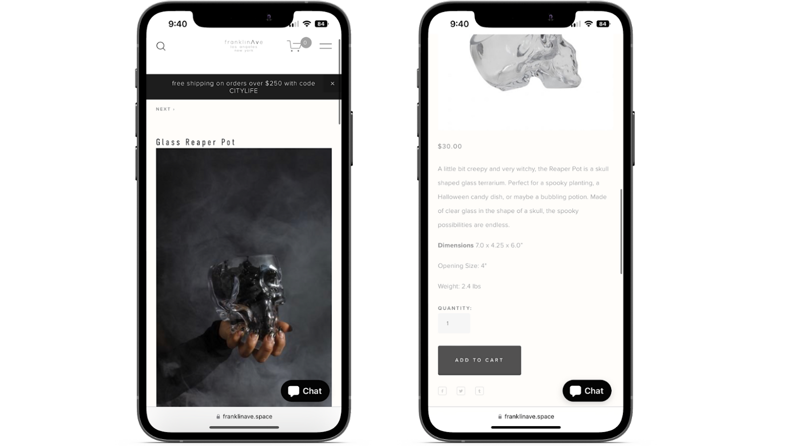
To further improve the omnichannel shopping experience for 90% of its visitors who browse on mobile, franklinAve repositions images from landscape mode to portrait.
“The landing page photos rotate to coincide with marketing and social media more frequently keeping our regular customers more engaged,” Kristy adds. “I [also] removed any creative design graphics on all pages that were potentially slowing down page speed to increase on-page SEO.”
The results of franklinAve’s redesign and focus on incremental CRO were impressive. Within just one month, Kristy shares that conversion rates increased from 1% to 4%. Considering the impact even a few percentage points an ecommerce conversion rate increase can have on the bottom line, this is an incredible feat for a website making its first pivot into DTC ecommerce.
3. Highline Wellness
Highline Wellness operates in a highly regulated and competitive industry. It sells CBD products through its online store, aiming to capture a portion of the $3 billion annual consumer spend in this industry.
The retailer regularly engages with conversion rate optimization and tweaks design elements to guide website visitors through their intentional shopping experience.
The prominent bestseller carousel they’ve added to the site now acts as a vote of social proof. Complete with how many five-star reviews each of its best-selling products have—shown directly on their collections/best sellers page, it’s a great way to have visitors easily discover products they can make snap decisions on based on the design elements.
According to CEO and Founder, Chris Roth, this section includes “featured products that are popular amongst our customers and that provide them with the highest utility.”
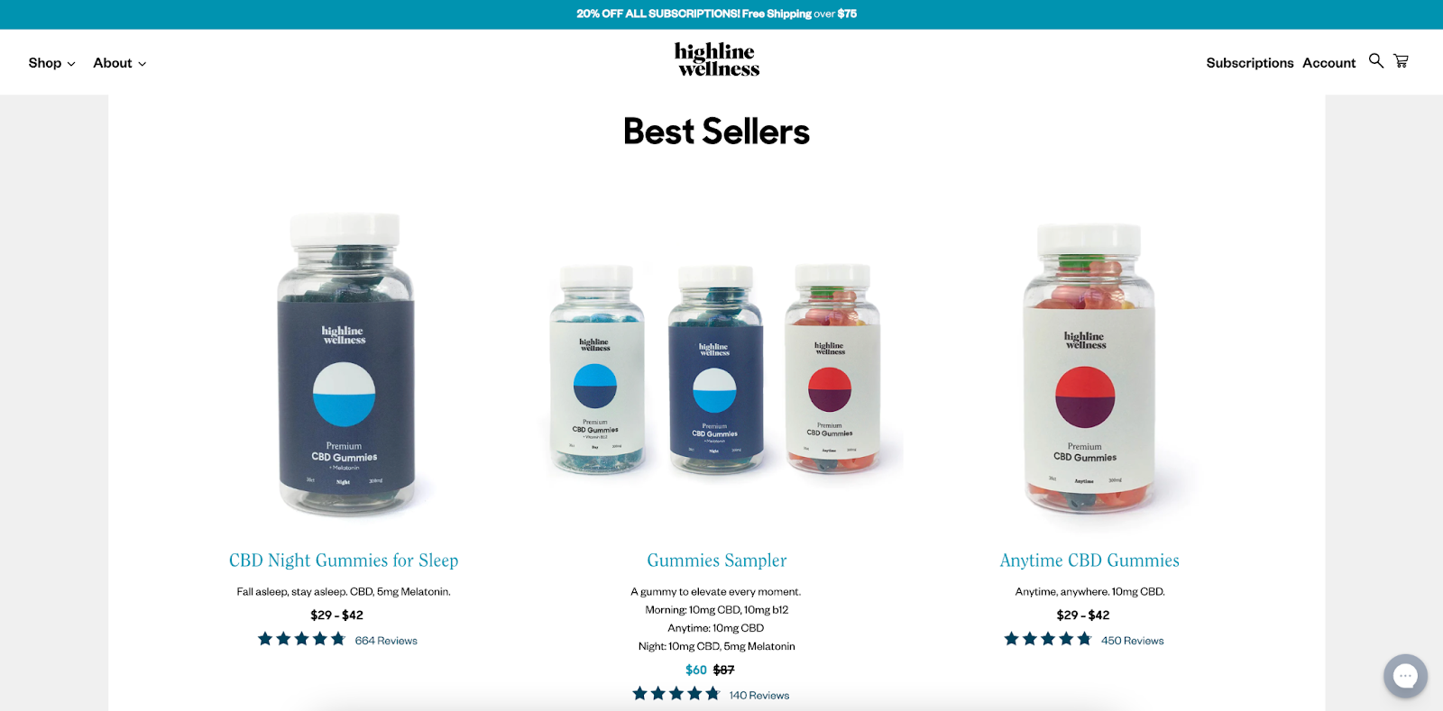
From there, the retailer also added a filter section in the menu bar at the top of each page:
“This allows customers to filter their search by product type and price,” Chris says. “This feature increases conversions by making it easier for customers to find the product they’re looking for, [fast].”
Highline Wellness’ focus on improved site navigation and rich design has paid off. According to Chris, the website’s conversion rate has increased by 102% over the last quarter. However, Chris adds that their job isn’t quite finished yet: “We are still rolling out more updates to our website design to further optimize it and facilitate maximum conversions.”
4. Nomad Goods
Nomad Goods is a DTC retailer known for its high-quality lifestyle tech products. But take one look at its website and you’ll notice that the design and experience it’s giving to customers is vastly different (and elevated) from competitors.
Nick Walden, Nomad’s Creative Director, credits this with micro-moments—conveying quality through thoughtful design without compromising usability.
“As a scaling brand, we know the importance of design is not only about developing good products but also about how a customer interacts with our ecommerce website…For Nomad, that starts with detailed product imagery.
Having gone headless using Shogun Frontend, Nomad uses the resulting design flexibility to deliver their interactive on-site experiences. Sleek animations show up-close product details, giving online shoppers a 3D view of the items they’re considering.
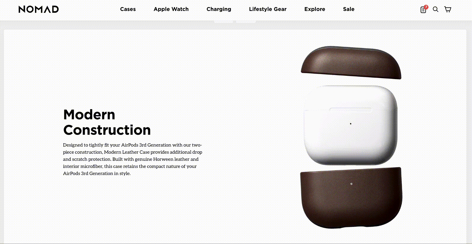
Nomad uses rich merchandising not only to interact with shoppers, but also to subtly communicate quality. As an example, take this sliding scale that shows how the product will look after 100 days of use.
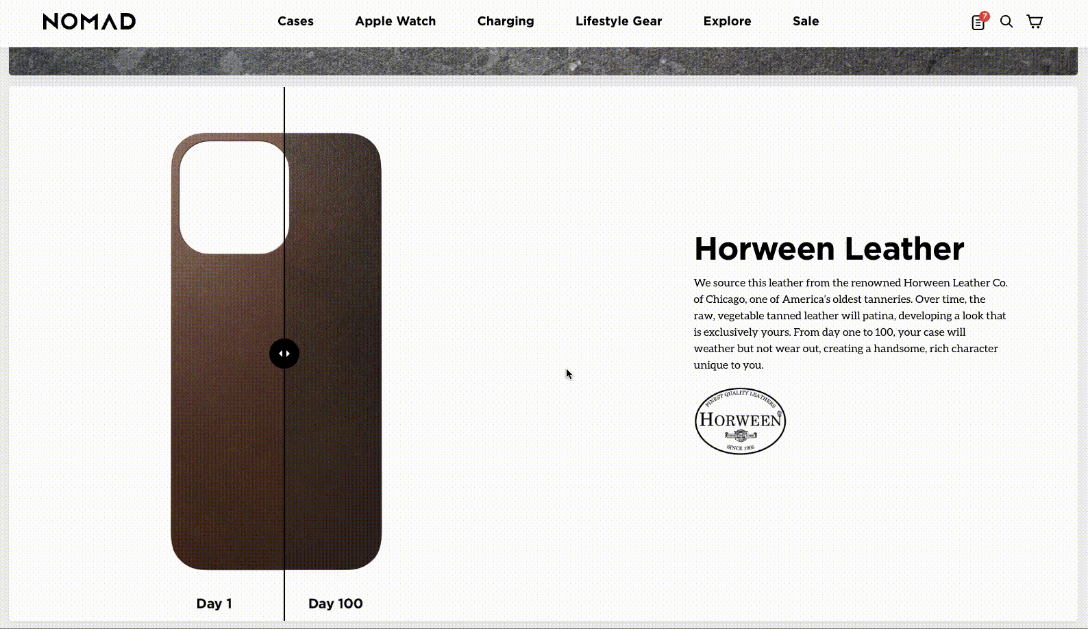
This product-info strategy Nomad takes with their elevated product pages could play a role in reducing returns. It’s no coincidence that 22% of customers return online-bought products because they look different in person, and this brand is cleverly getting ahead of this challenge.
Shortly after switching to headless architecture and ensuring their site would stay performant even amid their richer designs, Nomad saw ecommerce conversion rate increase by 25%, as well as saw a 25% increase in revenue per session!
#cta-visual-pb#<cta-title>Build your store without coding<cta-title>Design the store of your dreams without writing a line of code with Shogun Page Builder.Get started for free
5. The Oodie
The Oodie sells oversized wearable blankets through its online store. In a YouTube video breaking down how the DTC business improved conversion, its founder Davie Fogarty says: “You want to be able to go on a website, shop, and find products easily. Our website was pretty good at that, and we always were. We were always focused on that. But one thing that we didn’t do well is have a good brand experience.”
Describing the website back in 2020, Davie says, “We’ve got a bunch of different capitalized fonts, different typography, different colors floating around. And even when you look at our emails during this time, they were also very inconsistent.”
The brand enlisted the help of Oddit, a CRO agency for DTC brands, to create a custom brand report. It implemented the recommendations to improve brand consistency. Now, its website uses the same color scheme, typography, and brand messaging across all channels.
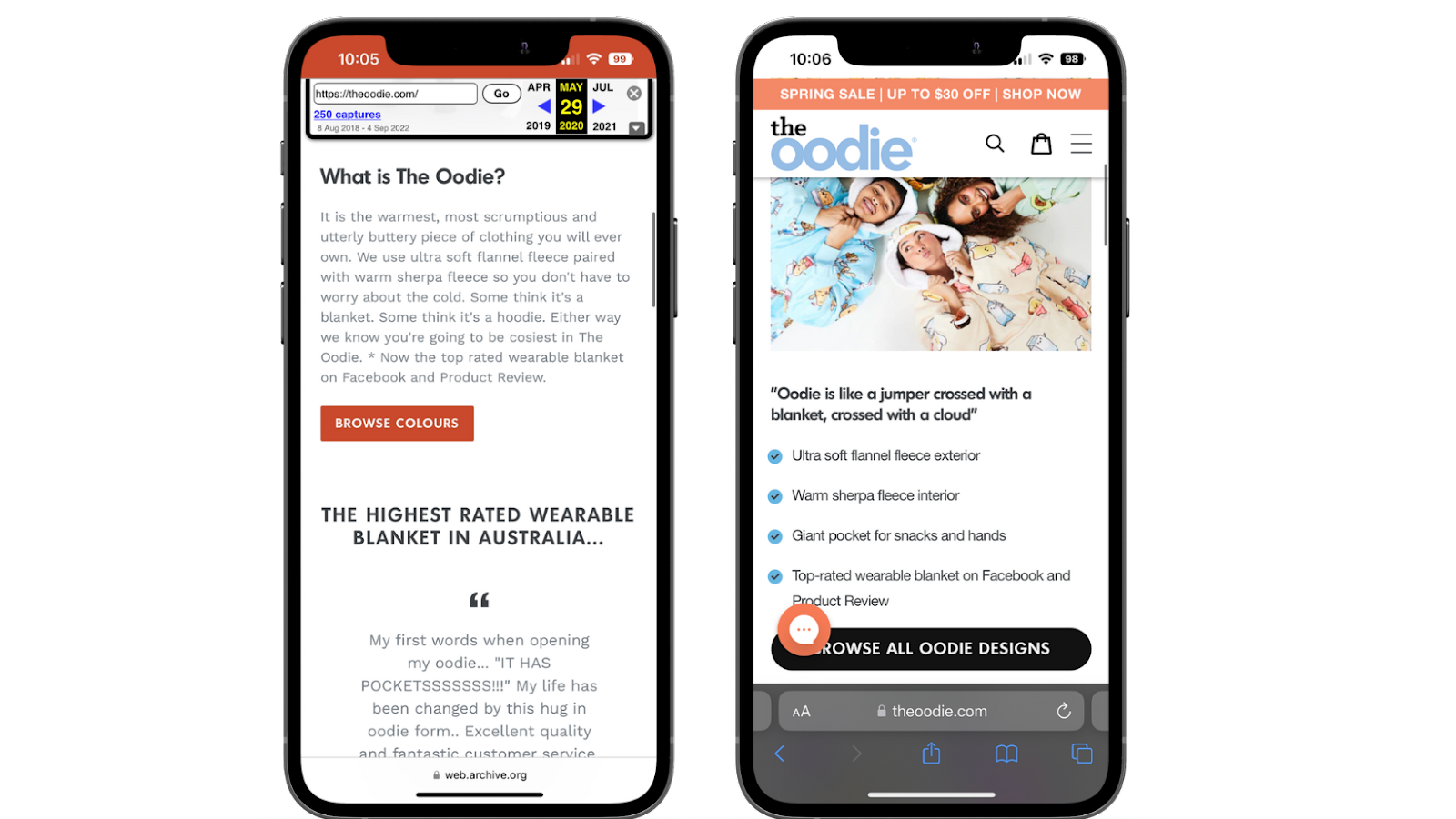
Similar to the other examples we’ve shared, The Oodie’s website redesign involved an overhaul of its navigation. “People don’t want to have to figure out how a website functions,” Davie says.
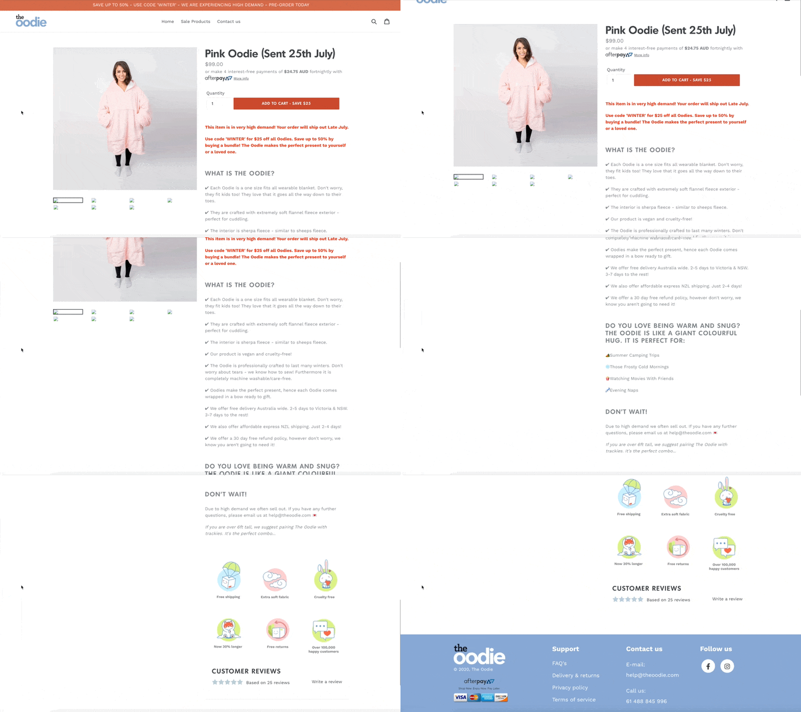
One way the retailer solved this problem is by eliminating negative space beside product descriptions on its old product pages:
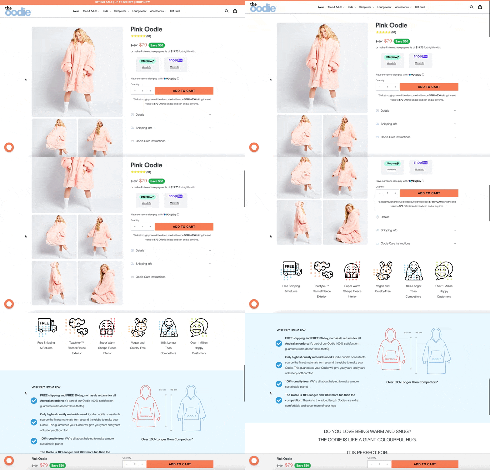
Images on its revised website stick to the page and follow a visitor as they scroll. There are no more big gaps this way—just a seamless shopping experience that maximizes available space on the page:
The agency, Oddit, also suggested that The Oodie revamp its main navigation bar (which previously contained just three links: home, sale products, and contact.) It added new and best sellers in this prime real estate, with a more detailed navigation that appears when a user hovers over it.
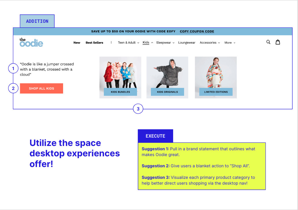
As a result of these changes, The Oodie’s website conversion rate increased from 3% to 5%, contributing to a $400 million turnover within four years. Davie adds, “Customers feel safer with us; they understand our brand values; and it’s just a generally nice shopping experience.”
6. TULA Skincare
Since 2014, TULA has been an online-first, omnichannel brand with strong DTC capability. They sell probiotic skincare products and have been no stranger to growth, ultimately leading to an acquisition by P&G in early 2022.
Part of TULA’s success relies in its continuously elevated website design. The store runs on Shopify Plus, but enlisted the help of Shogun Frontend in September 2021 to detach the frontend layer from the backend and deliver out-of-the-box experiences to shoppers.
As CEO Savannah Sachs says:
“Speed is incredibly important and is one of the biggest reasons we have gone headless. By building our own frontend, we can really optimize speed and the shopping experience. How quickly your website loads, and how fast your customer can navigate through it, is a huge determinant of performance.”
With Shogun, TULA’s online store now offers an incredibly fast shopping experience, while also using rich merchandising—like user-generated content carousels and subscription offers—to improve product discovery.
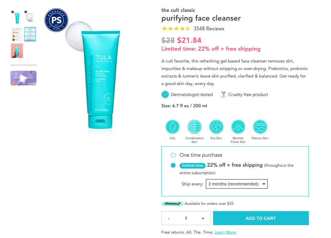
Since implementing Shogun Frontend, TULA has improved site load times by approximately 35%. Page-to-page click throughs are also five times faster. And, its ecommerce team can keep up with constantly changing consumer preferences without developer help thanks to reusable codeless sections and sitewide editing.
Jessica Zhang, Digital Product Senior Manager at TULA adds, “Now that the site’s frontend is separate, we’ll be able to sync code and content from one store to multiple, global stores more efficiently as we expand internationally.”
How a flexible frontend (or headless commerce) can unlock better web design
Standard ecommerce templates or custom themes can only get you so far these days. With new ecommerce brands emerging daily, brand and how you convey yours is THE key differentiator for modern online stores.
A flexible frontend presentation layer for your site opens the doors for you to scale with better web design. Headless architecture allows you:
- Add rich merchandising features without sacrificing performance. From scrolling backgrounds to automatically changing product photography based on a shopper’s color selection (without leaving the page), you can give shoppers interactive, richer experiences that don’t tank performance or site speed.
- Deliver content, fast. Online stores built with progressive web app (PWA) technology, (the output of a site built with Shogun Frontend), deliver content with sub-second speed page to page. This improves user experience, organic search, and supports more conversions (especially on mobile).
- Master global expansion. Once your frontend layer is decoupled, it can become much easier to duplicate your storefront to create localized locales or sub-brands. You can give shoppers personalized shopping experiences with their own currencies, and use your various locales to test alternative layouts before rolling out substantial design changes to your largest demographic.
Ultimately, the success of your online store lives and dies by the elevated experience you give to shoppers.
As we’ve seen with the successes we’ve shared from the brands above, there’s a strong correlation between excellent site design, performance, and conversions. How are you investing in your ecommerce experience?
#cta-visual-pb#<cta-title>Customize your store for more conversions<cta-title>Easily create custom product pages, collection pages, and more with Shogun Page Builder.Start building for free

Elise Dopson
Elise Dopson is a freelance writer for B2B commerce and martech companies. When she's not writing, you'll find her in the Peak Freelance community or on Twitter.

