Your Scaling Ecomm Brand Can’t Skimp on Quality Visuals

If you’ve ever found yourself in a high-end department store like Harrods or an exotic auto dealership like Mercedes Benz, you know firsthand what luxury looks like personified. It just feels expensive being inside these stores. And because of this, customers feel confident and justified in their purchases.
The same goes for ecommerce.
Building an online store that not only functions smoothly but looks superior to a standard, cookie-cutter storefront signals to site visitors that you’re the real deal. Your store offers quality goods. Anything less, and you run the risk of damaging your brand perception and negatively impacting your conversions.
And perception is reality. It’s been shown that 17% of customers abandon their carts because they don’t trust the website they’re on with their credit card information. Other than ensuring your site’s got solid security markers visible (like SSL or other badges), another quick and easy way to make your site look especially trustworthy? High-quality visuals and brand design.
At Shogun, we see especially stunning visuals as a way you can instantly signal quality. In this final chapter of our Exceptional Ecommerce series, I’m walking you through what quality visuals need to accomplish, examples of how brands apply them effectively, and how you can do the same.
Scaling ecommerce brands need to balance technical and stylistic elements in visuals
Often, and what we see for Shogun Frontend customers is that exceptional brand visuals can be categorized in two ways:
1) They tick the technical elements checkboxes
Your brand’s site images need to be:
- Correctly formatted and able to be viewed on any device (responsive)
- Compressed to a file size around 150 KB (high-resolution photos) and under 100 KB (PNGs) and is configured to the appropriate amount of lossy or lossless for faster page load times
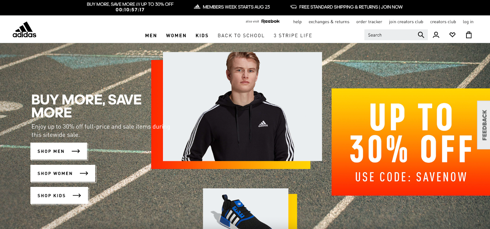
A great example of the technical elements in action is the Adidas website. All images on their desktop and mobile sites are formatted correctly, aren’t pixelated, are high-contrast, and adhere strongly to Adidas branding.
What’s more, per a quick Lighthouse audit, we see this is a fast-loading ecommerce site despite the number of high-quality visuals.
2) They infuse stylistic elements
That is, all images are:
- Consistent with the brand tone and style
- Show precise product detail and offer additional context up-close
- Provoke some kind of emotion or feeling with how the product is photographed (think: lighting and brand elements applied in post-production)
A great example of this at work is Jeep. Jeep’s visual identity speaks to their ideal customer: folks who want a vehicle ready for any adventure yet also want some level of luxury.
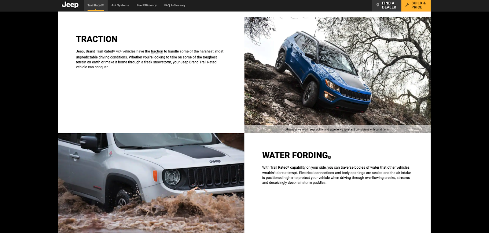
Jeep even includes brand-centric illustrations—like the “Jeep Wave” to represent their customer care program further down the home page.

Exceptional brands strike this balance between technical and stylistic elements with their visuals, and this balance is something you can apply to your direct-to-consumer brand too.
Many brands A/B test new site visuals, and I suggest—alongside testing and iterating—that you run regular Lighthouse audits to monitor the technical performance of your site after adding these assets. You want to ensure you’re balancing a quality look and feel with a highly performant site.
Aside from visuals…there are four other factors contributing to a successful ecommerce experience. I’ve written about the other components—real-time personalization, dynamic rich merchandising, beautifully functional design, and extremely fast loading—in other posts.
#cta-mini-fe#Wondering if headless commerce is right for your brand?Learn more about Shogun Frontend
Examples of stellar brand visuals in the wild
I’ve covered how Shogun defines high-quality brand visuals. Now let’s see these principles in action on two exceptional ecommerce stores.
TULA Skincare
TULA, a probiotic skincare line, is a great example of how to use stunning, branded imagery throughout your store to push things into the exceptional category.
The visuals throughout this site strike a balance of high-quality flat-lays, texture closeups, and studio shots—all using the brand’s signature teal color scheme. The playful, colorful, fresh vibe of the visuals makes them feel “Instagram-worthy” and implies to customers that TULA is of a higher caliber than other brands in its price range.
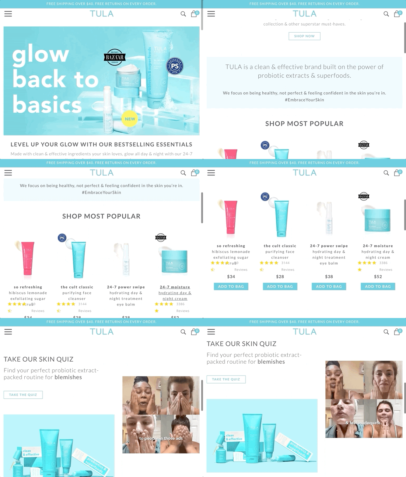
TULA’s site visuals make the behind-the-scenes components of their brand visible. They convey the quality of their products with elevated imagery. You just know that everything from their inventory management to how they handle customer service will be exceptional based on their site’s look and feel.
#cta-visual-fe#<cta-title>Get a TULA-quality ecommerce store.<cta-title>Learn more about how Shogun Frontend can help you get the store design of your dreams—all without compromises.Schedule a demo
Oliver Bonas
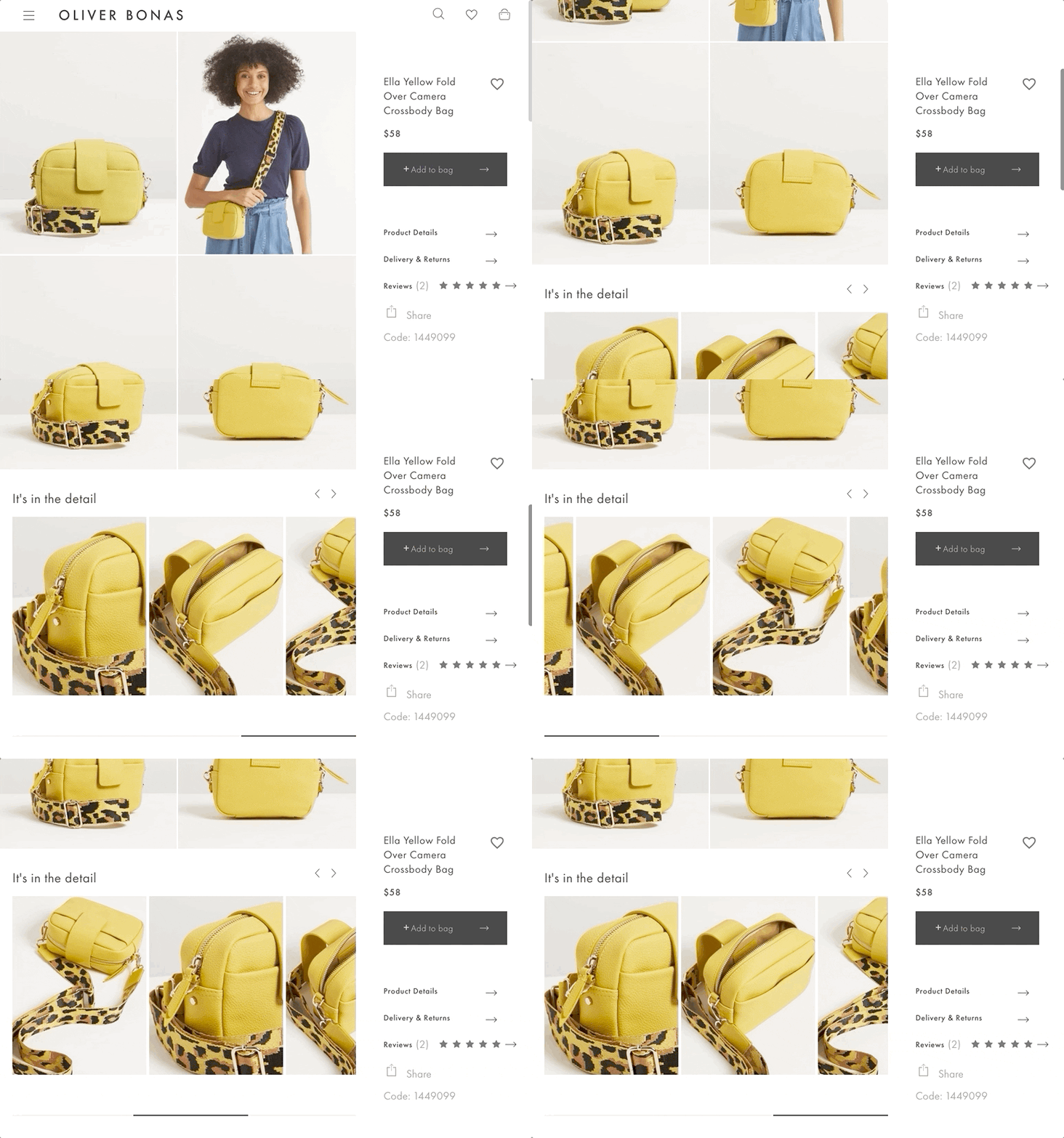
Oliver Bonas, a British fashion, jewelry, and gifts retailer, also uses stunning visuals to convey their product quality: like background videos, bright, bold imagery, and user-generated content.
Oliver Bonas uses visuals that give shoppers the whole product picture. You can ‘zoom in’ on product images to get a clearer look at the fabric, material, or quality, for example. The brand incorporates product images with both models and stand-alone, white-background images to provide shoppers with as much context as possible.
So, why do high-quality images and detail matter so much?
It’s simple: brands need to signify that they sell high-quality goods and that they’re worth the price tag.
In other words, when your store invests in imagery like this, you subtly declare to visitors that everything—from your return policy to your customer service and more—is going to be smooth.
Your shipping process? Seamless!
The package customers will receive after they’ve purchased? (It goes without saying it will come in a shiny branded box with stickers and eco-friendly tissue paper).
You convey that your products are worth their price point. And that receiving your products will feel wayyyy different from an Amazon box or drop-shipper experience.
If you use cheap-looking images or ones that fail to prioritize your brand, you can tip off alarm bells that this will end up being a typical, or cheaper-feeling shopping experience.
These days, consumers want brands that feel luxurious. In fact, 72% of consumers who purchase luxury goods claim they do so because these items last longer and hold their value. They aren’t interested in purchasing quick one-off products where they know they’ll need to replace the item after it goes through the wash.
How can you embody “exceptional” with visuals?
Here are a few ways I recommend your team approach this:
Revisit and continually update your brand style guide
To be consistent, you need to work on your style guide for photos and videos. Some components to keep in mind:
- Content: What are you including pictures of? What are you trying to communicate? And is there an emotion or story you can tie in with what’s being shown?
- Composition: What are the angles or viewpoints you want to capture? How will they assist your visitor to make a purchase (what do they need to see close-up?)
- Tone: How should customers feel when they look at these visuals? What do you know about your buyer that you can infuse with your visual identity?
With an updated, considerate style guide for your ecommerce web team, there’s never a question as to whether an image belongs on your site or not. And you can select photographers who can convey the tone you’re going for much more easily and consistently.
Establish a technical checklist for visuals
Ensure your t’s are crossed and i’s are dotted by creating a checklist for the technical side of your brand visuals.
This checklist should include questions like “Are all image files compressed and appropriately sized to ~150 KB?” and “How do these images appear on mobile?”
Tools like ImageOptim are excellent for compressing based on the unique properties of the image.
Evaluate your ecommerce tech
Lastly, while it’s important to include strong visuals throughout your entire store, adding more visuals to your site can mean tradeoffs from a site-speed perspective.
To add quality imagery without sacrificing your site speed and load times, as a scaling brand you can start to consider headless commerce. More specifically, you can explore whether a decoupled frontend platform could help you support this type of exceptional imagery.
A great example of this is the luxury razor brand, OneBlade. Not only does OneBlade sell high-quality products, but they are also super visual.
After launching their Shogun Frontend-powered PWA, OneBlade could add multiple high-resolution videos and images throughout their site—all without compromising on site speed. The brand’s CMO, Josh Nash, said this about their visual capabilities after Shogun Frontend:
“We wouldn’t have been able to feature 3D renderings of each razor model on the site without Shogun Frontend and the speed it affords us as a PWA.”
#cta-paragraph-fe#A progressive web app (PWA) to help support your brand’s visual goals could be a lucrative option—without the site lag. See how Shogun Frontend can help you do just that. Book a demo
Quality brand visuals build trust and boost conversions
Despite more people shopping online given the state of the world, a mere 2.17% of ecommerce site visits convert into purchases.
This means you need to pull out all the stops for your customers. You need to show them exactly why they should buy from you, and brand visuals offer a way to convey that message both consciously and subconsciously.
Putting your best foot forward means careful consideration of all aspects of your customer’s journey, and visuals are no exception.
#cta-visual-fe#<cta-title>Experience the power of headless commerce for yourself.<cta-title>Get an ecommerce site that not only looks incredible but doesn’t compromise on speed or performance. Try Shogun Frontend

Finbarr Taylor
CTO and co-founder of Shogun.

