How Visual Merchandising Translates to Ecommerce: Practical Ways to Design For Sales

Crafting beautiful and stimulating visual displays takes skill, time, and no small amount of effort. Coming up with visual merchandising that evokes the core of your brand and showcases your best products is an art form.
Especially if you want to convert from display to sales!
If you’ve worked hard to create exactly the right atmosphere in your store, you’ll be keen for your customers to catch a breath of it wherever they meet your brand.
So how do you translate what you have in-store to online merchandising?
How can you apply the same design principles to a very different setting, maintaining consistency of style, tone, and customer experience as you do so?
While the medium may be different, the message needs to be the same. Here, we’ll look at some of the techniques you can use to create compelling visual merchandising for your ecommerce customers. We’ll also highlight some stunning online visual merchandising examples you can turn to for inspiration.
What is Visual Merchandising?
Visual merchandising is the attractive arrangement and display of products in a way that draws your customers’ attention to them and increases sales. Despite the name, visual merchandising also makes use of space, sound, touch, and even smell.
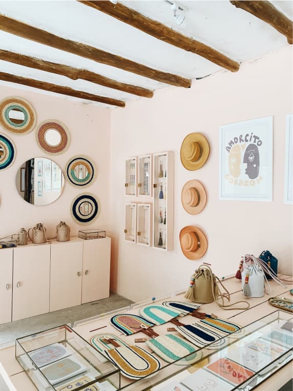
Commonly used in-store visual merchandising techniques include:
- Window displays with themes and creative, artistic flourishes
- Lighting that spotlights your displays, making them stand out
- Interactive displays featuring screens or other interfaces such as VR that help create an immersive experience
- Signage with punchy slogans and product information
While visual merchandising is traditionally associated with physical retail stores, the same principles can also be used online to highlight products, generate faster sales, and create a consistent brand experience.
Why is Visual Merchandising Important?
As a retailer, you need some way to make your products stand out. When your customers first come into your store or land on your site, what do you want them to notice first? How do you want them to move through your store? The products you choose to bring to the forefront shape your customers’ entire shopping experience.
Get visual merchandising right, and you’ll have a rush of enthusiastic customers who feel moved to make a purchase.
But it’s not just about delighting customers with your premier products. The design choices you make in your store communicate who you are as a brand.
What are the benefits of visual merchandising?
Visual merchandising has several benefits:
- Boosting sales
The more you engage your customers with unique and captivating product displays, the more likely they are to make a purchase. Turning casual browsers into motivated shoppers is just as hard (if not harder) online than it is in-store. If you can find a way to stimulate your customers’ senses and create enthusiasm for your products as soon as they hit your site, you’ve gone a long way to making a sale and a lasting impression. - Moving visitors through the sales funnel faster
By steering customers towards the product or product range that has the highest value, visual merchandising can speed up your sales process. Instead of leaving it to visitors to explore your store in their own haphazard way, intentionally lead them in the direction you want them to go via design principles. This will create a more satisfying customer experience and drive higher sales. - Building brand identity
Whether you use cool, somber tones or bright, happy displays, if it’s in your store, customers will associate it with your brand. Think carefully about your design choices: they will, subconsciously or consciously, stick in visitors’ minds, and they all say something about your brand.
What is Online Merchandising?
Just as you use design elements that engage your customers’ senses in a real-world store, online merchandising refers to using the same elements available to showcase your products in an attractive and stimulating way on your brand’s website.
There are more technical elements to consider online—such as how shoppers use search, site navigation, user-generated content, personalization, and more (we’ll get to all of these later)—but the goal is the same: to highlight your products in a way that brings your customers closer to making a purchase.
One important thing to keep in mind when deciding how to organize your online merchandising: you need to have a dedicated person responsible for it.
With all the decisions you have to make when opening an online store, it’s easy for online or visual merchandising to get lost in the mix. How your site navigation and search works, for example, will depend on many factors, some of them driven by backend ecommerce considerations.
Having a defined online merchandising role in your marketing team means someone is fighting for the design vision of your store and how this appeals to your customers. As you grow, this function may belong to your director of ecommerce or brand manager.
How to Boost Sales with Online Merchandising
When selling online, you’ll have to do it without the same sensory experience that you can create in your real-world, physical store—or like many direct-to-consumer brands, there’s a chance you don’t even have a physical location, and it’s all online. It can sometimes feel like you’ve got one hand tied behind your back. But with a little practice, you’ll uncover a wealth of options that are unavailable to you in-store. Master one or two of them, and you might even find it easier to merchandise online.
Make sure your site has:
- Personalization features: This is one way that visual merchandising for ecommerce really stands out from its in-store equivalent. Offering ‘save for later’ features that will pop up on the home screen the next time a customer visits or foregrounding displays based on previous shopping habits means you’re merchandising on a granular level.
#cta-paragraph-fe#According to Accenture, “91% of consumers are more likely to shop with brands who recognize, remember, and provide relevant offers and recommendations.”
- The ability to gather data: Whether Google Analytics or third-party customer data, you need to be able to know who your visitors are and see how they’re responding to your merchandising efforts. Gather as much information as you can and adjust your merchandising accordingly.
- Great mobile customer experience: How your site looks and feels on mobile and how products are optimized for display on small screens or device sizes needs to be one of your top ecommerce merchandising considerations.
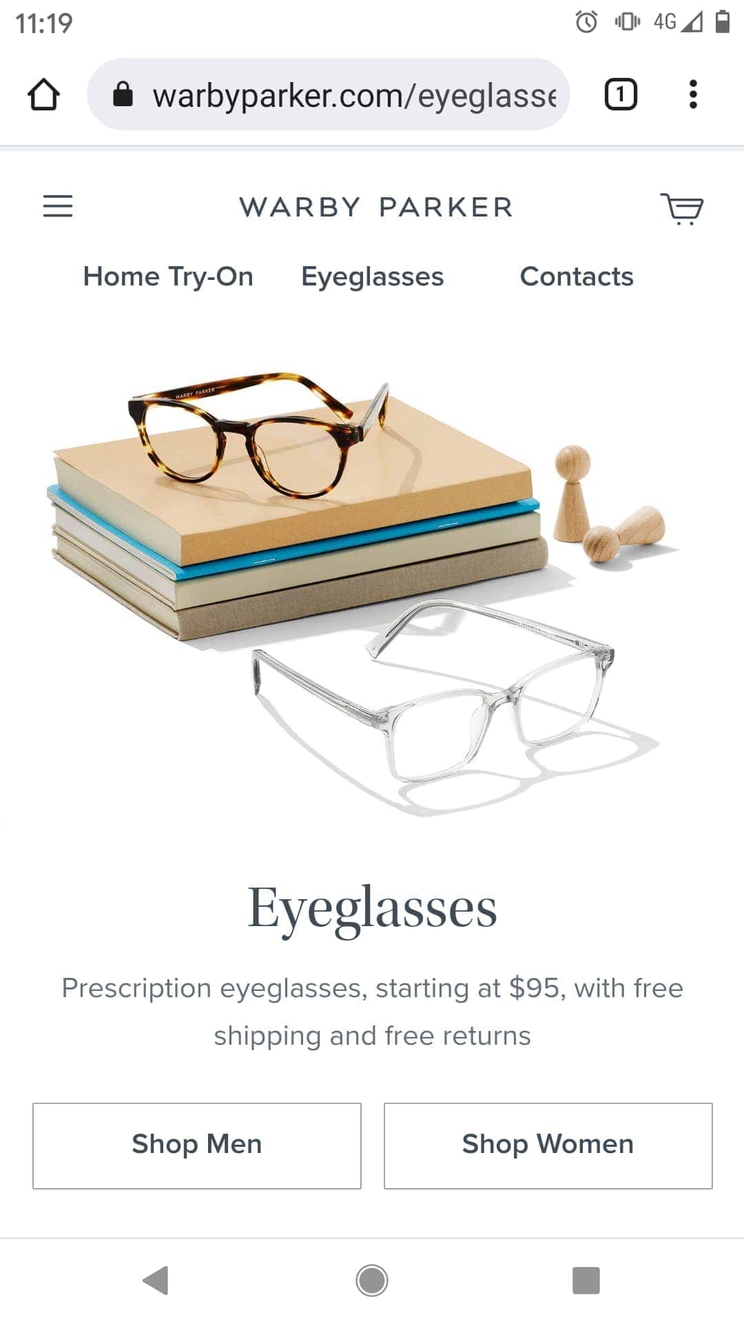
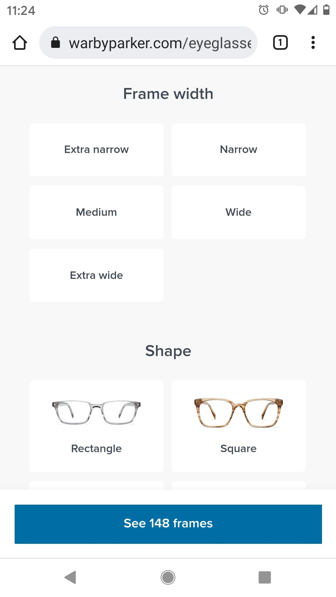
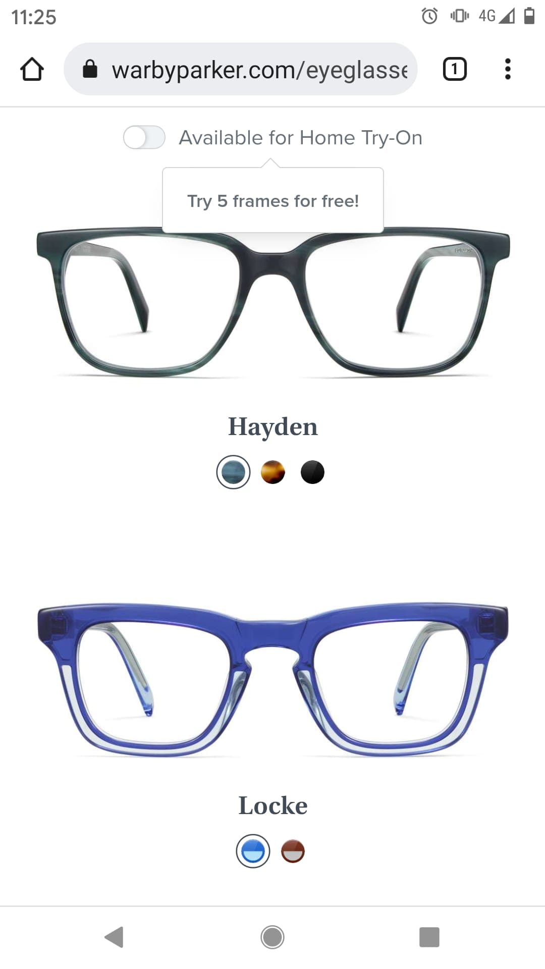
Online glasses retailer Warby Parker makes great use of space and neutral colors on mobile that let their products stand out. Their site navigation is simple and intuitive, allowing for straightforward and enjoyable choices while customers select a new pair of glasses.
Online Visual Merchandising Techniques
Here are some more actionable tips on merchandising online to connect with shoppers and spur purchases:
Pull in user-generated content (UGC) into your site’s design
Social proof in the form of reviews and customer feedback is one of the best ways to convince a site visitor of the value of your products. In particular, a whopping 79% of consumers say UGC has a big impact on their purchasing decisions.
It’s important to display this user-generated content smartly. Reviews featuring UGC (like product images they’ve taken once the product’s been delivered) work best on product pages, and if you can embed them in a way that highlights star ratings and reviewers’ names it’s more likely your customers’ eyes will be drawn to them.
UGC can also come from social media. Running campaigns that encourage customers to take pictures of themselves using your products not only creates a buzz around your brand on Instagram or Twitter, but you can then also use the content on your site— showcasing your satisfied customers to new site visitors. The North Face asks their intrepid customers to post pictures of their adventures, creating excitement and bolstering their brand identity.
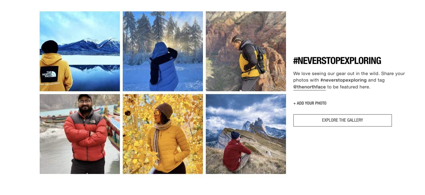
Remember as you aim to collect usable UGC to set up a reliable, unchanging hashtag the way North Face does. This’ll ensure your ecommerce team can find the social proof easily for inclusion on your site and encourages even more sharing among your audience. It gives brand fans a way to join the community (“contribute to the gallery”) and see your products in action.
Ensure you’ve set up site search/filtering options
In your online store, you can set up the search function so that customers can make design choices too. Giving them the ability to sort by color or style or displaying responsive product collections based on browsing behavior turns passive visitors into active participants in the process. Making them feel part of the experience, or giving them the ability to tailor it in this way, increases the likelihood of sales.
While giving the customer this power, you’ll want to retain the ability to boost your premier products up the search ranking. Getting the balance right will take some trial and error, so make the most of user data to speed up the fine-tuning.
Make the most of your homepage’s above-the-fold real estate
The place customers first land, your homepage should make the best possible impression. Think of this as the online version of a window display in a brick-and-mortar store. Your homepage is the part of your site that’s going to have the most eyeballs on it and catch the most passing traffic.
A well-designed, easy-to-navigate homepage with a clear call to action (CTA) can often be the difference between a customer clicking through to the product page and adding an item to their cart or deciding to bounce from your site.
Affordable luxury jewelry brand Mejuri opts for a simple yet engaging homepage design. The CTA in the center of the homepage promotes a premium collection and encourages visitors to click through and start shopping.
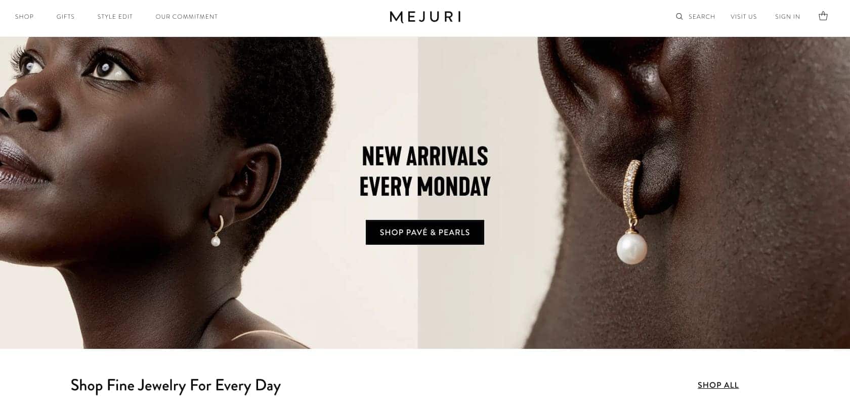
Just like a window display, the products and collections featured on your homepage should be changed regularly to keep things fresh.
Consider the seasonal collections or promotions you want to highlight as a visitor’s first step, and design a few slider images to amplify these collections on the homepage.
Product Page
Once visitors arrive at your product page, they’re getting serious about making a purchase, but they’re not quite all the way convinced just yet. How you merchandise here is your chance to seal the deal.
Your product page should feature:
- Product images
- Product specifications
- Cross-selling products with call-outs like ‘customers also bought’ or ‘often bought together’
- Reviews and ratings
You should also think about how you can incorporate videos, animations, and product demonstrations, all of which give an enhanced user experience and make your customers feel more engaged.
Try going beyond simple cross-selling and create beautiful collections pages that appeal to your customers’ tastes and habits, showcase how your products can be used together, and spark your customers’ imagination and creativity.
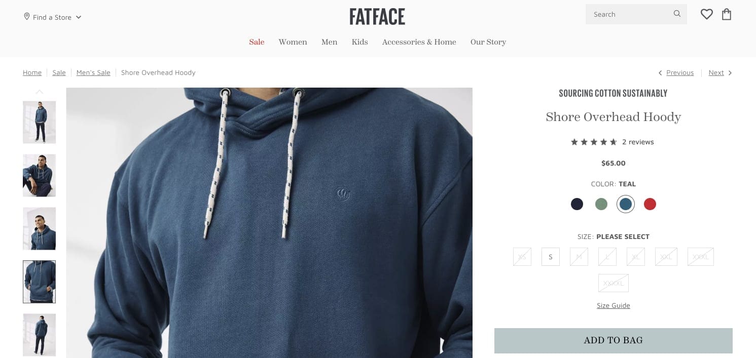
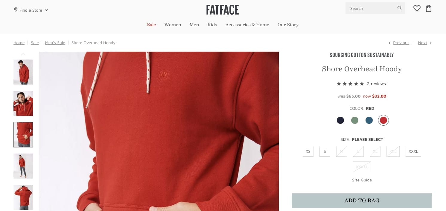
During Covid restrictions, the thing that 45% of shoppers reported missing most about shopping in physical stores is the ability to touch and try on products. Finding ways to re-create this shopping experience online will make you stand out from the crowd. If your product is available in different colors or specifications, allow customers to instantly see how it would look in a different color or size.
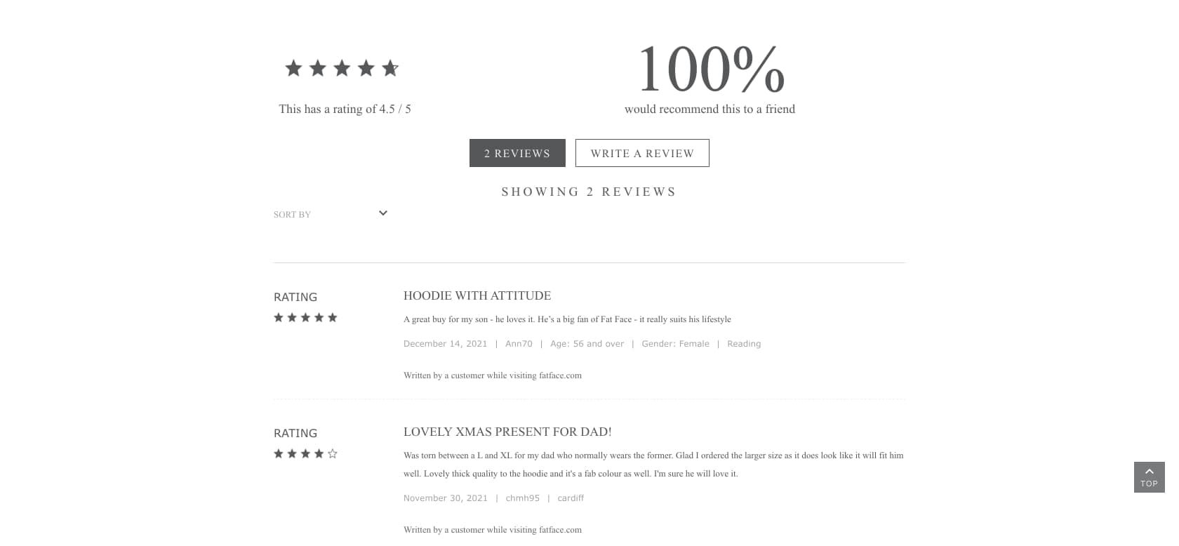
Lifestyle clothing brand FatFace lets customers select different color options for products, giving them confidence in their choices. They back this up with cross-selling recommendations and customer reviews further down the page.
Doing this especially well is the lifestyle brand Nomad. When you select a phone case, for example, the color you select changes dynamically throughout the product page you are currently viewing:
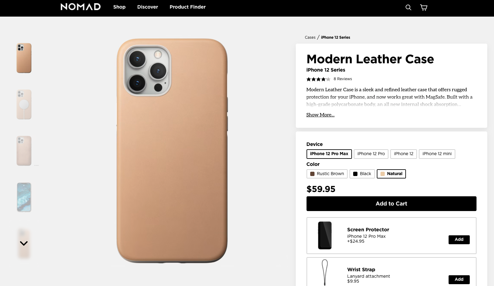
With their headless progressive web app, this dynamic swap out is happening on the level of the URL, which isn’t traditionally possible without separating the site’s frontend from the backend. A very cool feature that’s allowing shoppers to really see the product in multiple angles and images as they swap through color options.
#cta-visual-fe#<cta-title>Want to elevate your ecommerce experience like Nomad?<cta-title>If you’re looking to add more dynamic interactions into your store’s visual merchandising, you may want to consider going headless to make it easier.Learn more.
How to recreate your aesthetic
Any pro-visual merchandiser will tell you that their goal is to appeal to all five senses. In-store, you should look for ways to stimulate:
- Sight
- Sound
- Touch
- Smell
- Taste
But how do you do this online, where you’re limited to working with sight and sound?
Don’t be afraid of empty space
In visual merchandising, space without displays or products is referred to as white space. You shouldn’t feel like you need to cram every available space in your store with stuff—shoppers need room to take in their surroundings and become immersed in the merchandising experience. The principle of less is more applies here.
The same is true online—if you try to cram in too many images, CTAs, or other merchandising elements onto your pages, your customers will feel overwhelmed and confused. Even considering margins and padding often helps here. More often than not, the result will be a higher bounce rate if this element is off.
Allow your gorgeously arranged images, copy, and site layout the space they need to make an impact.
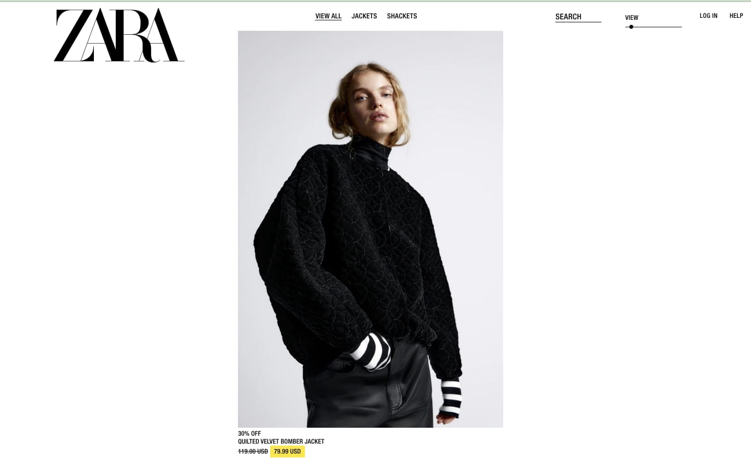
Fashion brand Zara has the confidence to leave lots of empty space around their product images. The model below and the clothing provide a striking image. The space around it gives it room to fully make an impact.
Create balance
Visual merchandisers will make sure their store displays are balanced, either symmetrically or asymmetrically. The concept of balance isn’t about the actual weight of displays, it refers to whether the displays look and feel visually balanced. Merchandisers strive to achieve harmony within and between displays.
The same principle should apply online. The visitor should feel their attention drawn to products and product information naturally, and their journey through your store should be guided by a logical flow.
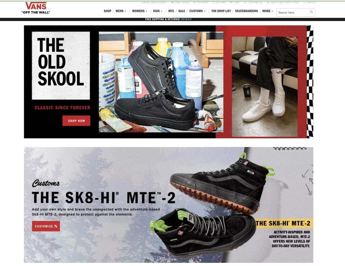
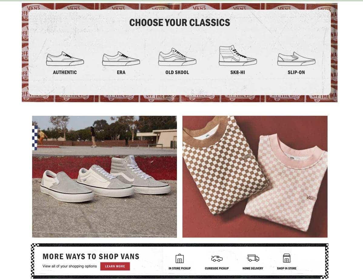
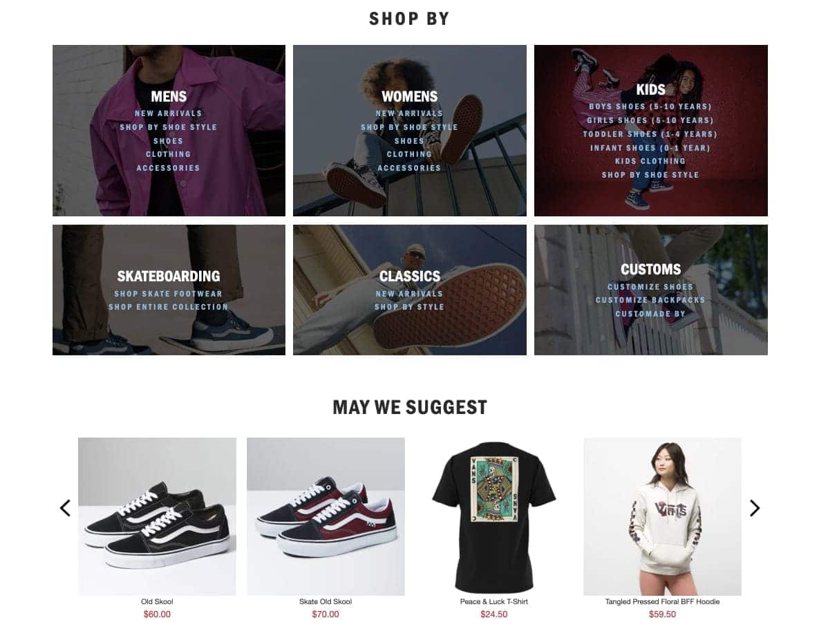
With shoe and fashion retailer Vans’ site, the product images are arranged in rows and columns of different sizes in a way that visually balances, drawing the eye down the page. The arrangement of biggest images at the top and smallest at the bottom leads visitors down the page in a way that feels intuitive.
Use omnichannel and multichannel
If you already have a clear brand identity in your brick-and-mortar stores, your customers will expect you to extend this into the online world. They’ll already have a set of associations that come from visiting your stores; re-creating this online with visuals will evoke these same associations for them.
Think about how you can use color, video, animation, and even sounds to align your online presence with the look and feel of your physical stores. This approach should be across all of your digital output, not just your site. If you’re posting a lot to Instagram, make sure the posts have a consistent tone and color palate.
Ensuring consistency across online and real-world merchandising can actually make your life easier. You don’t have to reinvent the wheel with every post. For example, a beautiful and striking in-store display can make for an impactful Instagram story.
Exclusive British brands Harrods and Fortnum & Mason have used this technique to great effect:
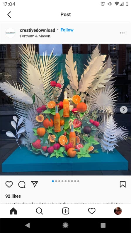
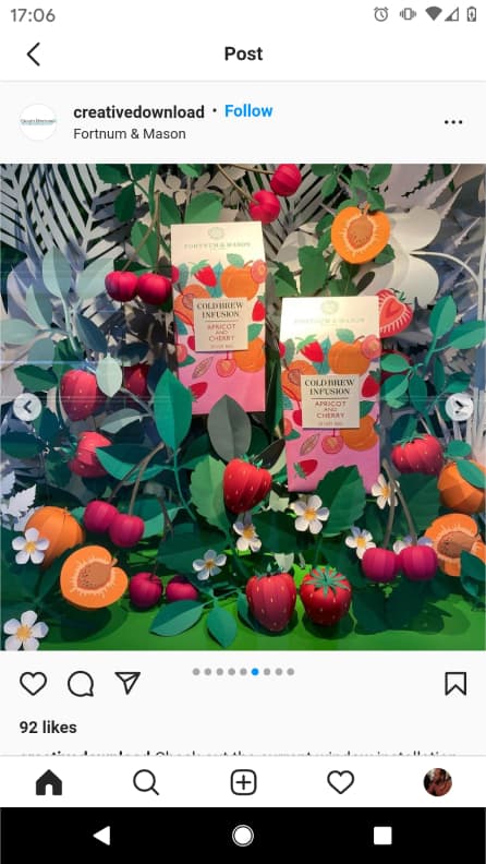
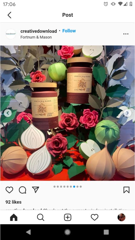
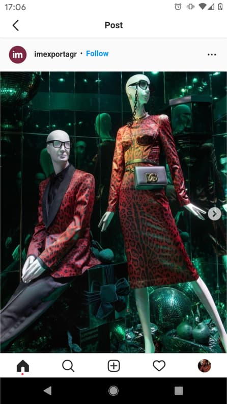
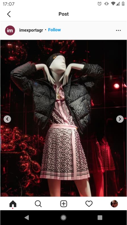
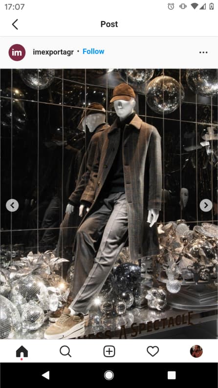
These images could also be used to create virtual “window displays” on the site to showcase outfit pairings, or their color palette could be recreated on the homepage/throughout.
How to Tell a Story About Your Brand
In addition to engaging your customers’ senses, your visual merchandising efforts have another job. To tell site visitors who you are, what you’re all about, and why your product matters to them. In a word: to tell your story.
All the techniques we’ve talked about here should help to tell that story.
And the structure of the site journey itself should help create your brand narrative. The way visitors feel moving around your site should be in keeping with your brand.
If you’re trying to cultivate an air of exclusivity, then a crisp, minimalist site may work for you. If you’re appealing to an ostentatious Gen Z audience, you can try something more unabashedly exciting.
Look at this example from Rue21:
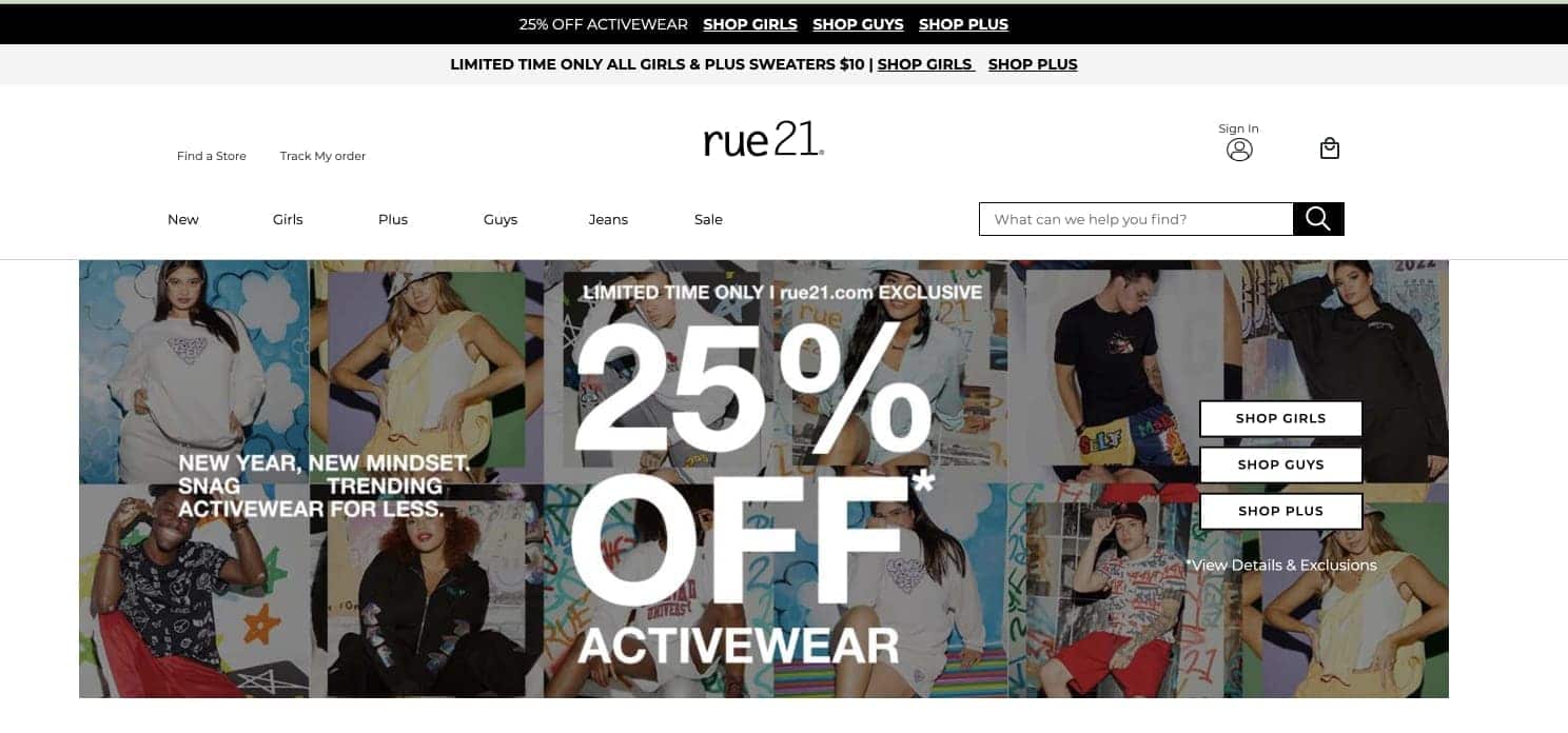
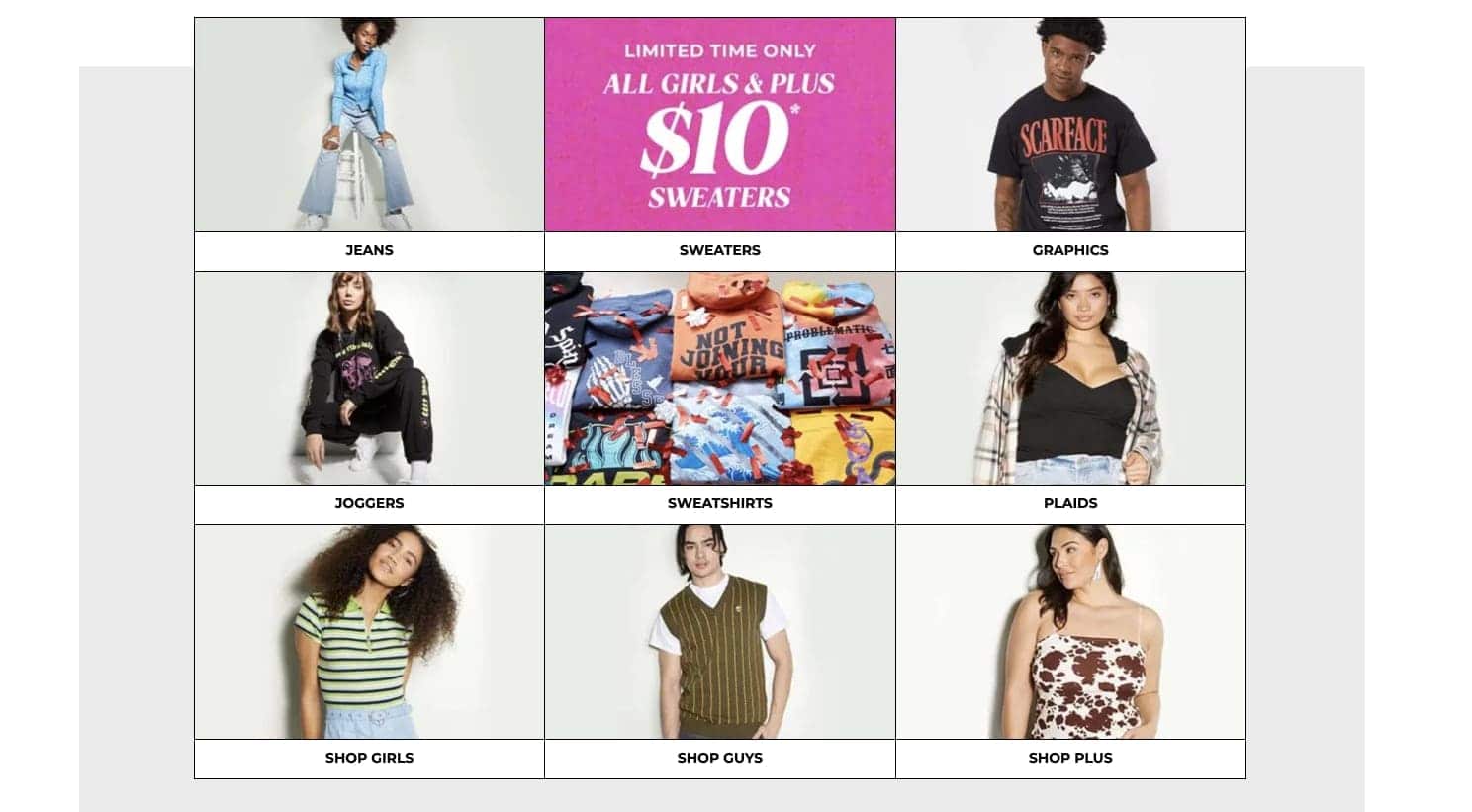
There’s a clear logic to how you move around the site and how you get from homepage to product page, but the tone is lighthearted, fun, and exciting thanks to the punchy colors, exactly how younger/edgier brands want their customers to feel when they shop on their site.
Free your creativity with Shogun Frontend
Creating rich merchandising that’s compelling and consistent isn’t always easy. But if you want to give your customers an unforgettable digital experience that will excite them, bringing them closer to your products and your brand, investing some time and patience in getting online merchandising right is crucial.
The online merchandising strategies that we’ve looked at here will help you craft those priceless experiences. And if you’re particularly invested in making your site design match your brand in ways that exceed the limits of modern commerce, you may want to consider taking your site headless.
Shogun Frontend is purpose-built for aspirational brands who want to craft exceptional ecommerce sites without the headache of trying to manage multiple third-party providers.
The headless frontend platform provides an intuitive, code-free environment in which to realize your creative vision.
You’re free to explore visual merchandising trends and experiment with different options, all while delivering fast, unique, and unforgettable customer experiences.
#cta-visual-fe#<cta-title>Finally realize your brand’s creative vision<cta-title>Create the exact ecommerce site you’ve been dreaming of. Learn how Shogun Frontend is helping brands go headless, the easy way.Learn more

Rhys Williams
Rhys is a writer specializing in enterprise software, ecommerce, and SaaS. He describes himself as a geek and a wordsmith and relishes making complex, technical topics come to life in easy-to-understand web copy.

