25 of the Best Ecommerce Landing Page Examples (+ Tips For Converting)
No matter what type of online store you run, ecommerce landing pages are kind of a big deal.
In fact, ecommerce landing page optimization can mean more for your success than how many followers you have, how many clicks you get, or even how much traffic you drive to your store.
Why?
Because without high-converting ecommerce landing pages, you won’t get the most value out of those clicks or traffic.
You won’t have anywhere intentional to send visitors when they click on your ad, email, or blog post.
If you want to convert more visitors into customers, you need landing pages that are built to do just that.
Lucky for you, there are plenty of beautiful BigCommerce and Shopify stores out there that you can draw inspiration from.
Skip ahead:
But first, let’s make sure we’re all on the same page—yes, pun intended—in terms of what an “ecommerce landing page” actually means.
#cta-visual-pb#Build landing pages that convertBuild landing pages that convertCreate and customize landing pages with all the vital elements for conversions—quickly and code-free.Start designing for free today
What is an ecommerce landing page, exactly?
Simply put, an ecommerce landing page is any site page designed to get visitors to take a specific action on your online store.
Most often, landing pages aren’t one of your main store pages (though they can be, as you’ll see).
If we’re being completely literal here, a landing page is where visitors land from specific sources—social media posts, Google Search, paid ads, email marketing, etc.—for the best chance at conversion.
We define ecommerce landing pages as one of five types of pages:
- A dedicated sales landing page built toward a single conversion goal
- A product or collections page for exploring one type of product
- A campaign landing page to create excitement
- A PPC landing page designed to convert
- A testimonial landing page made to showcase trust and social proof
Let’s explore each type briefly.
Types of ecommerce landing pages
Let’s look at these two types of ecomm landing pages in a bit more detail.
1. A sales landing page designed for one goal
This is the classic ecommerce landing page, and many of the examples in this article will fall into this category.
They can encompass any part of a customer’s journey from the top to the bottom of the funnel.
Visitors click on an ad, email, SERP result, or social media post and land on a page built specifically to capture those clicks.
For example, you might create a sales landing page to:
- Promote a limited-time special offer or launch a new product
- Educate potential customers about subscription program (like Copper Cow Coffee did)
- Drive traffic to an existing collections page or product page
- Generate leads by getting visitors to register for your email list or sale event
- Create buzz for your brand’s launch
To ensure your landing page has the best chance of converting your particular visitors, you’ll want to have a great checklist of best practices that you can follow each time you build one.
2. A product or collections page
While some might not consider product or collection pages to be landing pages, there are landing pages that focus on a product or collection.
A visitor might land on a product landing page when they’re searching online for “matching yoga sets” or click on an Instagram ad that prompts them to “shop the collection.”
However, not all product pages function as landing pages.
Since landing pages are built around a single conversion goal, product and collections pages can fit the bill if they’re designed to get visitors to take a specific action.
For a collections page, the goal might be to get customers to click on product images for more details.
3. Campaign landing pages to generate a buzz
One of the more “classic” use cases of a landing page is for campaigns.
Dedicated campaign landing pages act as a hub for your campaign with the idea that they can find everything they need to know about the campaign on that page.
For example, Nuun created a dedicated page for their collaboration with obé Fitness using Shogun:
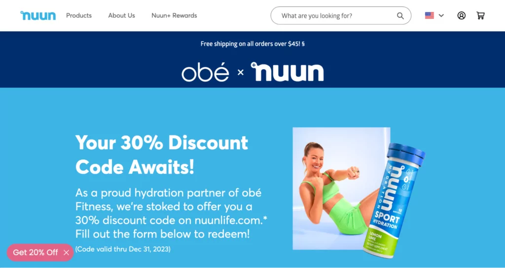
This page makes it easy for customers to not only find the discount code for this campaign, but it tells them how to redeem it—which is critical!
#cta-paragraph-pb#Learn more about Nuun’s growth with Shogun. Read the case study
4. PPC landing pages designed to convert
Landing pages are often an integral part of PPC campaigns, serving as the destination for many ads.
Linking to a dedicated PPC landing page for an ad campaign means taking away any distractions that customers might find on other pages of your site.
In fact, PPC campaigns with tailored landing pages can see conversions as high as 11.45% or higher.
5. Testimonial pages aimed to showcase social proof and trust
There are countless ways to display testimonials on your site.
Testimonial landing pages are a great way for you to quickly communicate real customer feedback and experiences with potential new customers.
For example, including testimonials on customer education pages—like Briogeo’s “Why your hair needs repair” page—is a great way to reinforce your content:
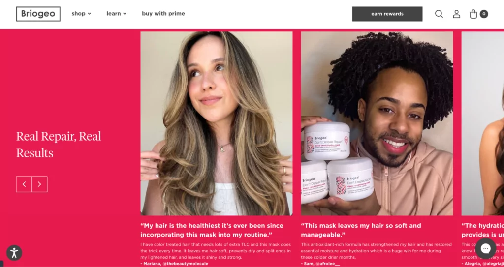
Making testimonials a highlight of a dedicated landing page like this also builds trust among customers—both new and potential.
Ecommerce landing pages vs. product pages
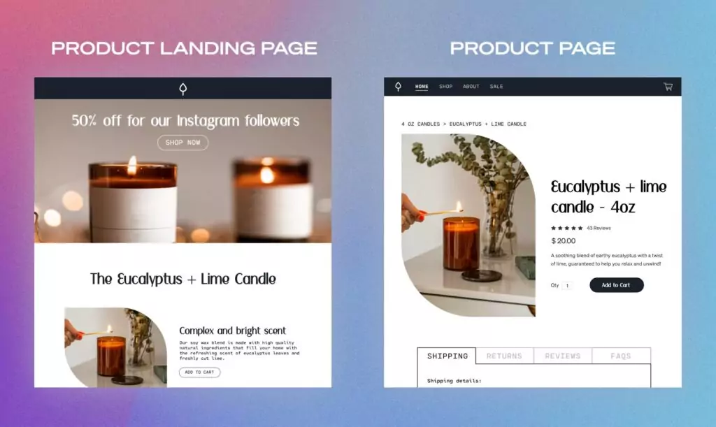
What’s the difference between ecommerce landing pages and Shopify product pages?
While there is some overlap between the two, as described above, a true landing page is built expressly to drive a specific action—to get visitors to add a product to their cart or to get visitors to subscribe for future nurture email marketing.
Landing pages aren’t always designed to sell (that’s where product landing pages come in).
They just need to accomplish their campaign goal.
That might be driving customers to a product page (and on into checkout) or capturing their email in exchange for your newsletter, a discount, product launch updates, giveaways, etc.
Ecommerce product pages, on the other hand, are purpose-built to describe and sell a product.
They might include more detailed information about things like product specs, pricing, shipping, and reviews—all the logistics that need to be communicated at the moment of purchase.
Traditional product pages aren’t always the best place to send traffic from a specific campaign. The messaging might not match the campaign, which means it won’t speak to that specific audience.
To summarize their differences, let’s look at the main elements of each.
| Landing pages | Product pages |
|---|---|
| Are designed to drive one action | Are designed to sell one product but also suggest others |
| Can use multiple CTAs that all go to the same place | Will use multiple CTAs that go to various site pages |
| Will often remove site navigation to funnel visitors to the CTA | Always include site navigation for easy shopping around |
| Target a specific audience and campaign goal | Target the brand’s general audience |
| Uses messaging hyper-focused on campaign goal | Use general messaging that describes the product and brand |
| Not specifically made for SEO purposes | SEO-optimized to capture lots of traffic |
#cta-paragraph-pb#You can see there are many key differences between these pages and their goals. To learn how landing pages differ from your most visited store page, check out our comparison of landing pages and homepages.
#cta-visual-pb#<cta-title>Create better landing pages<cta-title>Create and customize landing pages with all the vital elements for conversions—quickly and code-free.Start designing for free today
Ecommerce landing pages vs. homepages
When comparing landing pages to homepages, it’s helpful to think of the two like this:
- A landing page is a standalone page on your site designed to drive a specific audience to take a specific action.
- A homepage, on the other hand, is the hub for your brand. It introduces your brand to the world, sharing who you are and what you sell, along with clear calls to action.
A landing page encourages customers to do something on your site, like shop a collection or check out a new product.
Landing pages are intended for a small subset of your audience. Because of that, they’re typically super customized. Homepages are like the front window display of your online store. They communicate to customers your values, products, and overall brand ✨vibe✨
Does your store need landing pages?
Yes! The most successful brands use ecommerce landing pages to capture leads, drive traffic to a specific store page, and, of course, make sales.
If your product page provides a close-up look at the item being sold, your landing page is more like your storefront.
When someone clicks on a message that resonates with them and ends up on your site, they want to see that same message reflected on the landing page.
Your landing page needs to be optimized for that specific visitor from that specific traffic source. Then, from there, they can choose to go deeper into your shop, browse specific products, and see what you have to offer.
Landing pages are also the ideal candidate for some good old-fashioned A/B testing—so you can find out what works best for your store and your audience without messing around with your core web pages.
Benefits of using ecommerce landing pages
OK, but what are the advantages of creating these landing pages? Let’s quickly go through the top benefits of using landing pages on your ecommerce site.
- Marketing teams can quickly design and launch landing pages for unique campaigns
- Paid ad campaigns can have a higher return on investment with focused messaging
- A/B testing on individual landing pages can reveal highest converting elements
- Brands gain extra insights into their target audiences and what they like
- Targeted landing pages have higher conversion rates than core store pages
- Visitors get the best possible introduction to your brand with focused messaging
Landing pages are a great way to communicate extra details that might not fit on a product or collection page.
25 examples of ecommerce landing pages that convert
To give you an idea of what these best practices look like in action, let’s look at some examples.
The following ecommerce landing pages are built by Shogun customers who know how to create pages that convert.
1. TKEES – Visually dynamic product landing page example
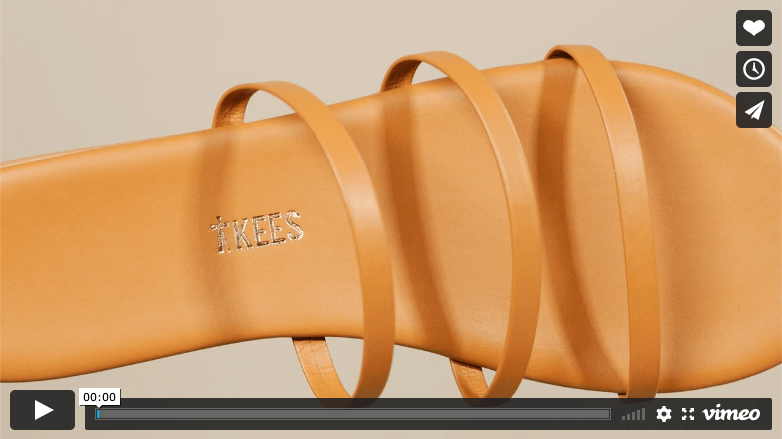
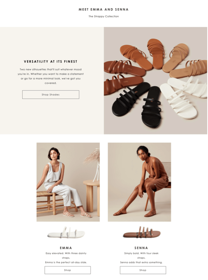
This example is a collections page from the ever-stylish sandal brand TKEES. They likely use this page to capture traffic interested in their newest sandal styles—the Emma and the Senna.
What we like best about this ecommerce landing page:
- The video header makes smart use of that crucial above-the-fold real estate.
- The sleek design uses white space to make the product stand out.
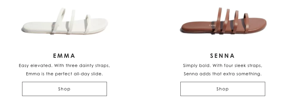
- A clear and simple CTA. Even though there are four CTA buttons (two linking to the Emma product page and two to the Senna), the entire page is built to serve a singular goal: getting customers to shop the new style—a.k.a., visit the product pages.
2. First Day Inc – A special offer landing page that creates urgency
First Day created this colorful limited-time offer page to promote their new vitamins with a back-to-school sale.
What we like best about this ecommerce landing page:
- The countdown timer urges customers to take advantage of the offer before it expires.

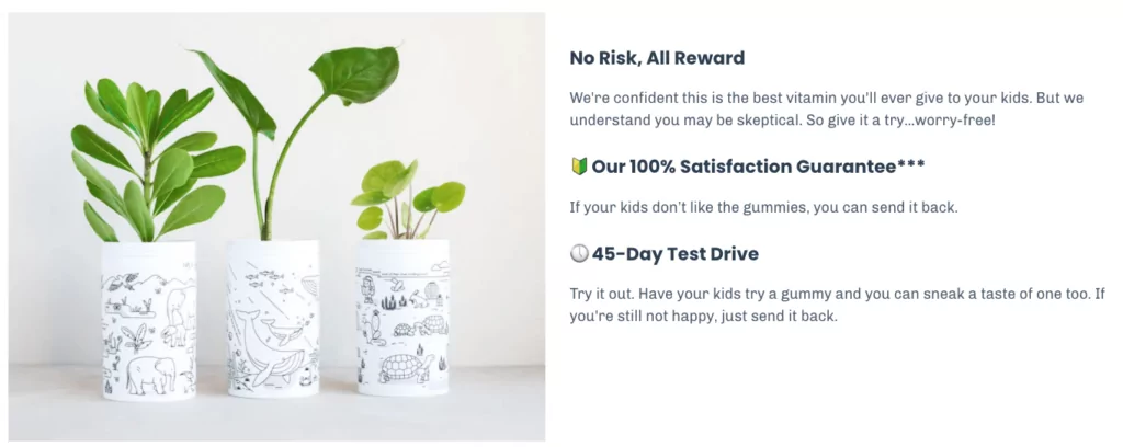
- Repetition of the 100% satisfaction guarantee puts buyers’ minds at ease and removes a common sales objection.
- A personal story from one of the founders (accompanied by baby photos). This builds trust in the brand and connects to parents on a personal level.

3. OLIPOP – A powerful product comparison landing page example
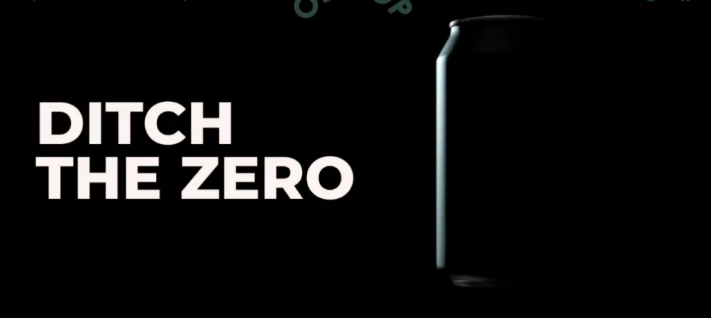
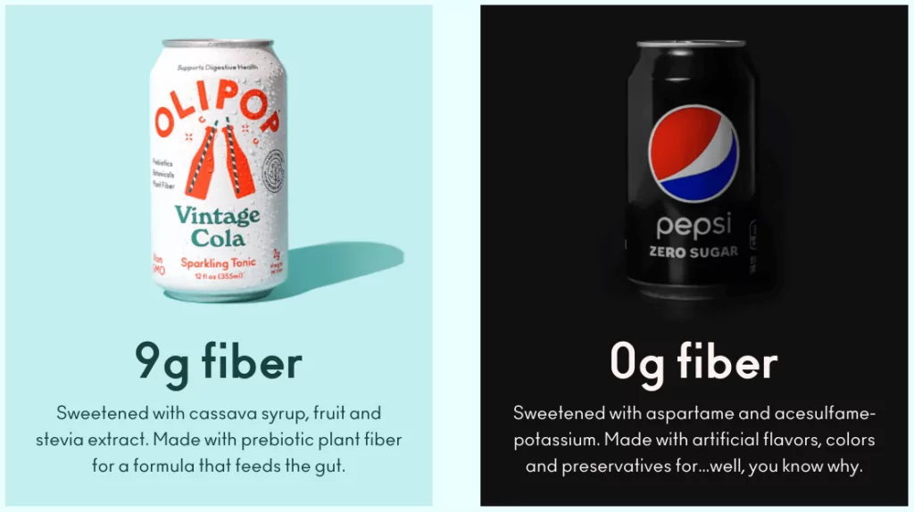
This landing page boldly contrasts the benefits of OLIPOP against the drawbacks of zero-sugar sodas.
The messaging directly challenges the assumptions of visitors who currently drink diet or low-sugar beverages as a “healthier” alternative to sugary sodas.
What we like best about this ecommerce landing page:
- The whole page provides a direct comparison between OLIPOP and their competition. The message is clear: “Ditch the zero” and “switch to OLIPOP.”
- A side-by-side visual of Olipop and a zero-sugar soda helps emphasize the health benefits of leaving the dark side (including 9g of fiber per can).
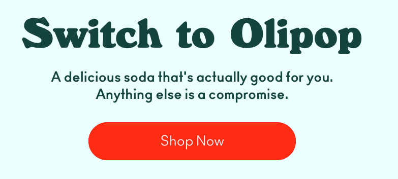
- Identical CTA buttons that invite visitors to “Shop Now” are shown just below the fold and again at the bottom of the page to convert shoppers as soon as they’re ready to buy.
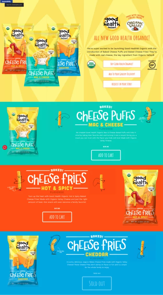
4. Utz – A striking brand launch landing page
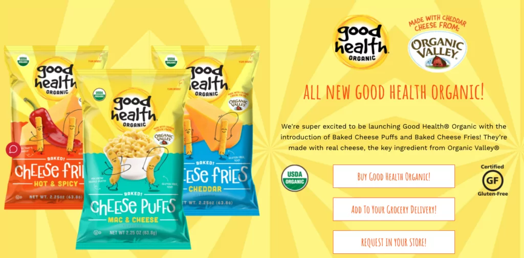
Next up, this promotional page by Utz introduces a new brand—Good Health Organic—and debuts a range of cheesy snacks.
Unlike a traditional product page, this landing page provides a quick overview of several new products all in one place.
What we like best about this ecommerce landing page:
- Space above the fold is used extremely well. They manage to announce the brand, incorporate package design into the page itself, show us all three variations of the cheese puffs, and convey that the snacks are gluten-free and organic.
- Clear next steps for customers to get their hands on the product (“Add to cart,” “Request in your store”)
- Z-shaped layout and color blocks make it easy to skim for details.
5. Nuun – A loyalty program landing page with visual flair
Bursting with emojis, an animated header, and tropical fruits, this colorful promotional page gets Nuun customers excited about their loyalty program.
What we like best about this ecommerce landing page:
- Attention-grabbing visuals at the top that look cool and get the main message across (i.e., “More Nuun = More Points = More Rewards”).

- Engaging, positive copy that matches the message and the brand. (“Fun stuff starts right now!”)
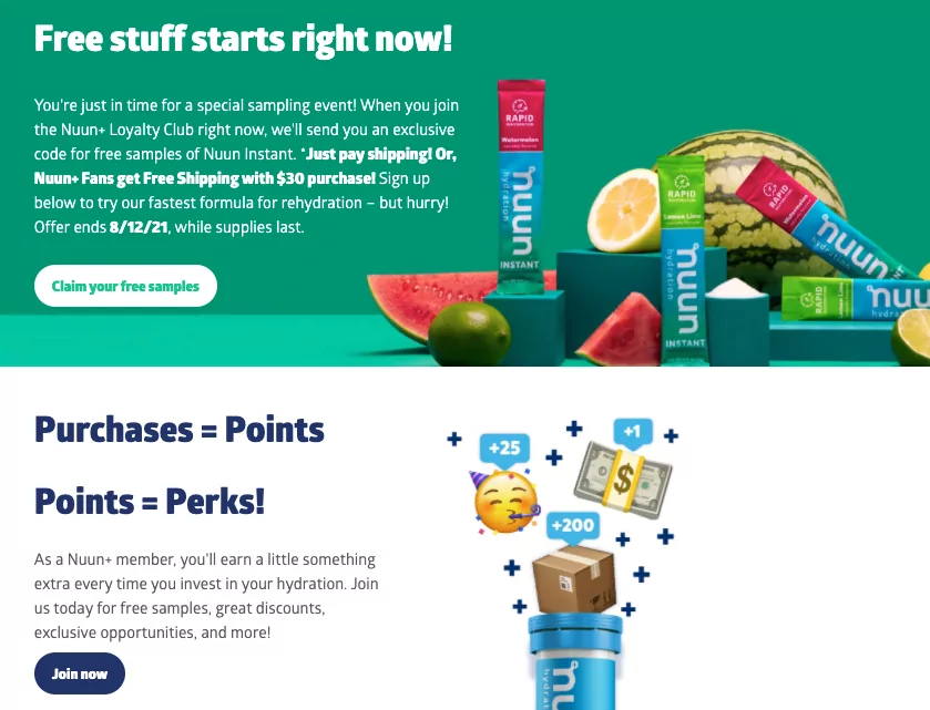
- One conversion goal. There are multiple action-focused CTAs, but the CTA buttons all lead to the same place.
#cta-visual-pb#<cta-title>Your store could look this good<cta-title>Try Shogun for free and start building out your perfect store to create a totally unique customer experience.Start building for free
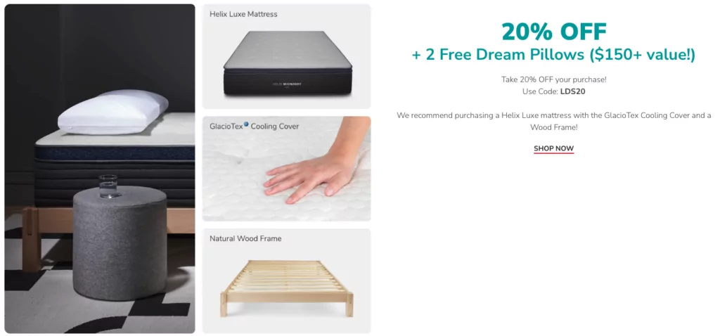
6. Helix – A special offer page that emphasizes customer savings
Helix Sleep uses this special offers page to inform shoppers about all of their active promotions and deals.
What we like best about this ecommerce landing page:
- Value is emphasized by using the dollar amount of savings offered as headings for each section of the page.
- Bright CTA buttons stand out against the background.
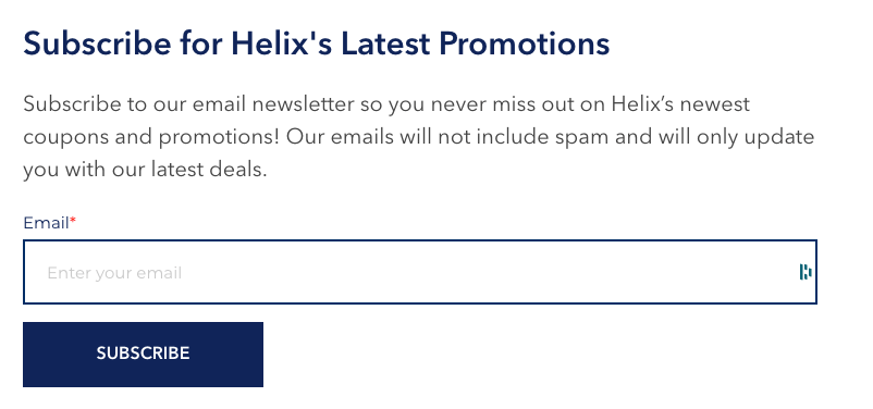
- Lead capture form at the bottom of the page only requires one field, which makes it easy to sign up and builds out Helix’s email list.
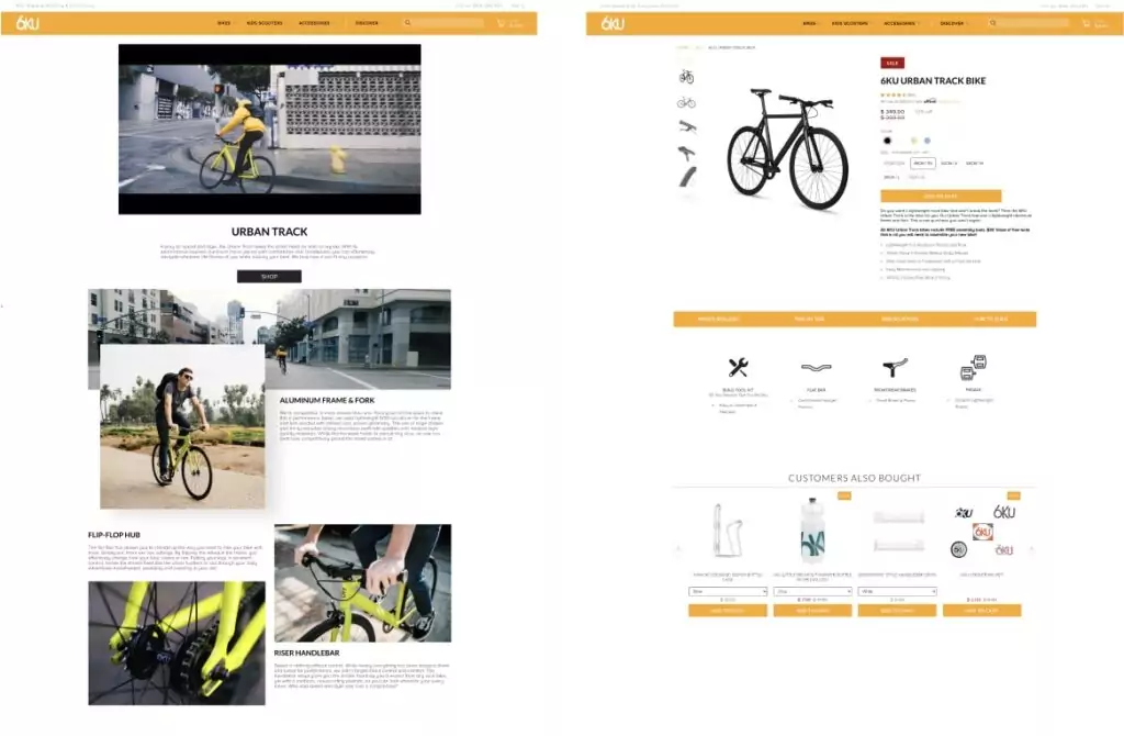
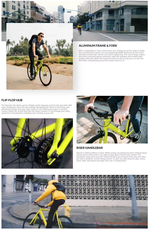
7. 6KU – An action-packed product landing page example
This ecommerce sales page from 6KU provides a high-energy overview of their new model, the Urban Track, and then links to the traditional product page when you click “shop.”
What we like best about this ecommerce landing page:
- Action-packed video tells a story of cycling through the city on your new set of wheels and shows customers what they’ll look like riding it.
- A mix of lifestyle photos and product close-ups showcase the bike from every angle.
8. Flower Moxie – A step-by-step wedding package landing page
This example is part landing page, part wedding to-do list.
Flower Moxie uses this page to guide brides in customizing their flower package—with plenty of information, resources, and “Add to Cart” buttons.
What we like best about this ecommerce landing page:
- Bright and beautiful photos. The colorful images really pop against the plain white background.
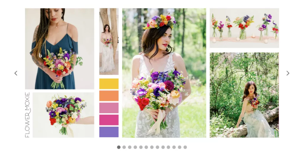
- The header image is actually a slider, which allows visitors to see various bouquet options before scrolling down.
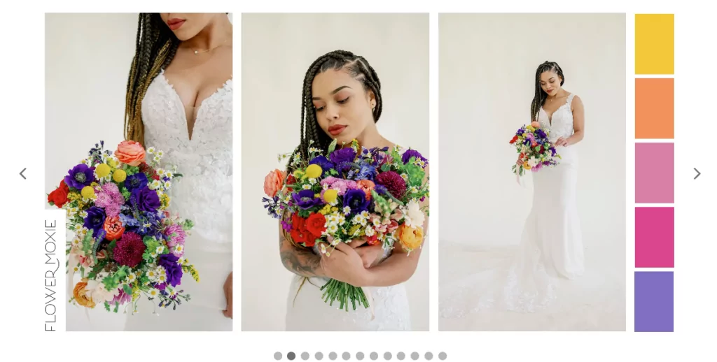
- Awesome shopping experience. The step-by-step customization flow gets customers invested in the product, ensures they get what they want, and guides them toward checking out.
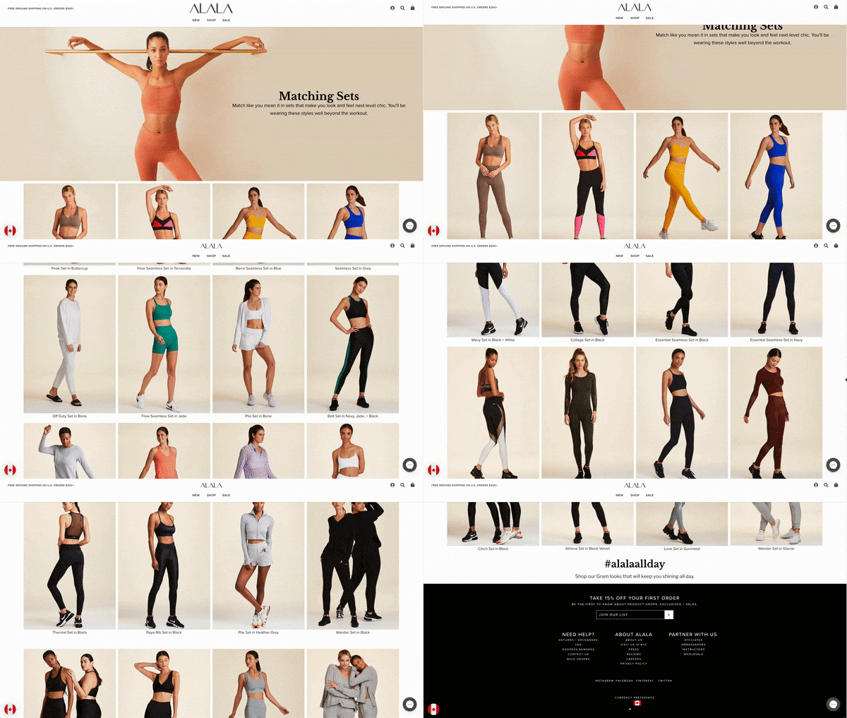
9. Alala – A colorful collection-centric ecommerce landing page example
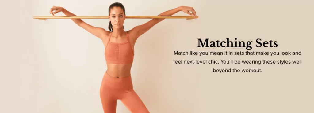
This collections page gives shoppers an overview of all the matching set styles and colors available from Alala.
What we like best about this ecommerce landing page:
- Powerful header image and cool copy. Everything from the model’s stance ( a power pose if we’ve ever seen one) to the copy (“Match like you mean it”) tells visitors this page is all about feeling confident.
- Gallery of matching sets that drives clicks right to the relevant product page.
- Images organized by color. Just like the sets, the page itself is color-coordinated, with bright colors at the top of the grid and more neutral colors as you scroll down.
10. Active Doodie – An on-brand collection landing page example
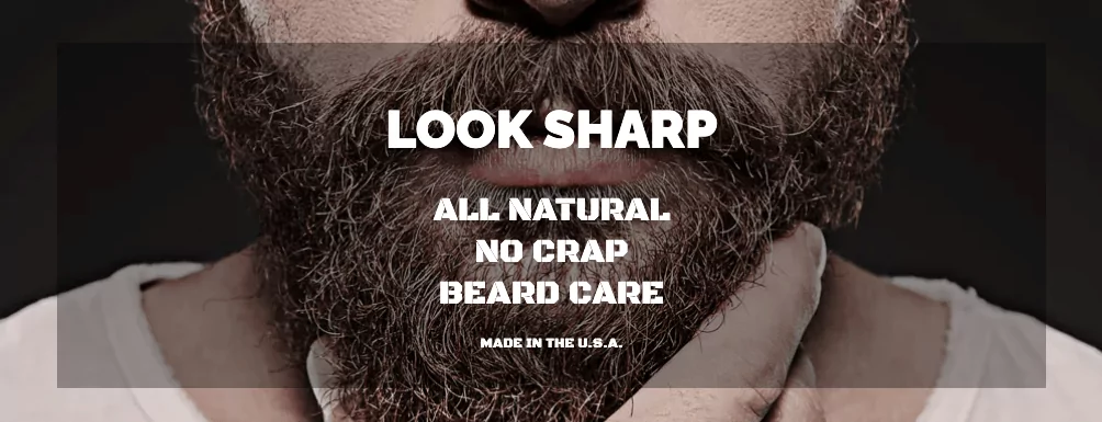
This ecommerce page is focused on Active Doodie’s all-natural beard grooming products, including a gift set.
What we like best about this ecommerce landing page:
- Gruff-sounding copy without any fluff—which is super on-brand and complements Active Doodie’s promise of all-natural “no crap” beard care.
- Simple four-quadrant layout makes it easy to view all the products at once without much scrolling.
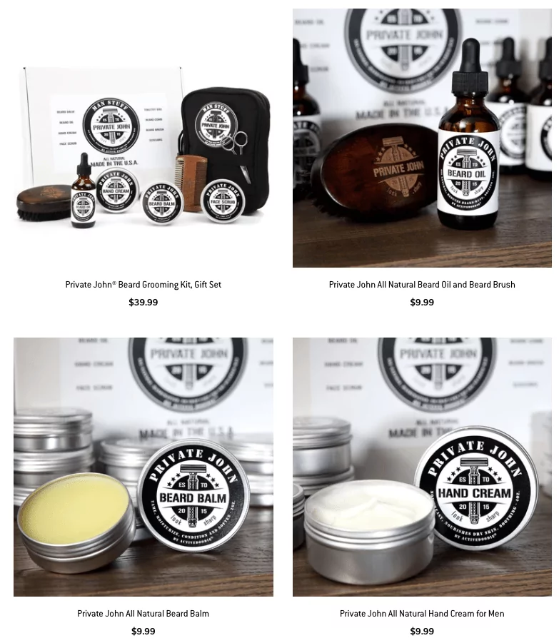
- Product photos act as CTA buttons, giving visitors the option to click through to the product page for the gift set or the individual items it includes.
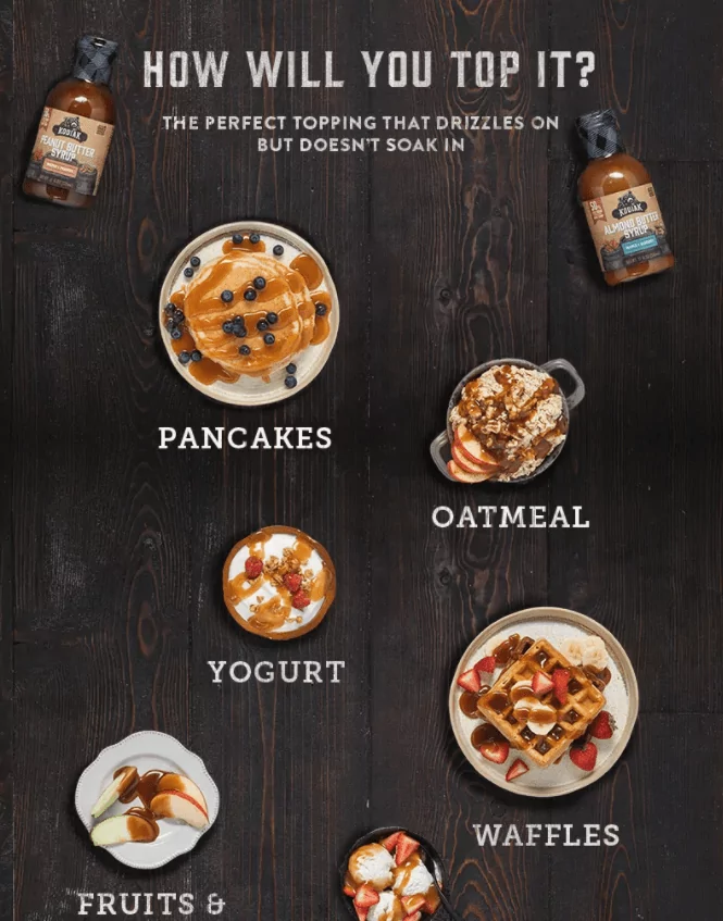
11. Kodiak Cakes – A product launch landing page that builds excitement
This landing page by Kodiak Cakes introduces their new nut butter syrups, gets visitors excited about the flavor combinations, and then directs them to Target where they can buy the product.
What we like best about this ecommerce landing page:
- Mouth-watering header image that visualizes the flavors (maple + peanut and maple + almond) and shows the syrups in use.

- The CTA invites visitors to “find a bottle” and redirects them to a product page on Target’s website.

- The “How Will You Top It?” section provides tons of inspiration for how to best enjoy the nut butters.
12. The Ridge – A slick product line introduction landing page
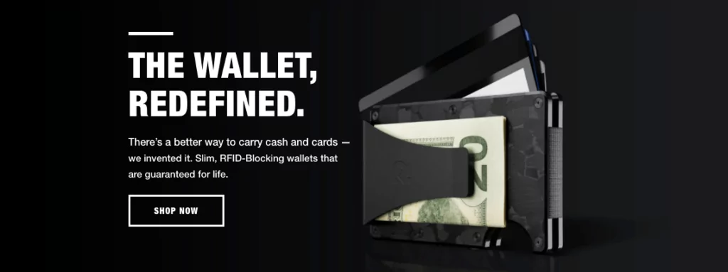
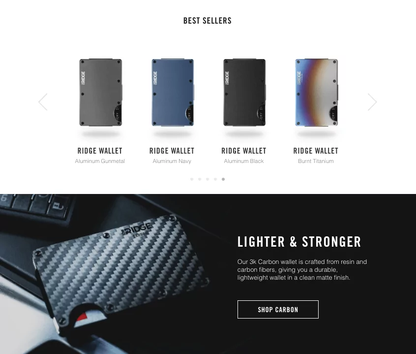
This page from the Ridge provides a sleek overview of their sleek product line: RFID-blocking wallets that still look stylish.
What we like best about this ecommerce landing page:
- The bold header image gives visitors a glimpse inside the wallet and a peek at the core features, inviting them to learn more.
- Contrasting white and black sections give the page structure while allowing the product to really stand out.
13. IdeaPaint – A discount landing page with three product funnels
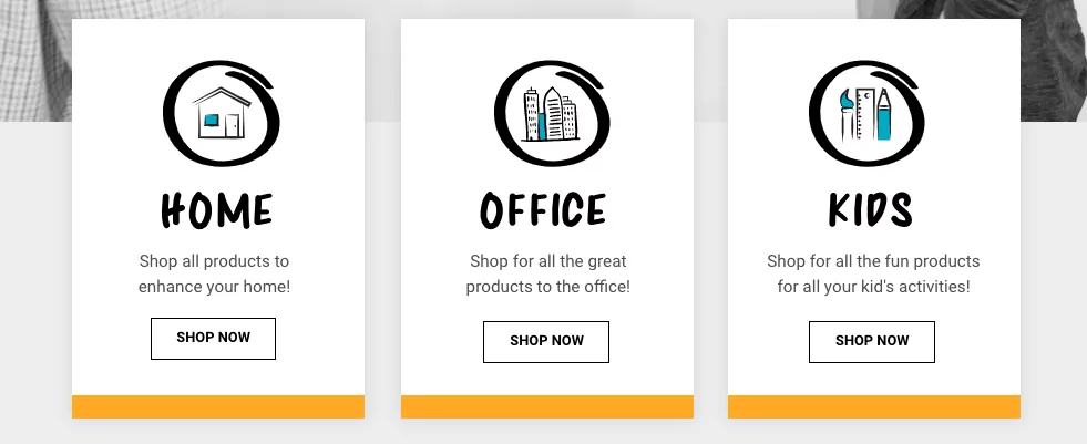
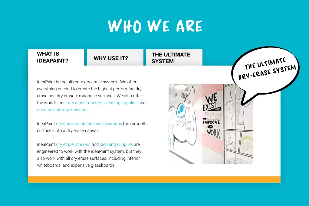
On this promotional landing page, IdeaPaint attracts visitors with a discount code and then funnels them to the most relevant product page depending on their use case.
What we like best about this ecommerce landing page:
- Three clickthrough buttons to qualify visitors based on intent. Are you shopping for your home, office, or kids’ activities? Although these are technically competing CTAs, it works here because the traffic could be coming from any number of sources.
- Tabs to organize information. The page covers a ton of product details (what it is, why use it, and dry erase bundles) without making the visitor feel lost.
14. Hamama – An informative product introduction landing page
Hamama uses this landing page to preview some of their most popular microgreens and invite customers to purchase their own Microgreen Kit Sample Pack.
What we like best about this ecommerce landing page:
- Time-lapse video of greens sprouting shows visitors how it works and gets them excited about growing their own.
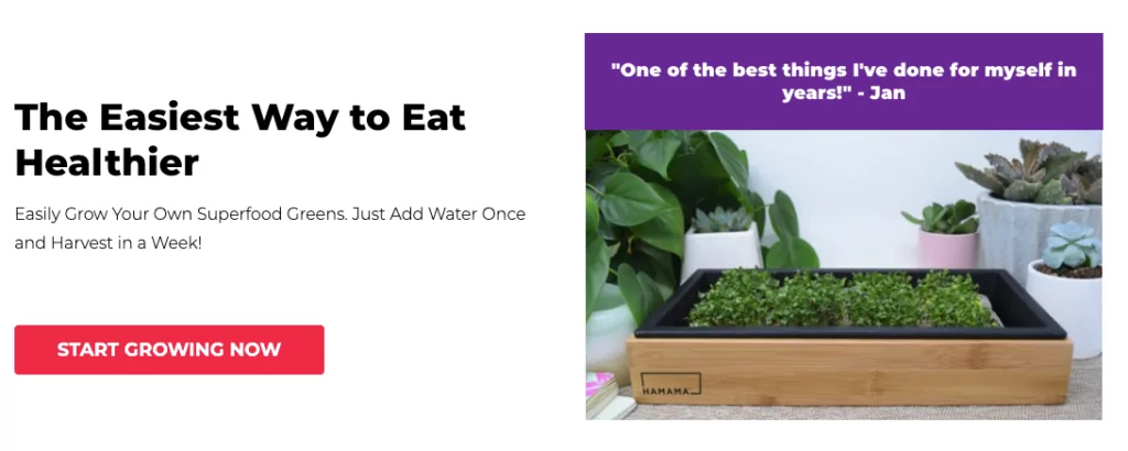
- Emphasis on how easy it is to get started. Growing microgreens might sound intimidating for those new to gardening, but Hamama provides plenty of reassurance and information about exactly how it works.

- Multiple opportunities to convert are placed throughout the page. Every section of this landing page contains a bright red CTA button with unique copy—all of which add the sample pack to your cart.
15. DMOS Collective – A product landing page rich with social proof
DMOS Collective built this landing page with Shogun to showcase the Alpha Driveway Shovel.
What we like best about this ecommerce landing page:
- Emphasis on benefits. The bulk of the page focuses on the ergonomic design, versatility, and durability of this two-in-one tool.
- Prominent CTA above the fold that doesn’t beat around the bush: “Get Yours Now.”

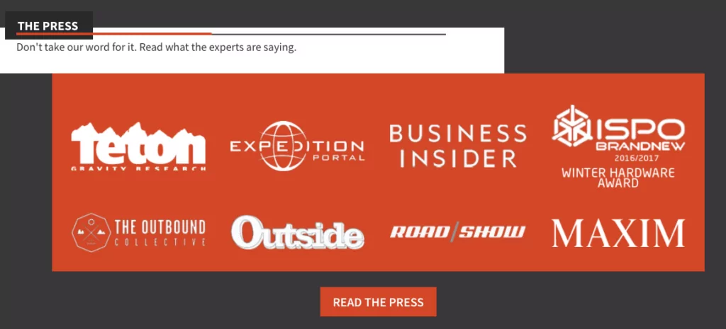
- Loads of social proof from top to bottom. A powerful quote from Maxim below the header image makes an immediate impact on visitors.

- Near the bottom of the page, there’s a section on press with logos from well-known publications. (Not to mention testimonials from customers around the country and a mention of 400 five-star reviews.)
#cta-visual-pb-ee#<cta-title>Not Your Average Shopify Store: 25 Gorgeous Custom Landing Pages<cta-title>See how custom pages make these 25 beautiful Shopify stores drive conversions and get inspired to elevate your store’s customer experience.Grab your free copy
16. Rumpl – Dedicated landing pages to showcase Rumpl artists
Rumpl’s RAD Artist Collective is a group of artists and makers who’ve collaborated with the brand on creating exclusive products.
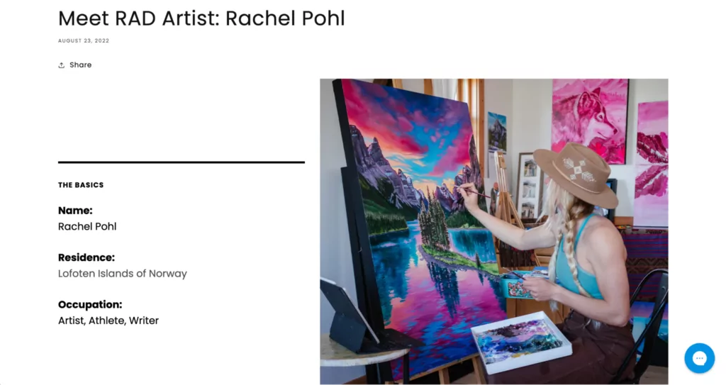
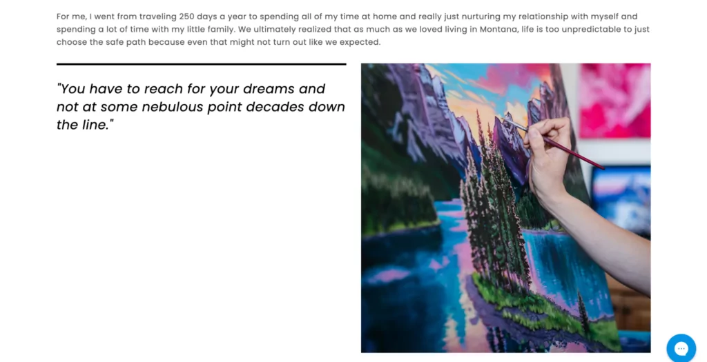
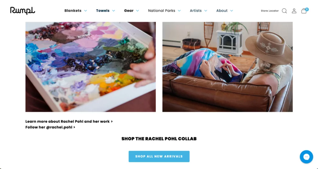
Rumpl creates a dedicated page for each RAD artist using Shogun, which includes a Q&A with the artist, pull quotes, video, high-resolution images, and a CTA to shop artist-specific products.
What we like best about this ecommerce landing page:
- A balance of stills and video make this page dynamic and help tell each artist’s story. In this example, Rumpl features artist Rachel Pohl’s colorful creations.
- Landing page elements like columns and containers to add structure to the page and help guide eyes as customers scroll.
- A CTA at the bottom of the page to encourage customers to shop the featured artist’s collection.
#cta-paragraph-pb#Learn more about Rumpl’s experience with Shogun. Read the case study
17. Grace Loves Lace – Lookbook landing pages that inspire
Shopping for a wedding dress online poses a unique challenge.
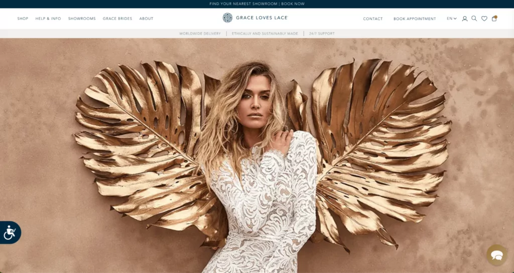
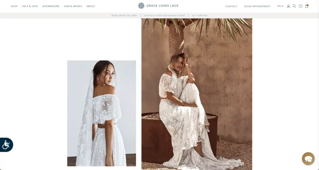
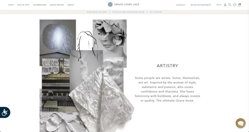
Australian-born bridal brand Grace Loves Lace aims to intrigue (while providing important product context like fit, draping, and movement) with their various lookbook landing pages.
What we like best about this ecommerce landing page:
- Big, bold imagery throughout the page serves up loads of inspiration for shoppers.
- Plenty of CTAs throughout the page give shoppers ample chances to find what they’re looking for or explore further.
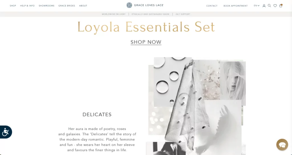
- In true lookbook fashion, the page pulls elements, textures, and vibes that align with the products and inspire an entire bridal look—going beyond what you might find on a similarly-structured collection page.
#cta-paragraph-pb#See how Grace Loves Lace grew their global presence with Shogun. Read the case study
18. ModCloth – A page for pre-loved clothing shoppers to find gems
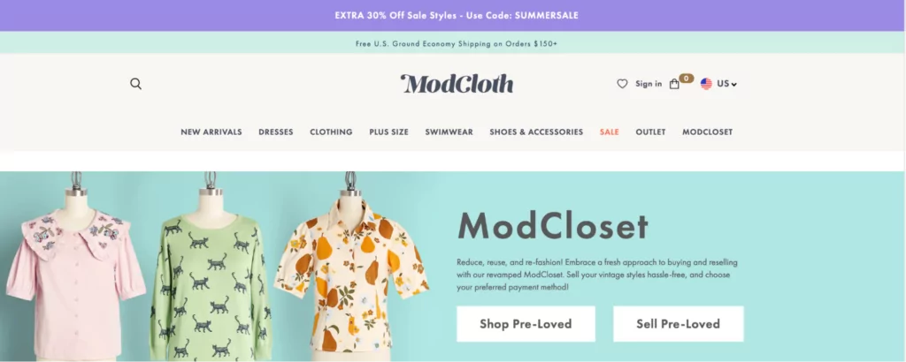
ModCloset, clothing brand ModCloth’s hub for buying and reselling pre-owned clothes, is an example of a clear, concise landing page.
The page is aligned with the rest of ModCloth’s branding, yet looks like a separate offering from their main clothing line.
What we like best about this ecommerce landing page:
- Buttons in the hero image make it easy for shoppers to shop pre-loved clothing or start selling.
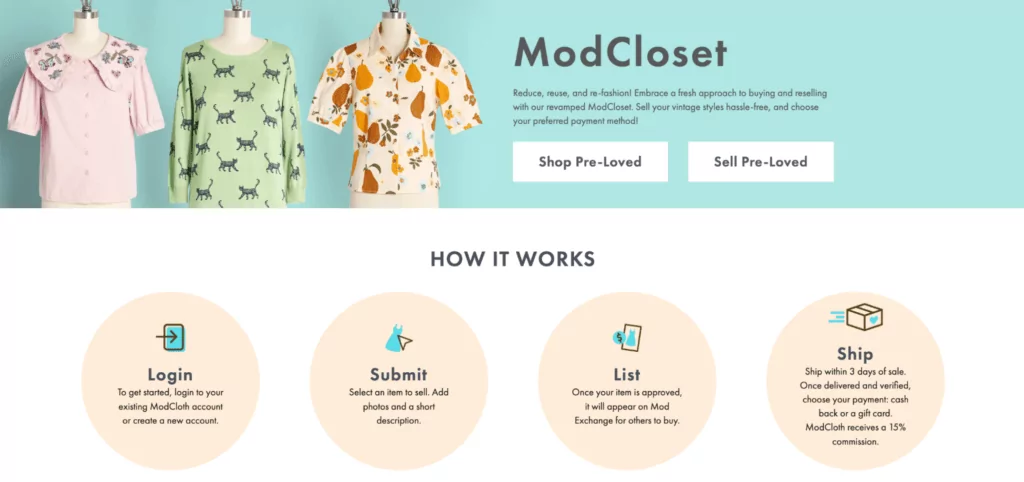
- Easy-to-follow instructions on how to get started with ModCloset.
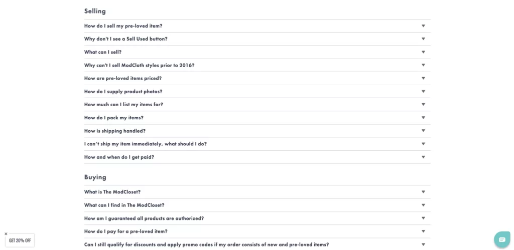
- A hefty FAQ section that answers every possible question shoppers might have about the program.
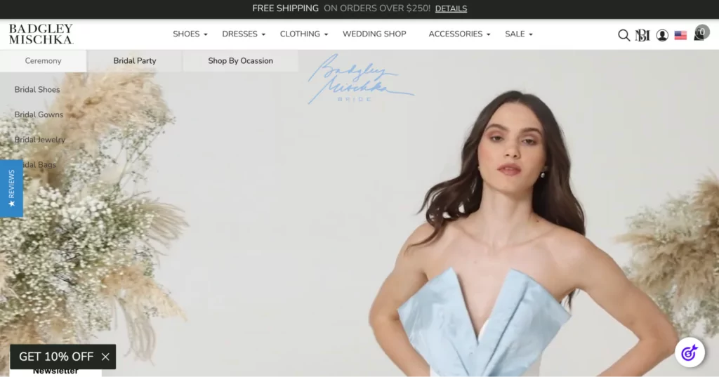
19. Badgley Mischka – A dedicated wedding shop page for all things bridal
Badgley Mischka is a world-renowned fashion brand with an ecommerce site to boot.
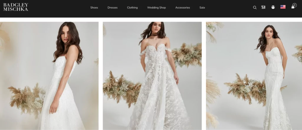
The brand’s wedding shop page (created in Shogun!) is where Badgley Mischka fans can find wedding dresses and accessories.
What we like best about this ecommerce landing page:
- The video in the hero section gives shoppers a quick preview of what to expect in the wedding shop.
- A grid of high-quality images acts like a lookbook—drawing instant attention and conveying product detail.
#cta-paragraph-pb#Learn more about Badgley Mischka’s growth with Shogun. Read the case study
20. Hoover CA – A collection page that highlights
The ONEPWR cordless vacuum system from Hoover is featured on the site using a dedicated collection page.
This is a great way to draw extra attention to the ONEPWR system and why shoppers should pay attention.
What we like best about this ecommerce landing page:
- Product reviews are baked into the page in an easy-to-read grid design.
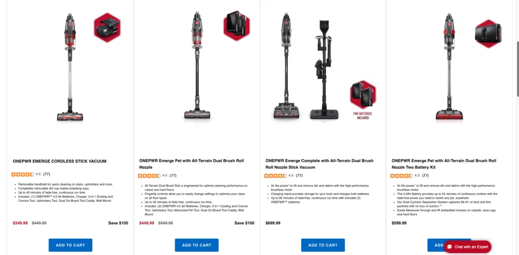
- Shoppers can see important product details up-front with a bullet-point style product description.
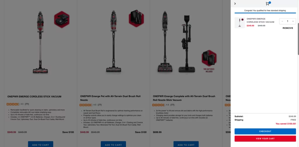
- A cart drawer shows customers what’s in their cart without interrupting their shopping experience.
21. GE Appliances – An interactive gallery page that primes for conversions
GE Appliances has a trove of SKUs on their site. As such, content hierarchy is essential for their shopping experience.
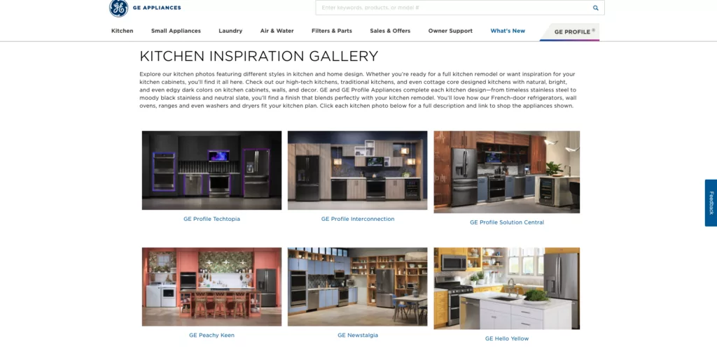
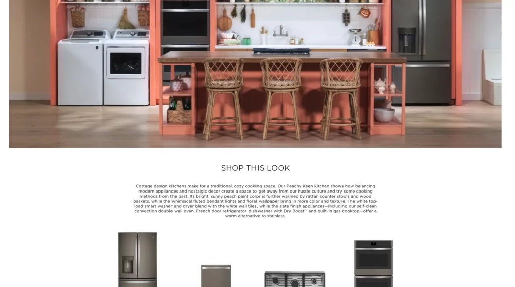
But to make things even more engaging, GE Appliances built an interactive Kitchen Inspiration Gallery with Shogun to inspire, motivate, and drive conversions.
What we like best about this ecommerce landing page:
- Featuring six totally different kitchen looks, customers can explore the appliances that match their style with ease.
- A+ content hierarchy makes it easy for shoppers to find the exact products they’re looking for once they choose a kitchen style.
#cta-paragraph-pb#Learn more about what GE Appliances builds with Shogun. Read the case study
22. No Cow – Highlighting celebrity partnerships with video and product recommendations
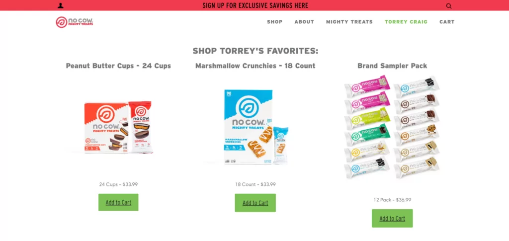
Plant-based protein brand No Cow goes all in on showcasing their partnerships to establish credibility and create buzz.
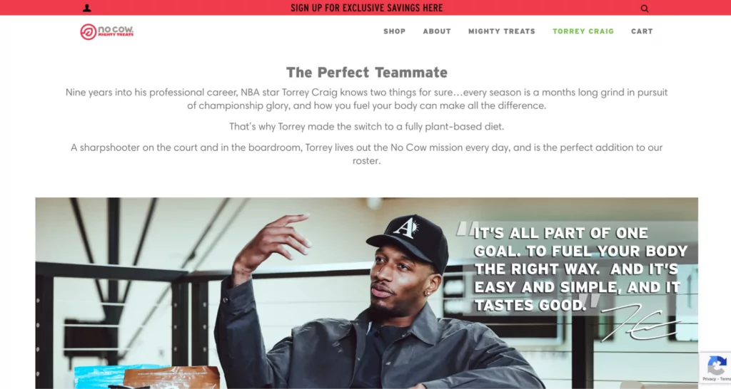
With their dedicated landing page highlighting their collaboration with NBA star Torrey Craig, No Cow weaves storytelling into their online shopping experience.
What we like best about this ecommerce landing page:
- Succinct yet engaging copy below the fold kicks off Torrey’s No Cow story and introduces curious shoppers to the partnership.
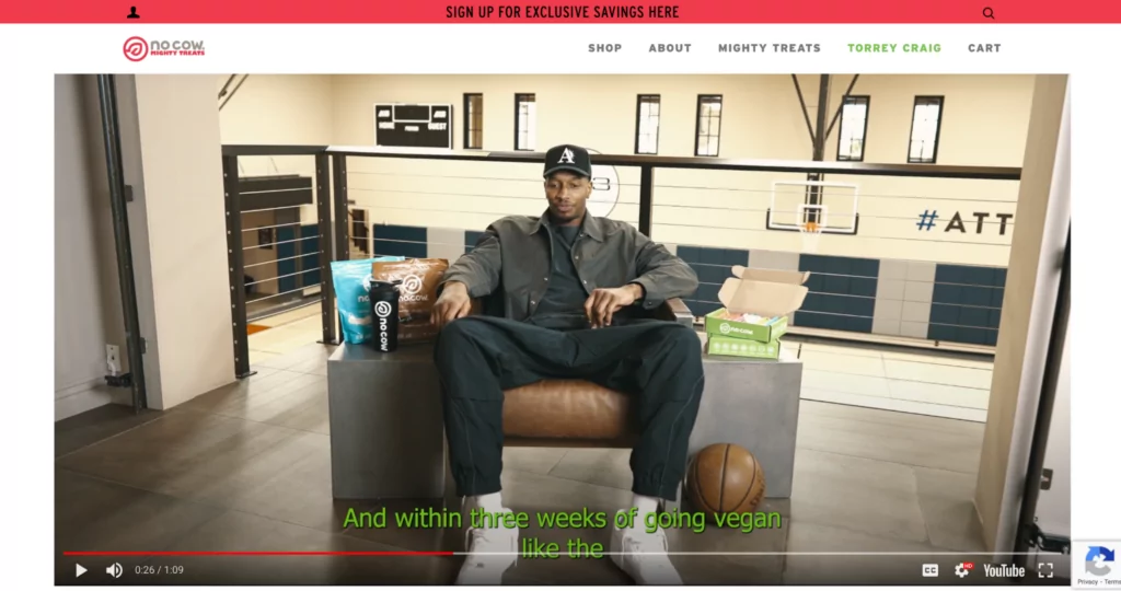
- A short branded video of Torrey explaining his vegan journey that hooks customers in.
- Customers can easily shop Torrey’s favorite No Cow products after watching the video.
23. Lyre’s – A recipe hub to inspire your next booze-free drink
Non-alcoholic spirits brand, Lyre’s, is on a mission to make booze-free cocktails more accessible to the sober-curious and sober alike via their ecommerce experience.
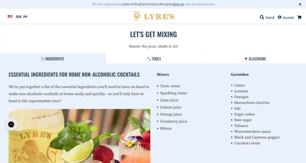
Lyre’s Mixology Hub is a place where folks can find inspiration for a spirit-free beverage no matter the season or hankering.
What we like most about this ecommerce landing page:
- Lyre’s sets customers/pro-bartenders-in-the-making up for success with a tabbed list of tools, ingredients, and glassware needed to make their next drink.
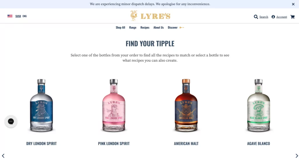
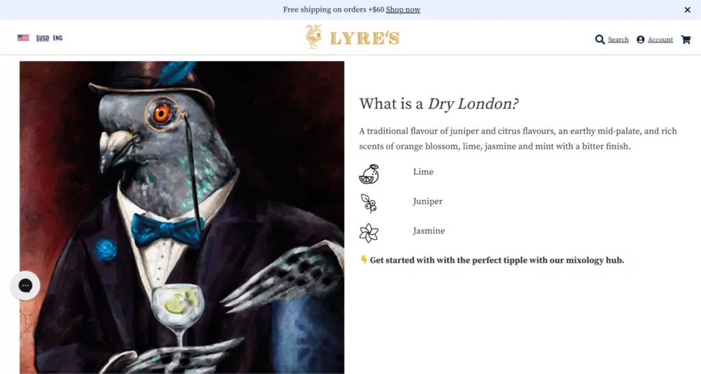
- Then, shoppers choose their drink and can see various recipes for it, serving as both an interactive and educational experience.
#cta-paragraph-pb#Learn more about Lyre’s growth with Shogun. Read the case study
#cta-visual-pb#<cta-title>Your store could look this good<cta-title>Try Shogun for free and start building out your perfect store to create a totally unique customer experience.Start building for free
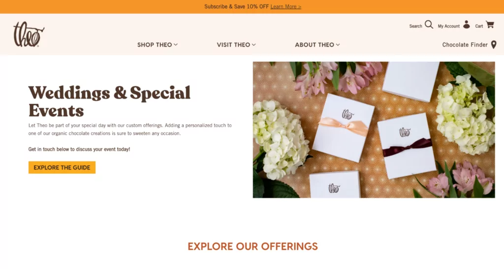
24. Theo Chocolate – Making it easy to add sweetness to any special event
Organic and Fair-Trade-certified chocolate brand, Theo Chocolate, wants to be there when you get married or attend your next special event.
Joke aside, their Wedding & Special Events landing pages helps customers add a sweet treat to their event with ease.
What we like best about this ecommerce landing page:
- A CTA to download their events guide is front and center on this page—helping customers find the info they need faster.
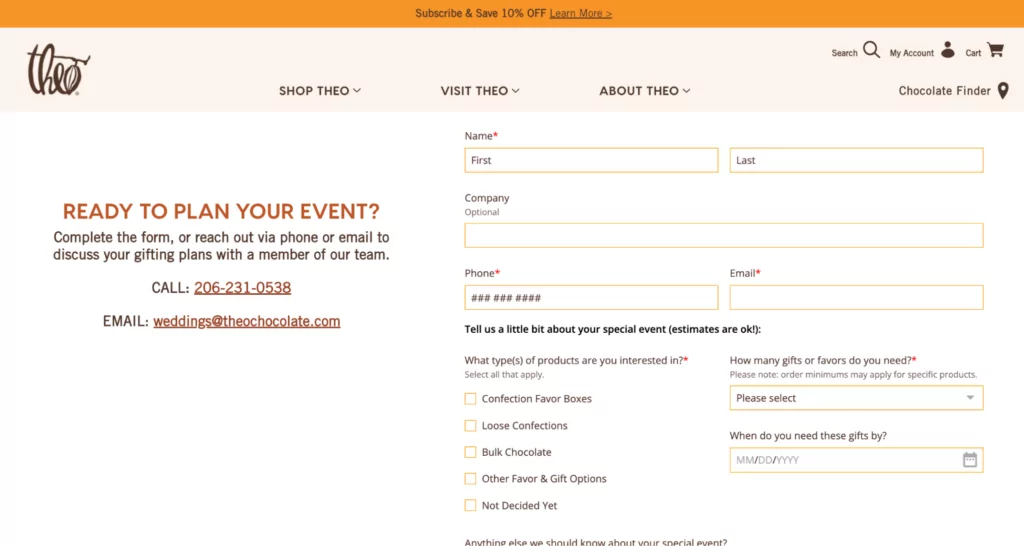
- A simple form at the bottom of the page captures enough information for the Theo team to understand the event details without it being too laborious for customers.
25. BondiBoost – A landing page designed to help customers find products faster
Australian-born haircare brand, BondiBoost, wants you to have the best hair of your life.
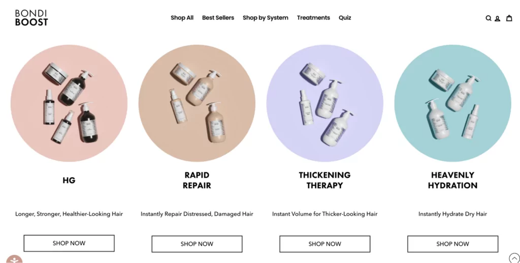
To do that, they designed a landing page that takes the guesswork out of finding the right haircare system for your unique needs.
What we like best about this ecommerce landing page:
- Text works wonders in this use case—helping customers find the products they need with simple, concise copywriting paired with quality imagery.
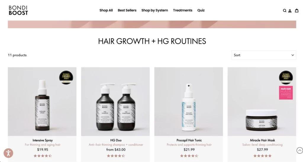
- From there, customers can shop individual hair system collection pages and find the right products for their hair goals.
#cta-paragraph-pb#Read more about BondiBoost’s growth with Shogun. Read the case study
How to build stunning ecommerce landing pages with Shogun
Building a stunning landing page like the ones above doesn’t have to be complicated! In fact, with the latest features from Shogun, it’s anything but.
Here’s a quick round-up of some of the newest features we’ve added to the Page Builder toolbox:
- AI Text: The blank page is a thing of the past. With Shogun’s AI Text, get quick copy for product descriptions, headlines, and more—all editable right within our builder.
- Customer review integrations: We recently added integrations with popular customer review software Loox and Judge.me. Now, it’s easier than ever to weave in customer praises across your ecommerce site.
- Global Snippets: For brands managing multiple stores, Global Snippets makes it easy for you to build once and reuse across each instance. This ensures consistency across all your sites. Plus, you can customize each Global Snippet for different customer markets—great for international brands.
- Product Page Templates: Bundling products into a single layout is now possible with Product Page Templates. You can control multiple product pages at once!
- AI Elements: Take custom elements to the next level by letting AI write the code for you!
#cta-visual-pb#<cta-title>What will you build in Shogun?<cta-title>Create and customize landing pages with all the vital elements for conversions.Start designing today
10 Ecommerce landing page best practices to follow
What makes a good ecommerce landing page?
As unsatisfying as it can be to hear it, the truth is that it depends. It depends on your intention behind the page and what next steps you want visitors to take.
The content, design, and conversion goal of your landing pages can differ based on your audience, industry, and campaign type.
But there are a few best practices that you should always keep in mind.
Let’s talk about best practices for creating great ecommerce landing pages. When it comes to optimizing your Shopify store pages, there’s a mix of art and science involved.
Here’s what some of the best ecommerce landing pages tend to have in common:
- A single call to action. In order to maximize conversions, each landing page should focus on one goal and include one main CTA—whether it’s sales, clickthroughs, signups, or something else that serves your campaign.
- Minimal distractions. If there’s too much happening on your page, visitors might get lost on their way to converting. Limit on-page distractions (like competing links or multiple CTAs) to keep the focus on your core offer and conversion goal.
- An immediate impact. Don’t wait for visitors to scroll before giving them a reason to stick around—or you might lose them before you can say “bounce.” Use above-the-fold real estate smartly to quickly grab visitors’ attention.
- Compelling copy. Give your visitors something to get excited about. Communicate clear value in an interesting way. What’s your product or offer and why should customers want it? What’s the unique selling point?
- Consistent messaging. Relevant, specific messaging is key to an effective ecommerce landing page. Make sure your landing page messaging matches that of the overall campaign.
- Eye-catching visuals. High-quality images, GIFs, and video content play a vital role in bringing your ecommerce landing pages to life.
- An easy-to-skim layout. When you’re browsing for ecommerce landing page ideas, you might notice that F-pattern and Z-pattern layouts are quite popular. There’s a good reason for this—these layouts follow the most common scanning patterns of website visitors. (Your favorite restaurant might use one of these layouts for their menus, too!).
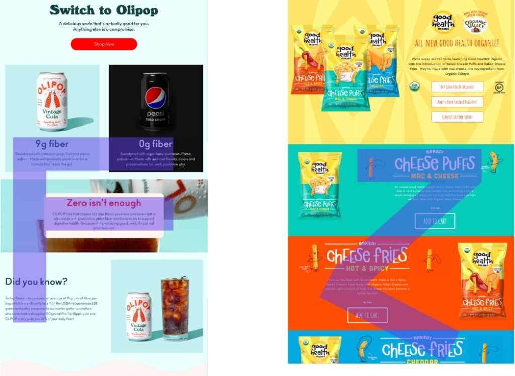
- Strategic information hierarchy. Use headings, subheadings, bullet points, page dividers, and different font sizes to make your landing pages easy for visitors to read, understand, and respond to.
- Social proof. The more credible your social proof, the better it is for your conversion rate. That means using reviews from real customers, full names, and photos when possible. Likewise, using the names and logos of well-known brands can make a powerful statement and add clout to your store.
- Battle-tested elements. To make sure you’re getting the absolute most from your ecommerce landing page, consider using A/B testing to optimize your store. With Shogun, it’s easy to swap out low-performing elements for those that bump up conversions.
#cta-visual-pb-ee#<cta-title>See 25 Gorgeous Custom Landing Pages<cta-title>Get inspired by jaw-dropping custom Shopify landing pages from incredible brands.Download the ebook
Ecommerce landing page FAQs
Let’s answer a few straggling questions on this topic.
How do I create an ecommerce landing page?
Creating an ecommerce landing page is easy once you’ve identified the goal of your campaign.
If you are trying to introduce and sell a new product, you build your messaging around that product’s features and how it will solve your customers’ pain points.
When trying to increase email signups, you describe all the benefits visitors will get from your newsletters—like exclusive offers, presale opportunities, and enriching content.
With a tool like Shogun Page Builder, your landing page can come together in a matter of minutes by dragging and dropping pre-built page elements into place and adding your content and media.
What makes a great ecommerce landing page?
A really powerful landing page needs to include a few essential elements:
1. Above-the-fold content that wows
2. Copy that gets at their pain points
3. Stunning visuals to keep them scrolling
4. Compelling CTAs that go to a single place
5. A well-designed layout for easy skimming
6. Inclusion of powerful social proof
7. A lack of distracting elements (like navigation bars)
Can you sell a product on a landing page?
Yes! Ecommerce landing pages are often built to sell products. These product landing pages help educate and persuade potential customers before pushing them to the product page.
We’ve got really great examples of product landing pages that use the format extremely well.
What is a product landing page?
A product landing page is merely a landing page whose goal is to sell a product.
While this sounds like a product page, these landing pages aren’t built to encourage immediate clicks of the buy button but to instead educate a targeted audience on why this product is right for them.
This type of ecommerce landing page can spend more time exploring potential objections, battling common pain points, and defining key features of a product.
How do I create a landing page for ecommerce?
There are several steps to creating a high-converting landing page. Some of the most important are:
1. Define the page goals: Do you want to sell a product? Promote your latest sale? Create buzz around a collab with another brand? Before you start designing, you need to determine what you want customers to do once their on the page. This will inform the design, content, CTAs, and more.
2. Determine your CTAs: You’ve got your page goals sorted, now you need to figure out what CTAs (and how many you want to place on the page).
3. Highlight the key benefits for customers: Make sure you communicate—using a combination of images, copy, and layout—why shoppers should care about what you’re selling.
4. Include social proof: Adding real customer testimonials is a great way to drive home the value of what you’re selling or offering and build trust. If you use a landing page like Shogun Page Builder, you can easily drop in social proof elements like product reviews and social media to build this right into the page experience.
What is the best Shopify landing page builder?
We’re biased, but we think Shogun Page Builder is the best Shopify landing page builder 😉
Our visual page builder is equipped with tons of tools and resources to help you bring your ecommerce store vision to life—like content syncing, AI text generation, and more.
The page builder you decide on should empower your team to not just work smarter and faster, but to build the store you actually imagined.
For the latest feature releases on Page Builder, stay up-to-date with our changelog.
What shouldn’t you do on a landing page?
While there are plenty of things you shouldn’t include on a landing page, here are some of the most important:
Don’t clutter your page design
The quickest way to get shoppers to move on from your site (without purchasing) is a confusing site design that isn’t clear on what you want them to do.
Keep it simple. Make sure your CTAs are clear and pop-out on the page. Include high-quality visuals that guide and communicate detail and your value proposition.
When in doubt: more is less.
For inspiration on how to design your next page, check out our Ecommerce Website Templates Library.
Don’t include blocks of text
A landing page that’s difficult for any customer to read or navigate is likely going to send them on their way. Similar to page design, try to be as succinct as possible without losing any meaning.
Don’t make shoppers wait for your site to load
As you make updates to your site, be sure to be checking your site speed, too. Adding large images and dynamic elements can slow down a site quickly, which can lead to an increase in your bounce rate.
Use tools like ImageOptim to compress images before uploading them to your site. Google Lighthouse can help you understand how your site performance fluctuates as you make changes to it, so you can ensure shoppers always get a speedy experience.
What are the elements of a high-converting ecommerce landing page?
Landing pages come in all shapes and sizes and serve various purposes. But every successful landing page has these foundational elements in common:
– It focuses on a single purpose (e.g., promote a sale, debut a new partnership or product, etc.)
– It has a clear call to action (customers know what to do once they land on the page)
– It’s consistent and on-brand (your tone and voice read loud and clear from top to bottom of the page)
– It’s interactive (shoppers want to stay on the page and learn more)
For more elements on high-converting ecommerce landing pages, check out 22 Landing Page Best Practices That’ll Drive Your Conversions Way Up
How will you use ecommerce landing pages in your store?
Ecommerce landing pages can play a key role in the success of your store—as long as they’re customized for your brand, goals, and audience.
Wondering how to create an ecommerce landing page of your own?
With Shogun, you can build ecommerce landing pages for your store without a developer or designer.
Need more inspiration for your next landing page?
Get loads of ecommerce landing page ideas to inspire your own from our Shopify store showcase. Then, use our visual editor to bring your vision to life.
#cta-visual-pb#<cta-title>Create better landing pages today<cta-title>Create and customize landing pages with all the vital elements for conversions—quickly and code-free.Start designing free today

Emily Bauer
Emily is a content marketer from Toronto. She helps tech companies and startups develop awesome content for their blogs, websites, and social media. When she’s not writing or thinking about writing, Emily can be found chilling on her yoga mat, loitering in bookstores, or exploring the city with her super cute (and super spoiled) corgi, Wilbert.

