How to Use Color Psychology In Marketing Design To Drive Conversions
As an ecommerce manager, you are up to your eyeballs in things that demand your attention. And when it comes to your online store, there’s so much to think about—the design, user experience, product selection and how you feature products, and, of course, your digital marketing strategy.
There’s one often overlooked component of successful ecommerce brands that can make or break a brand: Color psychology.
Color psychology is the study of how color impacts human emotions and behaviors—things that are mission-critical to a profitable ecommerce business.
Choosing the right colors for your brand isn’t always easy, which is where color psychology marketing comes into play.
Today, you’ll learn:
- Color theory basics
- What color psychology is
- The psychology of each color
- How to find the right colors for your brand
- Tips for using color psychology in your site design
But before we jump into how your ecommerce brand can leverage color psychology in your marketing, buckle in for a super quick color lesson.
#cta-visual-pb#<cta-title>Build an ecommerce site that shows off your brand colors<cta-title>Add and save your brand colors within Shogun Page Builder for quick page customization.Start building for free
Color theory 101 🎨
Primary colors
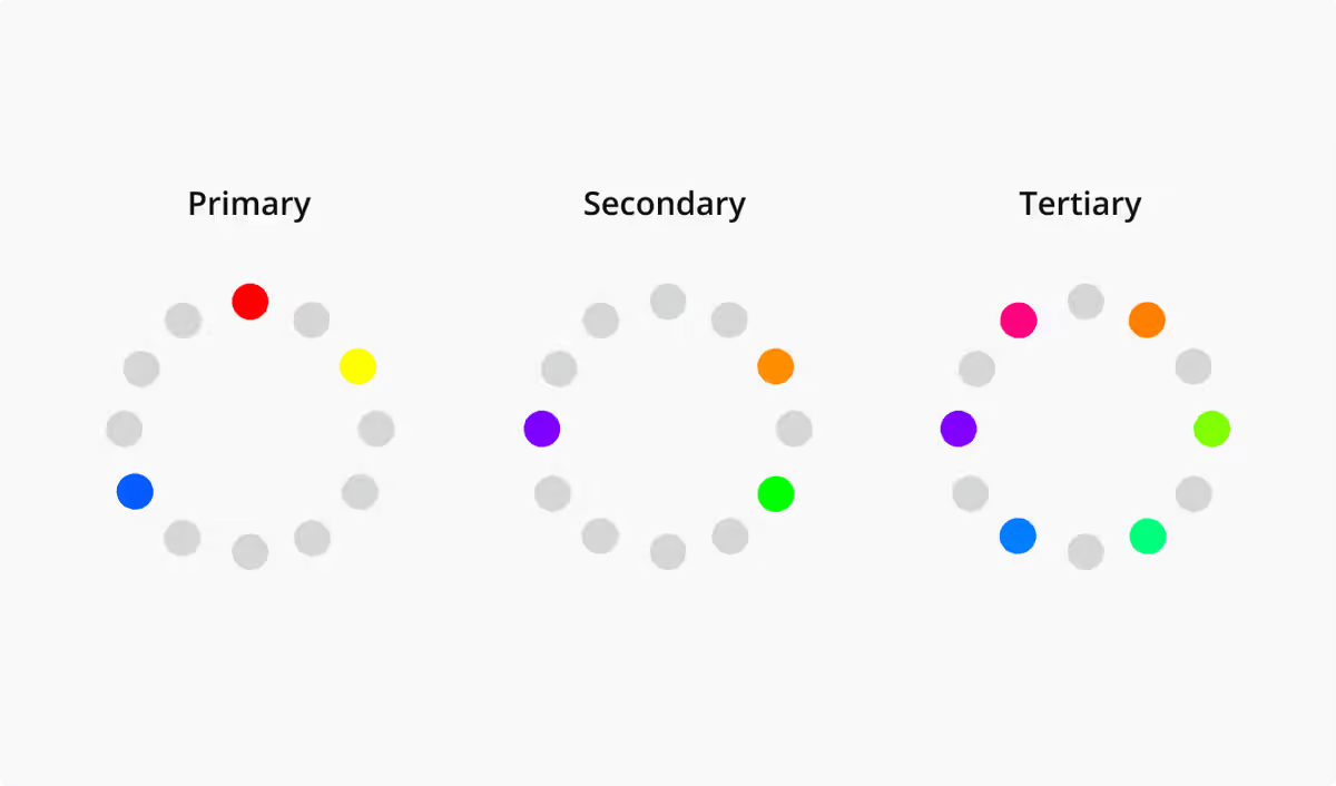
Primary colors are colors you cannot create by mixing two or more colors. Think of them as the “default” colors of our universe or the ones that trace back to any color imaginable.
There are three primary colors: red, yellow, and blue.
Secondary colors
Secondary colors are created by mixing two primary colors.
- Red + Yellow = Orange
- Yellow + Blue = Green
- Blue + Red = Green
These colors can only be achieved when mixing the purest hue of each primary color. More on hues in a bit!
Tertiary colors
Finally, we have tertiary colors. These colors are created when you mix a primary color with—you guessed it—a secondary color.
This is where things get a little spicy. Not every primary color complements every secondary color.
For example, if you were to mix red and green, you’d get a brownish color, which may or may not be what you’re after for your brand color palette.
Tertiary colors are made when a primary color is mixed with a secondary color next to it on the color wheel:
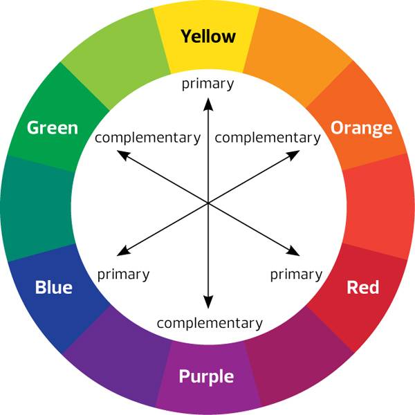
With the color wheel, you can see how colors relate to each other, which can help you choose your color palette. Some versions of the color wheel include more in-depth color variations involving hue, tint, tone, and shade.
So, looking at the color wheel, you can mix blue and purple to get blue-purple (violet) or yellow and green to get yellow-green (chartreuse).
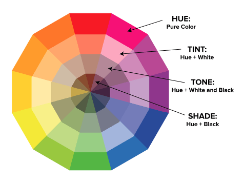
We’ve got our base colors down, now let’s get into the nuances (if you will) of color.
Hue
Hues are a color in its purest form; they are colors with the least amount of other colors in them.
For example, if you mix the hues of yellow and blue (primary colors) together, you’ll get the hue of green (secondary color).
But, if you mixed yellow and blue that carry other tints, tones, and shades (or not the true hues of yellow and blue), you’re adding more than just two colors together.
Tint
A color tint combines a hue with white (the presence of all color).
If you combine red and white, you’d get the tint of red—commonly referred to as pink.
Shade
A color shade combines a hue with black (the absence of all color).
For a darker shade, you’d add more black to a hue, and vice versa to get a lighter shade.
Tone
A color’s tone (also called saturation) is when you add both black and white to a hue. These colors result in a grey-ish version of the original hue.
For example, mixing green with black and white gives you a grey-green color.
What is color psychology?
Now that you’ve got color basics down, let’s get into color psychology and why it’s so impactful.
To put it simply: Color psychology is the study of how colors influence perception and behavior.
Colors—whether we realize it or not—have a profound effect on our actions. For example, one study found that color can increase or decrease or appetite, change our mood, reduce perception of waiting time, and more.
Warm and cool colors have different effects on people.
Colors with long wavelengths, are considered “arousing or warm” (hence the name “warm colors”), while colors with shorter wavelengths are considered “relaxing and cool” (inspiring the name “cool colors”).
Pretty wild! 🤯
So how does this impact ecommerce marketing and your brand?
In an ecommerce setting, color psychology marketing focuses on how color impacts a customer’s perception of a brand, and how that perception affects their willingness to purchase.
Color is a huge part of a brand’s look and feel, and ultimately plays a major role in how that brand is received.
The role of color across cultures
Color has been linked to different components of the human experience for centuries.
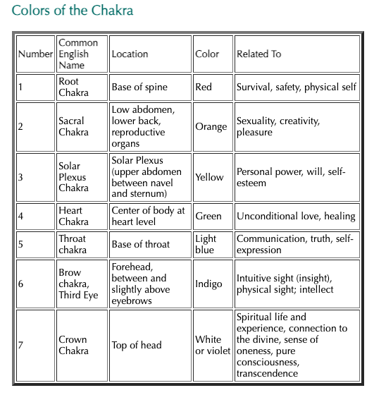
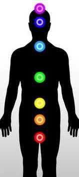
Like the seven chakras derrived from ancient Indian scriptures called the Vedas, for example.
Each chakra—or portal to human energy—is linked to a color, which is tied to a specific meaning:
However, colors tend to carry different meanings in different cultures:
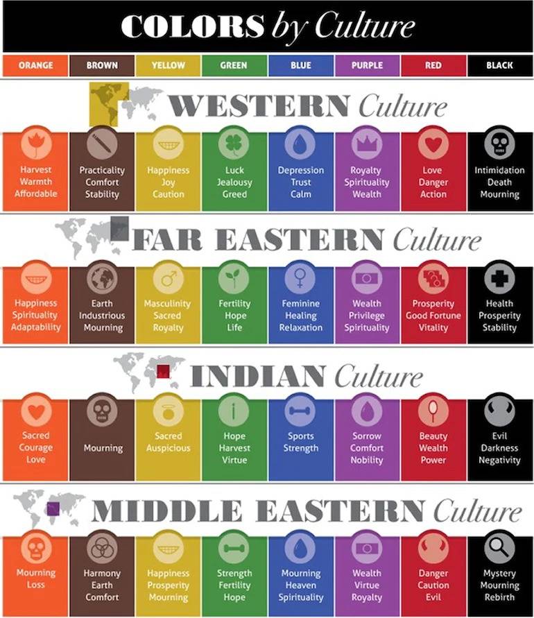
Brown signals practicality and stability in Western cultures but mourning in Indian culture—quite the juxtaposition!
It’s important to know how color is perceived in different cultures when determining which colors are best for your brand.
Color influences our behavior, ideas, emotions, and understanding of, well, everything. Color also provides context, educates us, and helps us decide the importance of things.
The psychology of color in ecommerce marketing
In some cases, color can be life-saving. Like different color flags to signal tide conditions to keep beachgoers safe.

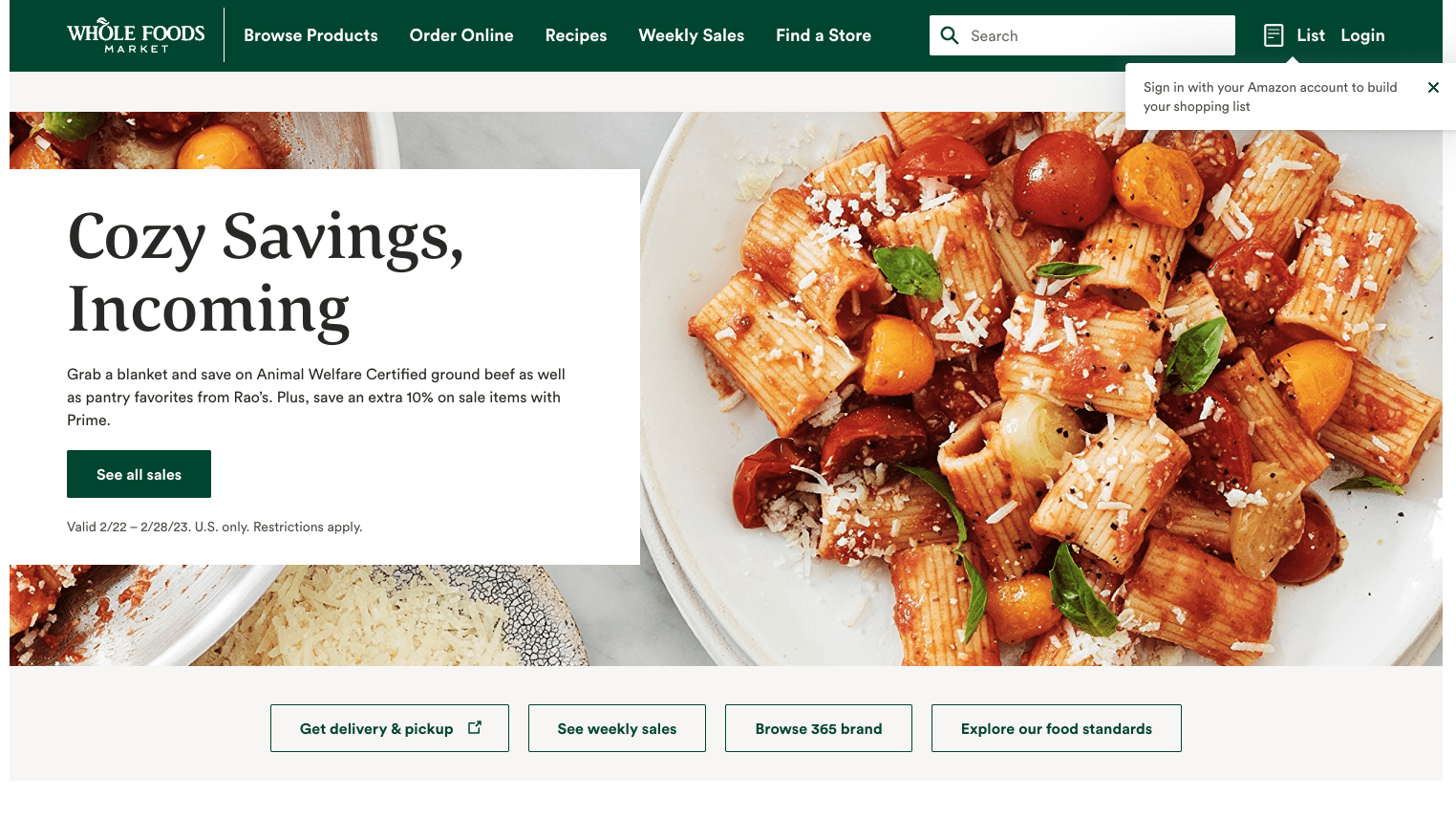
But in a business context, it’s interesting to see the color choices by some of the biggest companies in the world to evoke or tie themselves to certain emotions—like Whole Foods with green, and Lowe’s with blue.
Businesses use color psychology to craft their brand’s identity and influence customer perceptions.
The chart below highlights several popular brands and the color psychology associated with them:
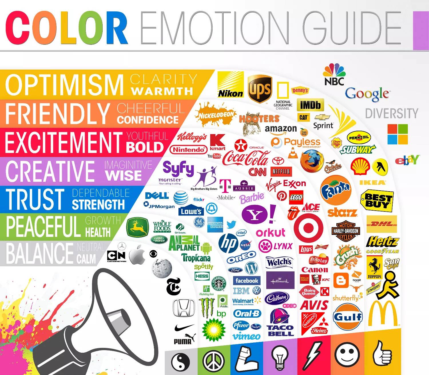
However, even with helpful charts like these, it’s clear that color psychology isn’t an exact science. It’s largely fluid; colors signify different things to different people and their experiences—both shared and independent.
So what does this mean for your brand?
You can be strategic about which colors you choose to represent your brand, evoke your values, and touch on different emotions in your customers.
That said, let’s look at the psychological significance behind each color.
The psychology of the color red
Stop signs. Romance. Warning.
The color red holds several meanings that vary depending on the context. But one thing is for certain, it’s a powerful color.
One study found that the color red is linked to attracting emotional attention—both in a negative (e.g., blood, fire, danger) and positive light (e.g., food, relationships).
In other words, red can be used by a variety of brands.
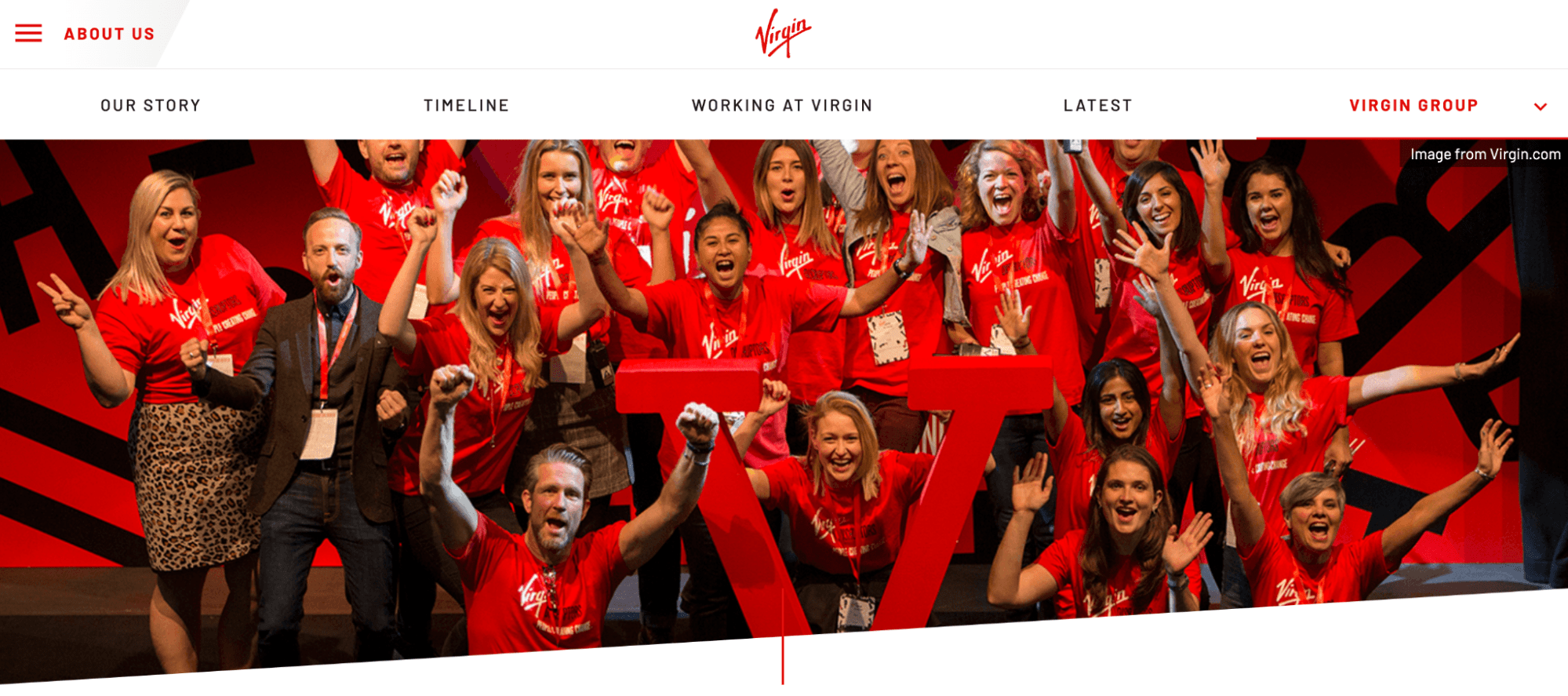
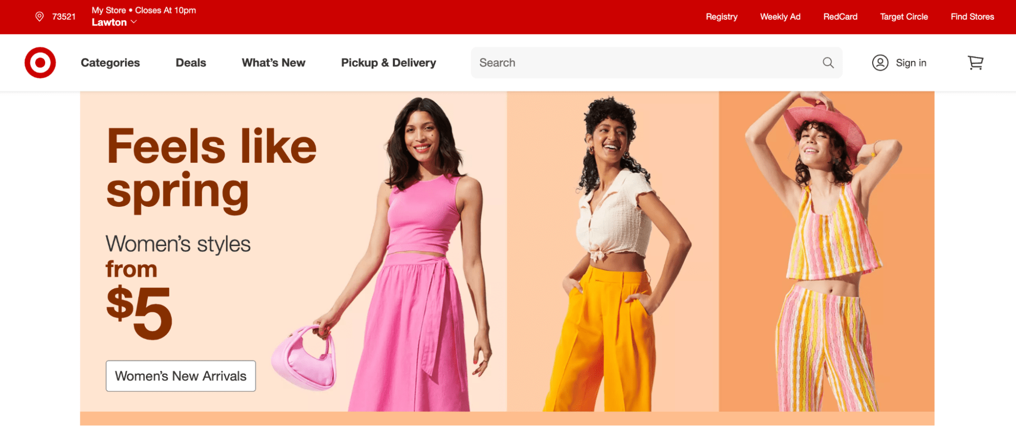
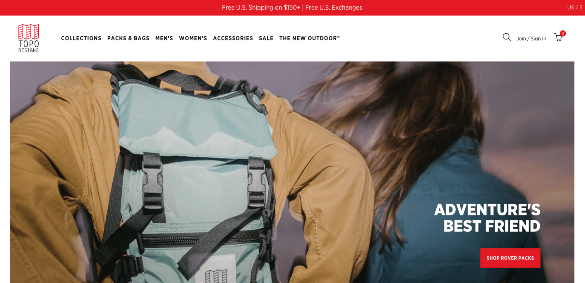
That’s likely why Target, Virgin, and Topo Designs chose red—it evokes excitement, boldness, and passion.
The psychology of the color orange
Love it or hate it, orange is a very stimulating color. It’s often regarded as a friendly color—blending red’s boldness and yellow’s fun.
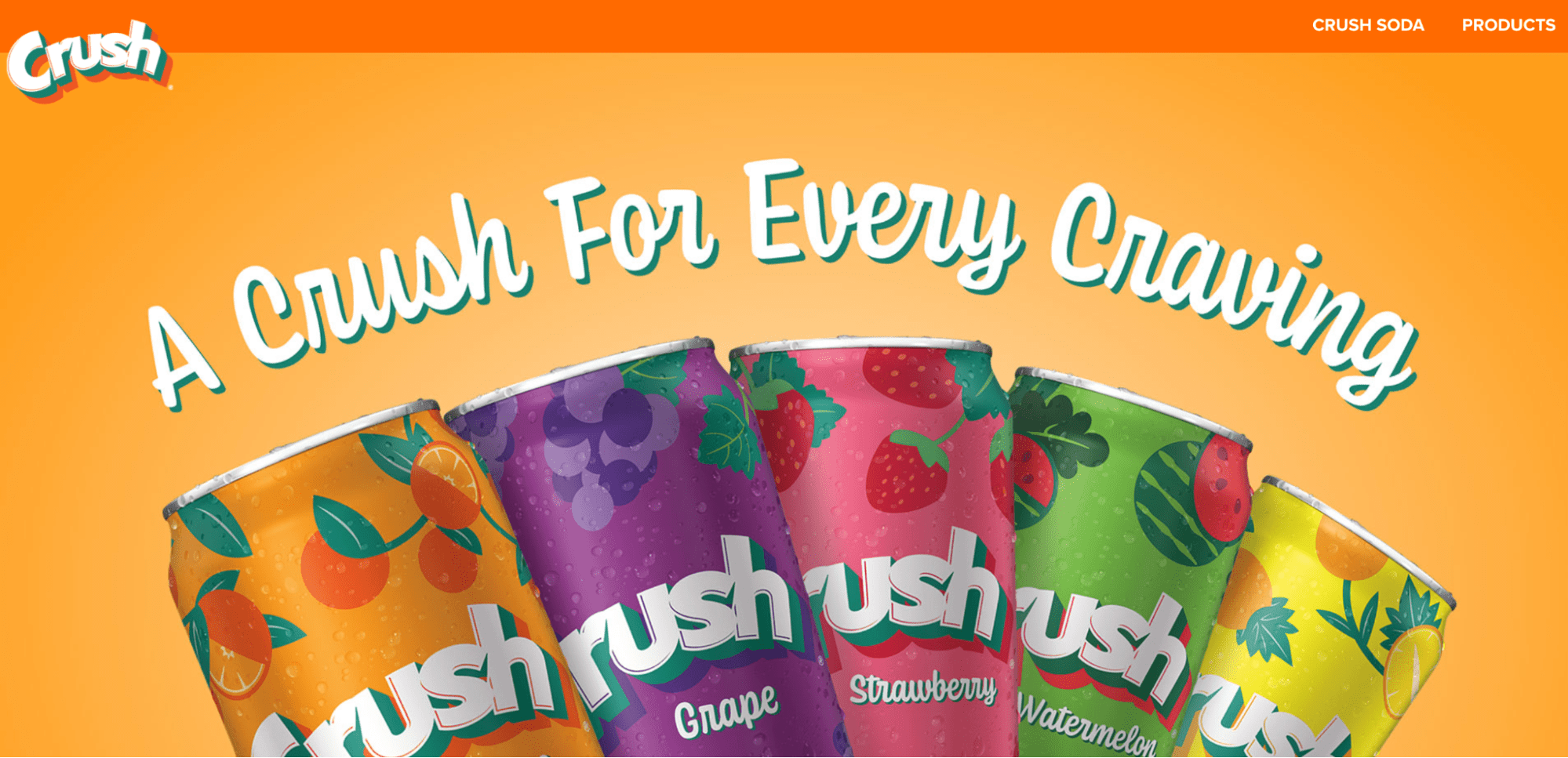
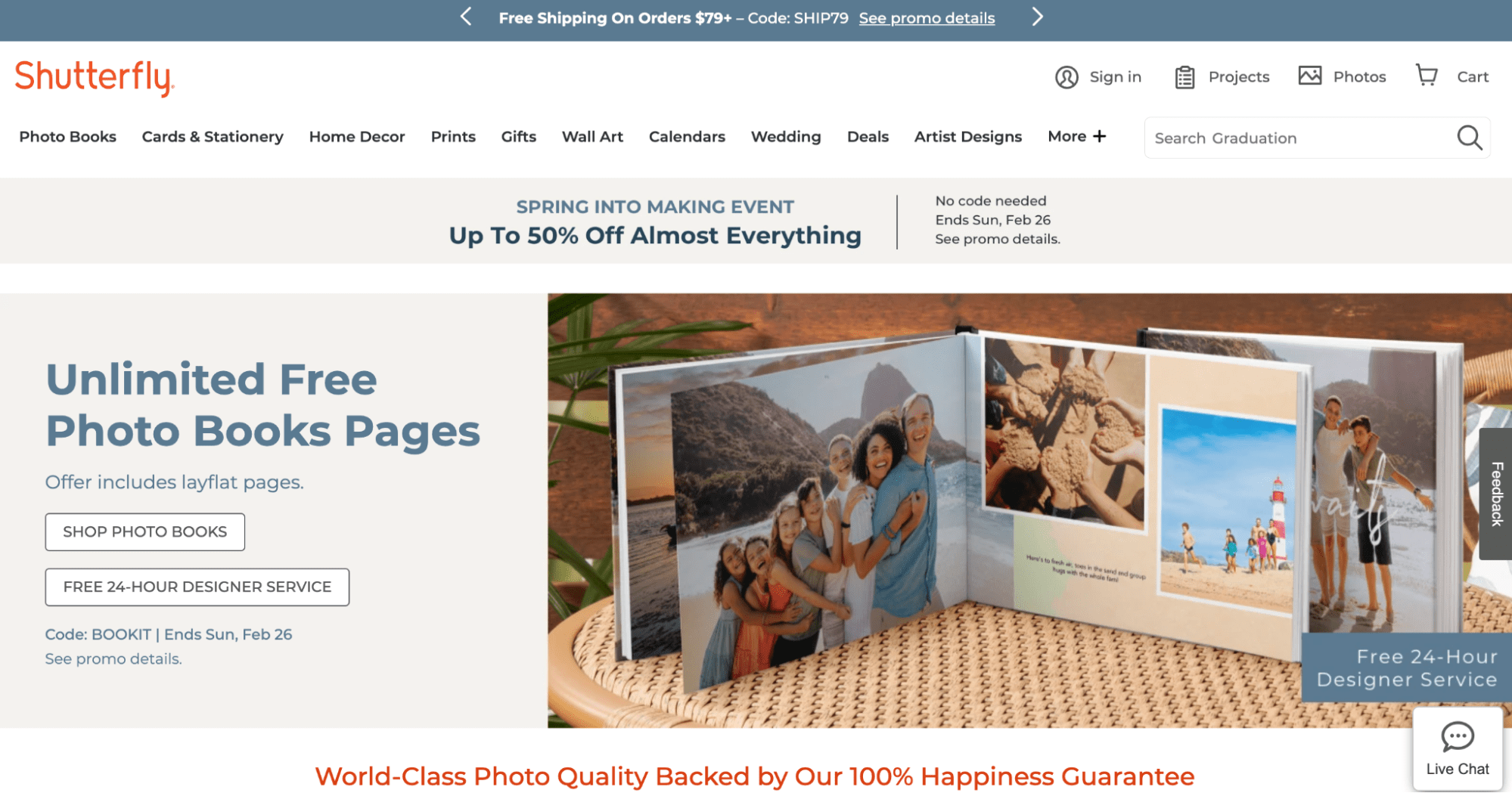
Orange can be motivating (hello, OrangeTheory Fitness), yet it can be found among brands that trend on the playful or adventurous side, like Nickelodeon, Crush Soda, and several sports teams.
#cta-visual-pb#<cta-title>Boost your conversions with a stunning storefront in your brand colors<cta-title>Make your store look and feel as unique as your brand by customizing with the best page builder for Shopify.Start building for free
The psychology of the color yellow
Sunshine, bananas, and the McDonald’s arches. All yellow.
Yellow is associated with positivity, adventure, happiness, and food that tastes good.
A study found that yellow holds the strongest psychological connection to playfulness, happiness, and humor.
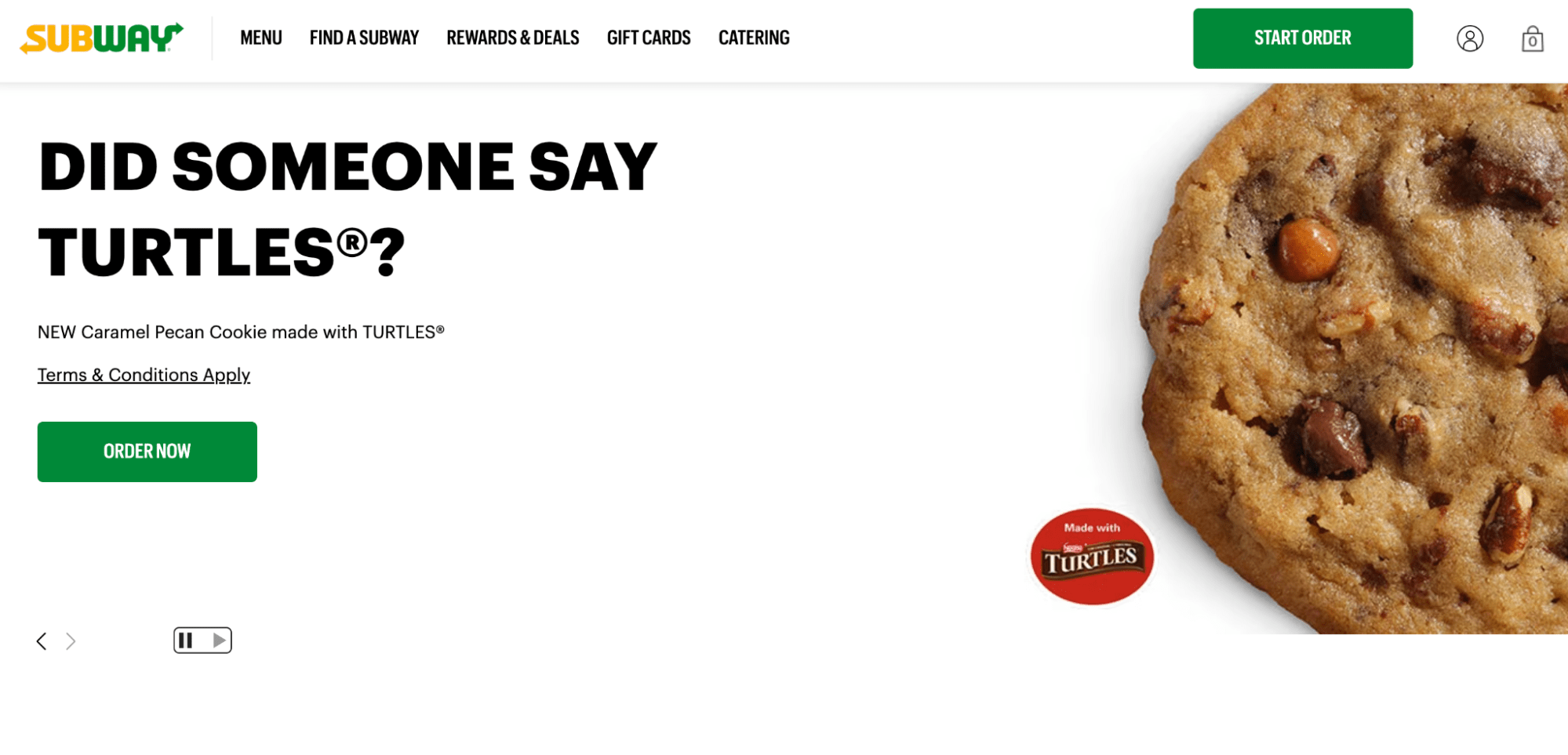
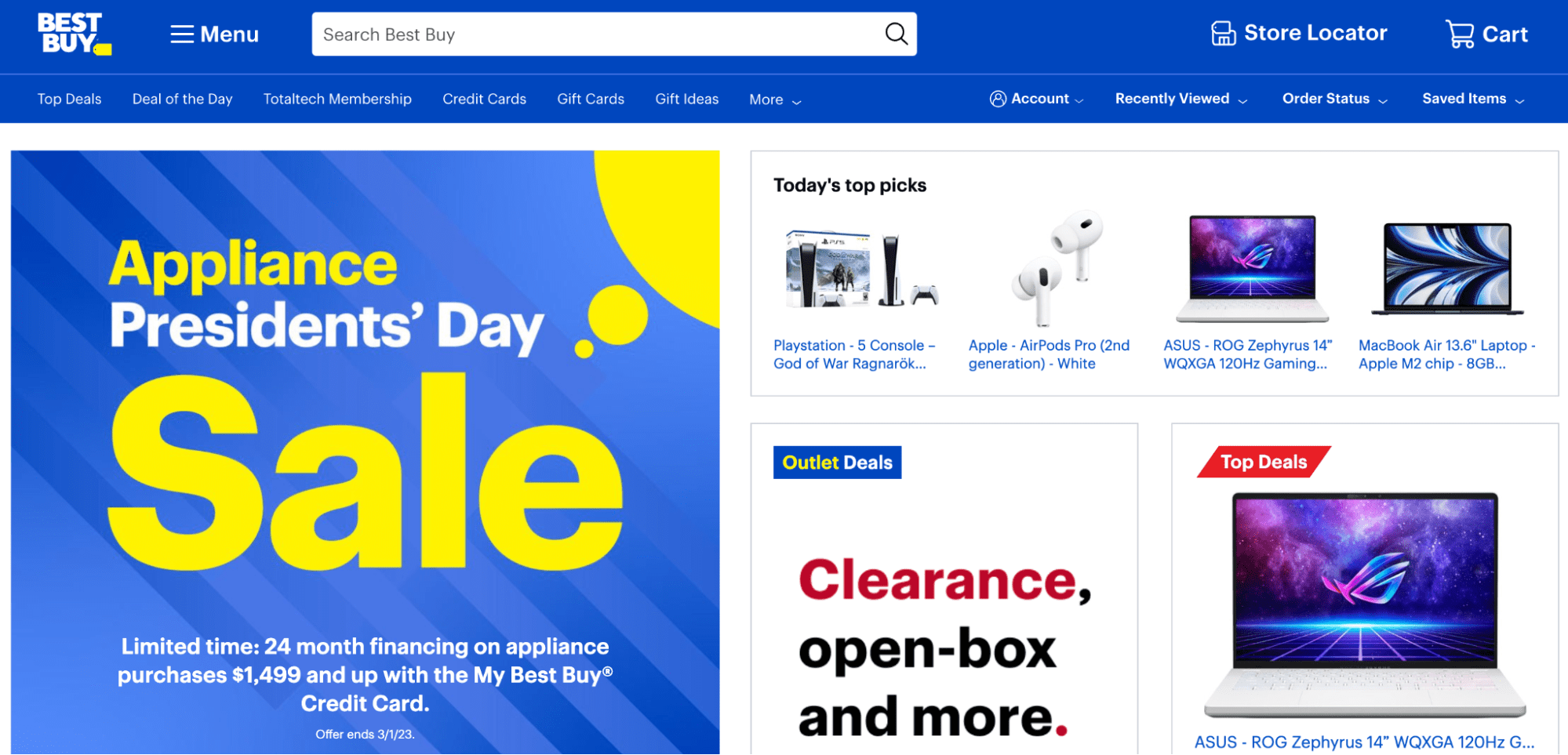
A few popular brands that use yellow in their branding are National Geographic, Subway, and Best Buy.

The psychology of the color green
The color green is often associated with health, wellness, growth, and safety. It’s also frequently found in nature, of course.
Studies show that the color green is relaxing, which is why green pops up so much in public spaces.
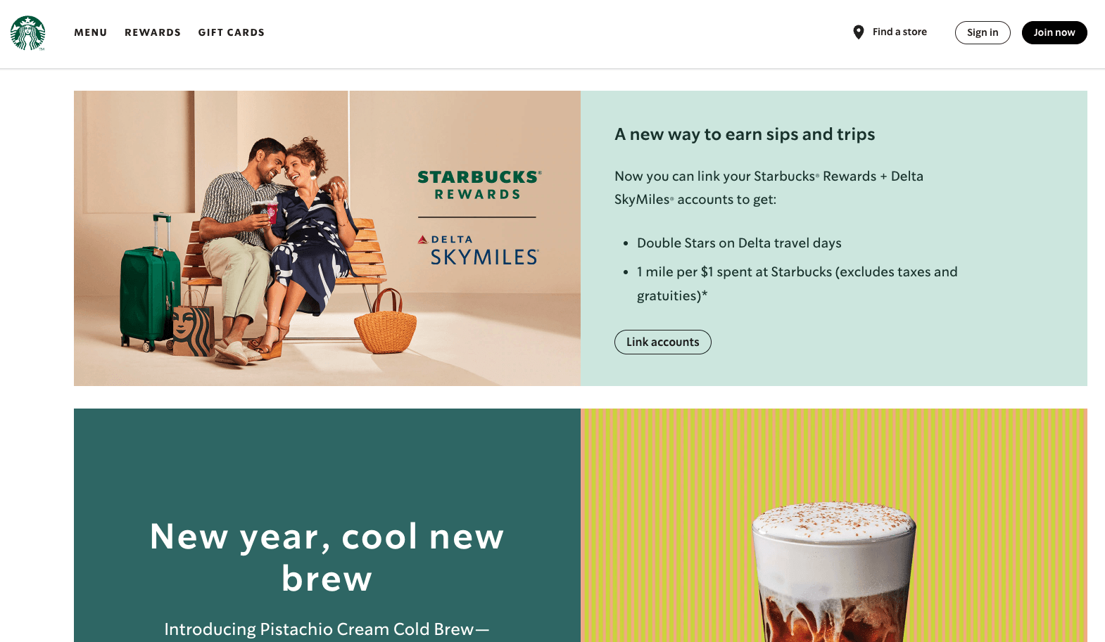
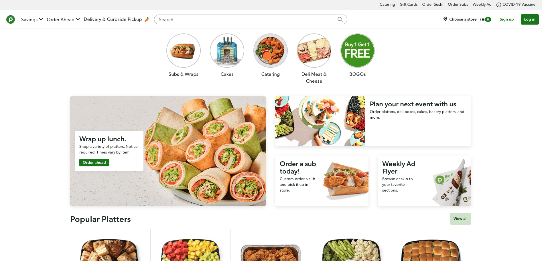
Brands like Whole Foods, Starbucks, and grocery store chain Publix use green in their branding to inspire emotions tied to these values.
The psychology of the color blue
Blue is the most popular “favorite” color, and for good reason. Like green, blue is a cool color often associated with relaxation, trust, dependability, and life.
And because it’s such a popular color, it’s mostly viewed as non-threatening and evokes feelings of calmness, security, and peace.
However, blue is also associated with sadness and depression—as per the expression “feeling blue.”
Blue is used by brands like Lowe’s and Ford to suggest dependability and trust. It’s also used by Nuun to speak to the brand’s product—a hydration supplement.

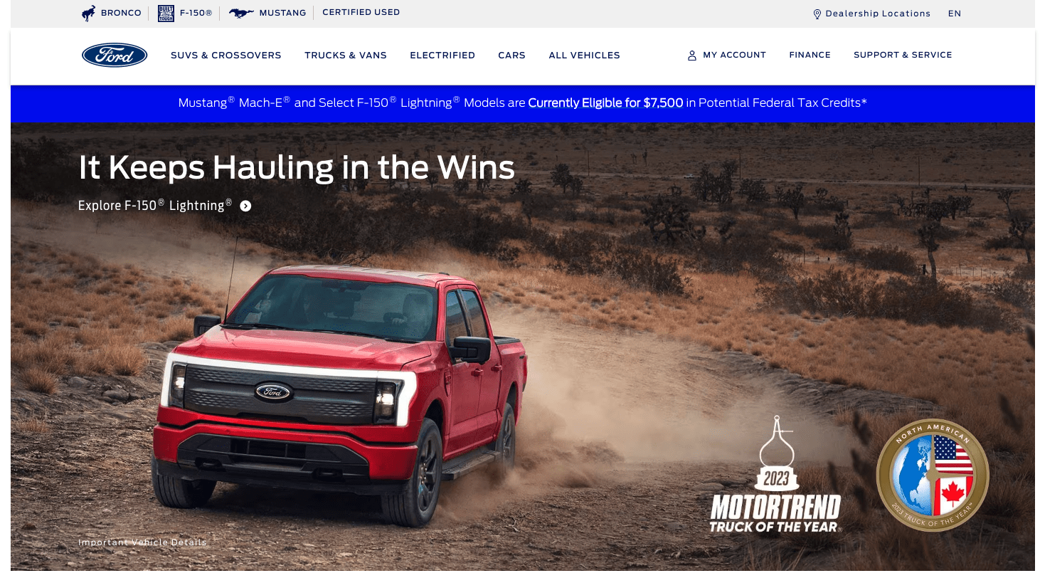
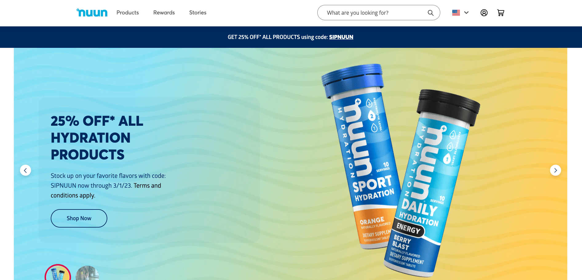
Blue is popular in branding because of its versatility and ability to elicit different emotions or perceptions in customers.
The psychology of the color purple
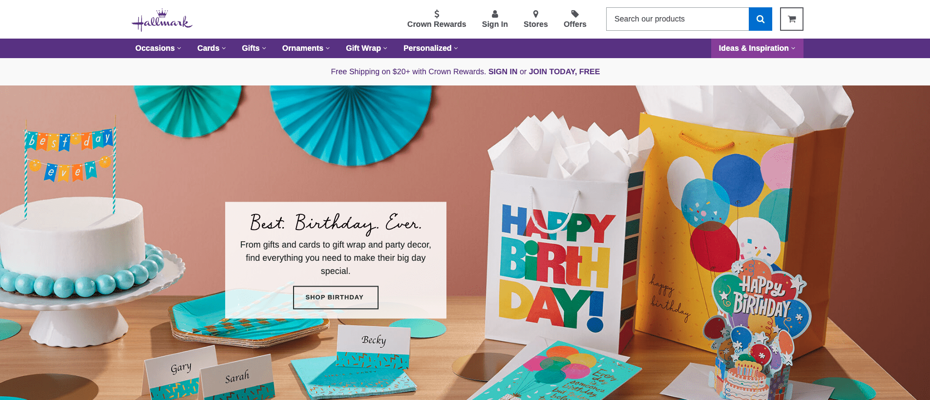
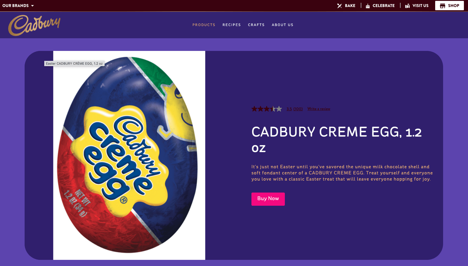
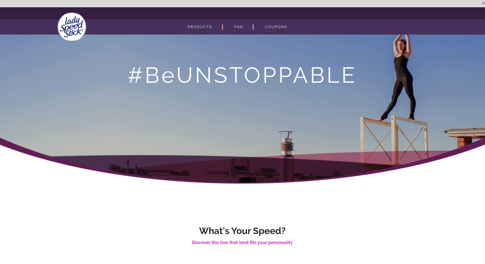
Purple is a unique color that suggests creativity, imagination, wisdom, wealth, and magic.
The power of red blended with the calmness and trust of blue make purple an interesting color dynamic.
Purple is strongly associated royalty throughout history. Purple dye was typically reserved for royalty—like Persian King Cyrus in 1200 B.C.E—and was extremely expensive.
In the United States, the color purple represents bravery, heart, and courage as seen in the Purple Heart honor in the military.
Brands using purple in their branding include Hallmark, Cadbury, and Lady Speed Stick.
#cta-visual-pb#<cta-title>Customize your ecommerce site with your brand’s color palette<cta-title>With Shogun Page Builder, you can customize every must-have page for your store, super simply.Start building for free
The psychology of the color pink
Pink is technically a tint of red, and therefore holds a lot of the same connotations like power and romance.
But it’s a softer version—inspiring emotions tied to care, understanding, hope, and nourishment.
Pink is seen in a lot of women-focused brands—like Barbie, Playtex, and Billie. It’s also the main color for the breast cancer Susan G. Komen Fondation.
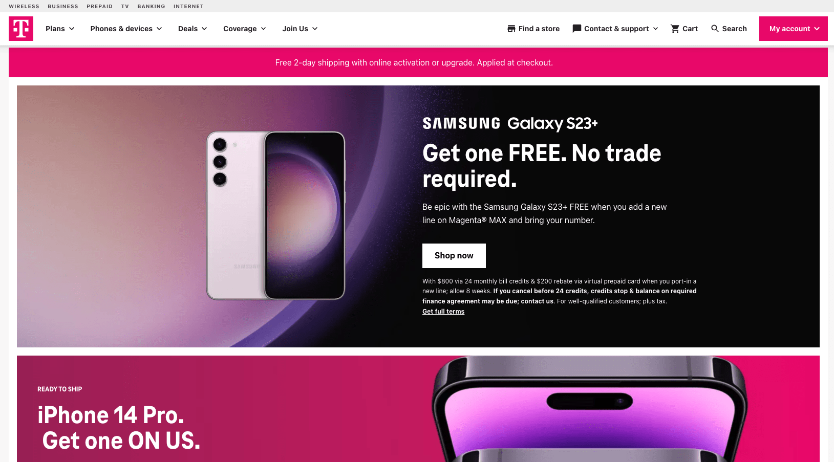
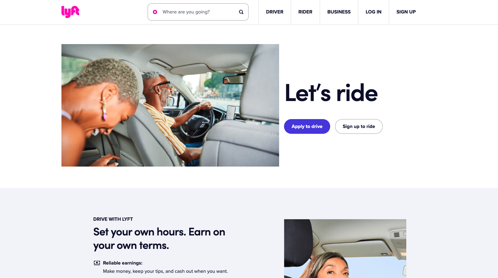
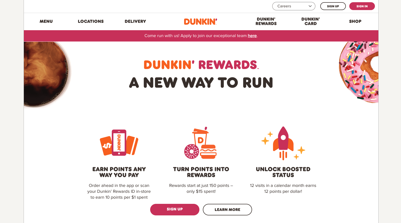
But it’s also seen in a variety of other brands as well, like T-Mobile, Lyft, and Dunkin’, to draw attention and convey an approachable demeanor.
The psychology of the color brown
While brown may not be the most exciting color—compared to pink and yellow—it exudes protection, reliability, and structure, which are important qualities in a brand.
Brown is a stable, grounding color and is often used by furniture brands, coffee shops, campgrounds and national parks, and universities.
It’s a color that conveys quiet confidence, elegance, and dependability.
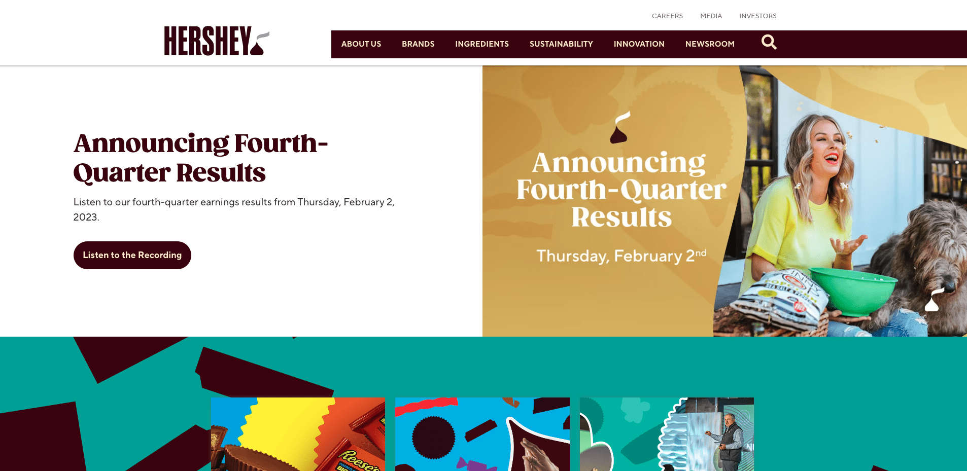
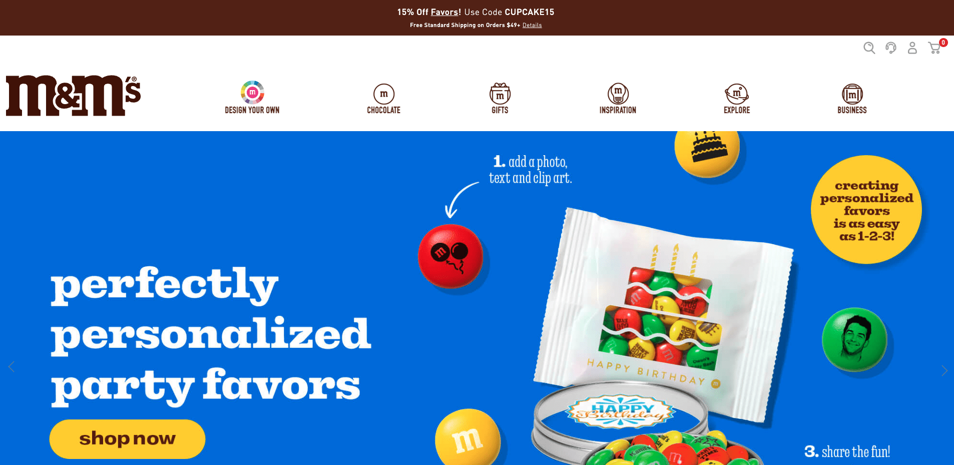
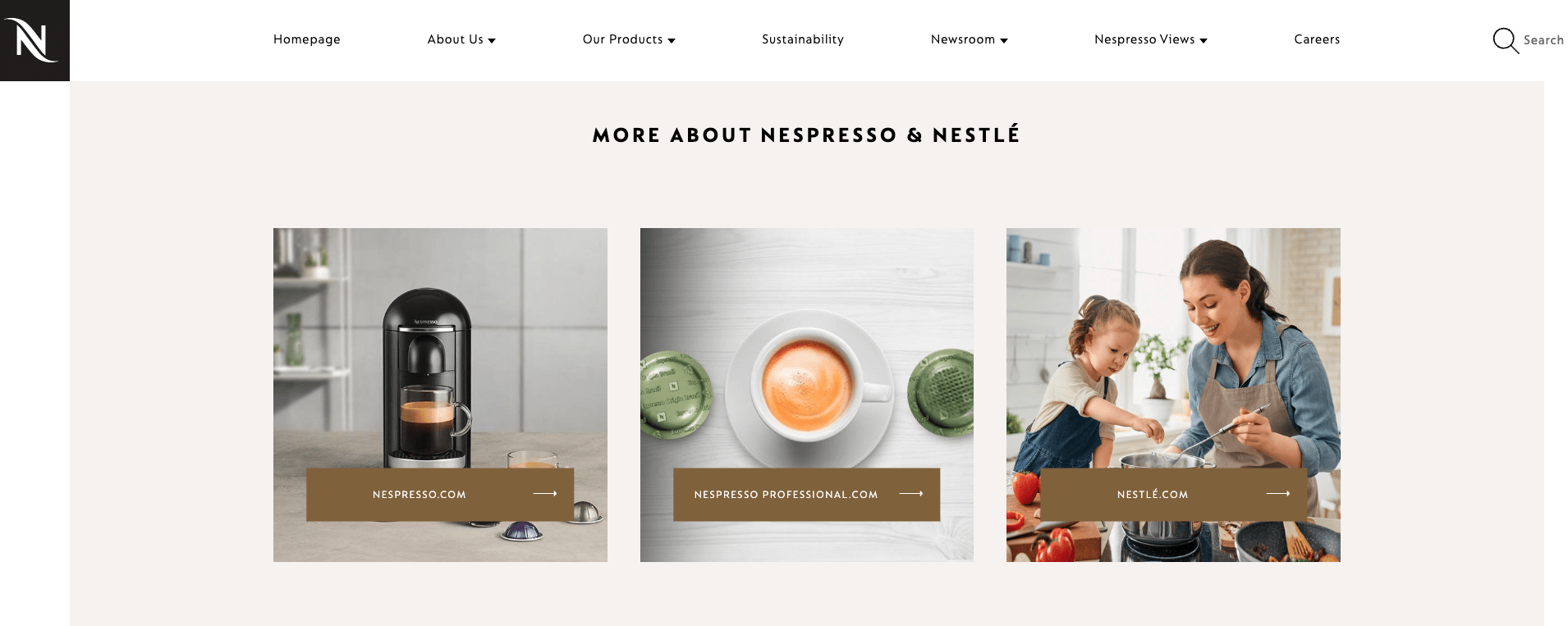
In fact, brown is used more often in branding than you may think. A few brands that leverage the underestimated power of brown include UPS, Hershey’s, M&M’s, and Nespresso.

The psychology of the color gold
Gold is usually tied to symbols of wealth, treasure, sophistication, and prosperity. This makes sense as the color gold is inspired by the rare metal gold.
However, using too much gold in your ecommerce branding can appear tacky and conceited.
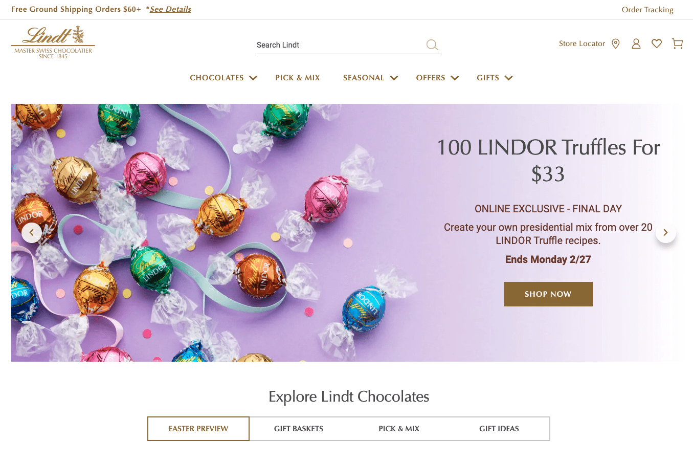
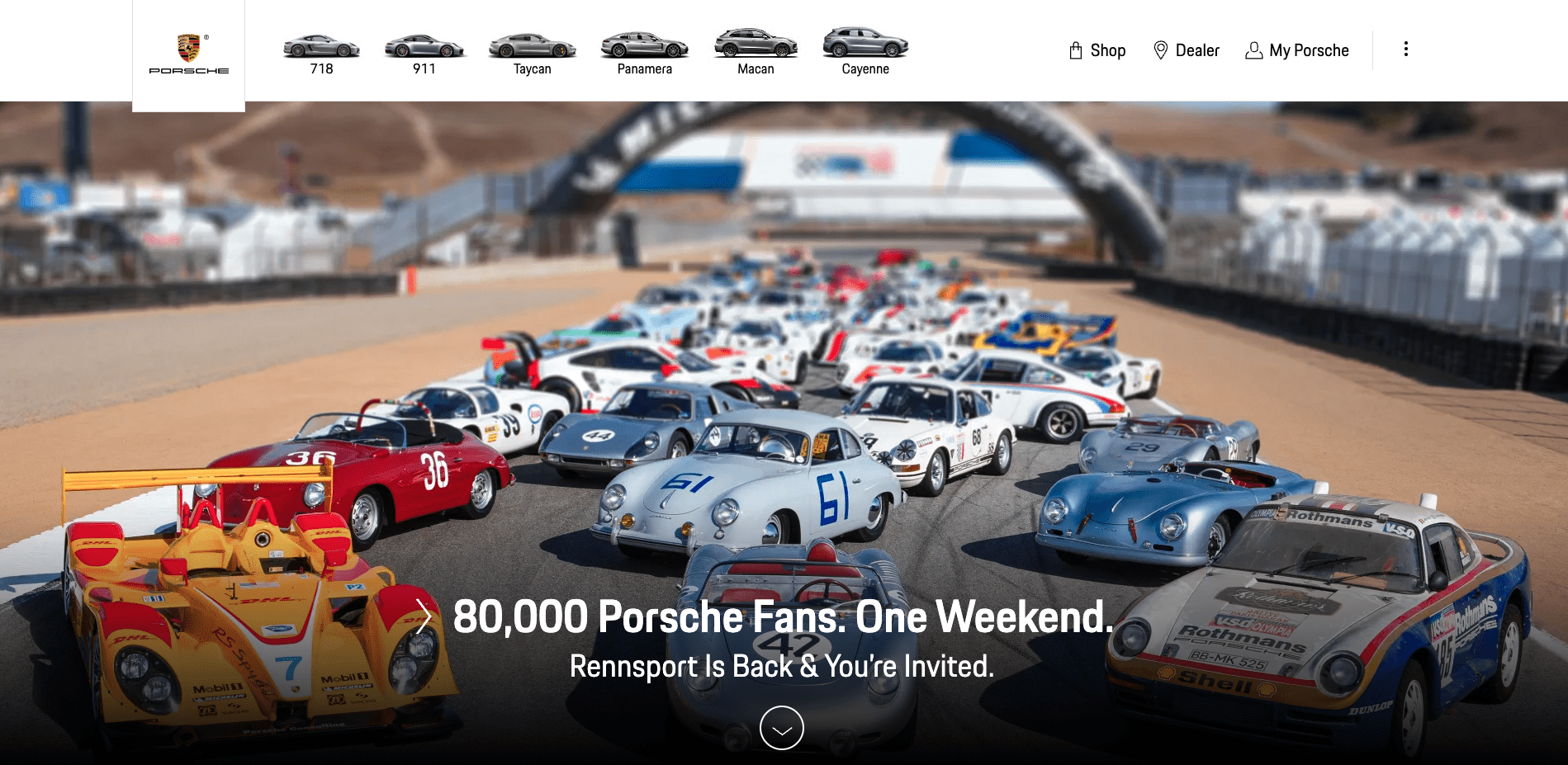
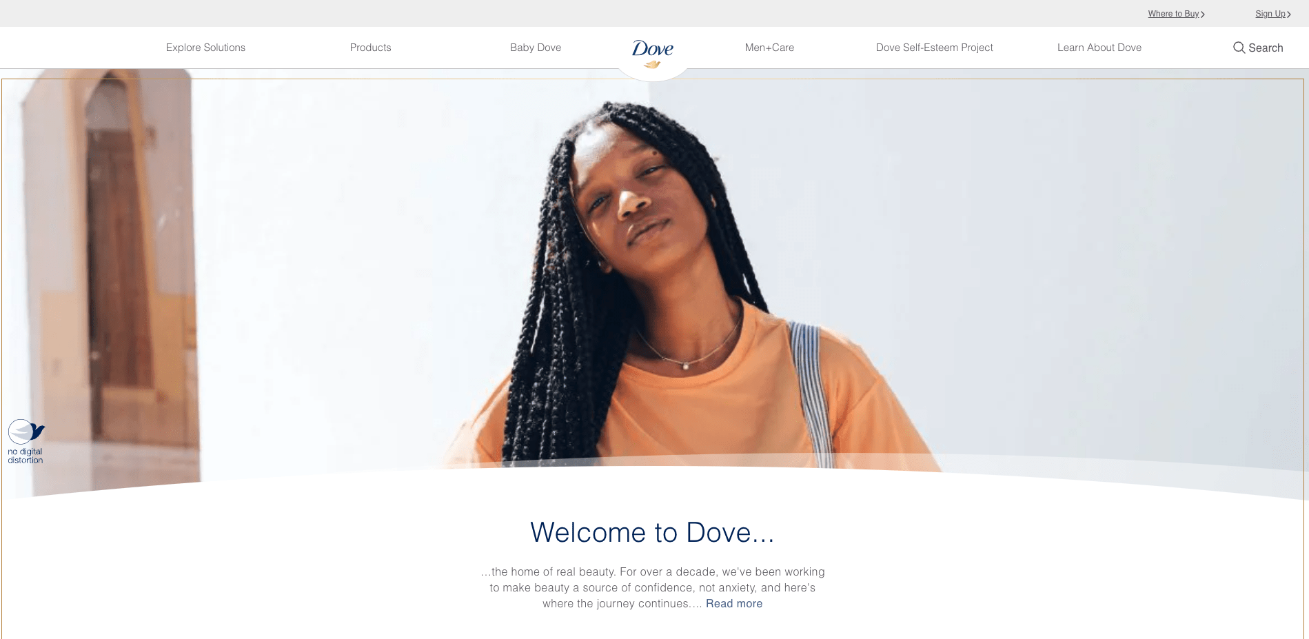
Brands like Lindt, Porsche, and Dove—quite the variety of SKUs there!—use gold in their branding to convey luxury and high-quality.
The psychology of the color black
Like gold, black is associated with luxury, power, and sophistication. Black is the absence of all colors, and that fact holds a kind of power of its own.
Black is a great color to use for contrasting elements on your website and throughout your brand. It can also help with readability.
However, too much black can come off as dark, sad, and negative, so be mindful of how much you’re using—unless, of course, dark, sad, and negative is the vibe you’re going for with your branding.
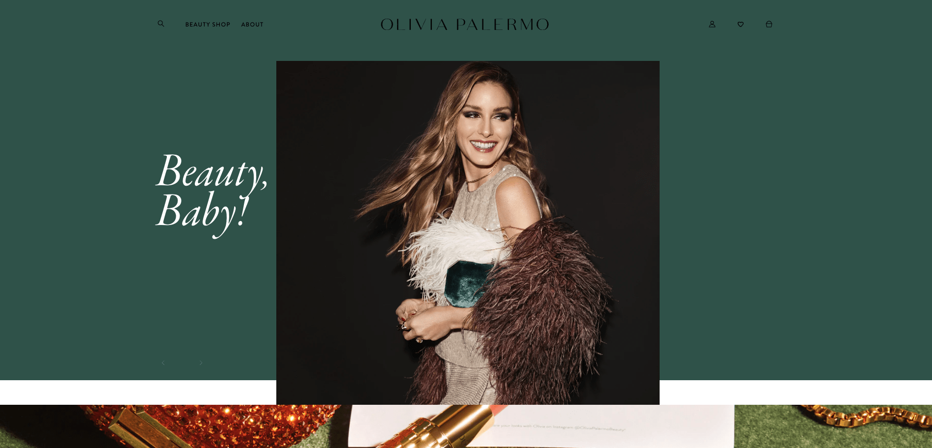
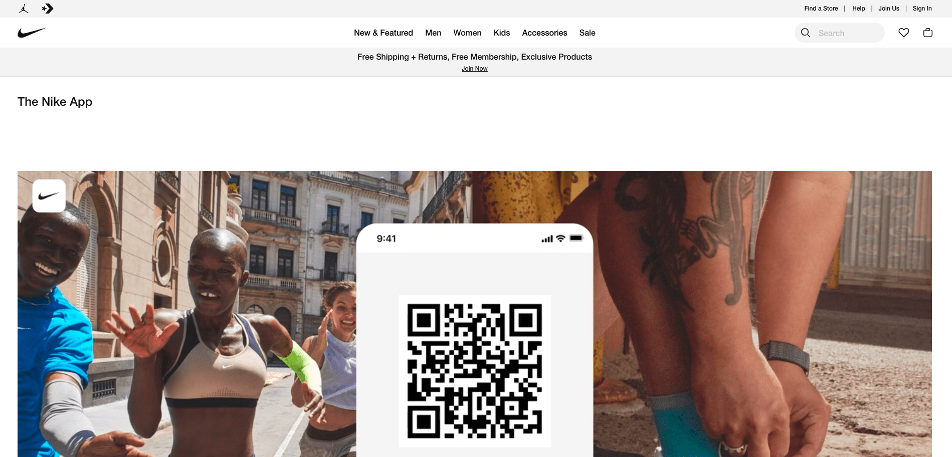
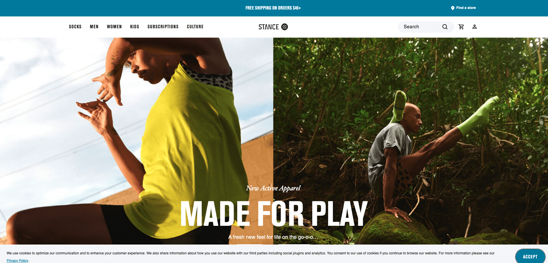
A few brands that use black in their branding include Olivia Palmero, Nike, and Stance.
The psychology of the color white
Last but certainly not least, the color white (the presence of all color) represents purity, innocence, cleanliness, and peace.
White is often used to articulate a fresh start, but using too much can evoke feelings of loneliness and emptiness and can give a sterile vibe.
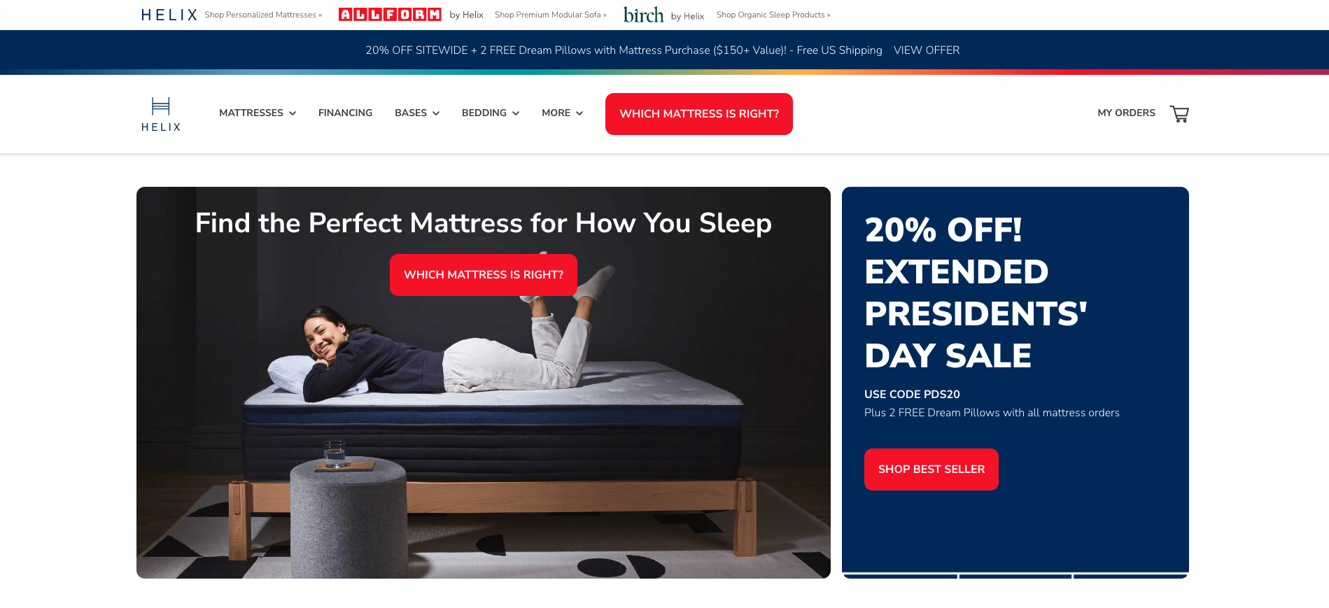
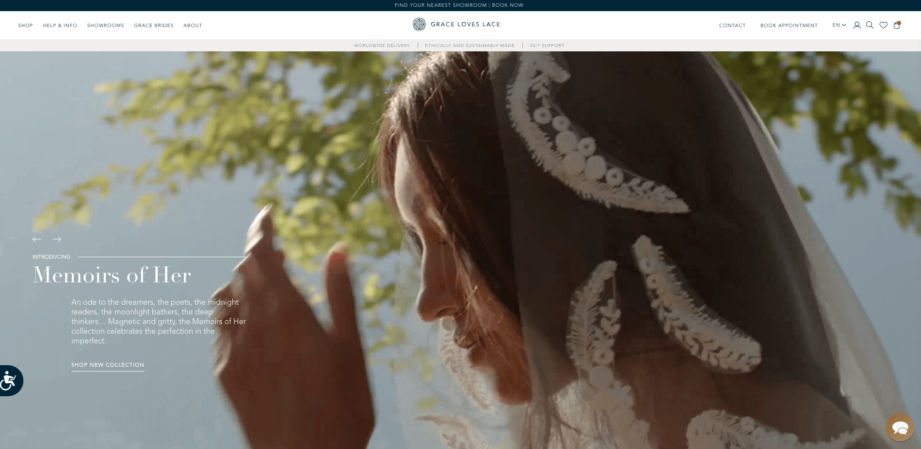
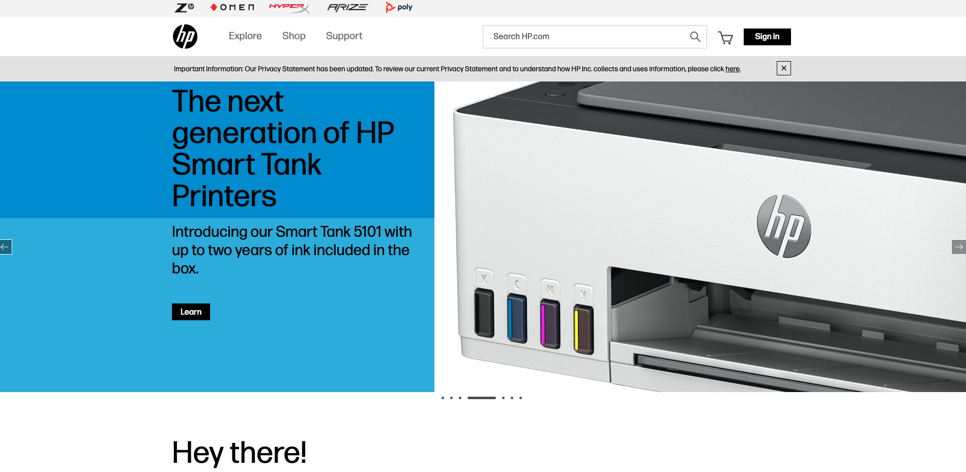
In a business setting, white is used by brands like Helix Sleep, Grace Loves Lace, and HP to convey freshness, peace, and minimalism.
#cta-visual-pb#<cta-title>Make every page sing with your brand colors<cta-title>With Shogun Page Builder, you can save your go-to colors to make customization a breeze every time.Start building for free
How to find the right colors for your brand
Now that you know the psychology behind popular colors used in ecommerce marketing, you may have an idea of what colors could work—or definitely couldn’t work—for your brand.
But to ensure you’re really nailing your brand’s emotion and vibe with the right color, here’s a helpful framework you can use.
1. Identify your brand personality and values
If you don’t have your brand values (what your brand stands for) mapped out yet, this is the perfect opportunity. Once you’ve established your brand values, you can identify possible colors to represent you.
To identify your brand values, take these questions to your team brainstorm:
- What does your company stand for?
- Who is your target audience, and what do they value?
- What sets your brand apart from competitors in your industry?
- What do you believe are the most important ethical considerations for ecommerce brands?
- How do you want your customers to feel when they interact with your brand?
- What are some of the key benefits that your products or services offer to customers?
Aside from values, what would your brand’s “personality” be like? If you met it for a coffee, what would it order? How would it text? What kinds of clothes would it wear?
These questions can help get your creativity flowing to inspire how you want your brand to sound, and later, which colors make the most sense.
Lastly, think about the kinds of buyer personas you attract or want to attract. What colors might deter them? Or inspire them?
2. Research your competitors
Look at what your biggest competitors are doing with their brand colors.
- What kind of mood or emotion are they communicating?
- How are they seen in your industry?
- What do customers think?
It’s important to keep tabs on your competitors and study their positioning, but remember: you brand is unique! You want to choose brand colors that represent your brand well and help potential customers remember you.
Understanding what your competitors are doing can help you figure out where you want to go (or not go) as a starting point.
Then, let your brand values guide you.
3. Determine the colors that represent your brand
Using what you’ve learned from your brand values exercise and your competitor research, think about which colors represent your company.
For example, if your brand is personality playful and friendly, perhaps working yellow, pink, or purple into your color palette would work well.
Or if you want your brand to exude elegance and sophistication, a combination of black, white, and blue could do the trick.
For some instant-inspiration, check out Shogun customer Hippy Feet’s color palette:
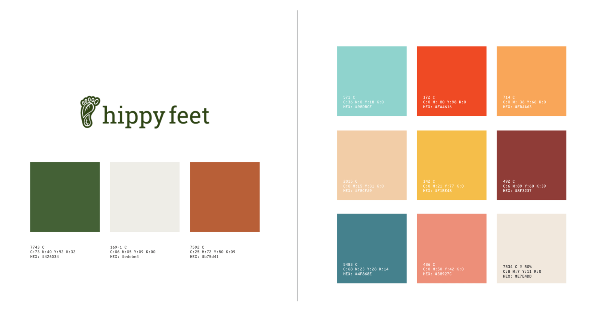
They’ve established their primary brand colors (left) along with secondary brand colors (right) that complement the primary colors, making for a harmonious, playful, and fun brand palette.
Here are a few A+ color wheel and theory resources that can help you develop your brand colors:
These tools can help you discover color combinations that work well together (not all colors complement each other as we’ve learned!) and build your brand color palette.
4. Create a style guide to ensure consistency
A major component of any successful brand is consistency.
If you use one shade of pink for newsletters but another for social media graphics, that can fracture your brand integrity and cause confusion among customers.
To ensure consistency, and to create a memorable brand, build a style guide (a collection of your brand’s rules on color, type, etc.) that includes:
- Brand color palette: Your approved color palette, including color codes and usage guidelines. It’s also good to include approved color combinations and color usage in different contexts.
- Logos: This should include guidelines for the logo, including the logo design, variations, and usage. It should also include placement, sizing, and color usage parameters.
- Typography: Include the approved font families, sizes, and styles. It should also include guidelines for usage, such as for headlines, body text, and captions.
- Imagery: Add guidelines for the imagery used in your brand, including the approved style, tone, and type of imagery along with guidelines for photography, illustration, and iconography.
- Voice and tone: Don’t forget to add your approved language and messaging guidelines. This section should provide examples of how your brand should sound in different contexts, such as in social media, email marketing, and customer support.
Once you have your style guide built, it’ll be easy for your team to create consistent social media assets, ads, and website updates that align with your set guidelines every time.
Tips for using color psychology in ecommerce store design
Ready to put your color psychology knowledge to the test but aren’t sure where to start? Here are a few tried and tested tips to get you going.
Use white space
Whitespace, sometimes referred to as negative space, is areas of a site left empty on purpose.
Whitespace helps establish information hierarchy, draw attention to important aspects of your site, improves readability, and helps with the aesthetics of your site design.
For example, Rumpl uses white space to break up sections of their homepage.
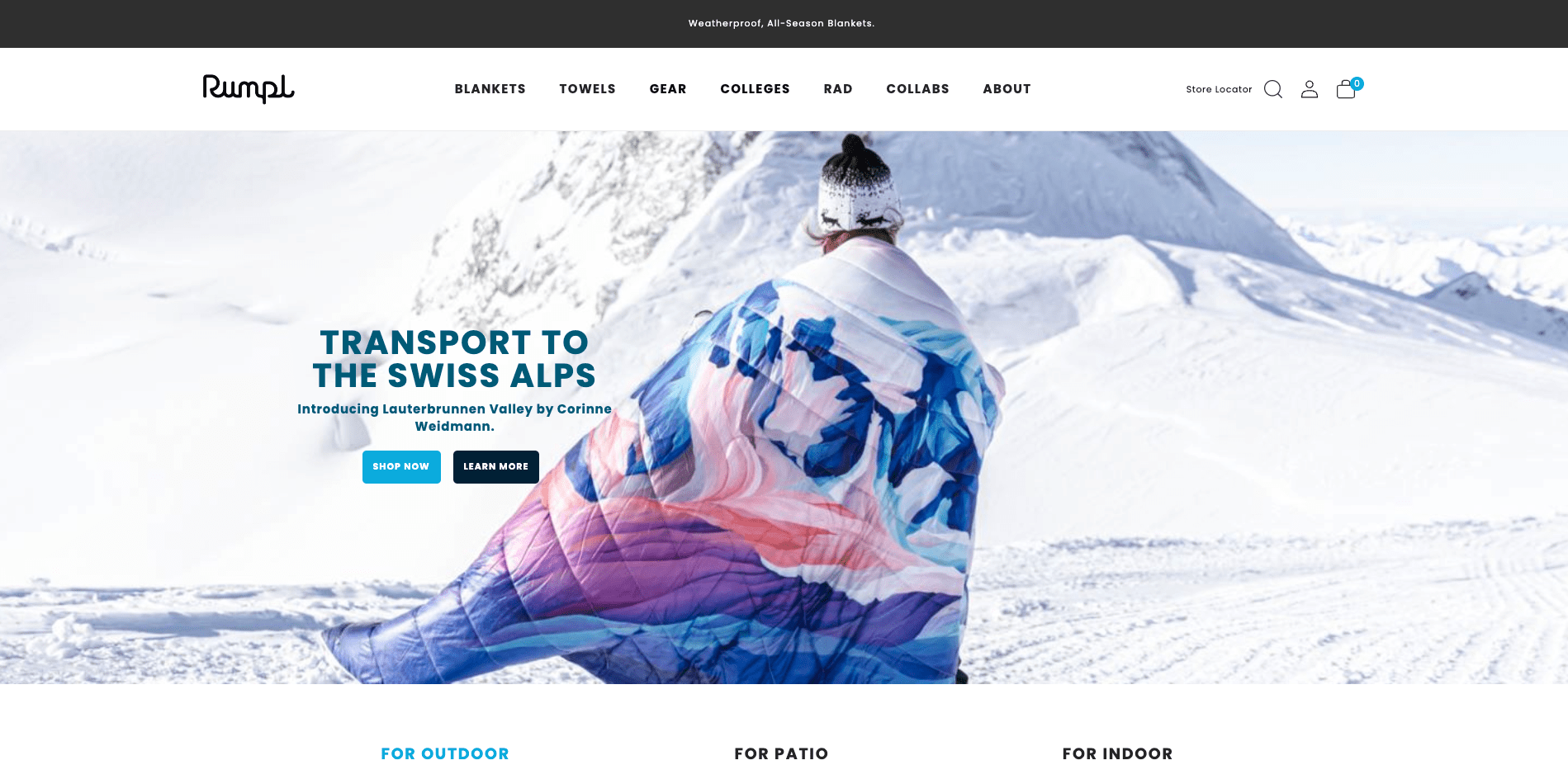
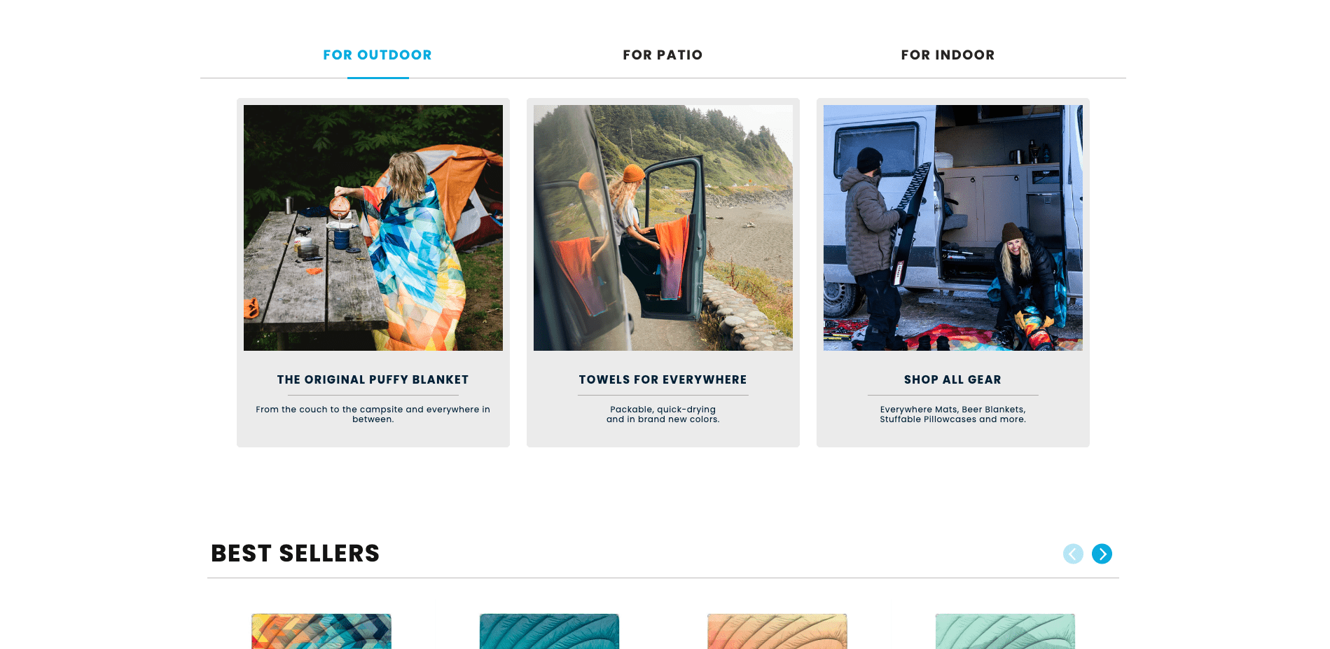
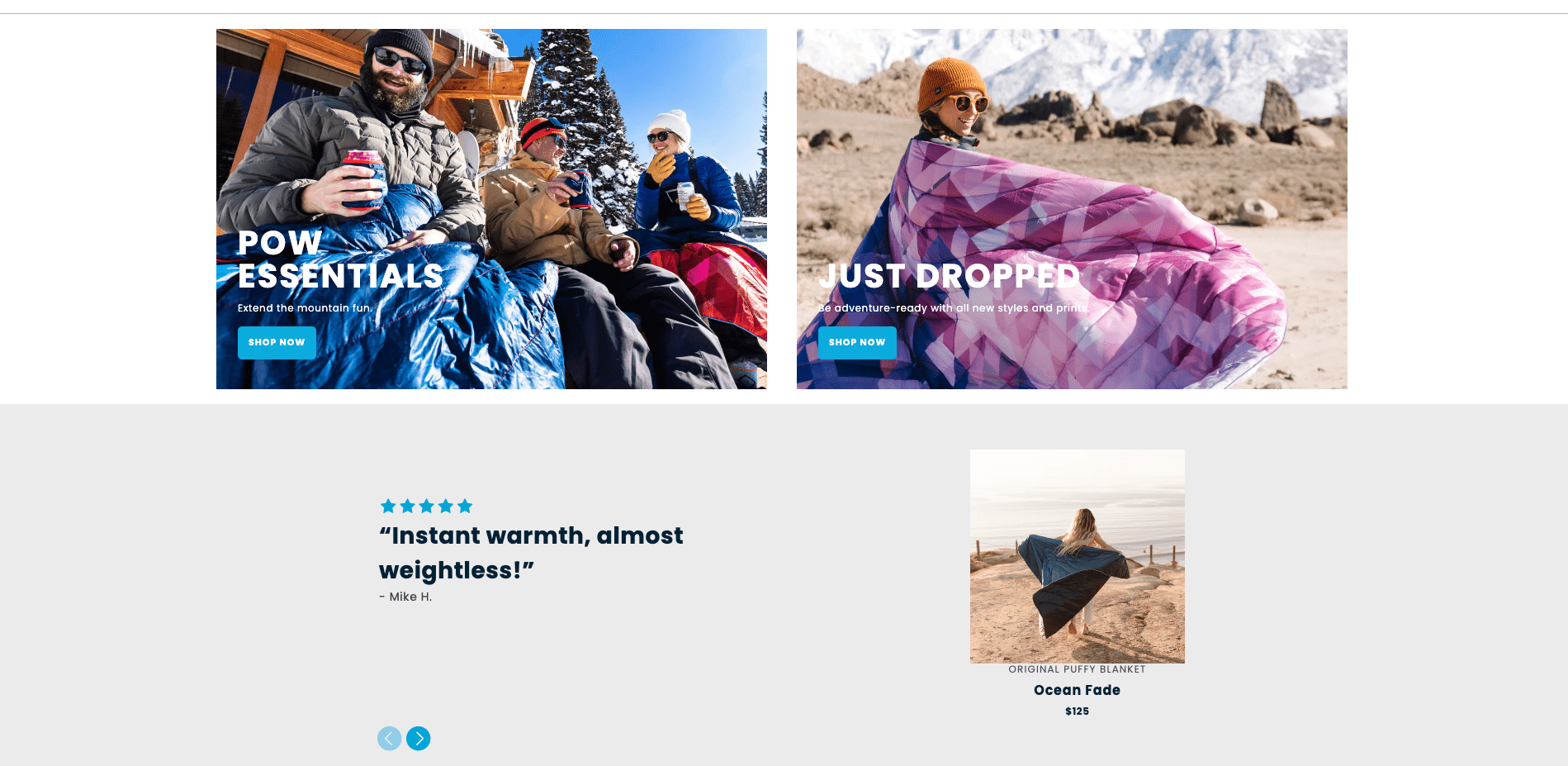
Because Rumpl uses Shogun Page Builder, their team can easily drag-and-drop content elements, like separators, that add whitespace to their page design.
Consider cultural differences
As we mentioned earlier, colors have different meanings across cultures.
Black represents evil, darkness, and negativity in Indian cultures, but represents health, prosperity, and stability in Far Eastern culture.
Pay attention to who your customers are and where they live when thinking about your brand color palette. It may be OK to use a little of one color (like as an accent color) instead of making it a primary color in your palette.
Your customer personas and brand values will help inform this direction.
Leverage your color scheme
It makes for a more interesting ecommerce site design to include various colors within your palette instead of using just one or two colors.
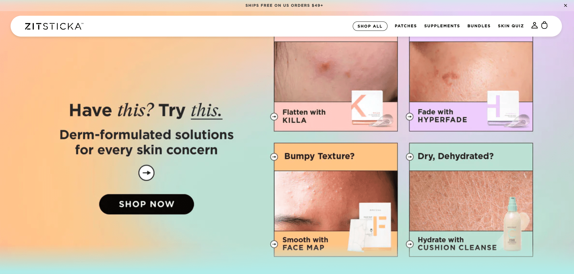
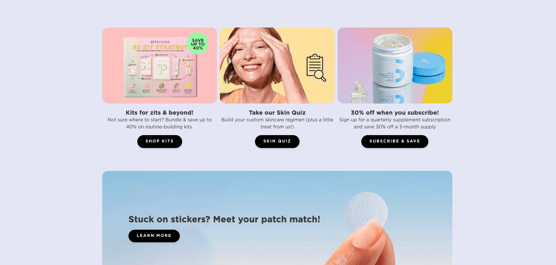
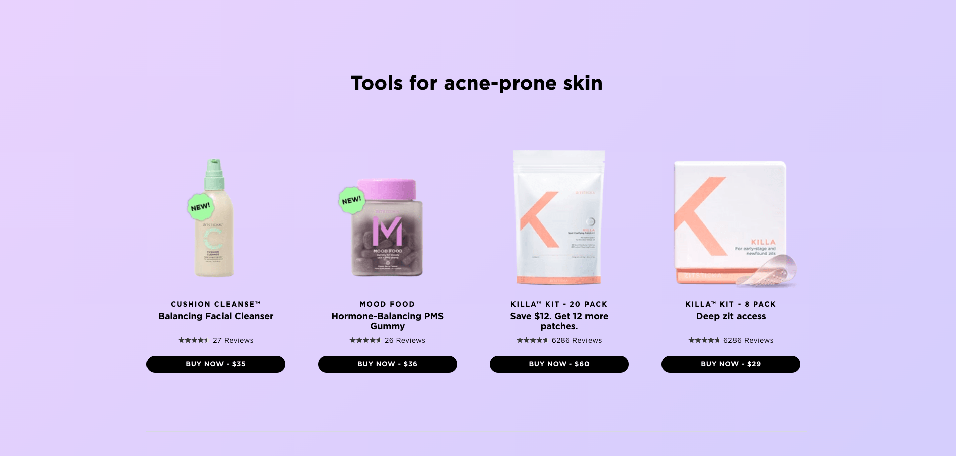
For example, Shogun-powered brand Zitsticka does an amazing job of using complementary colors throughout their ecommerce site.
Scrolling down the homepage, the background color changes with a cool CSS effect, and makes for an engaging brand experience.
Zitsticka also uses color gradients throughout their site to create consistency and to make certain page elements pop.
Using color psychology to craft a memorable, high-converting brand
Color psychology is a powerful tool ecommerce brands can use to create a memorable, engaging, and high-converting online experience.
Understanding the meaning behind colors and aligning that to your target customers and your brand values will help you craft the perfect palette.
Your brand’s color palette is likely to evolve as your brand does, but incorporating principles from color psychology will ensure you’re on the right track each time you assess your brand’s look and feel.
By starting out with an informed color palette, you can build more an effective ecommerce marketing strategy that makes your potential customers remember you and drives up your conversion rates.
#cta-visual-pb#<cta-title>Customize your ecommerce site with your brand’s color palette<cta-title>With Shogun Page Builder, you can customize every must-have page for your store, super simply.Start building for free

Kaitlyn Ambrose
Kaitlyn works on all things content at Shogun. ⚡

