Ecommerce UX: How to Deliver Excellent Experiences to Online Shoppers
How many times have you purchased something from a retailer whose website was incredibly difficult to use?
Chances are, the answer is “almost never.”
Many shoppers are thrown off by pop-ups, slow-loading pages, and broken links. Each contributes to a bad user experience—one that persuades you to leave this brand’s store in search of another that’s more enjoyable to browse.
Prevent bounces from your own online store by prioritizing user experience (UX). The concept is: the more enjoyable it is for visitors to engage with your site, the more likely they are to stick around and purchase.
In this article, we’ll cover:
- What ecommerce UX is
- The importance of UX in ecommerce
- How to improve UX on an ecommerce website
- UX best practices for category pages
- UX best practices for product pages
- Ecommerce UX trends
- How to measure ecommerce UX
User experience is the quality of experience someone has when visiting your online store. From finding or discovering the product they’re looking for to completing their purchase, user experience defines whether they’ll make it through the entire sales funnel.
Ecommerce UX, in particular, is typically defined in terms of functionality (what the website visitor can do), and usability (how easy it is to complete a task/purchase).
Online stores that get those two core components right see an uplift in conversion rates.
“Ecommerce shoppers want a personalized experience. UX experts need to cultivate an experience that is not only satisfactory to customers, but meaningful.” — Katie Lyon, co-founder of Allegiance Flag Supply
Regardless of how many people visit your website or paying customers you have, get ecommerce UX right, and you’ll benefit from:
- Reduced bounce rate. You arrive on an ecommerce site and are overloaded with pop-ups and ads. Too many distractions and offers feel overwhelming, so you exit without giving the brand a real chance to showcase its products. Eliminate this problem—and convince people to stick around—with an engaging customer experience.
- Charging premium prices. Six in 10 shoppers are willing to pay a premium to shop with brands that have exceptional UX. Those premiums have significant effects on your bottom line, generating profit you can reinvest back into scaling your ecommerce business.
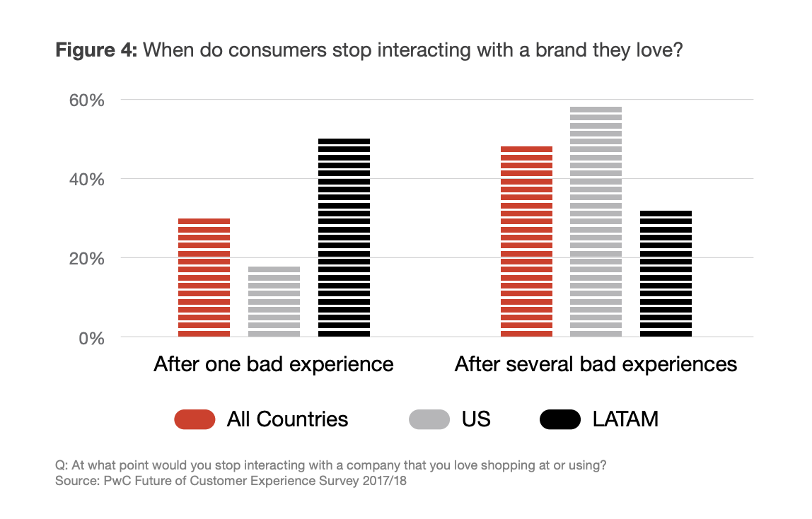
- Improved customer retention. By prioritizing UX and delighting customers throughout the sales process, you’ll stand a better chance of convincing them to purchase again. One in three consumers say they will walk away from a brand they love after just one bad experience.
- Enhanced customer data. Some 63% of consumers are willing to share more information (such as their email address) with a company that offers a great experience. The more data you have about your customers, the better you can personalize the shopping experiences that encourage them to buy.
From homepage to post-purchase, the entire experience a shopper has on your website needs to be consistent.
As Jessica Kats, ecommerce and retail expert at Soxy, explains:
“You can’t have one or two pages with a completely different design and scope than the rest of your site. Your visitors should never think they have come to a completely different website if they visit a particular product page.”
And there are plenty of other design or customer-experience components to get right beyond just a cohesive look and feel.
Unsure where to start? Here are seven key components of strong ecommerce user experiences.
1. Offer up fast page loading times
“One of the most important things to consider is page load time because customers are less likely to stick around if things are taking too long,” says Darren Litt, co-founder of Hiya Health.
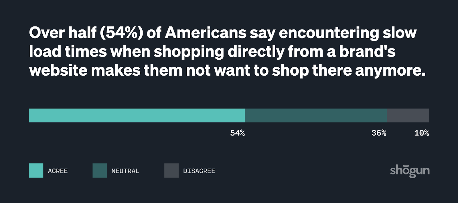
Research backs this up: More than half of Americans say a slow-loading website makes them less likely to shop there in the future, causing retailers to lose out on $2 billion each year.
Set yourself off on the right foot by showcasing web pages to first-time visitors in as little time as possible. That means:
- Using a fast hosting platform
- Minifying excess code
- Removing unused plugins
- Reducing redirects and broken links
- Optimizing images
#cta-visual-pb#<cta-title>Enable your whole team to start creating<cta-title>Designed for larger ecommerce teams, Shogun Page Builder Advanced gives you 10+ user seats with unique roles and permissions to scale your content creation efforts.Learn more
2. Plan out simple navigation
Often, potential customers visit your homepage in search of something in particular—be that a solution to a problem or an item they saw an influencer talking about on Instagram.
Help them find it—and therefore, improve their user experience—with simple, clean navigation.
“One of the things that shoppers are looking for is a navigation that is simplified and easy to understand. No one wants to browse a website, scroll and click around endlessly, and still not find what they’re looking for.” — Perry Valentine, founder of AtPerry’s
The best UX practice for ecommerce navigation bars is to keep it simple. Baymard found that most users began to feel overwhelmed when they were presented with more than 10 subcategory options.
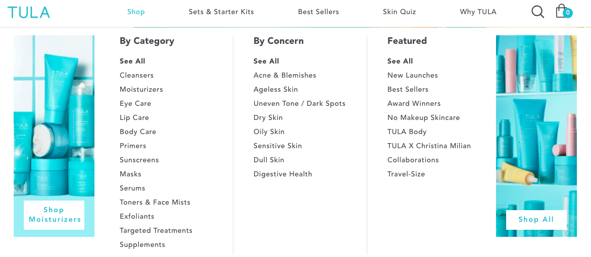
TULA Skincare, for example, has its main navigation bar broken down into four pillars:
- Shop
- Sets & Starter Kits
- Skin Quiz
- Why TULA
Hovering over each pillar gives extra subcategories for refined browsing:
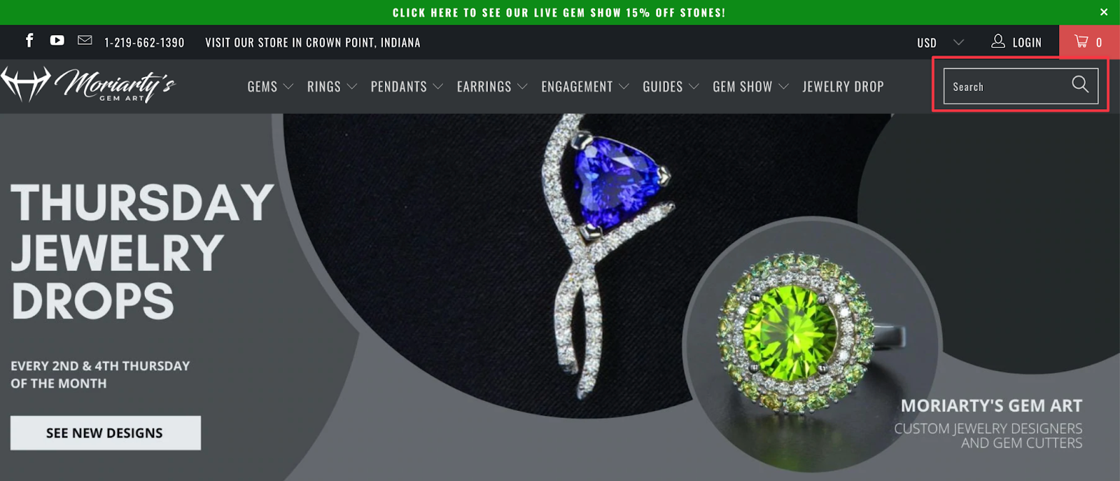
Similarly, make navigation easy with an internal search box for people to find exactly what they’re looking for.
Jeff Moriarty, marketing manager at Moriarty’s Gem Art, found the location of this search function had a major impact on conversion rates:
“We noticed that when people used our website’s internal search bar on their mobile device, the conversion rate was 4x that of those who didn’t.
“We immediately moved it to being visible at the top of the mobile website 100% of the time, and saw our average conversion rate on mobile devices almost double.”
3. Ensure responsive design
Consumers no longer open their laptops, visit a website, and make a purchase. It’s not linear, and the sales process has evolved to include several platforms, channels—and, more importantly, devices.
By 2025, more than 10% of all retail sales in the US will be from mobile commerce.
The problem? Many ecommerce brands still don’t offer the user experiences designed to keep mobile users around. People who have a negative mobile experience are 62% less likely to purchase from that brand in the future.
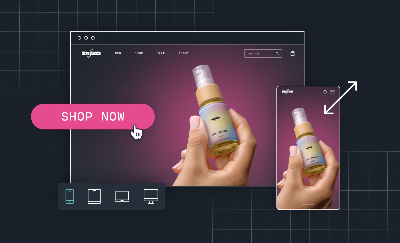
The easiest way to cater to these mobile users is to have a responsive web design—the same site that automatically resizes based on the screen size it’s loaded onto.
Other best practices for mobile-friendly design include:
- Using large buttons to cater to “fat finger” syndrome
- Large, clear images that demand enough page space
- High-contrast call-to-action buttons to make next step prompts more obvious on a smaller screen
4. Give personalized product recommendations
Earlier, we mentioned that positive UX results in customers being more willing to share their data with brands. That’s a huge advantage—especially when brands who use personalization see a $20 ROI for every dollar spent.
Collect information about your website visitors through:
- Items added to their cart
- Past purchases
- Quizzes
- Incentives and smaller offers (think: discount codes in exchange for someone’s email)
Use that information to deliver personalized product recommendations—both on your website and via email marketing.
“Companies can use the data they glean from their target audience to suggest products that they’ll use, as well as products that speak to them on an individual level. If you know that part of your customer base cares about sustainability, then suggest eco-friendly products to them when they browse your site.” — Katie Lyon, co-founder of Allegiance Flag Supply
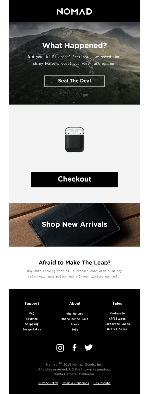
NOMAD, for example, reminds visitors of the items they had in their shopping cart before exiting its ecommerce store. Not only does this reminder jog subscribers’ memory of a purchase they may have otherwise forgotten about, but pointing people directly towards the product removes additional clicks.
Remember: fewer steps in the customer journey equals less friction.
5. Optimize a fast, easy checkout
Did you know that 17% of shopping carts are abandoned because the checkout process was too long and complicated?
It’s why Darren Litt, co-founder of Hiya Health, recommends to “make the checkout process as smooth as possible. This means ensuring that all of the required fields are included in the checkout form and that the customer does not have to re-enter information multiple times.
“You can also make it easy for customers to pay by providing various payment methods, such as credit cards, PayPal, and debit cards.”
Optimize the checkout process even further with alternative options, such as:
- Guest checkout
- 1-click checkout
- Social login checkout
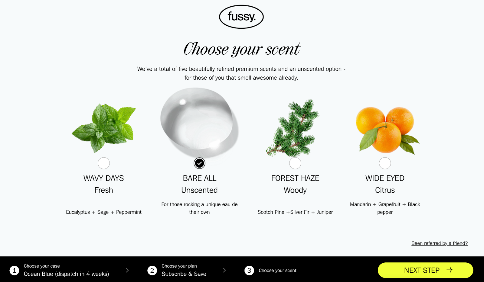
DTC brands like Fussy even gamify the checkout experience.
When purchasing a complex product with several options, shoppers can see how close they are to finishing via the steps shown in the interface. This step-by-step indication throughout the checkout appeals to completion bias—the notion that people are more likely to complete a task they’ve already started.
6. Incorporate easy access to customer support
In terms of UX, you’ll also want to make it as easy as possible for shoppers to discover something on their own. As Chris Lavoire, senior technology partner manager at Gorgias says,
“Customers will inevitably have questions pre- and post-purchase, so make accessing customer support easy. Customer service functions need not to be a focal point, but should be on the site subtly and easy-to-find. Work to have them blend in nicely with your branding.”
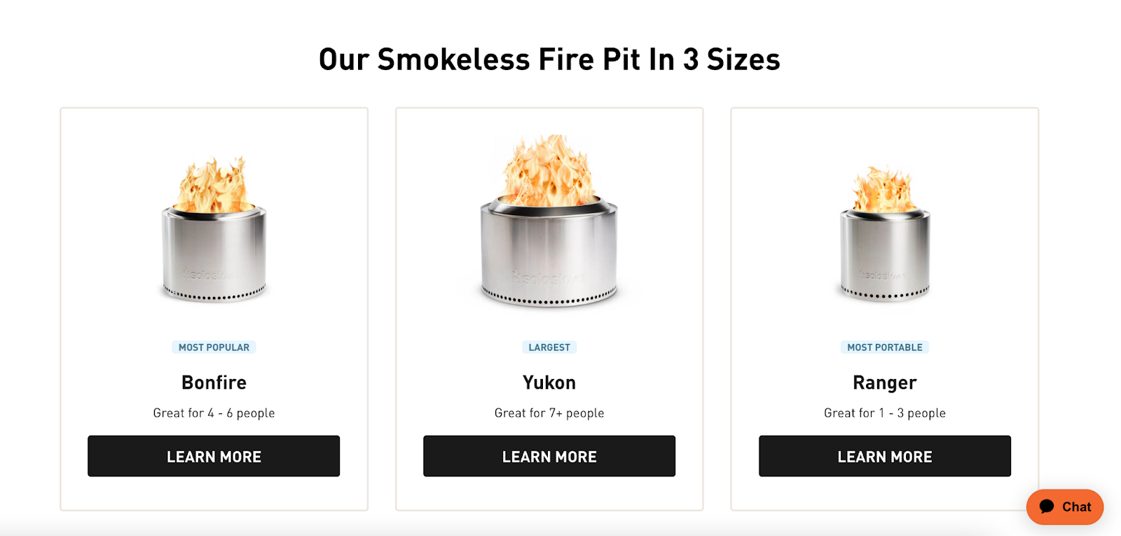
For an example of how this looks in practice, take a look at Solo Stove’s website. A subtle chatbot icon in the lower-right corner shows help is available, should the shopper need it.
Alongside chatbot icons and customer service prompts, preempt questions a shopper would have when visiting your ecommerce store. That could mean incorporating returns policies or shipping information into your website design and product info page copy.
#cta-visual-pb#<cta-title>Enable your whole team to start creating<cta-title>Designed for larger ecommerce teams, Shogun Page Builder Advanced gives you 10+ user seats with unique roles and permissions to scale your content creation efforts.Learn more
7. Run A/B tests
The first variation of your website is unlikely to be the one that best delights your customers. Experiment with different designs, layouts, and buttons to improve conversions. Run with the variants that have the biggest positive impact on UX.
Public Rec took this approach with its UX strategy. CEO and founder Zach Goldstein says, “We use A/B tests to understand our target demographic and track which content on our website they respond best to. For example, by using A/B testing to refine our abandon strategy, we reduced abandoned cart rates on our website by 4%.
“We also tested our email subscription CTAs with split-testing and grew our email list over three times in one campaign. As our brand evolved more and more closely with consumer expectations, we noted higher CTRs, conversion rates, and browsing of our product pages.”
So how can you put these components into play? Let’s get into that, specific to different aspects of your store:
Optimal user experience helps a shopper complete the desired action of the particular page they’re visiting. For this reason, category pages have a different set of UX best practices than other pages on your site.
Potential customers arriving on a category page are likely unsure of which products they should buy. Help them make their decision with UX features like:
- Basic product info: Showcase each item’s name, review, and price—three main components shoppers evaluate when considering whether to click the product page and learn more.
- Bright, clear product images: Some 90% of shoppers’ purchasing decisions are influenced by the quality of photos. Allow category browsers to scan through your catalog visually and in multiple, high-res angles.
- Subcategories: If someone’s browsing your dress category, for example, allow them to browse different subcategories—like casual, cocktail, and midi-style dresses.
- Filters: Help shoppers get even more granular with product filters. Popular filters include color, material, size, and pain point (i.e. skin type for a skincare retailer.)
- Sort by: Whether your potential customer is on a budget or looking for bestsellers, show a “sort by” button on category pages to improve UX.
- Add to cart buttons: Not every shopper needs to digest an entire page of information about one product. Use “add to cart” or “buy now” buttons and give shoppers the chance to go from category to checkout page in as few steps as possible.
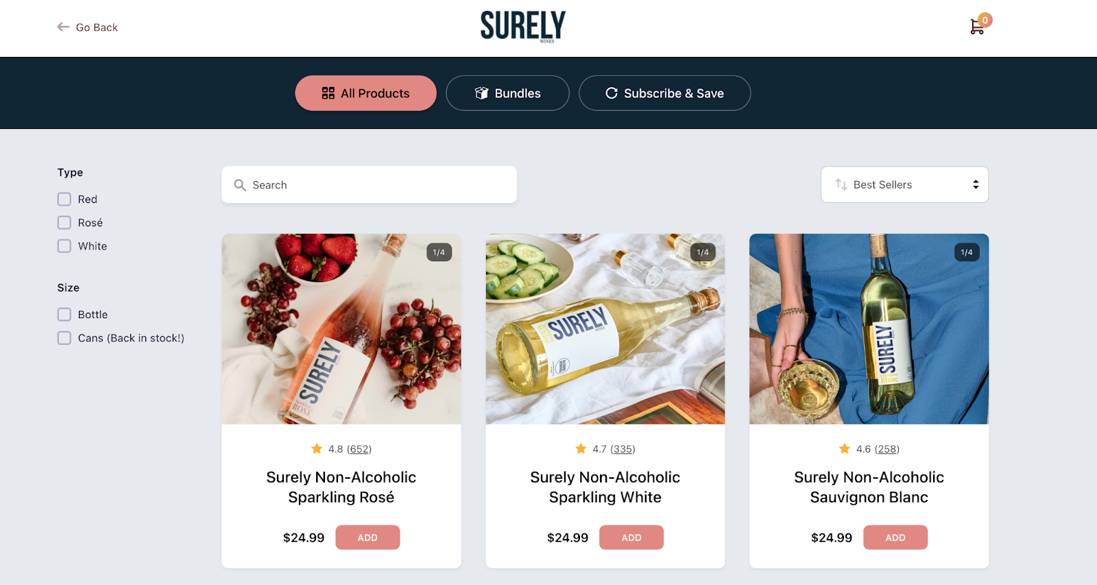
Need an example of these UX category pages in action? Take inspiration from Surely.
The DTC brand’s category pages show clear photos of each product, its price, and its rating, alongside an add-to-cart button. Shoppers can also filter and sort results, helping them to find the beverage that best suits their needs:
A product page is any ecommerce brand’s last-ditch attempt to convert a website visitor while they’re on the site. Improve your chances of doing so by including these UX features on each product page:
- Product name. Here consider exactly what customers may be looking for based on keyword research.
- Product information. List the product’s benefits, USP, and instructions for use in the product description. (Again, include keywords here to improve SEO.)
- High-quality visuals. Use photos and videos (with zoom!) to cater to the 75% of online shoppers who rely on product photos to make a purchasing decision.
- High-contrast call-to-actions. Whether it’s an “add to cart” or “buy now” prompt, purchasing the product is the main goal of a product page. Make these buttons stand out against the rest of your website design to reinforce the next step to shoppers.
- Product options. Show product variations, such as size and color, to help potential customers find the right item.
- Price. Alongside the purchase price, highlight any savings a customer is getting when they purchase the product via your online store. Is it currently 20% off RRP? That’s a huge incentive to buy.
- Trust signals. People buy from retailers they trust. Reinforce this by highlighting SSL certificates, encrypted checkout, virus software logos, and money-back guarantees on your product pages.
- Reviews. The vast majority of consumers read reviews before purchasing a product. From social media reviews to influencer endorsements, showcase them on your product pages to prevent shoppers from leaving the site in search of them.
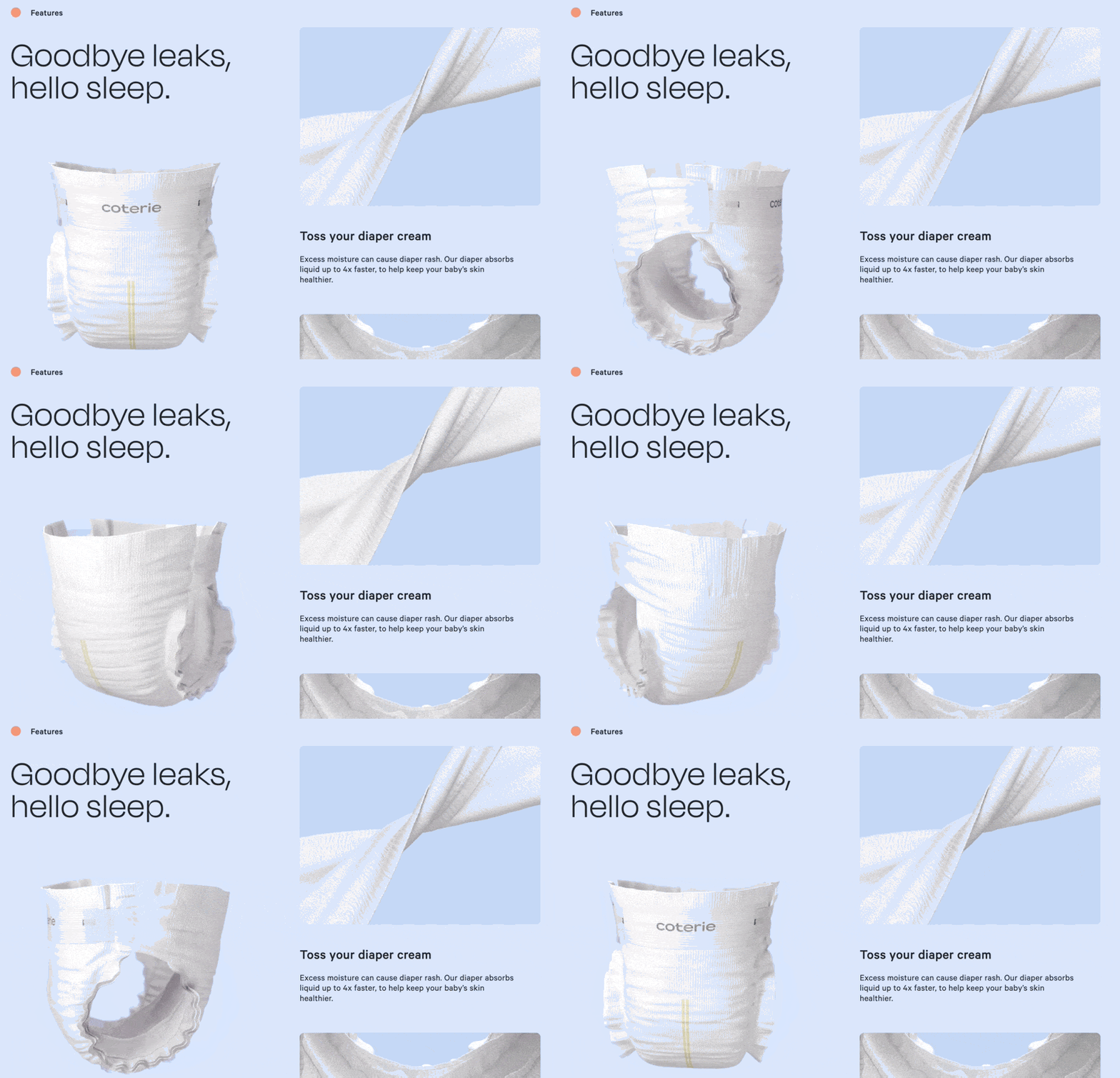
DTC brand Coterie applies these UX best practices to its product page. First-time visitors see the benefits of purchasing the diaper, its 5* rating, and endorsements from well-known parenting publications.
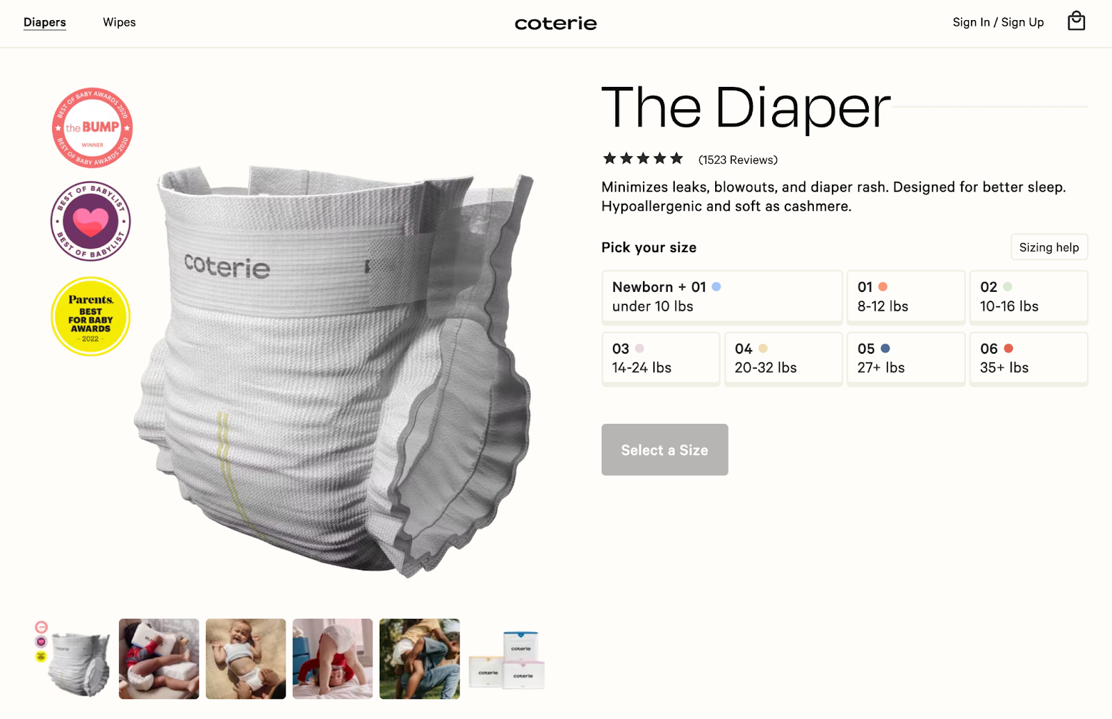
Scroll further down, and you’ll see a 360-view of the product.
Ankur Goyal, Coterie’s head of growth, explains the thought process behind this layout:
“Our UX design breaks up information and images into sections on each landing page. The setup is simple and visually appealing. As customers scroll, they can find information on the product, customer reviews, and our brand awards in easily digestible segments.”
User experience best practices can often make brand owners feel stuck within a box. With consumers becoming accustomed to such strict or “standard” ecommerce experiences, here are five UX trends to experiment with—without compromising conversions.
Trying out dark mode
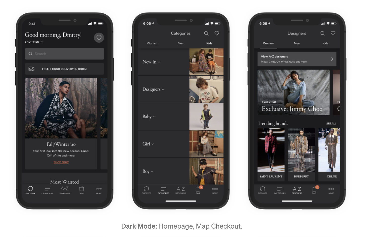
Dark mode is a color scheme that uses light-colored text on a dark background. It goes against traditional best practices for UX, yet an increasing number of consumers are preferring dark mode to light.
“Dark mode is so much easier on the eyes; amazing for late night or in the middle of the night when a lot of people may be browsing.” — Maria West, copywriter at DTC Mom
Debating whether to test dark mode on your ecommerce store? You don’t have to overhaul the entire design for every website visitor. Add a small toggle button in your navigation bar for people who prefer dark mode. Monitor how many people use it before investing further.
Testing for accessibility
Web design has accelerated to a point where retailers can offer almost any kind of online experience to their customers. But companies who go overboard—and fail to simplify their UX—leave an estimated $402 billion on the table.
For this reason, Lindsey Allard, CEO and co-founder of PlaybookUX says:
“Do not overlook the actual experience of the customer. Are there places where they might feel vulnerable to technology? Are there things you can remove from the process to make it easier/quicker? Are there too many hoops to navigate through for the user? Do you not provide enough details?”
Find these hurdles by regularly going through the checkout process yourself or monitoring how others do it via website recordings.

Experimenting with augmented reality
Online shoppers can’t physically engage with a product they’re browsing. It’s largely why the return rate for online businesses is much higher than brick-and-mortar (20% online versus 9% in-store.)
Combat that issue and improve UX with augmented reality—technology that allows online shoppers to see what a product will look like in person before they buy it.
Warby Parker was one of the first DTC brands to make AR more accessible to shoppers. Its mobile app overlays its product photography over a live video on the shopper’s smartphone. Potential customers can see how the glasses look on them in real life, eliminating any potential returns and improving the experience.
#cta-visual-pb#<cta-title>Enable your whole team to start creating<cta-title>Designed for larger ecommerce teams, Shogun Page Builder Advanced gives you 10+ user seats with unique roles and permissions to scale your content creation efforts.Learn more
Include data visualizations
Selling a complex product? It’s essential to include specifications on the product page. Save your consumers from getting bogged down with too many figures by using data visualizations.
“At Tumble, we’ve started to focus on data visualization using videos and diagrams. Customers want data, but they don’t want to be bogged down by figures. If we can present how-tos and statistics in visually appealing ways through our UX design, we can improve the customer experience and build trust in our brand.” — Justin Soleimani, co-founder of Tumble
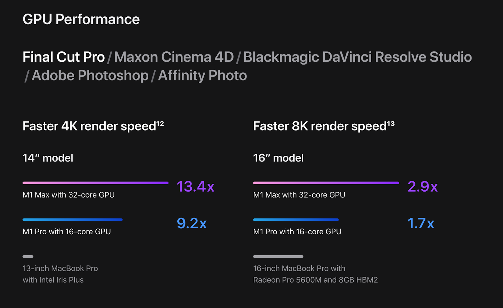
Apple, a brand known for its incredible UX, uses this approach on the product page for its Macbook.
Product specifications are displayed in colorful bar charts, like this one comparing the speeds of each device. It’s much more engaging than simply stating its 14” model has a 13.4 times faster 4K render speed.
Add the option for wishlists
“One of the best things you can do to improve your UX is to give your consumers the option to add items to their wishlist,” says Samuel Speller, founder of Kenko Tea.
“Sometimes, adding an item to a basket can be too much of a commitment for a consumer. However, you want them to be able to remember the things they are interested in so that they can come back to them in the future. If something is added to a wishlist, I have noticed that consumers are more likely than not to come back and buy it at a later stage.”
Understand whether your UX efforts are paying off by measuring how website visitors engage with your website. There are two types of data we can use to track this: qualitative and quantitative.
Quantitative data
Quantitative data is numerical, usually sourced from website or app analytics. Important UX metrics to pay attention to include:
- Conversion rate
- Cart abandonment
- Net Promoter Score (NPS)
- Task success rate
- Task completion time
(Note that “conversion” can differ depending on the goal of each page. A purchase is the end goal of a product page, but not necessarily a blog post—though you can introduce CTAs there to purchase, too.)
Qualitative data
Qualitative data is non-numerical, largely focusing around the thoughts, feelings, and experiences a potential customer has when engaging with your website.
Use tools like Hotjar and Maze to collect qualitative data through polls and surveys. Ask shoppers questions like:
- What is one thing you’d change about this page?
- Did you find everything you were looking for today?
- What may have stopped you from buying?
Lean on this data to improve your ecommerce customer experience. If you find that 35% of people exited the buying process because they couldn’t find delivery times, for example, prioritize making shipping information more prominent across the site.
Improve your ecommerce user experiences
With so many ecommerce websites to choose from, customers demand that their favorite brands invest in user experience.
The feeling and first impression someone has when visiting your website plays a major role in their decision to buy. From speedy load times to augmented reality features, deliver exceptional ecommerce experiences to website visitors—and get rewarded with higher conversion rates.
#cta-visual-pb#<cta-title>Enable your whole team to start creating<cta-title>Designed for larger ecommerce teams, Shogun Page Builder Advanced gives you 10+ user seats with unique roles and permissions to scale your content creation efforts.Learn more

Elise Dopson
Elise Dopson is a freelance writer for B2B commerce and martech companies. When she's not writing, you'll find her in the Peak Freelance community or on Twitter.

