13 Awesome Facebook Ad Examples That You’ll Want to Steal
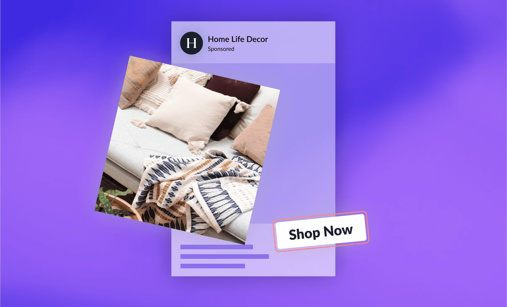
OK, you’ve got your shiny product and you’ve built a gorgeous ecommerce store—now you just need shoppers to discover your brand and fall in love with it.
For ecommerce businesses, the most immediate way to get the right type of traffic is through paid advertising. Many brands have found great success running Facebook ads to get the right eyes on their products.
Their reach is undeniable. Globally, they have 2.91 billion active users and 79% of their monthly users are active every day.
According to HubSpot, Facebook ads give the highest return on investment (ROI) of all paid ad channels.
That said, the true power of any ad is driven by the ad itself—the creative assets and copy which entice visitors to click through to the product page.
A great ad will look different from vertical to vertical. What works for an athleisure brand may not work for a supplement company and vice versa.
In this post, we’ll quickly cover what makes a Facebook ad good and show great Facebook ad examples from several types of brands.
#cta-visual-pb#<cta-title>Send your paid traffic to high-converting landing pages<cta-title>Make sure you pair that amazing Facebook ad with the perfect landing page for converting—build it with Shogun Page Builder today.Start designing it now
What makes a Facebook ad really great?
Building a powerful ad on Facebook centers on how well you know your target audience.
The persuasive copy and gorgeous imagery emerge out of that understanding, determining how effective the ad will be at convincing them to learn more about your brand and give you money for your product.
To create a really good Facebook ad, you’ll want to check off the following boxes:
- Focus on the objective. Your ad creative and your ad objective need to be aligned. For ecommerce ads, you’ll likely to aiming for clicks so make your copy and images drive them to click through.
- Be unique. You aren’t the only one advertising to that audience, so you need to rise above the other brands with a unique selling proposition that persuades them to investigate further.
- Narrow your audience. If you try to sell to everyone, you’ll end up just failing bigger. Choose a more targeted audience and write your ad with them in mind. You can always create different ads for different audiences, each designed to convert with targeted creative.
- Match copy and visuals. People are reading your visuals and copy as a package. If they don’t fit with each other, the message won’t work. Each ad needs to be a unified marketing message to drive clicks and conversions.
- Test and measure. Being able to run many ads at once is a blessing for learning what works and what doesn’t. Try a variety of headlines with the same image or vice versa to see the best combinations of images and copy to get users to your store. A/B testing ads is simple!
- Send traffic to the right place. Just as your ad creative needs to match to work together, so does the landing page you send that ad traffic to. For products, you can send traffic to a persuasive product landing page. For sales promotions, direct them to a dedicated special offer landing page. Don’t lose them with mixed messaging!
If you’ve gone through this list and still have questions, that’s fine. We’ve only just gotten started!
Let’s head on into some killer advertising examples that will show what all the above learnings mean in real-life ads.
13 Facebook ad examples and why they are so good
To get inspired to create your own incredible Facebook ads, it helps to see what other successful brands have done.
We’ve put together a bunch of examples of the best Facebook ads from a bunch of great brands that use Shogun for customizing their gorgeous ecommerce store pages. Let’s take a look at them.
#cta-paragraph-pb#If you want to take a look at what your competitors are doing with their Facebook ads, head over to Facebook’s ad library and search for the brand name. It could help give you some awesome ad ideas to really compete. Check out our roundup of awesome Instagram ad examples to see what other brands are doing.
Barebones Living creates the scene
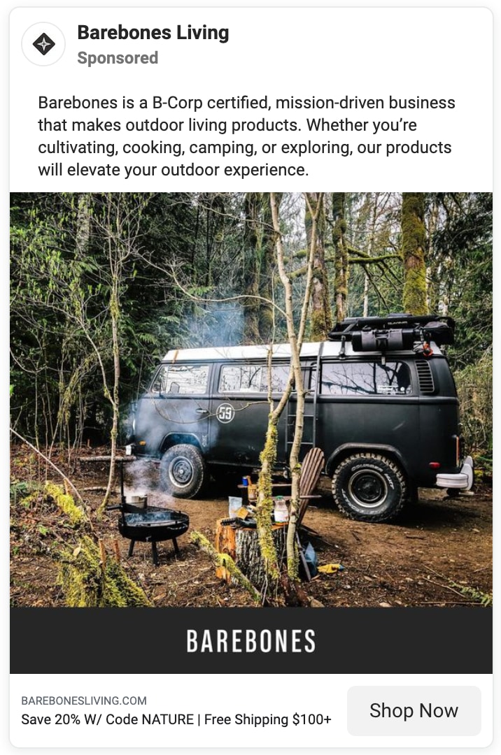
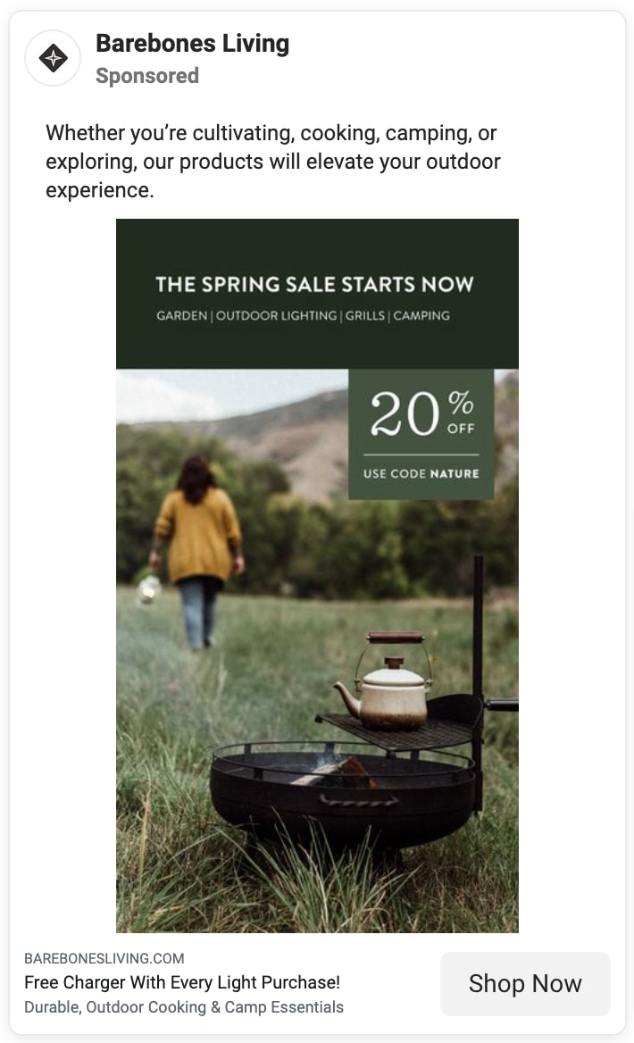
Outdoor living brand Barebones uses the grandeur of nature to amplify its message of how their products will “elevate your outdoor experience.”
They sell all manner of high-end gear and supplies for camping, gardening, grilling, and more. The value of their product offering comes out clearly in their ads.
Why these ads are great
The copy is straightforward, telling their target audience that whatever outdoor experience they are pursuing, Barebones can help make it better. The first even leads with its B Corp status, attracting a certain sustainability audience.
The visuals portray simple scenes of living outdoors, transporting the viewer and encouraging them to imagine getting away.
Getting to the CTA, you are met with a special offer of 20% off and a free charger, making the Shop Now button pretty compelling.
Landing page these ads link to
- Ad #1: Barebones Living homepage
- Ad #2: Retro Camp Lights landing page
Copper Cow Coffee sells with social proof
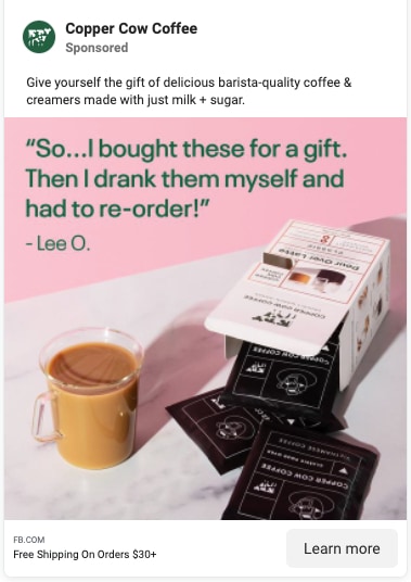
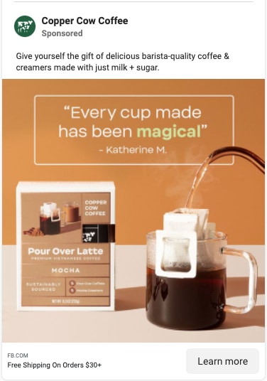
Single serve coffee brand Copper Cow introduces their defining product line with stunning colors and quotes from happy customers.
In our feature story on Copper Cow, we highlighted their effective use of how-to content to illustrate to an unfamiliar audience how their Vietnamese pour-over lattes worked.
Many of their video ads feature quick demos of how to make a cup, but in their image ads they choose to focus on the customer review aspect instead.
Why these ads are great
In our guide on customer reviews, we’ve shown the importance of capturing and highlighting customer reviews. Happy customers are the most effective marketing you can get.
Copper Cow lets their powerful customer quotes do the talking for them, floating them right above the carefully staged product photos. It’s simple but compelling.
As always, their colors are gorgeous, setting off both the quotes and the products well. They wrap it up by highlighting their free shipping offer.
Landing page these ads link to
- Ad #1 & #2: Copper Cow homepage
Hippy Feet leads with its social good bonafides
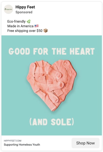
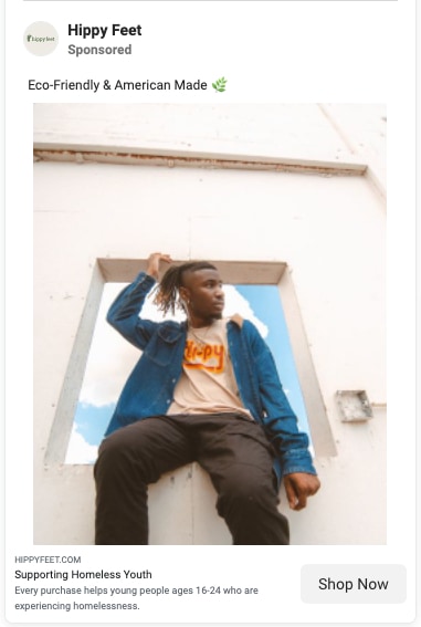
Eco-friendly sock brand Hippy Feet gets right to the point of how they are unique from all the other sock brands.
Aside from being sustainable, their socks are American-made and the brand supports homeless youth. Their ads clearly highlight each of these points.
Why these ads are great
They keep the ads simple, checking off the major features—eco-friendly, made in America, free shipping, supporting homeless youth—and pairing them with clear product-centric images.
Facebook’s audience targeting allows brands like Hippy Feet to show these ads to shoppers that value sustainability and social responsibility, so their focused approach has a great chance of success.
Hippy Feet’s brand identity is well-defined—as we found in our feature on the brand—so they can easily create a cohesive experience from ad to landing page to purchase by keeping with their style guide.
For any celebrity or brand collaborations they do, they create special partnership landing pages that helps funnel the traffic from ads and influencers to the right messaging.
Landing page these ads link to
- Ad #1 & #2: Hippy Feet homepage
Rad Power Bikes solves for your pain points
Rad Power Bikes knows why customers buy their products—to make their complicated lives easier.
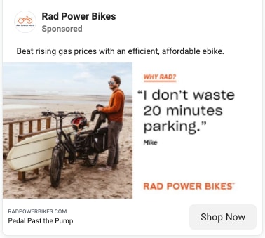
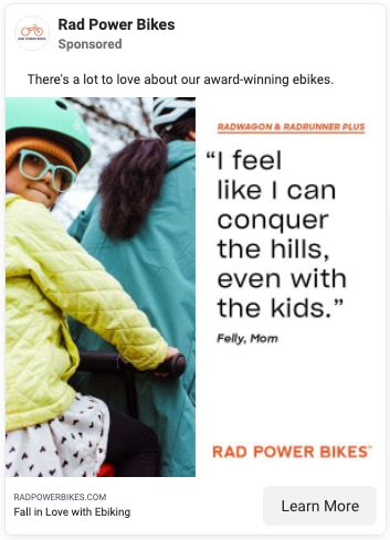
So, they use their ads to target those exact pain points for people who are considering buying an electric bike.
Why these ads are great
They use real customer quotes to get straight to the pain points that their potential customers are facing, like riding up hills in traditional bicycles or having to park a car.
They even take advantage of real-time pain points by targeting the rising cost of gas and offering the gas-free option for getting around.
The photos are show people out and about, seemingly free of the troubles described in the copy and quotes. The CTAs take it home by encouraging users to Shop Now or Learn More.
Landing page these ads link to
- Ad #1 & #2: Electric Bikes collection page
- Variation of ad #2: Ebike Fit Finder Quiz landing page
PANGAIA wows with vibrant colors
Sustainable athleisure brand PANGAIA creates super comfortable clothing in a whole range of gorgeous colors.
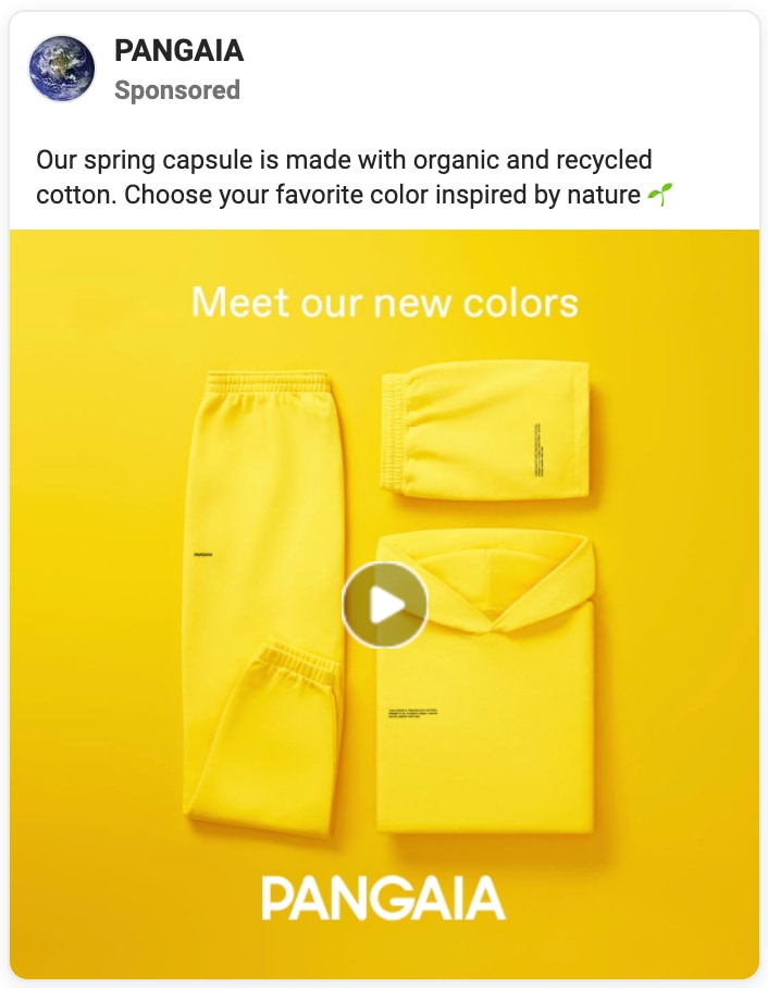
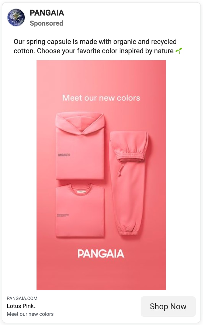
They regularly come out with new collections, often consisting of sweatpants, a hoodie, and a shirt in a single brilliant pigment.
Why these ads are great
Here, they are advertising their Spring capsule collection with colors reminiscent of the flowers and sprouts emerging all around us this season.
The first ad is a video cycling through the colors and the second is one of many standalone image ads showing a single color from the collection. The ads are super simple but the colors alone are exciting.
The copy is also fairly simple, introducing the collection and hinting at its sustainable credentials. It shows that ads can say a lot with a little.
Landing page these ads link to
- Ad #1 & #2: Seasonal Core Colors collection page
Rumpl leverages unique design partnerships
The innovative sleeping bag blankets from Rumpl are super popular—so much so that they’ve made them available in tons of beautiful designs.
Knowing that their customers love the variety of designs they offer, they’ve partnered with many designers to create truly unique limited edition blankets.
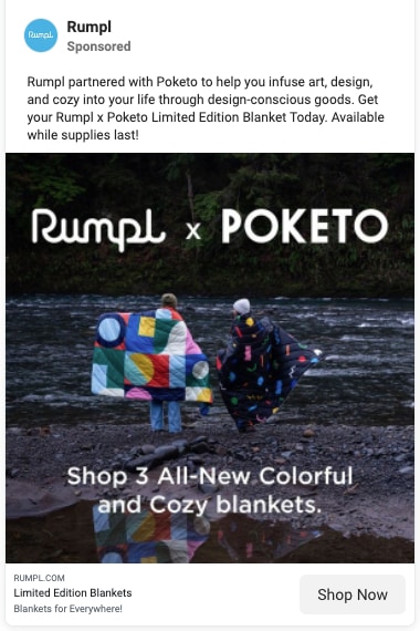
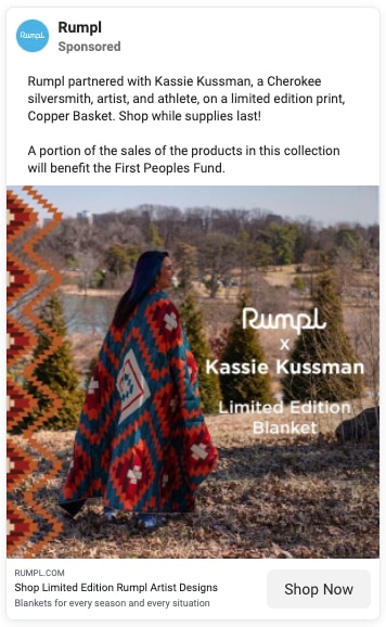
These ads show off these partnerships to attract shoppers of various design tastes.
Why these ads are great
As with all of their product photography, Rumpl shows off these uniquely designed blankets in natural scenes. They center the blanket designs in the photos and demonstrate people using them in the elements.
Since these blankets are limited edition, advertising plays a big role in getting them in front of as many best-fit shoppers as possible. There’s urgency there with limited supplies and the designs will appeal to various types of shoppers.
It allows them to capture a wider customer base, which they can later remarket to for future purchase.
#cta-paragraph-pb#When Rumpl started using Shogun Page Builder to create their own killer landing pages, they saved themselves 200 development hours and increased their conversion rate by 20%.
Landing page these ads link to
- Ad #1 & #2: Collaboration collection pages
Semaine Health woos with sales and samples
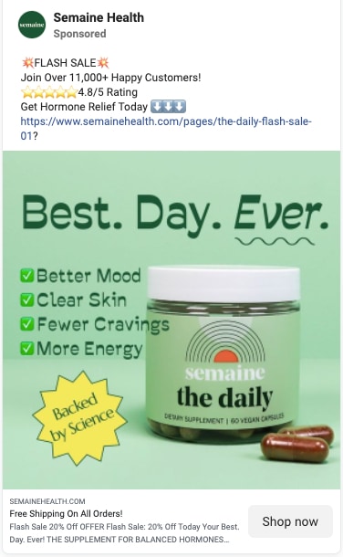
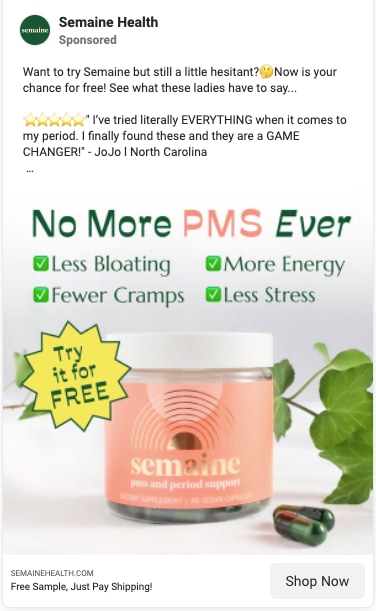
Feminine health brand Semaine uses a flash sale and the offer of a free sample to get people to try their hormone balancing supplements.
With clear benefits and powerful social proof, they make sure that people don’t scroll past without taking a look.
Why these ads are great
Their use of emojis draws users eyes to the quick and unambiguous social proof—11,000+ happy customers, 4.8/5 star rating, a fawning customer quote—before driving you down to the benefit-packed image.
Semaine uses copy in their images to great effect. From the ‘Backed by science’ assurance to the answer to your prayers list of benefits, the target audience would be hard pressed to ignore it.
Finally, for shoppers whose curiosity has been piqued, the offer of 20% off and free shipping in the first and a free sample in the second ad brings them over the line. Why not just give it a try?
Landing page these ads link to
- Ad #1: Flash Sale landing page
Vuori shifts with the seasons
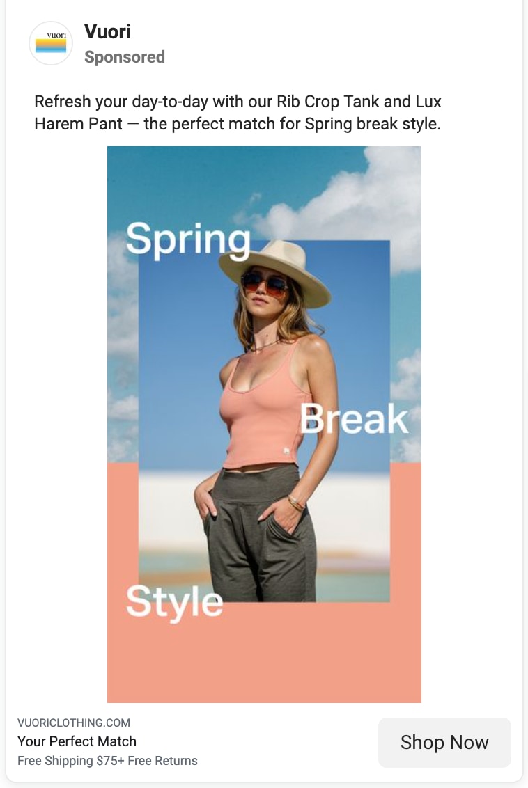
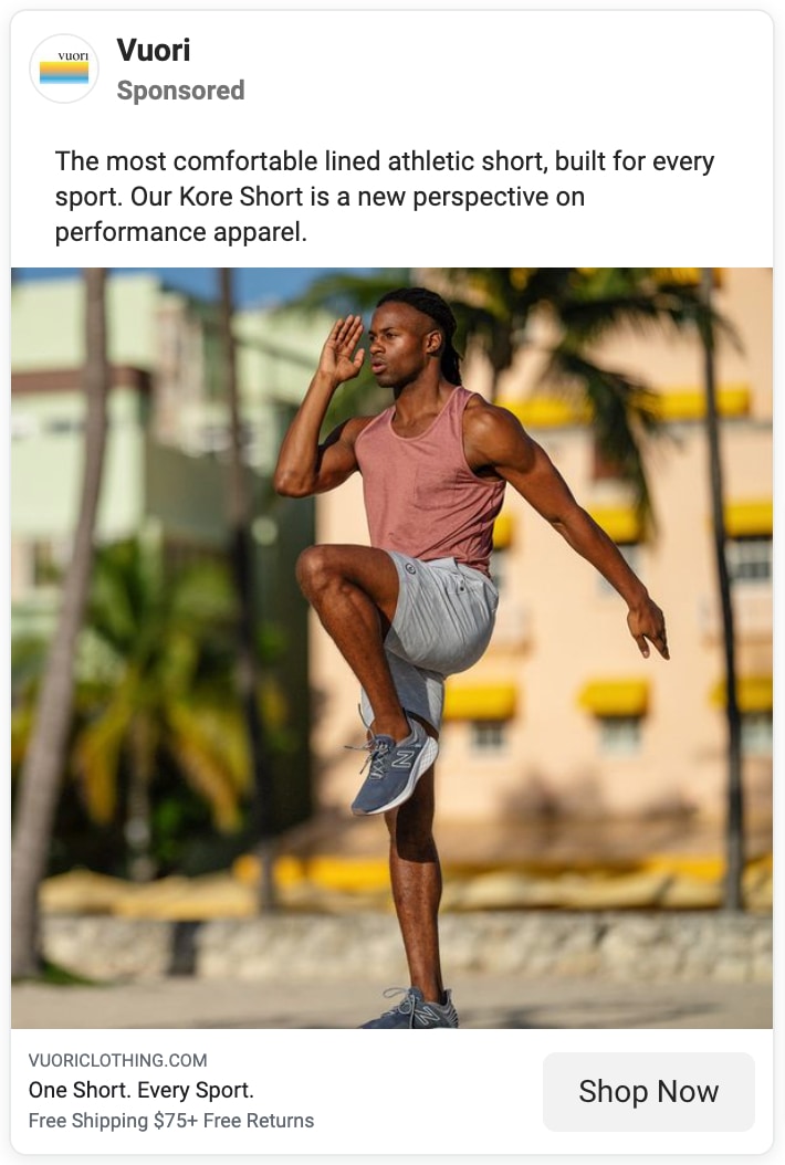
California-based performance apparel brand Vuori invests heavily in digital advertising and uses the seasons to help sell their stylish activewear.
Being based in California, they are blessed with beautiful surroundings for lifestyle photography.
Why these ads are great
The images keep the focus on the models and what they’re wearing. While the backgrounds are out of focus, the Spring vibe is clearly communicated.
Through the models’ poses, the utility of their apparel is obvious—the clothing is both a fashion statement and an athletic jack of all trades.
The copy supports this idea. In the first, it is the perfect Spring Break style refresh. In the second, it’s a super comfy athletic short that can take whatever sport you inflict upon it.
It ends with super simple taglines and the offer of free shipping to get you to Shop Now.
Landing page these ads link to
- Ad #1: Vuori homepage
- Ad #2: Men’s Fitness Favorites collection page
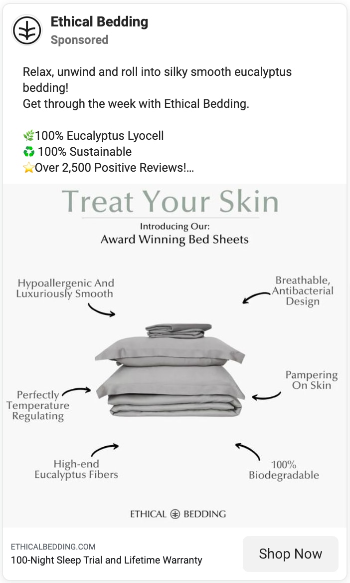
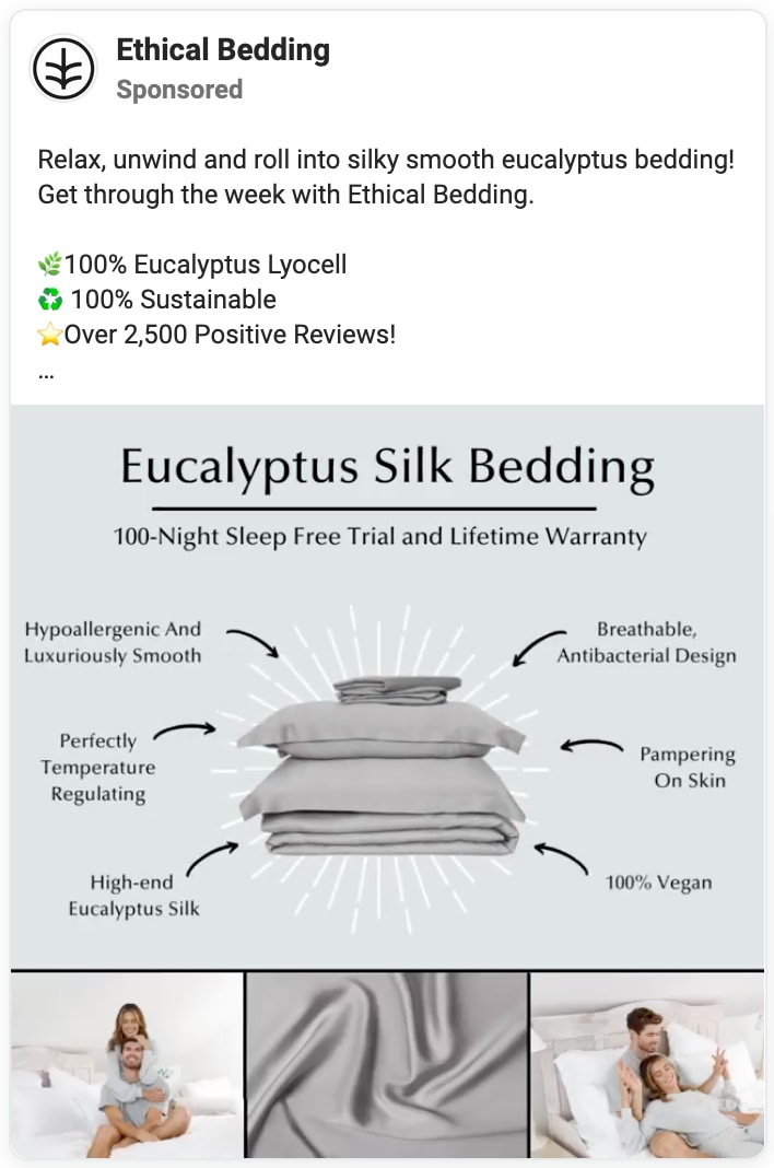
Ethical Bedding packs in the benefits
Sustainable brand Ethical Bedding doesn’t miss an opportunity to mention the many benefits their products offer to your sleep routine.
While these ads both say the same thing, the second ad is actually a video, introducing animation to the ad, with each benefit popping up like a realtime list.
Why these ads are great
What stands out most here are the benefits with helpful little arrows pointing to the product. They say everything a bedding consumer might be looking for—from temperature regulation to breathability and everything in between.
The copy begins with calming verbiage—relax, unwind, roll, silky smooth—and then uses an eye-catching emoji-laden list of what makes them special—100% eucalyptus, sustainable, 2,500 positive reviews.
Once you are nearly convinced, they show the offer of a 100-night sleep trial and a lifetime warranty to drive you to the CTA.
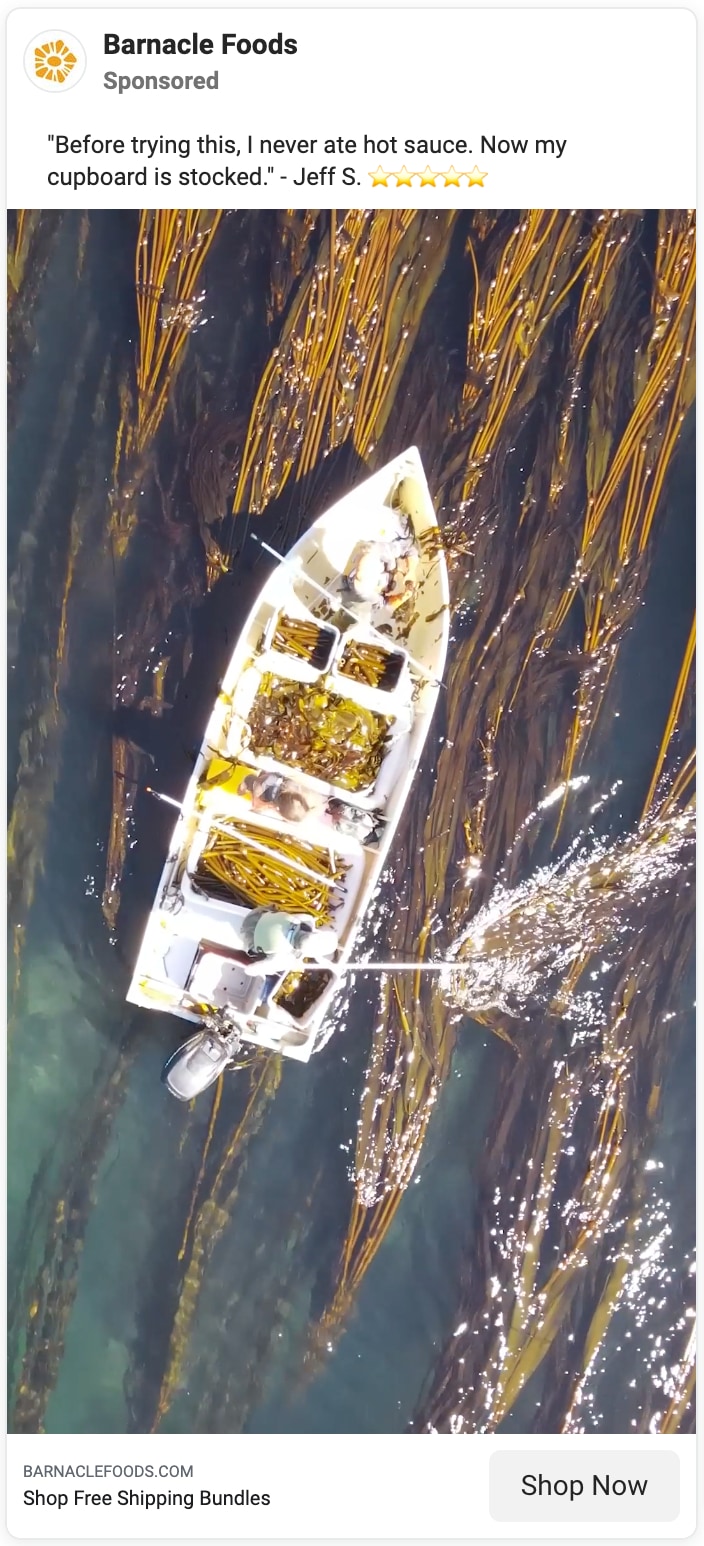
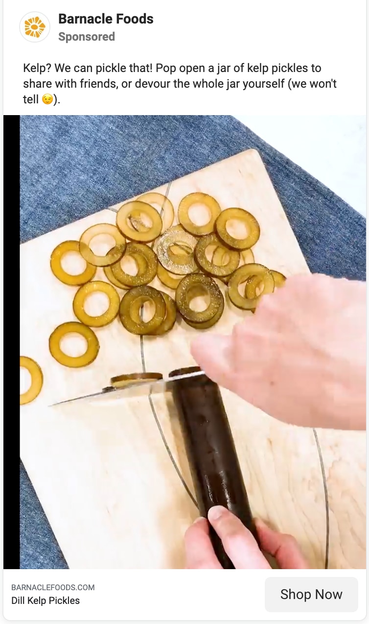
Barnacle Foods gives a view into the process
Some brands offer something totally different and unique that they need to introduce it to the world.
Barnacle Foods has rightly decided to use video ads to do this for their kelp-based product line.
Why these ads are great
The star of these ads is the video showing the harvesting of the kelp they use in their pickles and hot sauce. It recalls the best of YouTube cooking videos.
From pulling the massive sea plants out of the sea and slicing them up into delightful little circles to adding the finished product to toasts and pizzas for a satisfying crunch. They also hint at the sustainability and nutrition of this uncommon food source.
This is supplemented in the first ad with a super positive customer quote that makes you want to try it for yourself. The novelty alone may bring consumers to give it a chance.
Landing page these ads link to
- Ad #1 & #2: All products collection page
Welly Health attracts with vibrant patterns
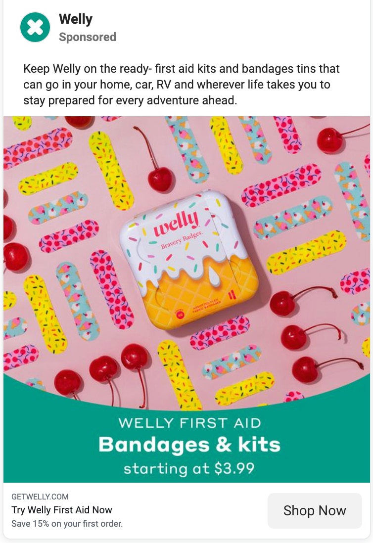
Wellness brand Welly Health advertises their bandages and first aid kits, trying to unseat the big names in first aid.
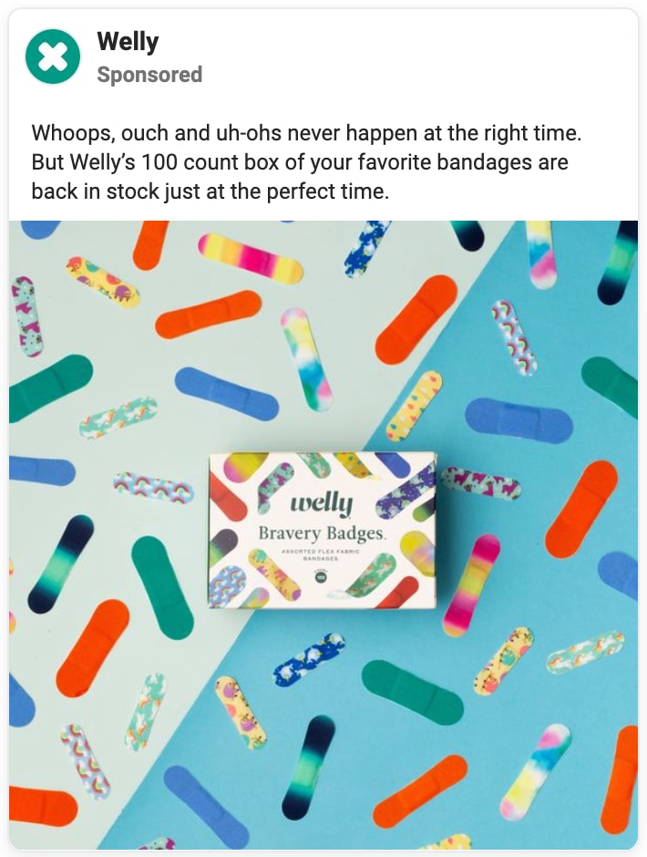
Their marketing is colorful, targeting the kids in everyone with a variety of patterns to choose from to wrap up your boo-boos.
Why these ads are great
To advertise their patterned bandages, they use the bandages themselves to create a colorfully patterned image with the product packaging at the center. It’s hard to scroll past the vibrant display.
The copy focuses on readiness, an apt theme for first aid. The first aid kit is a tin that you can keep in all the places you most need it—thus encouraging shoppers to buy multiple kits just in case.
The second ad is selling their ‘Bravery Badges’ and the copy plays more on this theme of childhood injuries by leading with “Whoops, ouch and uh-ohs never happen at the right time.” It’s clever and makes you want to have some on hand in case you need it.
Landing page these ads link to
- Ad #1: Bandage collection page
- Ad #2: Bravery Badges Box product page
Olipop removes the guilt
Good for you soda brand Olipop brands themselves as the alternative to soda and their ads do a good job of lighting up the senses while taking guilt out of the equation.
Why these ads are great
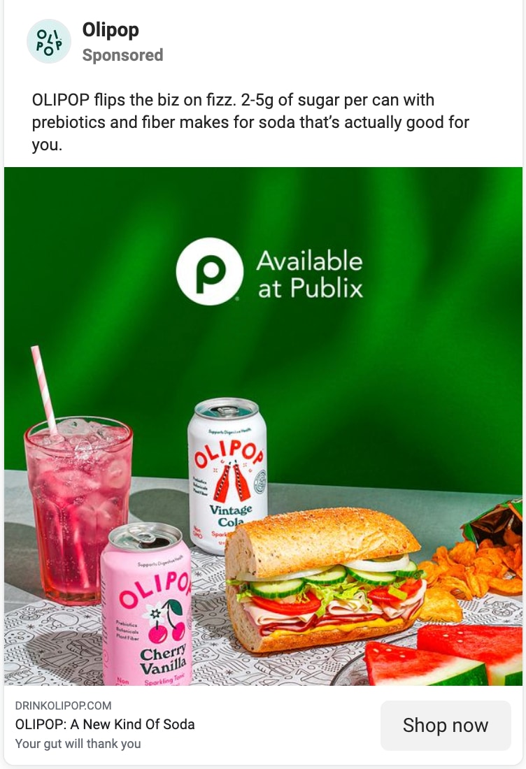
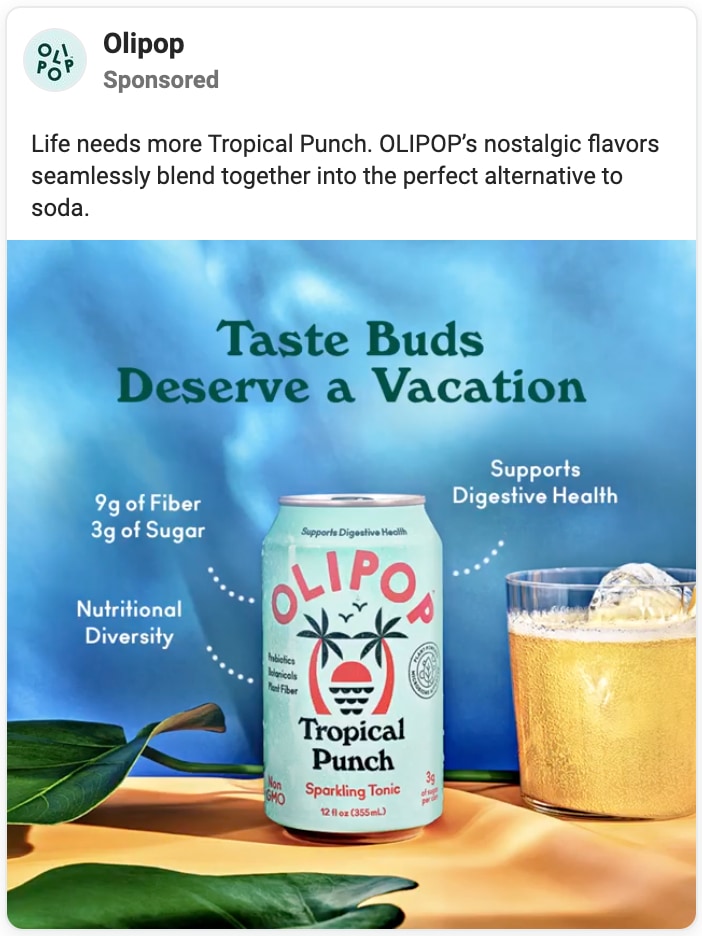
The ads create simple but evocative scenes—ice cold and fizzy soda in glasses, a simple colored backdrop, a few props to fit the theme.
In the first ad, the soda accompanies a deli lunch as something perfectly refreshing to wash it all down. In the second ad, the drink feels like an island cocktail with all the relaxation that goes with it.
They use copy to point out what differentiates them from regular soda—high fiber, low sugar, prebiotics—and why it’s actually good for you.
Olipop found success with targeting a US audience of 21 and older and lookalike audiences to their top purchasers, excluding anyone who has purchased in the past 30 days. In 2020, they increased their ad budget and saw a 2.1X increase in online purchases.
Landing page these ads link to
- Ad #1: Store Locator page (for Publix stores)
- Ad #2: Tropical Punch product page
Chubbies uses humor to persuade
Apparel brand Chubbies sells shorts that “spread that Friday at 5pm feeling” and a huge part of their brand identity is humor.
In fact, two of their five brand values are Irreverence and Laughter, which seem to work in the service of the other three—Fun, Relaxation, and Adventure.
Why these ads are great
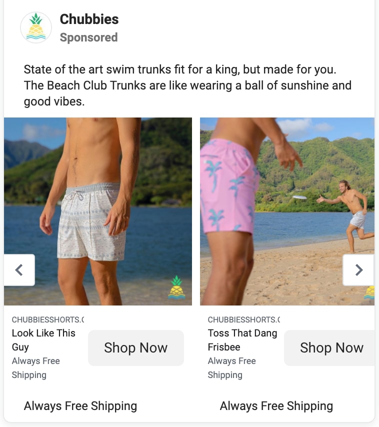
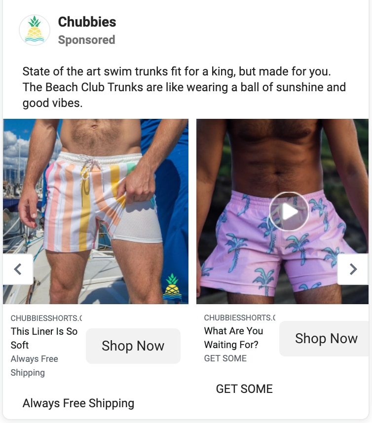
Chubbies brings their one-of-a-kind irreverent humor to their Facebook ads, stretching the comedic copy across Facebook’s carousel ad format.
This is the same ad, just scrolled over to the end of the carousel in the second example.
With copy that wittily pairs with the carousel images—such as “Look Like This Guy,” “Toss That Dang Frisbee,” and “This Liner is So Soft”—people are drawn into the story of these magical swim trunks.
They are also able to show off multiple product variations and features with this format.
To further persuade readers, they talk about how their “state of the art swim trunks” are made just for you and feel like “wearing a ball of sunshine and good vibes”, which sounds pretty great. To cap it off, they repeat their policy of “Always Free Shipping”.
Landing page this ad links to
- The Classic Lined Swing Trunks collection page
Imitate the Facebook ad strategy of brands doing it best
With so many people spending so much of their time on Facebook (and Instagram), it’s a great idea to spend some of your ad budget on Facebook ads.
And, the better your ads, the better your results.
It’s important to create ads that will really resonate with the audience you are targeting, then send that incredible traffic to the page that will make them convert.
To make your ads really great, take some of the lessons learned from the above brands and integrate them into your own powerful ads.
We can’t wait to see them!
#cta-visual-pb#<cta-title>Create the perfect landing pages for your Facebook ads<cta-title>Start building and customizing your landing pages to convert that Facebook ad traffic with Shogun Page Builder—no code needed.Design your first page

Sean Flannigan
Sean is one of Shogun's tireless content marketers. When he isn't creating exciting ecommerce content, he's probably biking or at the park.

