22 Landing Page Best Practices That’ll Drive Your Conversions Way Up
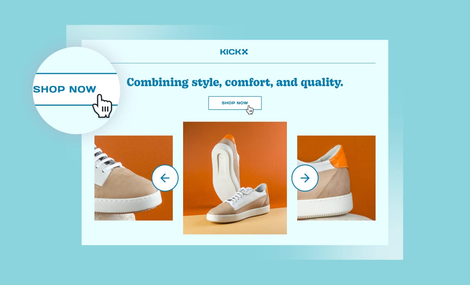
What is a visitor’s first impression when they land on your website? Do they click away in disinterest, or scroll through and follow your call to action?
This initial introduction is critical to drawing leads into the buyer journey.
By following a few landing page best practices, though, you can improve your brand perception, increase trust, and ultimately boost conversions.
A landing page is a page on your store that caters to a specific segment of your target audience. Their purpose differs greatly from that of a homepage in this way.
They increase your conversion rate from lead to customer with a personalized and relevant experience designed especially for that visitor.
This is different from a product detail page, which is designed to introduce your product.
Whereas a product page should include all the details about that particular SKU, the sole purpose of a landing page is to drive visitors to take a specific action.
Everything that doesn’t drive visitors to click that CTA—whether it’s images, copy, or that great video you spent a long time making—is cut.
Landing pages usually come into play alongside targeted paid ads, while product pages attract traffic from a variety of sources, including search engines and social media.
Thanks to their hyper-customization, landing pages are excellent for conversions.
Omnisend found that although landing pages were the least popular type of sign-up form, they had the highest conversion rate at 23%. A truly incredible number.
For context, a 1% to 4% conversion rate is considered “good” for ecommerce.
Armed with that incentive, let’s dive into a few best practices you can implement to create unforgettable landing pages that spur visitors into action.
#cta-visual-pb#<cta-title>Create landing pages that convert<cta-title>Use Shogun Page Builder to combine all the elements you need for a stunning landing page.Start building for free
22 Landing page best practices to follow for boosting conversions
Well-performing landing pages have a few things in common, from an easy-to-use (and navigate) layout to compelling copy and social proof.
Read on to learn about the key best practices to incorporate as you build your landing page.
Landing page best practices checklist:
1. Focus on a single purpose
Your landing page should have a single call to action and exit point. Although you can have multiple CTA buttons, they should all point to the same place—where you want your visitors to go.
With a single exit point, the only way someone can leave that landing page is to follow your CTA (or leave).
This directs all forward motion toward your CTA, whether it’s signups, purchases, or whatever else drives your campaign success.
Tip: Your CTAs may be worded differently, but they should all lead to the same place.
2. Keep it clean
Your landing page should minimize distractions.
Eliminate clutter—anything that doesn’t drive a visitor closer to the CTA—and remove any competing links or CTAs.
Often, landing pages withhold a menu to prevent leads from leaving the landing page (and CTA) to explore the rest of the website.
Below is the normal navigation of the Hummingbird website:
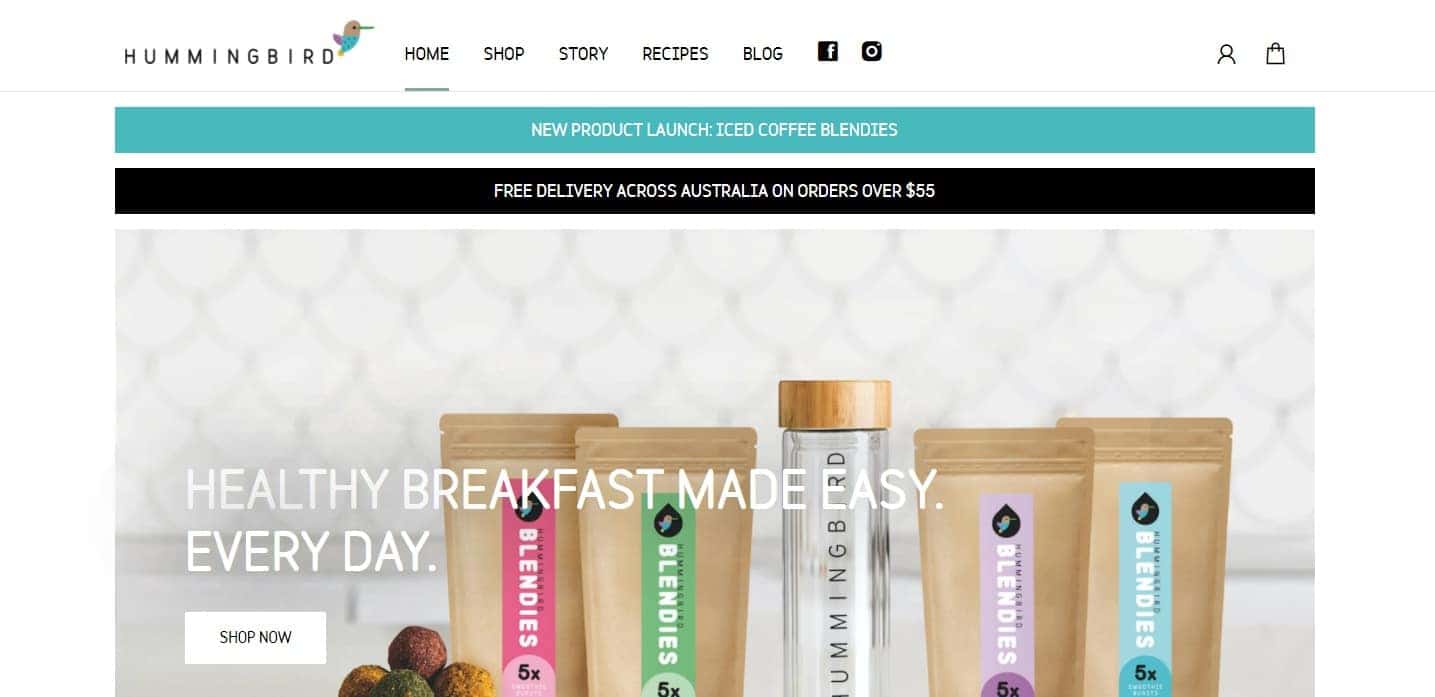
You’ll notice they have a full top menu and two announcement bars for a new product launch and free delivery offer.
Now, let’s take a look at one of their landing pages:
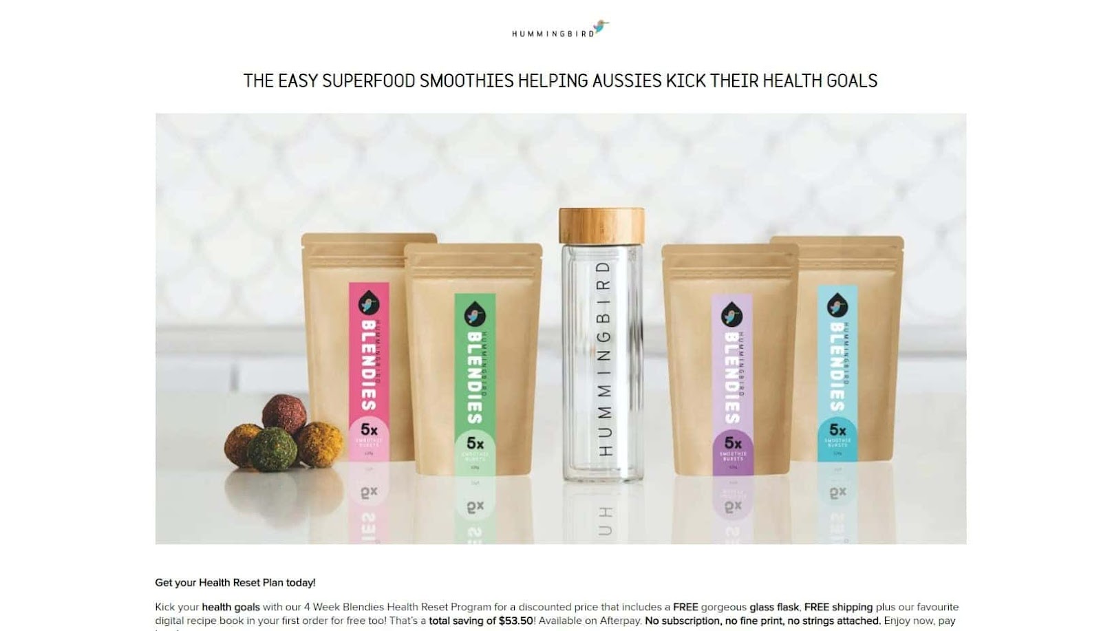
On this landing page, the menu and announcement bars are completely removed. Their logo is not hyperlinked to their homepage either.
Getting rid of navigation ensures visitors are focused on your main CTA and increases the chance of them completing your desired action.
Limiting visitors’ options also removes the risk of shoppers experiencing choice overload and abandoning the idea of making a purchase altogether.
Tip: Turn off pop-ups, announcement bars, and any other site-wide communications on your landing pages.
3. Open strong above the fold
A landing page must make an immediate impression above the fold. This refers to what visitors see in their browsers upon initially visiting the page.
The term comes from the front page of newspapers, where the most compelling headlines had to appear upon first glance of the paper, above where it was folded back.
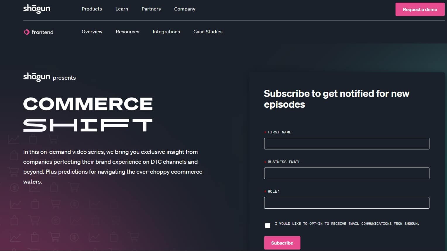
The same concept applies to your landing pages.
Above, you’ll notice that the Shogun landing page showcases a description of the offer, their value proposition, and their CTA (a sign-up form) all upon load and before you have to scroll down to see more.
Visitors must immediately see why they should stick around without having to scroll down and wait for the rest of the page to load.
Tip: Check what content appears “above the fold” on different devices, such as your desktop, mobile phone, and tablet, to ensure your page is optimized across devices.
4. Keep it consistent
Traffic to landing pages often comes from sources where you control the messaging.
For example, you set the headline and description for search ads, then you can design the images that go with social ads.
Your landing page elements need to mirror the tone, wording, colors, and design of the source of your traffic.
They must have the same look and feel to keep the shopper experience consistent from discovery (for example, an Instagram or Facebook ad) through to consideration (your landing page).
Maintain consistency from your first touchpoint to your landing page, and ensure your messaging aligns with your overall brand as well.
Tip: Try using the same headline in your ads on your landing page’s H1.
5. Nail your copy
Your copy must get the message across and push visitors to act. Everything from your headline to the CTA text must compel action.
Some tips for creating compelling copy include:
- Write customer-centric text. Focus on their wants and needs. Tell them what they want to know, not what you want them to know. For example, even if you have certification info elsewhere, a paragraph or icon can tell customers all they need to know without confusing, distracting, or boring them.
- Address their concerns. Figure out what pain points drove visitors to your landing page by testing different ad copy and adjusting your CTAs, monitoring what converts best. Uncover the job to be done (JTBD) that your visitor is considering you for, and highlight how you can serve that.
- Elicit emotions. Use emotional language to boost the response to your messaging. Nielsen found that ads generated a 23% spike in sales when they elicited an above-average emotional response.
- Find a length that works. Depending on your offer, your landing pages may not need much text. There are no hard rules as to how much copy a page should have—depending on your goal, you may need just a few sentences (for example, to download an ebook) or more descriptive content (for example, to convince someone to make a big purchase).
- Avoid jargon. Proof your copy for jargon or anything that might not make sense to your audience. If there’s a simpler way to say something, use that instead.
- Make it skimmable. Break up your paragraphs and cut down longer sentences for easy skimming. Employ bullet points to separate ideas and boldface to highlight key thoughts.
Tip: Stick to one key claim or idea per paragraph.
6. Optimize your CTA

Your CTA is what moves your visitors to the next stage of their buying process. It’s the most important element of your landing page.
Try to keep your main CTA above the fold, and include multiple CTAs across the entire page.
For a longer landing page, you might include three or more CTAs at different intervals—for example, at the top of the page, after listing the benefits, and after displaying social proof.
Make sure all your CTAs work together to convince visitors to complete a single goal. When crafting your CTA, you need to take into account where your visitors are in their buyer’s journeys.
If shoppers coming to your landing page are still in the research phase, use a CTA such as “Learn More” to develop their interest in the product.
Visitors in the decision stage, however, should meet a CTA such as “Buy Now” that will nudge them into making a purchase.
Tip: Test variations of your CTA across the page, such as “Book a Demo” and “See it in Action.”
7. Choose the right visuals
Visuals guide the eye, engage your visitors, and can make a landing page stand out.
Add eye-catching images, incorporate motion such as videos and GIFs, and watch your landing pages come to life.
Introduce important messages into your visuals as well.
According to the picture superiority effect, your visitors will understand and recall the concepts learned in an image better than from plain text.
Tip: Use videos to explain more complex aspects of your product, such as how to use it. Implement GIFs and images to share lifestyle shots and help visitors picture themselves using your products.
8. Consider color psychology
Use color and contrast to paint a clear and attention-grabbing picture on your landing page.
Stay in line with your brand colors, but be strategic about how and where you incorporate them.
Colors often come with various associations as well, so be mindful of what those are for your target audience. For example, in Western culture, people commonly wear black to a funeral, but in East Asian culture, it’s customary to wear white.
Ecological valence theory states different people have different color associations and preferences based on their experiences.
However, there are some universal commonalities.
CoSchedule discovered various word associations more closely connected to certain colors. For example, black is more closely associated with “high quality” than blue.
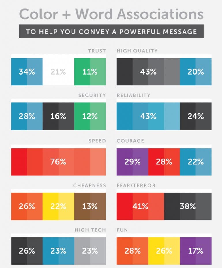
Select your landing page colors strategically based on which emotions you want to elicit and how you want visitors to perceive your brand.
Tip: Make your CTA pop with a contrasting color.
9. Make it interactive
Use interactive elements to encourage visitors to learn more without getting bored. Let your visitors click different elements to progress through your landing page.
Although you want to avoid people clicking away, integrating interactive content can help visitors better absorb the information and engage more with your landing page.
Below, you can see how Leesa uses interactive elements on their website to encourage visitors to learn more about their brand and process.
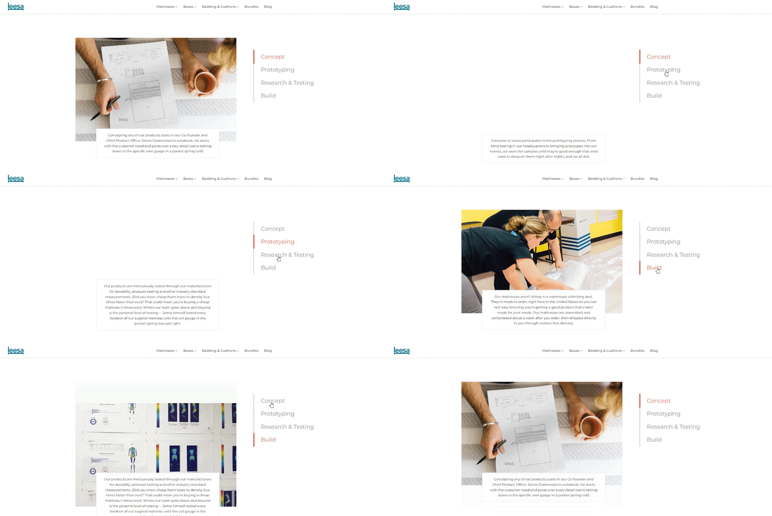
Tip: Try different elements, such as sliders or flip cards, to see what looks the best alongside your brand and serves your purposes better.
10. Flesh out your page structure
The way you structure your landing page is critical to how visitors digest your content.
Most visitors start reading a webpage the same way they learned to read a book, starting from the left top-most corner of the page, then going forward.
You want to order your most important copy and elements into those sections of your website. Two common models for this are to arrange your page into an F-pattern or a Z-pattern.
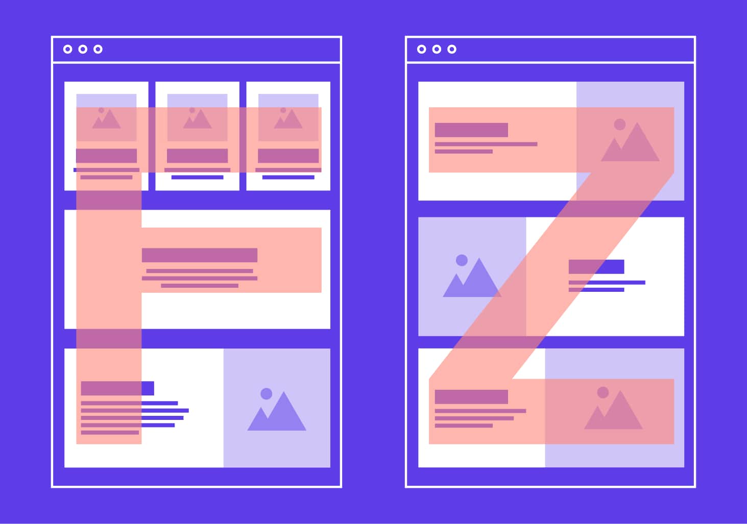
An F-pattern landing page draws the visitor’s eye from left to right, back to the left, then down the left side of the page.
A Z-pattern landing page draws the visitor’s eye from left to right, diagonally back to the left, then to the right again.
On a more detailed level, manipulate structural elements such as headings and subheadings to make your page clear and easy to skim.
Use colors to divide sections, bullet points to highlight key facts, and various font sizes to bring the most important information to the forefront of your visitors’ attention.
Finally, apply directional cues to point your visitors to your CTA.
Deictic gaze teaches our brains to look around us for hints on how to act and where to pay attention. This translates well to landing pages, too—for example, you might have a model pointing directly to your CTA to draw the eye there.
Tip: Try the F-pattern for copy-heavy landing pages and the Z-pattern for copy-light landing pages.
#cta-visual-pb-ee#<cta-title>See 25 Gorgeous Custom Landing Pages<cta-title>Get inspired by jaw-dropping custom Shopify landing pages from incredible brands.Download the ebook
11. Add social proof
Social proof shows visitors there are others—trustworthy customers—who have tried and love your product.
This helps them overcome hesitations to purchase and makes your brand seem more interesting.
For example, if someone sees their favorite influencer enjoying a new product, they may look it up themselves out of curiosity.

Here are a few ways you can incorporate social proof into your landing page:
- Logos of your partner brands
- Testimonials and reviews
- User-generated content, such as videos
- A feed of social posts mentioning your brand
Tip: List full names when possible to give your featured reviewers more authenticity.
12. Establish credibility
Showcase any special qualifications or accolades to build your credibility. For example, you might display the “Cruelty-Free” icon or organic certification.
These badges are a quick visual way to construe information.
A row of different certification badges can reassure visitors your brand is trustworthy and qualified.
Tip: Only show badges and certifications relevant to your CTA.
13. Make it responsive
With more than 55% of consumers around the world browsing the internet from their mobile devices (even more than from desktop), it’s imperative you account for the mobile experience.
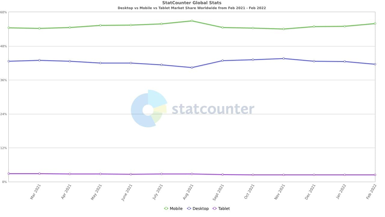
Here are a few more stats to support a mobile-first emphasis:
- 79% of smartphone owners have used their mobile devices to make a purchase online in the last six months
- As much as 34.5% of all ecommerce transactions are performed using mobile devices
- 45% of consumers are less likely to return to an unresponsive website
The online shopping experience is more mobile than not in 2022, and your landing pages should all work well and provide a hassle-free online session.
If a mobile user can’t find what they’re looking for quickly and easily while they’re on your landing page, they’ll simply leave and look elsewhere.
Mobile users won’t interact with your website in the same manner as desktop users, so you need to take that into account when designing your landing page.
Visitors using a smartphone or tablet to view your landing page use their fingers for navigation rather than a touchpad or a mouse for navigation, for example.
Check your landing page layout from your own mobile phone and analyze your thumb zone.
Are all your CTAs within easy reach for a thumb click? There’s a reason the keyboards on most phones appear on the bottom of the screen—it’s the easiest to navigate around from that position.
Ensure all major elements of your website, including links and buttons, can be accessed using thumbs only.
Since mobile users experience your landing page through a smaller screen, you should strive to use a bigger font size, as well as larger input boxes and buttons.
Tip: Ensure any forms on your landing page are easy to fill out and submit from a mobile device.
#cta-paragraph-pb#Want to see what excellent mobile landing pages look like? Check out these 7 High-Converting Ecommerce Mobile Landing Page Examples to Inspire Your Store.
14. Make your CTA easy to follow
Imagine you target and retarget a certain shopper with ads, newsletters, and webinars, and finally, you get them to your landing page.
They’re interested and click on your CTA, then leave without completing their purchase or submission.
If that story sounds familiar, you need to analyze your CTA user experience (UX).
Your CTA needs to be seamless and easy for your leads to follow. For example, if your CTA is a form, test it multiple times on various devices.
To analyze the UX of your CTA, check:
- How quickly it loads
- How easy it is to return to
- Whether any field is confusing
- How long it takes to fill out
- How easy it is to fill out (what about from a tablet?)
- Whether the submission button is prominent or hidden
If your form looks too long, a lead may become overwhelmed and leave.
Similarly, if your “Buy now” button leads to a long purchase process, your lead may get impatient and leave.
Ultimately, you want to make it as easy as possible for visitors to complete the action your landing page points to.
Tip: Consider two-part CTAs, especially for longer forms. These CTAs are split up into an initial “hook” and then followed by remaining questions.
For example, you may only ask for a name and email address at first glance. When someone enters this information and then clicks submit, it would take them to your full form with the name and email address pre-populated.
This way, you get their foot in the door and avoid overwhelming them with too many fields at first glance.
15. Use promos wisely
Not all landing pages need promotions and discounts.
In fact, sometimes, having too many “limited-time offers” and “amazing deals” with countdown timers can make your brand seem cheap.
However, when used strategically, these offers have their place. Rare promotions can delight your visitors and make them feel like they’ve discovered hidden treasure.
If you do include promotions within your landing page, call them out immediately.
And go beyond just “50% off”—highlight the benefit your customers will get when making a purchase. For example, you could say, “Discover your favorite pair of earrings at 50% off.”
You still show off the discount and also share what it means and why it’s so great for the visitor.
Tip: Always highlight the benefits with customer-centric language when sharing a promotion.
#cta-visual-pb-bes#<cta-title>How do top brands create high-converting special offer landing pages?<cta-title>Learn how to build persuasive landing pages for Black Friday, one-time discounts, seasonal promos, and more.Download the free guide
16. Be memorable
No landing page will convert 100% of the time.
However, it’s smart to focus on the entire customer journey as well as immediate conversions.
Even if your landing page doesn’t convert this time, ensure visitors will remember your brand for next time.
According to the mere exposure effect, the more we’re exposed to and remember something, the more trustworthy we find it. Additionally, the Von Restorff effect states we remember things that stand out.
Combine those two psychological phenomena, and you can turn your landing page into a tool that not only gets immediate conversions but also generates more brand trust.
Tip: Use colors, graphics, and smart taglines to make your landing page more memorable.
17. Use heat maps
You can set up heat maps to see where your visitors click on your landing page and where they spend the most time.
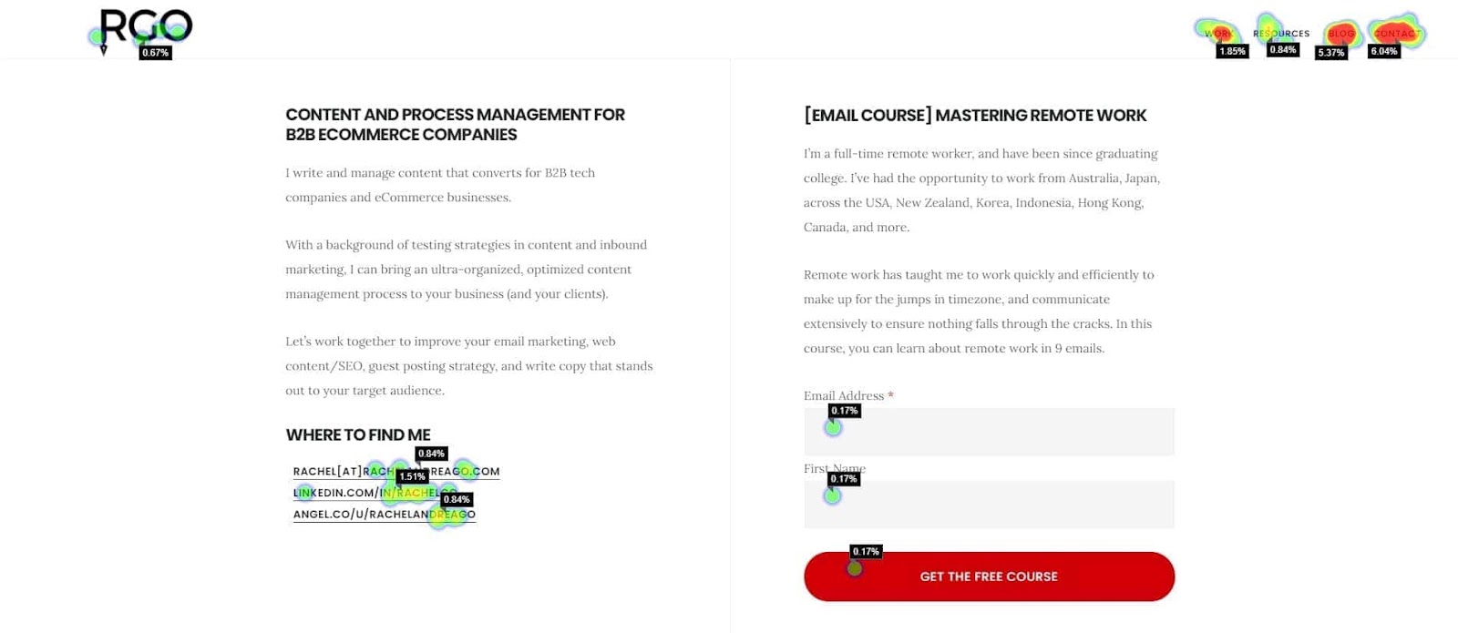
This will reveal any confusing elements on your page and identify your most valuable real estate.
For example, are visitors clicking on an image? You may want to add more explanation beneath it.
Do visitors watch your video? If not, consider swapping it for an image or GIF instead.
Heat maps uncover how visitors interact with your landing page so you can continually improve it.
Tip: Look at how visitors interact with your CTA. If they skip past it too quickly, you may need to make it more prominent or move it to a different spot.
18. Consider an exit pop-up
Another smart tactic is to set up page tracking to predict when a visitor is about to leave or has gone idle.
This provides an opportunity to serve an exit-intent pop-up with the same CTA as your landing page but a little something extra.
For example, you could offer a free gift or a discount if they make a purchase today.
Tip: Add excitement to your exit pop-ups with bold colors, a graphic, or a video to distinguish it from your main landing page.
19. Make it fast
As much as 25% of visitors abandon websites that take longer than four seconds to load, and customer satisfaction drops 16% for every additional second of delay.
That makes speed a top priority for every landing page.
Optimizing your landing page for mobile devices will not only improve its loading speed but also help it rank higher in Google, especially now that the search engine gives preference to mobile-friendly websites.
Much of your landing page load time rests in your developer’s hands and how well they set up your technical SEO.
Low-hanging fruit: Compress all of your images (larger files take longer to load).
Graphics-heavy landing pages often take longer to load because of the massive file sizes of GIFs and product shots.
Tip: Check your page load speed in Google PageSpeed Insights.
20. Say thank you
Don’t forget the confirmation message—although it comes after the conversion, it’s still an important part of your landing page and overall visitor experience.
If someone follows your CTA to make a purchase, use the thank you page to confirm you’ve received the order and that it’s on the way.
This is an excellent time to provide more information as well.
For example, you could let the customer know to expect a confirmation email and tracking number shortly.
You can also take this opportunity to add a secondary CTA. Say someone has made a purchase—you might ask if they’d like to sign up for email updates.
Tip: Once someone has converted, go for immediate gratification. If your CTA was to download something, consider providing a link to their download directly in the thank you page, in addition to their inbox.
21. Optimize for search (SEO)
Most traffic to your landing pages will come from paid ads, social media, emails, and your own marketing campaigns.
However, you should still optimize your landing pages to rank well in search. SEO can be a huge opportunity for free traffic.
Organic search is a valuable acquisition channel to hone, especially for your high-converting landing pages.
Optimize your landing pages for target keywords related to your CTA, and help your audience discover your offer without having to spend on PPC.
Tip: Prioritize your visitor experience over search optimization. The primary function of your landing page is to convert traffic that’s already landed. Consider leads discovering the page on their own as a nice bonus.
22. A/B test regularly
Finally, optimize your landing pages continuously to discover and implement what converts best. You can best do this by running A/B tests on your landing page elements.
A few things you should consider testing include:
- Headline
- Graphics
- Format
- Colors
- Copy
- CTA (color, position, and text)
#cta-visual-pb#<cta-title>Modify pages quickly with Page Builder<cta-title>Use Shogun to swap out low-performing copy, images, or buttons for higher conversion rates.Get started
Execute these landing page best practices to boost conversions
Landing pages are an excellent tool in any ecommerce merchant’s belt. Use them to increase conversions, leave an impression, and build your brand.
Follow the best practices we’ve outlined above to build landing pages that dominate the industry and drive your revenue skyward.
To gain total control over how your landing pages are designed, use a powerful landing page designer like Shogun. You’ll thank us later.
#cta-visual-pb#<cta-title>Start converting better with optimized landing pages<cta-title>Use Shogun to design amazing landing pages with these best practices in mind.Start designing now

Rachel Go
Rachel is a remote marketing manager with a background in building scalable content engines. She creates content that wins customers for B2B ecommerce companies like MyFBAPrep, Shogun, and more. In the past, she has scaled organic acquisition efforts for companies like Deliverr and Skubana.

