5 Core Landing Page Elements For Ecommerce Brands
Ecommerce brands have never had so many opportunities to sell products. Whether it’s through social media platforms like Instagram, through an email newsletter a la partnership, or through emerging channels like Tik Tok, there are several avenues your brand can take.
But no matter what new feature, tool, or platform emerges, one thing is certain: having high-converting landing pages will always be a critical part of selling online.
And while landing page creation for your online store is an investment of your time—the good news is, it’s not rocket science. There are “recipes” you can follow to ensure you include the right stuff on every store page for the effort you’re putting in.
Most high-converting pages include just a few key landing page elements. These core components are the foundation of any successful page, no matter the objective, audience, or industry.
Below, we break down the five most important landing page elements for ecommerce brands to include on classic “offer”-style pages, products, and collection pages, and we spotlight a few examples you can use as inspiration.
First, how are we defining an ecommerce landing page?
It’s important we call out that landing pages are nuanced when referencing ecommerce in particular.
Google defines a landing page as “A webpage where people end up after they click your ad,” and in online marketing generally, they’re often defined as “standalone web pages designed for a specific marketing campaign.”
For our purposes, you can think of ecommerce landing pages as either:
- Classic “offer” or sales pages you create for pairing with your ads or marketing campaigns (think: a dedicated page to guide a visitor to take a specific action.)
- Or your store’s product and collections pages. In other words, the store pages visitors “land” on, browse, and make purchases from.
It’s a good distinction that classic offer landing pages function differently from other pages on your store’s site. Unlike your store’s ‘About’ page, dedicated landing pages are usually built with specific intent, like:
- Drawing attention to a specific product line (prompting visitors to go browse further)
- Sharing a new “coming soon” offer/product
- Prompting subscriptions to your email newsletter
- Showcasing positive experiences from existing customers
You can think of these offer pages like infomercials for store promotions. They’re focused on getting visitors to take just one desired next action (which may or may not be a purchase). You might use these pages to queue up subsequent products and collections landing pages or to collect customer emails for future remarketing.
When done well, your store’s landing pages become the gift that keeps on giving. In fact, ecommerce businesses with landing pages typically see 12.5 more page views per shopping session as opposed to sites with only product pages.
So what does this mean for you?
As an ecommerce marketer, you need to perfect the creation of both classic offer style ecommerce landing pages and product and collections pages. They each have slightly different “anatomy,” but have recipes you can follow for the greatest chance of converting visitors into customers.
Here are the core landing page elements to include on pages where you’re highlighting just one campaign-specific offer.
The core landing page elements for an “offer” page
1. Your offer, clearly stated
Sometimes called a unique selling proposition (USP), a landing page isn’t complete without one.
Your USP is what sets you apart from your competition — it’s what makes your product or service different from the rest. Landing pages need an offer so your customers know what you do, and, more importantly, if you’re the answer to their problem.
An offer on a landing page is typically made of two key parts:
- A headline: a direct yet eye-catching sentence about who you are and what you do; less is more in a headline.
- A subheadline: supporting copy for added context/background.
A great example of a landing page with strong offers throughout is the “Ditch the Zero” page from Olipop, a soda alternative.
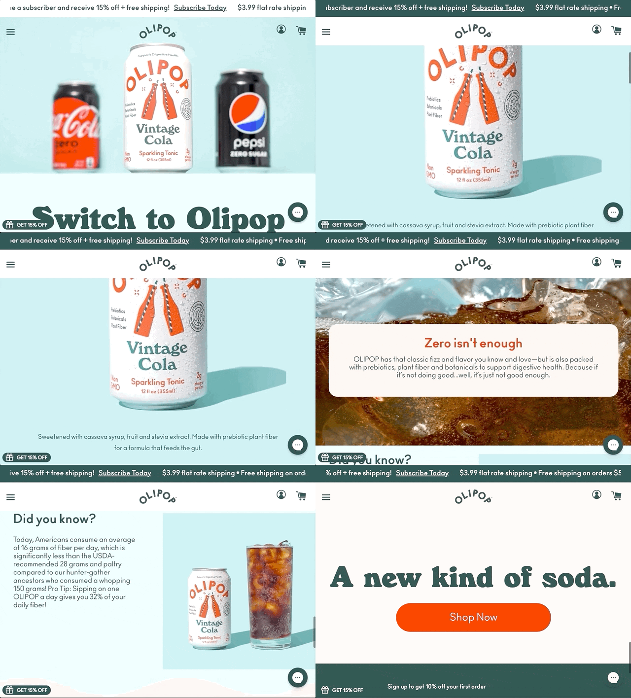
At the top of the landing page, three literal offers run in a ticker-tape fashion, which catches the immediate attention of site visitors. The way these offers are presented keeps customers on the site for longer as they read. It’s also a great way to call attention to what’s on offer before users start scrolling.
Once customers begin to scroll, they’re met with bold claims that encourage the swap from big brands like Pepsi Zero for Olipop as a healthier option for soda lovers.
The copy reads: “Switch to Olipop A delicious soda that’s actually good for you. Anything else is a compromise.” Followed by the big ol’ Shop Now call to action button:
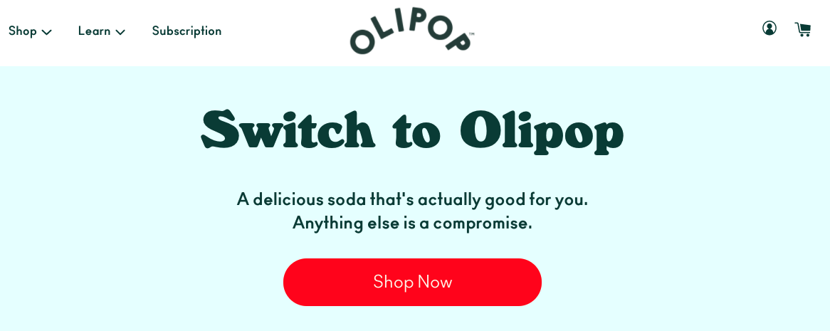
The juxtaposition between Olipop’s USP (a soda that’s actually good for you) and Pepsi, coupled with the offers at the top of the page, acts as a motivator for customers to give Olipop a try.
2. A striking hero image
Like the offer, the hero image (or video) sits at the top of the page and is typically the first thing customers see when they visit your offer landing pages. You’ll want this visual to be eye-catching, yet clearly show what your product or service is or does.
For example, this landing page for Spotify Everywhere is meant to call out the different ways you can enjoy Spotify, the music streaming service.
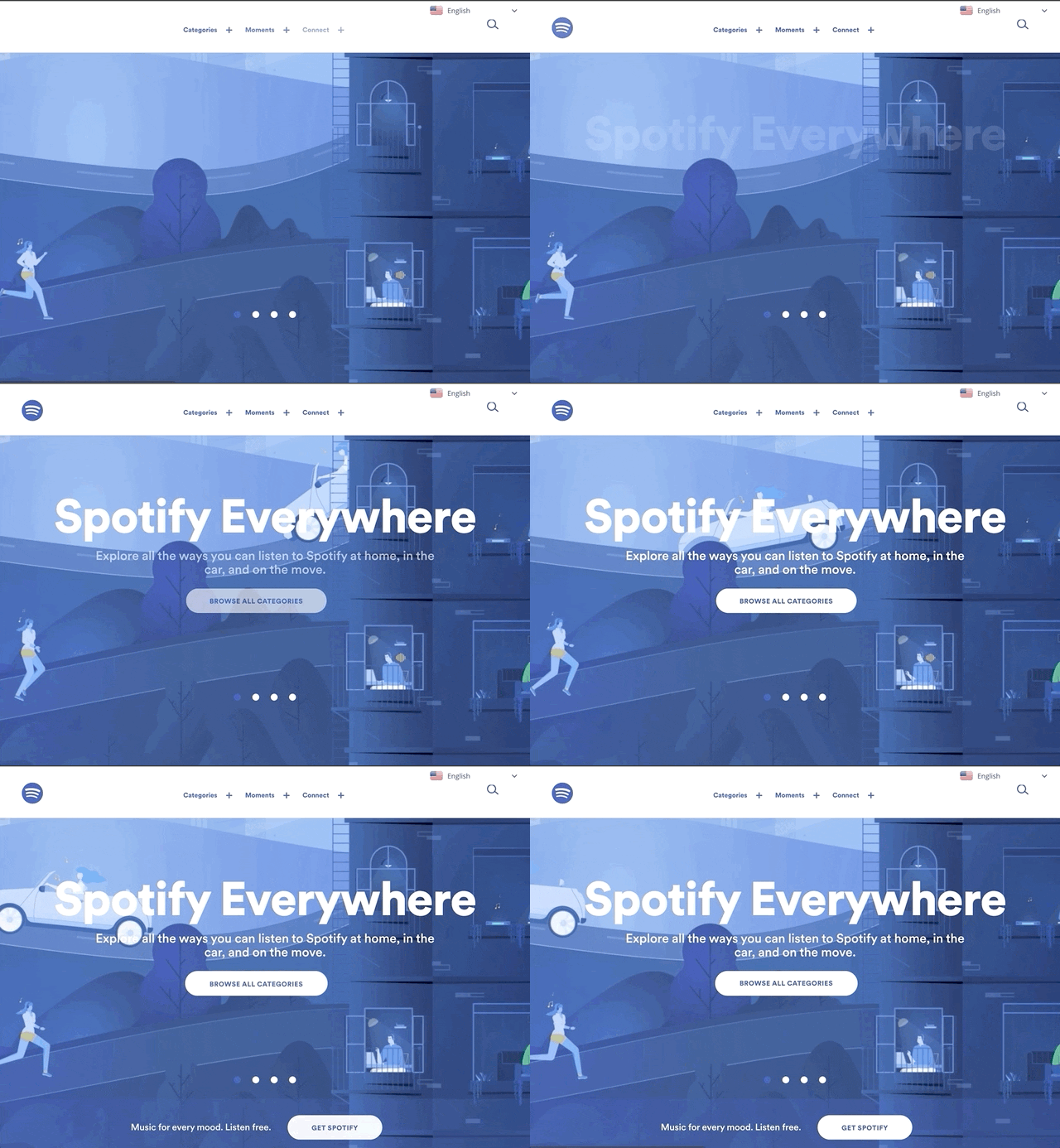
The hero image—or in this case, background video—shows people listening to Spotify in various ways, like in the car, while going for a jog, and during dinner. It’s a great, visual way to tell visitors about your business from a first glance and make an excellent first impression.
But what should you choose for your hero image?
Since this image is the first thing customers see when they navigate to your store, you’ll want to choose carefully! Here are a few components to consider:
Brand
Make sure the visual you choose is on-brand — from the content of the visual to the colors and style. For example, if your store is full of color, it might not be best to choose a black and white image.
Or, if your site adheres to a specific brand palette, choosing a visual outside of those parameters might look awkward.
Focal point
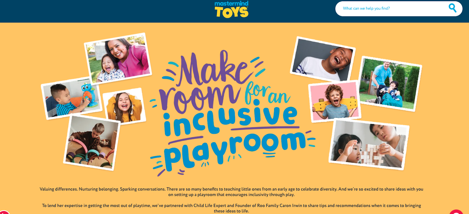
A hero image with a strong focal point helps direct your customers to where you want them to go. Take this page from the Canadian toy store chain, Mastermind Toys, for example.
This page showcases their toy options that “encourage inclusivity through play.” The eye is drawn to the text in the hero image of this page, which reads: “Make room for an inclusive playroom” in a bold, playful script to match the brand.
Beside the text are several cheerful images of families playing and learning together—an embodiment of what Mastermind Toys stands for.
Size
Creative direction aside, it’s important to make sure your hero image is cropped to the right dimensions, and the file is compressed.
Remember, this page serves as a first impression to your customers, so proper cropping is key. Also, too big of an image size can bog down your page load time, which can impact how long your customers stay on your site. Overall, make sure you’re optimizing your image size as you add them to your pages.
3. Compelling Benefits
Besides your USP and feature image, it’s not enough to simply list the features of your product or service or even why your business is different from the rest.
You must also show customers how you solve their problem(s). You do this by explaining the benefits.
A copywriting mentor of mine used to tell me, “When writing about the benefits of a product or service, always ask, ‘So what?’ after every benefit.”
For example, if you wrote:
“Our hand-stitched hats are designed to keep you warm or cool no matter the season.”
You’d ask, “So what?” At first glance, that sentence sounds great, but if you dive deeper into the reason why that benefit is so great, you connect the dots as to why your product is The One your customers need.
Instead, you could say:
“Our hand-stitched hats are designed to keep you warm or cool no matter the season, so you’re prepared for anything.”
Buying gear that helps your customers be prepared for any weather could be their motivating factor, making your product the answer to their pain point. Perhaps they’re looking for a hat they can wear any time of year, without worrying about being too hot or cold.
The bottom line: Make sure you connect the benefits and features on your landing pages, so it’s clear how your product is solving your customers’ problems.
A great example of this can be found with Shogun-customer Nuun’s landing page. They offer a drink enhancement that supports hydration, energy, and recovery for on-the-go folks:
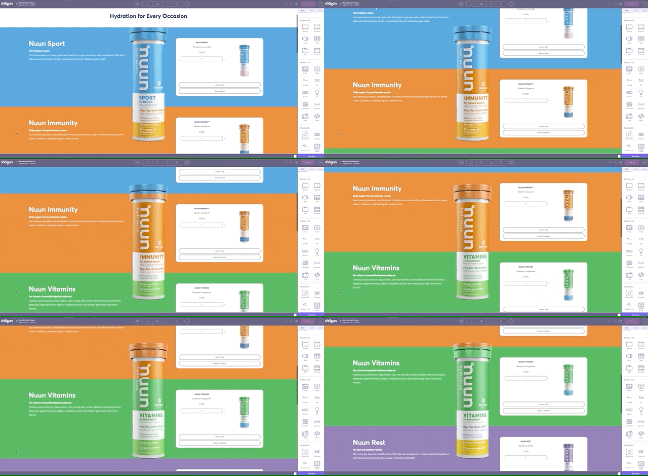
This particular landing page highlights the different products Nuun offers and the benefits of each. For example, under the “Nuun Endurance” header, the copy reads:
A supplement for the hardest workouts.
For when you’re planning to exercise for an hour or more. Elevate your athletic performance with a blend of electrolytes to stay balanced and efficient carbohydrates to support energy production.

From this, customers gather that this product is specifically for longer, tougher workouts and has ingredients that will help them get through it. Consider which benefits you’ll add to each of your product or offer pages on your ecommerce site, like Nuun.
4. Persuasive social proof
Social proof is a critical landing page element for several reasons.
For one, a whopping 94% of customers say that positive reviews make them more likely to purchase from a business. 88% of customers also trust online reviews just as much as personal recommendations from friends and family.
In other words, what your customers say about your business matters tremendously. There are a few ways to do this, but one of our favorites is from beauty and hair brand, Bombay Hair:
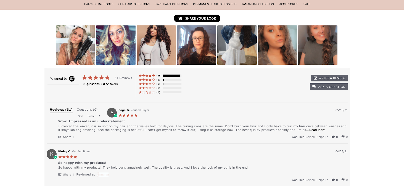
On each Shogun-built product page, Bombay Hair uses a section dedicated to customer reviews and images. Customers can write reviews and post photos of their experience with the product, which adds a layer of trustworthiness to the brand.
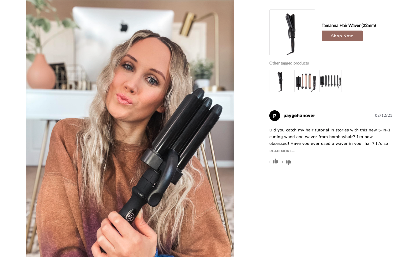
These social proof sections also allow customers to link to the products they purchase, so potential customers know exactly what products to buy to get the look they want. Potential customers on the fence about purchasing can see the results from real customers before buying.
5. A prominent call-to-action
Because a landing page only has one conversion goal assigned to it (e.g. email newsletter sign-ups, promoting a sale or exclusive offer, etc.), your landing page needs to have a clear call-to-action (CTA) that tells visitors what to do next.
This is typically done with a simple button and straightforward copy like “sign up” or “learn more.” Your CTA is just as important as other components of your landing page because, without it, you run the risk of visitors navigating away from the page and, well, not converting.
This landing page from Utz Snacks for its new health snacks line, Good Health Organics, shows the importance of including CTAs on your landing pages. This colorful Shogun-built page includes several large CTA buttons that serve different purposes.
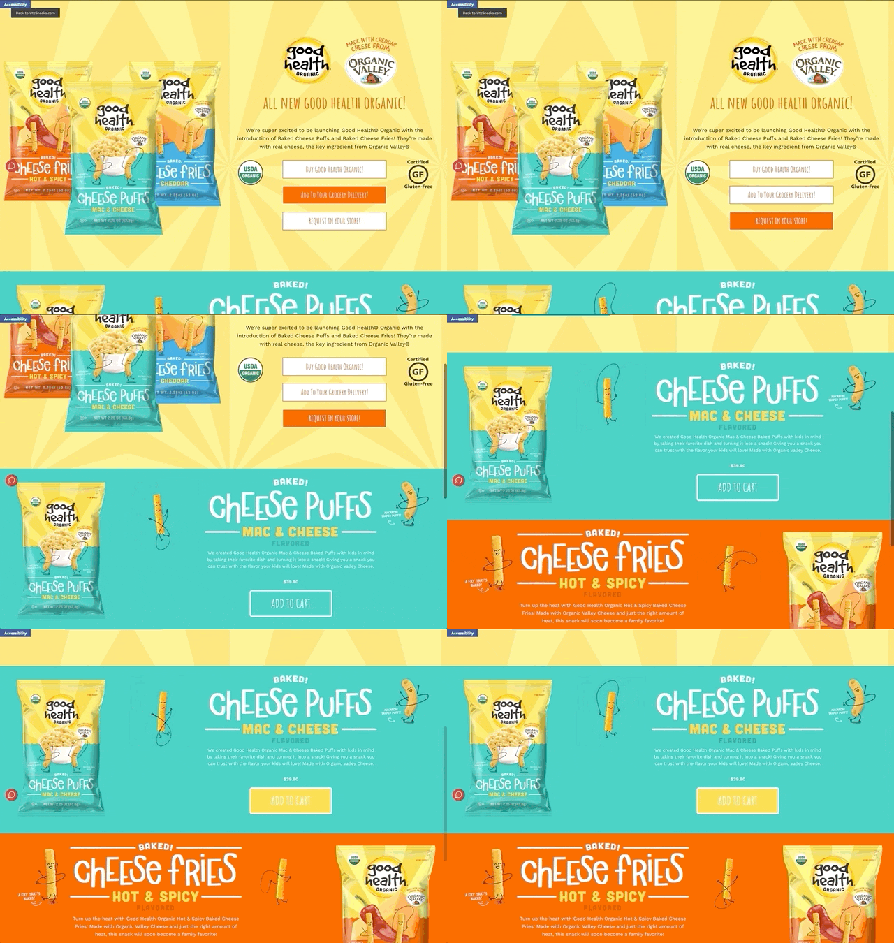
The buttons stand out even on a vibrant page like this one.
Because this is a new product line, Utz Snacks allows customers to not only purchase these snacks directly: “Add to cart,” but also to “request the product as part of your grocery delivery” or to “request that your local grocery store starts carrying these snacks.”
All super clear next steps from this page.
Now, while these five attributes are the core elements of a high-converting offer landing page in ecommerce, there are a few other landing page types merchants typically use to promote offers for online stores and we’ll cover the anatomy of these pages, too.
The anatomy of product and collections pages
In addition to the traditional “offer” style page we covered above, two other types of landing pages exist in the ecommerce world: Product pages and collections pages. These two landing page types are designed to display and promote products and encourage purchases.
Here’s a breakdown of these page types, complete with Shogun customer examples, so you can bookmark ideas for future pages.
1. Product pages
Product pages are the pages on your site that include detailed (but not too much) information about a product you sell.
Product pages are typically built with these core elements:
- Clear and engaging product imagery
- Product details (e.g. product title, description, sizing, materials, functionality, etc.)
- Customer reviews
- An “add to cart” call-to-action button (product pages use this CTA the most)
These pages are often one of the last pages your customers see before heading to check out. Therefore, striking a balance between concise and informative is important for product pages.
Since your customers can’t try on or test out your product before ordering, it’s crucial to design a landing page that converts site visitors into customers. Even if you offer a “try before you buy” option, you still need to make the case for why your product is worth ordering and testing out.
This product page from Rumpl, a maker of blankets made from technical and premium outdoor gear and activewear, is a great example of a well-balanced product page.
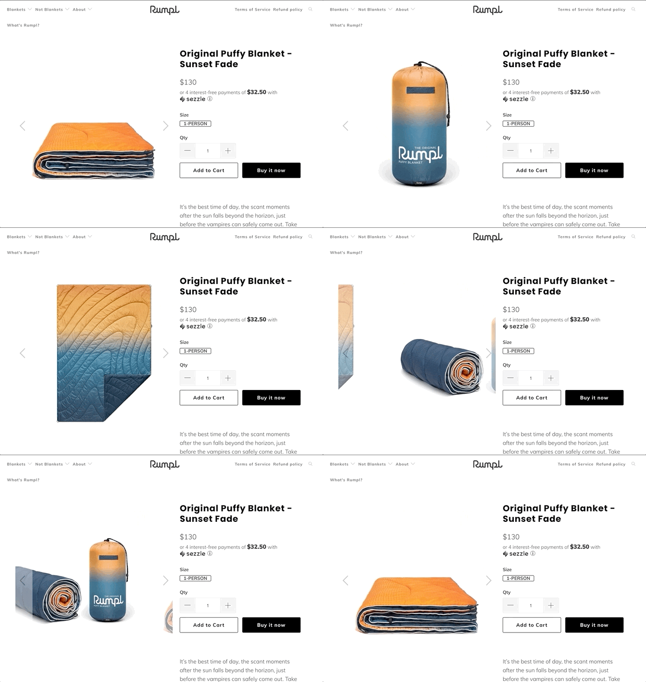
Why it’s great:
- Concise yet detailed copy throughout the page
- Clear, on-brand product and lifestyle imagery
- Other helpful information like features, specifications, and sizing
- An “unboxing” video for added context
- Customer reviews that are detailed and include star ratings
- An FAQ section that answers customers’ most pressing questions
2. Collections pages
When you have multiple products you want to showcase at once, like in a collection, it’s ideal to group up the products on one dedicated page. This way, customers can see the entire collection in one place.
This collection landing page from FEED Projects is an excellent example.
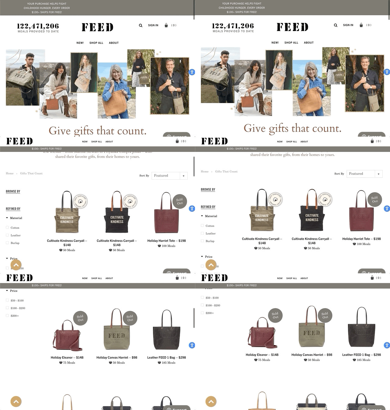
This page is specifically for FEED Projects’ holiday campaign that features a collection of favorites from different celebrities.
This kind of page typically contains the following elements:
- High-quality product images, grouped by product type
- Lifestyle images of products in use (can often feature celebrities included in the hero image)
- Filters, so visitors can sort products by price, size, reviews, and material
- Clear markings for on-sale items
- The CTA: usually a prompt to explore a product on the subsequent product page
To build high-converting landing pages for ecommerce, get clear on your end goal
While ecommerce site pages vary in design and goal, as we’ve seen via the above examples, a few foundational elements are consistent among especially high-converting landing pages.
Before you start to build, consider what your end goal is—or what you want your customers to do after landing on the page.
Do you want them to enter their email address? Do you want them to subscribe to your newsletter to receive 15% off their next order? Do you want them to test your product free with a sample?
Whatever your goal, start there. As long as you have the basics down, don’t be shy about playing with the design and copy elements after you’ve got the core five on the page!

Kaitlyn Ambrose
Kaitlyn works on all things content at Shogun. ⚡

