How Mobile-First Design Strategy Creates The Best Shopping Experiences
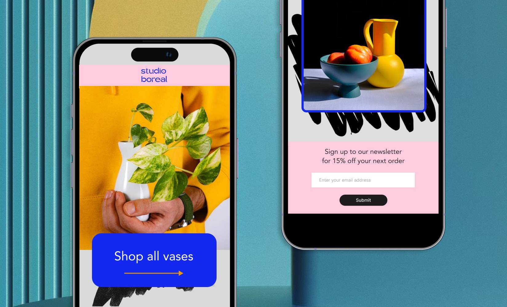
The design of your ecommerce store varies dramatically based on the page it’s loaded on. Desktop users get a wildly different interface than mobile browsers. But is one really more important than the other?
The short answer is: yes.
Studies show that almost 70% of the world’s population now own a mobile phone.
And we’re not just using them to check in with friends—by 2025, more than 10% of all ecommerce sales in the US will happen through a mobile device.
A mobile-first design prioritizes these mobile shoppers.
Instead of building a website on a desktop and assuming all customers will get the same experience, it focuses on how your store looks and feels on a mobile device first.
Unsure where to start?
In this guide to mobile-first ecommerce design, we’ll cover:
#cta-visual-pb#<cta-title>Build better mobile shopping experiences<cta-title>With Shogun Page Builder, you can design by screen size and make your designs responsive on any device. Start building for free
What is mobile-first design?
Mobile-first design is a concept in which websites are primarily designed for mobile devices. Everything from the original wireframe to the web development build-out is done with mobile at the forefront.
Contrary to desktop-first design, where mobile is a second thought, the mobile-first concept is rising in popularity. This reflects the increasing number of people accessing the internet via mobile phone.
Mobile-first design vs. responsive web design
Mobile-first design differs slightly from responsive website design—the latter of which automatically resizes a website’s content based on the screen size it’s being viewed on.
Most ecommerce platforms—including Shopify and BigCommerce—have responsive themes to iterate on top of.
A mobile-first web design approach means the mobile version of an online store is designed first. This doesn’t always mean the site is responsive by default.
The ideal scenario is a website that’s both mobile-first and responsive—a mobile-first responsive design.
So, although you’re prioritizing the user experience for people accessing your store on mobile, the design automatically resizes for desktop visitors.
#cta-mini-pb#Mobile design 101: Learn how to optimize your website’s mobile experience and increase conversions. Watch the webinar
Why is mobile-first design important for ecommerce brands?
Desktop is no longer reigning supreme in terms of website traffic. Studies have shown that almost 60% of internet traffic happens via mobile.
A mobile-first design prioritizes the user experience of your biggest audience.
By prioritizing the user experience of mobile visitors, content will be more accessible to your biggest base of potential customers.
This seamless user experience is the key to driving more revenue for any scaling brand.
“We ensured our site was clean, easy to navigate, and had a consistent look across all devices. We also optimized for speed to ensure customers can quickly load pages on the go. The results? Not only did we see an increase in our mobile conversion rate, but overall revenue went up too.”
— James Smith, co-founder of Inyouths
Plus, a mobile-first design can make your ecommerce website more accessible. A focus on design elements—like contrast, color, and text—when designing for mobile helps you meet ADA standards.
The final big benefit to mobile-first design is that it can help ecommerce merchants meet their target customers in search engines.
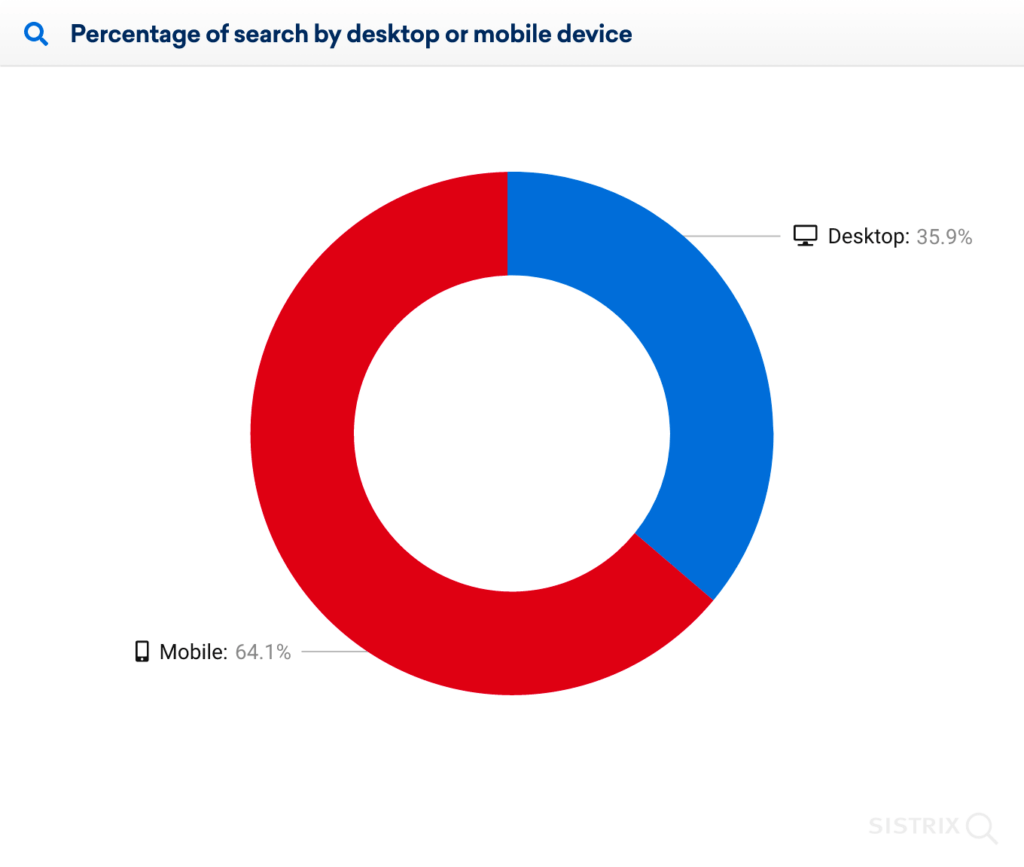
Some 64% of Google searches now happen on mobile.
As a result, Google introduced its Mobile-First Indexing algorithm, outwardly showing the importance of mobile-friendly design on search rankings.
Maria Harutyunyan, co-founder of Loopex Digital, put this into practice for a client whose ecommerce store wasn’t mobile-friendly, resulting in poor rankings in mobile search results.
The team revamped the website by:
- Making the site responsive
- Optimizing images and videos to reduce lag time
- Made the navigation smoother and more accessible
“We saw a jump in our client’s overall conversion rate by 40% over the previous year after implementing these changes,” Maria says.
“We also noted an increase in organic search rankings due to better mobile-friendly performance via Google’s mobile-first Indexing policy update, which greatly cut down on lost revenue due to higher bounce rates caused by inferior designs on smartphones and tablets.”
Best practices for implementing mobile-first design
- Decrease page load speed
- Use vertical images
- Limit pop-ups
- Stack your website navigation
- Use big, finger-friendly buttons
- Experiment with sticky CTAs
- Test your design on different devices
#cta-mini-pb#Want to put mobile-first design to the test with Page Builder? Start building for free
1. Increase page load speed
Mobile page speed has a domino effect on all aspects of the customer experience—starting with marketing.
Search engines like Google have been known to penalize websites with a slow load speed, resulting in fewer rankings. (And we all know the value of SEO for ecommerce merchants.)
Plus, back in 2018, Google found that people who have a negative mobile experience are 62% less likely to purchase from you in the future.
It’s why just a one-second delay in mobile load times has been proven to decrease mobile conversions by up to 20%.
That was a few years ago. Technology moves fast—as do consumer expectations.
Test how long it takes for your site to load with Google PageSpeed Insights. Compare key loading metrics—such as first contentful paint, speed index, and total blocking time—against these Shogun-recommended benchmarks:
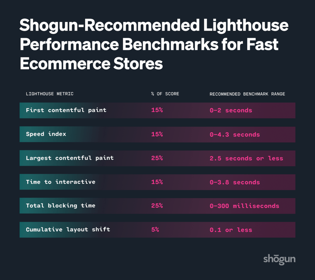
If your mobile page load speed is slower than you’d like, make mobile experiences faster by:
- Minimizing code. Browsers need more time to process excessive code. Minify HTML, JavaScript, and CSS code. (If this code is essential, enable browser caching so the same code doesn’t have to reload each time someone revisits your website.) Some ecommerce platforms, including Shopify, do this automatically.
- Compressing images. Mobile-friendly websites have large images, animations, or videos that are clearly understandable on a smaller screen. Compressing these images doesn’t always impact image quality—it simply makes the file size smaller, therefore improving load times.
- Uninstalling unnecessary apps. Shopify and BigCommerce each have hundreds of third-party apps that promise to help retailers with everything from marketing to inventory. But too many apps can slow down load times—Backlinko found each third-party script added to a page increases load time by 34.1 milliseconds. Audit apps installed on your website and remove those that aren’t essential.
2. Use vertical images
Social media platforms—which are predominantly used by mobile users—are no strangers to vertical images.
This type of stacked image is laid out horizontally and takes up the entire screen, often forcing the viewer to stop scrolling and immerse themselves in the content.
Take a similar approach when creating a mobile-first experience for online shoppers. Use vertical content—be that images, videos, or reviews—on your ecommerce product pages.
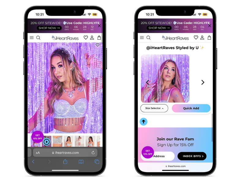
Take iHeartRaves, for example. Its founder and CEO, Brian Lim, said:
“The biggest changes we incorporated at iHeartRaves is making user-generated content, such as product reviews and feedback, more easily accessible on mobile devices.”
“Along with our customer’s photo wearing their purchases, we made sure all of our product images and descriptions fit on the mobile screen without any horizontal scrolling,” Brian said. “We also placed the respective links of the specific rave clothing and accessories in the bottom area of each review, making it easier to purchase items on a mobile device.”
3. Limit pop-ups
Pop-ups serve a variety of purposes, from offering discount codes to collecting email addresses you can use for future retargeting.
But remember: Mobile-first design prioritizes the experience of mobile shoppers. These people are loading your ecommerce store on a smaller screen.
Pop-ups, even those with just a few fields, can distract mobile visitors from purchasing.
Audit your pop-up strategy carefully to prevent overwhelming mobile visitors. This might mean:
- Limiting pop-ups to certain pages. The goal of a product page is to get somebody to purchase. Consider removing pop-ups on this page to keep the user on-task, and implement them on mobile landing pages (such as your homepage or about page) instead.
- Using triggers. Give mobile users a few seconds to interact with your website before they’re greeted with a pop-up. Experiment with triggers such as exit intent (which appear when a visitor signals they’re about to leave your site) or timed pop-ups (which appear after a set period of time, such as 30 seconds).
- Minimizing the pop-up box. If you don’t want to limit pop-up usage, give customers the option to minimize it. That way, they can revisit the pop-up they previously exited once they’ve read your page content.
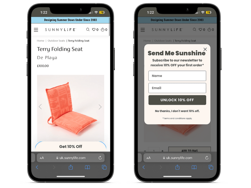
SUNNYLiFE is one DTC brand using this approach with its mobile-first design approach. It worked with design agency Createur (and Shogun!) to test and redesign product pages.
Its ecommerce store has a small pop-up appear on its mobile website that offers a 10% discount in exchange for their name and email address.
Customers who find the pop-up distracting can minimize it. But, if they change their mind and want the discount, they can click the “Get 10% off” button that sticks to the bottom of its product page.
4. Stack your website navigation
Your website navigation is arguably one of the most important elements of your ecommerce store. It’s the map that guides people around your website, helping them find the products they’re looking for.
Stack your mobile navigation to only link to your most important categories to prevent overwhelm.
If customers need greater search functionality, hide subcategories within folders that appear when the main option is clicked.
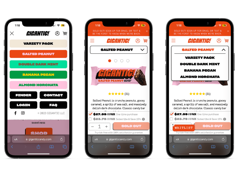
Gigantic Candy put this into practice with its mobile menu. Its main navigation bar is stacked and hidden out of the way—unlike desktop navigation, which is typically always accessible from any page.
Content takes priority, but the search function is there for those who need it. Each product page also has its own navigation.
Customers browsing a certain flavor of chocolate can quickly view and switch to other flavors that better suit their tastes—without having to hunt for it.
5. Use big, finger-friendly buttons
How many times have you visited a mobile website and accidentally clicked the wrong button?
Your shopping experience is thrown off course. You hit back, try to find the section you were up to, and click the right button.
Small buttons provoke users with “fat finger syndrome”—a problem that happens when a user’s finger is too big to see what they’re clicking. They either miss the button entirely or hit the wrong element.
Finger-friendly buttons help prevent this frustrating user experience on your ecommerce website.
Fix this with your mobile-first design approach by making buttons at least 45 pixels wide—the average user’s finger width. If you have more space to play with, cater to thumb-clickers with a 72-pixel width, which is the surface area of a person’s thumb.
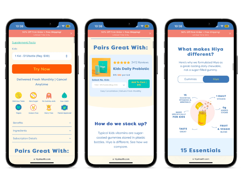
For example, Hiya Health uses a variety of calls to action (CTA) across its online store, from “add to cart” buttons to comparison switchers. Each of these buttons is large and spaced out enough to prevent users with “fat finger syndrome” from having a negative user experience.
6. Experiment with sticky calls-to-action
Best practice for ecommerce web design is to have a call-to-action (CTA) waiting for shoppers regardless of where they are on the page.
With a mobile-first design, this can be tricky.
You’re already working with a smaller screen. Too many buttons can have the opposite effect on user experience and deter customers from reading the page’s main content.
Solve this problem on your mobile-first store by making the page’s main CTA stick to the page as a user scrolls.
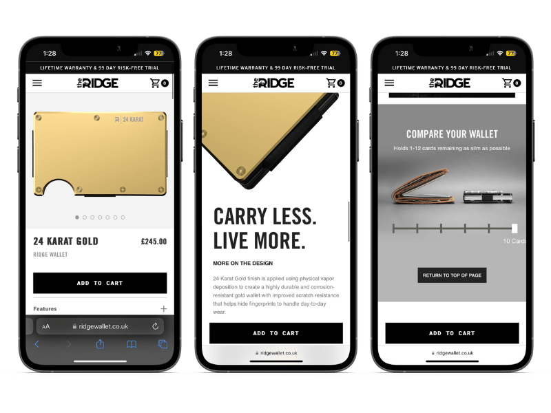
The Ridge, a DTC brand that sells RFID-blocking wallets, uses a sticky CTA on its product pages. The small, high-contrast banner at the bottom of a mobile screen makes the “add to cart” button constantly visible.
Regardless of where a user is on the page, the desired outcome is always clear.
7. Test your design on different devices
The biggest challenge of a mobile-first design is that most designers work from a desktop.
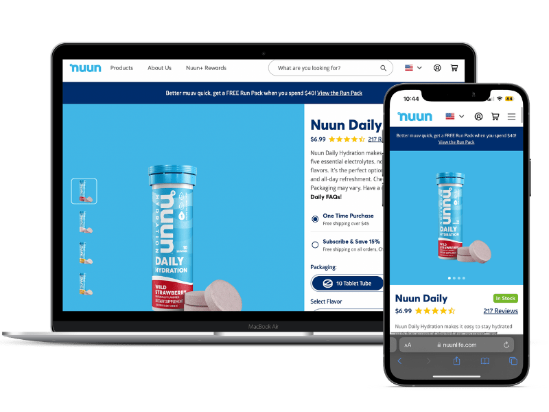
Before releasing your mobile-first design into the world, test whether it looks and functions properly across several mobile devices including iPhone, Android, or Google Pixel phones. Each device has a different screen size, and therefore, displays web pages differently.
But it’s not just mobile devices that need to be tested.
Alongside different devices, check your ecommerce store design works across different browsers. Does Google Chrome show your sticky CTA as well as Safari? Do customers accessing your online store through Microsoft Edge get the same pop-up experience your Firefox visitors do?
Finally, if you’re not ready to release your mobile-first design to your entire customer base just yet (or have a large site you want to minimize risk on), run an A/B test on your Shopify store.
It’ll split pages into a control and variant group, allowing you to compare how visitors interact with your new mobile-first design against the old version.
Mobile-first design FAQs
What are the disadvantages of mobile-first design?
1. Real estate on mobile screens is limited
2. A small percentage of customers still shop primarily through a desktop
3. Most designers and developers work from a desktop, often making mobile-first harder to design
Why is mobile-first design important?
Mobile-first design is important because it designs for the largest shopper base. Most ecommerce activity happens through a mobile device; therefore it makes sense to design your website with these shoppers in mind.
What is the opposite of mobile-first design?
Desktop-first design is the opposite of mobile-first. It’s the most traditional type of design in which the experience for desktop users takes priority over mobile users.
Should I use mobile-first or mobile-friendly?
It’s no longer enough for ecommerce sites to be mobile-friendly. Mobile-first is the better option for modern ecommerce stores because it prioritizes the user experience for the biggest customer segment: mobile shoppers.
What are the best mobile-first breakpoints?
A breakpoint is the width value of a screen that triggers content to be resized. Sites using Shogun Page Builder use 0px – 767px breakpoints to display content on mobile.
What is the difference between mobile-first and desktop-first?
The biggest difference between both design approaches is the device it’s prioritized for. Mobile-first design is a concept that prioritizes the experience of mobile users, whereas desktop-first design prioritizes users accessing the desktop version on a larger screen.
Perfect your mobile-first approach with Shogun
Mobile-first design is no longer a unique concept.
With more people accessing ecommerce stores via their mobile devices, it makes sense for merchants to prioritize these shoppers throughout the website design process.
As David Zhang, CEO of Kate Backdrop, summarizes:
“The best advice I can offer to other ecommerce merchants is not to neglect the mobile experience. Neglecting it can significantly impact sales, so make sure your website is optimized for desktop and mobile devices. Be mobile-first.”
#cta-visual-pb#<cta-title>Build unique experiences for different screen sizes<cta-title>Page Builder allows you to design by screen size and make your designs responsive on any device. Start building for free

Elise Dopson
Elise Dopson is a freelance writer for B2B commerce and martech companies. When she's not writing, you'll find her in the Peak Freelance community or on Twitter.

