The Importance of Optimizing Your Ecommerce Site for Mobile and How to Do It

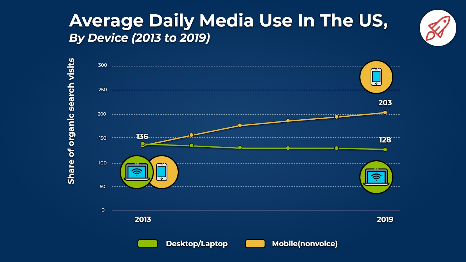
Over the past decade, mobile devices have evolved from a niche product to an ubiquitous part of everyday life. People now spend significantly more time on their smartphones and tablets than their desktops and laptops.

These numbers mean that whenever someone visits your ecommerce site, they’ll likely be doing so on a mobile device. There were 168 million U.S. mobile buyers in 2020, and these buyers generated $338 billion in revenue.
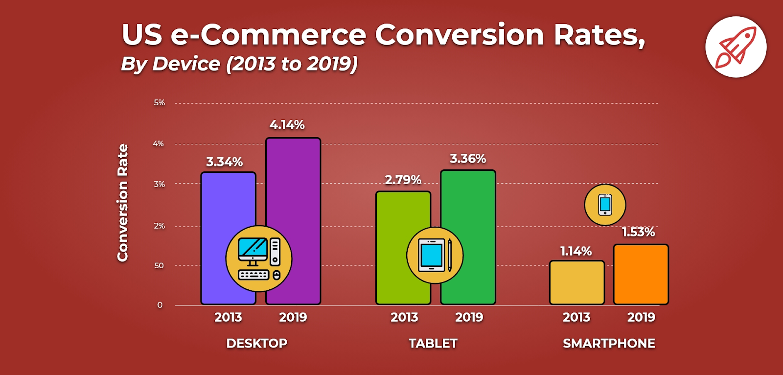
And yet, online stores have not been benefiting as much as they should be from their mobile visits, as smartphones and tablets still tend to produce a lower conversion rate than desktops.

In this guide, we’ll show you how to optimize your site for mobile devices and make the most of all this traffic.
The Impact of Optimization: How Walmart Canada Doubled Its Mobile Sales
If you’d like to see some proof that optimizing your ecommerce site for mobile will lead directly to more sales, you can look to Walmart Canada as a real-life example.
By making the site responsive, which means that it automatically adjusts to the type of device that the visitor is using, Walmart Canada was able to increase its conversion rate by 20% and its mobile orders by 98%.

Here’s how Walmart Canada was able to achieve those results:
Performance
Speed may be the most important aspect of the mobile experience. According to Google, 53% of mobile users will back out of your site if it takes longer than three seconds to load.
So, Walmart Canada made improving performance a priority when the company was redesigning its mobile experience. The company was able to make its mobile site 35% faster by using methods such as caching key components and using icon fonts rather than images.
Layout
After improving performance, Walmart Canada then focused on how the layout of its responsive site would be displayed across different devices.
The company analyzed which browser size widths were most common across both desktops and mobile devices, and then determined that using a 4/8/12 column system would make for an optimal user experience. The site scales smoothly on a grid between 320 and 1,152 pixels, with additional columns being displayed as more space becomes available.
Navigation
The navigation aspect of mobile design can be especially challenging — small screens limit the amount of options that can be included on a single page without looking too crowded, but fewer options also means that the user may need to click through many pages to reach their intended destination.
Walmart Canada found that displaying 60 products per page was just the right amount for mobile. That way, visitors could see a lot of products without making another click, and the amount of products displayed per row could toggle between three, four and six depending on the size of the browser window without there ever being an incomplete row at the bottom of a full page of results.
How to Make Your Online Store Mobile-Friendly
In addition to following the Walmart Canada example that we outlined above, here are a few other tips for making your site more mobile-friendly:
- Mobile-First Design: Walmart Canada had a website well before mobile devices were introduced, so the company had no choice but to start with the desktop version of its site and then develop its mobile experience around that. But considering that the majority of internet traffic is now mobile, online stores that are just starting out would be wise to design the mobile version of its site first and make its desktop version less of a priority.
- Visual Hierarchy: Speaking of priorities, one of the most important things to consider with mobile-first design is that you don’t have much room to work with. You’re not going to be able to feature many different types of content above the fold like you can on the desktop version of your site. Whatever is most important to your business at the moment (limited-time offer, new product, etc.) should be featured at the top of the page where users are most likely to see it.
- Every Page Counts: Think about the customer journey. Most people don’t start at your homepage and then go from there. Rather, the majority of your visitors will land directly on a product page from clicking on a search result, social media post or advertisement. And if they’re sent from a site that’s been optimized for mobile to one that hasn’t been, that experience will be so jarring that they’ll likely just back out.
- Prioritize Content When Setting Your Breakpoints: In mobile web design, a breakpoint is where a change in browser size triggers a corresponding design change, such as the switch from three to four columns in a product listings grid. While the sizes of common mobile devices should be considered when you’re setting your breakpoints, there are so many different types and sizes of devices out there (with more surely to come in the future), you’ll be better off considering the content on your site first.
- Be Bold: The limited space available on mobile devices also isn’t kind to subtleties. Detail that looks impressive on a desktop may very well make your site difficult to read and use on a mobile device. Instead, use bold colors and simple shapes as the basis of your mobile site’s design.
- Make Links and Buttons Easy to Click: Most mobile users will be using their fingers instead of a mouse to navigate your site. That makes it more difficult to select precise areas on the page — to help your visitors out, make clickable elements large and surround them with plenty of white space. Also, keep in mind that while it makes sense to feature buttons at the top of the page for your desktop version, this is an especially awkward area for the user to select with their thumb when using a smartphone.
- Use an Alternative for Hover Effects: Hover effects are an intuitive feature of desktop ecommerce sites. You can set them up so that by simply moving their cursor over a product image, the user can quickly see the available color choices, a zoomed-in view of the product, or some other option. But hover effects aren’t possible on mobile devices, so you’ll need to come up with an alternative, such as text instructions that read “Click to Zoom”.
- Break Up Your Written Content: Even on the desktop version of your site, it’s always a good idea to favor short paragraphs over long ones and generously use headings to make your content as easy to consume as possible. This is even more important for your mobile version, as dense walls of text are especially frustrating when the visitor has a smaller screen to work with.
- Test Continuously: Just because the mobile version of your site functions flawlessly on a Google Chrome browser doesn’t mean it does so on an Apple Safari browser. You should be testing your site on these browsers regularly to ensure there are no flaws that need to be fixed. And while Chrome and Safari are by far the most popular browsers, you should also consider that many of your visitors may be using the Samsung Internet browser, which comes pre-loaded on all Samsung Galaxy devices.
By following these tips, you’ll be able to make your ecommerce site much more mobile-friendly, which will in turn lead to more visitors and more sales.

Adam Ritchie
Adam Ritchie is a writer based in Silver Spring, Maryland. He writes about ecommerce trends and best practices for Shogun. His previous clients include Groupon, Clutch and New Theory.


