10 of the Best Product Landing Page Examples That Really Drive Sales
Conversion rates are critical to the success of your ecommerce brand.
Being able to drive a sale after investing so much in customer acquisition can mean the difference between wasted effort and a successful business.
The median landing page conversion rate across industries ranges from 2.4% to 9.8%. Meanwhile, the benchmark for a good conversion rate is 10%.
All of that to say: product landing pages must do their job—convert.
To boost your conversion rates, you need to craft a product landing page tailored to your audience’s interests and drive traffic towards it. This article will show you a few brands that do just that.
In this article, we’ll walk you through:
#cta-visual-pb#<cta-title>Showcase your products in their best light<cta-title>Use Shogun to start building out your perfect product landing pages.Start building for free
What is a product landing page?
Landing pages are meant to turn visitors into leads. To maximize lead generation, they’re isolated and have no links or distractions.
Normally, visitors are prospects who’re aware of a problem. Then, they learn you provide a solution and follow an action, such as making a purchase or signing up for an account.
A product landing page is similar but is specifically designed to promote or sell a product or service.
So, that could be physical goods, digital products, memberships, or subscriptions. Its purpose is to urge visitors to purchase your product.
What’s the difference between a product landing page and a product page?
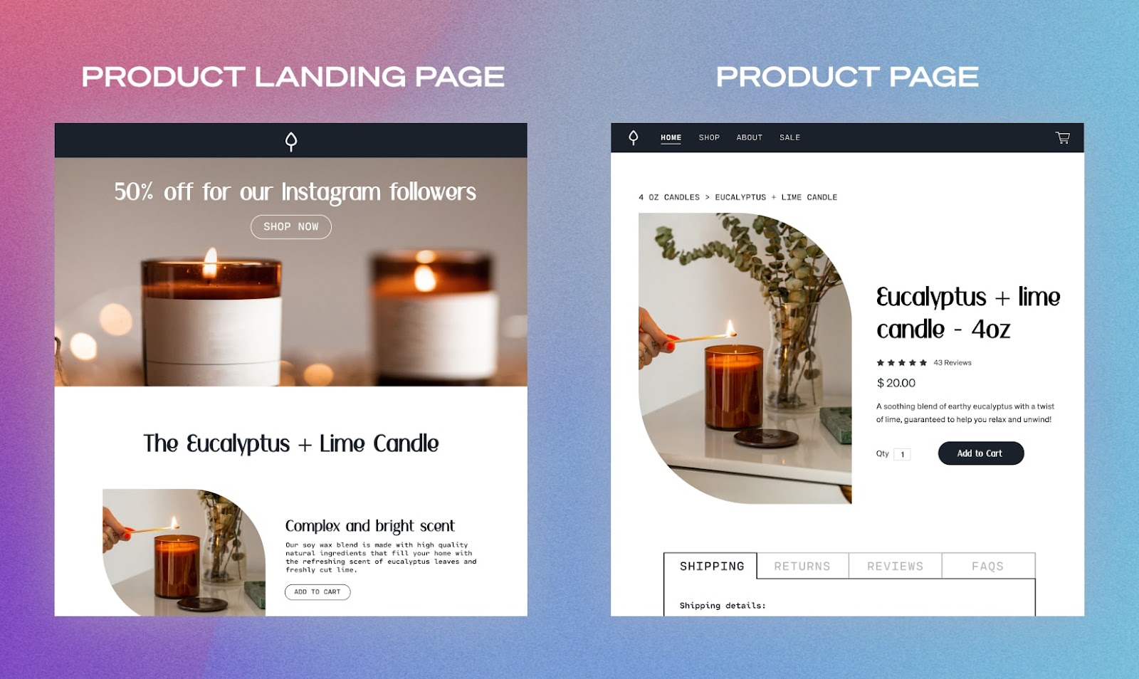
Here’s a quick breakdown of three particular types of web pages for easy differentiation:
- Product page – Features the product; is designed for the overall website; its focus is the product
- Landing page – May or may not feature the product; is designed for a specific campaign; its focus is on an action
- Product landing page – Features the product; is designed for a specific campaign; its focus is on an action
The above information reveals two key differences between a product page and a product landing page: their focus and sources of traffic.
By merging landing pages and product pages, you create a product-focused, campaign-driven page that is only concerned with driving conversions.
A product landing page’s main concern is to drive action and compel visitors to make a purchase. Think of it as an advertising landing page that’s designed for a specific campaign or ad and has one CTA.
On the other hand, a product page may have multiple CTAs and is centered around the product itself.
In terms of traffic sources, a product landing page usually has a dedicated URL tied to campaigns. Unless you’re coming via click-throughs from that campaign, they’re inaccessible.
Typically, a product landing page generates traffic through external marketing channels such as:
- Facebook or Instagram ads
- Email newsletters
- Search ads
Meanwhile, you can easily access a product page from a website’s navigation or by browsing through a store’s shop.
How to drive traffic to product landing pages
I touched on different traffic sources above, but let’s dive a little deeper into how to get customers to your product landing pages.
After all, your conversions depend on shoppers actually finding your amazing pages in the first place.
Paid ads
Having a unique landing page and URL can boost conversions for your ad campaigns while also making it easier to track results.
Two common types of paid ads include PPC campaigns that appear in search results, and social media ads.
Pay-per-click (PPC) campaigns are a common way to reach potential customers who are actively searching for the topic you bid for. They allow your ad to appear at the top of search engine results pages (SERPs) and position your product as the top solution to a problem.
PPC ads are also great at driving traffic for your product landing pages since higher SERP placement can increase your brand awareness by up to 80%.
Paid social media ads also let you reach a wider audience in a targeted manner, which I’ll elaborate on in the next point.
Social media campaigns
Platforms like Facebook, Instagram, TikTok, and Twitter are excellent sources of traffic and engagement.
Brands can run targeted campaigns with content and messaging specially designed to address unique interests and pain points.
Tailor your campaign to your chosen social platform, as each one excels at highlighting different content types:
- Facebook works well with images and lengthy captions and long-form videos or stories.
- Twitter, despite its small character count, is also great for posting images.If live events are part of your campaign, you can create a live feed for real-time coverage.
- Instagram is ideal for sharing high-quality lifestyle photos and videos.
- Lastly, TikTok is best for genuine, less-refined short-form videos. Hashtag campaigns or challenges also attract tons of engagement on this platform.
Utilizing these platforms can enlarge your following, attract more visitors to your product landing pages, and encourage them to make a purchase.
In fact, one study found some impressively high engagement rates specifically from social media followers;
- 91% of followers will visit your website or mobile app
- 89% of followers will make a purchase
- 85% of followers will recommend your brand to their friends or family
Influencer partnerships
Brands that use influencer marketing make a return on investment (ROI) of $5.78 per $1 spent.
You also get the added benefit of transferred trust between your influencer partners and your brand—people tend to trust recommendations from others more than they do from brands themselves.
Collaborating with influencers can help you reach a wider audience, gather user-generated content (UGC), and drive traffic to your product landing pages.
It can even boost your credibility.
Finally, you can customize discounts and offers per influencer. You can run campaigns where each influencer receives a unique link containing their special discount. Clicking on it then directs their followers to your product landing page (optionally customized per influencer).
Tip: Remember to follow the Federal Trade Commission’s (FTC) guidelines for influencer marketing. Be sure to disclose partnerships and be transparent.
Email newsletters
Your ROI for every $1 you spend on email marketing can be upwards of $40.
Email marketing is effective because your mailing list already consists of people who’ve expressed interest in your brand.
Your newsletter audience consists of subscribers—people who have willingly given you their contact details for the purpose of, well, contacting them.
They’ll be more welcoming toward your marketing initiatives compared to typical social media users or people who see your search engine ads.
To drive traffic to your product landing pages with email newsletters, be sure to provide valuable information about the product upfront to entice them to click through.
You can even tailor newsletters to subscribers’ personal interests.
Best practices for creating product landing pages
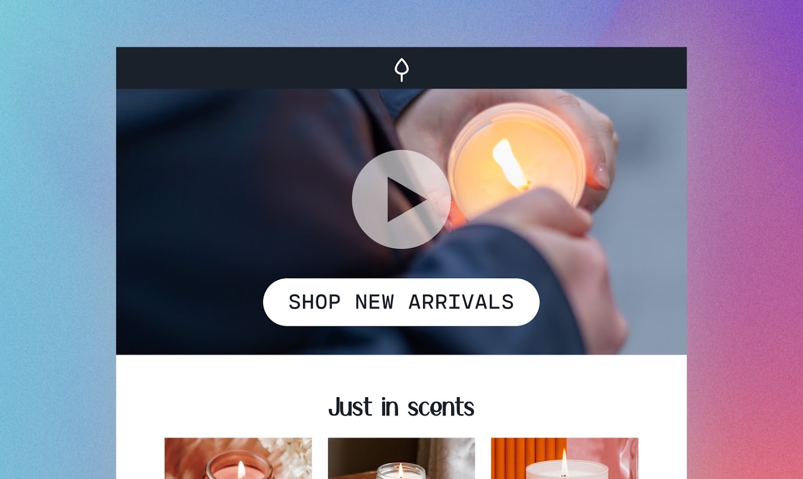
Your landing page delivers your product’s first impression, which is why the design plays a big role.
As your prospect navigates it, they should be guided along a path that leads to a purchase. Here are some tips to drive people towards that action.
Have a clear primary CTA
Having a single CTA and exit point streamlines your prospect’s journey through your product landing page.
Because they can only leave by following your CTA or exiting the page, their visit becomes straightforward.
The better you facilitate a visitor’s experience, the easier it is for you to drive them towards taking your desired action—to purchase your product.
On a side note, you can also have multiple CTA buttons (just make sure they direct your visitors to the same place).
Tip: Some brands also include a secondary CTA at the bottom of the page to capture email addresses, in case leads were not yet ready to purchase.
Make your product irresistible
Show your product in its best light.
Visuals maximize engagement and help your landing page stand out. Use eye-catching graphics, images, or gifs to make your item more attractive.
Videos of your product—which can consist of UGC like unboxings, reviews, and testimonials—give your visitors a first-hand look at how it works and its benefits.
To further drive home your point, incorporate important messaging into your visuals.
In fact, according to the picture superiority effect, visitors better understand and recall concepts learned in an image compared to plain text.
Stay consistent with your campaign
Since this is a dedicated product landing page, adjust every element to match your campaign. For example, you set the title, caption, and visuals for your social media ads.
Make sure the following landing page elements align with your traffic source:
- Context (i.e., the promises you made)
- Visuals (images, colors, fonts)
- Messaging (tone, wording, etc.)
Delivering the same look and feel gives your prospect a consistent experience along each step of their journey.
So, when they click through from your ad, email copy, social post, or whatever means you use to drive traffic, they’ll immediately recognize what they’re looking at rather than feel jarred by varying elements.
Most importantly, keep everything, from your traffic source to your landing pages, in line with your overall brand.
A/B test for conversions
A/B testing, or split testing, entails presenting your visitors two versions of the same landing page. Even small changes to each variant’s elements—like its copy, visuals, or CTA—can have a positive or negative impact on your conversions, allowing you to pinpoint what triggered the effect.
Here’s how it works:
- Prepare versions A and B of your product landing page.
- A is your “control,” or the original version, while B is your “variant.”
- Half of your visitors coming from your traffic source should be directed to your control, while the other half must be taken to the variant.
- If B performs better than A, it becomes the new control.
- Afterward, you’ll need to make another variant testing a different change to the page.
While conducting A/B testing, observe your conversion data to see which page variant works best.
From there, repeat the process to obtain better results; your objective is to maximize the traffic you draw in.
Overall, this methodology helps you discover what compels your target audience to take your desired action.
#cta-visual-pb#<cta-title>Create your product landing pages with Shogun<cta-title>Shogun Page Builder has everything you need to customize and optimize every page.Start building for free
10 Product landing page examples that drive sales
Lastly, here are 10 brands with effective product landing page designs.
One common characteristic they share is they all try to capture a visitor’s email address at the end (in case the sale doesn’t happen).
However, each one has key elements that help them further drive conversions.
Note: All examples showcase screenshots taken directly from the brand featured at the time of publishing.
1. Copper Cow Coffee
“We saw our conversion rate double when we directed them to this explainer page first.”
– Kate Strollo, Director of Digital Marketing at Copper Cow Coffee
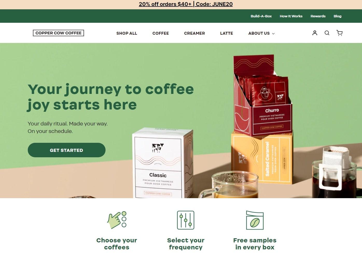
The coffee brand Copper Cow Coffee showcases beautiful photos of their products to increase their visual appeal to visitors and drive them to start a subscription.
The color scheme is also noticeably curated, making it easy to associate with the brand.
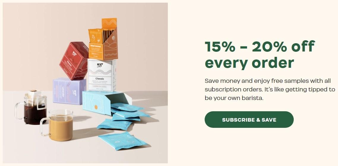
Copper Cow Coffee also uses eye-catching fonts, making relevant offers (like the whopping discount for every order shown above) easily noticeable.
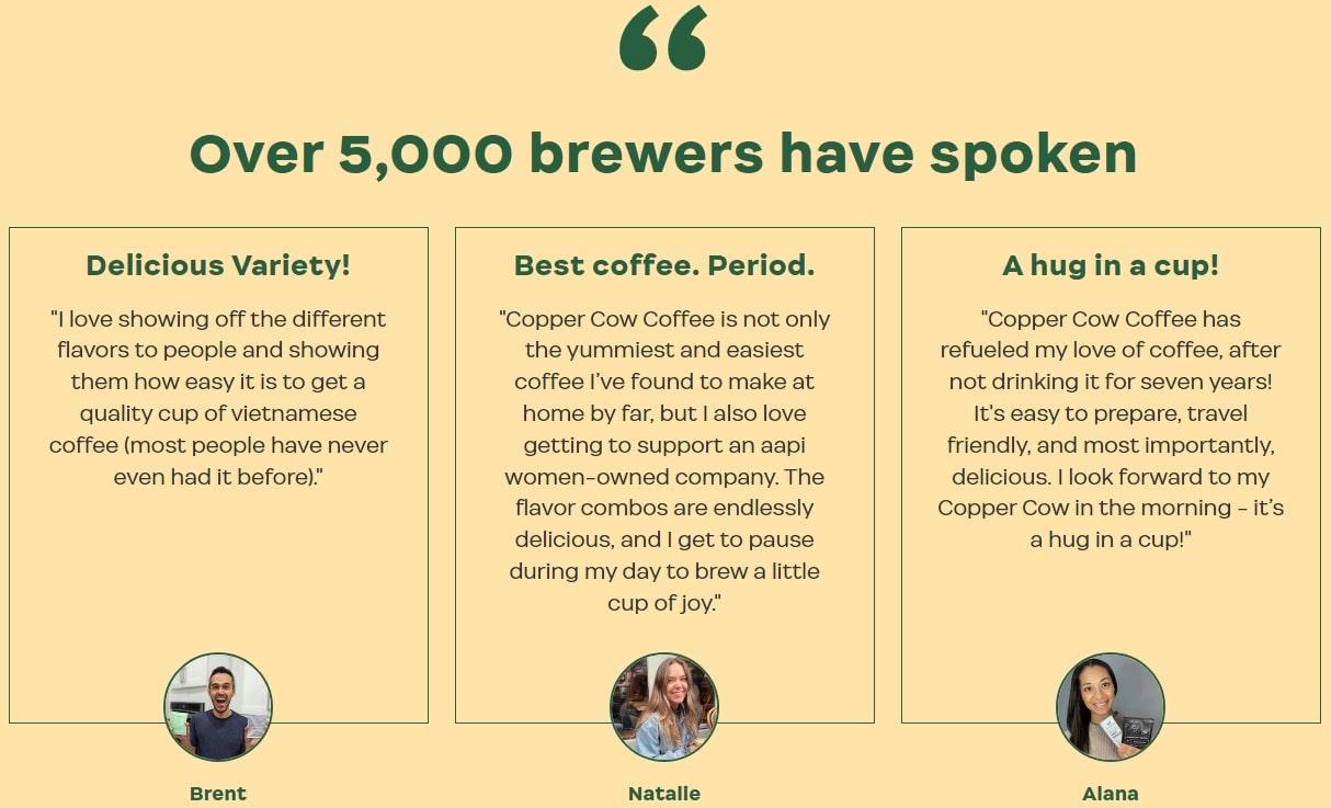
The inclusion of customer testimonials adds credibility to the brand’s messaging, further solidifying the claim that their coffee is excellent.
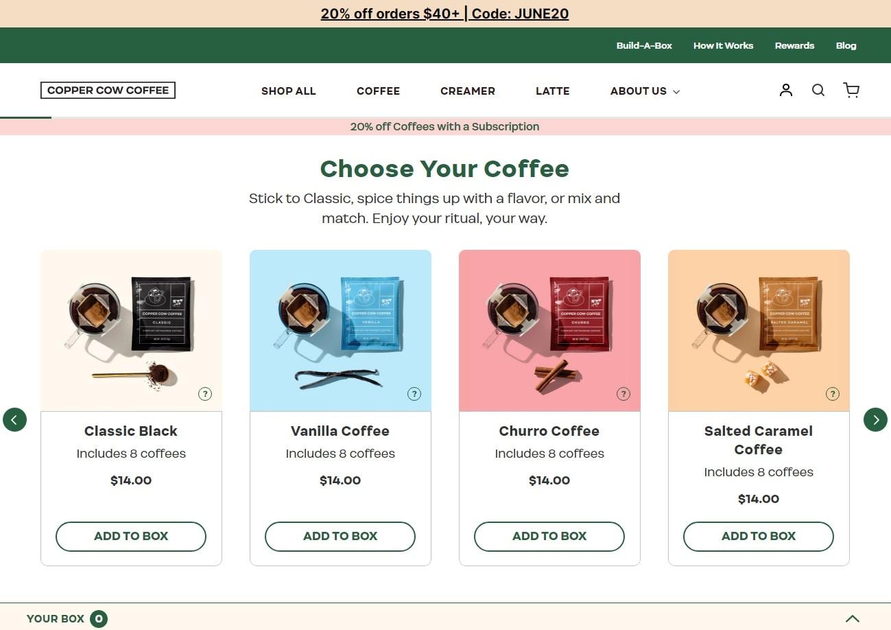
Lastly, Copper Cow Coffee streamlines visits by ensuring every CTA leads to the same exit point: a webpage where people create their unique subscription box.
If visitors are unsure how to begin, the “Start Quiz” button at the end of the page lets them take a coffee quiz.
Based on its results, Copper Cow then makes personalized recommendations.
#cta-mini-pb#Learn how Copper Cow Coffee used Shogun Page Builder to grow their brand through education. Learn More
2. OLIPOP
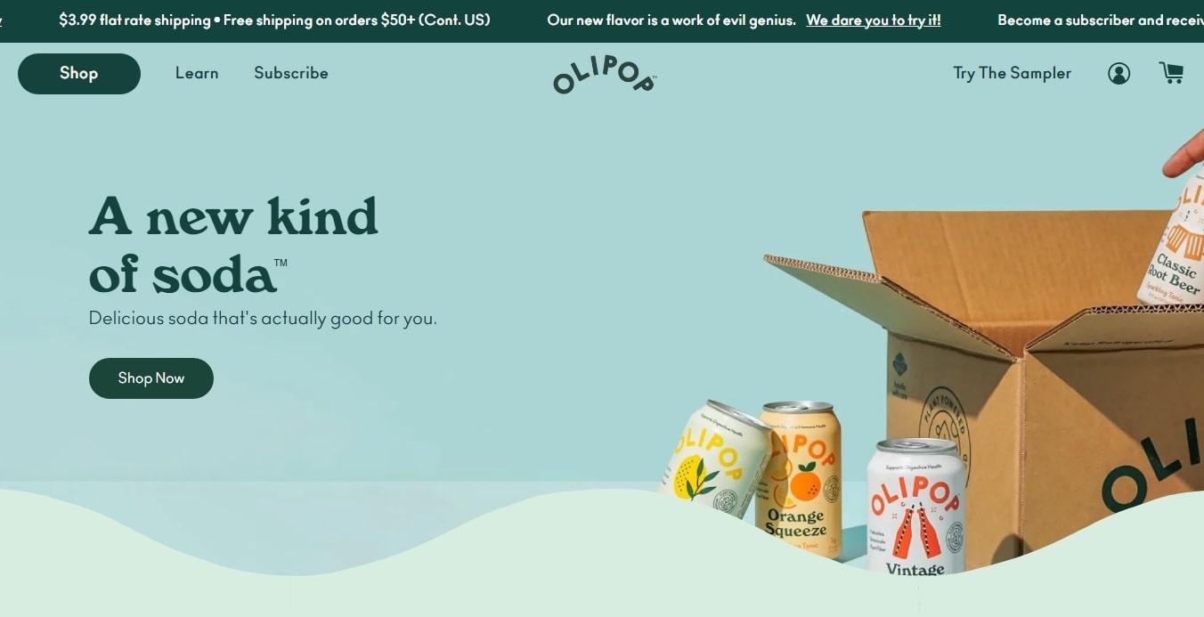
OLIPOP, a brand specializing in healthy probiotic sodas, leverages ease of use to make their product landing page stand out.
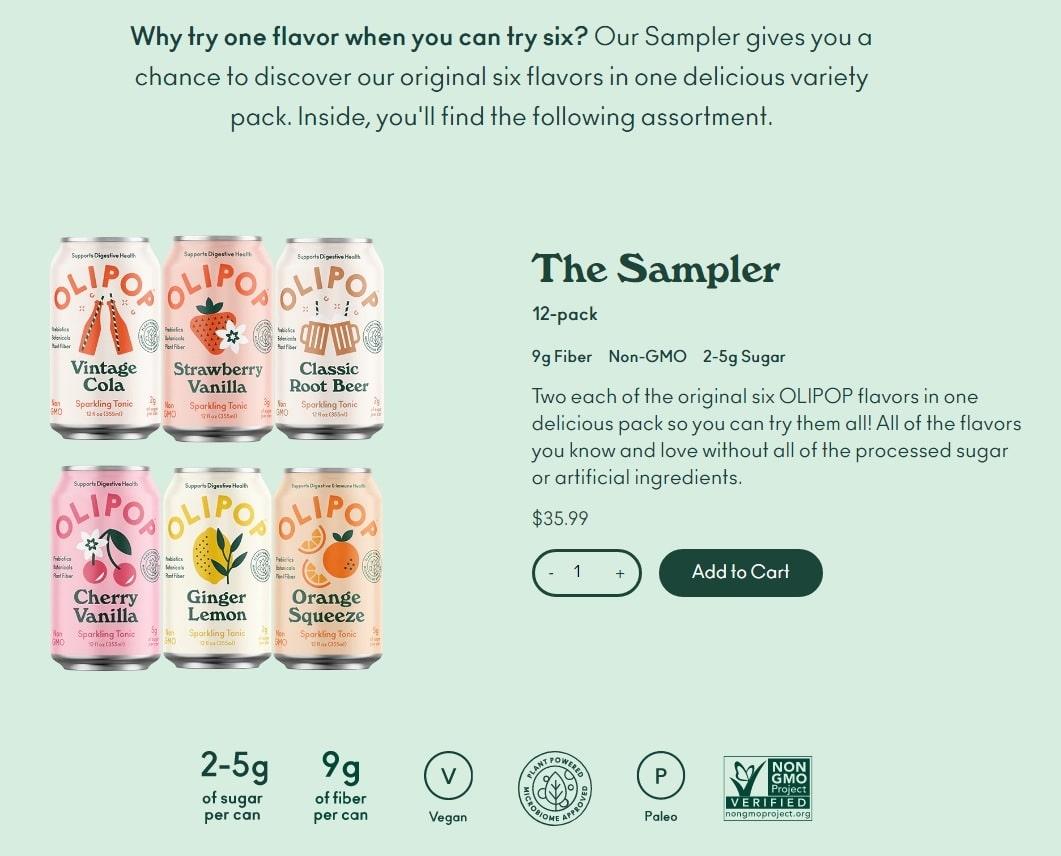
Besides the use of crisp product images, the brand offers visitors the option to purchase their promoted Sampler right from the landing page, effectivelyreducing touchpoints along the buyer’s journey.
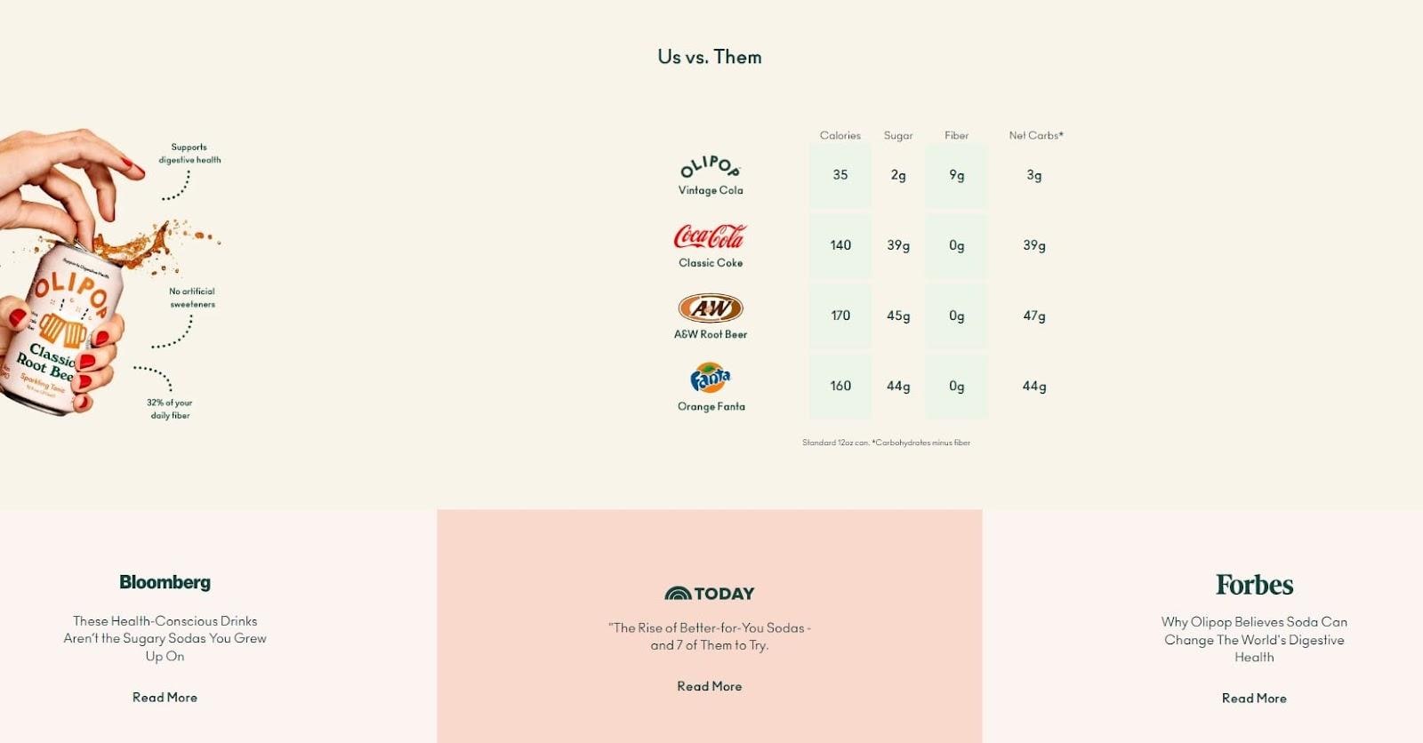
OLIPOP also clearly displays nutrition facts to highlight how healthy the company’s soda is compared to other major beverage brands.
Beneath it, they show review snippets from renowned news sites and publications, giving the brand further credibility.
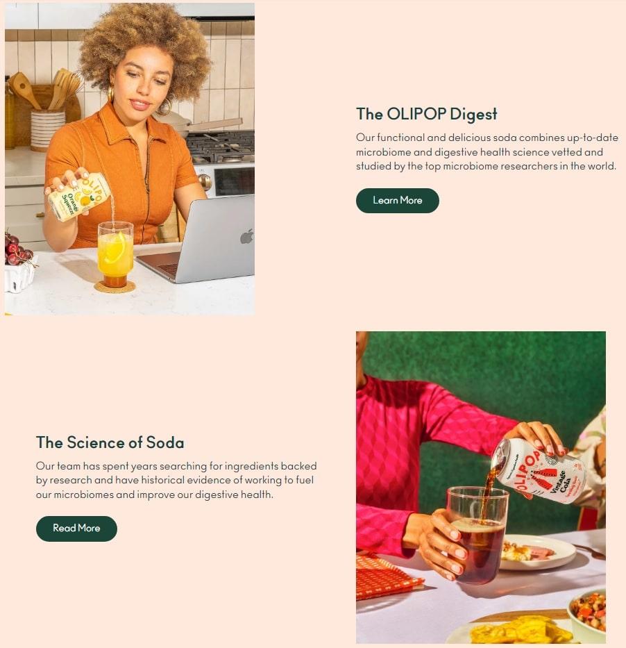
For people who want to learn more, OLIPOP strategically places two buttons at the end of the landing page that direct visitors to the brand’s blog and a page that further discusses OLIPOP’s soda.
This page also contains a video of customer testimonials for additional confidence-building UGC.
3. PANGAIA Superfoods
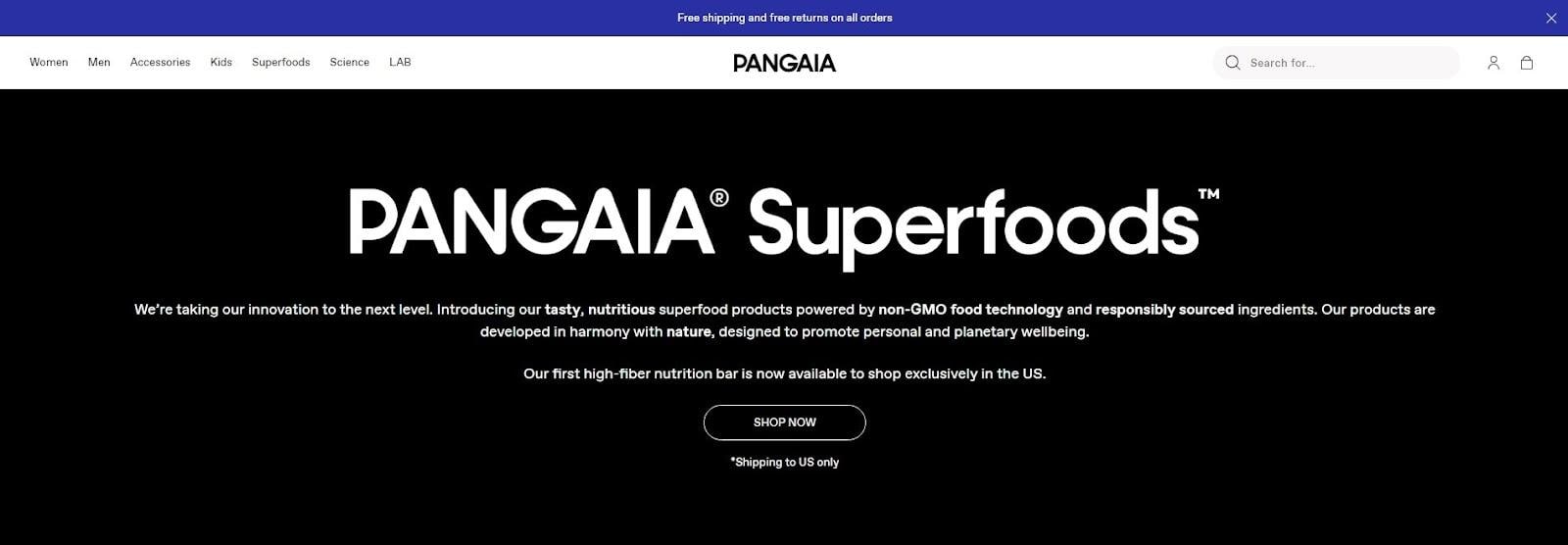
This superfood product, launched by the materials science (i.e. apparel) brand PANGAIA, uses visuals and straightforward information to drive a visitor’s purchase decision.
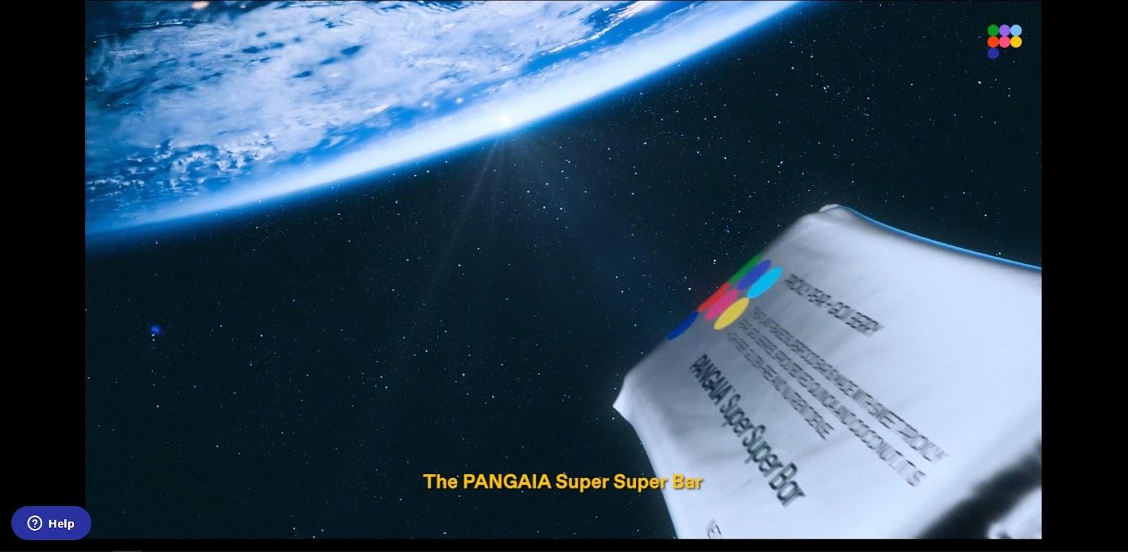
A creative, science-themed video greets people, with PANGAIA’s Super Super Bar as its focal point to engage visitors instantly.
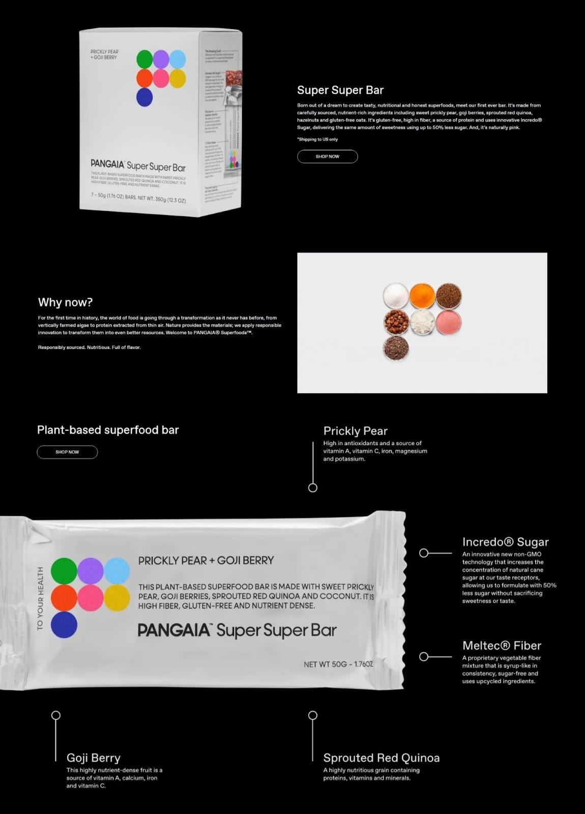
Next are high-quality images of the Super Super Bar, with accompanying key details that break down what it is and what it contains.
Additionally, all of the “Shop Now” buttons present on the landing page direct people to the same Super Super Bar purchase page, streamlining the buyer journey.
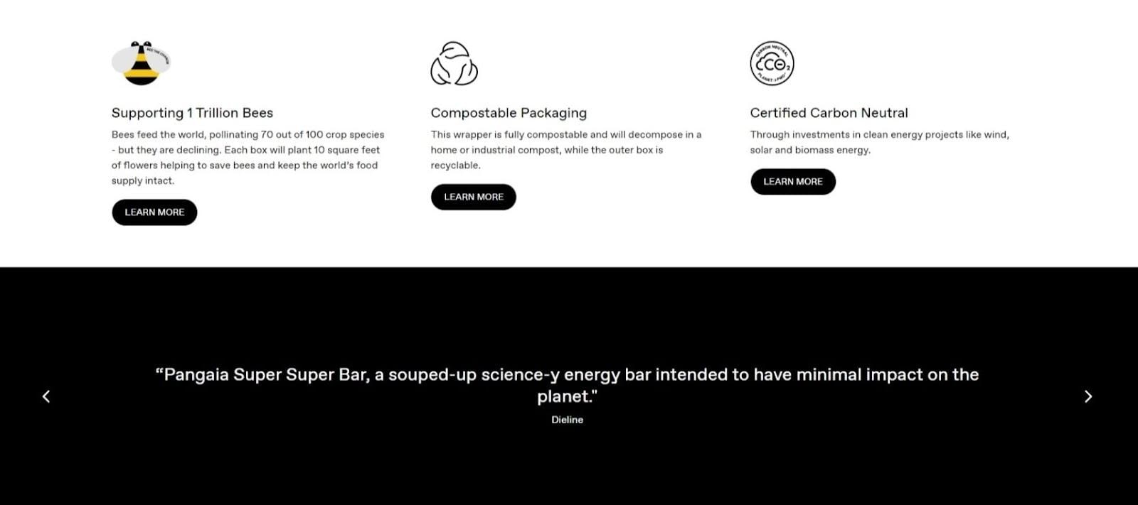
To close out its landing page, PANGAIA Superfoods places buttons that send people to webpages about their environmental initiatives.
With 57% of consumers intent on supporting companies that adopt sustainable practices, this helps drive more purchases.
They also display a few reviews from notable companies as a final push.
4. The Ridge
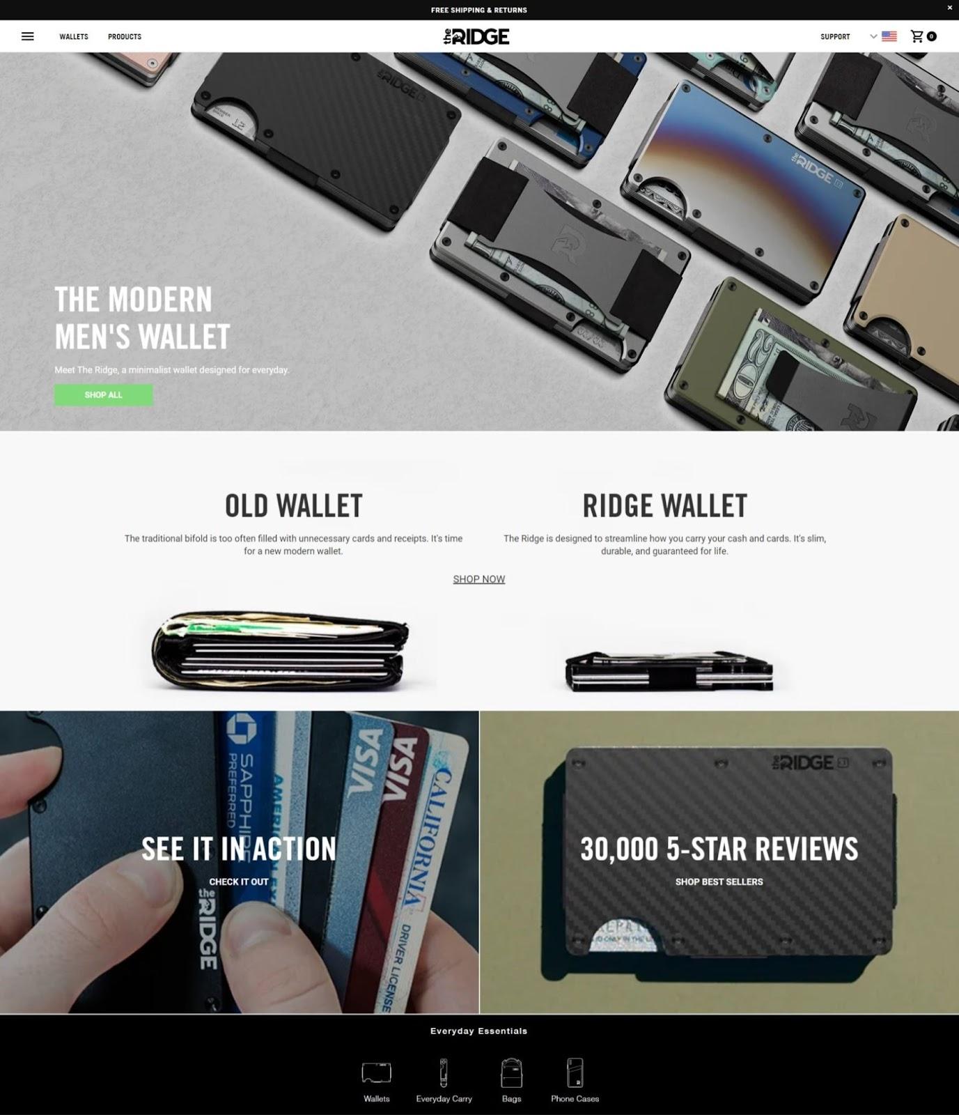
The Ridge, a minimalist wallet brand, follows the same minimalist ethos in their product landing page design.
Through powerful photos and short, straightforward messaging, they deliver everything a visitor needs to know about their product and drive purchases.
All CTAs lead to a purchase page, and the brand also provides clickable images close to the bottom that perform the following actions:
- One takes you to a webpage that shows you how The Ridge’s signature wallet works.
- The other image highlights the brand’s abundance of glowing reviews and takes visitors to a page where they can browse through the best sellers.
#cta-mini-pb#After switching to Page Builder, The Ridge saw a $2.5 million increase in revenue. Read the case study.
5. Beardbrand
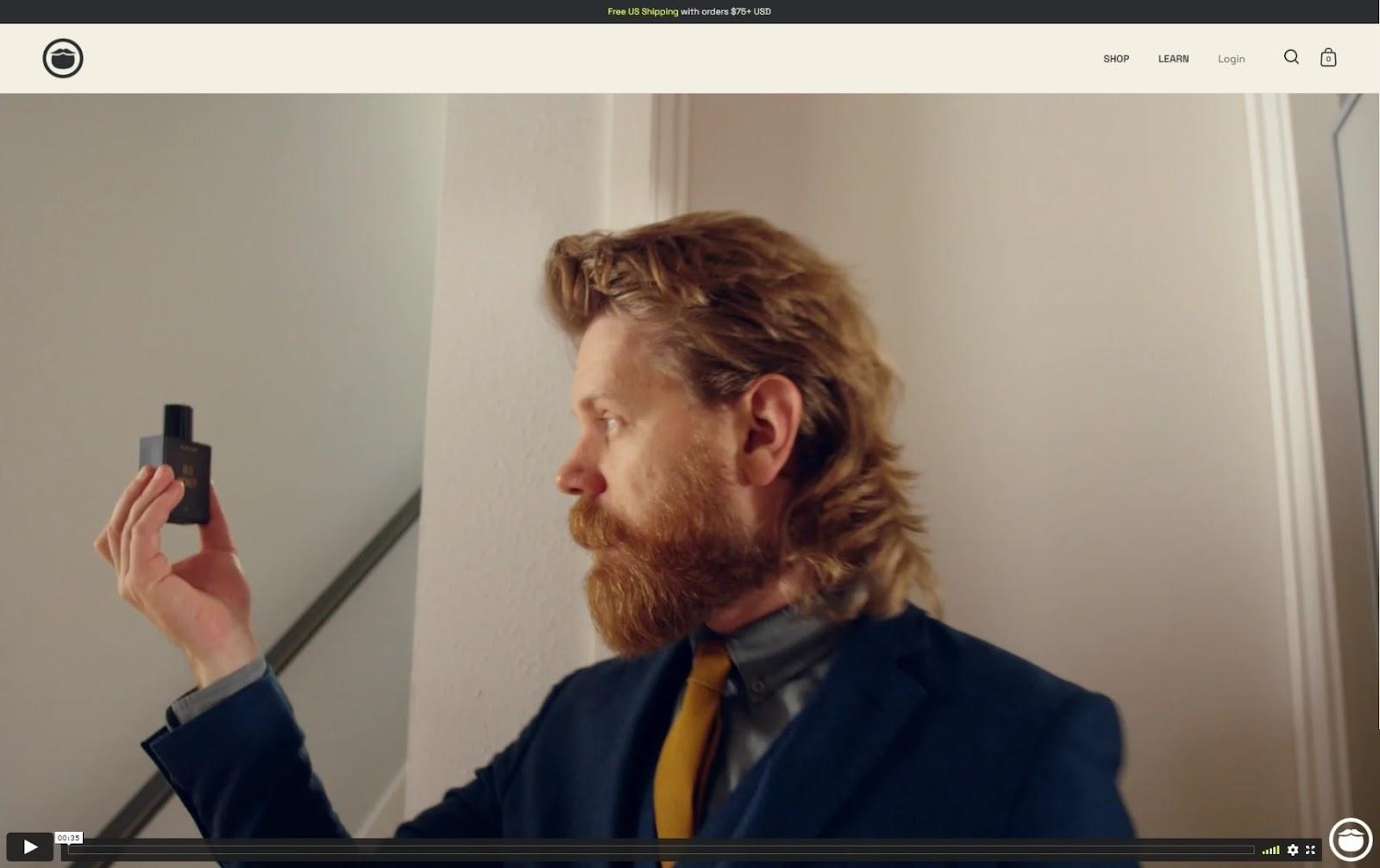
Beard grooming company Beardbrand taps into visuals, plus witty and descriptive copy.
It first hooks visitors by welcoming them with a short video that’s true to the company’s name, featuring bearded men using Beardbrand products in their everyday routine.
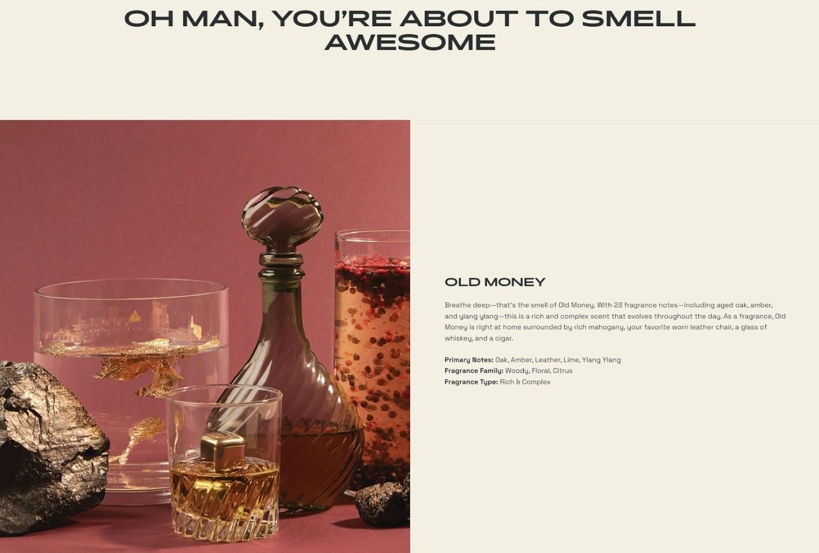
Beardbrand’s descriptive copy is written to build excitement and anticipation, enticing visitors to purchase their fragrances.
The company also streamlines the shopping experience by allowing visitors to buy items on its landing page.
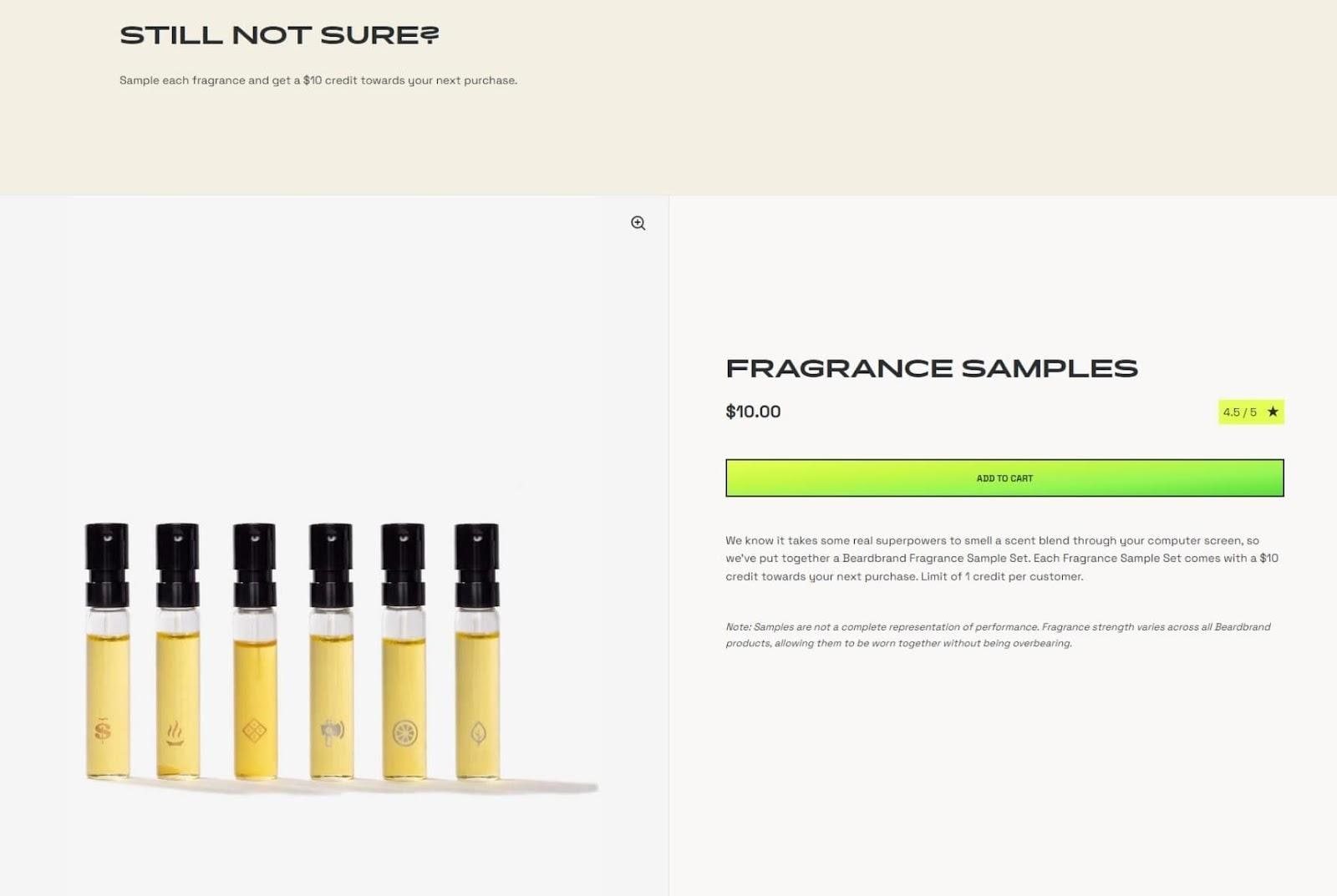
If leads are still unsure after scrolling through their highlighted fragrances, Beardbrand presents an opportunity to buy a sampling of their products—this is a good way to compel visitors to experience them firsthand.
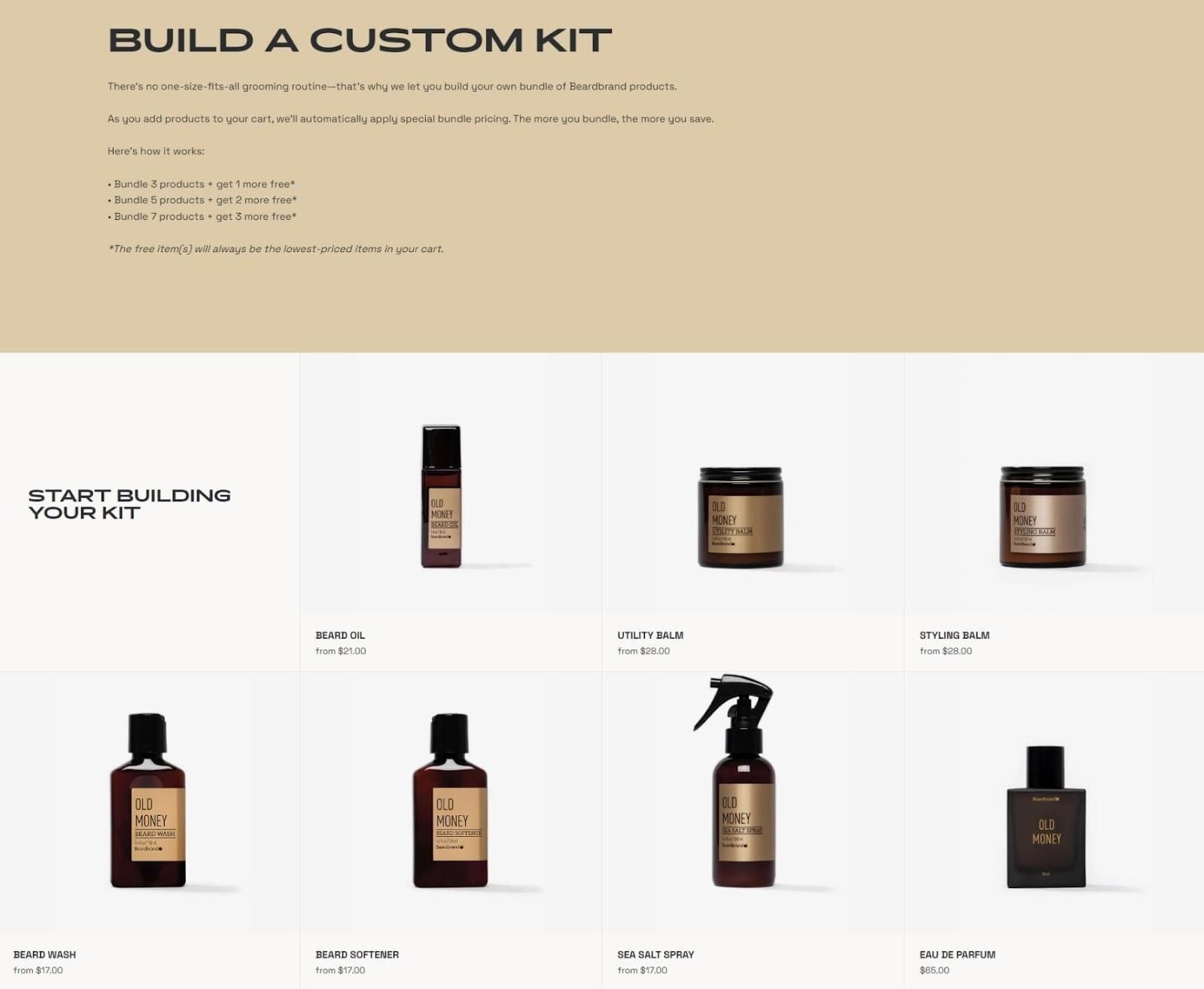
Those who’ve already decided to purchase from Beardbrand next see an offer to build a custom kit.
This option for personalization allows buyers to purchase a package that’s tailored to their needs.
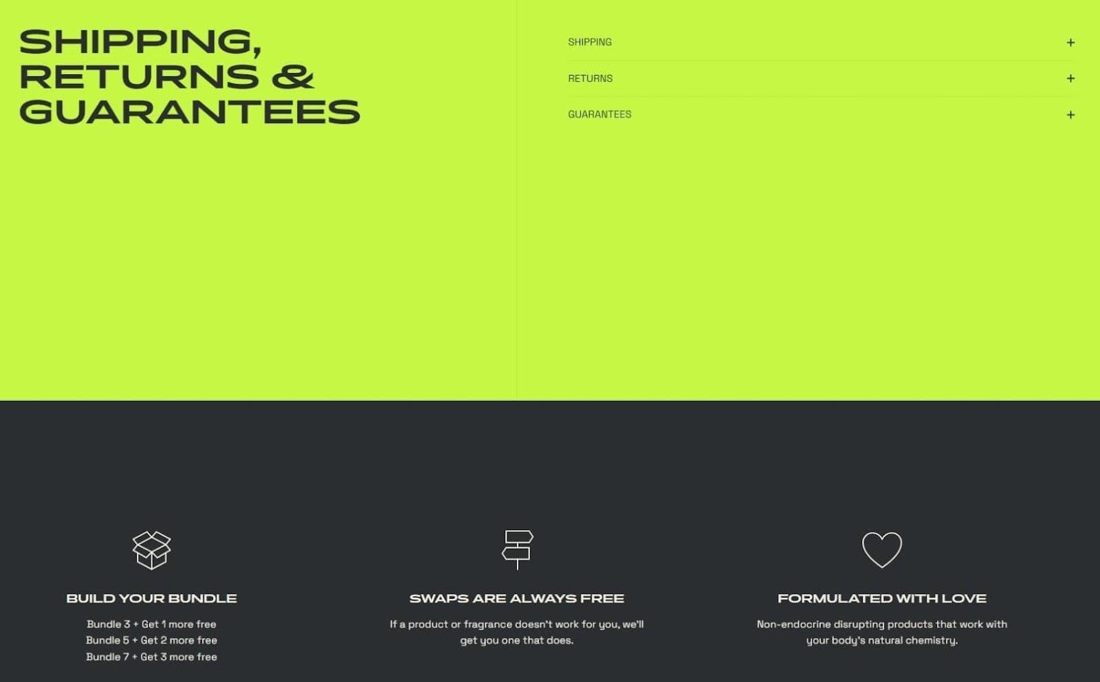
Beardbrand caps off their landing page with details about shipping (both in the U.S. and internationally), their returns policy, and guarantees (in case customers aren’t happy with their Fragrance Samples)—all of which enrich the customer experience.
#cta-mini-pb#With Page Builder, Beardbrand increased conversion rates by 40.1%. Read their success story.
6. 6KU
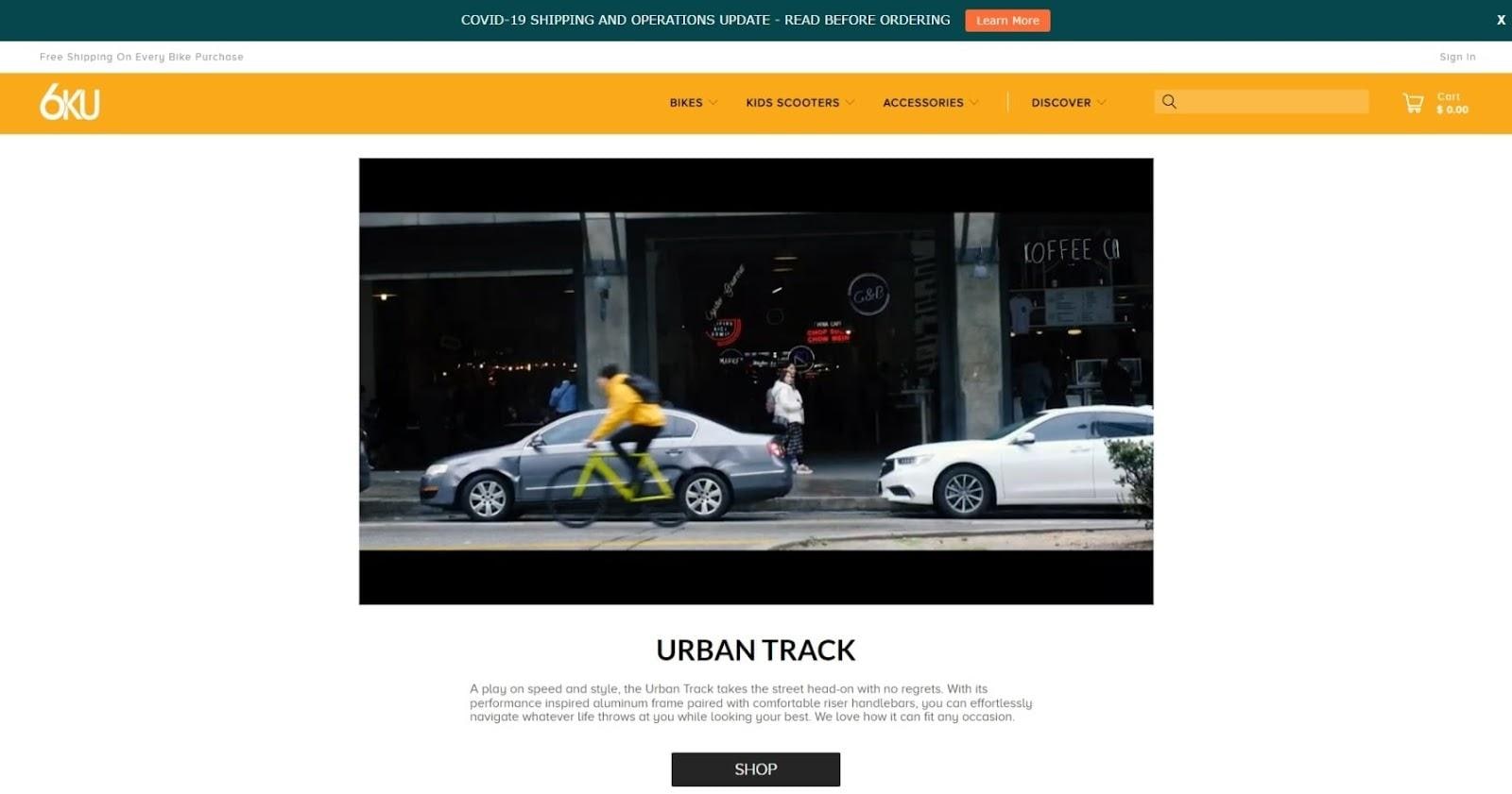
6KU is a bicycle brand that combines technology with style—a principle the company also applies on its product landing page.
The first thing visitors see upon arrival is a short video featuring 6KU’s Urban Track bike and how it seamlessly fits into one’s city lifestyle.
For those ready to make a purchase, a CTA button is strategically placed underneath the video.
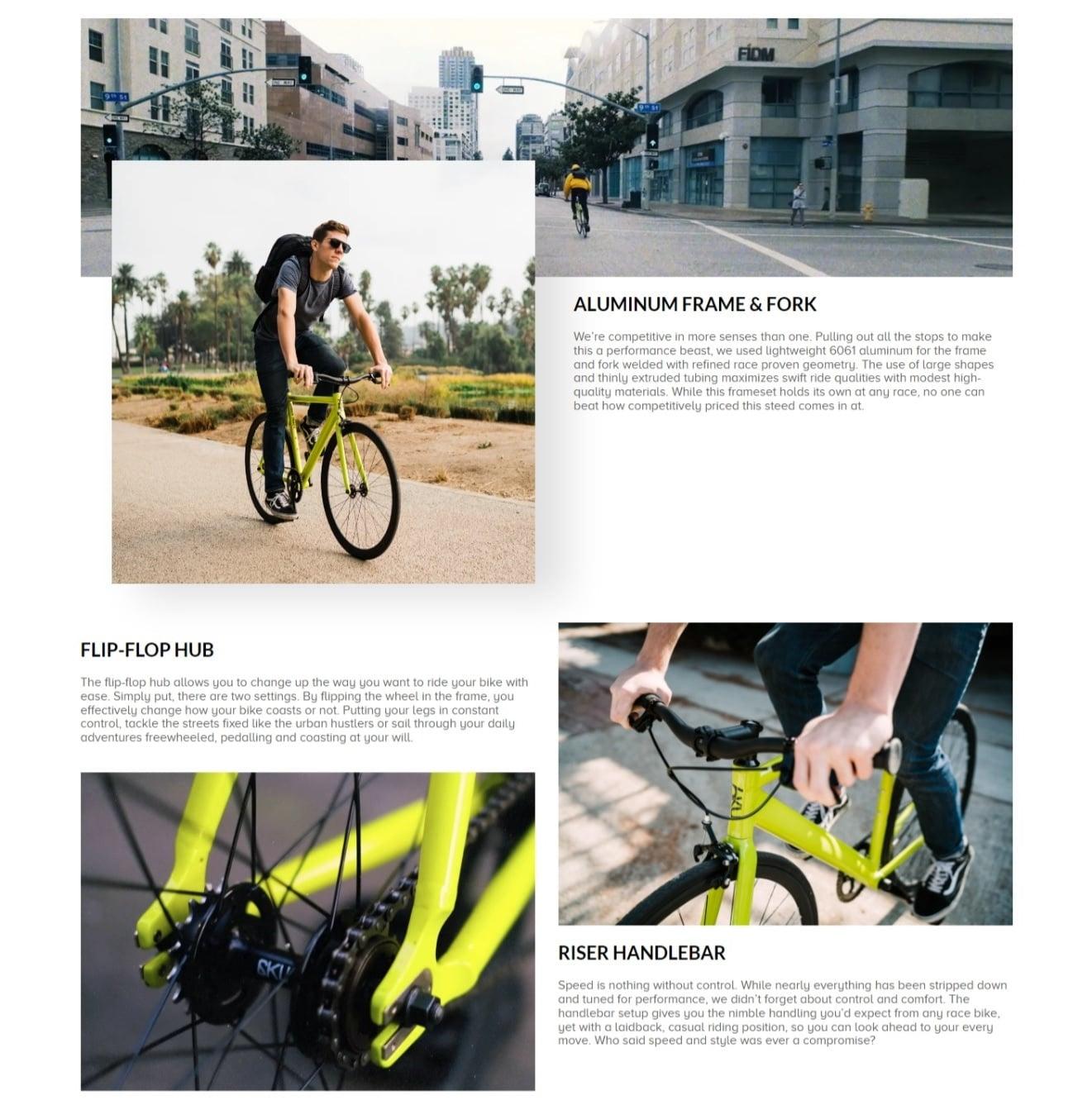
Next, descriptive copy accompanies high-quality images, emphasizing three key features of the Urban Track.
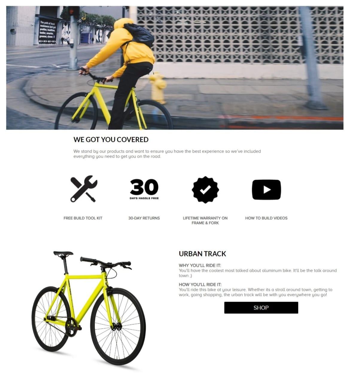
6KU then caps it off with a quick look at a few extras that come with the Urban Track, further emphasizing the brand’s guarantees for the customer.
Then, the page highlights some of the product benefits, followed by an appropriate CTA.
7. TKEES
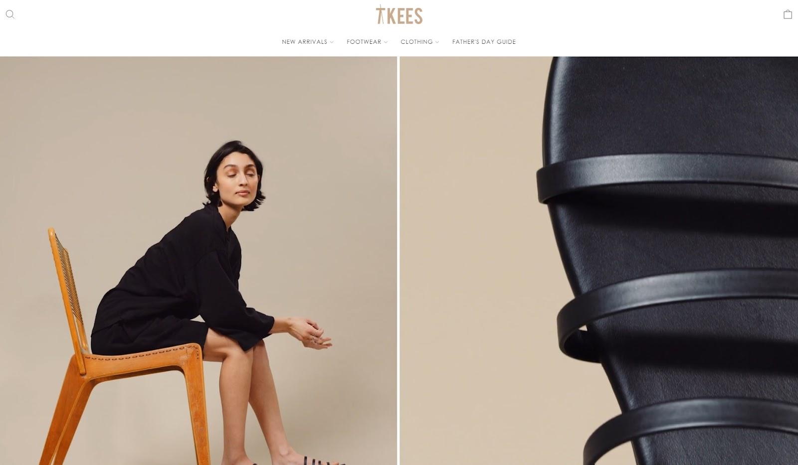
TKEES specializes in responsibly-manufactured sandals.
The landing page for their Emma and Senna styles starts with a video that shows off captivating photos of the sandals.
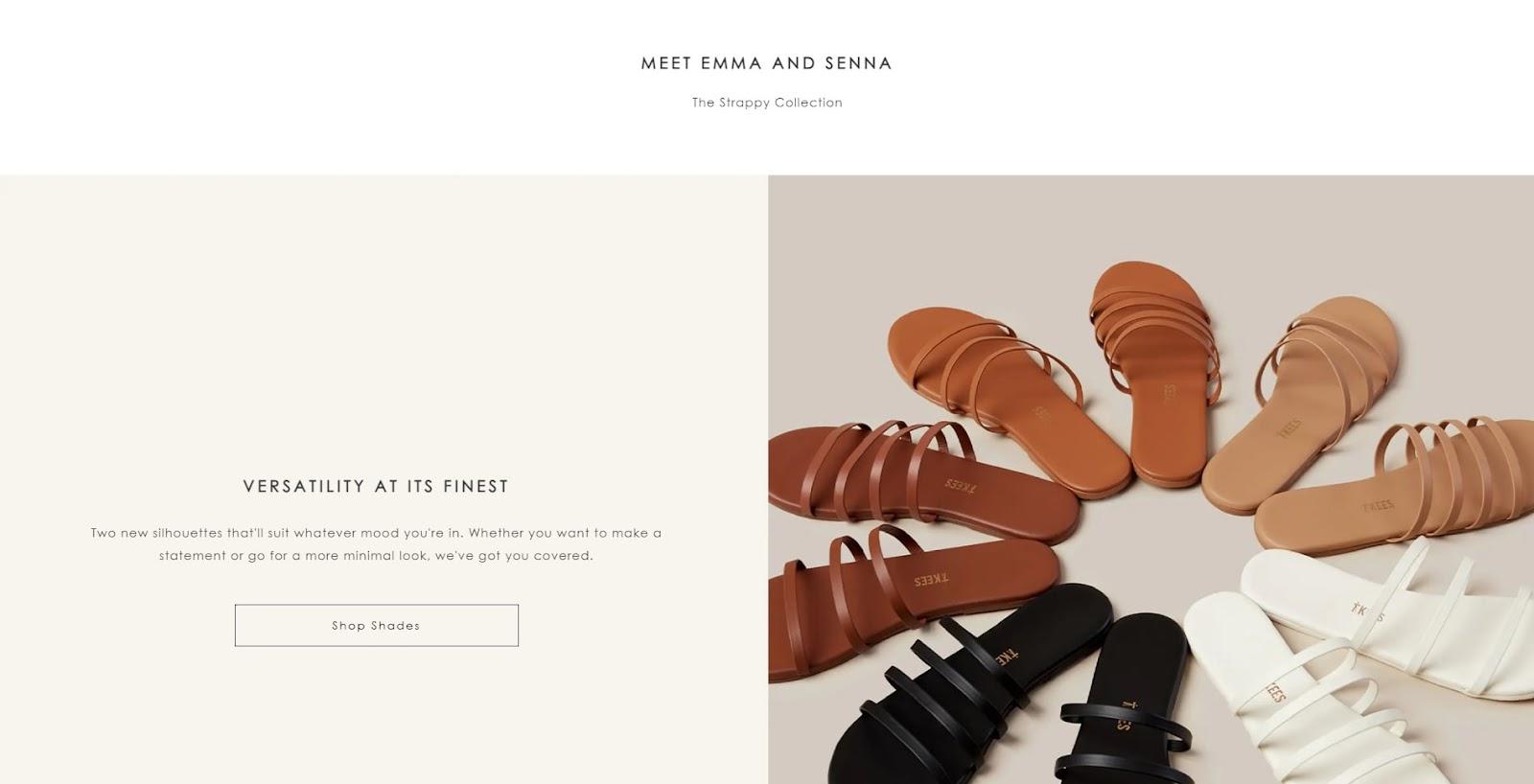
The images are partnered with concise and enticing copy that highlights the benefits of the sandals.
They also showcase brand models wearing the two shoes.
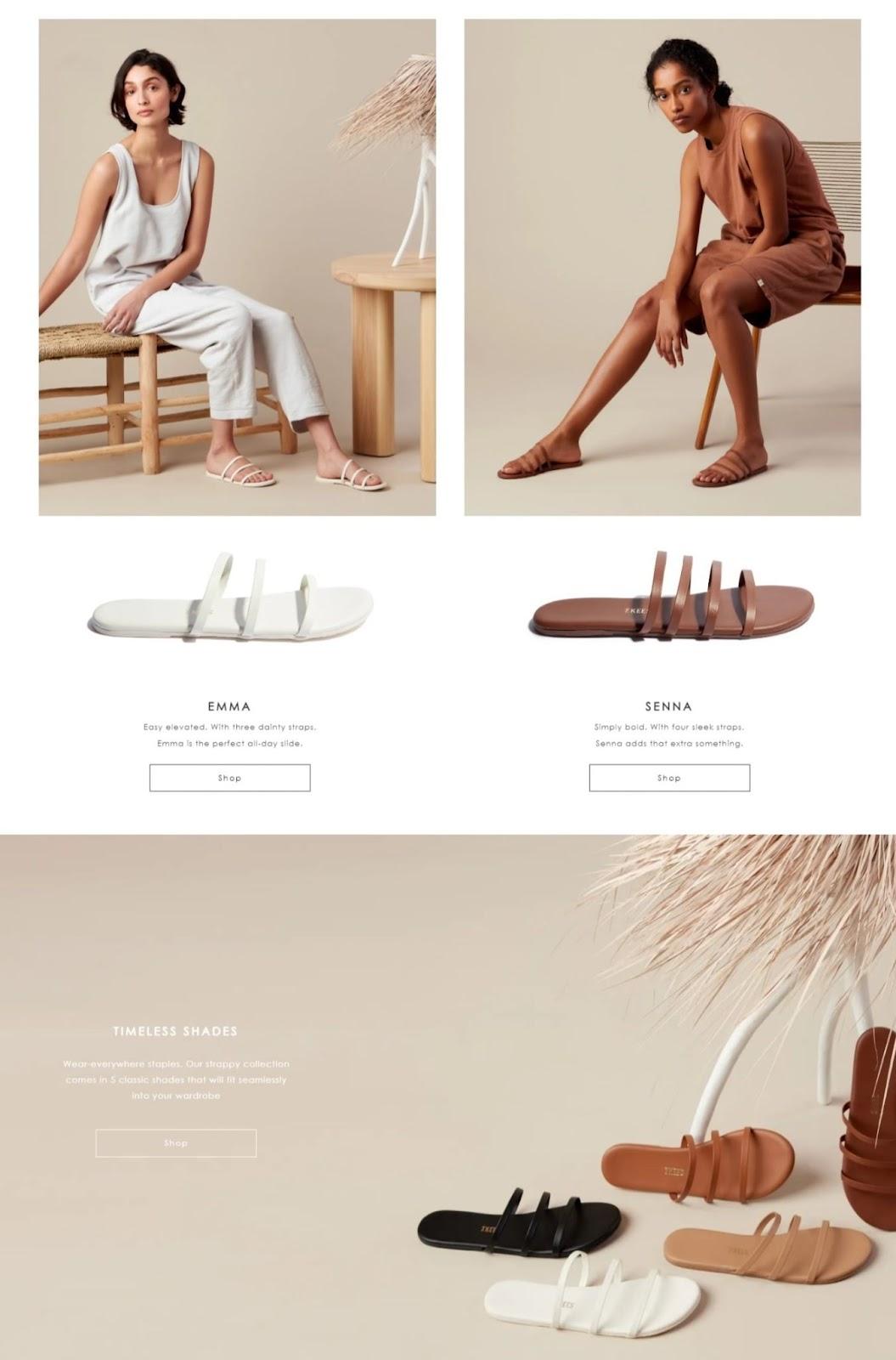
Throughout the page, they follow the same formula—high-quality images, simple and alluring copy, and appropriate CTAs at the end—and repeat it, which is evident as visitors scroll down.
#cta-visual-pb-ee#<cta-title>Get more inspiring landing page examples<cta-title>See this landing page and 24 others in our free guide to custom Shopify landing pages to learn how successful brands drive conversions.Grab your free copy
8. Sandler
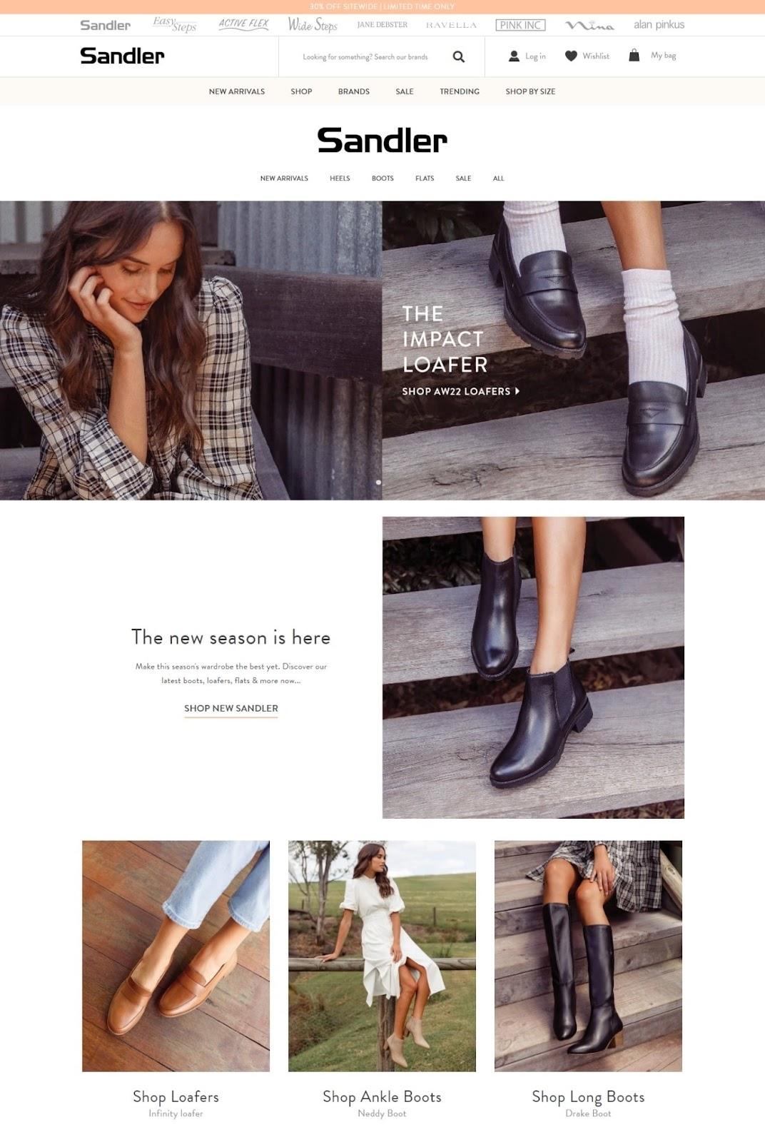
Sandler, an Australia-based brand of women’s leather shoes, shares similarities with TKEES.
Their landing page focuses on presenting attractive photos of the brand’s shoes (worn by models), delivering frank copy, and following with suitable CTAs.
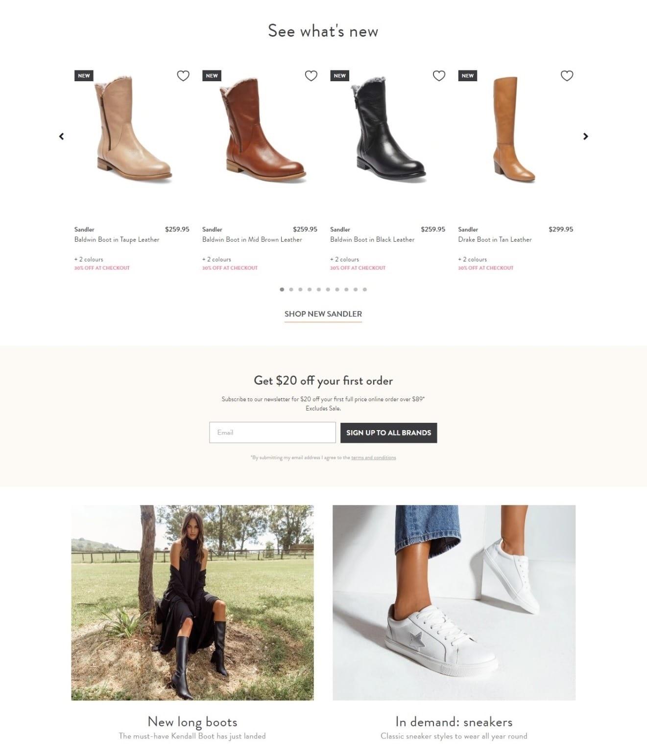
A key difference that makes Sandler stand out, however, is that their landing page allows visitors to scan a selection of shoes without leaving it.
This effectively streamlines the experience and encourages shoppers to buy.
Another effective tactic is their clear display of special offers, which provides potential shoppers a chance to receive a 30% discount on their purchase or $20 off their first order after subscribing to Sandler’s newsletter.
9. Naked Armor
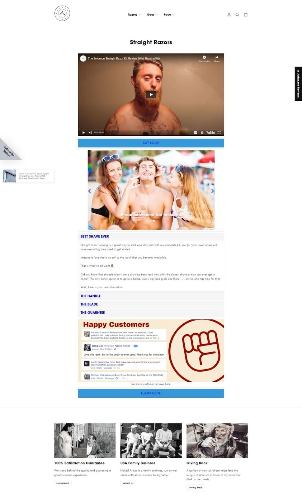
Naked Armor’s product landing page is compact and provides customers with the information they need in quick succession:
- First, you see a video talking about the quality of the brand’s razors, followed by a CTA.
- Next, they display photos of the product to showcase exactly what you’re buying.
- Then, you’re taken through the razor’s benefits, features, and the brand’s guarantees.
- Naked Armor closes it out with customer reviews and links to more company information.
As a whole, the brand’s product landing page design is meant to give you an efficient experience—not even a single second is wasted.
10. Elegant Strand
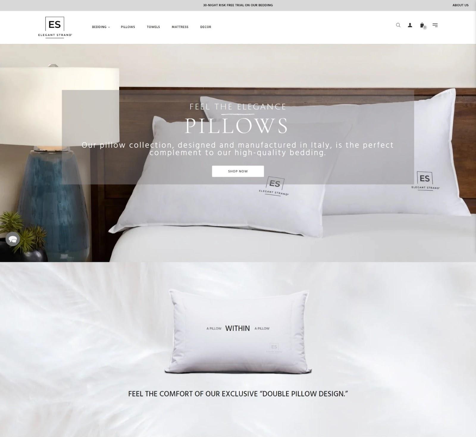
This bedding company’s product landing page stands out because of, as its name implies, the adherence to an elegant design.
Elegant Strand provides you clear images of its pillows, while concise messaging highlights the quality of its unique Italian design.
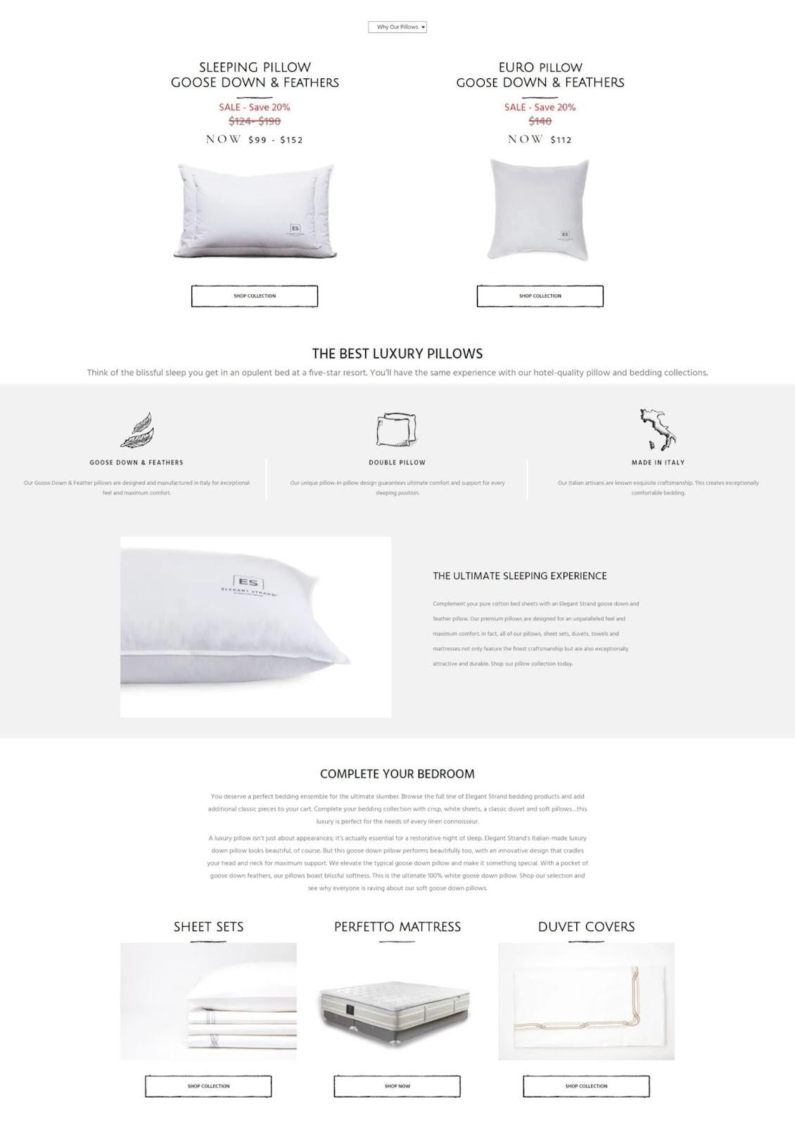
Your visit is made seamless through the provided offer in the middle of the page—a discounted purchase.
And as you further scroll down, Elegant Strand is able to quickly emphasize what makes its pillows unique.
At the end of the page, the brand also presents an opportunity to browse its selection of beddings through appropriate CTAs accompanied by photos that give you a preview.
Effective product landing page design boosts conversions
Having a remarkable product landing page can lead to more purchases, a streamlined buyer experience, and better campaign tracking.
Be strategic and follow the best practices we’ve outlined above to watch your conversion rates soar.
Remember, there are multiple ways of attracting visitors for your page.
Tailor your content, visuals, and messaging to your chosen source of traffic. Ensure the elements of your product landing page align with your source of visitors, and keep everything on-brand.
#cta-visual-pb#<cta-title>Use Shogun to create the best product landing pages<cta-title>Get access to speed, customization, performance metrics, and more.Start building for free

Rachel Go
Rachel is a remote marketing manager with a background in building scalable content engines. She creates content that wins customers for B2B ecommerce companies like MyFBAPrep, Shogun, and more. In the past, she has scaled organic acquisition efforts for companies like Deliverr and Skubana.

