16 of the Best Product Page Design Examples For Driving Ecommerce Conversions
Your product pages are your online store’s heavy hitters. They need to be interesting, compelling, and showcase your products in their best light—all while driving conversions.
Your product page design sets the tone for your brand and buyer experience.
If it’s too plain, you risk looking uninteresting. If it’s too complex, you could lose shoppers to confusion.
Instead, invest in product page design that considers brand, user experience, and conversions. This is key to avoiding exasperating consumers with hard-to-navigate design elements while still leaving a lasting impression.
In this post, we’ll cover:
#cta-visual-pb#<cta-title>Build product pages that convert<cta-title>Use Shogun Page Builder to craft product pages that showcase your best features.Start building for free
Landing page vs product page: What’s the difference?
Before we get started, let’s cover some basics.
Many sellers and consumers alike sometimes use “product page” and “landing page” interchangeably, but there are significant differences between these key pages.
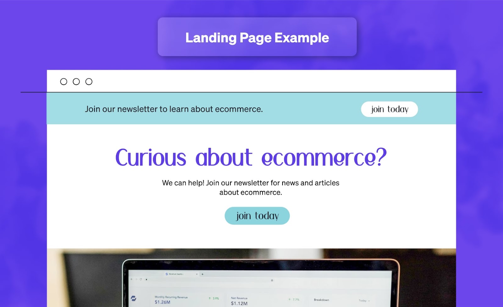
A landing page is a standalone page designed for a specific marketing campaign.
Typically, it has only one focus—to guide the visitor to take a specific action with minimal distractions. This action can be anything from signing up for an email newsletter to accessing an online course or buying a product.
Landing pages still contain focused offers, but they don’t necessarily have to be for an ecommerce product.
For example, you might have a landing page dedicated to your newsletter that includes links to previous emails and a form to sign up. In this case, the page’s goal is to get someone to subscribe to your emails.
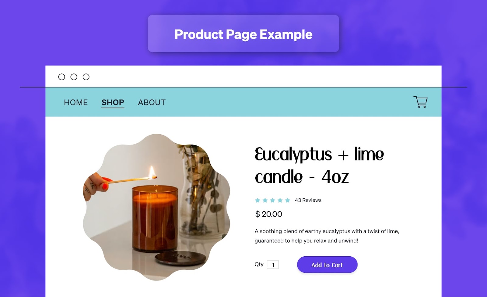
A product page (or product detail page) is the iconic ecommerce webpage that can be accessed through your store’s navigation or shop.
When you think about selling items online, chances are you imagine a headline, photo, description, and buy button.
A product page is designed to get visitors to buy a given product by providing specific product information.
These pages aren’t explicitly designed for conversion and can have several goals instead of just one call to action.
They often contain many links the visitor can click to navigate away from the page. In contrast, a landing page is typically where you’ll only want one focused link for visitors to click and may even exclude site navigation.
Landing pages and product pages are both useful for ecommerce stores, but they are designed for slightly different purposes.
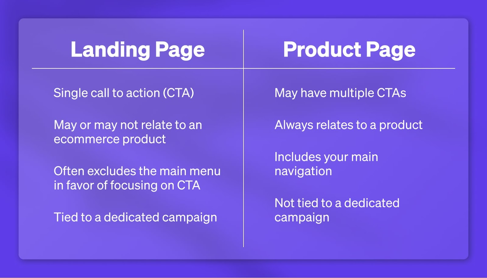
| LANDING PAGES | PRODUCT PAGES |
| Single call to action (CTA) | May have multiple CTAs |
| May or may not relate to an ecommerce product | Always relates to a product |
| Often excludes the main menu in favor of focusing on CTA | Includes your main navigation |
| Tied to a dedicated campaign | Not tied to a dedicated campaign |
#cta-paragraph-pb#Need to level up your ecommerce knowledge? Take a look at our roundup of the top 26 ecommerce blogs to bookmark for online success.
16 Vital product page design elements (with examples)
Now that we’ve cleared that up let’s dive into how to create product pages that will do your SKUs justice.
Some of the key components every product page design should contain include the product name, description, images and other visuals, add to cart button, user-generated content (UGC), shipping and returns information, and more.
Read on to learn about each element and why each is so vital.
1. A strategic product name
When someone visits your product page, they should immediately understand what you’re selling. That starts with a clear product title (or product name).
Your product name should be:
- Concise
- Descriptive
- SEO-friendly
Some brands like to use “clever” product titles, but these may do more harm than good unless the actual product is accurately described.
Even if some customers understand what you’re trying to do, it could confuse potential customers and decrease your organic ranking in search results.
Always consider the SEO implications of how you name your products.
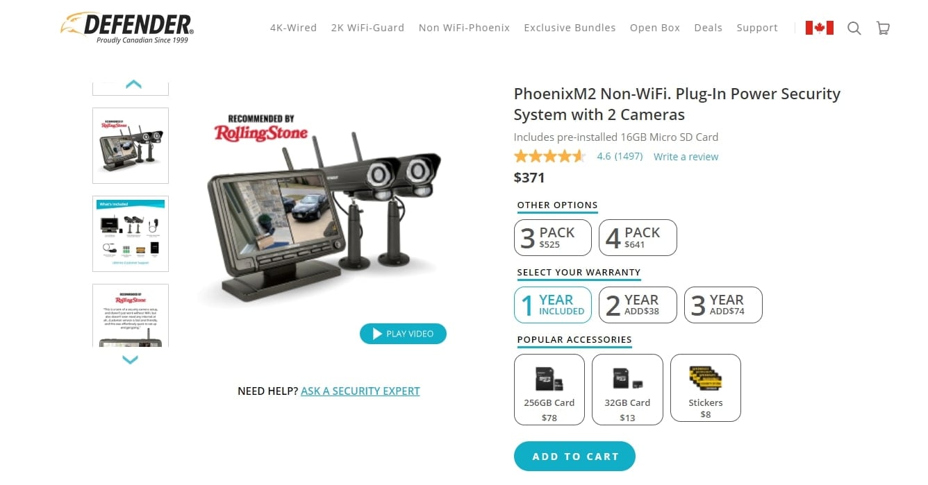
In the example above, Defender clearly states what the item is within the product title. Beyond that, it gives specific details, such as “Non-Wifi,” “Plug-In Power,” and “2 Cameras.”
All of these details make it clear precisely what someone is purchasing. Not to mention, their title will help them rank for a slew of relevant search terms, such as:
- Non-wifi security system
- Plug-in power security cameras
- PhoenixM2 security system
The more detailed these search terms are, the more likely they are to make a purchase.
That’s because these high-purchase intent keywords indicate a shopper is further along in the buyer journey and understands exactly which specs they want.
#cta-paragraph-pb#Need to figure out the best products to sell online? Check out these product research tools that can make the job even easier (and much more profitable).
2. A detailed product description
Product descriptions should provide all the key product information the potential customer needs to decide whether to buy.
Baymard Institute found that 90% of the top 60 ecommerce sites currently maintain a high level of quality and consistency in their product page descriptions.
That makes comprehensive product descriptions the industry standard by a large margin.
If your product page design doesn’t incorporate high-quality, detailed descriptions, your shoppers will notice an immediate difference once they see a competitor’s listing.
We recommend structuring your product page descriptions as ‘highlights’ to increase user engagement.
Although this content design tactic makes it easier to skim and enhances the user experience, 78% of sites don’t do it. This represents a significant opening for savvy brands.
Depending on your product type, you may want to include details such as:
- Materials/ingredients. What is it made of?
- Unique features. Explain the things that make your product the best.
- Size guides. How to pick a good fit—especially important for clothes or jewelry.
- Unique selling points. For example, if your customers are environmentally conscious, mention every purchase plants a tree.
In the images below, Seattle Chocolate Company separated their product description into two sections, each highlighting different product details.
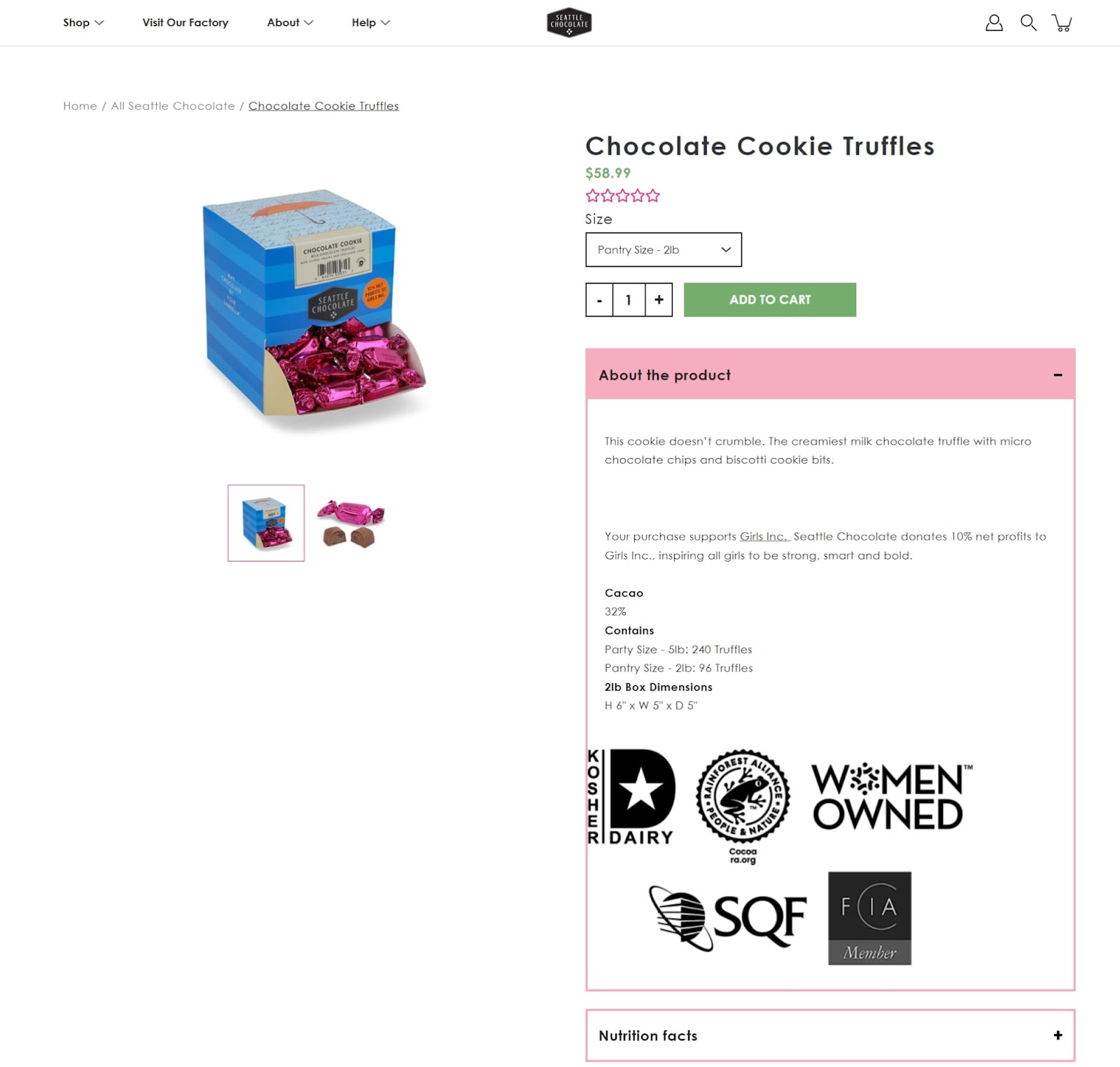
Their About the product section describes the truffles in mouthwatering detail, followed by a note that each purchase supports a foundation called Girls Inc.
It goes on to highlight important specs—like the percentage of cacao, size of the box, and how many truffles each box contains.
Finally, it includes different associations and accolades with the smart use of easy-to-read icons. At a glance, we can see they source their cocoa responsibly, they use kosher milk, and the business is women-owned.
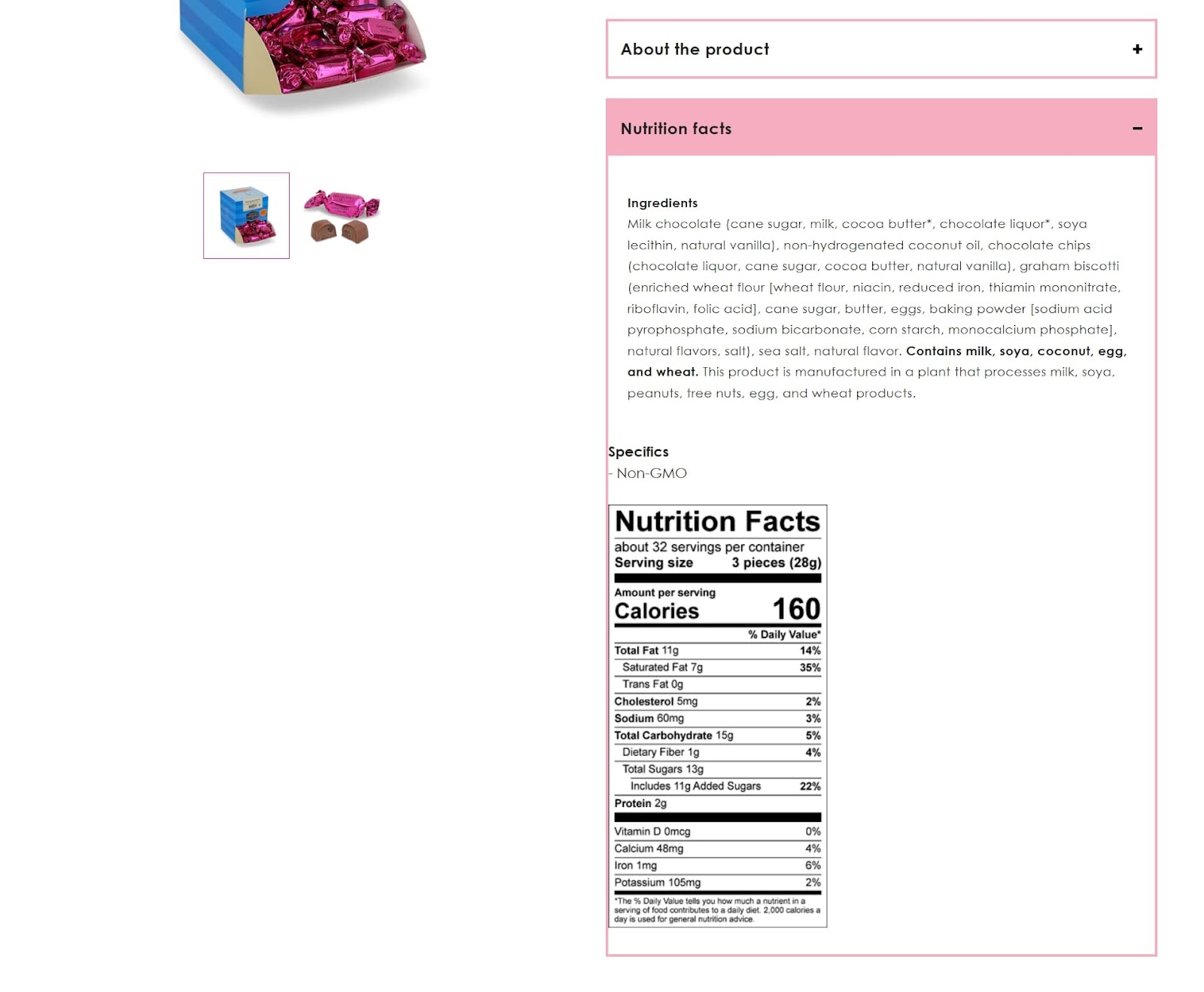
The second section, Nutrition facts, includes all the specifics of what’s in the product—a complete ingredient list, nutritional information, and an assurance that the product is “non-GMO.”
This product description masterfully aligns their consumers’ values with the product while making it enticing to purchase.
3. Stunning product images
Product images are essential when it comes to the conversion rate of your product page.
Images are a visual promise from your brand to your buyers—they showcase exactly what they will be getting if they hand over their hard-earned cash.
Baymard Institute discovered that 56% of users immediately started exploring product images after arriving on the product page.
However, their research also revealed that 25% of ecommerce sites failed to provide product images that met the user’s needs.
That’s a golden opportunity for every enterprising ecommerce merchant who wants to deliver a superior buyer experience. It’s a chance to stand out and capture those potential customers.
Here are a few key things that you need to pay attention to:
Image resolution
Low-quality images may affect how people perceive a particular product and how the brand that sells it.
If a shopper sees a blurry product image, they may draw conclusions about the sophistication of your store and assume you don’t pay attention to detail in other business aspects as well.
You can hire a professional photographer to capture amazing product photos or photograph the products yourself, with particular attention to quality.
Be sure to place sufficient lighting, find the best product angles, and take close-up shots of details that might be of particular interest to potential customers.
Zoom-in functionality
93% of ecommerce sites allow users to zoom in on some or all product images on desktop.
However, on some sites, the zoom level on the images is insufficient to see the visual details required to make the purchase decision.
This leads some users away from the product page since they can’t get a rich visual understanding of crucial product details.
Make sure that the zoom-in feature is sufficient to examine the products.
Image interactivity
Product images don’t need to stop at static images. Some innovative stores allow shoppers to rotate the images to see their products from different angles.
Other stores utilize GIFs and other interactive imagery techniques to give shoppers the best understanding of their goods.
The takeaway here is that you need to allow online shoppers to get a full visual read on the product if you want them to feel confident enough to buy it.
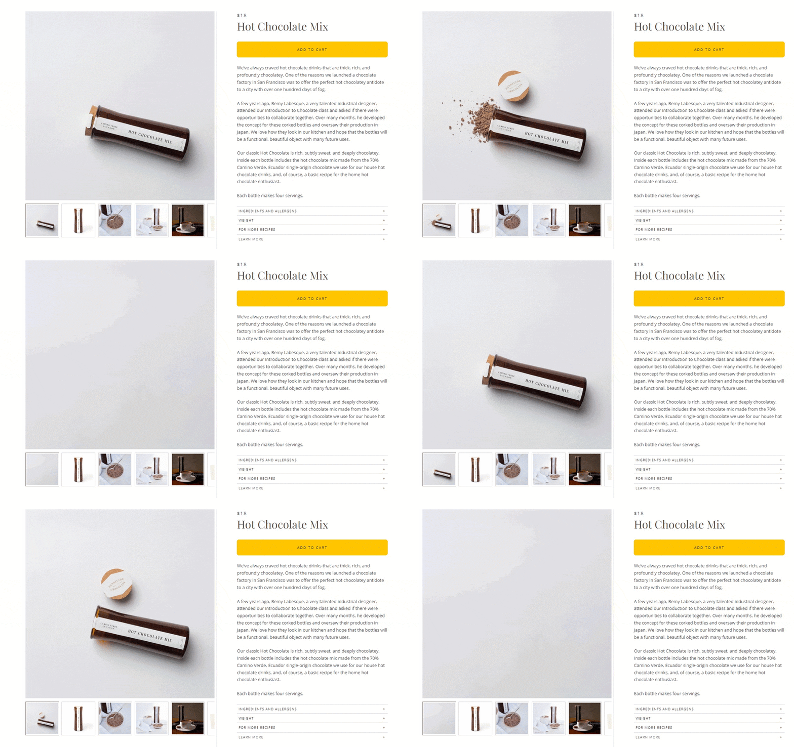
In the example above, Dandelion Chocolate goes a step further and makes one of their product images a gif of their chocolate.
Visitors can see the consistency and amount of hot chocolate in their package and then scroll to see more shots—the product packaging, a cup of hot chocolate, and even a gift card for gifting the hot chocolate.
4. Quality product videos
In addition to interactive images and other graphics, videos are an excellent way to introduce and showcase your items in an engaging way.
Even better, they convert—84% of people say they’ve been convinced to buy a product or service by watching a brand’s video.
There are a variety of ecommerce product videosthat you can choose from:
- Product tours
- Unboxing videos
- Production line videos
- How-to’s
Also, if you intend to offer a product video alongside product images, you should know that people struggle to find product videos on as much as 35% of ecommerce websites.
How can you make your product videos easy to find?
Just include the videos along with the image gallery thumbnails. You can also overlay your video assets with a “play” icon in the image gallery.
Adding videos to your Shopify store is simple and can be super effective for increasing sales.
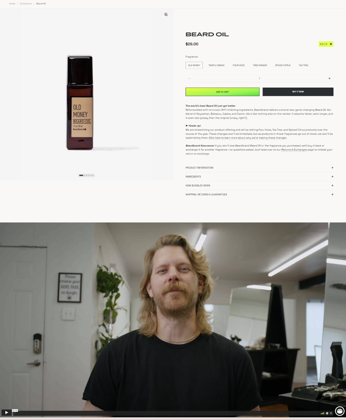
Beardbrand sells beard products, such as beard oils, styling balms, sprays, grooming supplies, and more.
They display videos explaining an overview of their products, how to use them, and the benefits.
Their videos are also in keeping with their casual brand style, following the Beardbrand voice and tone seamlessly.
The first words from his mouth are, “What’s up, my dudes!?”
These videos help assure shoppers that the items work, show them exactly how they work, and help them imagine themselves using Beardbrand themselves.
5. Special offers
Everyone loves a good deal. You can prominently highlight special offers and discounts on your product page to encourage purchases or other actions you want visitors to take.
For example, you might have a buy 2 take 1 sale that can help boost your average order values.
Or you could have a special bundle you’re encouraging shoppers to consider to introduce them to newly released products.
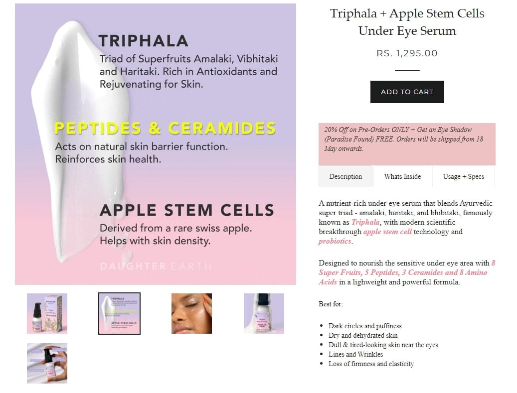
In the example above, Daughter Earth showcases a special offer highlighted in a pink box, so it stands out.
They offer “20% Off on Pre-Orders” plus “Get an Eye Shadow (Paradise Found) FREE.” In addition, they share shipping information, which preempts the common question of when pre-orders will arrive.
This was a great way to highlight their special deals while capturing sales on a potentially low-stock item.
Extra props to the Daughter Earth team for making the call-out box a recognizable brand color.
#cta-paragraph-pb#Make your next store promotion convert by checking out persuasive special offer pages from brands who’ve perfected them. Download the ebook
6. Check-out options
Some shoppers may prefer alternative payment options, such as buy now, pay later (BNPL), or purchasing via a subscription to save some money.
Providing your customers with alternative check-out options gives them flexibility in how they want to pay.
They may want to pay off their purchase over time or pay more now but get a discount in the long run.
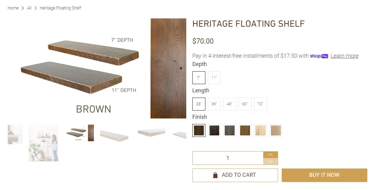
On this product page of the Dakota Timber Company, shoppers get an option to pay in 4 interest-free installments.
The tool automatically calculates the payment amount, in this case $17.50, and allows shoppers who can’t afford to pay the full price upfront to still purchase their items.
7. Shipping information
In a survey on why online shoppers abandon carts, some of the top reasons include:
- Extra costs such as shipping and taxes (49%)
- Slow estimated delivery speed (19%)
- Inability to calculate the order cost upfront (17%)
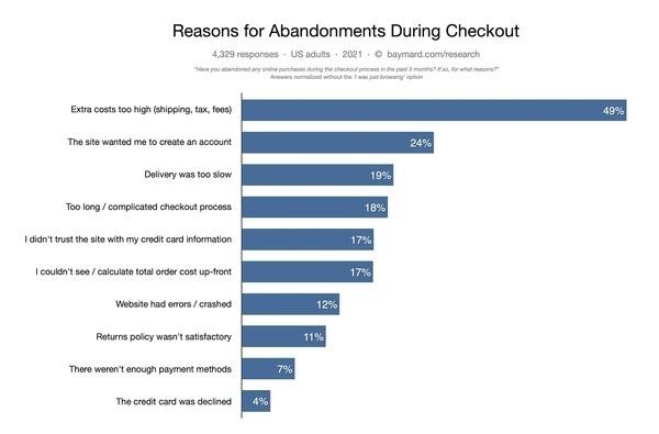
Shoppers don’t want to wait until they check out to learn about shipping costs or shipping speed.
That’s why it’s best to provide this information upfront on the product page.
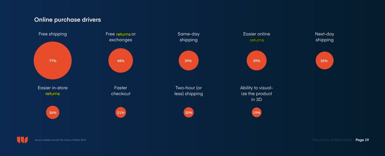
Moreover, according to a Walker Sands report, free and fast shipping is the #1 driver of online purchases.
If you can offer free 2-day shipping, then displaying that information on your product page can serve as an additional selling point.
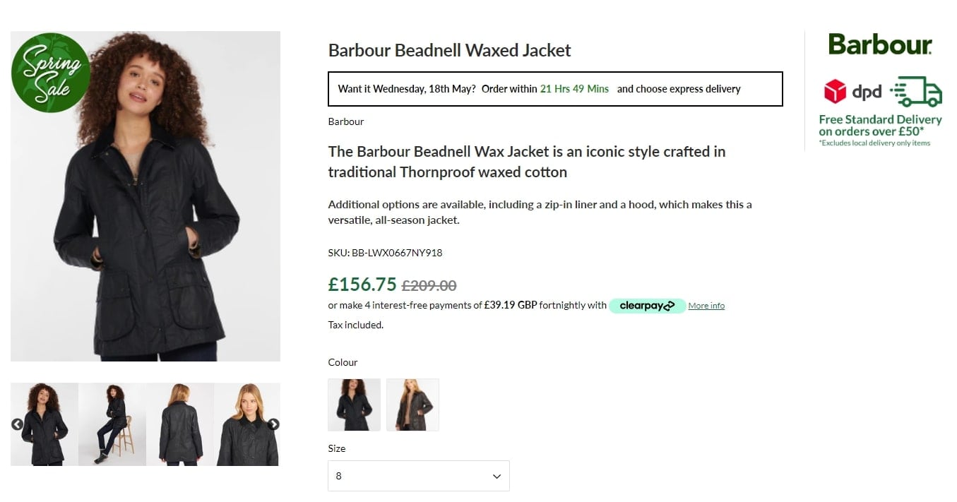
The product page from Sam Turner & Sons above showcases an offer to get the item delivered in 2 days if you order “within 21 Hrs 49 Mins.”
Not only does this prompt provide a sense of urgency, but it also calculates the exact date of delivery for shoppers who want lightning-fast shipping.
8. Value-added shipping options
In addition to fast and free delivery, your product page is also an excellent place to share different value-added shipping options.
For example, if you have retail locations, you can offer buy now, pick-up in-store (BOPIS). Or, you may have free shipping locked behind a minimum cart value.
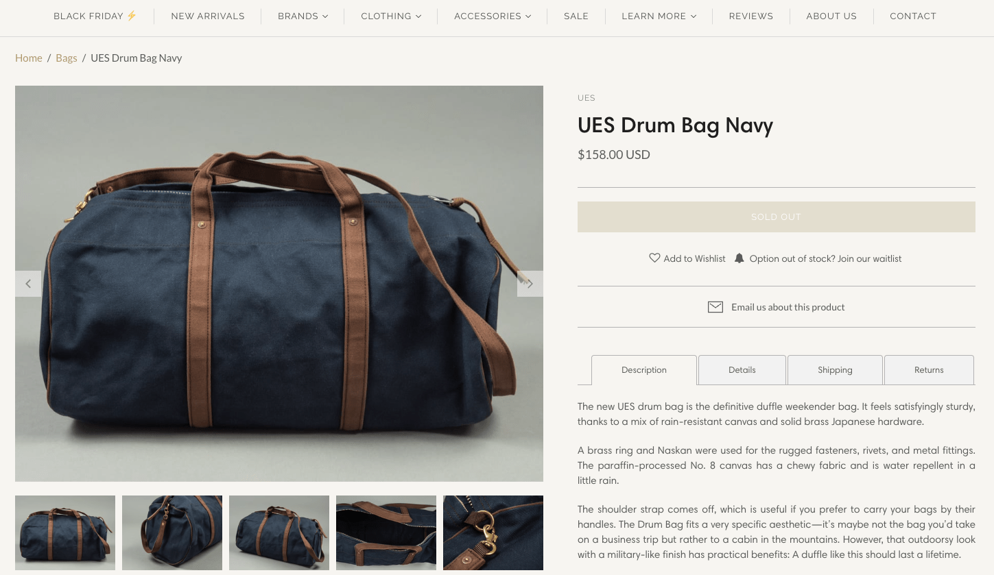
This product page from Redcast Heritage Co. showcases different shipping options, including free shipping and how to attain it depending on where you live.
The great thing about this product page layout is that it also caters to international shoppers.
Once someone reaches a minimum purchase amount, their shipping is free. That amount differs depending on whether they live in Spain, the European Union, or the “Rest of the World.”
9. Returns information
Walker Sands found that the second top driver of online purchases was free returns and exchanges, and the top fourth driver was easier online returns.
One of the main disadvantages of online shopping compared to brick-and-mortar stores is the inability to see, feel, and test out items in person.
No one wants to suffer buyer’s remorse without any recourse, especially for items they’ve never held.
Providing returns information on your product page can reassure potential customers that you will happily refund their money if the item doesn’t meet their expectations.
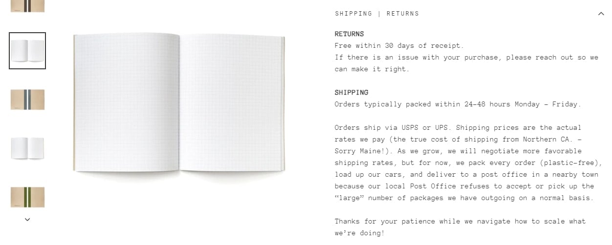
Wisdom Supply Co.’s No-Waste Notebooks product page showcases return information right beside their products in an accordion paragraph you can minimize or expand to read.
Their return policyis one simple line—“Free within 30 days of receipt.”
This straightforward return promise helps reassure shoppers of hassle-free returns and gives them the parameters they need to make a return (30 days) upfront.
#cta-visual-pb#<cta-title>Make your product pages easy to read<cta-title>Design your product pages exactly how you want them with Shogun Page Builder.Start building for free
10. Customer reviews
Potential customers care less about what your brand says about your product and more about what other people say about it. These customer reviews and testimonials provide social proof from users who have tried and tested your products.
That’s why displaying customer reviews can dramatically impact the conversion rate of your product page.
According to Spiegel Research Center, the purchase likelihood of a product with five reviews is 270% higher than that of a product with zero reviews:
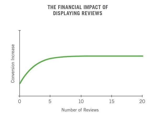
However, as you can see, the effect the number of reviews has on the conversion rate isn’t linear: the marginal benefit of additional reviews starts diminishing after the first five reviews.
Also, keep in mind that when it comes to customer reviews, it’s essential to make sure that they don’t come across as fake or staged.
Here’s what Spiegel Research Center found:
“Is five stars ‘too good to be true’ in the eyes of consumers? According to our research, it is. Across product categories, we found that purchase likelihood typically peaks at ratings in the 4.0 – 4.7 range, and then begins to decrease as ratings approach 5.0.”
Takeaways:
- Aim for at least five reviews
- Avoid deleting negative reviews
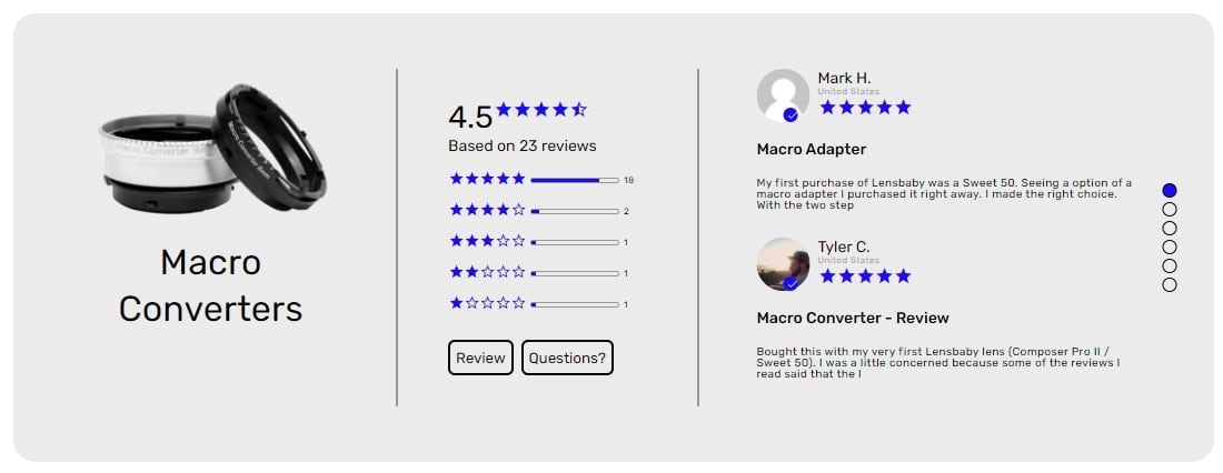
This product page from Lensbaby displays their review count prominently beside the product title and in a separate widget with more details below the fold.
They show the item, star rating, number of reviews, skew of ratings, and a preview of a couple of the most recent reviews.
11. User-generated content
In addition to customer reviews, you can add a slew of other user-generated content, such as lifestyle photos, social posts, video reviews, and more.
Leveraging the voice of your customers provides social proof, which many shoppers may find more trustworthy than any claims from the brand itself.
Using images, videos, and reels of social content posted by your customers using your products can also help shoppers picture themselves using it.
This, in turn, provides a vision of how your products can help them to provide immediate and desired value.
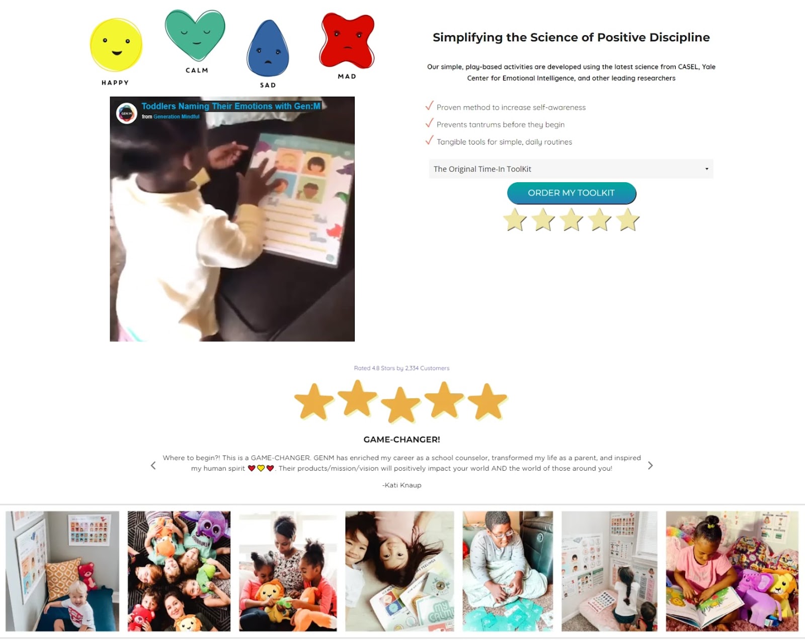
The Generation Mindful product page is laden with user-generated content.
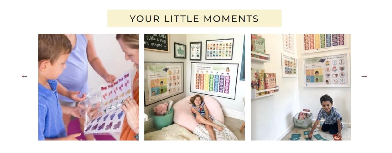
They feature clips of kids using their product, photos from their happy customers, and a section of “Your Little Moments.”
Tip: To get more UGC, try adding social sharing buttons—not to your product pages, but to your checkout confirmation page.
“A lot of people make the mistake of placing it on the product descriptions page, which somehow lowers conversions compared to websites without it. Instead, offer the social media share button after the purchase was made and had already been confirmed.”
— Sarah Jameson, Marketing Director of Green Building Elements
12. Product recommendations
Providing product recommendations can enhance your buyer experience, especially if you tailor recommendations to help them discover items they will genuinely love.
Beyond that, adding product recommendations are also a brilliant cross-selling opportunity that can boost your average cart values and introduce customers to new items.
Add a section of related products below your item details, or pair suggested items alongside the product’s main description to showcase other SKUs shoppers may want to add to their carts.
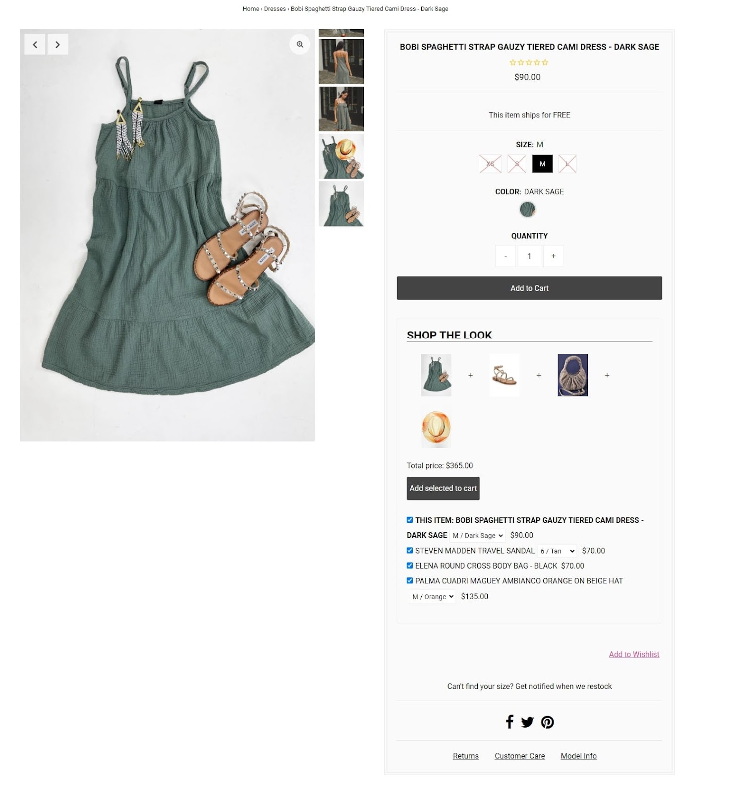
This product page from Hand In Pocket has a “Shop the Look” section that pairs their main product—in this case, a dress—with shoes, a bag, and an accessory.
In addition to enticing their shoppers with complementary pieces, the product page design also makes it easy to add those items to their carts all in one go.
They simply need to leave the additional items checked off and click the “Add selection to cart” button for a seamless bundle.
13. A Frequently Asked Questions (FAQ) section
You have probably already noticed that the same few questions repeatedly come up about your products.
So why not answer them on your product page? That will save your customer support team a lot of work!
After all, 69% of consumers first try to resolve their issues independently, but 55% of sites don’t have Q&As, which can cause friction in their purchasing journey.
By highlighting the most popular FAQs on your Shopify product pages, your customers will experience fewer issues, and conversion rates should increase.
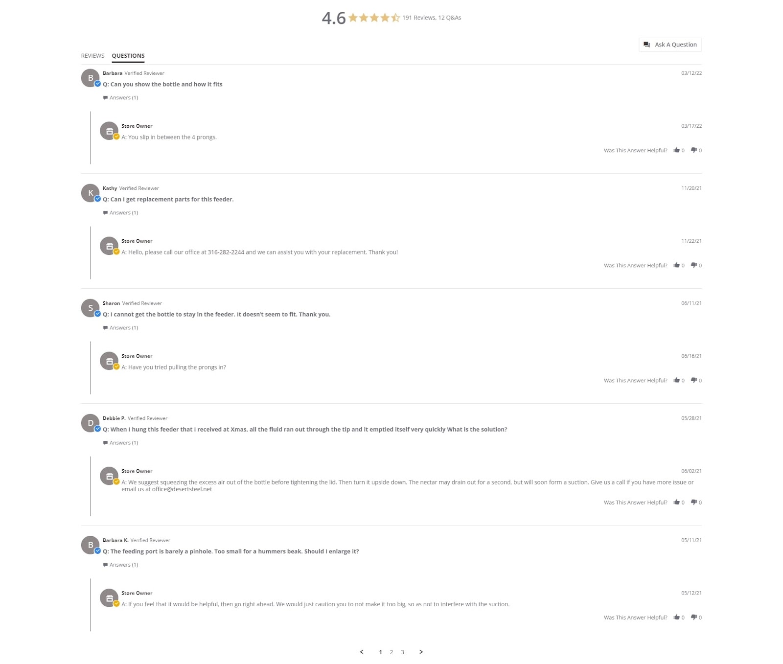
This FAQ section from Desert Steel is for a metallic flower-shaped hummingbird feeder.
The design is beautiful and blends into any garden, but buyers have many valid questions. Some of these include how high the feeder should hang above the ground, where it should be used, and the like.
The Desert Steel team takes care to answer each question themselves and succeeds at three vital things:
- Showing shoppers they care enough to answer their questions
- Calling out questions (and answers) during the shopping period, so by the time a buyer receives their item, they know how it works
- Publicly answering questions that other buyers may have so they don’t have to wait for customer support
14. Product instructions
Not all merchants sell items that shoppers innately know how to use. If you sell a pair of shoes, your buyers will understand how to use them.
However, if you sell a piece of sophisticated machinery, you’ll need to invest in buyer education to ensure your product is used safely and to its full potential.
When you sell more complex products, it’s important to include product instructions on your product page.
This will help educate your shoppers on proper use, as well as answer the questions:
- How do I use this product?
- Will I use this product?
- How will this product help me?
Product instructions can come in many forms, including a video, illustrated images with steps, or even a link out to a more detailed guide.
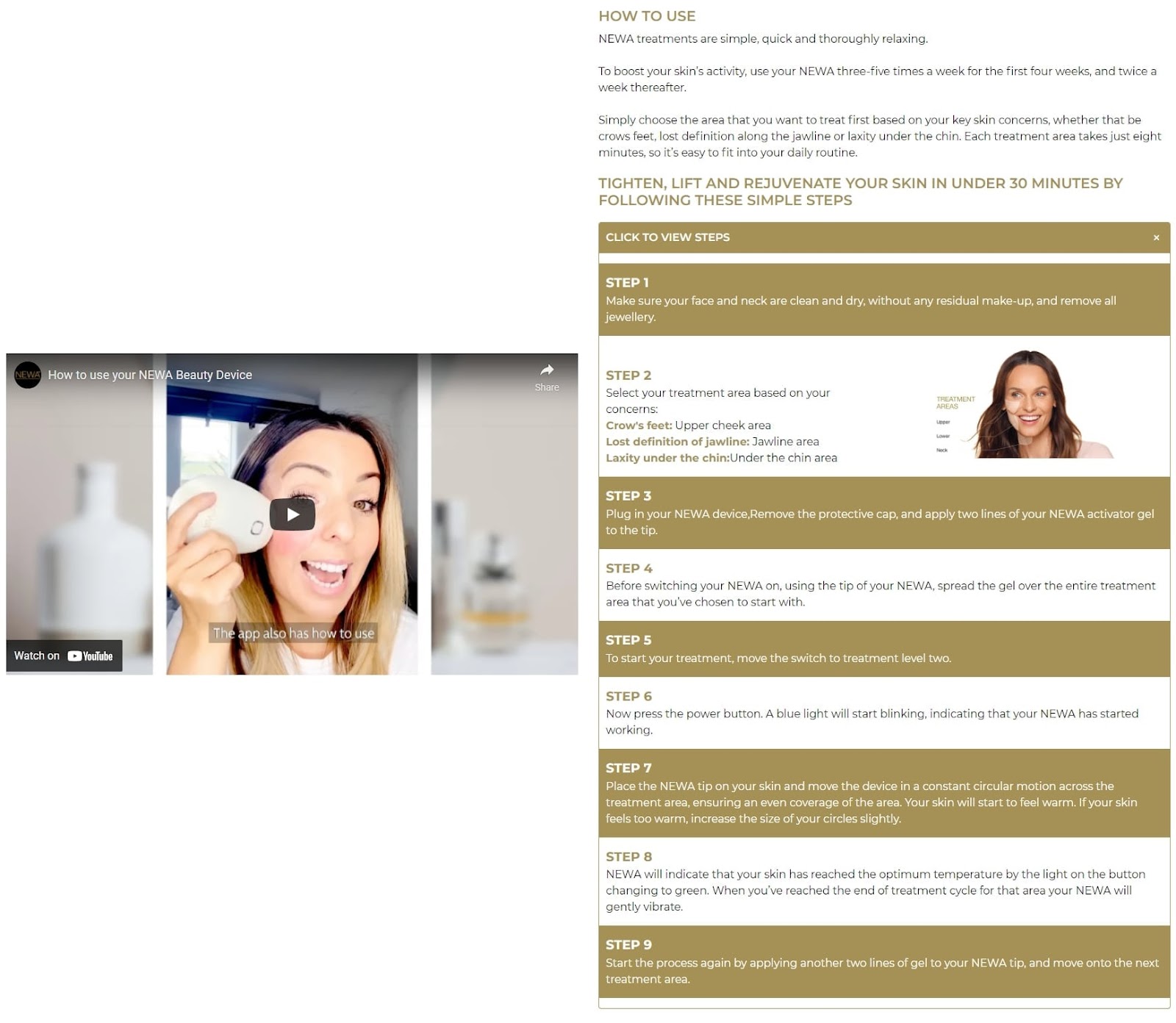
NEWA utilizes a combination of a video explainer and written steps on how to use their product.
They also employ an image in step two that helps users figure out how they want to use the product.
This is an excellent example of how a brand can use text, video, and graphics to educate their customers about how to use their item.
15. A call-to-action (CTA) button
Every product page should have a clear CTA, prompting visitors to take the desired action(s).
The main goal of most product pages will be to get visitors to add an item to their baskets and continue shopping or purchase the item immediately.
However, you can also have secondary CTAs.
For example, if someone isn’t quite ready to make a purchase, you might deliver a prompt to sign up for your newsletter to get exclusive offers.
Or, if you don’t have a product in stock, you might ask visitors to join a waitlist or check out an alternative product instead.
Tip: Research has shown that personalized CTAs that appear as buttons perform far better than images.
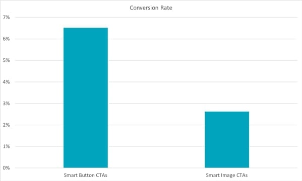
Consider running A/B tests to find the most effective CTAs and CTA types for your audience. What works for one company may not work for yours.
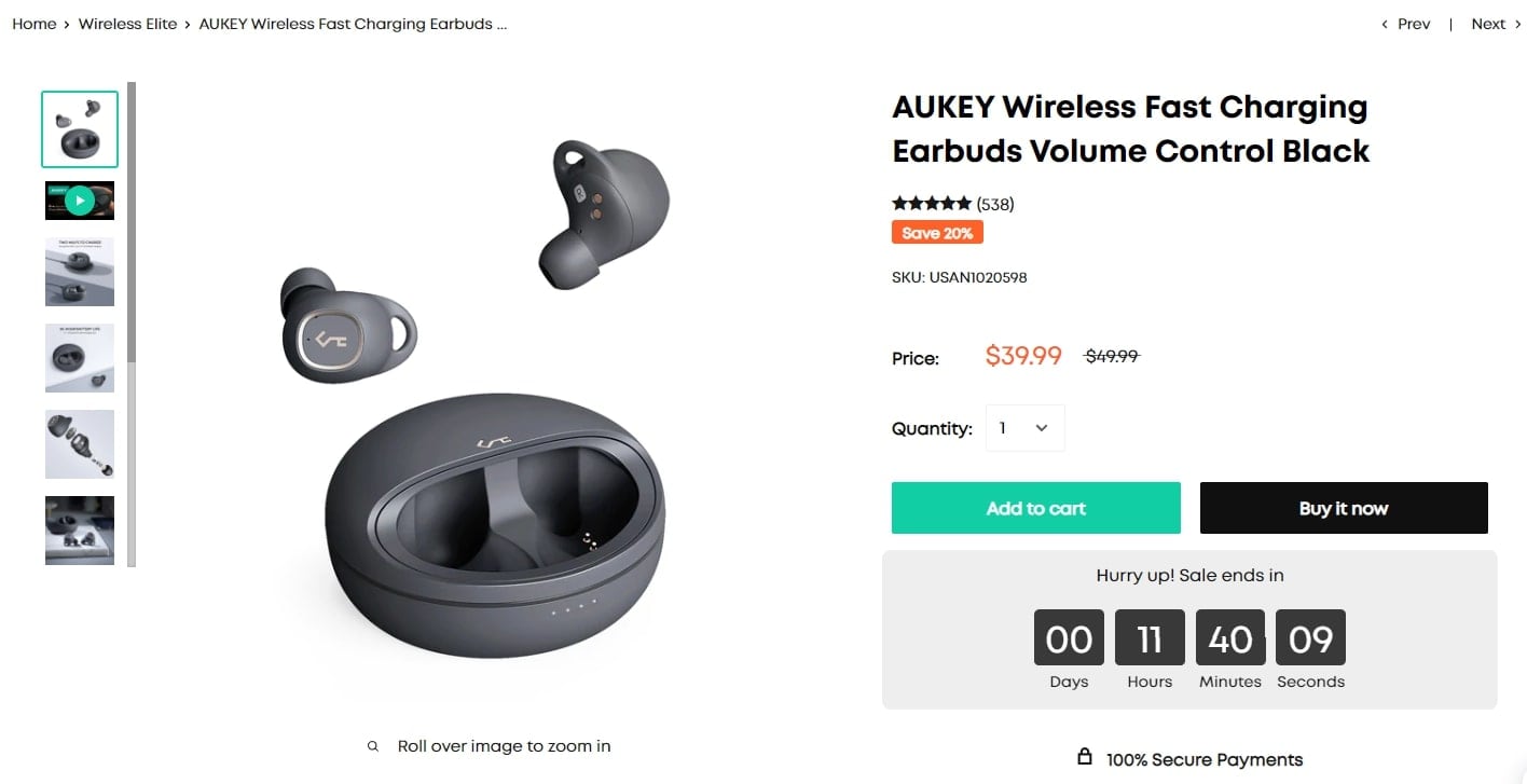
The product page above features two distinct CTAs above the fold:
- “Add to cart,” which will add the item to your cart
- “Buy it now,” which will take you straight to checkout with that item
The product page design does a good job of keeping their buttons on-brand with their colors and font while still distinguishing between them, so shoppers know these are distinctly different actions.
This prevents someone from clicking “Buy it now” while still wanting to shop around the site.
16. A mobile-responsive design
“At least half or more of web traffic comes from mobile web users, so your pages must be mobile-friendly and responsive. This makes it easier to entice people to continue browsing as it creates fluidity and reduces confusion as they look through products.”
— Sarah Jameson, Marketing Director of Green Building Elements
Last but definitely not least, it’s vital to have product pages thatlook great on every device.
With consumers shopping on the go or on the couch from their phones and tablets, your product page designs must adjust and still remain easy to use and convert from, no matter the screen size.
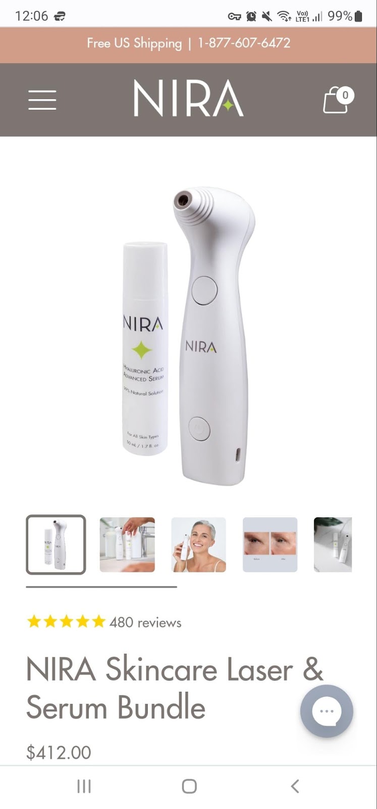
In the image above, shoppers immediately see what they are purchasing, with a product photo taking front and center alongside smaller thumbnails of other images available to scroll through.
Also visible above the fold are critical elements such as the product title, price, and the number of reviews.
This mobile design works well with the header banner offering free shipping and the company’s logo and menu available at the top.
As an added bonus, a quick chat button on the bottom right (well in reach of a right-handed scroller’s thumb) allows shoppers to get in touch via live chat or check their order status.
Ecommerce product page design template for getting started
Now that I’ve gone over the different elements of a great product page design and included specific examples, let’s bring it all together to look at a holistic view.
With Shogun Page Builder, you can build your own incredible product page templates to use over and over again. Find what works and spread the love.
Your product page design might look something like this:
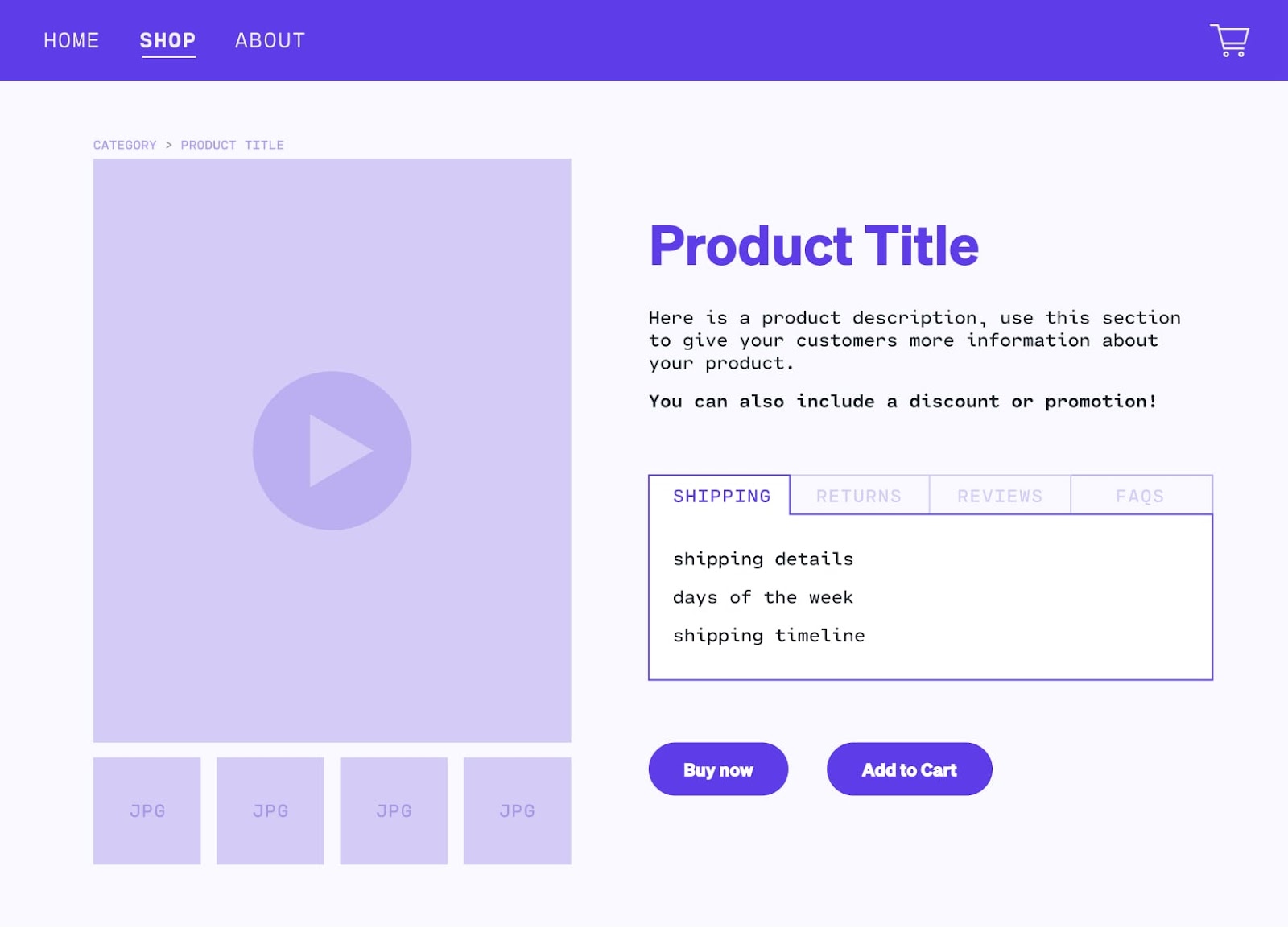
If you need some inspiration to start creating your own amazing product pages, check out some product page design templates that hit all the marks.
Building a stellar landing page with Shogun is easy (and fun!), so once you’ve gleaned the learnings from this post, you can start building your own. If you need some more help, here’s a quick video showing how easily you can create a product page with Shogun.
Invest in your product page design and reap the rewards
You’ve learned the ins and outs of building a compelling, comprehensive product page design.
Craft your product pages with the key elements touched on above, focus on what your customers want to learn from you, and make it easy for shoppers to find all the information they want.
Building great product pages will elevate your brand, buyer experience, and conversions—and your bottom line will thank you.
#cta-visual-pb#<cta-title>Create compelling product pages<cta-title>Find the right design, messaging, and layout for your best sellers.Start building for free

Rachel Go
Rachel is a remote marketing manager with a background in building scalable content engines. She creates content that wins customers for B2B ecommerce companies like MyFBAPrep, Shogun, and more. In the past, she has scaled organic acquisition efforts for companies like Deliverr and Skubana.

