How to Choose The Best Shopify Fonts & Pairings For Your Store
Fonts may not be top of mind when you are building your Shopify store, but they are hugely influential on how shoppers think about your brand.
An important part of creating an ecommerce store is the pre-work that goes into defining your brand identity. That involves developing a distinct color palette, a brand voice, and the typography through which your brand voice speaks.
By putting together a brand style guide, you can ensure consistency across all customer touchpoints, stitching together a singular brand image.
But how do you know what fonts work for your brand and your customers?
While we often take typography for granted, there is a lot to consider when choosing what’ll work best for your brand.
In this post, we’ll cover:
First, let’s get into the why of it all.
#cta-visual-pb#<cta-title>Add fonts to your Shopify store easily<cta-title>Customize your store with built-in fonts and an easy drag-and-drop interface by using the best page builder for Shopify.Design your store for free
Why fonts matter for Shopify stores
Fonts evoke specific thoughts, feelings, and behaviors depending on their form—and ultimately play a role in how your audience views your store.
But how is it that fonts have such a powerful psychological effect?
For starters, we tend to associate shapes with emotions. More angular fonts can mean a more formal and official tone, while round fonts are effective for expressing feminity and softness.
One study found that memorability increased when businesses were consistent with their typefaces across copy and advertisements.
Other research suggests that reading speed increases with serif fonts like Times New Roman and Garamond.
Newspapers and books make good use of serif fonts since they make long blocks of text easier to read.
An MIT study suggests fonts can have the power to affect your mood and cognitive ability.
This can help customers along the buyer’s journey, using fonts to create a positive brand perception that makes all the difference.
All in all, the strategic use of fonts is an opportunity to let your brand’s personality and messaging shine through—whether they’re good or bad choices.
If you don’t wisely choose the right font for your brand, you could be unknowingly harming its credibility.
How do fonts affect performance and why does it matter?
Well, if you’re trying to optimize your ecommerce store to rank in search engines, you need to take into account site speed—an important SEO ranking factor.
The faster your site, the more likely it’ll rank higher in search results where your products will be found by more people, and vice versa.
But how exactly does using web fonts come at a performance cost?
Google Fonts, for example, are hosted from remote servers that get millions of simultaneous API hits, which can delay load times for up to seconds.
In fact, each font can add up to 400 kilobytes to your page weight.
Below you can see the time difference it takes for a Google Font (Open Sans) to load in comparison to a systems font (Arial).
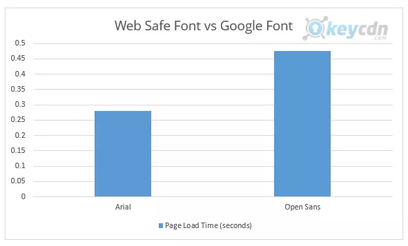
And according to Google, this plays a factor in site speed and bounce rate:
“As page load time goes from one second to 10 seconds, the probability of a mobile site visitor bouncing increases 123%. Similarly, as the number of elements—text, titles, images—on a page goes from 400 to 6,000, the probability of conversion drops 95%.”
However, if SEO isn’t how you primarily market your store, then you don’t have to think too much about whether you’re choosing fonts will affect your rankings.
But keep in mind that they still might affect your bounce rate nonetheless.
What are the best Shopify fonts for your store?
As you experiment with Shopify fonts, you might be wondering which fonts are the best for your store’s pages.
It’s an important question to ask, and the answer depends on a few factors:
- What’s your brand’s overall message and personality?
- What image are you trying to craft to reel in your target audience?
- What are your brand values?
- What feelings are you trying to evoke in your audience?
It’s questions like these that can help point you in the right direction.
For example, studies have shown that serif fonts are generally ranked as more “practical” and “mature”.
Here are some more tips to help you choose custom fonts for your Shopify store:
Choose your ideal font weights
When you’re choosing your fonts, there are different weight options to pick from.
For example, take a look at all the font weights there are for the Urbanist font.
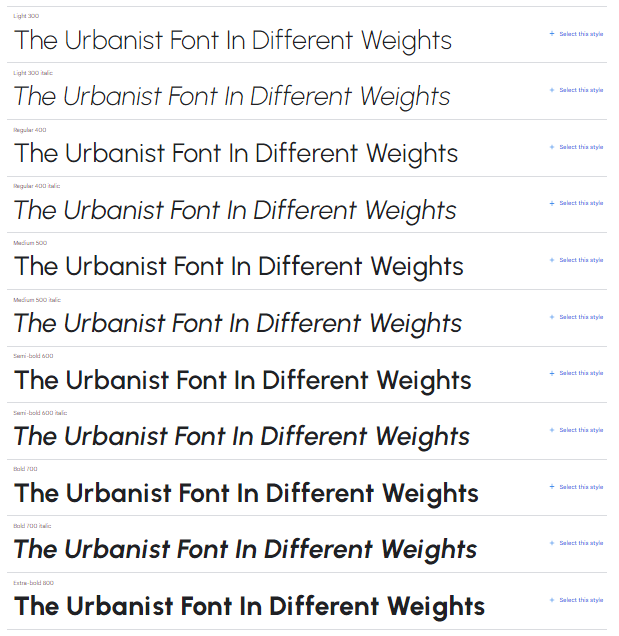
Different weights can suggest different brand personalities.
You usually associate thinner and more stylized fonts with modernism, minimalism, and elegance.
However, as your fonts get thicker, you realize that they start to look a bit more informal, loud, and even extroverted.
Consider leveraging color psychology
Here’s something you might not have thought about before—color psychology.
Color has a profound effect on brand perception. When you pair the right colors with the right fonts, it can make for a powerful brand experience.
So much so that some brands have even trademarked their own signature colors.
Research has found that up to 90% of how we judge people or products is based on color alone. You might be wondering what colors it’s best to stay away from.
A study suggests that the least favorite color for both male and females is brown, yellow, and orange.
Pairing color combinations with a sound font strategy can make for powerful brand recall.
Consider taking the time to experiment with font colors as well. Use a tool like Coolors to play around with color combinations.
Choose either complementary or contrasting fonts
Complementary font pairings play off each other without too much friction or difference between them.
For example, you can use a heading font in bolded format and use the same font in a regular font weight as a pairing. This implies harmony and balance.
On the other hand, there are contrasting font pairings to consider. These are two fonts that differ a lot from each other in shape, thickness, style, or alignment.
A popular contrasting font combination is to use a sans serif font as your main font while using a serif font as the supporting font.
#cta-paragraph-pb#Once you’ve figured out the best fonts for your store, learn how to add them with our tutorial on editing and customizing Shopify fonts.
Highlights from the Shopify font list
Admittedly, Shopify’s font list can be pretty basic. Below, we’ve listed some of the most useful fonts according to what they’re best for.
Montserrat: Best for accent text and body copy

Montserrat is the font you can’t go wrong with.
It’s built with softer edges and no serifs, meaning it’s highly legible and appropriate for a lot of different scenarios.
Alegreya: Best for adding some flair to your headings

Alegreya isn’t a font you see very often, but if paired well, it’s a font that can help make your brand more memorable.
Open Sans: Best for a classic, approachable feel

As a classic font that’s great for body copy, Open Sans is another great starting point.
Open Sans is a sans serif font that can go well with Helvetica, Lato, or Source Sans Pro.
Quicksand: Best for softer headings and titles

If you’re looking to create headings with a softer, more fun feel, look no further than Quicksand.
It’s a great header font to create different font combinations with.
Avenir Next: Best for legibility

Avenir Next is a geometric typeface that looks good on just about everything. It’s a favorite by lots of designers.
ITC Modern: Best for a professional look

The word “professional” and serif fonts pretty much always go together.
ITC Modern can work great for a brand that’s looking to create a timeless and trustworthy feel.
4 Awesome Shopify font pairings that work well together
We couldn’t end this post without giving you a few pointers in the font pairing department.
1. Playfair Display and Source Sans Pro

If your store sells beauty products or women’s dresses, then Playfair Display’s delicate, high-contrast strokes work great on titles—and headlines will work well with Source Sans Pro’s clarity.
2. Montserrat and Roboto

Not all fonts go well together, but the contrast between Montserrat’s heavy bold and Roboto light text is a winning combo for stores that sell electronics or industrial parts.
3. Overlock and Nunito
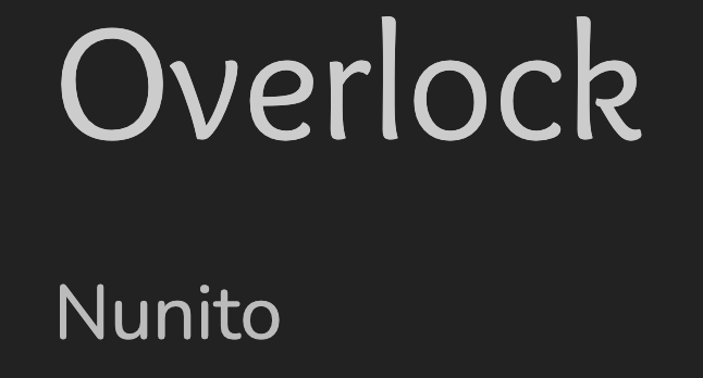
Overlock looks great when used for titles and short texts; it balances Nunito, which is more rounded. The pair work great together for a store that sells clothing.
4. Dancing Script and Lato
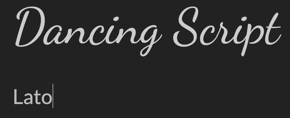
Dancing Script is a solid font that stands boldly wherever it’s placed, and Lato is a perfect compliment. They would work great together for a postcard and gift shop.
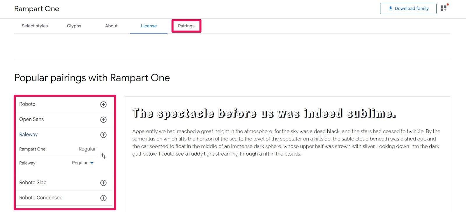
You can also use the Google Fonts Pairings feature. It lets you get a visual of what popular pairings look like.
Find the right font to define your Shopify store experience
Your Shopify store deserves to look its very best, with a distinct brand look and feel that is unique to your brand. Obviously, fonts are a huge part of this.
By investigating the typography that best fits your brand, you can create a brand experience that customers will love.
Hopefully, this guide has helped get you closer to a final decision on your perfect fonts and pairings.
#cta-visual-pb#<cta-title>Build a better Shopify store<cta-title>Make your store look and feel as unique as your brand by customizing with the best page builder for Shopify.Start building for free

Michelle Deery
Michelle Deery is a writer and strategist for B2B SaaS companies. She writes content that helps brands convert visitors into paying customers.

