In this comprehensive guide, we’ll go over absolutely everything you need to know about Shopify conversion rate optimization (CRO). We’ll also provide you with some actionable checklists that you can use to ensure you’re following CRO best practices while working on your product pages, landing pages, and the mobile version of your site.
In ecommerce, a “conversion” is simply when a visitor does something that is important to your brand.
While making a sale may be your ultimate goal, there are many other actions that could count as a conversion, such as the visitor adding an item to their cart, signing up for your newsletter, or clicking on a particular link — it all depends on what you’re tracking.
To calculate your conversion rate, just divide the number of converted visitors by the total number of visitors, then multiply that figure by 100.
For example, let’s say your goal was to generate more sales on one of your product pages. If the page had 1,000 visitors and 50 of them placed orders over the period that you were tracking, that would work out to a conversion rate of 5%.
Figuring out your conversion rate will only be a worthwhile endeavor if you have some context to compare it to.
Once you’ve run multiple CRO experiments of your own, you’ll be able to get a sense of whether a conversion rate is good or bad for your specific store. Until then, you can use more general benchmarks to measure success and guide your CRO strategy.
The average conversion rate for a Shopify store is 1.4%. In general, anything below 0.5% is considered a poor conversion rate for Shopify merchants, while anything over 3.3% is a good conversion rate.
It should be noted that different industries tend to convert visitors at different rates. As of May 2024, here are the average conversion rates for some of the most popular sectors within ecommerce:
So, a conversion rate of 2.5% during this time would be impressive for an online grocery store but not so much for an arts and crafts shop. Again, it’s all about the context.
Another factor to consider is where your visitors are coming from. Generally speaking, you should expect organic traffic to convert at a higher rate than traffic from advertisements.
The following chart breaks down the average conversion rates of different traffic sources for both business-to-customer (B2C) and business-to-business (B2B) sellers:
| Traffic Source | B2C Benchmark | B2B Benchmark |
| 2.8% | 2.4% | |
| Organic Social | 2.4% | 1.7% |
| Organic Search | 2.1% | 2.6% |
| Social Ads | 2.1% | 0.9% |
| Referral | 1.8% | 1.1% |
| Direct | 1.6% | 1.9% |
| Search Ads | 1.2% | 1.5% |
| Display Ads | 0.7% | 0.3% |
It’s easy to track conversions in Shopify — all you need to do is follow these steps:
Step 1. After logging in to Shopify, select the “Analytics” option in the left sidebar of the main dashboard.
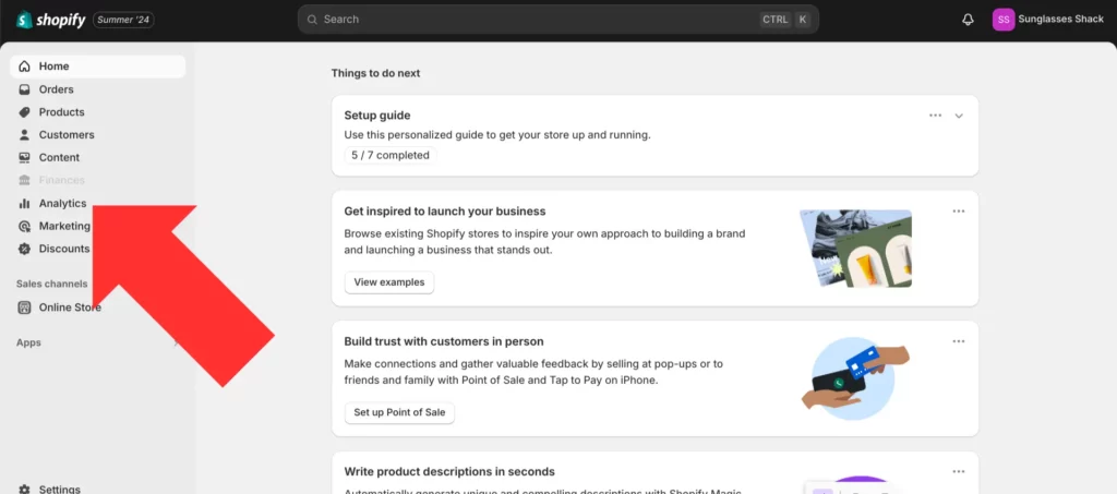
Step 2. Scroll down to the “Online store conversion rate” section.
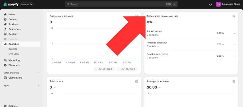
Here, you’ll be able to see your store’s conversion rate for three different types of actions: the visitor adding an item to their cart, the visitor reaching the checkout stage, and the visitor actually placing an order.
Step 3. Click on the “Online store conversion rate” section to see more details.
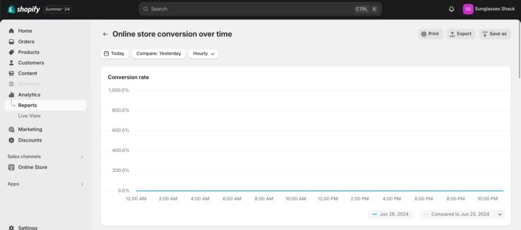
This is where you can generate your own “Online store conversion rate over time” reports. Shopify allows you to set a custom date range to review for your conversion rate, and you can compare one period of time against another as well.
Google Analytics 4 (GA4) is another popular way to track conversions. After linking your Shopify store to GA4, you’ll be able to view your conversion rate for a wide variety of different events, such as visitors submitting their payment information or viewing a certain promotion on your site.
Product pages are the backbone of every brand. Your product displays will be what moves shoppers from passive browsing into active buying.
To maximize your conversion rate for your products, pay close attention to these 5 elements of a product page:
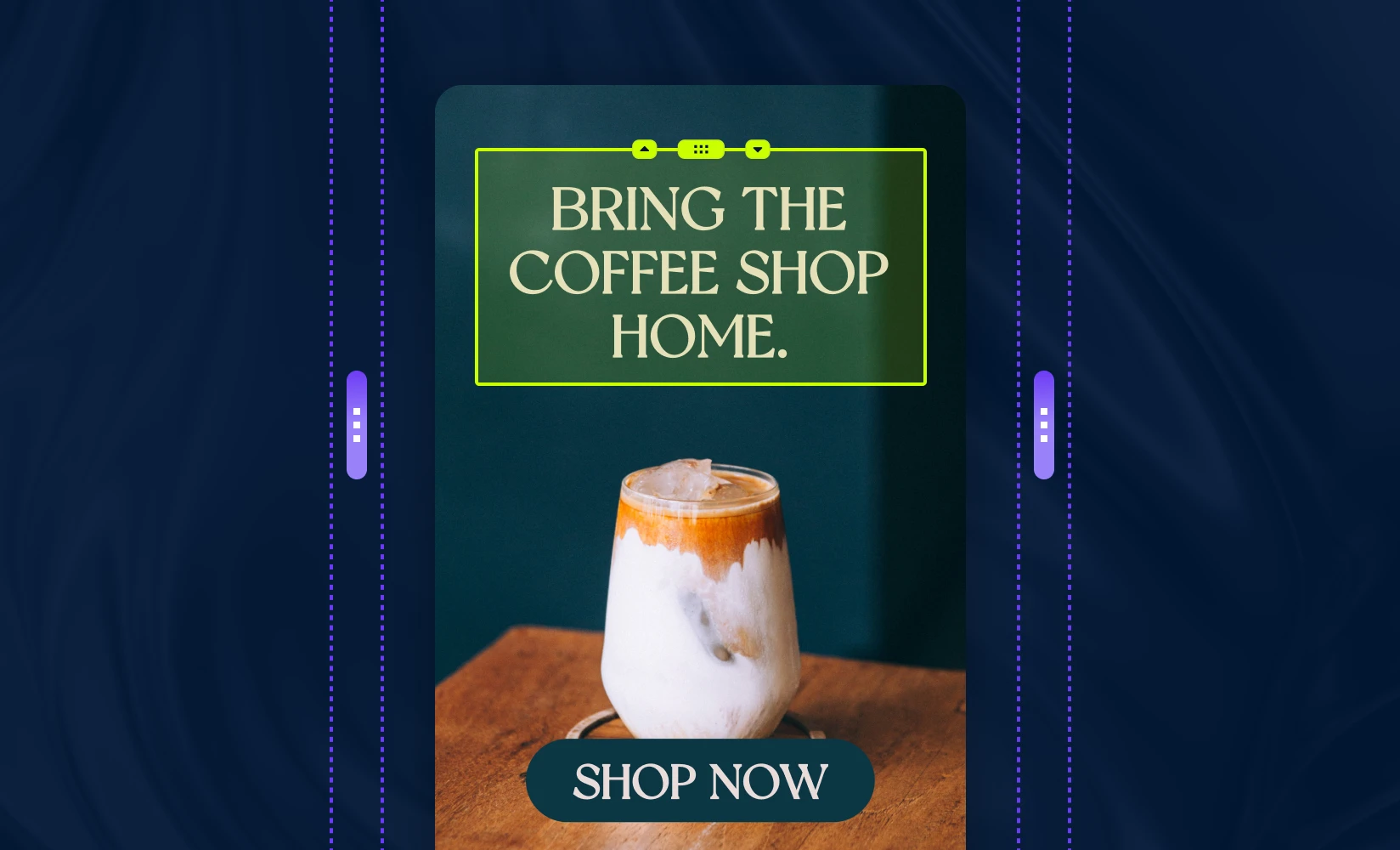
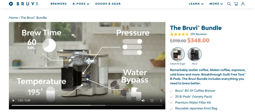
To demonstrate what these principles look like in practice, let’s take a look at this product page published by the coffee maker company (and Shopify merchant) Bruvi. They’ve done an exceptional job at following many of the established best practices for Shopify conversion rate optimization.
First of all, check out how they’ve incorporated a two-minute instructional video on the page along with their product images.
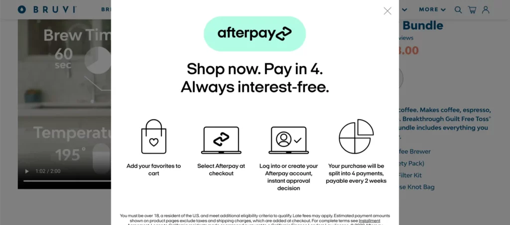
An integration with Afterpay allows customers to break up the $300+ cost into four installments.
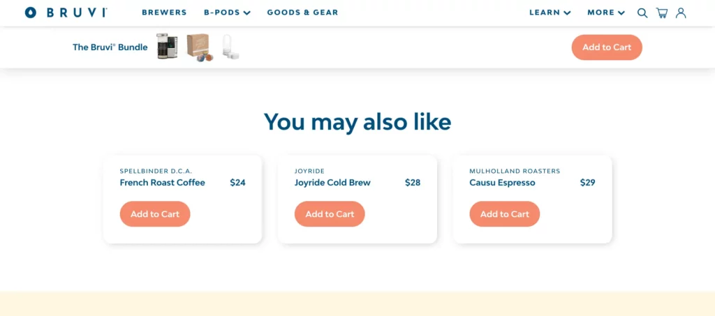
Related products are displayed to increase AOV.
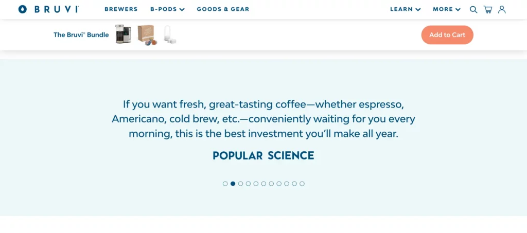
And positive quotes from publications are used for social proof. Adding the logo of each outlet is a nice touch, as it looks like a true stamp of approval.
We’ve just covered the broad strokes of product page optimization — the checklist below will help you address all the fine details involved in this process:
| Checklist Item | What To Look For |
| Optimize Above the Fold | Are the most important elements of the product page, including the title, description, images/video, and CTA button, located above the fold? This means the visitor doesn’t need to scroll down to see them. |
| Product Title | Is your product title specific enough? On the other hand, you don’t want to add too much detail to your product titles — if you try to jam a bunch of keywords where they don’t naturally belong, you risk violating the spam policies of search engines. In that case, you could be penalized with a lower ranking or removed from the rankings altogether. The perfect product title will be highly specific, yet also concise. You should test out multiple product title options to see which performs best. |
| High-Quality Images and Video | Are you providing visitors with a good look at your products through images and video? Think about this from the customer’s perspective — if you were interested in buying your own product, what would you most want to check out? Include as many alternate angles and close-up shots as necessary. |
| Product Description | Does your product description provide all the information visitors might want to know? The description also offers an excellent opportunity to include any keywords you’re targeting that you weren’t able to reasonably fit into the product title. |
| Color Swatches | If the product is available in multiple colors, did you provide a color swatch? Is it easy to use and navigate? |
| Shipping and Returns | Are you providing detailed shipping and returns information? If you’re able to offer free shipping, this can give your conversion rate a huge boost. |
| Pricing | Is the product discounted? If so, is this fact clear to the visitor? Highlight discounts with a prominent visual indicator, such as a strikethrough text effect on the original price. Also, is a BNPL option available? As with the product title, this is another area you should experiment with to determine which method is most effective. |
| CTA Button | Is the CTA button located close to other key elements, such as the product image and description? Are you using size, spacing, and an eye-catching color to help it stand out? |
| Buy Now vs. Add to Cart Buttons | Have you decided whether Buy Now or Add to Cart buttons would be a better fit for your store? Buy Now buttons direct the visitor straight to the checkout page, while Add to Cart buttons let customers keep shopping before they check out. With a Buy Now button, you’ll keep the visitor focused on completing their purchase, potentially lowering your abandoned cart rate. But allowing customers to keep shopping may increase your AOV. In general, Buy Now buttons are best for stores based on a single product, while Add to Cart buttons make more sense for stores with large catalogs. |
| Comparison Chart | Have you added a comparison chart to the page? Remember, this is particularly useful for when you sell several similar products, or when making the price of a product look more reasonable will help you prevent sticker shock and make more sales. |
| Complementary and Related Products | Are you giving the shopper off-ramps to other products in case they aren’t ready to buy what’s in front of them? |
| Ratings and Reviews | Have you included positive ratings and reviews in order to add social proof to the page? |
Customization is the key to success in ecommerce. By speaking directly to a visitor’s unique preferences and needs, you can build a connection and improve your odds of converting them into a customer.
This is what makes landing pages so important. Landing pages are pages designed for a single traffic source, usually a marketing campaign — by creating a custom campaign experience rather than just directing visitors to your default product page, you’ll be able to provide a seamless transition for visitors after they click on your off-page marketing link.
Landing pages are especially useful for traffic that you’re directly paying for, such as a search ad or influencer marketing campaign. Such marketing efforts can cost a lot of money, so you’ll want to minimize risk to ensure you get a substantial return on your investment.
There are no guarantees in ecommerce, but landing pages are a much safer bet for generating conversions than any other option.
You don’t need to take our word for it — Omnisend recently analyzed thousands of campaigns to determine the best ways to get visitors to complete a signup form. Of the techniques tested, landing pages were by far the most effective. They had an astronomical conversion rate of 23% (the most popular technique, a popup form, had a conversion rate of 3%).
Many of the same best practices that apply to product pages also apply to landing pages, including using photos and videos to provide an adequate amount of visual information, adding social proof to build trust, and using product comparison charts to put your pricing into perspective.
The main difference between these two types of pages is that product pages need to appeal to everyone, while landing pages are only for one audience. That means you should be more targeted with your approach. You should also consider removing some of your standard navigation options from your landing pages — while you might be fine with visitors exploring your site in general, landing pages should be all about encouraging a single action.
And to squeeze as many conversions out of your marketing campaigns as possible, try pairing your landing page with a promotional offer, such as a limited-time sale.
Here are some items to check on your landing page to make it as optimized as possible:
| Checklist Item | What To Look For |
| Social Proof | Have you included testimonials on your landing pages to build trust for your brand? |
| Compelling Product Images and Video | Are you providing visitors with enough visual information? Make sure you’re highlighting your product with more than just flowery copy. |
| Pricing Anchors | Are you leveraging product comparison charts to showcase the value of the product to shoppers? |
| Personalization | Are you personalizing the landing page based on conditions such as the visitor’s geolocation, purchasing history or referral source? Personalized landing pages can help increase conversion rates dramatically. |
| FAQs | Does your landing page have an FAQ section? This can help you address any common concerns that may be standing in the way of a purchase. |
| Email Capture | Are you asking the shopper for their email address? If they’re not ready to make a purchase now, this would at least allow you to alert them about other deals in the future — you don’t want to leave the interaction empty-handed. |
| Navigation | Have you removed any unnecessary navigation options in order to keep the visitor focused on the conversion action you’re targeting? |
| Urgency | Are you encouraging visitors to act quickly with a flash sale or other promotional offer? |
In 2023, the total value of mobile ecommerce sales reached $2.2 trillion. That’s 60% of total ecommerce sales, and this figure is expected to reach 62% by 2027.
Just a few years ago, the standard practice was to design your site for desktops and then adapt it for mobile devices. These days, it makes more sense to do it the other way around — this practice is known as mobile-first design.
You need to accommodate the smaller screens of mobile devices. Text, images, and navigation options that work fine on desktops and laptops might be too small or too crowded for mobile use.
Page speed is also crucial for mobile design. Mobile users have a higher bounce rate (58.45% to 60.19%) than desktop users (48.38% to 50.33%). And according to Google, the probability of a bounce for pages that take three seconds to load is 32% higher than it is for pages that only take one second.
It’s already difficult to hold the attention of mobile users — don’t make it harder on yourself by serving up a sluggish experience.
Use this checklist to confirm you’re providing a good experience for your mobile users:
| Checklist Item | What To Look For |
| Compressed Images | Have you converted PNG and JPG images to the WebP format? This will significantly reduce the file size of your images (and thus reduce the amount of time it takes to load the page) without sacrificing much quality. Online tools such as Squoosh and TinyIMG make this process easy. |
| Images are Lazy Loading | Are any images located below the fold only loading when the visitor actually scrolls down to see them? This is much faster than loading everything all at once. |
| Responsive Images | Do the images on your site automatically adjust to the size of the visitor’s screen? |
| Accessible Tap Radius | Do your links, buttons, and CTAs have an appropriate tap radius for mobile devices? If it’s difficult for mobile users to even select what they’re trying to select, you’re going to miss out on many potential sales. |
| Properly Centered Content | Are your titles properly centered for mobile devices? This is a common issue for sites that took a desktop-first approach to design. |
| Margins and Padding | Did you use percentages when setting up the margins and padding on your site? Since your site will be viewed on several different types of devices and screen sizes, this makes for a better experience than using a set number of pixels. |
| Background Images | If you’re using any background images, are they scaled properly to fit mobile device screen sizes? In many cases, it’s better to just remove background images entirely from the mobile version of your site. |
| Legible Fonts | Are your fonts large and clear enough to easily read on the relatively small screens of mobile devices? |
| Mobile-friendly Menu | Is your site menu easy to navigate on mobile devices? |
| Image Aspect Ratio | Do your images look stretched or squashed on mobile devices? If so, adjust the aspect ratio until they look normal. |
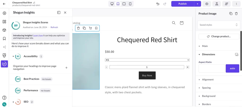
In addition to this checklist, you can use Shogun’s Insights feature to make sure your Shopify store is optimized for mobile. This tool grades your site according to several different factors (Accessibility, Best Practices, Performance, and SEO) on a scale of 0 to 100. Whenever your score is less than 100, Shogun will tell you exactly what kind of improvements you need to make.
For example, if any of your buttons are smaller than 48×48 pixels, Shogun will let you know you should make them bigger so that they’re easier to tap on mobile devices.
All of the advice mentioned so far in this guide is somewhat generalized — for whatever reason, a design tip or persuasion technique that works for most stores might not work for yours.
The only way to really know whether something will work for you is to try it out and see what happens. You must experiment.
Of course, every experiment needs a control. How else will you know if an improvement in your conversion rate is due to the changes you made or some other factor, such as seasonal trends or simple variance?
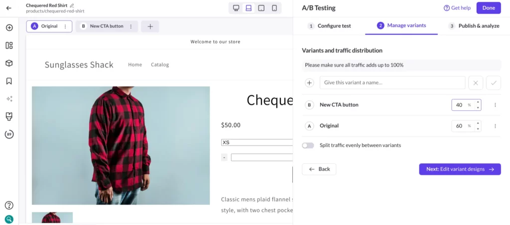
With Shogun’s A/B testing feature, you can run your own experiment and control by designing and publishing two versions of the same page. Some visitors will be directed to the original version, while others will be directed to the updated version. You can then measure the conversion rate of both versions over the same period of time to objectively determine whether your changes are having their intended effect.
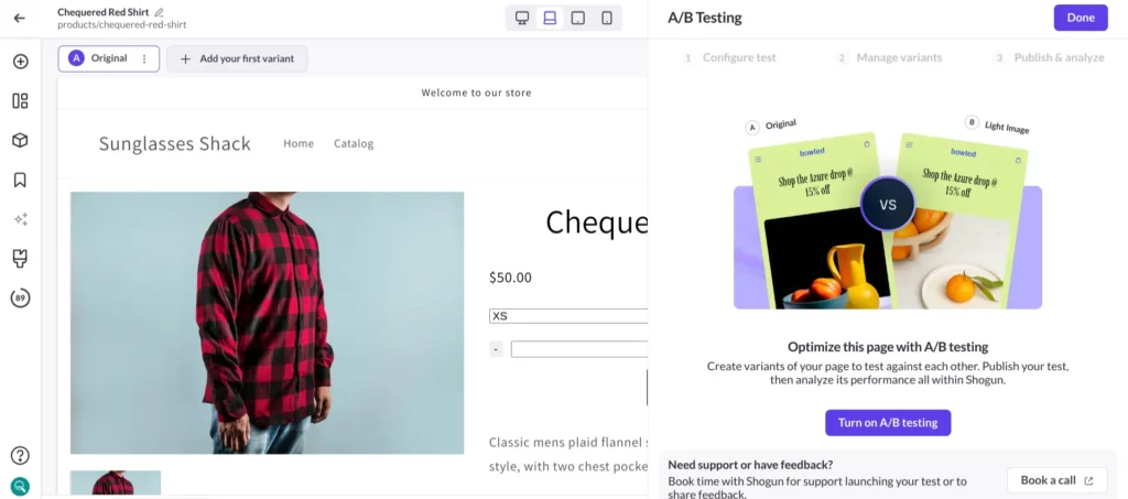
Shogun gives you a variety of customization options for your A/B tests. For example, you can manually set the percentage of traffic that will go to each version. It’s usually a good idea to send less traffic to the updated version — that way, if your changes end up having a negative impact on user experience, fewer visitors will be affected.
A/B testing can be used to perfect many aspects of your CRO strategy, such as:
Basically, whenever you have an idea for increasing your conversion rate, you can use A/B testing to see if it’s truly worth moving forward. Why leave it up to chance?
Just about every ecommerce brand successful enough to become a household name relies on personalization.
eBay personalizes its homepage according to each visitor’s interests. Netflix’s personalization features help keep their massive user base highly engaged and satisfied with their service.
And, arguably more than any other factor, it was personalized product recommendations that turned Amazon into the trillion-dollar company that it is today.
Personalization can also work wonders for your business, especially when it comes to CRO — research conducted by McKinsey & Company has shown that personalization can increase the ROI of marketing campaigns by 10% to 30% and raise total revenue by 5% to 15%.
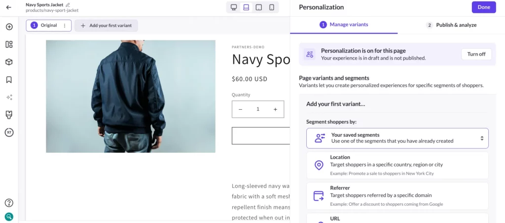
Similar to the A/B testing feature, Shogun’s Personalization feature allows you to design multiple versions of the same page. But instead of being a temporary test, with Personalization the alternate versions are left up for good.
Here’s how it works — you can set up audience segments in Shogun based on a variety of conditions, including the visitor’s location, the URL that sent the visitor to your site, and the visitor’s purchasing history.
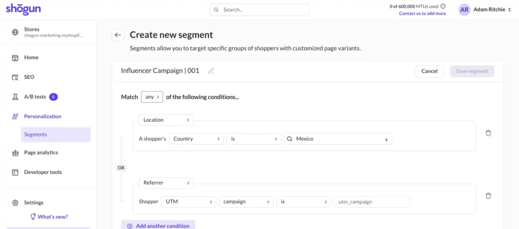
Once your audience segment is set up, create a new variant of any page within Shogun, assign it to the segment, and make any design changes you want. These changes will only be shown to that group of visitors and no one else.
In the case of an influencer marketing campaign, you could create a custom page variant that features an image of the influencer as well as references to the influencer in the product description. This would help you form a stronger connection with the influencer’s followers who are landing on your store, while all your other visitors will still be shown the original version of the page since they wouldn’t understand that context.
Or, if you ran an international fashion brand, you could account for the different locations of your customers by promoting coats in cold areas while you promote swimwear in warm areas on the same page at the same time.
The possibilities with personalized experiences are endless.
With Personalization, A/B testing, and all the other tools that Shogun has to offer, you have everything you need to handle Shopify conversion rate optimization on your own.