Ecommerce A/B Testing Ideas to Help You Scale Your Store

Scaling an ecommerce business requires ongoing experimentation. Creating variations of your store’s content—such as adjusting button placement, refining product copy, and tweaking landing page layouts—could mean the difference between a trickle of sales and hyper growth.
Today, A/B testing (also known as split testing) makes it possible to understand the preferences of your online audience in real-time by presenting them with two different versions of a landing page, product images, pricing, ad, or email, and then tracking which version performs better.
The easiest way to understand a method is with examples, so we’ve broken down seven different ecommerce A/B testing examples that you could explore to optimize performance. First, let’s dig into the mechanics and metrics that define success.
The Basics of A/B Testing in Ecommerce
A comprehensive study from Harvard Business School found startups that used A/B testing generated 10% more page views, had a 5% higher chance of securing VC funding, and launched 9–18% more products.
It doesn’t guarantee success but essentially speeds up the experimentation phase and allows businesses to make more data-driven decisions. A/B testing for ecommerce begins with grasping two key components: the experimental setup and the success metrics.
Setting up an A/B Test
Setting up an A/B test means creating at least two versions of a single page element such as copy, layout change, button color, or product imagery to test how the changes impact performance of the page. It creates two groups:
- Control Group (A): This is the existing version of whatever is being tested, often called the baseline.
- Treatment Group (B): This is the variant with one key difference from the control, which you hypothesize will lead to better performance.
Participants (i.e., website visitors, email recipients, etc.) are randomly assigned to either the control or the treatment group; their interactions are then measured and analyzed.
It is critical that you test a single element at a time, otherwise you won’t know which change actually led to performance improvements.
Success Metrics
The key performance indicators (KPIs) for A/B testing will vary depending on the specific goals of the test. Common success metrics in ecommerce A/B testing include:
- Conversion Rate: The percentage of visitors who take the desired action, such as making a purchase or signing up for a newsletter.
- Average Order Value (AOV): The average amount of money each customer spends per transaction.
- Customer Lifetime Value (CLV): A prediction of the total value generated by a customer over the whole period of their relationship with the company.
- Revenue Per Visitor (RPV): The average revenue generated from each visitor to a site.
- Click-through Rate (CTR): The ratio of users who click on a specific link to the number of total users who view a page, email, or advertisement.
These metrics help interpret the results of the A/B test and determine which version—A or B—performed better.
Ecommerce A/B Testing Examples
Now, let’s dive into some practical examples to come up with some ideas of what could be tested when setting up your A/B tests.
Website Design and Navigation
One of the core elements that influence the user experience on an ecommerce website is design and navigation. A seamless, intuitive design can significantly improve the shopping experience and lead to more sales.
An A/B test on website design and navigation might focus on elements like:
- Product Layout: Which elements do users interact with more on different versions of the PDP? This could include the arrangement of images, promotions copy and placement, buy now button color, or the inclusion/exclusion of videos.
- Menu Layout: Testing how customers interact with a horizontal compared to a vertical menu can show which is more user-friendly and leads to increased engagement.
- Search Bar Placement: Does having the search bar at the top of the page versus in a more prominent central position affect how quickly users can find products they’re looking for?
- Color Scheme: Do certain colors result in better visitor retention or conversion rates? For example, a brighter ‘Add to Cart’ button may draw more attention.
For example, Vuori, a comfort clothing brand, has a “Gifting” tab as the holiday season approaches. You could repurpose the idea and make season-specific tabs every few months to capitalize on shopping trends.

Metrics to Measure
Here are a couple of metrics you may want to focus on as you begin testing your navigation and site design:
- Bounce Rate: The percentage of visitors who navigate away from the site after viewing only one page.
- Pages Per Session: The average number of pages a user visits in one session.
- Session Duration: The average time spent on the site per session.
- Conversion Rate: How each design variant impacts overall sales or other conversion goals.
Experimenting with design and navigation elements can help identify the most intuitive layout that encourages users to stay on your site longer and navigate through more product pages, potentially increasing the likelihood of a purchase or even increased AOV.
Landing Page Copy
Landing page copy is incredibly important in the process of converting visitors into customers. The copy should clearly communicate the value proposition of the product or service and encourage users to take action.
Here is how you could run an A/B test on landing page copy:
- Headlines: Test different headlines to see which one captures attention and drives more conversions. You could experiment with emotional appeals, different lengths, the inclusion of numbers or statistics, etc.
- Subheadings: Different subheading styles can be tested to see which best supports the headline and entices visitors to read more of the content.
- Body Copy: The length and tone of the body copy can be modified—testing a concise, bullet-point format against a more detailed, paragraph format helps identify which is more compelling to your target audience.
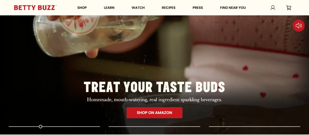
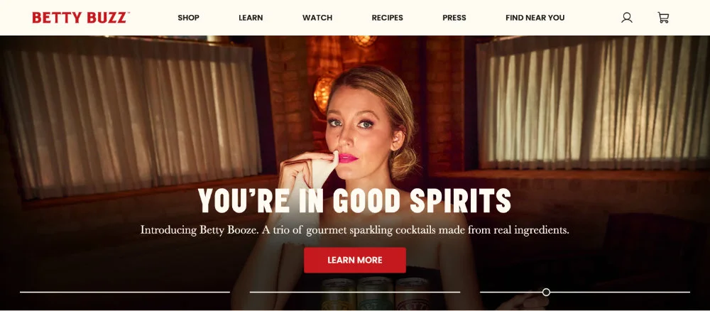
Blake Lively’s Betty Buzz soft drink company does a great job testing different copy. The homepage features three different headlines that quickly rotate and are routinely changing.
Metrics to Measure
When you’re testing different landing page copy, think about these metrics:
- Click-Through Rate (CTR): How many people click on the CTA after reading the headline.
- Conversion Rate: The percentage of visitors who take the desired action after landing on the page.
- Bounce Rate: Determines if the copy holds the visitor’s attention or causes them to leave immediately.
- Time on Page: Measures engagement and indicates whether the copy is compelling enough to keep visitors interested.
By experimenting with different versions of landing page copy, ecommerce sites can find the most effective way to communicate their message and convince visitors to convert.
Product Page Copy
Product page copy is critical in influencing purchasing decisions on an ecommerce site. It not only needs to explain the features and benefits of the product effectively, but also align with the brand’s voice and appeal to the target audience.
An A/B test on product copy could include:
- Description Length: Testing a short and snappy description against a longer, more detailed one to see which better resonates with customers and leads them to purchase.
- Format: Experiment with different formatting such as bullet points, paragraphs, or a mix of both. This can help highlight key information and make it easier for customers to digest.
- Tone of Voice: Adjusting the tone to be more professional, friendly, or playful can have different impacts on different demographics and types of products.
- Technical Specifications: Some consumers may prefer technical details about a product, while others might be more convinced by practical benefits and use cases.
- Storytelling: Descriptions that weave a narrative about the product’s development or how it fits into the customer’s lifestyle could be more engaging than straightforward feature lists.
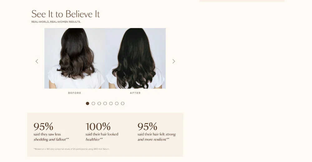
Vegamour, a beauty brand that uses “Real-world, real-women results” as one of its taglines, has detailed product pages with survey and study results. This is the perfect opportunity for A/B testing, to see which results resonate best with their target audience.
Metrics to Measure
Product description experiments can be measured with a ton of different metrics, but here are some of the most important:
- Conversion Rate: Changes in the rate at which visitors to the product page become buyers.
- Add to Cart Rate: The frequency with which visitors add the product to their shopping cart, which can indicate purchase intent.
- Time on Page: Whether different descriptions keep potential customers on the page longer can suggest higher engagement.
- Bounce Rate: Whether users leave the page quickly after reading the product description.
By methodically testing different types of product descriptions, ecommerce businesses can determine which are most effective at converting browsers into customers and possibly upselling related products.
Product Images
High-quality product images are fundamental in ecommerce because customers cannot physically touch or see items before purchasing. Images help bridge this gap by providing visual confirmation of what customers can expect.
Here’s how you could approach A/B testing with product images:
- Quality: Compare high-resolution images to faster-loading lower-resolution options to see if the image quality impacts the conversion rate.
- Quantity: Test having just one product image against having several images showing different angles and details.
- Lifestyle vs. White Background: Some products may be better represented in a lifestyle setting, showing the product in use, versus a sterile white background.
- Use of Models: For fashion or wearable items, test images with models against product-only shots to see which are more effective at driving purchases.
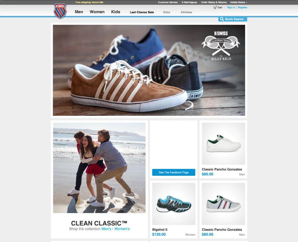
K-Swiss, a shoe brand that’s been operating for more than 50 years, uses almost exclusively white background, no-model images to showcase its products. But that wasn’t always the case. If you look back at the site from 10 years ago, K-Swiss was using a lifestyle approach to product imaging.
A/B testing can show you whether you need to invest in that comprehensive photo shoot or whether customers just want to see the product up close.
Source: Wayback Machine
Metrics to Measure
If you’re A/B testing product images, here are some things to think about:
- Engagement Metrics: Includes time spent on product pages and interactions with image galleries (zooming in, clicking through multiple images, etc.).
- Bounce Rate: Indicates if the presentation of the product via images is appealing enough to keep potential buyers on the page.
- Add to Cart Rate: A measure of whether customers are motivated enough by the images to consider a purchase.
These help determine the most effective way to visually communicate the value and quality of your products, ultimately influencing customers’ purchase decisions.
Call To Action
The call to action (CTA) on any webpage, email, or ad is critical for guiding customers toward the next step. A/B testing CTAs involves experimenting with different aspects to see which is more effective:
- Button Copy: Varying the text of the CTA button, e.g., “Buy Now” vs. “Add to Cart” vs. “Get Yours Today,” to see which phrase generates more clicks.
- Button Color and Design: Changing the color, size, or shape of the CTA button can affect its visibility and attractiveness, impacting the click rate.
- Placement: Testing different locations for the CTA on the page to find the most effective spot. For instance, above the fold, below product descriptions, or sticky buttons that scroll with the page.
- Sense of Urgency: Adding elements of urgency (“Limited offer,” “Sale ends soon”) or scarcity (“Only 2 left in stock”) to the CTA to prompt quicker action.
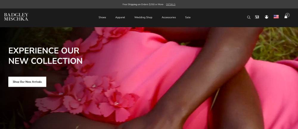
Badgley Mischka, a luxury accessory brand, uses “Shop Our New Arrivals” on its homepage to guide visitors to the hottest items. Through A/B testing, they could try a seasonal CTA like “Browse Winter Collection” or something more rhetorical like “Arrive In Style.”
Metrics to Measure
While the most obvious metric to follow with CTAs is click-through, there are some secondary indicators to follow like:
- Conversion Rate: Tracks how many of those clicks result in the desired action, indicating the effectiveness of the entire funnel.
- Engagement with the CTA: Measures not just clicks but also interactions such as mouse hovers, which can indicate interest level even if the user doesn’t click immediately.
- Bounce Rate Post-CTA: Observe whether users are clicking the CTA but not completing the expected action, suggesting a disconnect between the CTA and the destination page.
Careful A/B testing of CTAs can lead to actionable insights into which elements encourage users to take the desired action.
Best Practices in Conducting A/B Testing
Let’s look at some best practices that can help ensure the reliability and effectiveness of your A/B tests:
- Clear Hypothesis: Start each test with a clear hypothesis about what change you expect to see and why you think it will happen.
- Test One Change at a Time: To clearly understand the impact of a single variable, change only one element per test.
- Sufficient Sample Size: Ensure you have a large enough audience to obtain statistically significant results.
- Duration: Run the test for an appropriate length of time to account for business cycles and external factors.
- Segmentation: Analyze how different user segments respond to A/B tests. Behavior may vary across demographics or user types.
To help with the complexity of A/B testing, ecommerce businesses often turn to platforms like Shogun. We provide an intuitive interface and a suite of optimization and personalization features that can help streamline the A/B testing process, from hypothesis to analysis to help you scale your business.
Final Thoughts
Effective A/B testing is an art and a science, combining data analysis with creative variations to discover what resonates best with your audience. The examples of A/B testing, from website design to ad copy to CTAs, represent just a handful of the many opportunities available.
While not every test will yield groundbreaking insights, each is a learning opportunity to help you fine-tune your approach, improve user experiences, and grow your bottom line.

Elise Dopson
Elise Dopson is a freelance writer for B2B commerce and martech companies. When she's not writing, you'll find her in the Peak Freelance community or on Twitter.

