7 High-Converting Product Page Examples You Should Learn From
It takes a lot of time and money to drive visitors to your ecommerce site. You need to pay for advertising, churn out marketing emails, optimize your content for search engines, maintain an active presence on social media, etc.
If you’re not able to convert those visitors into customers, all that effort will be wasted.
Want to get a bigger return on the investment you’ve made in your online store? Below, we’ll show you exactly what it takes to create high-converting product pages.
Table of Contents
- The elements of a high-converting product page
- Exmaples of high-converting pages from top brands
- How Shogun helps brands optimize their product pages
The Anatomy of a High-Converting Ecommerce Product Page
Of course, you shouldn’t expect to convert everyone who lands on your product pages. Even the most effective pages are only able to turn a small fraction of their visitors into customers.
So, what is a good conversion rate for a product page?
A 2022 survey of over 3,000 stores found that the average conversion rate is 1.3%. The top 20% of stores have a conversion rate of over 3.2%, and the top 10% of stores have a conversion rate of over 4.8%.
To improve your odds of hitting a conversion rate of 5% or higher, follow these tried-and-true best practices:
High-quality Images and Video
Product photography will help you make up for the fact that your customers can’t physically see or touch your products before they buy them. The more visual information you provide on your website, the more comfortable visitors will be with making a purchase.
If you’re a reseller, reach out to the manufacturers that make your products to see what photos they may be able to provide you.
If you make your own products, you may be tempted to cut costs by taking the photos yourself. Only consider this option if you truly have the experience and equipment to do the job right. It’s not as simple as just point and shoot — creating high-quality product photography involves setting up backdrops, perfecting the lighting, post-production color correction, and much more. It may be necessary to hire and direct models as well.
Whether you’re taking photos yourself or working with a professional, be sure to think about the customer’s point of view. If they encountered your products in a brick-and-mortar store, what would they pay the most attention to? Get all the necessary angles and close-up shots to cover these key details.
If a picture is worth a thousand words, a video might be worth a million. Product videos are much better at replicating the in-person shopping experience. This is especially important for products that are often used in motion, such as e-bikes and automobiles, as well as innovative products that visitors might not understand unless they are able to see a demonstration.
Create high-converting product pages with ShogunBuild dynamic product pages that convert shoppers into customers. Get started now
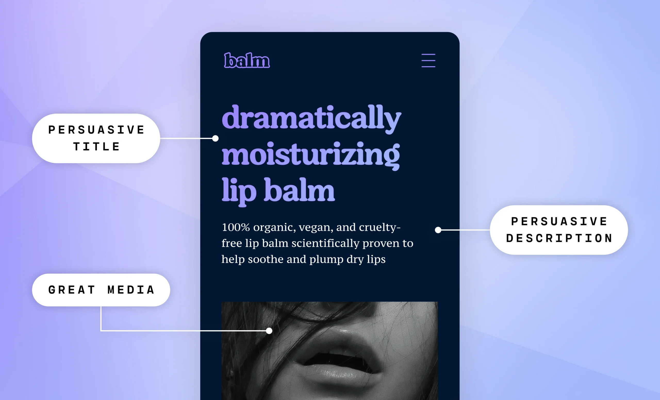
Persuasive Product Titles and Descriptions
The media on your product pages certainly deserves a lot of attention, but that doesn’t mean you should neglect your text.
Again, when customers feel informed, they are more likely to buy from your store. You can use your product descriptions to identify the main problem your product solves and illustrate why it’s the best solution. It’s also a good idea to add an FAQ section to address common questions. Your product title should match the intent of the visitor that landed on your product page as closely as possible as well.
Before you write a single word of content for your product pages, make sure you fully understand your target buyer’s needs, preferences, and concerns. Conducting surveys and interviews will allow you to learn more about your customers, which will in turn help you write copy that’s more persuasive for this particular audience.
Keep in mind that it’s possible to be too informative. You shouldn’t add a wall of text that goes over every single detail of your products — many visitors would get overwhelmed and just back out. So, be specific. Review your customer research and focus on the information they find most important. And you should use short sentences, short paragraphs, and bullet points whenever possible in order to make your product descriptions easier to read.
You should also aim to strike a balance between being concise and being descriptive in your product titles. Short product titles are too vague, while long product titles can be confusing. The ideal product title length is 75 to 100 characters, as this allows you to be descriptive without going on so long that the title gets cut off in Google search results.
Indeed, search engine optimization (SEO) is another key consideration for your product titles and descriptions. After all, to convert visitors into customers, you’ll need people to land on your product pages in the first place. Research which keywords make the most sense for your store, and then find a way to organically add these keywords to your product pages without sacrificing the quality of your content.
Social Proof
Product titles and descriptions can be quite persuasive when done well, but on some level your customers will always be aware that this information is biased. They know your main goal is to make a sale, so you have a strong incentive to exaggerate the benefits and minimize the flaws of your products.
This is what makes customer reviews so important. Showcasing positive reviews on your product pages will help assure visitors that they won’t be disappointed if they decide to make a purchase.
As with your written content, visitors are aware that the photos and videos you provide will only show your products in the best light. You should enable customers to add their own images and videos to their reviews, as this will give visitors a better look at what your products are actually like in real life.
In addition to customer reviews, you can use trust badges from respected third-party organizations to add social proof to your product pages. For example, if you’re selling a laptop that has been named an Editor’s Choice by PCMag, highlighting this fact will give visitors a reason to feel more confident about the quality of the product.
Enticing Pricing
You should regularly put your products on sale and prominently display these discounts, as customers are much more likely to buy your products if they believe they’re getting a good deal.
Adding an option for customers to pay for a product in installments can also make the difference between making a sale or not. Many people are more comfortable with a series of smaller payments rather than paying for everything upfront (and if you sell relatively expensive products, this may be the only way that some of your customers can afford the purchase). According to research conducted by RBC Capital Markets, adding a buy now, pay later (BNPL) option typically increases conversion rates by 20% to 30%.
If you sell products that are often bought multiple times, such as food items or cosmetics, consider offering a subscription option. It’s a win-win — customers get the products they want delivered right to their door without the inconvenience of going through the purchase process, and you’ll be able to count on a steady stream of income. With subscriptions, it only takes one conversion to generate multiple sales.
Eye-catching CTA Button
The call-to-action (CTA) button, which is what customers press to buy a product or add it to their cart, may very well be the single most important aspect of product page design. If visitors don’t click on this button, then you don’t make the conversion. Here are a few tips for making your CTA buttons more noticeable and encouraging visitors to click:
- Size: The CTA button should be relatively large compared to the other design elements on the page.
- Color: Use a bright color to grab the visitor’s attention.
- Space: Don’t place your CTA button too close to the other elements such as product descriptions or images.
Optimized Performance
So far, we’ve only gone over the appearance of your product pages. But what’s under the hood matters, too.
According to a Digital.com survey, 53% of online shoppers expect ecommerce pages to load in three seconds or less, and 50% will abandon their shopping cart if pages take too long to load. Your product pages will need to be fast in order for you to maintain a high conversion rate.
Your product pages must also be responsive, meaning that they automatically adjust to the smaller screens of smartphones and tablets. Most web traffic comes from mobile devices these days — if your product pages only look good and perform well on desktops, then you’re going to be missing out on a lot of potential sales.
Top Examples of Brands with High-converting Product Pages
Now that we’ve told you how to improve your conversion rate, we’ll show you what these principles look like in practice. You can reference the following examples of high-converting product pages whenever you’re working on your own store:
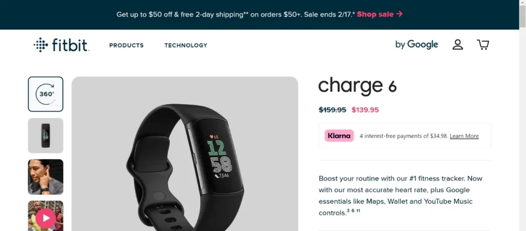
What They Sell: Activity-tracking fitness products
What They Do Well: Fitbit provides visitors with a 360-degree image on this product page, allowing visitors to rotate the product on demand and see it from every angle. They also use a strikethrough text effect to highlight that the product is on sale, and their Klarna integration offers customers a BNPL option.
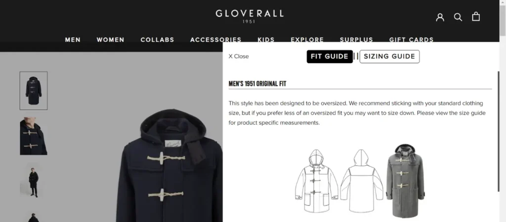
What They Sell: Outerwear
What They Do Well: The difference between shopping online and shopping in-person is especially apparent for clothing items. How can customers commit to buying clothes without even trying them on? Gloverall helps solve this problem with their pop-up fit and sizing guide, which even notes that this product is designed to be oversized, so customers may want to consider sizing down.
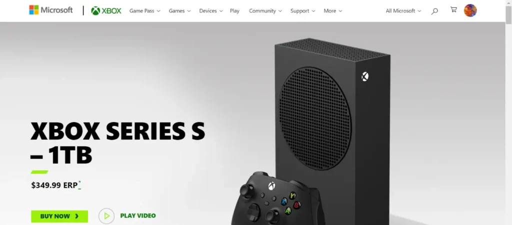
What They Sell: Video game consoles
What They Do Well: This is an excellent example of how to design a CTA button — the electric green color really makes the button pop, and there’s no distracting clutter around it. The product photography here is quite nice as well.
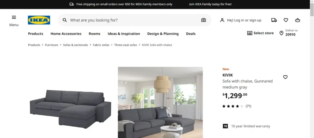
What They Sell: Furniture
What They Do Well: In addition to a simple image of their product with a plain white background, Ikea includes a staged photo of what their product looks like inside a sample home. This helps visitors imagine what the product would look like inside their own home, and they just might get attached to that idea. Ikea also wisely features their 10-year warranty above the fold (visitors don’t need to scroll down to see it), making potential customers more comfortable with buying this product sight unseen.
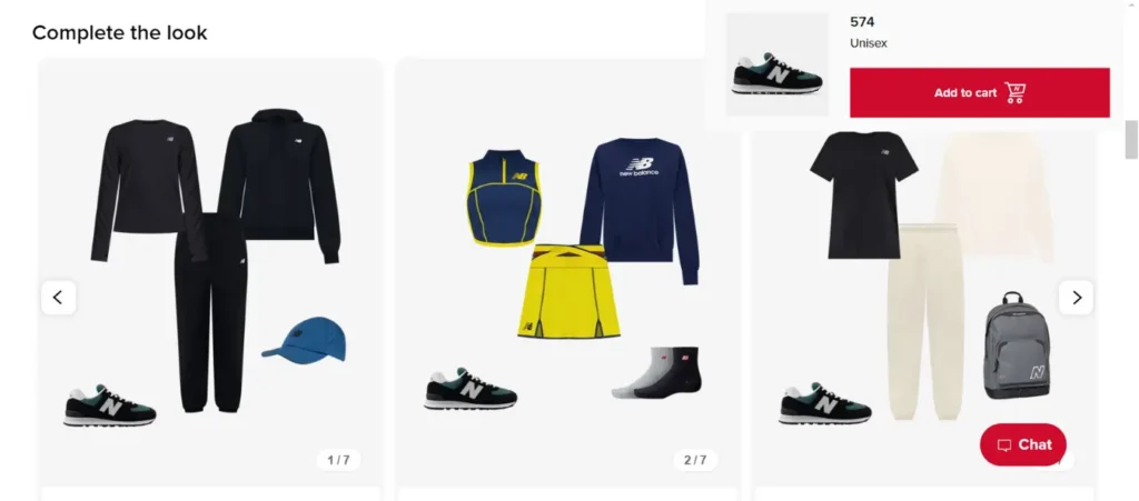
What They Sell: Footwear
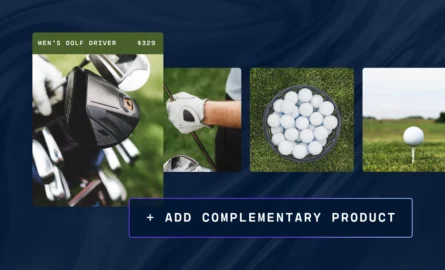
What They Do Well: Ideally, you’ll be able to use each of your product pages to sell multiple products. For example, check out this “Complete the look” feature for a pair of New Balance sneakers — this is a creative take on the classic related products approach to adding cross-selling opportunities to a product page. Could you do something similar on your store? This product page also has a live chat feature — if you have the resources to offer live support, you can quickly address any concerns that might be standing in the way of a purchase.
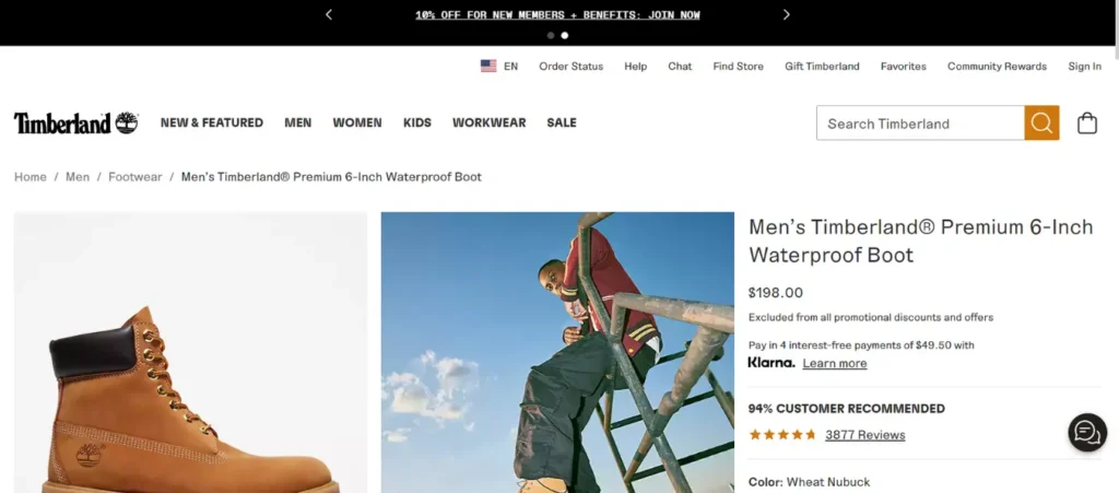
What They Sell: Footwear
What They Do Well: This Timberland product page has three types of social proof above the fold: star rating, percentage of customers that recommend the product, and number of reviews. If a product has a lot of reviews, you should display this fact, as customers will then know that a high average rating isn’t just the result of a small sample size.
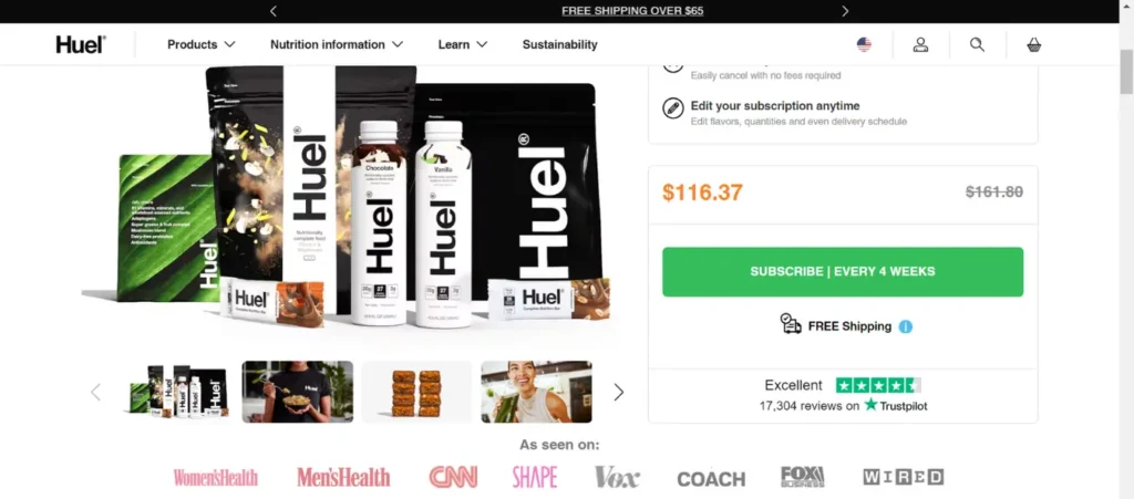
What They Sell: Protein shakes, nutrition bars, and instant meals
What They Do Well: Huel shows that customer reviews aren’t the only form of social proof that you can include on your product pages. While it isn’t quite above the fold, you don’t have to scroll too far to get to their “As seen on” section, which highlights that this brand has been featured in well-known publications such as CNN and Fox Business. They also make a subscription the default payment option, encouraging customers to keep purchasing their products again and again.
Create high-converting product pages with ShogunBuild dynamic product pages that convert shoppers into customers. Get started now
How Shogun Helps Brands Increase Product Page Conversion Rates
With Shogun’s powerful visual editor, anyone can easily incorporate all the design elements described above into their product pages. Shogun provides you with a vast library of page design elements, including text, images, video, buttons, customer reviews, and much more. You can use Shogun’s grid tool to place elements wherever you want them on the page, and each element is fully customizable as well.
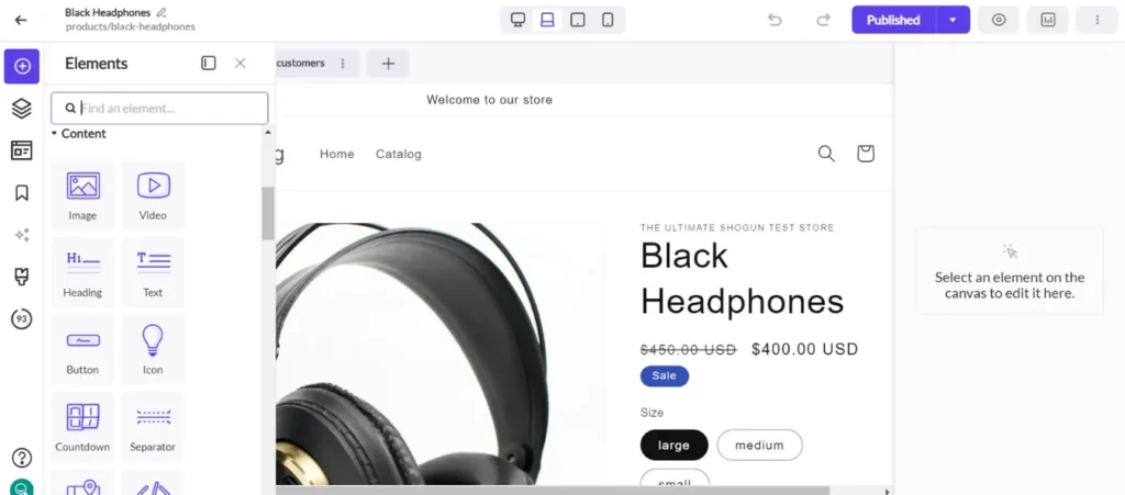
Also, A/B testing is critical to understanding which changes to your product pages would help you increase your conversion rate. Many prominent ecommerce brands have used A/B testing to figure out how to improve sales — for example, A/B testing enabled The Ridge to increase their conversion rate by 15%, leading to $2.5 million in additional revenue.
A/B testing involves randomly directing some visitors to the original version of a page and other visitors to a new version with updates. You’ll then be able to compare how each version performs over the same period of time, allowing you to objectively determine whether your updates are having their intended effect.
Shogun offers an A/B testing tool with multivariate capability, which means you can save an enormous amount of time by running multiple product page tests concurrently.
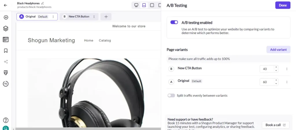
Another way to increase your conversion rate is to make the shopping experience more personalized. Different segments of your customer base have different wants and needs — targeting each segment rather than trying to appeal to everyone usually produces better results.
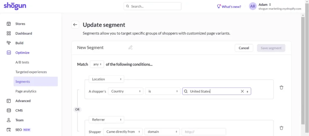
Shogun’s targeted experiences feature allows you to do exactly that. As with A/B testing, you can use the Shogun visual editor to design different variants of the same page. But instead of randomly directing visitors to these variants, you get to choose exactly who sees each version. The audience segments for your targeted experiences can be built using conditions such as the physical location of the visitor, which web domain the visitor is coming from, UTM tags, and Klaviyo customer data.
Finally, it’s worth noting that Shogun is natively integrated with Shopify and BigCommerce which makes getting started easy. Learn more about Shogun and get started designing today!
Create product pages that convert with ShogunBuild dynamic product pages that turn shoppers into customers. Get started now

Phill Moorman
Phill, the VP of Marketing at Shogun, is a seasoned expert in ecommerce. With a keen focus on strategic marketing, Phill drives growth and cultivates brand success in the dynamic online marketplace.

