4 Amazing Black Friday Landing Pages Built With Shogun Page Builder
Let me set the scene: Black Friday (and it’s temporal neighbor, Cyber Monday) are just weeks away. You’ve got a drool-worthy product, a scrumptious website, and a dedicated team prepped for the barrage of incoming sales.
But your Black Friday landing pages are sagging under the weight of their own dullness.
Everything is in its right place, but this landing page obstacle means your would-be customers never make it past the prospective stage. Woulda been, coulda been, shoulda been, but never did.
Clicking through from that ad or email only to be met with a confusing layout, lackluster headlines, and a CTA that’s as compelling as a wet sock. There go your conversion rates!
Yet, there’s hope!
Your landing page can get the makeover it so desperately needs. With the right elements and some fresh inspiration, your team can start building landing pages worth the Black Friday campaigns that drove them there in the first place.
Plus, with Shogun Page Builder, it doesn’t take a whole team to get this done. The intuitive visual designer makes it easy to drag, drop, convert, and repeat.
In this post, we’ll take a deeper look at four Black Friday landing pages that understand the assignment, and effectively turn would-be customers into regulars.
#cta-visual-pb#<cta-title>Increase sales with the right landing page<cta-title>Design the perfect Black Friday landing page to catch your visitors’ attention and increase conversions more reliably.Start building for free
Must-have elements of a great sale landing page
We’ve talked a lot about landing pages on this blog.
Not only because Shogun is the perfect tool to create amazing ecommerce landing pages but also because landing pages are vital tools for any marketing campaign.
We don’t need to go super deep into what makes a landing page effective (for that, you can visit our guide on landing page best practices), but we should detail the top elements for your BFCM landing page before we look at some examples.
- Eye-catching design. If you aren’t impressing them with great visuals, why should they keep scrolling?
- Value-promising headline. Make the first words they read a promise of the awesome product and deal they’ll get.
- Benefit-focused copy. Features are great, but what does it mean for the shopper? Tell them how the features benefit them to persuade them more effectively.
- Value-confirming social proof. When other people love something, shoppers take notice. Show them that you are widely loved, and they’ll be convinced of their own love for you.
- Compelling product imagery. Your products can speak for themselves, but you need to get them to strike a pose. Lifestyle and studio photography can join to make a convincing case.
Now that we know what to include in a great Black Friday landing page, let’s look at how these elements show up in some examples.
4 Awesome Black Friday landing pages built with Shogun
The one time to pull out all the stops in your marketing strategy is for your Black Friday and Cyber Monday campaign. A great landing page is the keystone to your success.
Here are four examples of great landing pages for BFCM.
Feel Goods Immunity Icon
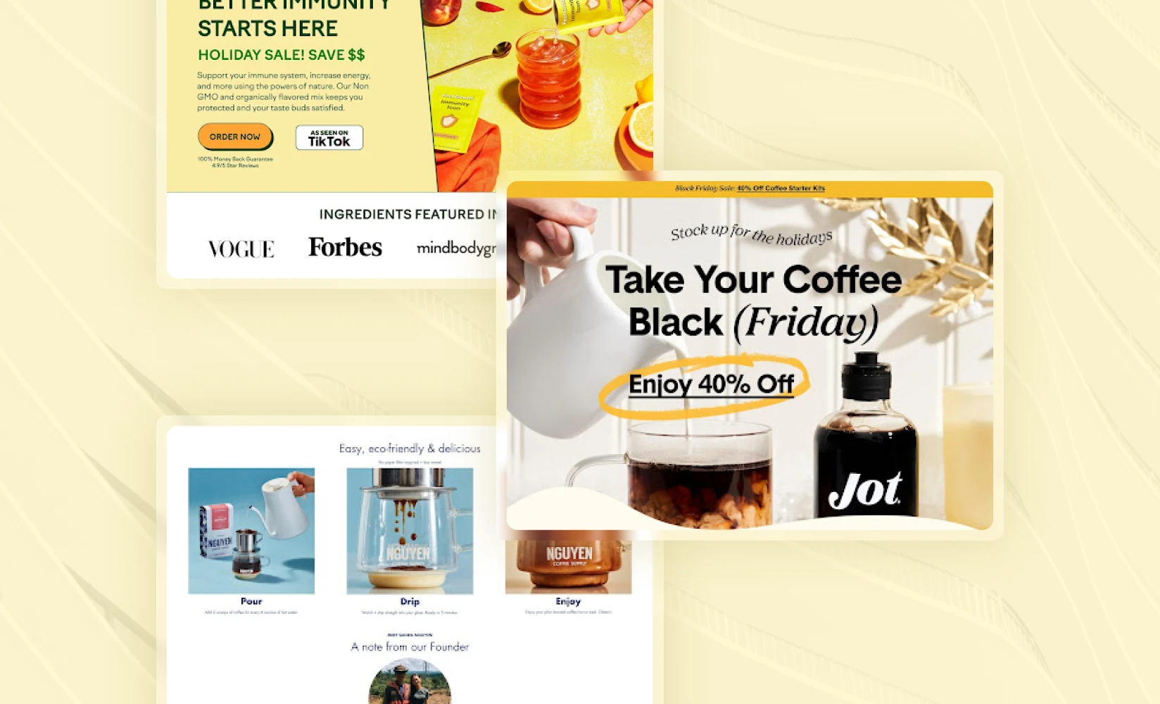
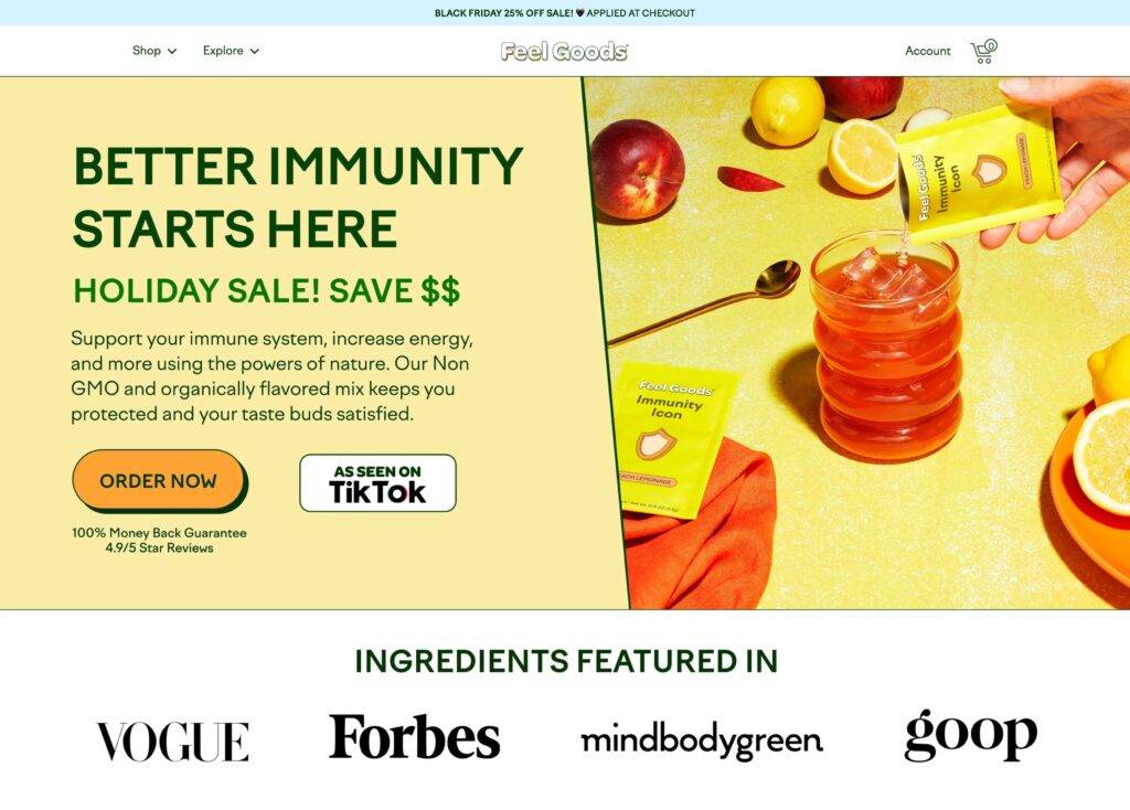
Right from the top of the page, you’re greeted with vibrant design, high-contrast color scheme, and product photography that makes you thirsty.
The headline plays on the central benefit of Immunity Icon—better immunity.
Not only that, but they follow it by playing up the added benefit of the savings you’ll get from this holiday sale. It makes their first CTA (ORDER NOW) pretty compelling.
If you haven’t been convinced just yet, they follow up with social proof from major publications (not to mention the TikTok call-out).
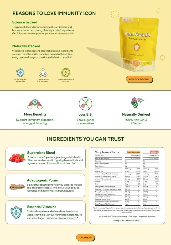
Next, they go into more detail about what’s so good about their product. Supported by icons, they let visitors know that their product is natural, backed by science, and energizing.
Following that, you get the full list of ingredients and vitamins. You can also see what’s not in there: sugar, artificial ingredients, animal-based products, and preservatives.
The FEEL GOOD TODAY call to action is super tempting.
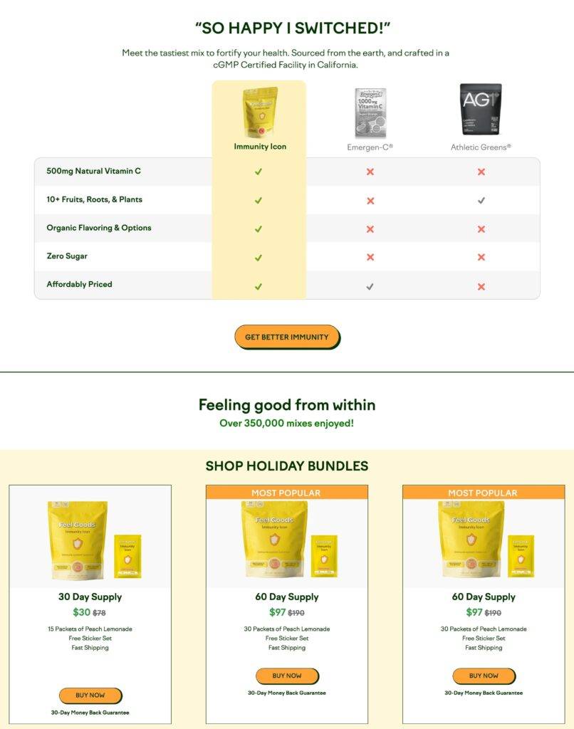
Moving down, they compare Immunity Icon with Emergen-C and Athletic Greens to show how they stack up on their main benefits.
Having made an excellent case for the product at this point, they switch to featuring product bundles that can save customers a significant amount of money.
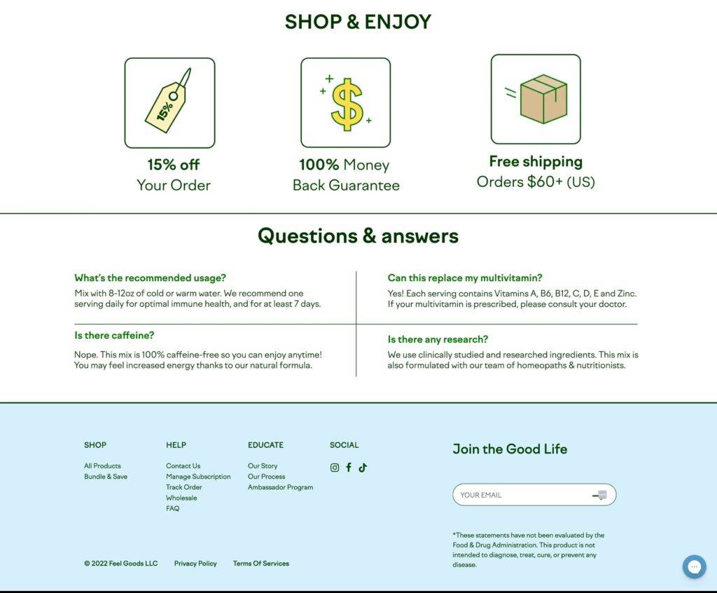
To wrap it all up, they point to the savings you get from this deal, plus free shipping and a money back guarantee. Not too shabby!
If anyone had any questions at the end of this incredible landing page, they don’t leave you hanging, delivering concise FAQs as a final send-off.
Balancing minimalist design and delivery of key pieces of information is hard, but this landing page nails it.
I know why I’d get it, I like reading it, and I understand the savings—perfect!
Jot Coffee
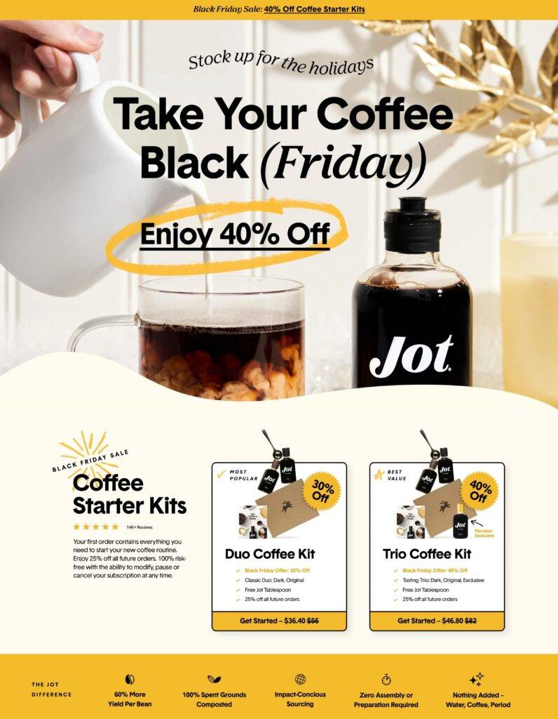
Here’s another brand that excels at page design, which is obvious from the full-width lifestyle photo and the following section that organically bleeds into the image.
Their brand clearly shows up in the black, yellow, and cream color scheme (with yellow flourishes throughout).
The headline is clever and simple. And the Black Friday savings are right there—”Enjoy 40% Off”. I don’t mind if I do!
Their coffee starter kits are the central focus, allowing you to get started with a regular coffee subscription at a screaming deal.
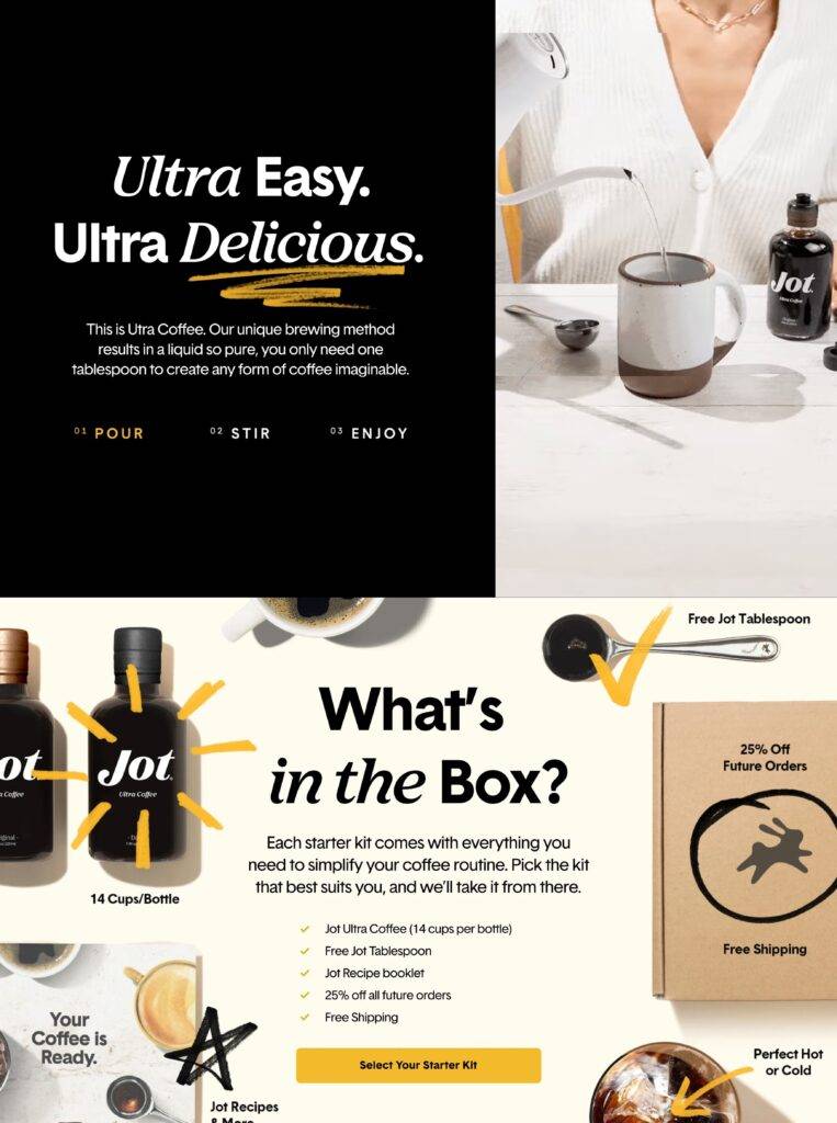
They want you to scroll. If you don’t already know what the product is, they wait until you’ve been hooked in to let you know.
Their unique twist on coffee is that it’s a concentrated extract that you simply mix with water. Pour, stir, enjoy—that’s all it takes.
And everything you need for that comes in the box, the contents of which are inventoried in detail below.
Keep going, and you’ll see that they are beloved by tens of thousands of coffee lovers, who throw five star ratings at them in droves. Plus, they’ve been featured in the biggest magazines around.
Who among us isn’t swayed by powerful social proof?
They quickly describe their three brew options, which get “Bottled Daily in Boulder, CO.” A simple way to tell you there are real people making this for you in the US.
As with the last example, they finish with an FAQ section to answer any final questions.
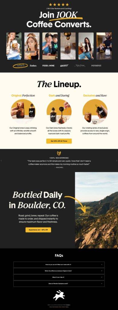
This is one of my favorite examples of a landing page that understands the assignment. From the design and photography to the humor and clear USPs, it has everything you need.
Nguyen Coffee Supply
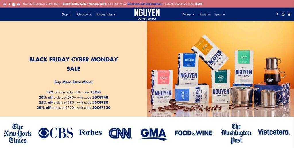
Another coffee brand, another approach to brewing coffee. Nguyen focuses on the Vietnamese way of making coffee and sells their own Vietnamese coffee makers so people can make it at home.
The hero here centers the product and keeps it straightforward for the headline.
It’s a sale, folks, and here are the deals. The savings actually increase as you spend more, which surely boosts their AOV.
Finally, in this above-the-fold section, they show off their social proof from big media names, like any good landing page must.
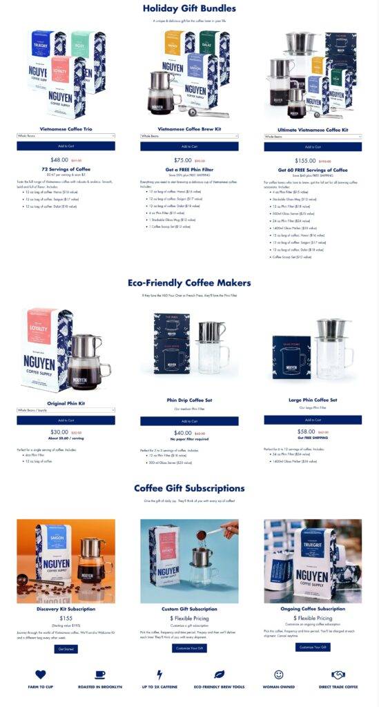
Getting straight to the point, they go into the product features. First up, the holiday gift bundles. As you spend more on these, you not only get bigger savings, but also free product.
Each product bundle has a product variant dropdown and an add-to-cart button for easy shopping straight from the landing page.
The next collection is their coffee makers, which they smartly market as eco-friendly. Sustainable products are increasingly popular, as are novel ways to make coffee.
Their last collection on the page are gift subscriptions, assuring you a consistent supply of your daily dose.
In three images, they show how easy it is to brew coffee with their coffee maker—pour, drip, enjoy.
To wrap up the page, they end on a personal note.
Literally, they include a note from the founder and, finally some facts about robusta coffee beans, which they use instead of the typical arabica consumed throughout the world.
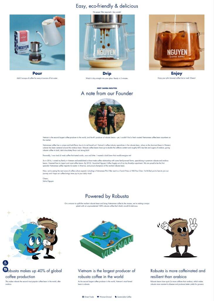
This landing page does a lot but includes many of the key elements for converting coffee-loving deal shoppers.
Mancave
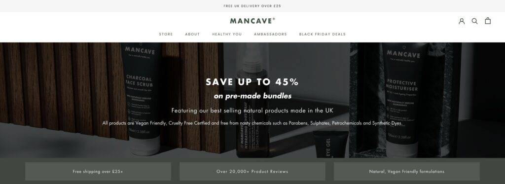
As we saw in the Feel Goods landing page, not all special offer pages need to specify the holiday. Savings alone will suffice.
Such is the case for Mancave’s bundle sale. Dispensing with the fluff, they go straight for the savings in the headline.
They follow that up by checking off the boxes their customers love—vegan-friendly, cruelty-free, no nasty chemicals, free shipping, and tons of product reviews.
Next, it’s the bundles in question, with descriptive names like “Relax & Recover” and “Cleanse & Unwind.” They just make you want to start scrubbing up.
Each bundle shows the savings you get with this sale, as well.
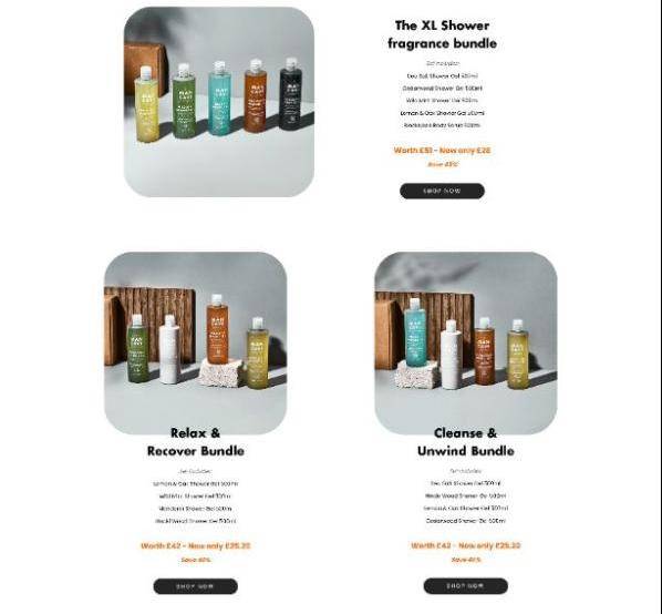
But, that’s not all! With the headline “Kick start your routine” they show off five more beautifully photographed bundles.
To end the page, they give you yet another option—to create your own bundle. Because, who can guess the perfect bundle for everyone?
Sharing the coupon code, they leave you to make the decision and reap the rewards of the sale.
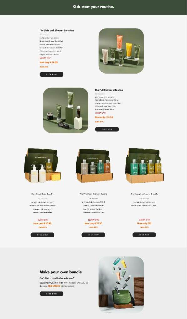
While simple, this landing page is effective. Plus, by templating it, they can use it over and over again with little to no changes for whatever holiday campaign they want.
That’s a valuable prospect to busy ecommerce marketers out there.
Create better Black Friday landing pages to maximize BFCM sales
Hopefully, these awesome landing page examples inspire you to build your own high-converting BFCM landing pages (we’d love to see them!).
Just as with any landing page, there are key elements that persuade shoppers to keep scrolling and eventually click that CTA.
As you could see from these pages, it came down to a few vital things:
- Great headlines
- Compelling CTAs
- Social proof from media and customers
- Obvious savings
- Great design
As you build your own, keep these things in mind. Once you have a landing page you’re satisfied with, you can save it as a template in Shogun Page Builder to use over and over again.
You can always make it better, but launching future pages will be super fast once you’ve got it down to a science.
#cta-visual-pb#<cta-title>Grow your holiday sales with strategic landing pages<cta-title>Craft the ideal experience for your visitors and optimize your landing pages for maximum conversions.Start designing for free

Sean Flannigan
Sean is one of Shogun's tireless content marketers. When he isn't creating exciting ecommerce content, he's probably biking or at the park.

