7 High-Converting Ecommerce Mobile Landing Page Examples to Inspire Your Store
The best ecommerce landing pages are not only beautiful, but they’re also easy to navigate and enjoyable to scroll through on any screen size.
After all, what’s the point of designing a gorgeous website if it’s not going to look just as awesome on a mobile screen?
Especially since by the end of 2021, mobile sales are projected to make up 72.9% of all ecommerce transactions.
That’s right—almost 3 out of 4 shoppers who visit your store are likely doing so on their phones. That’s huge!
We know there’s a lot to consider when it comes to building high-converting Shopify landing pages: from including the core landing page elements that move customers to take action to ensure your designs are on-brand and customer-friendly.
Furthermore, you need to build responsive mobile landing pages that display well on customers’ phones.
Fortunately, with the right tools, it’s easier than you think to make your store look amazing for customers on any device.
#cta-visual-pb#<cta-title>Start building your store pages, your way<cta-title>Try Shogun for free and start building responsive mobile landing pages, product pages, and collection pages that your customers will love.Start building for free
What is an ecommerce landing page?
First things first, let’s define what we’re talking about here. What is an ecommerce landing page, and why does your store need them?
A landing page is a web page designed to get visitors to take a specific action.
For ecommerce brands, that might be getting shoppers to click through to a product page, browse a new collection, join your mailing list to unlock a discount, start a subscription, or some other conversion goal.
As for why you should build landing pages for your store?
Ecommerce landing pages are the best place to send inbound traffic from paid ads, social media posts, emails, and anywhere else your customers might learn about your brand online.
What’s a mobile landing page?
A mobile landing page is any landing page designed for customers who are shopping on their phones.
The best part is that you don’t need to build out an entirely separate mobile version of your site for it to look perfect. Instead, you can use a tool like Shogun Page Builder to design a responsive landing page that will look amazing on any device.
So, your mobile landing page doesn’t need to be a completely different experience or design from your desktop store.
You can build responsive ecommerce landing pages with elements, copy, and content optimized for each visitor’s device.
With Page Builder, you can easily remove, add, or rearrange elements, swap out text, and edit CTA buttons to create the ideal mobile experience.
#cta-mini-pb#Want to see what else Page Builder can do? Learn more
The challenge of creating on-brand store pages for customers on any device
What exactly makes a good mobile landing page?
Many of the landing page best practices you follow when building for desktop shoppers apply to mobile landing page design, too.
But if you truly want to optimize your mobile landing pages, you need to pay extra attention to user experience, button placement, and load times.
If someone were to view your landing page on desktop and mobile side by side, the gist of it is the same.
The core elements would be the same.
However, there might be differences within the messaging and elements that create the optimal shopping experience on each device.
For instance, on the mobile version of your landing page, there might be more white space between sections to fit into a single-column layout.
The intro copy might be shorter. The buttons might be bigger to make them easier to click.
To ensure your landing page looks good on mobile, it should follow the best practices outlined below.
Mobile landing page best practices to follow
Here’s our list of best practices for building a great landing page for mobile. They hew quite closely to what we consider the elements of a successful ecommerce landing page.
Pay extra attention to above-the-fold content
No matter what device you’re designing for, it’s important to be selective about what’s visible above the fold.
You can’t fit as much on a mobile screen, making that prime piece of real estate even more valuable on mobile devices.
Keep header copy clear and concise
Visitors should immediately know what your mobile landing page is about.
That means making sure your header image and copy communicate value and get right to the point.
Meet visitor expectations by repeating the messaging and offer that lead to the page.
Prioritize quick load times
In the competitive world of ecommerce, it’s not just every second that counts—it’s every millisecond.
Visitors form opinions about your ecommerce store in less than the blink of an eye. (About 50 milliseconds, to be exact). If your page takes too long to load, you won’t get to make an impression at all before they bounce.
Considering that mobile shoppers might have a less reliable internet connection than those on a computer, load times are critical.
You can make some simple changes to your mobile page design to improve load times. For instance, “lazy loading” removes bloat by loading page sections as visitors scroll (rather than all at once when they land on your page).
Opt for a single-column layout
This is one of the biggest differences between designing landing pages for desktop vs. mobile devices.
Sticking to a single-column layout helps prevent clutter and distractions. This makes it easy to read on a smaller screen without ending up with tiny font or a crowded page.
Use mobile-friendly font and formatting
When it comes to choosing a font for your mobile landing page, size and style matter.
Make sure your text is large enough and clear enough to read on a smaller screen. A wall of text is never a good look for landing pages, but it’s especially deadly on mobile pages.
So, use bullet points, line breaks, headers, and formatting to make it more mobile-friendly.
Be strategic with CTA placement
As with any good landing page, your mobile landing pages should focus on a single call-to-action.
Additionally, your mobile landing pages should feature clickable buttons that are big enough to easily tap. That means not placing any buttons in the hard-to-reach top left area of the screen.
The best place for your CTA is at the bottom of the screen, either centered or to the right.
If your page is on the longer side, consider using a sticky CTA to keep it visible (and clickable) at all points.
Simplify and shorten forms
If your conversion goal involves visitors signing up for something or filling out a form, keep it short and sweet.
Make sure the fields are large enough to easily click on and fill out. There should be enough space in between fields to prevent accidentally selecting the wrong one.
Also, try to keep the number of fields short to prevent overwhelming users. Use the autofill option if the visitor has it turned on.
7 examples of the best mobile landing pages
Now let’s take a look at what some of those best practices look like on live landing pages.
We’ve rounded up a mix of ecommerce landing pages that look awesome on mobile (including several Shogun-built mobile landing pages from our customers!).
We love these examples because they really embody mobile landing page best practices, offer excellent UX, and make it easy for visitors to convert.
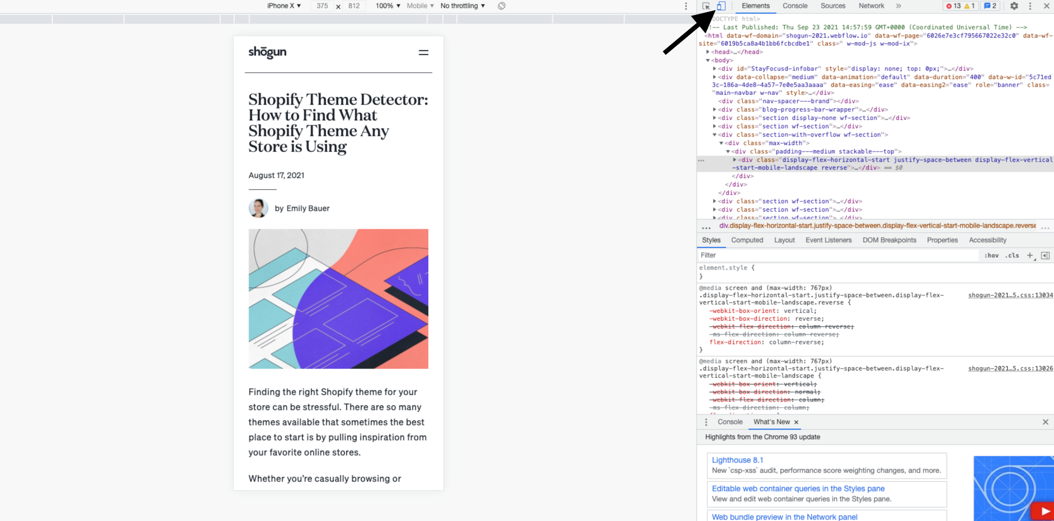
Note: Since these examples are meant to be viewed on mobile, here’s a quick reminder on how to see the mobile version of any page on your computer.
- Start by clicking through the example page you want to view. (Links are provided at the bottom of each example.)
- Then, right-click anywhere on the page to open the dropdown menu and click on “Inspect.”
- From here, you can toggle from desktop view to mobile by clicking on the screen size icon (highlighted below).
- You can also switch between different phone screen sizes by selecting a device from the drop-down menu at the top of the page view.
#1: Blissy
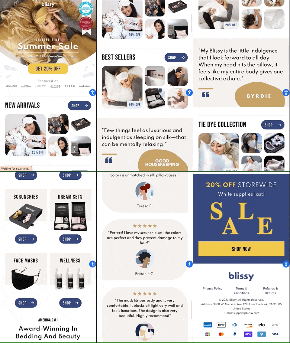
Blissy directs Facebook traffic to this mobile landing page for their limited-time summer sale.
The page provides an overview of the brand and includes a selection of different product categories and collection pages for visitors to click on.
What you can learn from this mobile landing page:
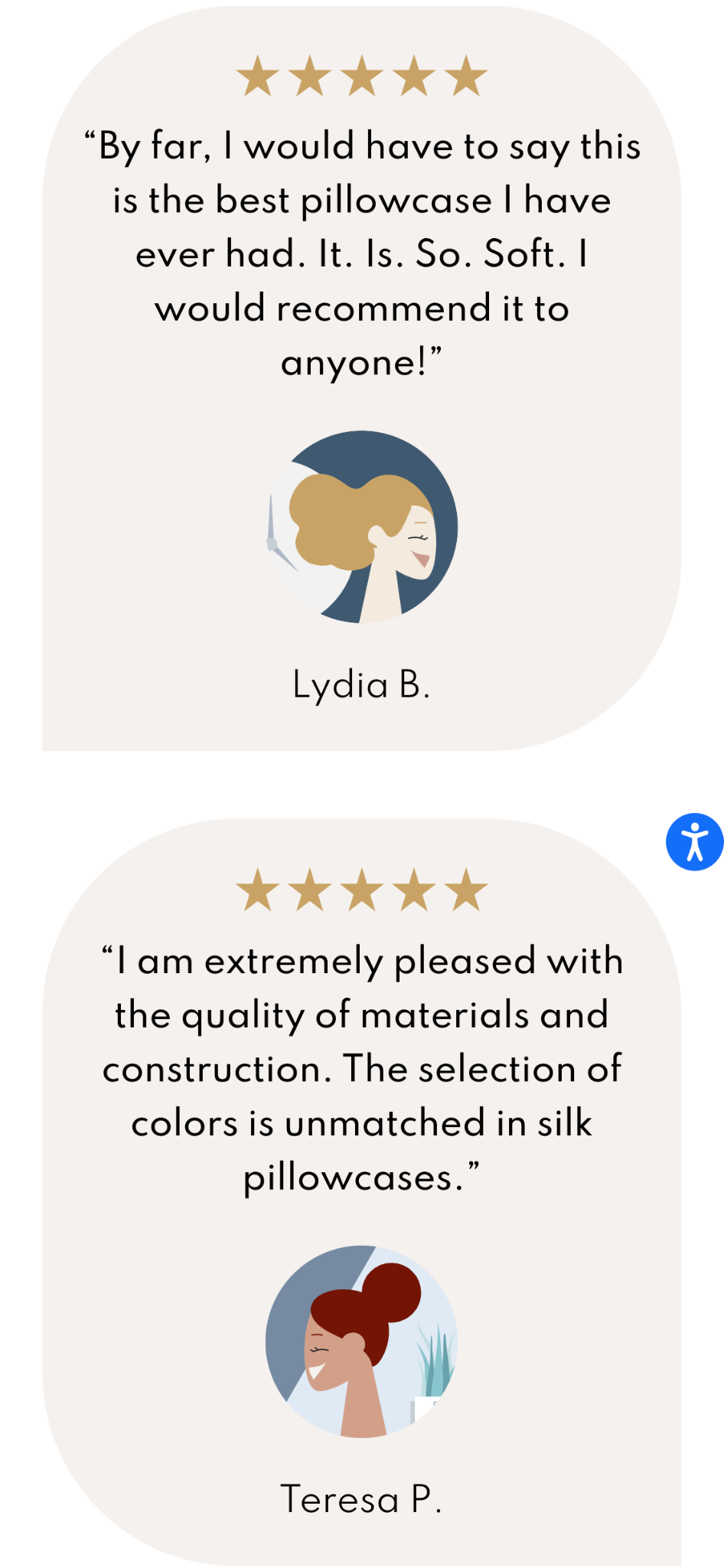
- Balance text and images to keep shoppers engaged. Blissy uses a healthy mix of visuals and text to keep visitors interested without overwhelming them. There are no walls of text, and every section includes something visual—even the customer reviews, which feature cartoon avatars in place of real customer photos.
- Keep sections to bite-sized, mobile-friendly lengths. Although this page itself is quite long, it’s easy to digest and follow along with because each section is kept fairly brief. Visitors can easily view an entire section on the screen before scrolling down to the next one.

#2: FEED Projects
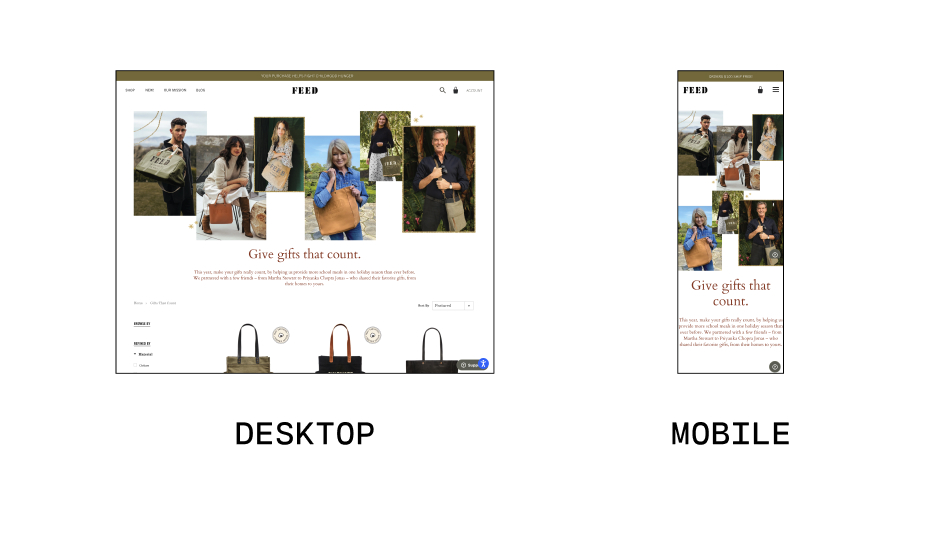
FEED Projects built this collections page to build awareness and drive conversions for their holiday campaign.
By harnessing the star power of household names, FEED Projects adds clout to their charitable gifting program, which donates holiday meals with every purchase.

What you can learn from this mobile landing page:
- Simple designs can be impactful. Aside from the header image and intro copy, the bulk of this page is focused on product images. It’s a simple two-column layout, but it manages to communicate all the vital information customers might want to know before clicking through to a product page: the name of each tote, pricing, what it looks like, and how many meals are donated when you buy.
#cta-paragraph-pb#Want to add a custom collection to your mobile landing page? Try out Shogun’s Product Collection Element to see how easily you can add a collection of clickable products or images.
- Reposition elements to make them mobile-friendly. You don’t necessarily need to make major changes to your page design to optimize it for mobile. FEED Projects uses the same photo cluster for its mobile and desktop landing page, but the formation changes to fit each screen size best.
#3: Goodboy
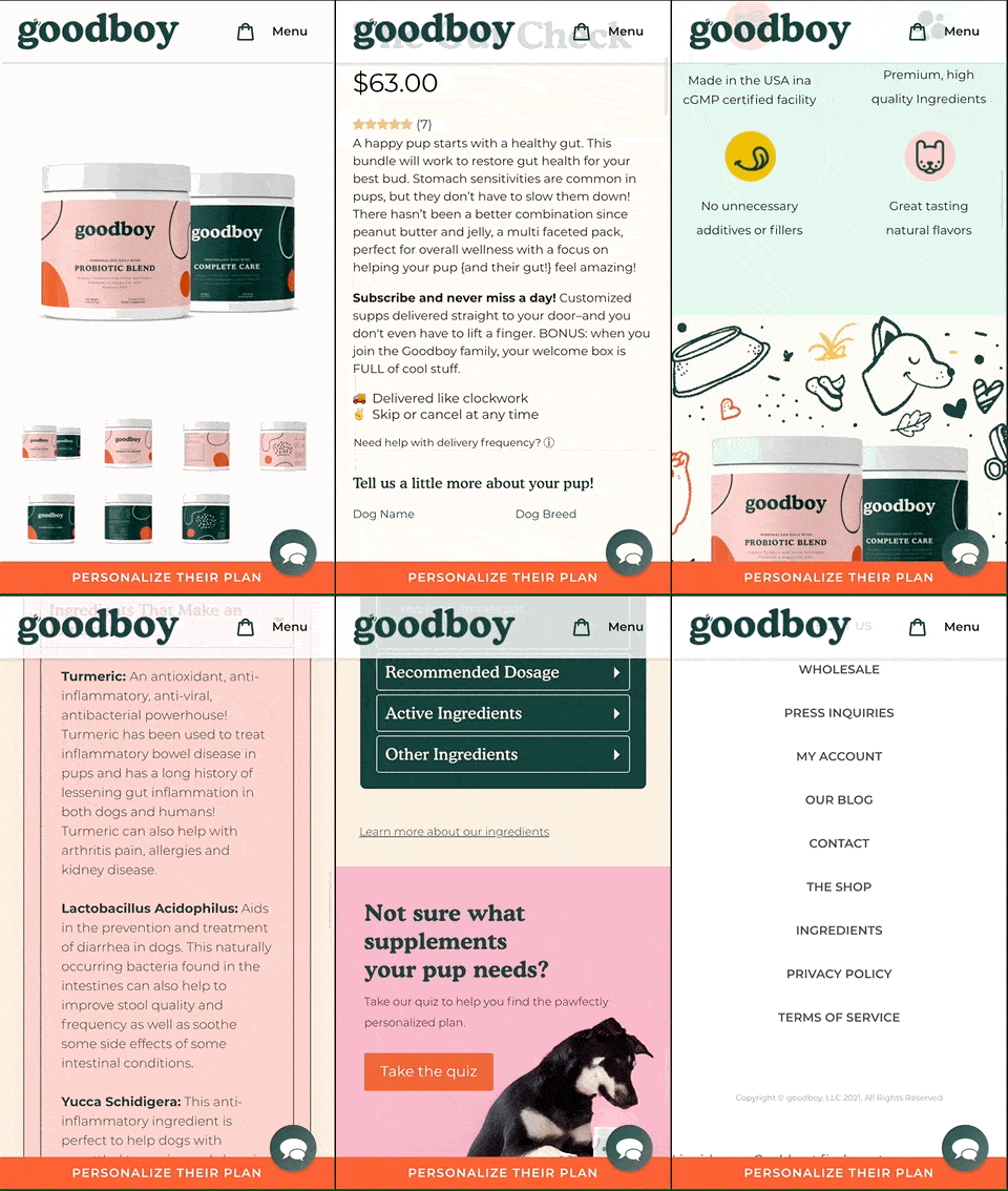
This example is a product page for Goodboy’s Gut Check probiotic bundle, which features two supplements for pups with sensitive stomachs.
Shoppers can either make a one-time purchase or subscribe for regular shipments.
What you can learn from this mobile landing page:
- Use color to emphasize multiple products in a bundle. This page packages two Goodboy supplements together to promote gut health for customer’s dogs. Since shoppers are likely curious about the ingredients and benefits of any supplements they might give to their pets, Goodboy provides separate FAQ sections for each formula—and distinguishes them with a bold background that matches the branding on the labels.
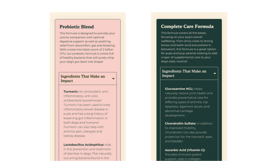
- White space (and padding) is your friend. There’s a lot of information presented on this page, but the layout, spacing, and padding give visitors room to breathe between blocks of content. Another reason why the FAQ blocks under “An Impressive Duo” work so well is that there’s just enough padding to make the sections fit comfortably on the screen.
#4: Après
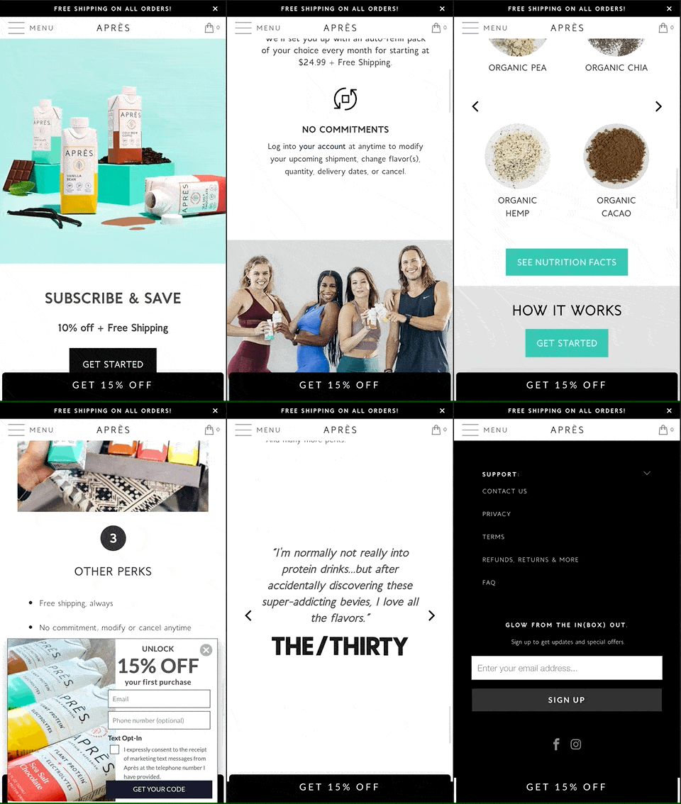
Health brand Après used Shogun Page Builder to create this landing page for their “auto-replenishment” subscription service.
The responsive design looks great and is easy to navigate on any device, so customers can subscribe to Après whether they’re on the go or finishing up an at-home workout.
What you can learn from this mobile landing page:
- Use gifs to bring icons to life. We really enjoy the cute little check marks that appear above “Try em’ out” and the button icon that swaps between pause, start, and stop above “No commitments.” Replacing static icons with gifs is an easy way to add movement to your mobile landing page (and communicate value visually) without adding bloat or slowing it down.
- Place headers strategically to inspire visitors to start scrolling. From the fun hero image that shows off their colorful branding to the promise of 10% off to the bold CTA button that can’t be missed, Après has mastered the art of above-the-fold content. Even better, they use that content to tease the rest of the page and entice visitors to scroll down. By placing the heading “Your Risk-Free Trial of Après” just above the fold, inviting visitors to scroll down to see what it’s all about.
#5: OLIPOP
This subscription page for OLIPOP beverages highlights just how easy it is for customers to start or update their subscription by text message.
By offering 15% off on all subscriptions and hassle-free cancellations, it’s hard to come up with a good reason not to subscribe.

What you can learn from this mobile landing page:
- Give visitors access to offer details without crowding the page. By using space-saving elements (like the dropdown FAQ in this example’s “Got questions? We got answers!” section), you can keep your page lean and clean without sacrificing content.
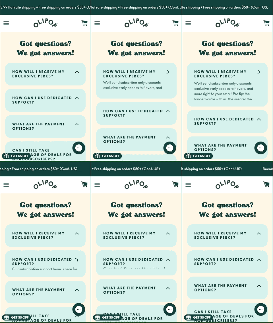
- Place prominent CTA buttons throughout the page. One of the first things visitors notice when they land on this page is the large, central “Subscribe Today” button. OLIPOP goes on to repeat this CTA three more times at strategic intervals (including at the very bottom of the page, just above the footer) to maximize conversions. While best practices suggest you should only have one CTA per landing page, you can and should repeat it several times.

What else we’d recommend: To make the messaging really pop, we’d suggest using a contrasting font color or a translucent background for any text placed over the image (“Always free shipping,” in this example).
#6: First Day Inc.
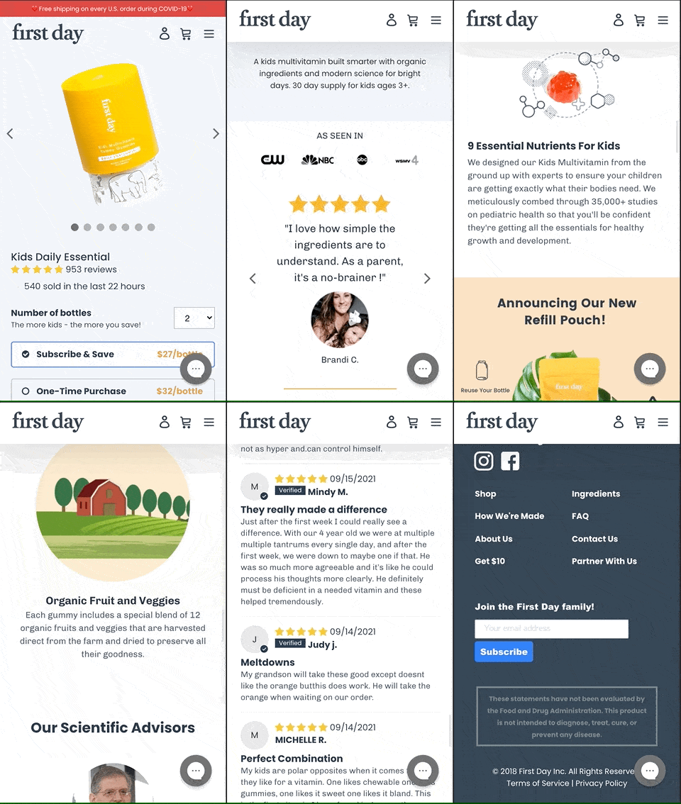
This example is a long-form product landing page created by First Day Inc.
Although it’s a product page for children’s vitamins, the page is designed to educate and build awareness just as much as it sells.
What you can learn from this mobile landing page:
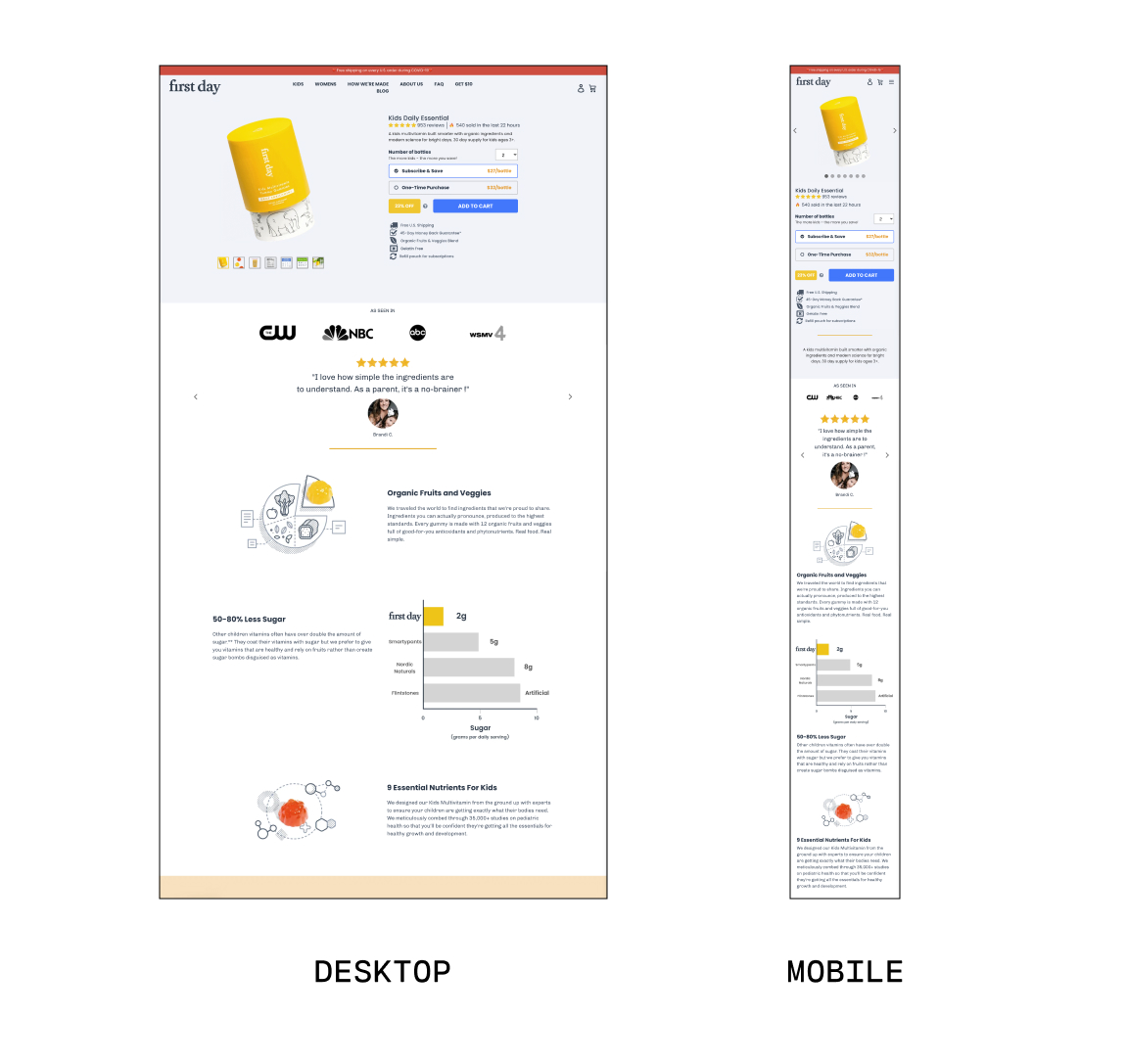
- Optimize your layout for landscape and portrait. On the desktop version of this page, the benefits are presented in a reader-friendly Z-pattern. However, this layout doesn’t work well on a phone screen due to the narrow width. So, First Day Inc. designed this responsive landing page to stack benefits in a single-column layout on smaller screens.
- Use images and icons to break up text. By stacking images above the text (instead of placing them side by side), this mobile landing page provides plenty of visual breaks. Not only does stacking otherwise horizontal items make it easier to scroll through on a phone, but it improves readability, too.
#7: The Ridge
Sometimes, less is more.
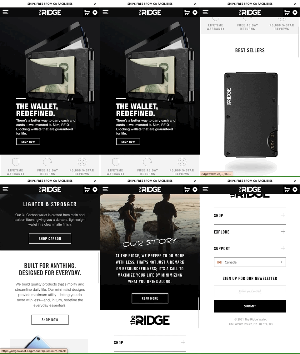
On this mobile landing page (which, coincidentally, is also their homepage), The Ridge embraces minimalist design with high-contrast sections, black and white design, and simple “Shop Now” CTAs.
What you can learn from this mobile landing page:
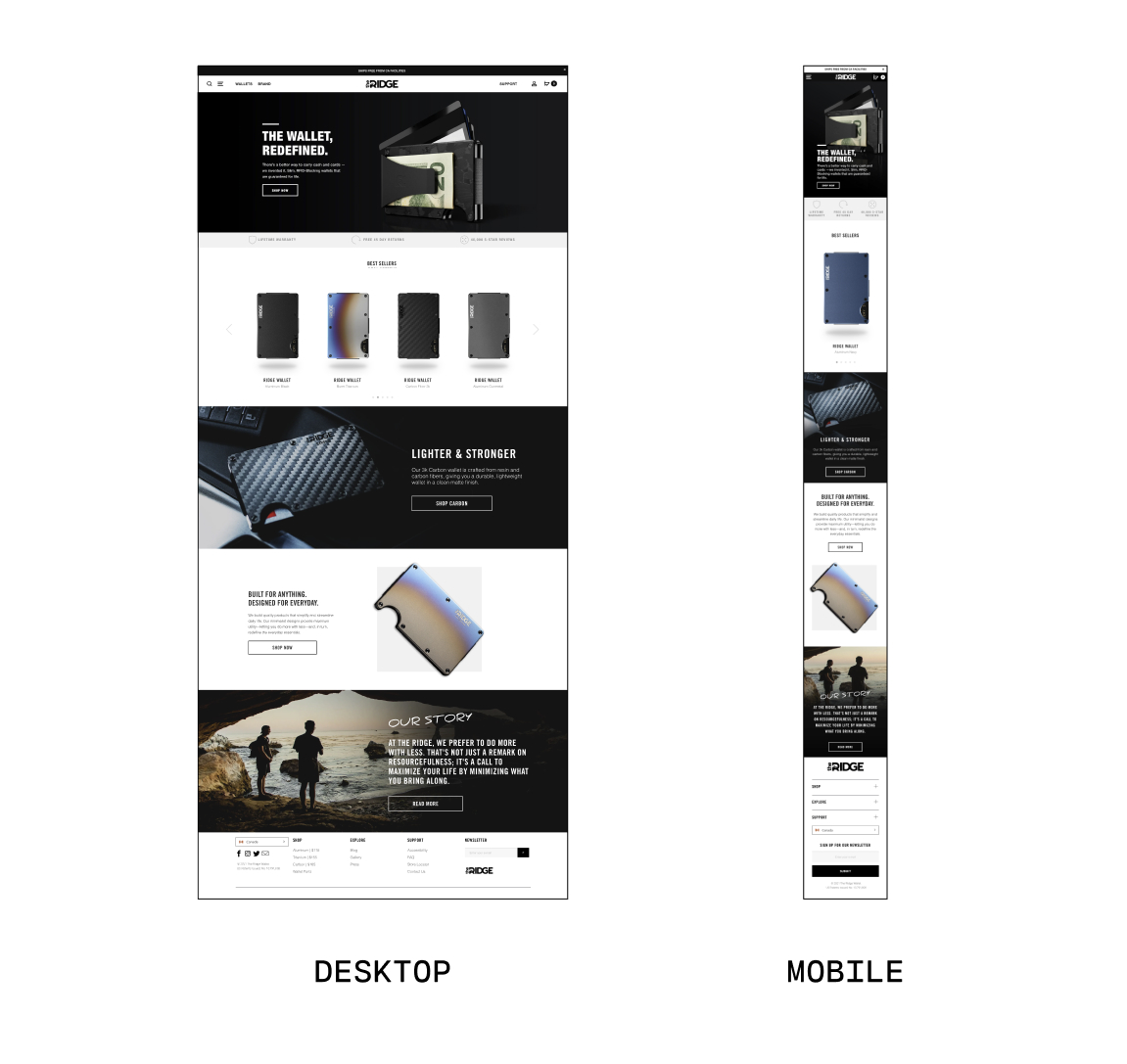
- You don’t need to create entirely separate page designs for mobile and desktop visitors. Like The Ridge, you can design a versatile storefront and customize exactly how it appears on every type of device. Whether you visit their website on a phone or computer, the experience and design are almost the same—just optimized for each device according to the best practices discussed above.
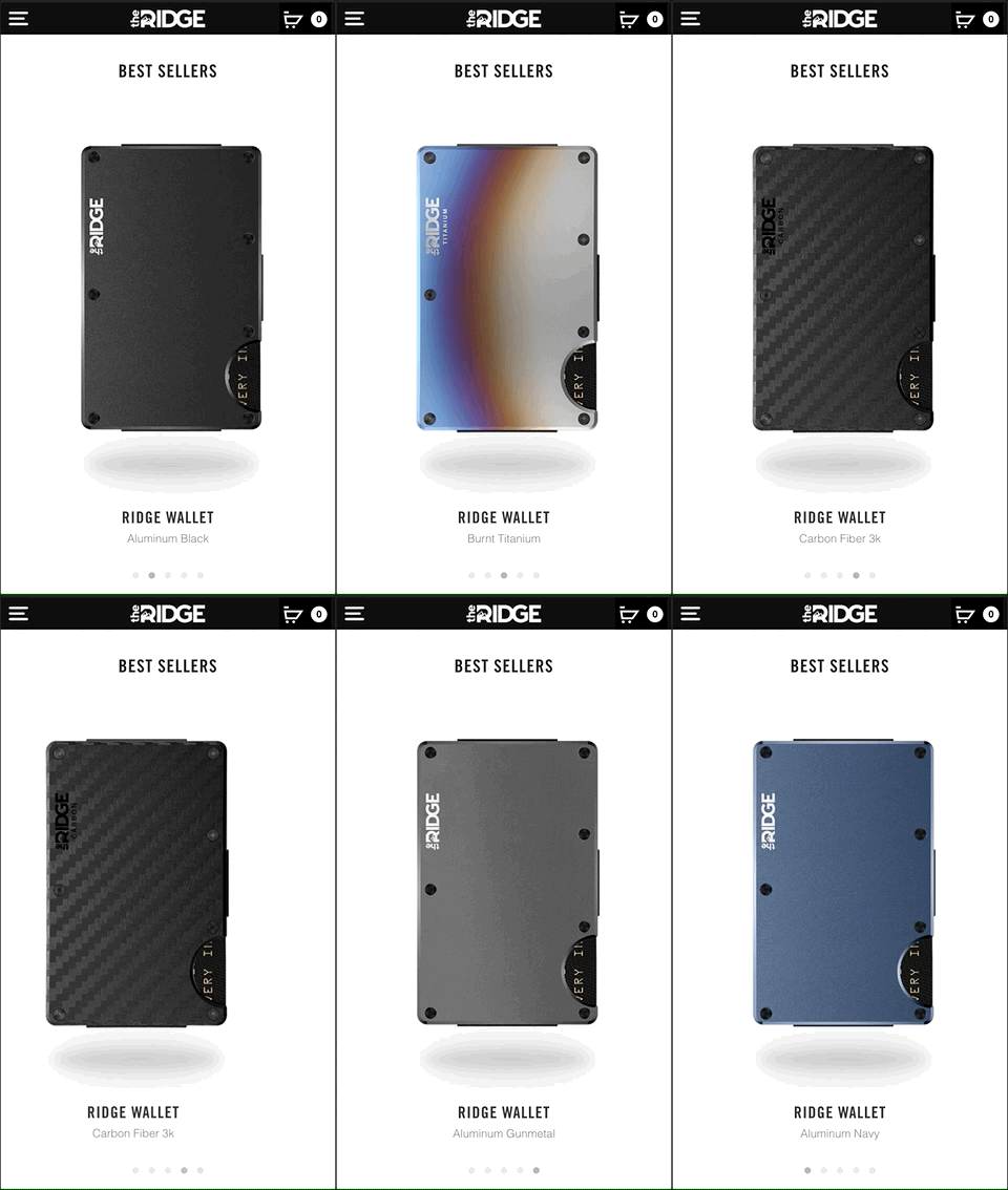
- You can show more in less space with a carousel element. This allows visitors to see a range of wallet options and click on the one that most catches their eye without a ton of scrolling.
#cta-paragraph-pb#Looking for even more landing page ideas? Check out these 35 successful Shopify stores to inspire your next build.
How to easily build a mobile landing page
Wondering how to build a responsive landing page that looks awesome no matter which device your customers are using?
With a tool like Shogun Page Builder, creating an on-brand mobile landing page is simpler than ever.
Start from scratch or choose a mobile-friendly Shopify theme and drag-and-drop elements to create custom pages that look great on every device.
You can easily switch between screen sizes in Shogun Page Builder to build a fully responsive and optimized landing page.
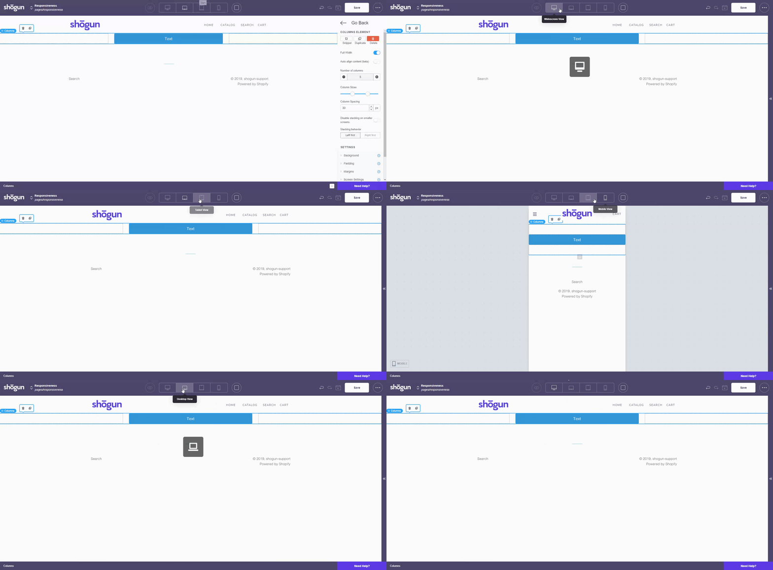
Page Builder makes it easier to:
- Choose which elements show up on mobile vs. desktop vs. tablet. For example, let’s say your landing page includes an eye-catching video header. For customers who visit the mobile landing page, you might decide to show a static image instead of the video to ensure fast load times.
- Show different messaging on different devices. This allows you to show specific offers to mobile users (for instance, if your store sells phone accessories, you can acknowledge in the copy when a customer is using their phone). Or simply use this ability to optimize copy length, with shorter, punchier messaging that better fits a mobile screen.
- Change how elements appear on different screen sizes. Many of the elements in our library have responsive landing page features that allow you to customize how they display on various devices. For example, you could turn on automatic stacking for icons or columns on smaller screens. Or you can create a parallax background effect for desktop users but turn it off for mobile customers to simplify the experience. You can also adjust margins and padding to optimize the customer experience on each device.
Create mobile landing pages worthy of your brand
When you create and customize your landing page in Page Builder, you have total control over how the page looks and feels on any device.
Try it today to see how easy it is to build mobile landing pages that drive conversions and sales.
#cta-visual-pb#<cta-title>Start building store pages that look great on any device<cta-title>Try Shogun for free and start building landing pages that are beautiful, on-brand, and mobile-friendly.Start building for free

Emily Bauer
Emily is a content marketer from Toronto. She helps tech companies and startups develop awesome content for their blogs, websites, and social media. When she’s not writing or thinking about writing, Emily can be found chilling on her yoga mat, loitering in bookstores, or exploring the city with her super cute (and super spoiled) corgi, Wilbert.

