43 Ecommerce Website Design Examples From Inspiring Brands
Today anyone can build an ecommerce storefront, which is amazing if you ask us.
But creation alone doesn’t guarantee a store’s success.
Many brands turn to innovative ecommerce website design to differentiate themselves in their vertical by creating a unique, memorable shopping experience.
But how much does modern ecommerce website design matter?
Well, 38.5% of online shoppers cite outdated website design as the top reason they’ll leave an ecommerce site.
What’s more, the same study found that 61.5% of online shoppers cite bad navigation as their reason for bouncing.
In other words, appealing ecommerce website design plays a huge role in what shoppers think of your brand and whether they’ll convert.
Today, we’re looking at the anatomy of effective ecommerce websites, with 43 examples of brands knocking their ecommerce experiences out of the park.
Jump right in, or skip ahead:
#cta-visual-pb#<cta-title>Create stunning ecommerce design with Shogun<cta-title>Build and customize landing pages with all the vital elements for conversions—or build a fabulous homepage quickly.Start designing for free
Key elements of successful ecommerce web design
Colors, fonts, and images are critical to conveying your brand experience online, but that’s not all.
To create a high-converting shopping experience, you must tick these checkboxes, too.
It’s engaging and adds value
To keep shoppers browsing, your ecommerce website design has to be captivating.
Rich merchandising makes your site feel different from competitors and creates that captivating X factor.
For example, shopping for cookware on the Our Place website versus Amazon is quite different. Our Place prioritizes rich merchandising throughout the site—like background video, high-quality imagery, remerchandising, and more.
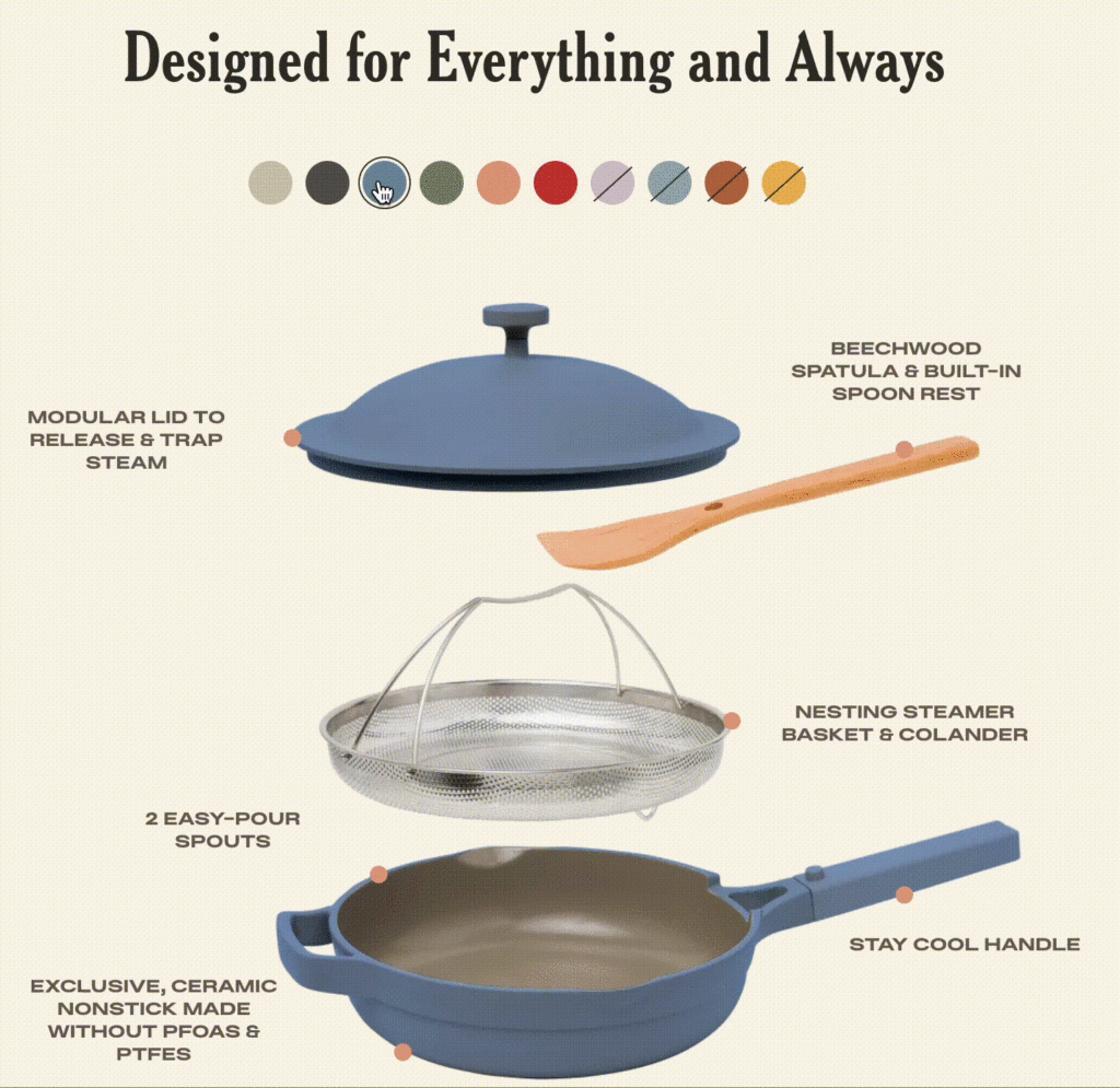
The Our Place experience feels elevated and unique compared to Amazon’s now generic shopping:
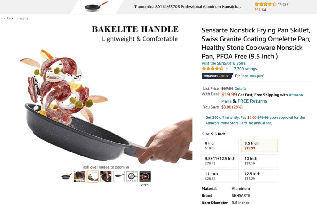
Aids in product discovery
In addition to creating engaging and valuable experiences through design, it’s important to help shoppers explore your brand and products.
Product discovery works twofold: for customers who don’t yet know what they’re looking for but are interested in your brand, and for customers who know precisely what they’re after and need to find it ASAP.
Website design elements that help with product discovery include:
- A well-organized, intuitive site navigation
- Product collections
- CTAs
- Clear copy and accompanying imagery
Another way to facilitate product discovery is with cross-selling and upselling.
For example, if you just launched a new version of a product, you can use upselling to encourage customers to purchase the new version. Or, you could use cross-selling to recommend related products.
Trustworthy
Ever shopped on a site and felt it was a little…suspicious? Like, “is this a legit brand?” or, “will I get my package on time?” suspicious.
If a customer deems your site untrustworthy on the first visit, it’s tough to win them back.
That’s why trust signals like high-quality visuals, customer reviews, company contact information, trust seals, secure delivery via HTTPS, and more need to be a core part of your ecommerce website design.
This is especially important for new stores establishing brand recognition. And especially true for how your checkout operates.
Easy checkout
There are several reasons why a customer will choose to abandon their cart.
Some are out of your control, like an unreliable internet connection that interrupts their shopping experience.
However, other factors, like the complexity of your checkout experience, are in your control.
With nearly 20% of shoppers citing a too-long checkout process as their top reason for abandoning their cart, simplifying your checkout can make or break your customer experience.
Audit your existing checkout flow for:
- Simplicity: Can shoppers figure out how to place their purchase easily? How might you communicate a pricing breakdown so they’re aware of all fees and items in their cart? How do you notify them about purchase confirmation? Shipping details? These factors streamline the checkout flow and ensure shoppers know what they’re getting and how much they’re paying.
- Speed: How many steps are required for shoppers to complete their purchase? Walk through your checkout flow and remove any unnecessary or confusing steps. Often, a speedy checkout will also be a simple one, so these factors go hand-in-hand.
- Security: Cyber-attacks and data breaches keep online shoppers on high alert. It’s best to reassure them your checkout is secure with security signals like payment logos, reCAPTCHA, and SSL certificate encryption.
Streamlined site navigation
It doesn’t take long to spot a confusing ecommerce site. And as soon as shoppers do, they’ll be on to the next.
Streamlining your site navigation ensures shoppers will keep exploring your site, but it helps them find what they’re looking for—which can lead to more conversions.
In fact, simplifying your site navigation can boost your conversion rates by as much as 18.5%!
Zoomed out, a great site navigation menu will include:
- Top navigation bar
- Drop down menus
- Sidebar menus
- Breadcrumb navigation
- Footer menus
The key is to provide shoppers with the information they need when they need it.
#cta-visual-pb#<cta-title>Double-down on high-converting site design<cta-title>Create and customize landing pages with all the vital elements for conversions with Shogun Page Builder.Start designing for free
Far from cookie-cutter
There’s nothing inherently wrong with cookie-cutter website design.
Templates and themes are a fantastic way to kickstart your site design, especially if you don’t feel totally confident in your design eye.
💡 Looking for your next website theme? Check out our roundups of the best BigCommerce themes and the best Shopify themes. |
However, where cookie-cutter design becomes problematic is when your brand starts to look like another brand, and another, and another—leaving shoppers unsure of who you are or what you offer.
High-converting design takes the principles that great themes have, and expands on them to fit a brand’s unique flavor.
Take Omsom, for example.
The Asian cuisine brand started with Shopify’s Crave theme, and completely transformed it into a custom, aesthetically pleasing shopping experience.
But, we’ll talk more about why we love Omsom later. 😉
Designed for speed and mobile
Last but not least, building an ecommerce website with both blazing speed and A+ mobile commerce functionality is key.
With people spending about five to six hours per day on mobile devices, crafting a responsive ecommerce web design made for smaller screens is important as it’s likely how many customers will experience your site.
Plus, with 54% of shoppers saying that experiencing slow load times prevent them from shopping on a site again, site speed is a critical part of your experience.
Both speed and mobile responsive design are SEO ranking factors, so it’s important to prioritize those.
43 Best ecommerce website design examples
Whether you’re gathering ideas for your design revamp or are curious about what other ecommerce businesses are up to, here are 43 of the best ecommerce website design examples from the following verticals:
- Apparel
- Food and Beverage
- Beauty and Skincare
- Lifestyle and Miscellaneous
Apparel
There’s no shortage of stunning ecommerce fashion sites out there. Here’s a round up of some of our faves.
1. Fabletics
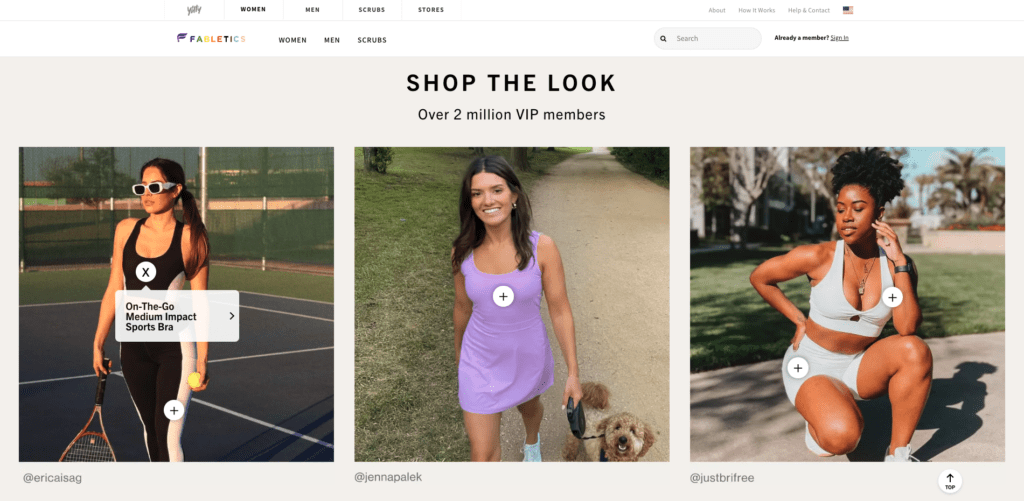
Athletic wear brand, Fabletics, uses a blend of animation, bold text, and flashy imagery to stand out from other sites and convey function and fashion.
They’re also pros at product discovery.
The fitness brand doubles down on user-generated (UGC) content throughout their site and social media presence, like this section on the homepage:
Fabletics also makes it easy for customers to shop new drops and collections right from the main navigation bar:
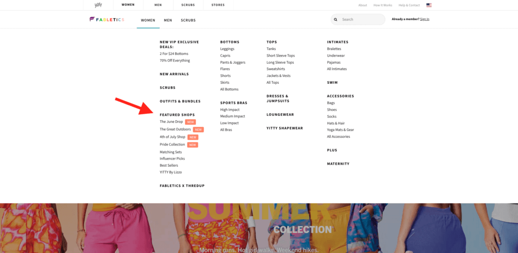
This is an excellent way to draw attention to new products or seasonal collections.
2. Rumpl
Technical blanket and gear brand, Rumpl, is making waves in the outdoor equipment space. They’re experts are infusing storytelling with their online shopping experience, and it makes an impact.
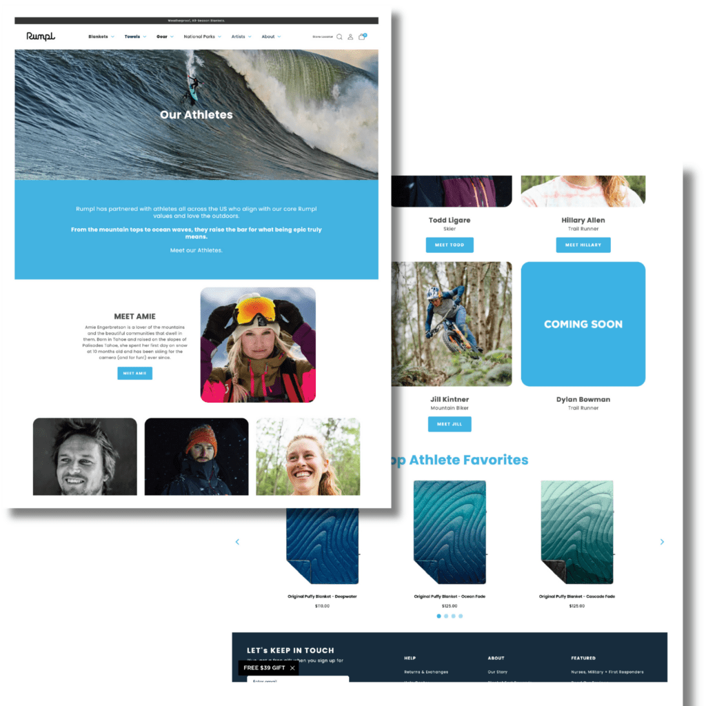
Rumpl uses Shogun Page Builder to build dynamic pages like their Rumpl Athlete pages and custom blanket page.
The Rumple Athlete team page is an excellent example of how to marry storytelling with value by:
- Showcasing the stories of different outdoor athletes—from skiers to surfers. This kind of juxtoposition underscores the Rumpl brand as being adventurous, fun, and high-quality.
- Highlighting Rumpl Athlete favorite products. Rumpl makes it easy for customers to shop recommended products from some of the coolest outdoor enthusiasts around.
Another great example of the impact of weaving storytelling with ecommerce is the custom blankets page.
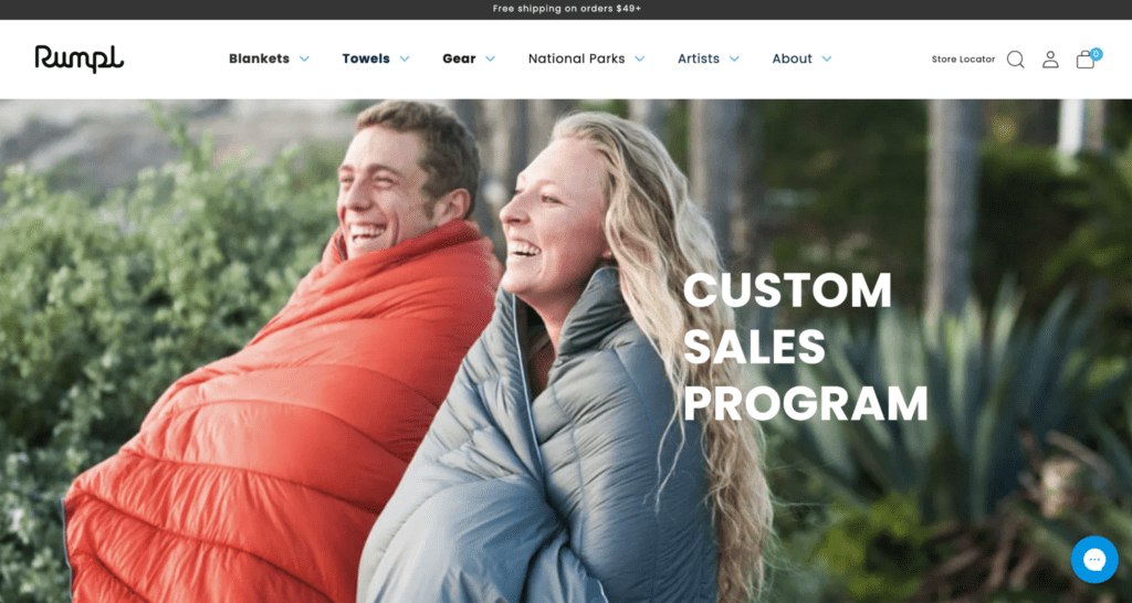
Allowing customers to customize their own Rumpl blankets puts them at the center of the story.
Using Shogun’s intuitive visual editor, the Rumpl team can create impactful pages like this in hours instead of days. What’s more, non-technical team members can make site-wide updates easily and as needed.
This level of flexibility led to Rumpl increasing their conversion rate by a whopping 20%!
#cta-paragraph-pb#Learn more about Rumpl’s success with Shogun Page Builder. Read the case study
3. Generation Tux
This suit rental brand completely simplifies the customer journey with a sleek experience.
Not only is the site clean and modern—mirroring their products—but shoppers can customize their rental with a Home Try-On feature.
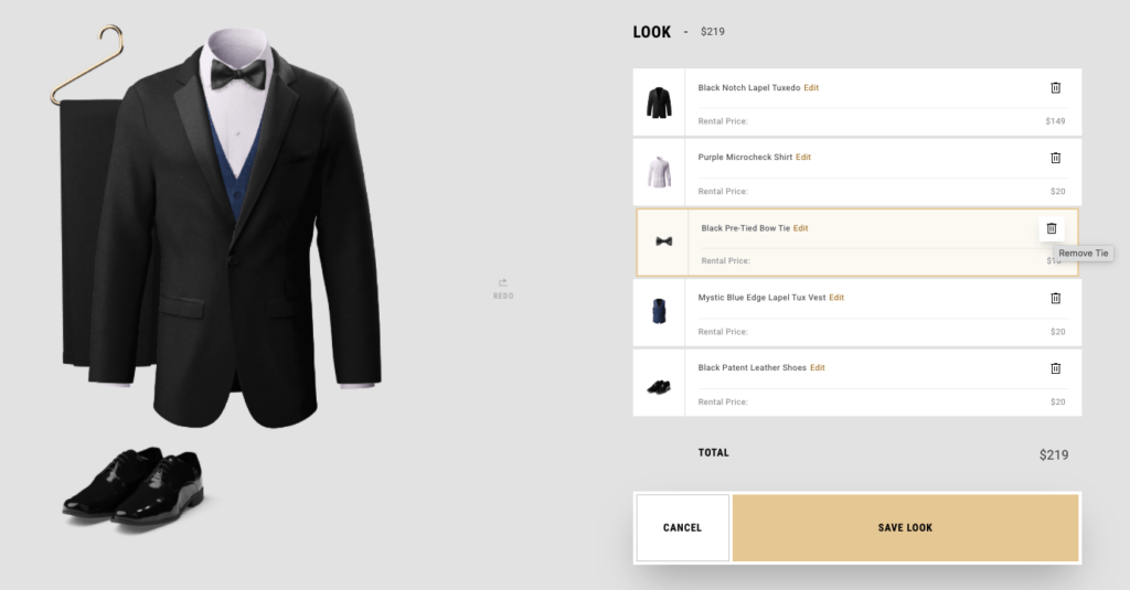
Customers choose the items they want in their home try-on using an easy drag-and-drop menu—even if it’s just pants and a jacket.
Curious to see what a pink shirt, blue jacket, and pant combo would look like? This feature lets you preview these combinations so you get the exact look you want.
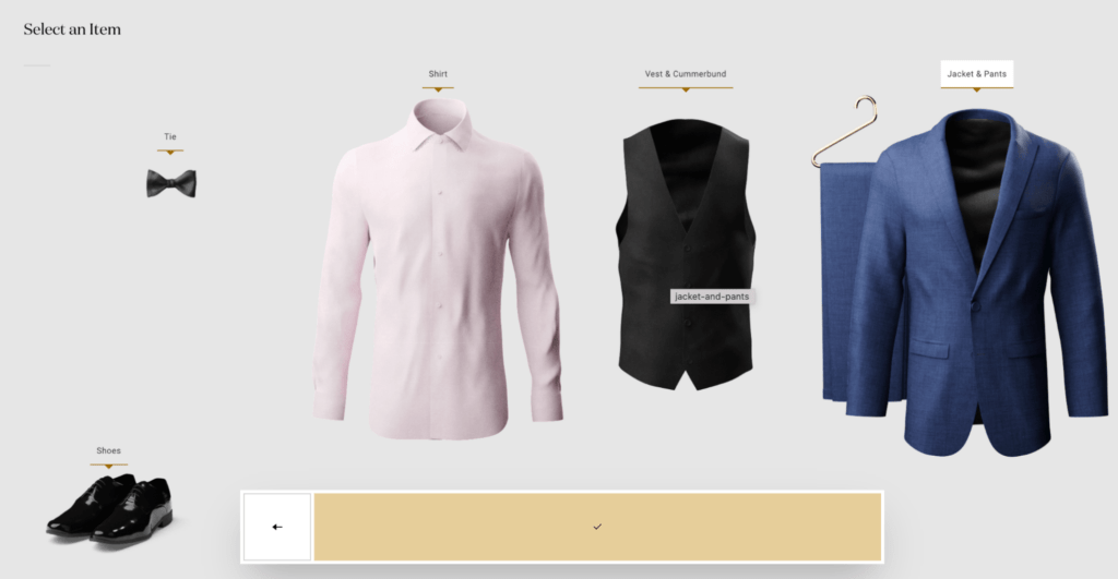
Plus, there’s great inspiration throughout the site:
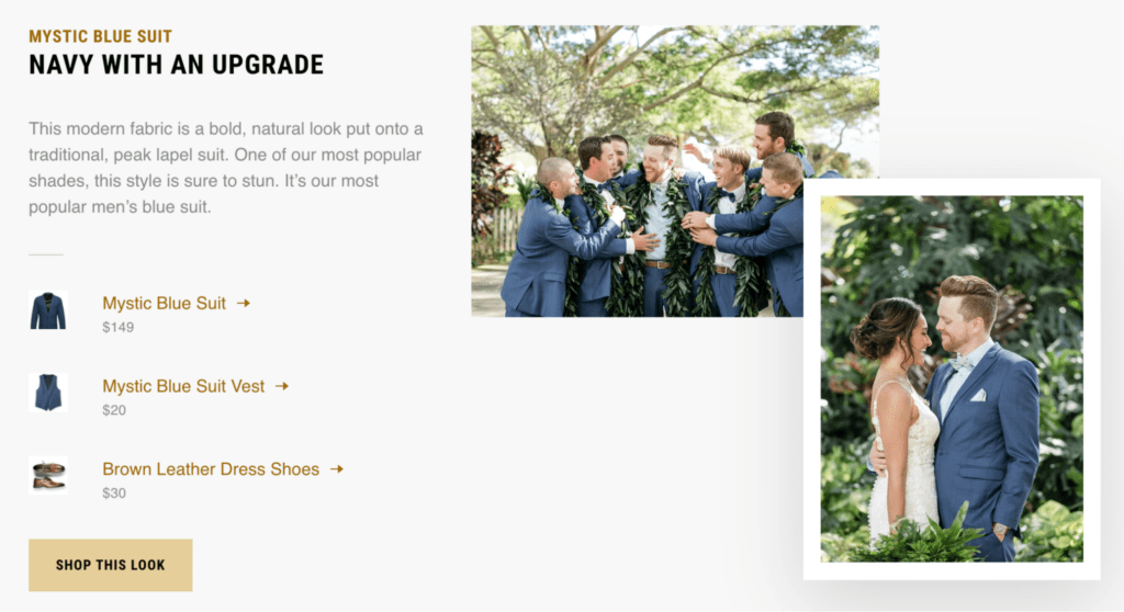
Shoppers can check out the inspiration gallery and click directly to the product page of a suit they want to learn more about. A great way to weave in product discovery.
4. Faherty
This laidback apparel brand built an ecommerce site design that embodies California surf chill—from the product photography and background videos to the fonts and page layouts.
However, the Faherty site differentiates with a shoppable digital catalog:
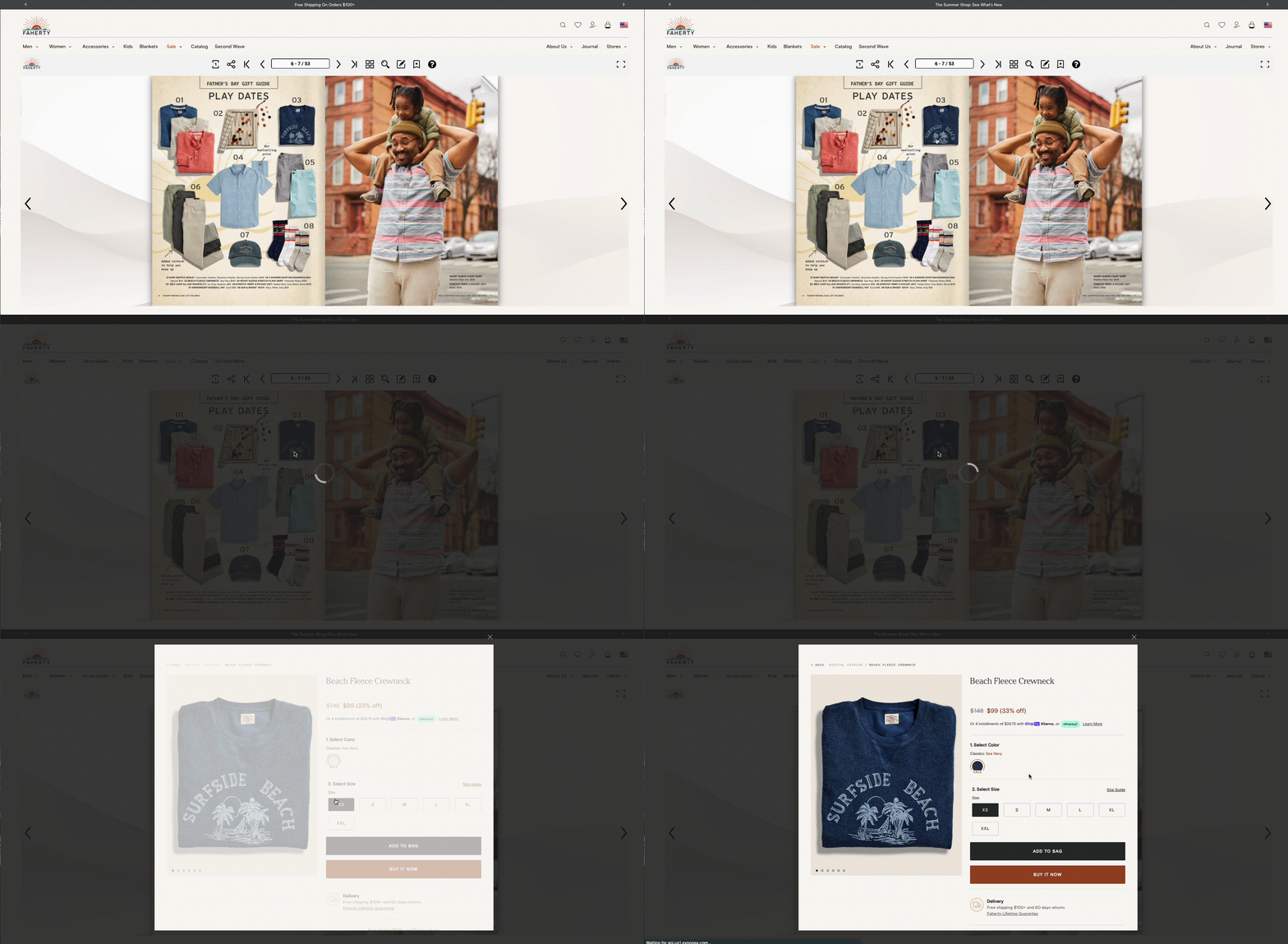
This online catalog adds uniqueness to the site and offers another cool way for shoppers to discover products.
5. PANGAIA
Eco-friendly loungewear brand, PANGAIA uses editorial-style photography, background videos, and educational site pages to tell their brand story without taking away from the shopping experience.
For example, their science and innovation hub page does a great job of educating shoppers on how they make their products and why.
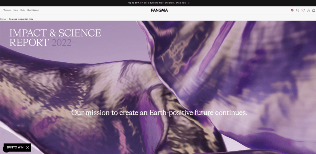
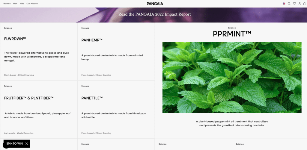
It’s clear this information is important to PANGAIA’s customers and is another avenue to be transparent about brand values.
Their Shogun-built store pages hit exactly the right notes for their target audience.
6. Warby Parker
Eyewear brand, Warby Parker, couples convenience with style with their ecommerce website design.
The site is clean, crisp, and uses high-quality imagery to indicate product caliber. Their product pages create an especially engaging shopping experience.
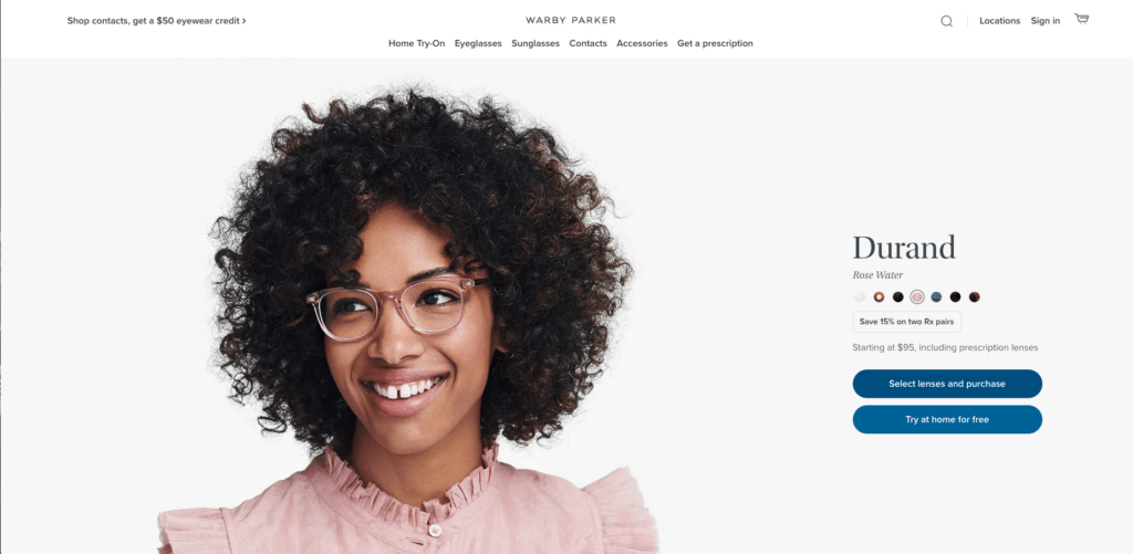
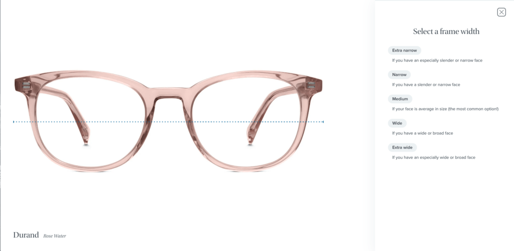
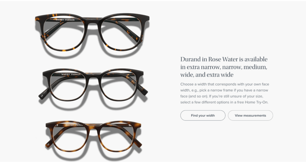
The brand knows eyewear isn’t one-size-fits-all. Their “Find your width” feature helps customers choose the right frames for the best fit, which adds confidence to the buyer experience.
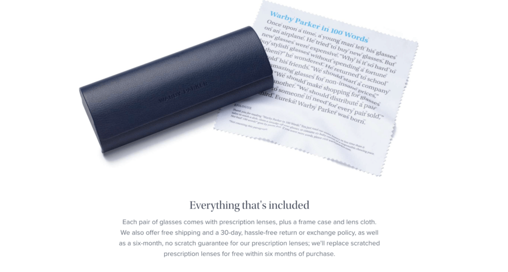
What’s more, the ‘What’s Included’ section on each product page quickly answers FAQs, like “Do I need to buy a case?”
Lastly, customers can choose five frames to try on at home for free.
With their top website design, it’s clear Warby Parker is simplifying the eyewear experience online and helping their customers feel confident.
#cta-visual-pb#<cta-title>Create custom ecommerce pages like these brands<cta-title>Build custom landing pages with all the vital elements for conversions with Shogun.Start designing for free
7. Mahabis
Footwear brand Mahabis shows off the unique qualities of their slippers, sandals, and accessories with stunning site design.
This site balances simple site navigation with product discovery, making it the perfect use case for both shoppers who know what they’re looking for and those who don’t.
For example, the main navigation is a classic drop-down menu but includes product thumbnails next to each category.
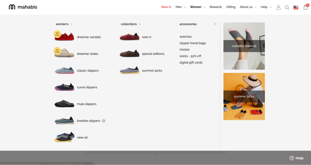
This simple design decision provides even more context to shoppers, so they can find what they’re looking for faster.
On top of that, Mahabis uses Shogun to create collection pages that are simple, yet elegant—like their dreamer slides collection page.
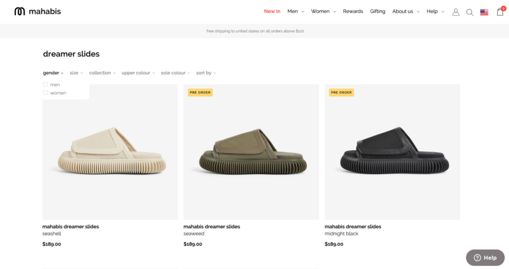
This collection page allows shoppers to quickly add their dreamer slides of choice to their cart by selecting their shoe size.
The cart drawer instantly pops up, confirming that products have been added.
Sometimes, in ecommerce, erring on the side of simplicity is best.
8. Badgley Mischka
Iconic fashion brand Badgley Mischka was historically only available in department stores like Saks Fifth Avenue and Neiman Marcus.
But in recent years, their team has invested in creating ecommerce experiences as elegant as their designs.
Badgley Mischka uses Shogun Page Builder to create customized site content that’s far from cookie-cutter.
For example, Badgley Mischka’s Wedding Shop was built using Shogun elements like images, tabs, and columns.
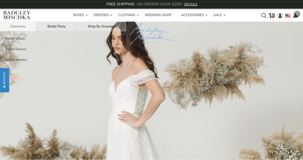
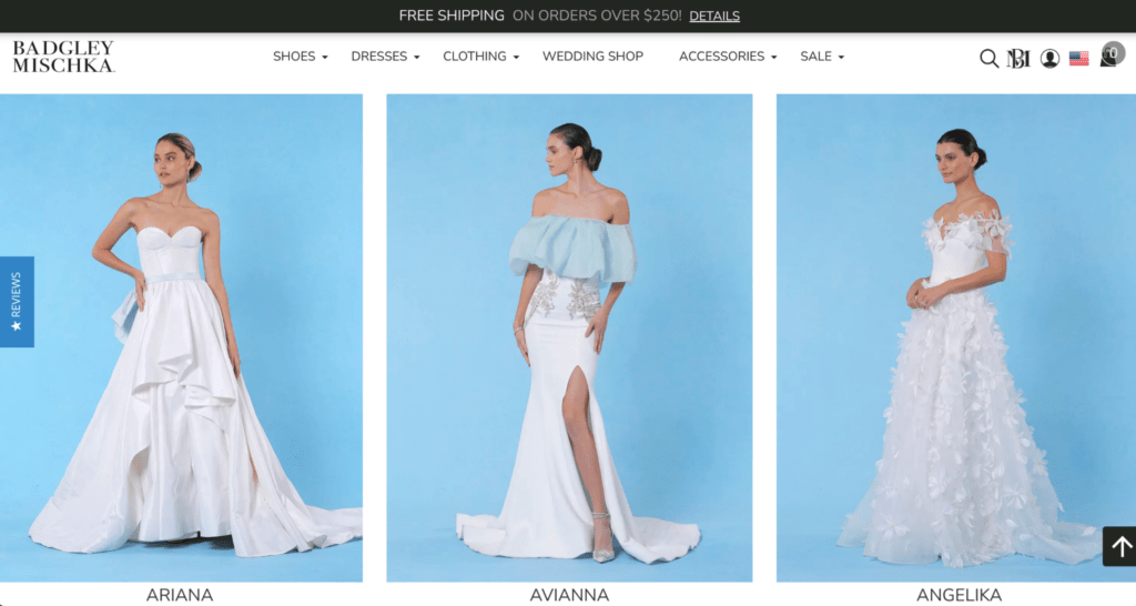
The fashion brand also uses Snippets—or saved custom blocks that can be reused across any site page—to build even faster without compromising on consistency.
#cta-paragraph-pb#Learn more about Badgley Mischka’s success with Shogun Page Builder. Read the case study
9. Grace Loves Lace
Aussie-based bridal designer Grace Loves Lace faces quite a few challenges from an ecommerce perspective.
For one, buying a wedding gown online comes with its own obstacles, like conveying details like textures and materials, sizing, and how the gowns move while on someone.
Adding to their tall order, Grace Loves Lace is rapidly expanding into various global markets like the US, UK, and EU.
To mitigate these challenges, Grace Loves Lace uses Shogun to build site pages that convey product detail and quality, while catering to international audiences.
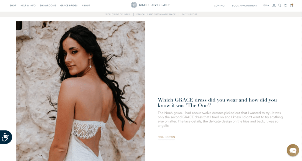
For example, customer stories on Grace Loves Lace’s blog do an excellent job of infusing product details with real customers images.
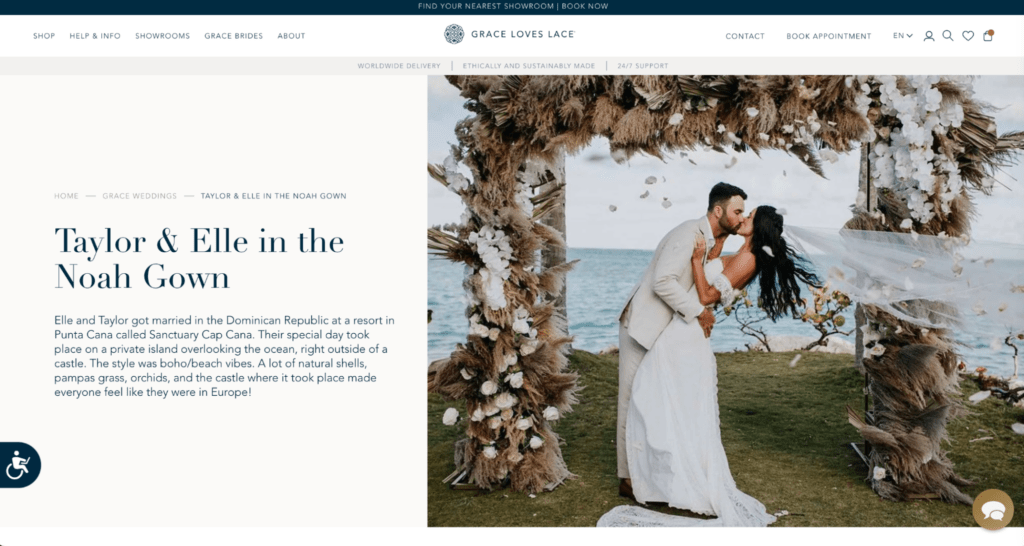
Built with Shogun elements and Snippets, customers can see how Grace Loves Lace dresses look like on happy customers, while also being able to quickly navigate to a particular dress’ product page.
What’s more, Grace Loves Lace can manage and update their global instances without having to make manual, tedious changes to each site with Shogun.
Using Global Snippets and content syncing, the Grace Loves Lace team can work smarter, not harder.
#cta-paragraph-pb#Read more about Grace Loves Lace’s success with Shogun Page Builder. Read the case study
10. Chubbies
Known for their bright, eclectic products and branding, Chubbies ecommerce experience is memorable and fun.
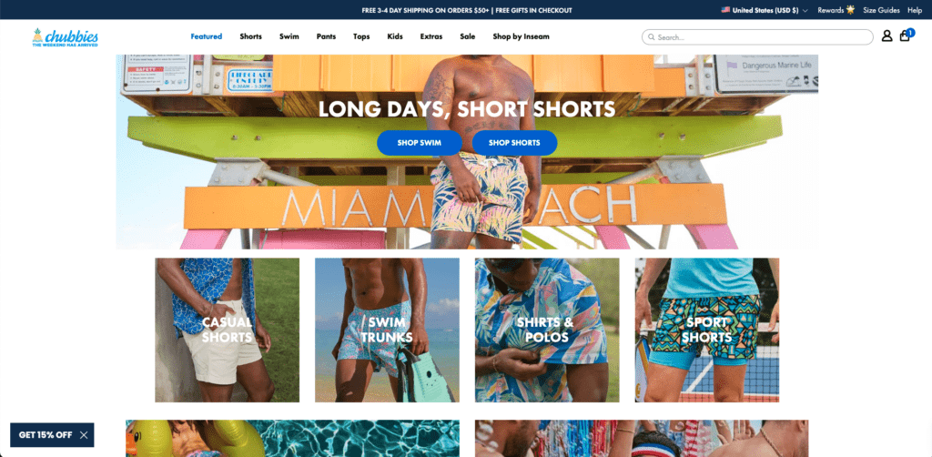
In addition to their fun images that blend product-focus and branded photography, Chubbies makes it easy to purchase (and discover other products) with their streamlined checkout flow.
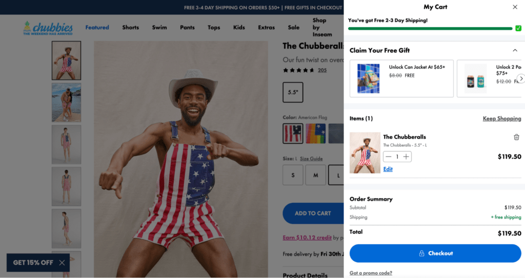
A drawer cart makes it easy to see what is in your cart without leaving the current page. There’s a ton of functionality within the cart that makes this flow easy to use:
- Customers can easily add free gifts they qualify for
- Added items and relevant details like the number of items, price, and item name are clearly shown
- A clear free shipping indicator tells shoppers when they’ve qualified
- A quick order summary shows the pricing breakdown (including free shipping)
- Other related items can be easily added to the cart without leaving the cart
A checkout flow this powerful and easy-to-use eliminates friction at this critical point in the shopper experience.
11. Stance
Stance is known for their socks, but they also sell a variety of t-shirts, shorts, and accessories.
The clothing brand’s community, Punks and Poets, is a collective of world-changers, athletes, and adventurers. This community represents what Stance values: creativity, movement, and self-expression.
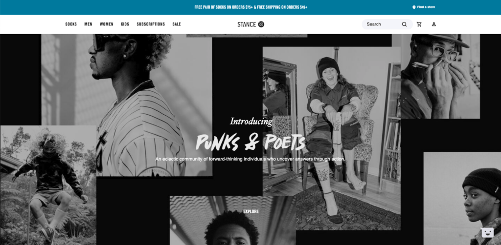
Stance’s ecommerce design embodies these values with does a great job taking this editorial style and putting on a new twist.
Editorial-style visuals, complementary font pairings, and blocked sections help this site feel anything but standard, yet still functional.
Stance uses Shogun to build dynamic site pages—like The Reserve, a collection of former collaborations.
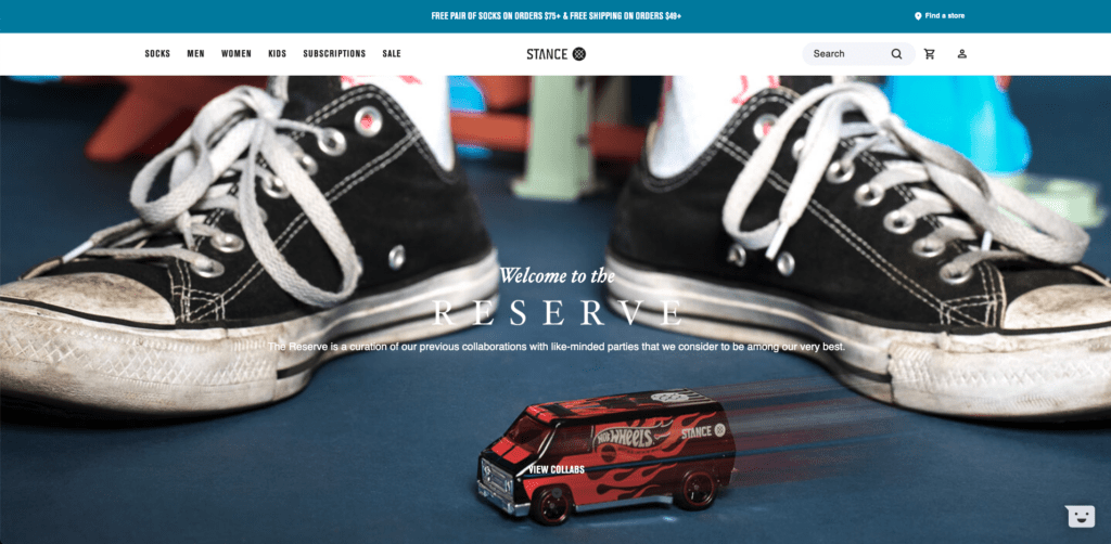
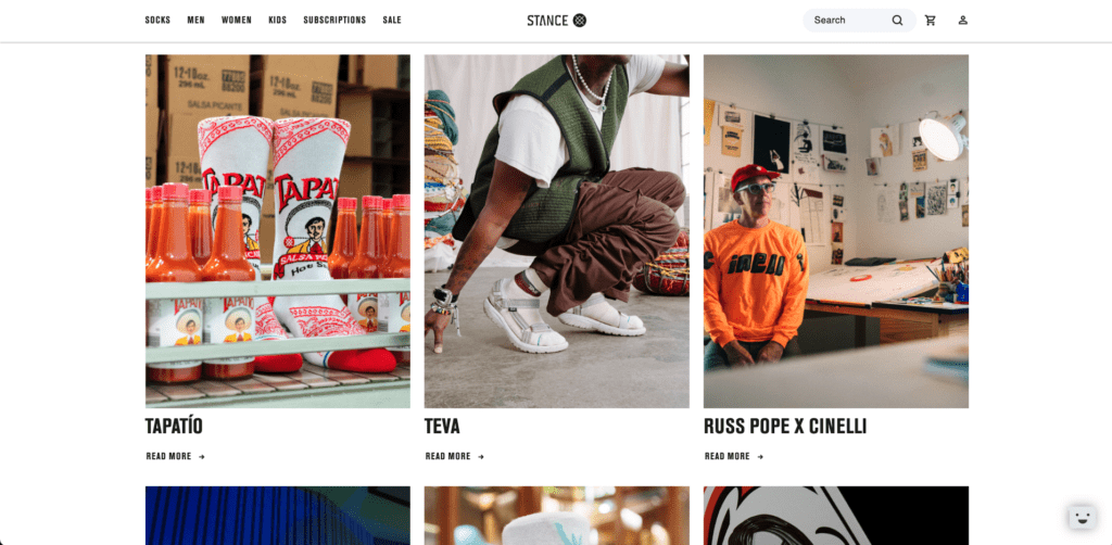
Stance uses Shogun elements like columns, text, and images to bring this page to life and create something visually engaging.
12. Topo Designs
Adventure apparel and gear brand Topo Designs knows how to make a statement with their ecommerce website design.
Layered images, pops of their signature bright red brand color, and discoverable product collections work together to help shoppers find what they are looking so they can get back to adventuring.
Topo Designs uses Shogun to build unique site content, like their Apparel Kit page:
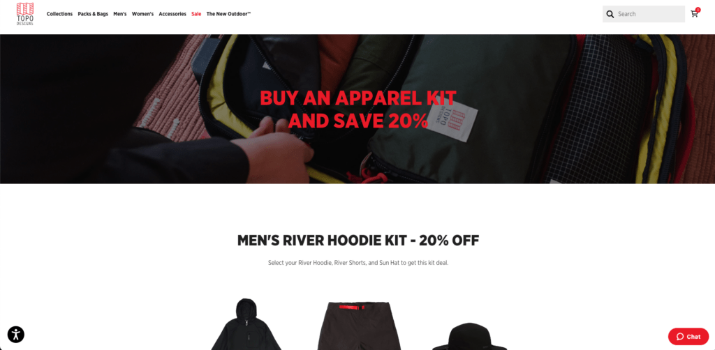
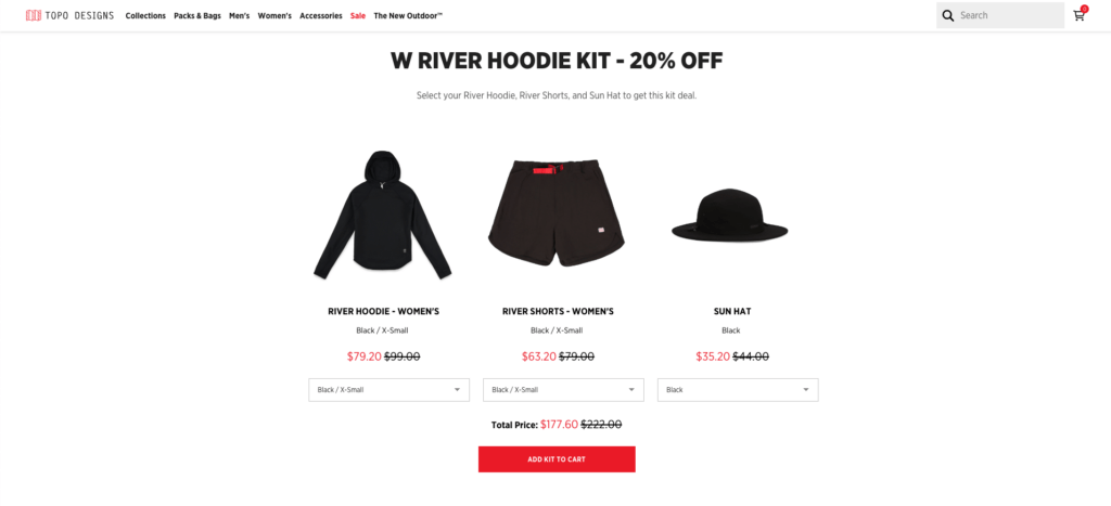
Shoppers can save when they bundle three items. This page makes it easy to choose sizes and see how much is saved by shopping a kit.
Pages like these not only up your AOV, but encourage shoppers to discover related products they’re sure to love.
Food and beverage
From colorful cans to spirited non-alcoholic beverages, this list of food and beverage brands will kickstart your creativity for your next page.
13. De La Calle
You’ll be thirsty for all nine flavors of De La Calle’s tepache (a Mexican fermented beverage) after exploring this site.
The design articulates the brand’s cool, chill, ready-for-a-good-time vibe with lively photography, scrolling text, and fun animated background videos.
The dynamic remerchandising of the entire product page to match each flavor’s unique color palette/personality also makes for an engaging shopping experience.
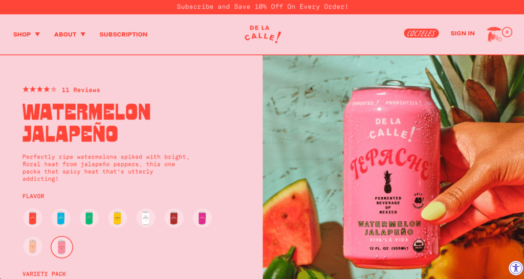
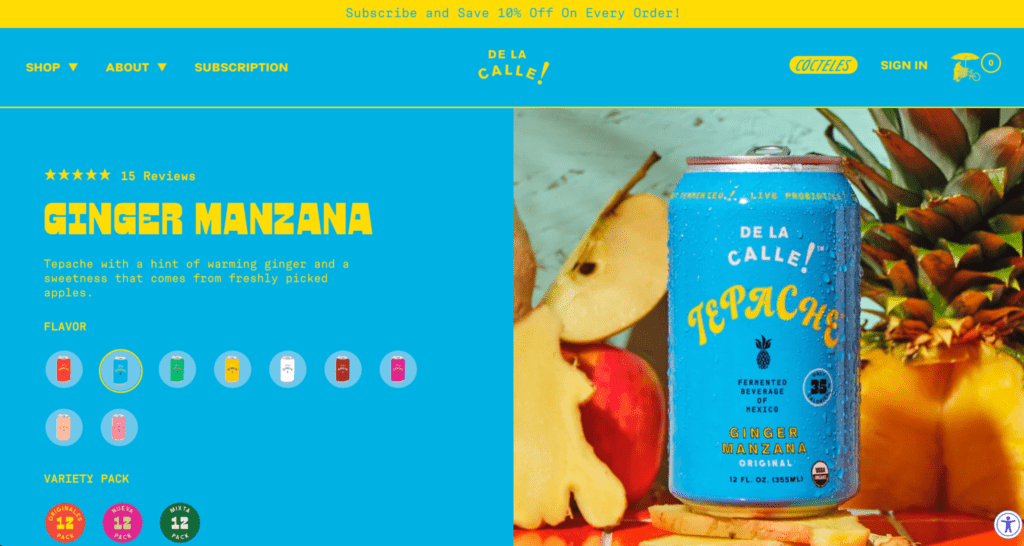
The founders’ Mexican origins inspire the design and branding, and it makes you want to enjoy one (or two!) in the sunshine with friends.
14. La Colombe Coffee Roasters
Philadelphia based-coffee brand La Colombe features more than just coffee and coffee-drinking accessories on their site.
In addition to how they merchandise their products—subscriptions, gift sets, and bulk orders—La Colombe’s brew guides offer a step-by-step tutorial on how to brew your best cuppa yet.
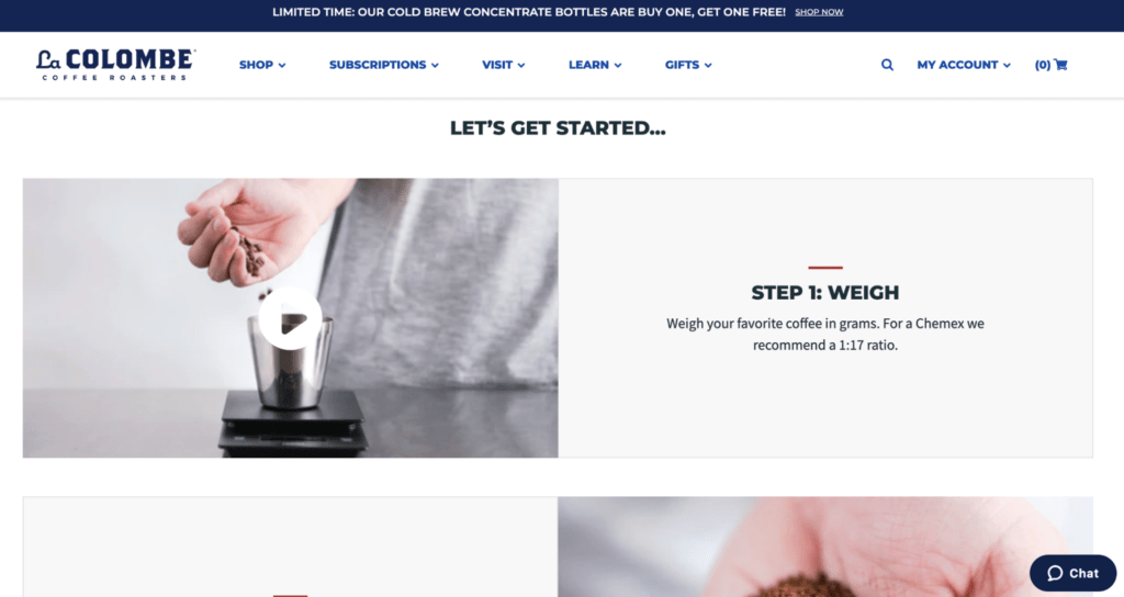
This unique video content initiative makes the shopping experience more compelling through education and anticipation (e.g., customers look forward to receiving their new Chemex brewer and La Colombe blend to start their morning right).
15. SOMOS Foods
SOMOS Foods, a Mexican food brand, nods to their colorful, bright roots throughout their website.
This Shopify store feels anything but standard—from the stop-motion animations on the homepage…
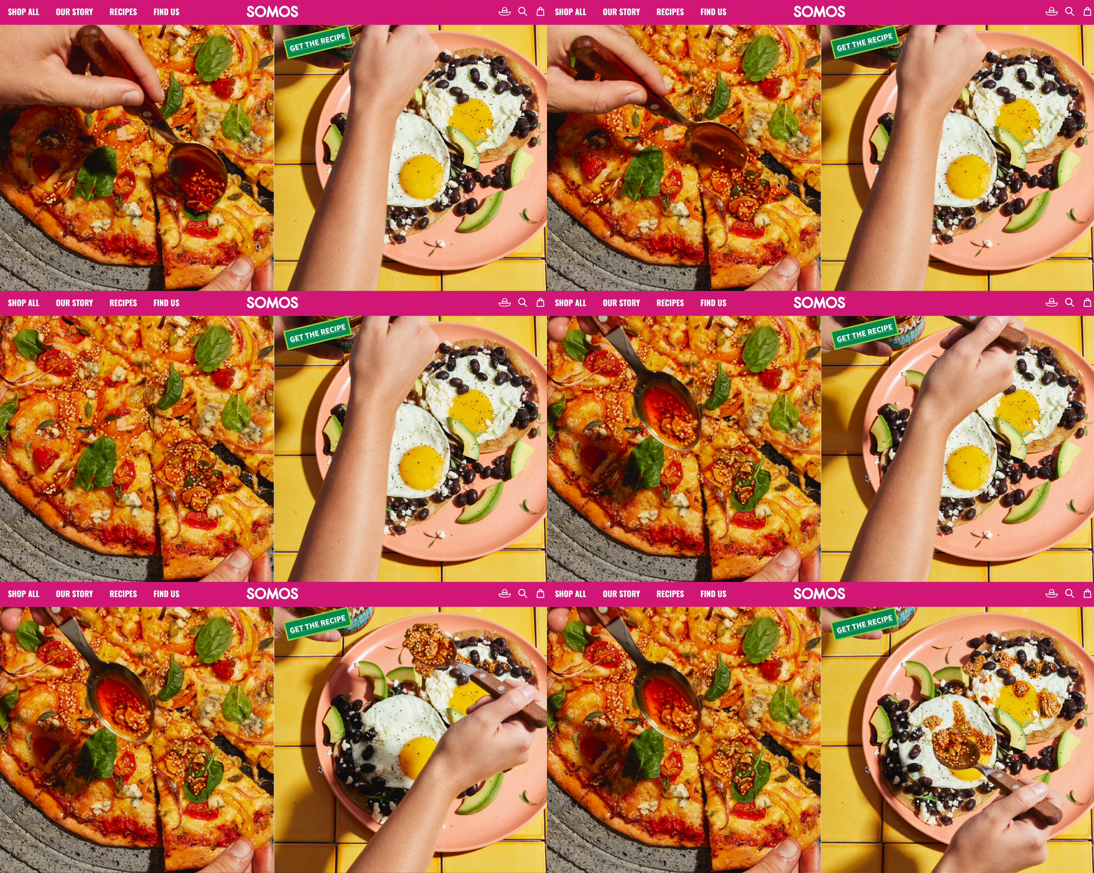
…to the cool background video featured in the hero section of SOMOS Foods’ Our Story page and on the product pages.
Through rich visual merchandising, shoppers get a taste of this vibrant brand and their history while finding delicious meal ideas and learning how to make them at home for loved ones—just like the founders of SOMOS.
16. Good Culture
Good Culture’s ecommerce website design indicates they’re a brand that values transparency—from the product pages with nutritional information and simple copy across the site.
Clean, simple site design with plenty of whitespace and pops of color also nods to Good Culture’s promise of only using “simple ingredients” in their products.
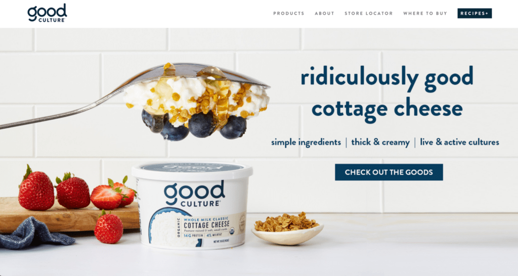
The Products page is a long scroll page with jump links, making it easy to hop to different product sections to learn more.
In addition, the design on the B Corp and About Us pages mirror their standard of quality and commitment to doing good—from the straightforward copy to the playful visuals and high-resolution images.
17. Omsom
Asian food brand, Omsom, offers an ecommerce shopping experience that’s equal parts dynamic and memorable. Just look at this home page 😍
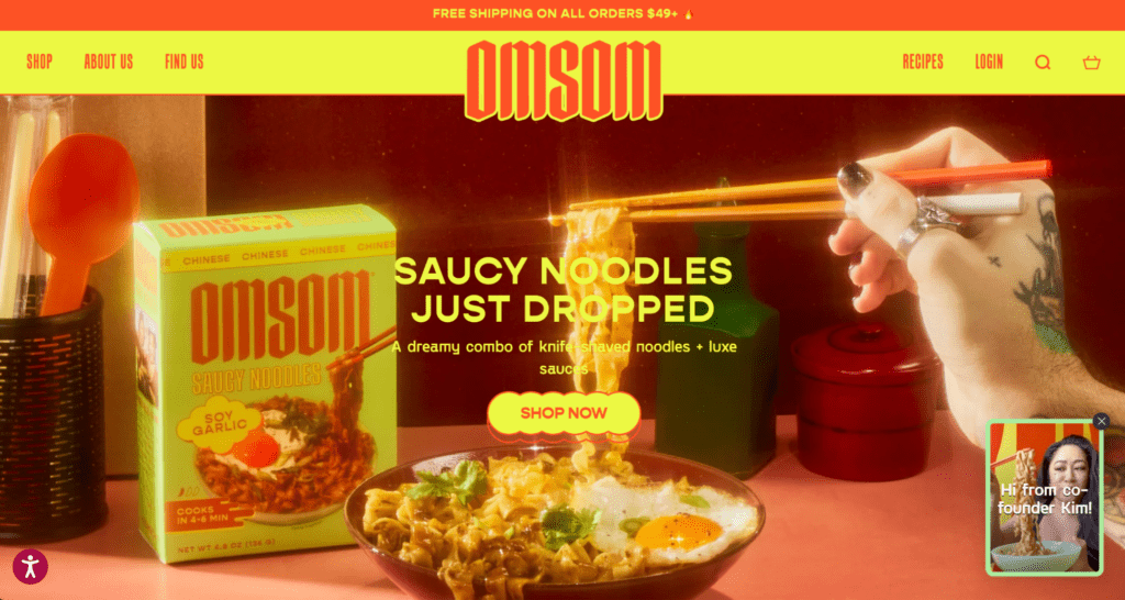
Omsom nails personalization from the start; When a customer first lands on the site, they’re greeted with a video message from one of the founders.

From there, in a choose-your-own-adventure way, customers can learn more about Omsom’s products, get to know the brand, or get help choosing products to try.
With this video, Omsom introduces themselves to customers and offers to assist with product discovery and education.
#cta-visual-pb#<cta-title>Design a memorable ecommerce site<cta-title>Take your online store to new heights with Shogun Page Builder.Get started for free
18. OLIPOP
Soda alternative OLIPOP’s ecommerce site brings a new twist to classic soda branding.
This site includes fun, bright, bubbly branding—from product images and detail photos to subtle animations on product pages:
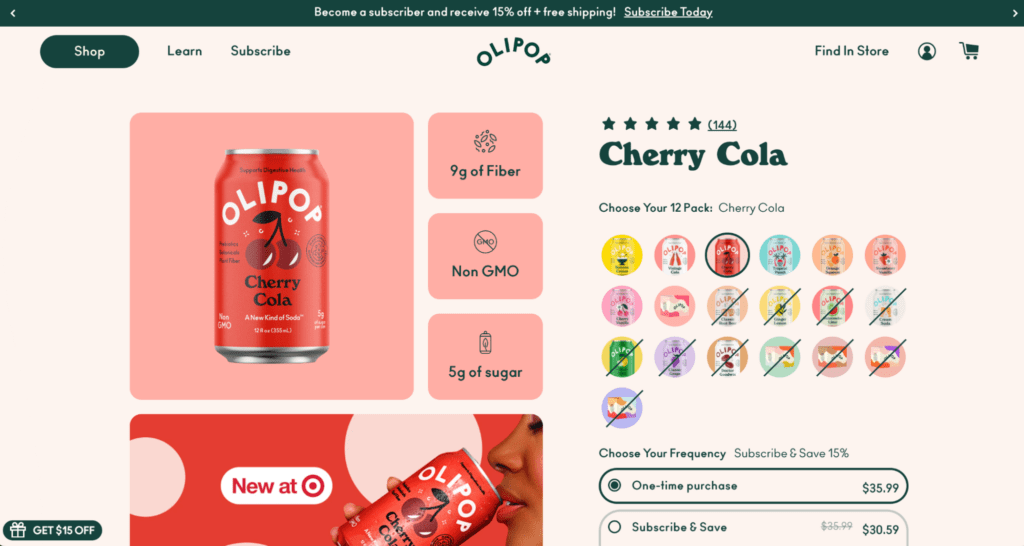
What’s more, OLIPOP recently revamped this page with a design that makes it easier for customers to toggle between flavors, resulting in a more dynamic experience and a 25% conversion rate increase.
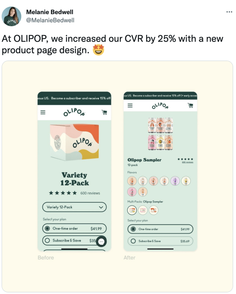
And, with Shogun Page Builder, they can quickly create gorgeous landing pages that precisely match the messaging for their most important marketing campaigns.
19. Oatly
Oatly’s ecommerce site makes shopping for dairy milk alternatives anything but standard and boring.
Horizontal scrolling, a cartoon cursor, subtle animations across the site, brand videos, and an atypical navigator bar (shoppers click on icons and branded images to explore the site) make this custom site engaging and unique.
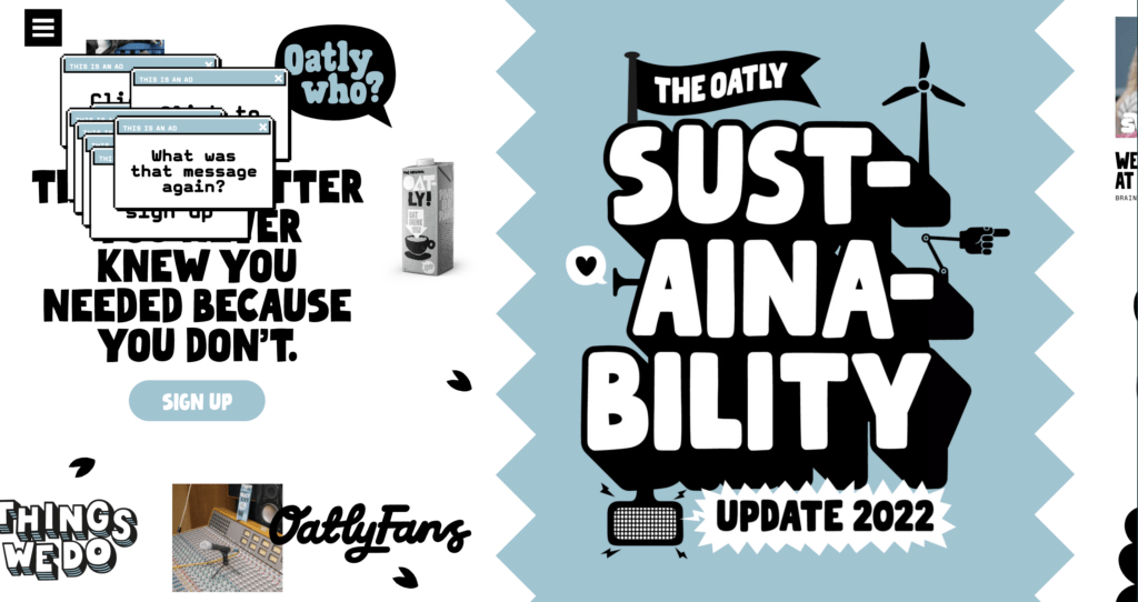
Other fun pages on the site include their “Brainwashing” page, which features educational content like “Milk Myths” and “Oatly Who?” videos (content explaining how dads aren’t always the best at living a plant-based lifestyle and how you, the customer, can help them).
20. Nuun
Hydration supplement brand, Nuun, aims to create a memorable online shopping experience that strengthens their brand awareness.
With Shogun Page Builder, Nuun has more control over design elements like fonts, colors, images, and margins. They also have access to ready-made page templates that can be easily customized as needed.
Nuun’s team has created 160+ pages with Shogun, like the Nuun Sport Powder page:
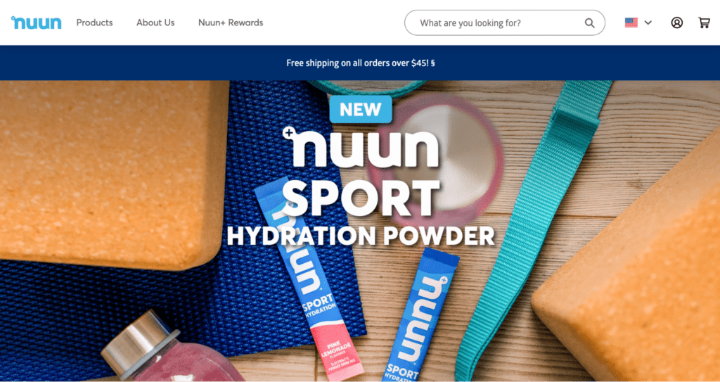
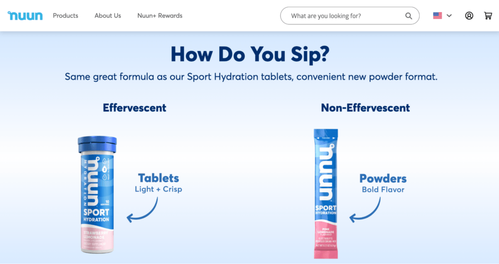
This page is packed with contextual and branded visuals, showing customers just how Nuun can fit into their everyday life—from workout routines to outdoor adventures.
#cta-paragraph-pb#Learn more about how Nuun increased their ROAS by 275% with Shogun Page Builder. Read the case study
21. Kettle & Fire
Your grandma’s bone broth, reimagined.
Kettle & Fire’s nutrient-packed broths and soups come alive in their ecommerce website design—from quality brand photos and user-generated content to mouth-watering recipes.
Kettle & Fire aims to educate customers on the health benefits of drinking and cooking with nutrient-dense bone broth, like digestion and gut health, joint mobility and recovery, and more.
Kettle & Fire’s Shogun-built ecommerce site includes several components that serve as both customer education and trust signals.
For example, the Learning Library is a hub of information including both product-specific and general resources.
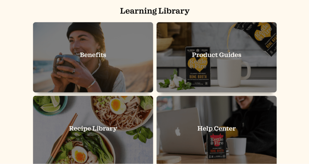
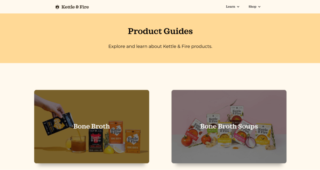
This section of the .com not only teaches customers about the benefits of bone broth, but their well-researched blog content verifies their claims and credibility.
22. Jot
There’s no shortage of caffeine in Jot products, and it shows throughout their ecommerce experience.
Bold typography, images, and benefits, this ecommerce website design bottles Jot’s core differentiator: simplifying the coffee-drinking experience without skimping on caffeine.
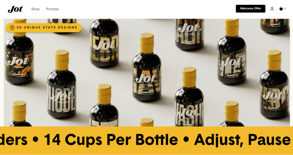
Like their products, Jot’s product pages are simple. One page allows you to add as many Jot bottles to your cart as you wish—coffee cup conversion math included.
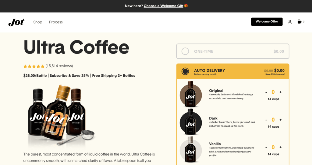
This streamlined product page doesn’t distract from the core action (purchasing coffee) and offers to simplify things for shoppers further with subscriptions.
Jot uses Shogun to create other engaging ecommerce experiences, like their “What Type of Coffee Drinker Are You?” quiz to help you pick your free gift:
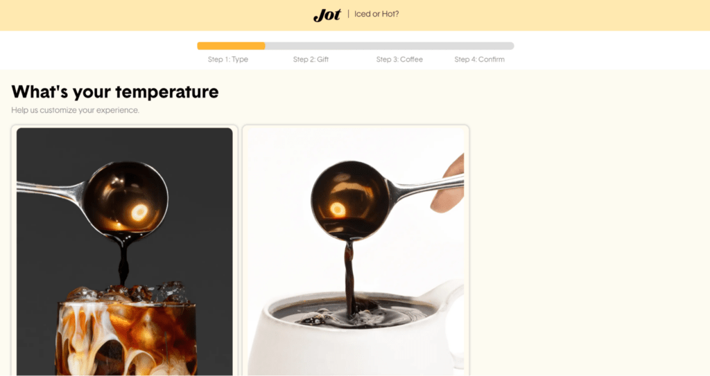
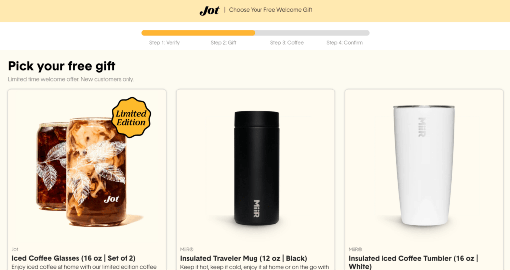
Experiences like these provide added value to customers in the form of a surprise and delight, which is always a plus!
23. Lyre’s Spirit Co.
With the societal shift to a sober-curious mindset, non-alcoholic spirits brand Lyre’s set out to make their global ecommerce experience more accessible to both customers and wholesalers alike.
Taking their BigCommerce site customization further, the CPG brand uses Shogun Page Builder Advanced to create global site content at scale.
With Shogun, Lyre’s can duplicate existing site pages to other store instances and customize based on audience’s preferences.
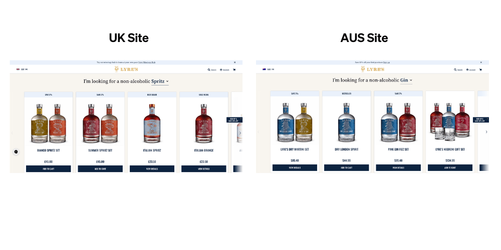
As a result of custom content like this, Lyre’s has increased their landing page conversion rate by 15% across US landing pages.
#cta-paragraph-pb#Read more about Lyre’s success with Shogun Page Builder Advanced. Read the case study
Beauty and skincare
Shopping online for makeup and skincare products is a tall order for brands, but these websites deliver.
24. Glossier
Makeup and skincare brand Glossier’s website speaks to the brand name through glossy images and a sleek shopping experience (easy add-to-cart buttons for featured products).
The models featured in the brand imagery are of varying skin colors, which signals to customers they have products that work on all skin types and tones—like on the Boy Brow product page:
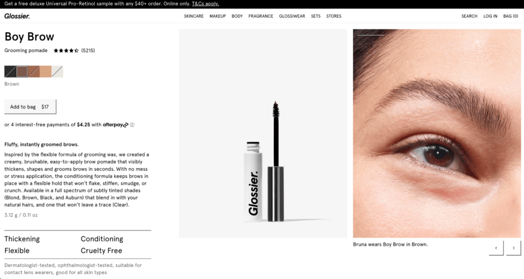
Plus, the UX elements make the experience feel like a native app (e.g., horizontal scrolling or add-to-cart buttons under every featured product on the home page).
The high-quality imagery doesn’t slow down page speed, which is key for boosting CVR and keeping eyes on the site.
25. TULA
Prestige skincare brand TULA Skincare uses high-quality imagery to take their ecommerce website to a new level.
Using a combination of high-quality flat-lays, texture closeups, and studio shots—all using the brand’s signature teal color scheme—make TULA feel “Instagram-worthy,” and implies to customers that TULA is of a higher caliber than other brands.
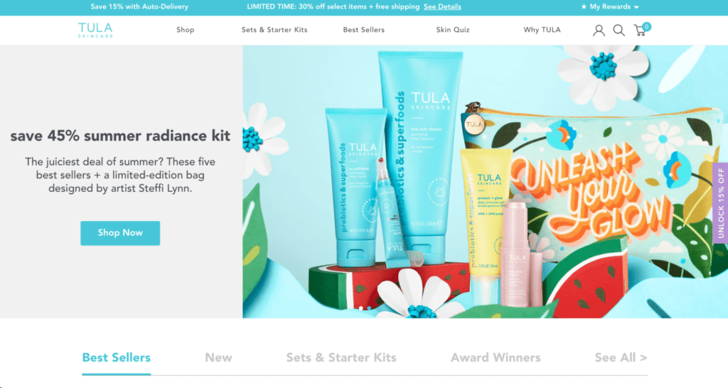
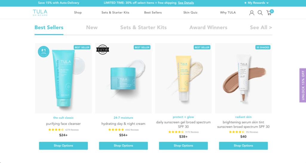
Customers can expect a certain quality based on the exceptional look and feel of this site.
26. ColourPop
Makeup brand ColourPop offers products that look a lot like art supplies—an artist’s dream!
This fun ecommerce site is brimming with—you guessed it—color. But the site isn’t overwhelming to explore.
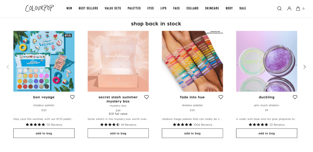
Ample whitespace gives each image space to shine.
The grid layout keeps the site organized and easy to navigate, which would otherwise be a challenge due to the vibrant product imagery.
If shoppers need some direction, the top bar navigation and footer makes it easy to shop by category and narrow down their search
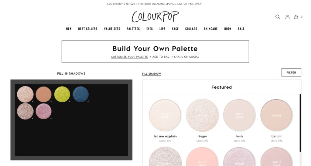
For customers wanting to add a dash of personality to their Colourpop palette, the “build your own palette” feature allows for easy customization and makes for an engaging site element:
#cta-visual-pb#<cta-title>Build a site as stunning a TULA or Glossier<cta-title>Customize your ecommerce site content with ease using Shogun’s drag-and-drop page builder.Get started for free
27. Bite
Bite—a plastic-free toothpaste alternative—knows how to keep customers on their site.
To help with product discovery, Bite includes a shoppable hero image right on the homepage:
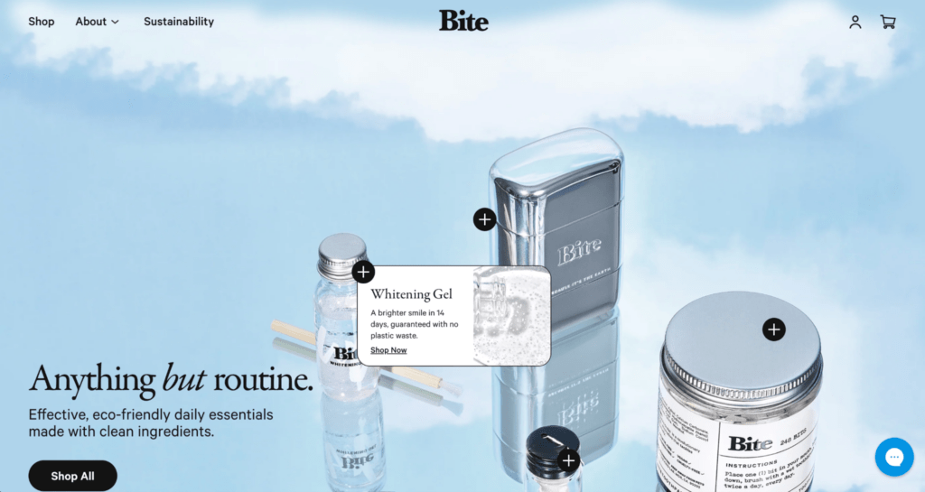
Drawing immediate attention to their products, Bite’s hero images give ethereal vibes. Taking it a step further, customers can shop the in-image products right from the hero image.
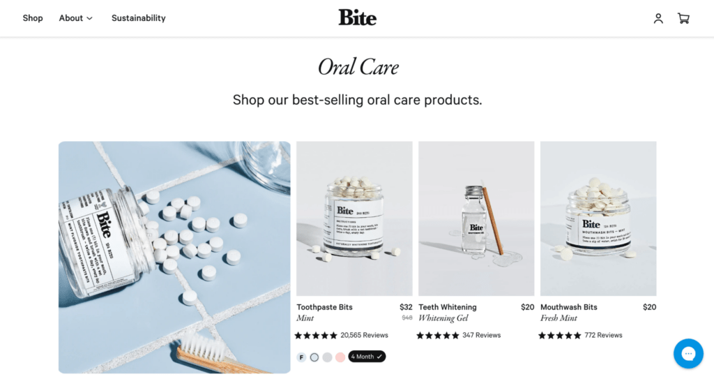
As shoppers scroll, they can explore other best-selling products or by category like “Oral care” and “Personal care.”
28. Hims and Hers
Hims and Hers—a telehealth company—recognizes that men’s and women’s healthcare needs vary, so they’ve split their ecommerce experience into two sites.
The sites may look different in terms of layout, but the branding ensures the sites are cohesive.
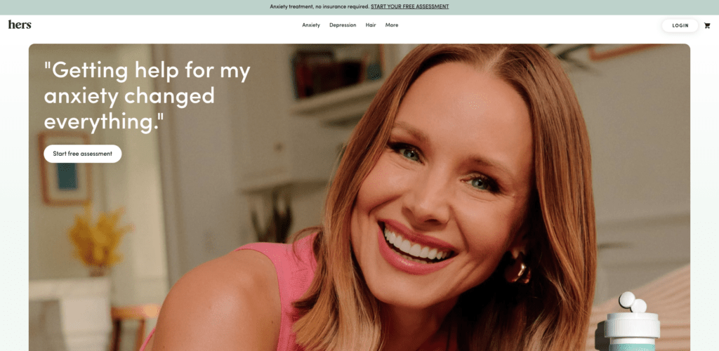
For Hers, mental health care is at the forefront of the site.
A large hero image featuring a quote from celebrity Kristin Bell with a simple CTA encouraging shoppers to start a free anxiety assessment shows the brand is focused on helping customers at their core.
For Hims, the homepage looks a lot different. Hair loss, mental health, and skincare are the primary focal points on the home page.
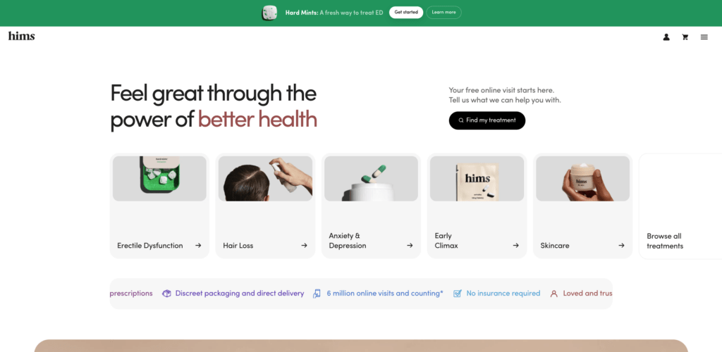
This site includes trust signals like the option to speak with a doctor and copy like “Loved and trusted by over 1 million subscribers” speak to concerns their male-identifying customers may have like product efficacy and discretion.
Across both sides, product detail pages, like the Acne Cream page, are equal parts engaging and educational.
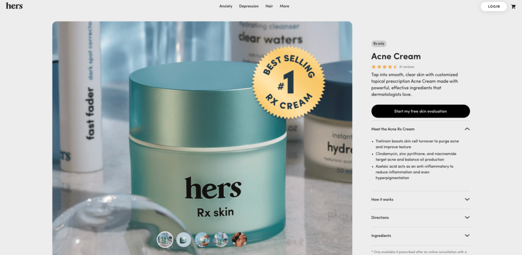
These pages include product closeups, details about what it treats, who should use it, etc., information on how to order, sample treatment plans, and more.
Both Hims and Hers sites are as engaging as they are informative and trust-building. Customers looking to improve their health don’t need to go far.
29. BondiBoost
Australian-born haircare brand BondiBoost knows all too well the importance of crafting online shopping experiences that cater to varying audiences.
As the brand has grown their international presence, BondiBoost creates customized site content that resonates with each audience, like their homepage design:
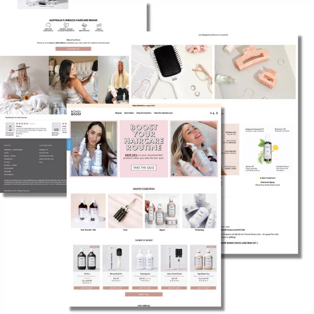
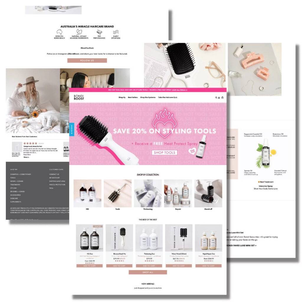
This level of tailoring across the site has had a profound impact on their bottom line to the tune of a 196.7% increase to conversion rates across all US landing page offers.
What’s more, with Shogun, BondiBoost can maintain consistency across these experiences with features like Global Snippets and content syncing.
#cta-paragraph-pb#Learn more about BondiBoost’s journey with Shogun Page Builder Advanced. Read the case study
Lifestyle and miscellaneous
There’s no shortage of inspiration from these lifestyle brands. Check out 11 of our favorites.
30. Made by Nacho
“Cat-crafted cat food” brand Made by Nacho uses a combination of 3D-looking images and illustrations, punchy copy, and a layout that directs the eye down the page in their ecommerce website design, making this a stand-out site.
From micro animations on the About page…
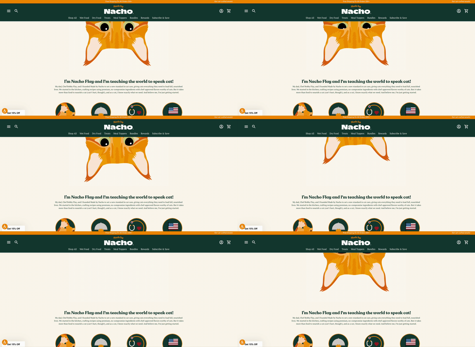
…to Nacho’s favorite recipes, which features different pairings of cat food…
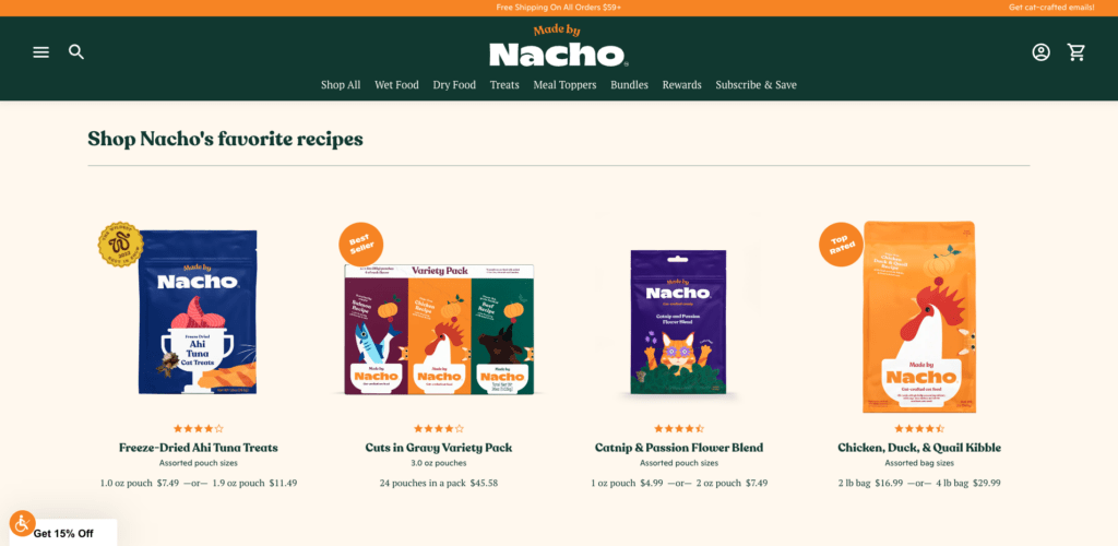
…it’s clear Made by Nacho is determined to 1) surprise and delight and 2) stand out as an elite cat food option to their target audience—shoppers who want only the best for their cats.
Details like this convey value and quality, which is essential for brands in crowded industries.
31. Clare
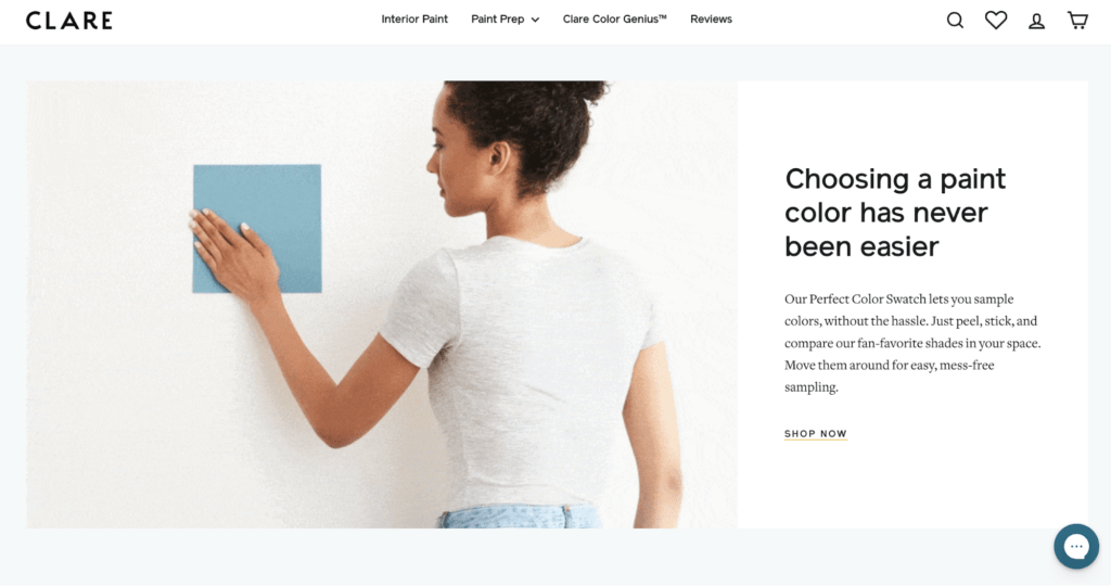
Finding the perfect paint color is easy (and fun) with Clare’s sleek, elevated site design. The paint brand’s use of visuals works as a way to communicate what they sell but what makes them different, too.
Clare’s visuals elegantly share why they’re a high-quality paint choice:
- Product images, like on-wall examples of paint colors and high-quality color closeups of swatches
- GIFs that show how to use their stick-on paint swatches to test colors
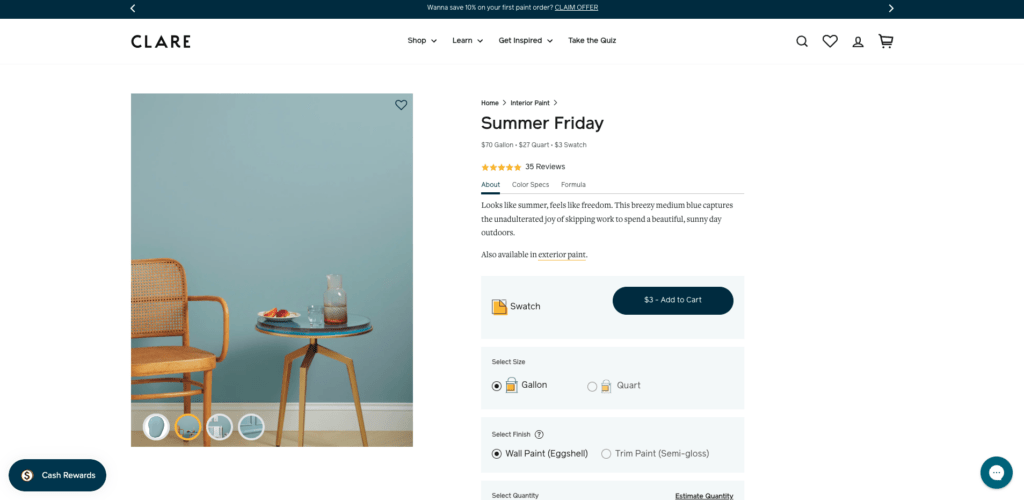
- Helpful product pages packed with relevant information
Context photos on product pages show what different types of paint colors look like on different surfaces (trim vs. wall), which helps customers find (and verify) their perfect color match.
Lastly, the color quiz helps customers find the perfect color based on the room size, type, amount of sunlight the room gets per day, and more.
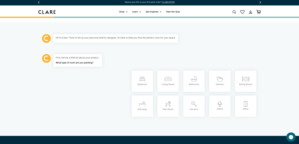
With this ecommerce web design, it’s clear Clare wants their customers to feel confident about their selections and empowered to complete their next project.
32. Stikwood
Home decor brand Stikwood uses engaging site design to convey the quality of their products.
With background video, high-resolution imagery, and dynamic product exploration tools like the Material Explorer and space visualization tool, Stikwood helps customers find the right product for their next DIY project.
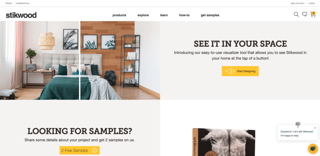
Stikwood’s robust ecommerce features make for an online shopping experience that helps with product discovery while remaining speedy.
33. Away
Away’s products are on the more expensive side; you can buy the same size suitcase for a fraction of the cost on Amazon.
But the brand shows the quality of their products through design elements like luxe imagery and product collections that emphasize making travel easier make for an elevated shopping experience.
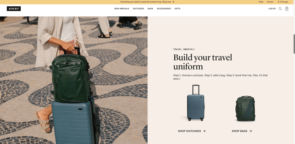
Image closeups show how equally elegant and durable Away products are.
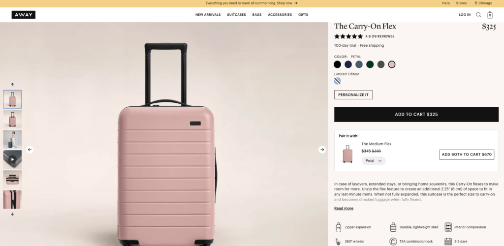
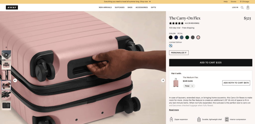
What’s more, shoppers can add their initials to their Away products, which makes the buying experience personalized.
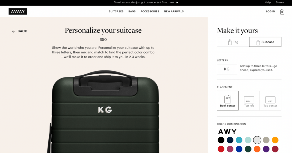
Away’s online magazine “Here” offers city guides, travel inspiration, and even essays and interviews to spark the travel bug in their target customers.
Everything about this ecommerce experience says, “if you travel the world with this bag, you’ll look great doing it.”
34. Brooklinen
The homepage of luxury bedsheet brand Brooklinen starts off with a bang—touting their award-winning bedding collections with “Internet-famous for a reason” headline.
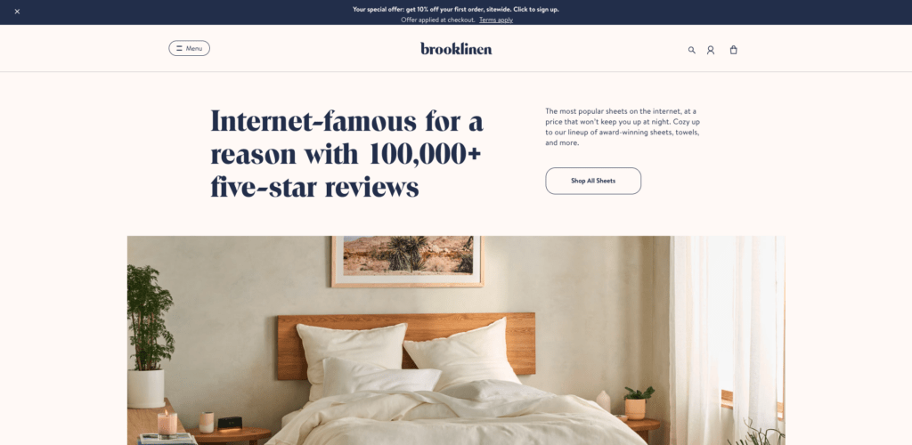
For customers who aren’t sure what kind of bedding they’re looking for—and who are perhaps a little skeptical about shopping for sheets online—Brooklinen’s product collections help them find the perfect products for their sleep style and comfort preferences.
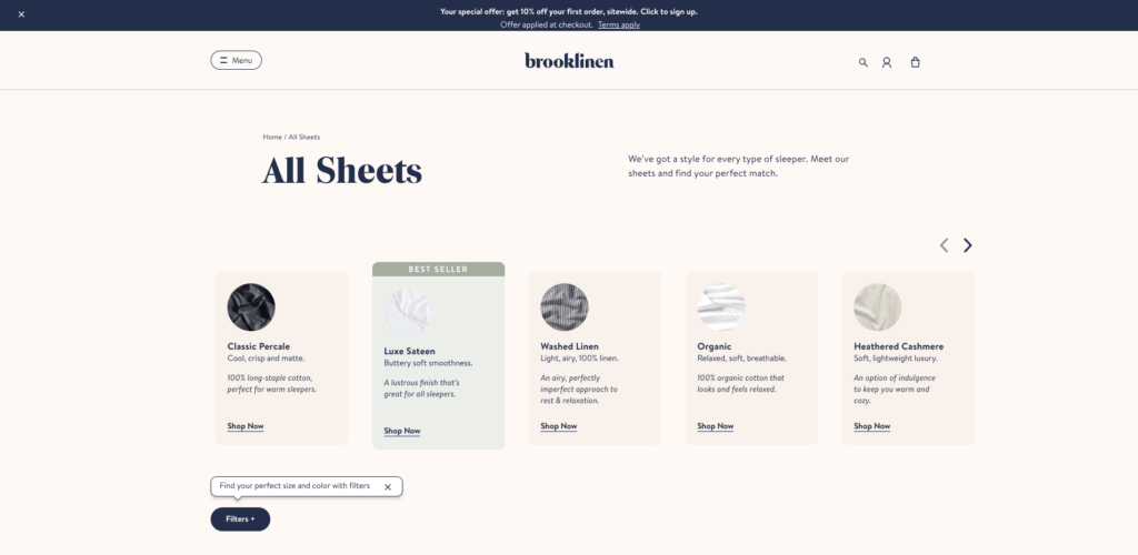
Additionally, product image closeups, video explainers from the Brooklinen team detailing product specs, and product comparisons offer shoppers tons of context to make a confident purchase decision.
35. The Sill
Online plant shop The Sill’s website is bright, colorful, and aesthetically pleasing using a mix of product and lifestyle visuals, easy-to-read fonts, and balanced whitespace.
It’s clear the brand is big on customer education with several features on the site:
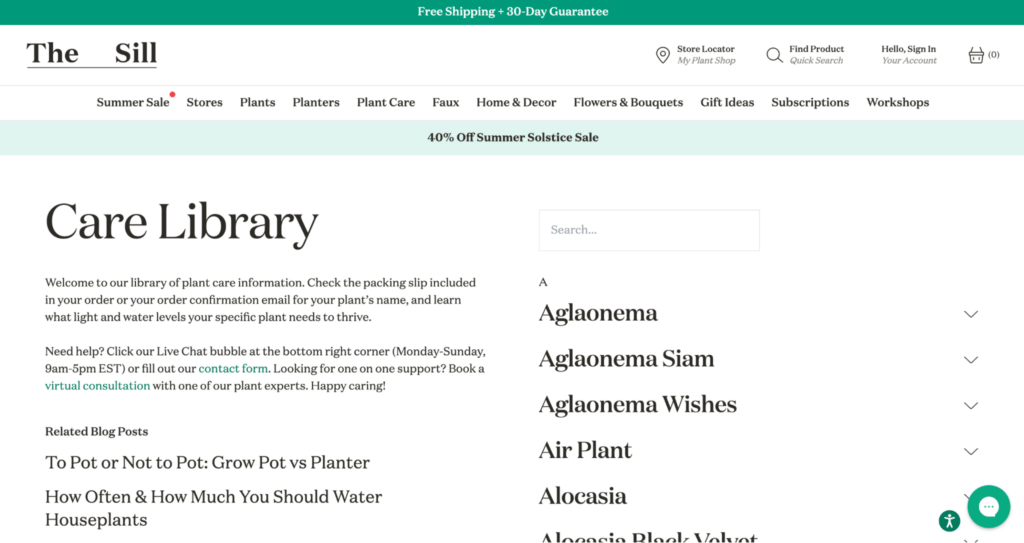
- The Sill highlights its “For beginners” plants alongside other collections, which speaks to their target audience (folks who like plants but perhaps don’t know a ton about plant care).
- Other collections like “flowering plants,” “live plants,” and “pet friendly” help customers find exactly what they’re looking for—whether it’s a large monstera or a faux fiddle leaf fig tree.
- The Sill includes a helpful FAQ section with questions like “Do I have to repot my plant once it arrives?” and “How will my plant arrive?”, which reduces shopper friction and hesitation about purchasing a plant.
- Customers can even join The Sill’s Plant Care Library and Plant Care Assistant to learn more about their new plants, ask questions, access sales, and more.
36. Rifle Paper Co.
Rifle Paper Co. began as a stationery brand and has evolved into a lifestyle brand with a variety of products, including jewelry, sleepwear, and home decor.
As a result, the brand has become a pro at rich visual merchandising, as seen throughout their ecommerce website—like on product pages, collections pages, and on the Our Story page:
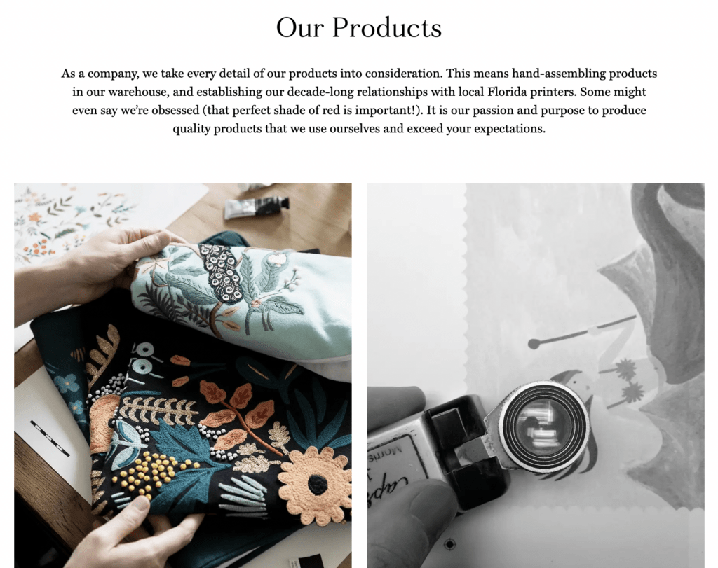
High-resolution product and lifestyle imagery give Rifle Paper Co. an elevated, editorial, and more aspirational feel as you shop.
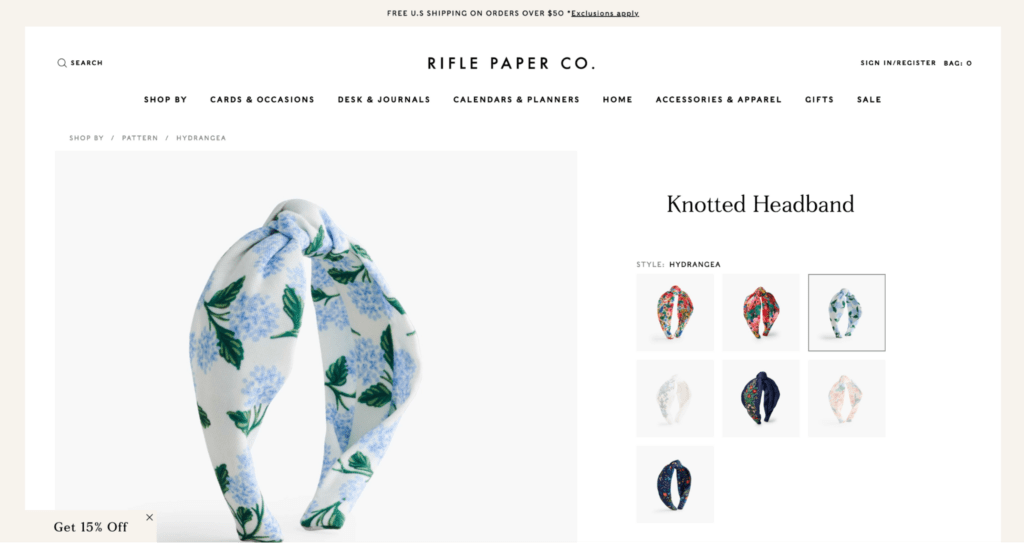
The brand provides plenty of contextual imagery for shoppers to see the versatility of their designs closeup, and in great lighting.
#cta-visual-pb#<cta-title>Create stunning ecommerce design with Shogun<cta-title>Build and customize landing pages with all the vital elements for conversions—or build a fabulous homepage quickly.Start designing for free
37. The Ridge
Functional wallet and accessories brand, The Ridge, communicates their brand ethos and value from the moment customers land on their ecommerce site.
From contextual comparison images that show how sleek The Ridge’s products are to the storytelling behind their collections, this ecommerce site is dynamic and memorable.
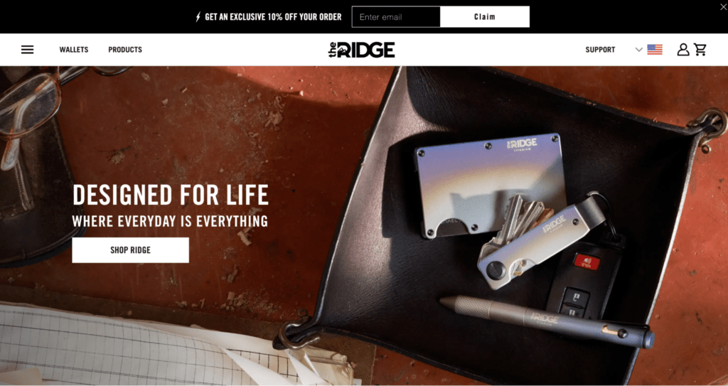
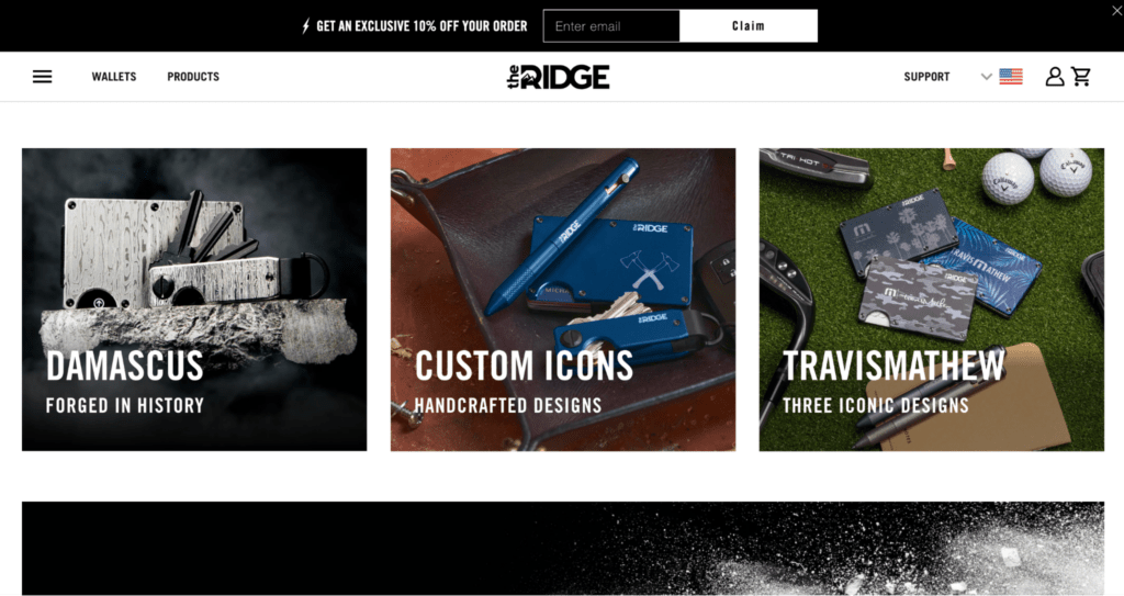
With Shogun, The Ridge can design engaging site content that communicates their value proposition that justifies their price point. Using Shogun elements, The Ridge has increased their conversion rate by 15%.
#cta-paragraph-pb#Learn more about the Ridge’s experience with Shogun Page Builder. Read the case study
38. Floyd Home
Floyd Home’s ecommerce website design is nothing short of stunning. It’s elegant, quality, and editorial all at once.
Upon landing on the homepage, the site design makes a great first impression with the hero image.
It almost looks like you’re walking into someone’s living room. It’s inviting and luxurious.
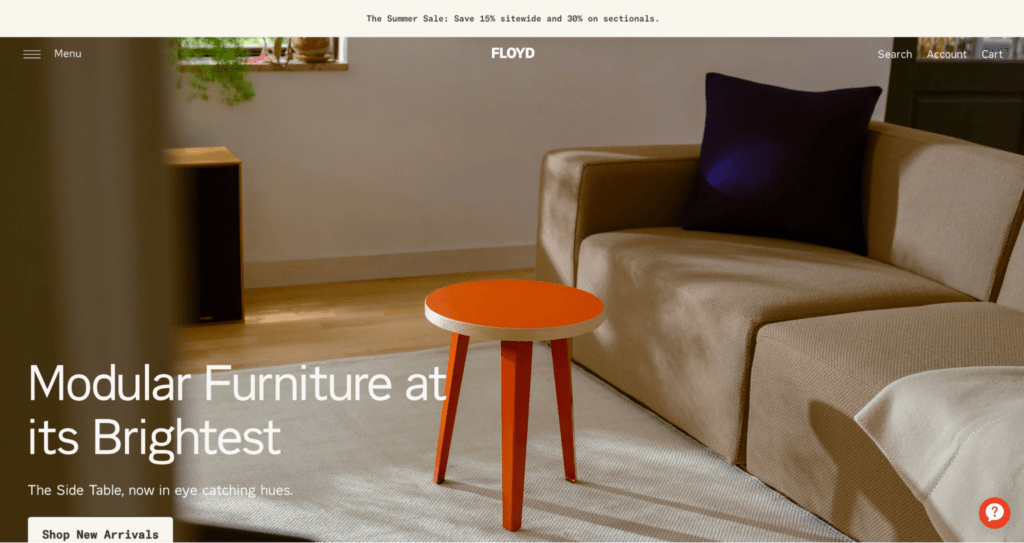
In addition to evoking feelings of home, Floyd Home’s site makes it easy to customize furniture to your exact desired specs:
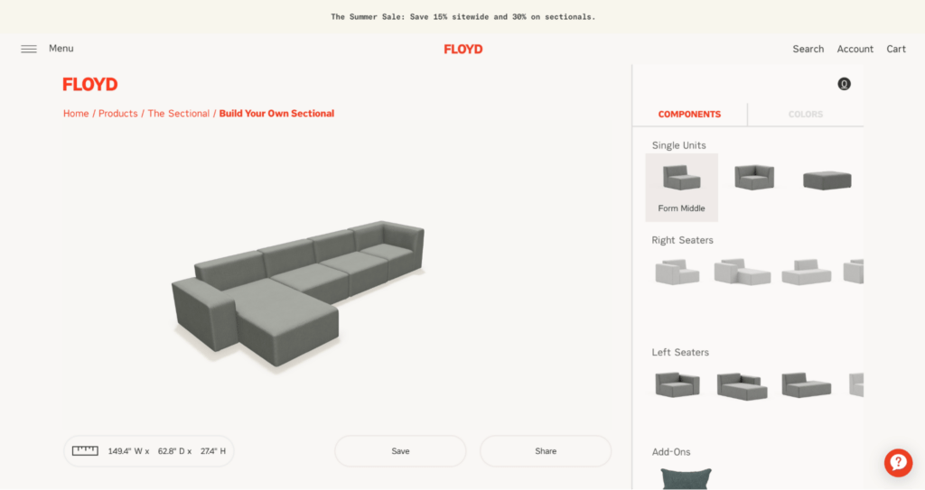
The process of designing your own Floyd Home item feels high-end and high-tech, adding to the overall ecommerce experience.
39. GE Appliances
Global appliances brand GE Appliances has a trove of SKUs ranging from RV refrigerators to countertop appliances.
A catalog this large can be tricky to organize on an ecommerce site, but GE Appliances categorizes their products using A+ information hierarchy.
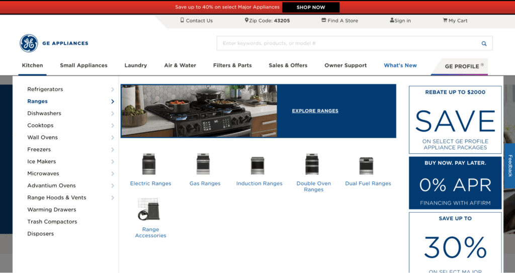
In addition to excellent site navigation, GE Appliances manages multiple site instances seamlessly with Shogun Page Builder Advanced.
With Shogun, the GE Appliances team can make site-wide updates in minutes, making them ultra efficient and consistent.
#cta-paragraph-pb#Learn more about GE Appliances’ experience with Shogun Page Builder Advanced. Read the case study
40. Tuft + Paw
Cat furniture and litter brand Tuft + Paw is all about customer education.
From contextual GIFs throughout the site to images that highlight the benefits of their products, Tuft + Paw aims to convey the quality cat owners can expect to find.
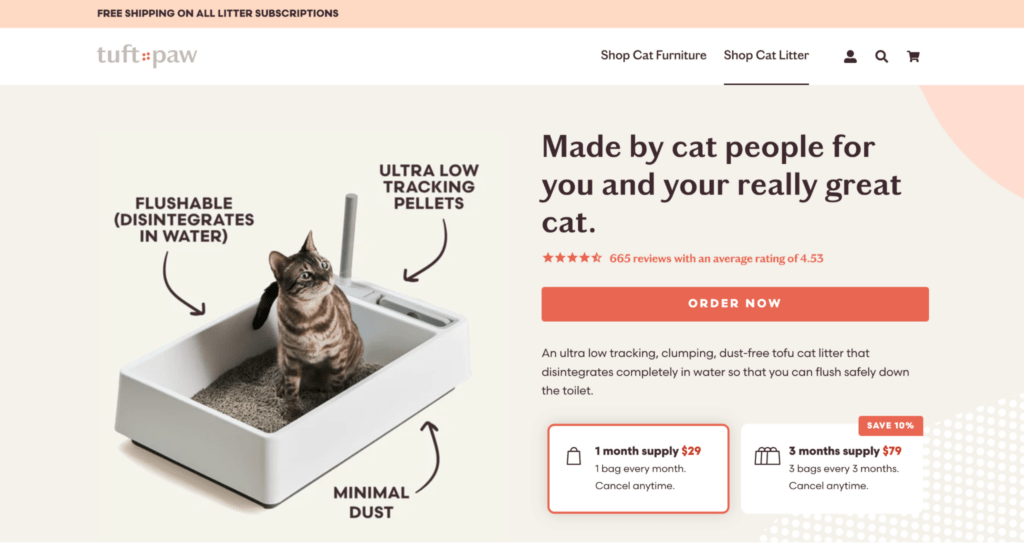
Tangentially, their Cat Education Center serves as a hub of information for cat owners to learn all about their furry besties—from different kinds of cat litter to cat behavior.
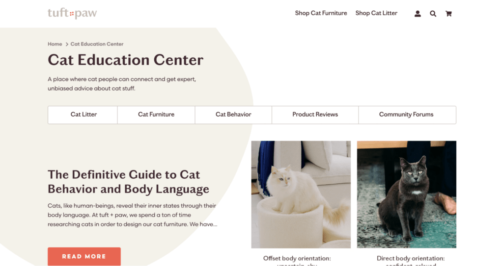
Tuft + Paw uses Shogun Page Builder to build eye-catching blog content found on their Cat Education Center to cement themselves as a go-to cat resource.
With Shogun, the nimble team can spin up custom blog content in hours instead of weeks using Shogun’s drag-and-drop functionality, snippets, and elements.
#cta-paragraph-pb#Find out more about Tuft + Paw’s success with Shogun Page Builder. Read the case study
Frequently asked questions about ecommerce website design
What is ecommerce design?
Ecommerce design is the visual layout and user experience component of an online store that allows for the buying and selling of products.
It includes balancing aesthetics, usability, and functionality to create an engaging, easy-to-use online shopping experience for all customers.
Why is ecommerce design important?
Ecommerce design is important because it can directly influence your conversion rate.
With 38.5% of online shoppers citing outdated site design as a top reason they’ll leave a site, it’s critical to invest in design.
What kind of design is good for an ecommerce website?
Strong, high-converting ecommerce design is:
– Engaging
– Focused on communicating value to customers
– Created to help with product discovery
– Trustworthy and secure
– Streamlined for checkout
– Easy to navigate
– Far from cookie-cutter
– Designed for speed and mobile commerce
What’s the best ecommerce website builder?
Nowadays, anyone with a strong internet connection and an entrepreneurial spirit can create an ecommerce website thanks to emerging and improving technology.
Ecommerce platforms like Shopify and BigCommerce are two leading options for building and customizing your online store.
If you want to take your site customization even further, tools like Shogun Page Builder allow you to build anti-cookie-cutter site pages with drag-and-drop functionality, pre-built snippets, and more.
What should a good ecommerce website have?
A successful ecommerce website will include:
– Easy site navigation
– A simple checkout process
– Ample product details found in copy and images
– Calls-to-action that tell customers what to do next
What ecommerce website design trends should my band consider?
Trends fluctuate, but adding features like “quick add” cart buttons, try-before-you-buy interactions, and coupon/offer popups are excellent ways to boost conversions and build customer relationships.
Related: Capture More Conversions With These 10 Tips (+ Examples)
Designing beautiful ecommerce experiences with an intuitive page builder
The ecommerce stores that become memorable brands have one thing in common: They use website design to create exceptional shopping experiences.
Stand-out ecommerce website design is multifaceted.
It’s not enough to use the standard default theme and expect a surge of conversions or a cult following to assemble.
Brands who strive to scale must have ecommerce sites that convey their product quality, values, personality, and trustworthiness in every interaction.
#cta-visual-pb#<cta-title>Double-down on high-converting site design<cta-title>Create and customize landing pages with all the vital elements for conversions with Shogun Page Builder.Start designing for free

Kaitlyn Ambrose
Kaitlyn works on all things content at Shogun. ⚡

